You can use CSS3 to add blur, shadow, brightness or contrast to an element. Overall, there are ten filters available. The SVG format knows filter effects as well. Partially, these options overlap, for example when it comes to blur. However, the SVG format knows several additional filters that CSS3 alone can’t create. With little effort, you can add SVG Filters to an HTML element.
What SVG Filters Exist?
While CSS3 has a total of ten different filters, the SVG format offers 19 of them. For example, there’s “”, which mixes pixels on an image with adjacent pixels. This creates a smudgy effect similar to the motion blur in Photoshop. Using “” allows you to apply a Gaussian blur, while “” makes sure that the pixels of an image are thinned or thickened.

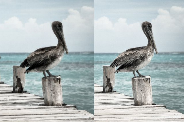
Original Image and the Applied “” Filter
You can use the filter “” for different color manipulations, for example to alter an image’s saturation, hue, and brightness.
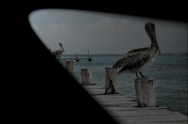
The two filters “” and “” allow you to add lighting effects like diffused or reflected light to a picture. With “”, “” or “”, you can define different light sources.

Image With Lighting Filter
There are several other filters, some of which are rather unspectacular, “”, which only moves an image, and some of which are rather special, like “”, which creates turbulences and fractals.
Creating and Applying SVG Filters
If you want to apply SVG filters to any HTML element, all you need to do is setting the filter itself via SVG. This should be done within the “” section. This one is made for elements like patterns, flows or filters, meaning elements, that are not visible, but are applied to other elements. Also, filters need to be placed within the “” element.
<svg>
  <defs>
    <filter id="blurryexample">
      <feConvolveMatrix order="20, 1" kernelMatrix="1 1 1 1 1 1 1 1 1 1 1 1 1 1 1 1 1 1 1 1" />
    </filter>
  </defs>
</svg>
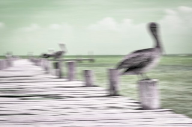
In the example, the filter “” is set. The attribute “order” defines how many adjacent pixels on the x- and y-axis should be included. In the example, only pixels on the x-axis are mixed, which creates motion blur. The values defined by “order” form a matrix – 20 times 1 pixel in this example. “kernelMatrix” is used to define the values of every pixel of the matrix. As our matrix only consists of one line, 20 values need to be defined for this line. Values for further lines would be set divided by a comma.

Picture With Motion Blur
The filter needs an ID in order to be applicable to other elements within the HTML document. Afterwards, you need to transfer the SVG filter’s ID to the CSS3 attribute “filter()”.
img {
  filter: url(#motionblur);
}
In the example, the filter is applied to all “![]() ” elements. You need to be aware of the fact that the attribute “filter” only works with a fitting vendor prefix on some browsers.
” elements. You need to be aware of the fact that the attribute “filter” only works with a fitting vendor prefix on some browsers.
While modern browsers like Chrome and Firefox support the option of applying SVG filters to any element, this doesn’t work on Internet Explorer, and Microsoft’s new browser Edge (yet).
Combining Filters and Applying Them to Texts
Of course, you can also combine filters. To do so, simply set multiple filters within one “” element.

Picture With Motion Blur and Hue Changes
<svg>
  <defs>
    <filter id="motionblur_huevalue">
      <feConvolveMatrix order="20, 1" kernelMatrix="1 1 1 1 1 1 1 1 1 1 1 1 1 1 1 1 1 1 1 1" />
      <feColorMatrix type="hueRotate" values="-90" />
    </filter>
  </defs>
</svg>
In the example, the filters “” and “” are combined. The latter makes sure that the hue rotation (“hueRotate”) of 90 degrees is achieved via “type”.

Text With Motion Blur
As mentioned in the beginning, the filters not only work for pictures, but for all HTML elements. This allows you to create interesting text effects. When applied to a heading e.g., it gains a motion blur effect.
Examples on Codepen
(dpe)
* You might also be interested in the following articles


![The Truth about WordPress Performance [#1/2] The Truth about WordPress Performance [#1/2]](http://www.noupe.com/wp-content/plugins/contextual-related-posts-2.0.1/timthumb/timthumb.php?src=http%3A%2F%2Fwww.noupe.com%2Fwp-content%2Fuploads%2F2015%2F03%2Fwordpress-performance-partone-teaser.png&w=250&h=200&zc=1&q=75)


