Archive

Archive for February, 2016

Building Concentric Circles with Nice Color Palettes For Fun and Science

February 19th, 2016 No comments

By replicating a little design I found, I learned a lot of different things: Jade loops, exploded attributes, nested SVG circles, color libraries and APIs, and more.

Direct Link to ArticlePermalink


Building Concentric Circles with Nice Color Palettes For Fun and Science is a post from CSS-Tricks

Categories: Designing, Others Tags:

CSS Custom Properties: How to Use Variables in Chrome 49

February 19th, 2016 No comments

Starting with version 49, Chrome supports custom properties, namely CSS Variables. Now, another central element of professional programming is ported to the browser without any additional requirements.

Variables: Central Element of Structured Programming

Variables are an irreplaceable part of professional programming. Just imagine having to manually redefine the values for every single application area instead of having them managed as variables from one central spot. Searching and replacing things, if necessary, would take a bunch of effort even with professional development tools. However, until now, this procedure was inevitable when using CSS.

Only since Chrome 49, Google’s browser supports variables in the shape of CSS custom properties, also when it comes to the creation of stylesheets. As expected, this is certainly useful. You won’t want ever to miss it once you’ve gotten used to it.

CSS Custom Properties: This (and More) Can be Done With CSS Variables

CSS Custom Properties are useful for many purposes. An instantly recognizable example is the page-wide alteration of color values. CSS itself is already a relief in this regard. Thinking back on my first design in the 90s, I still feel uneasy today. Without CSS, I used to newly place colors on every single HTML element. When the client changed the color set, I was busy for multiple days, trying to find and replace all the values manually.

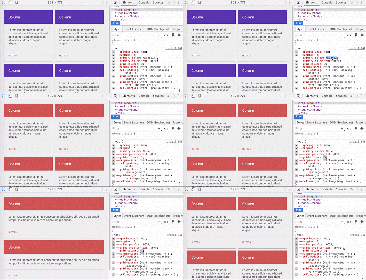
But even with CSS, altering elaborate color schemes can become confusing rather quickly. Here, CSS variables are a massive aid. For the visual reader type, I’ll simply integrate the GIF that Google has used in its Chromium blog to announce the new features here:

CSS Custom Properties: How to Use Variables in Chrome 49

An exemplary code can look somewhat like this:

:root {
  --main-color: #06c;
}
 
#foo h1 {
  color: var(--main-color);
}

Experienced developers will immediately recognize the principle. Here, --main-color is the freely definable variable, the custom property. Custom properties always start with two hyphens.

Besides fixed values, calculations and conditions can also be set up as custom characteristics. This way, you can react to changes in screen resolution in responsive designs, for example.

I’m stoked. Chrome 49 surely has even more new things to offer. The CSS variables are definitely my favorite, though.
(dpe)

Categories: Others Tags:

A Quick Overview of `object-fit` and `object-position`

February 19th, 2016 No comments

object-fit and object-position are my two favourite CSS properties lately. They give developers control over the content inside an img or a video similar to the way that we can manipulate the content of a background with background-position and background-size.

First, let’s dig into object-fit.

This property defines how an element, such as an img, responds to the width and height of its content box. With object-fit we can tell the content to fill that box in a variety of ways such as “preserve that aspect ratio!” or “stretch up and take up as much space as possible!”

Here’s an example:

This image is 400px x 260px. If we style that image like so…

img {  
  width: 200px;
  height: 300px;
}

…then we end up with awkward distortion because that image is being squished to fit that container:

See the Pen 1b15cf30a6226d9f419b4f765458a059 by Robin Rendle (@robinrendle) on CodePen.

The content of our img will take up all the available space inside its new box that we created when we changed its height and width, thus destroying its original aspect ratio.

To preserve the image’s aspect ratio whilst also filling in the space, we can use object-fit:

.cover {
  object-fit: cover;
}

See the Pen 7080df9cb7158c0860b8a66db9667a7d by Robin Rendle (@robinrendle) on CodePen.

The image on the left is our original and the image on the right has cut off the sides of the image, now preserving our aspect ratio! This might not look like a particularly interesting development at this scale but once we move into designing more realistic interfaces then the power of object-fit reveals itself.

Let’s take another example:

See the Pen WrBzey by CSS-Tricks (@css-tricks) on CodePen.

Here we have two images and we want them to fill the width of 50% of the browser window (so they sit side by side) and 100% of the height. This we can do with the help of viewport units:

img {
  height: 100vh;
  width: 50vw;
}

The problem is that when we resize the browser we change the aspect ratio of the images which can cause all sorts of weirdness. Instead, we want to preserve their aspect ratio just like in the previous demo and we can use exactly the same method of doing so. object-fit: cover to the rescue!

See the Pen YwbeoG by CSS-Tricks (@css-tricks) on CodePen.

Try resizing the browser again. No aspect-ratio weirdness, right? This is also extraordinarily helpful if we have images that have different dimensions because they’ll effectively be cropped by their bounding box.

cover is only one of many values for object-fit, more of which you can read about on the Almanac entry, but so far it’s the only value that I’ve found to be the most useful in day-to-day interface development.

Let’s move onto my next favourite thing: object-position.

We’ll get things set up by using the same image as before and using these styles:

img {  
  background: yellow;
  height: 180px;
  object-fit: none;
}

Two things to note here: we need to declare the dimensions for our image in order for object-position to work properly and we also need to set object-fit to none so that the image can be pushed around instead of filling up the whole box, as it would do by default. This makes a bit more sense when you see that the default for object-fit on an image is fill, even if you don’t declare it.

Speaking of defaults, object-position centers all objects horizontally and vertically without a value:

img {
  background: yellow;
  height: 180px;
  object-fit: none;
  object-position: 50% 50%; /* even if we dont declare this the image will still be centered */
}

The first value moves the image left or right and the second moves it up or down. We can experiment with those values here:

See the Pen Object position by Robin Rendle (@robinrendle) on CodePen.

We can even nudge the image inside its content box so that we can reveal the background-color that we set earlier.

But how is this useful? Good question! Well, in a recent project I found that a particular section of an image needed to be moved towards the center so that it caught the attention of the reader. We didn’t need to load a new image, and so we didn’t need the element in this case, all we wanted to do was move the image over a little bit.

Besides moving the focus of an image, I’m not sure what else this property might be helpful for in a practical sense. But I’ve been messing around with object-position to show how you can hide parts of an image and then reveal bits of it on click, like in this demo:

See the Pen SVG sprite with object-position by Robin Rendle (@robinrendle) on CodePen.

I haven’t experimented with how or why you might use this for elements. Full screen video that hits all the edges, perhaps? There’s plenty more to learn about and explore when it comes to these properties.

What’s the support?

Generally speaking, pretty good!

object-fit is supported by everything except IE/Edge. Whereas, object-position is supported by everything except Safari and IE/Edge.


A Quick Overview of `object-fit` and `object-position` is a post from CSS-Tricks

Categories: Designing, Others Tags:

How to usability test your site for free

February 19th, 2016 No comments

Usability testing is sometimes one of those things that designers conveniently ‘forget’ about. Why? Well do a search for it. Usability testing, as it is generally practiced, costs money. There are interviews to perform, a variety of tests to create for each and every project, services to pay for… and what if your client’s in another country? Or what if they’re a small business with a small budget, or a brand-new startup? What if the only reason you learned web design in the first place was to build your own site? Check your wallet. Can you pay for classic usability testing?

This, is usability testing for the rest of us

It’s not uncommon for advice written about usability testing to assume that you’re working on a “big project” for a client that can afford the fancy stuff. Even the articles that talk about testing on a budget will often refer you to paid services. Simply put, there are times when any kind of paid service, on top of every other expense, is not an option. This, is usability testing for the rest of us…

Start with friends

Paul Boag wrote this on the subject:

Get 5 or 6 random people to sit in front of a computer, look at your site and ask them to complete a series of tasks while talking about them.

Well, that‘s where you‘d start. I‘d add a few extra recommendations:

  1. Grab the least-technically savvy people you know. You know, the ones who feel uncomfortable with a mouse. The ones who beg you for help every time they see a dialog box asking them if they want to save their file. If they can use your site, you’re set.
  2. If possible, test on mobile devices too. Don’t test the same user on one platform, then another. They’ll have had time to get used to your site’s basic structure. Get different users to test your site on different devices.
  3. Remember that observing a phenomenon can alter the outcome. In this case, people who know they’re being watched as they interact with a site may behave differently than they would normally. But hey, slightly skewed data is better than no data at all.

Get your role-play on

No robes and wizard hats here, unless you feel like it (actually, I do want a wizard hat) but you have to bring your ‘A’ game. It can be hard to see your project with fresh eyes. You built it. You know it inside and out. How do you pretend not to know it? It’s not enough to say, “Okay, I’m just going to get into character as Joe Averagedude and we’ll do this thing!” That’s not how it works. Even if you’re really good at playing pretend, you’re still you. My advice? Adopt a persona and change the browsing conditions. Try speed-browsing your site out in the sunlight on your phone. Grab a free screen reader, put on a blindfold, and try to reach your own calls to action as a blind person might. Lazily scroll through your site on a tablet in your living room, with the TV blaring. Use an older browser, on desktop or mobile, as a worst case scenario. Just try to simulate the conditions under which different users will be browsing your site. You might have to leave your office to do it. You might have to tie one hand behind your back. Whatever it takes, do it. Stop thinking like you.

Look for the free tools

There aren’t many. Proper user tracking and testing takes time and money, there are no two ways about that. Two companies, however, are offering quite a bit of good stuff for free. Well, that’s free as in ‘Google gets more information about you and your website’s users’, and ‘Optimizely gets a chance to upsell you on its pro plan’. If you can live with that, read on. Now when I say “Google”, I am of course talking about Google Analytics. If nothing else, you can set up ‘goals’ for your website’s users. That is, you can define specific actions you’d like them to take — clicking a link, filling out a form — and the analytics platform will keep track of just how many of your users are taking that action. It won’t tell you much really, but it can help to identify the existence of any major issues. There’s more that the platform can do, of course, but that should get you started. Optimizely is a different beast. It comes with a lot of free tools designed to not only collect data, but give it as much context as possible. The free plan has its limits, but it will be more than enough to start you on your way. As a bonus, it integrates with Google Analytics. All other free services that I’ve found so far are so limited as to be almost unusable in the long term. Well, there’s Five Second Test, but all that gets you is usability tests performed on fellow designers. The better ones might be able to spot some of your problems; but user testing is likely more effective when performed on users in your target demographic.

Conclusion

Free usability testing tools are not plentiful, but don’t let that stop you. All you really need are some willing friends, family, and acquaintances, and the willingness to get creative about testing your site. Don’t just check to see if it looks okay in all the browsers, test that thing ‘til it breaks, then start all over again. And don’t worry if not all of the tests go as planned. There’s always the next iteration. Featured image, project review image via Shutterstock.

Fast, Responsive, SEO-Friendly WordPress Slider SlideDeck3 – save $92!

Source

Categories: Designing, Others Tags:

Web Development Reading List #125: The Fallacy Of Urgency And Building A Modern Theme Switcher

February 19th, 2016 No comments

It’s Friday again, and I found some interesting articles for you to read over the upcoming weekend. In projects, developer, manager and product leaders still try to put pressure on the people who work on a task. Somehow they feel relieved, more secure if they do that. On the other hand, the people experiencing the pressure of urgency are struggling massively with it.

Responsive containers in Gmail

The fallacy here is that while the ones spreading the pressure feel better, the people experiencing it usually do a worse job than without the pressure. It leads to more bugs, unstructured work and, in the end, all people involved will suffer from the result. So instead, a team, which includes everyone from a developer to a manager, should focus on the purpose of the work. Give it a try, y’all, and now, enjoy your weekend!

The post Web Development Reading List #125: The Fallacy Of Urgency And Building A Modern Theme Switcher appeared first on Smashing Magazine.

Categories: Others Tags:

Outlook For Web Undergoes A Major Update

February 19th, 2016 No comments

Outlook has recently undergone a big revamp, and has rolled out a whole new set of features for its web version. Keeping the growing market share of GMail in mind, Outlook’s new look seems to be an attempt to outsmart the competition.

Among other things, Outlook now has a whole new design, plus a new set of emojis. You can “like” emails, and even tag people right within the email body.

Outlook also comes with mediocre image-editing capabilities within your inbox — possibly as a reply to Google’s Drive integration in GMail. Plus, you also have Giphy integration in Outlook, so you can share and send GIFs with ease.

An interesting feature that Outlook has added to email now is the introduction of social networking concepts in your inbox. You can “like” conversations as if they were Facebook posts — simply like the email in question, and you needn’t respond to it either. Similarly, you can use the @ sign to tag people in your email body — possibly to draw their attention towards a specific point that you are making.

Outlook has already had integration with other Microsoft products, such as Office Online and Skype. Thus, you can still have document editing and video chatting facilities in Outlook, and this latest update focuses more on the email-centric aspect of things.

Also, Outlook now has a new set of third-party addons, such as PayPal, Yelp, Uber and Wunderlist that you can incorporate in your workflow. Learn more about the new Outlook updates on this page.

What do you think of these updates? Will you be using Outlook anytime soon, or you’d prefer sticking with GMail? Share your views in the comments below.

Categories: Others Tags:

A Beginner’s Guide To Creating A WordPress Website

February 18th, 2016 No comments

Earlier this year WordPress passed the 24% mark, running almost a quarter of all website – and for good reason. It has a loyal user base and scores of dedicated developers bringing better features to the system all year round.

A Beginner's Guide To Creating A WordPress Website

This article is for those of you who are either new to WordPress, or are regular users who want to learn about the best way to run a WordPress website. We’ll be learning about domains, WordPress installation, managing content and using great plugins and themes to secure our site and make our content shine.

The post A Beginner’s Guide To Creating A WordPress Website appeared first on Smashing Magazine.

Categories: Others Tags:

Outlook takes on Gmail with huge new update

February 18th, 2016 No comments

One of Microsoft’s biggest challenges is to try and ensure that Outlook remains competitive against Google’s Gmail. To that end, it’s rolled out new features for its Outlook web app that are now available to everybody.

The features include new design-related elements like new emoji, but also more practical ones such as liking emails and tagging specific people within the email body.

If you’ve ever thought that your Outlook experience was a bit drab and boring, then worry no more: Outlook now features a bunch of new emoji that can help you signal your mood in both personal and professional emails. Helping with the fun are some new image-editing capabilities and themes.

One of the more creative additions to your Outlook experience from now on is the use of GIFs for certain circumstances and experiences. For instance, if you’re excited about an upcoming event, then just use Outlook’s new Giphy integration to include that video of that dancing cat to all of your recipients! This third-party plugin definitely works to liven up any email.

Even composing an email works along a different design with this update. You can now tag—using the @ sign—different people in your emails, similar to what you’d do on social media sites like Twitter and Facebook. Let’s say you’re going back and forth with a bunch of coworkers about an issue in a very long email thread, and you want to call the attention of one of them to a very vital point you’re making. Instead of bolding or writing the entire sentence in caps, simply tag them into the conversation at that particular point. Efficient and easy.

It’s also possible for you to like entire emails as well. Again borrowing from the social media world, Outlooks lets users like an email, which saves them the trouble of having to compose an actual reply—while still letting people they’re communicating with understand that they’ve read the email in question.

Skype (owned by Microsoft) support is bolstered too, allowing you to chat and make both video and voice calls right from your inbox. Plus, you’re able to edit documents due to the complete integration with Office Online. This includes separate interfaces for Excel, Word and PowerPoint.

Rounding out the updates are a Yelp feature to instantly embed business and dining suggestions and Wunderlist integration to transform emailed requests into to-do tasks on the spot.

Whereas this big update was previously only available to a small group that signed up for preview access, it’s good to see Microsoft make these beneficial updates available to everyone.

It’s interesting to note the timing of Outlook’s new look and features; recently, Google announced that users can now sign into Gmail without having to first sign up for a Google account. Both companies are giving users more features and convenience in a race for app dominance. Ultimately, the better user experience will determine who comes out on top. And as always, competition is the mother of invention.

LAST DAY: Responsive Email Designer App from CoffeeCup Software – 51% off!

Source

Categories: Designing, Others Tags:

Best of 2015: 100 Resources for Web Developers

February 18th, 2016 No comments
pattern lab

While we were primarily focusing on the graphical material, having provided you with all the sorts of stuff, including GUIs, icons, fonts, website layouts, the time has come to pay attention to another fundamental side of the development workflow. This routine is challenging, tricky and time-consuming. Thus it is not surprising that developers are eager to employ third-party resources that help to sort out issues in short order. These assistants in some cases are sterling solvers, in others just tiny yet professional enhancements. Whether you are a newbie or a skilled specialist, they certainly have something to offer.

2015 was rich in various instruments that enhanced the workflow and added icing to the cake. Our collection features solutions for creating animations, instilling dynamics into UIs, manipulating with various aspects of website design and giving projects a responsive behavior. There are also alternative responsive grid systems, color assistants and more.

Pattern Lab

Creator: pattern-lab
License: MIT.

Motion

motion

Creator: legomushroom
License: MIT.

Stock Up

stockup
Creator: Steve Benjamins
License: License info available for each individual photo.

Responsify.js

responsify
Creator: Zach Lieberman
License: MIT.

Layers CSS

layers css
Creator: Jerry Jäppinen
License: MIT.
Snatchr

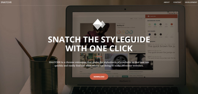
snatchr
Creator: Mio Yoshigiwa, Michael J Dintaman and Robert Paige.
License: Declared as Free, no proper license given.

Interdimensional

interdimensional
Creator: Ilya Makarov
License: MIT.

Pingendo

pingendo
Creator: pingendo’s team
License: Declared as Free, no proper license given.
Gridlex

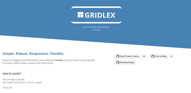
gridlex
Creator: devlint
License: Declared as Free, no proper license given.

Jump

jump
Creator: callmecavs
License: MIT.

SkyBlue CSS Framework

skyblue framework
Creator: Stanko
License: MIT.

Transformicons

transformicons
Creator: Bennett Feely and Sara Soueidan
License: MIT.
Flickity

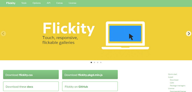
flickity
Creator: metafizzy
License: three kinds of licenses: open-source, commercial, and OEM.

NativeScript

native script
Creator: NativeScript
License: Apache 2.0 license.
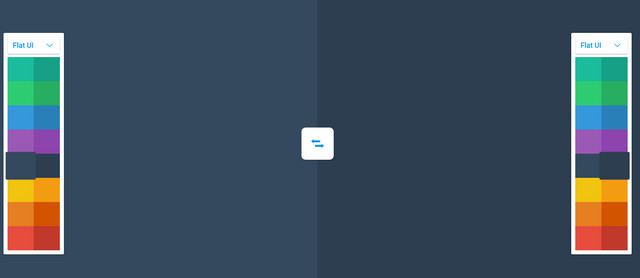
Blend

blend
Creator: colinkeany
License: Declared as Free, no proper license given.
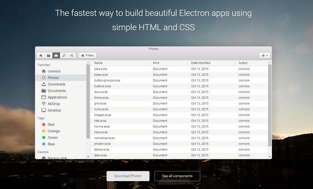
PhotonKit

photonkit
Creator: Connor Sears
License: MIT.

AndroidLibs

android libs
Creator: AndroidLibs
License: Declared as Free, no proper license given.
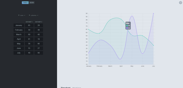
TinyChart

tinychart
Creator: lechienvic
License: Declared as Free, no proper license given.
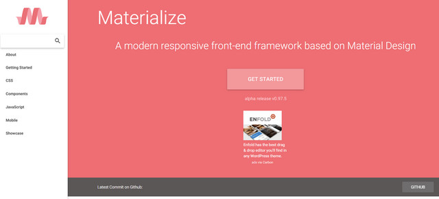
Materialize

materialize
Creator: Dogfalo
License: MIT.

Popmotion

popmotion
Creator: Popmotion
License: GPLv3 and Premium version.

Corpus

corpus
Creator: jamiewilson
License: MIT.

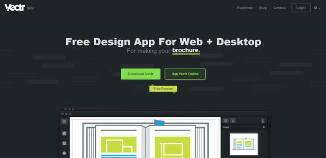
Vectr

vectr
Creator: Vectr Labs Inc
License: Special Terms.
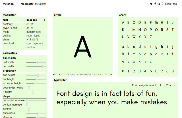
Modulator

metaflop
Creator: metaflop
License: sil open font license.
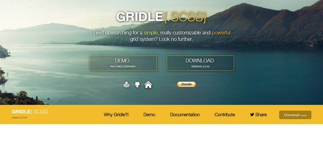
Gridle

gridle css
Creator: olivierbossel
License: MIT.

Vue.js

vue
Creator: Evan You
License: MIT.

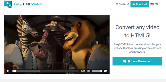
Easy HTML5 Video

convert To HTML5
Creator: easyhtml5video
License: Personal use.

img2CSS

img2css
Creator: javierbyte.
License: Declared as Free, no proper license given.
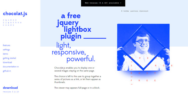
Chocolat

chocolate
Creator: NICOLAS T.
License: Attribution-ShareAlike.

Frontify

frontify
Creator: Frontify
License: Free option for 3 users.
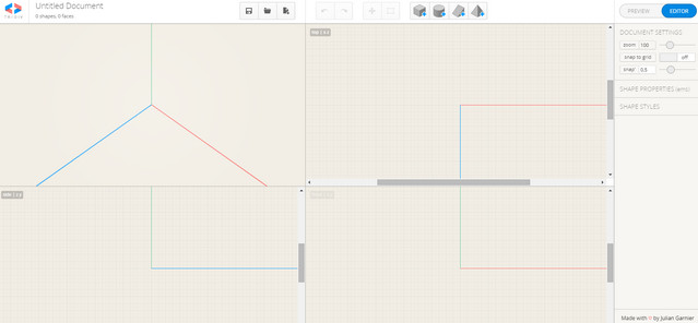
Tridiv

tridiv
Creator: Julian Garnier
License: Declared as Free, no proper license given.
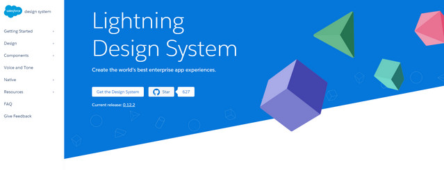
Lightning Design System

lightning design system
Creator: salesforce-ux
License: BSD License Clause 2 and Creative Commons Attribution-NoDerivatives 4.0.
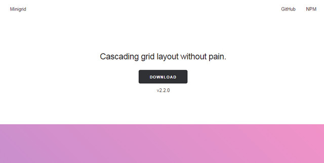
MiniGrid

minirid
Creator: henriquea
License: MIT.

Expose

expose
Creator: Jack000
License: MIT.

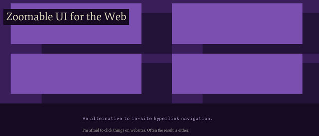
Zoomable UI for Web

zoomable ui
Creator: jonikorpi
License: Declared as Free, no proper license given.
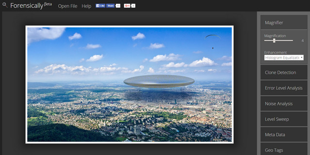
Forensically

forensically
Creator: Jonas Wagner
License: Declared as Free, no proper license given.

Flarum

flarum
Creator: Toby Zerner
License: MIT.

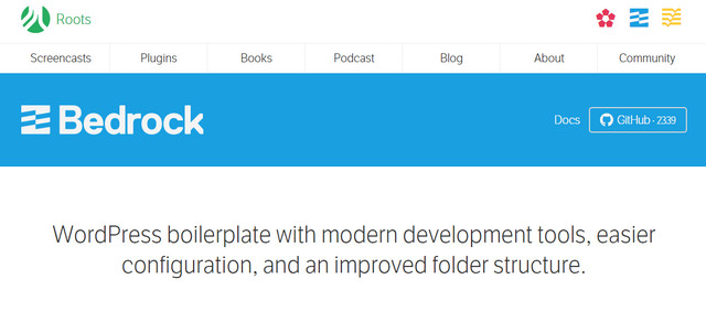
Bedrock

bedrock
Creator: roots
License: MIT.

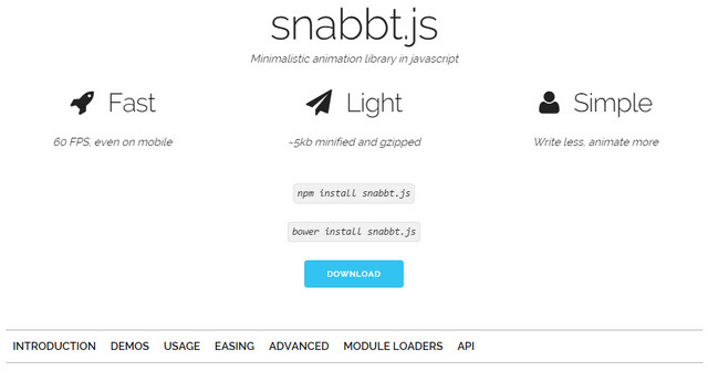
Snabbt

snabbt
Creator: Daniel Lundin
License: Declared as Free, no proper license given.
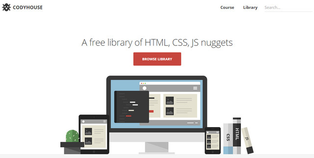
Codyhouse

codyhouse
Creator: Amber Creative
License: Free for personal and clients projects.
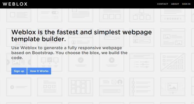
Weblox

weblox
Creator: Haris Mahmood and Trudy MacNabb
License: Special Terms.
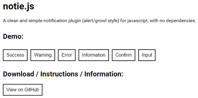
Notie.js

notie
Creator: jared reich
License: MIT.

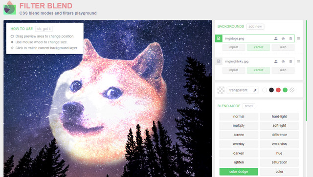
Filter Blend

filter blend
Creator: ilyashubin
License: Declared as Free, no proper license given.

Roll.js

roll
Creator: williamngan
License: Apache License.

Plotly

plotly
Creator: Team of plotly
License: MIT.

InstantSearch

instantsearch
Creator: algolia
License: MIT.

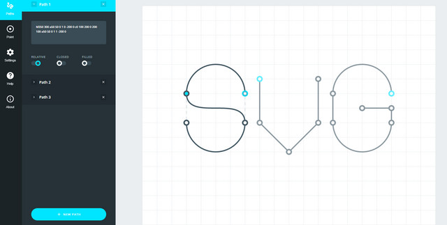
SVG Path Builder

svg path builder
Creator: anthony dugois
License: Declared as Free, no proper license given.
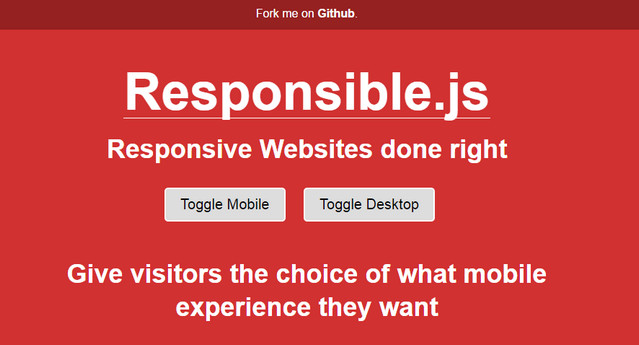
Responsible.js

responsible
Creator: David Wells
License: free to use in commercial projects.
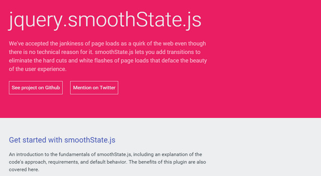
smoothState

smoothstate
Creator: Miguel Ángel Pérez
License: MIT.
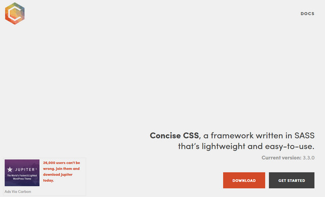
Concise CSS Framework

concise css framework
Creator: Keenan Payne and James Kolce
License: Declared as Free, no proper license given.

Drop.js

drop
Creator: HubSpot
License: MIT.

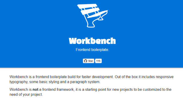
WorkBench

workbench
Creator: Jesse Kester
License: Declared as Free, no proper license given.
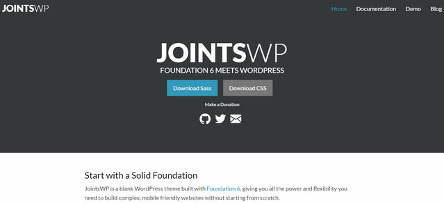
JointsWP

jointswp
Creator: Jeremy Englert
License: Declared as Free, no proper license given.
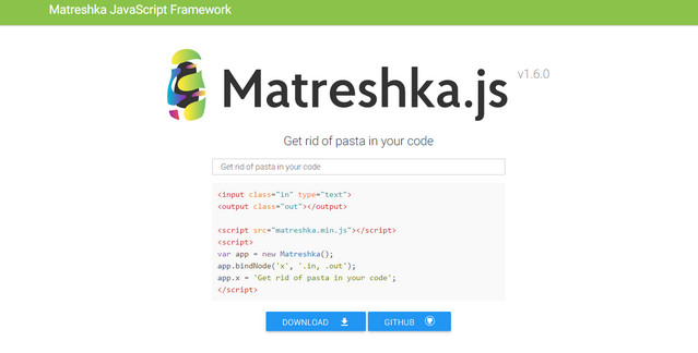
Matreshka JavaScript Fr-amework

matreshka
Creator: matreshkajs
License: MIT.

Simple Lightbox

simple lightbox
Creator: Andre Rinas
License: MIT.

AntiModerate

antimoderate
Creator: Jett LaRue
License: Free for personal and commercial use.
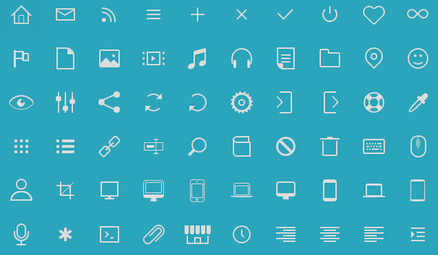
Icono

pure css icons
Creator: Saeed Alipoor
License: MIT.

Retini

retini
Creator: ERIK TERWAN
License: Declared as Free, no proper license given.
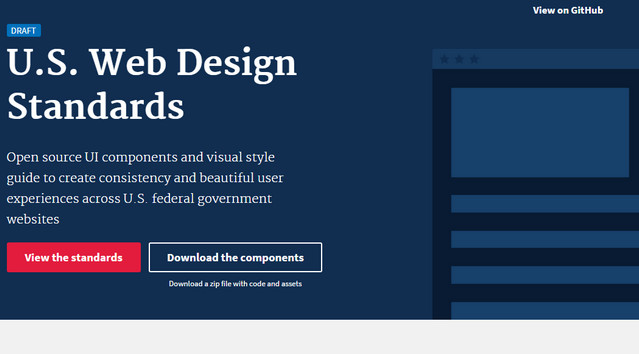
U.S. Web Design Standards

us web design standards
Creator: 18F
License: MIT.

YouTransfer

youtransfer
Creator: remie
License: Apache License, Version 2.0.
N1

n1
Creator: Nylas, Inc.
License: GNU General Public License.
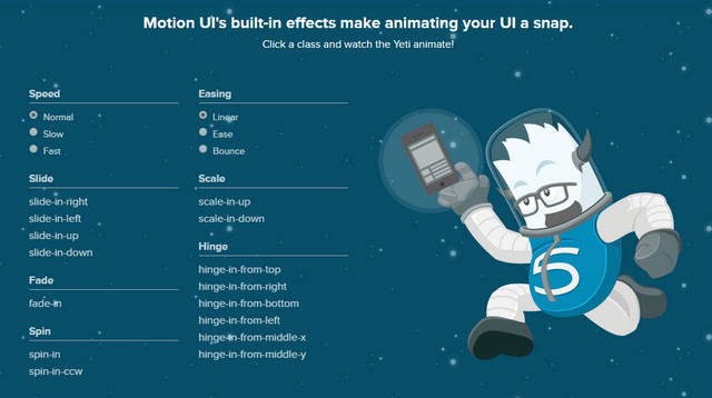
Motion UI

motion ui
Creator: Zurb
License: Declared as Free, no proper license given.
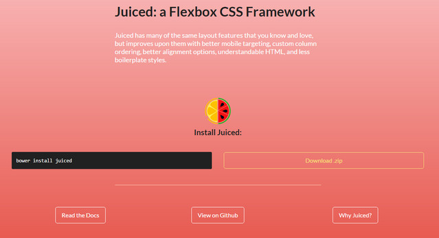
Juiced CSS

juiced
Creator: Joey Lea
License: MIT.

SmartCrop

smartcrop
Creator: Jonas Wanger
License: MIT.

Neutron CSS

neutron
Creator: NeutronCSS
License: Free for personal and commercial use.
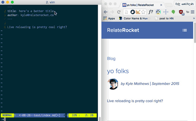
Gatsby

gatsby
Creator: Kyle Mathews
License: MIT.

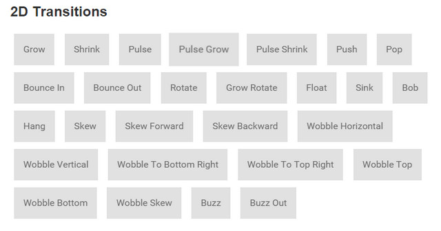
Hover CSS

hover css
Creator: Ian Lunn
License: MIT.

GlitchTop

glitchtop
Creator: chrisfoley
License: Declared as Free, no proper license given.

Shift.css

shift css
Creator: octavector
License: Free for personal and commercial projects.
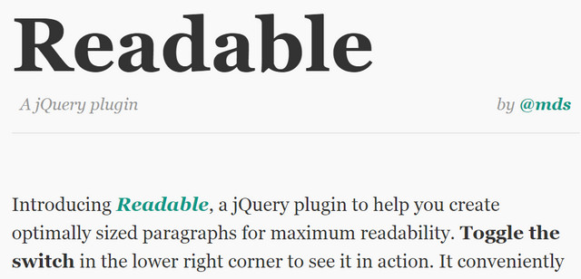
Readable

readable
Creator: Mds
License: MIT.

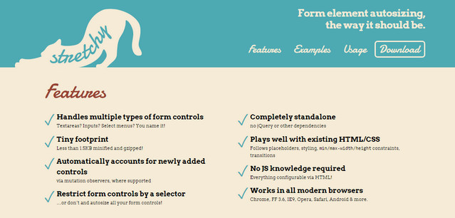
Stretchy

stretchy
Creator: Lea Verou
License: MIT.

jQuery Nice Select

nice select
Creator: Hernán Sartorio
License: Declared as Free, no proper license given.
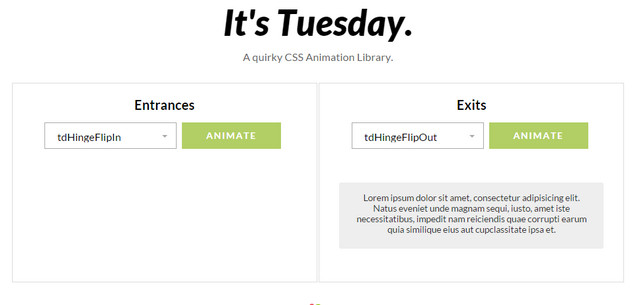
A quirky CSS Animation Library

animation library
Creator: shakr media
License: MIT.

BreakpointTester

breakpoint tester
Creator: Device Widths
License: Declared as Free, no proper license given.

Wallop

wallop
Creator: Pedro Duarte
License: MIT.

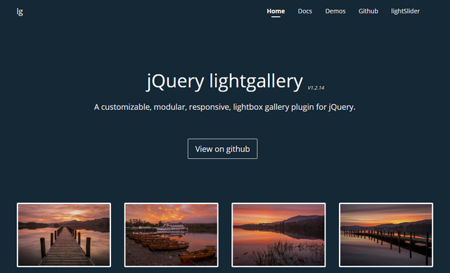
jQuery LightGallery

lightgallery
Creator: sachinchoolur
License: Apache License Version 2.0.
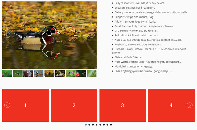
jQuery lightSlider

light slider
Creator: sachinchoolur
License: MIT.

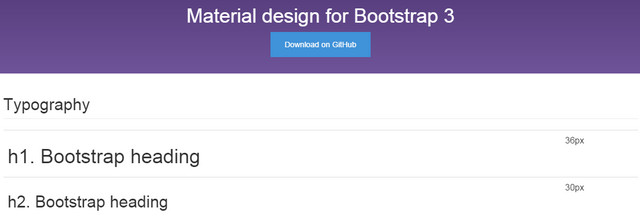
Material Design for Bootstrap 3

material design for bootstrap 3
Creator: melnik909
License: MIT.

Resize.ly

resizely
Creator: UsabilityDynamics
License: Free for 10 images.

CSSFmt

fmt
Creator: Masaaki Morishita
License: MIT.
StyleGuide

styleguide 2
Creator: hugeinc
License: Declared as Free, no proper license given.
HTML5Tooltips.js

html5tooltips
Creator: ytiurin
License: MIT.

Dummy / Fake Credit Card Generator

credit card generator
Creator: Saijo George
License: Declared as Free, no proper license given.
substituteteacher.js

substitute teacher
Creator: Dan Schlosser
License: MIT.

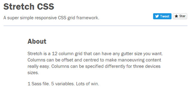
Stretch CSS

stretch css
Creator: David Ingledow
License: Declared as Free, no proper license given.
Serverless Framework

serverless framework
Creator: ac360
License: MIT.

CSS2SASS

css2Sass
Creator: Jose Pablo Barrantes and Hayk
License: Declared as Free, no proper license given.

CSSGram

cssgram
Creator: Una
License: Declared as Free, no proper license given.

Pure CSS Apple

pureCSSApple
Creator: Ömer Aslanbakan
License: MIT.

Typeset.js

typeset
Creator: davidmerfield
License: CC0.

Rucksack

rucksack
Creator: Simpla
License: MIT.

Scooter

scooter
Creator: Dropbox
License: Apache license.
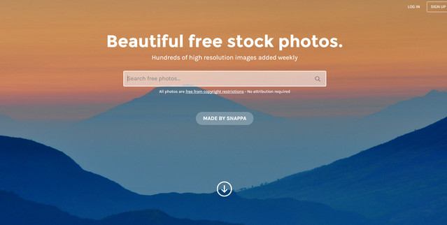
Stocksnap

free stock photos
Creator: Snappa
License: Creative Commons CC0.
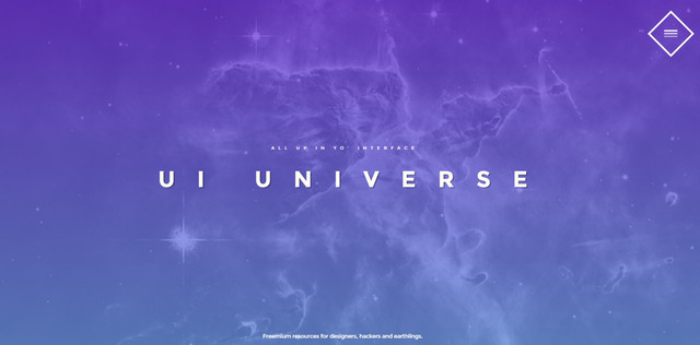
UI Universe

ui universe
Creator: jpgdcl
License: MIT.

Workmanship Manual

workmanship manual
Creator: Michael Fouquet
License: MIT.
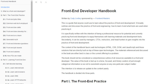
Front-end Developer Handbook

front-end developer handbook
Creator: Cody Lindley and Frontend Masters
License: Creative Commons Attribution-NonCommercial-NoDerivs 3.0 Unported.
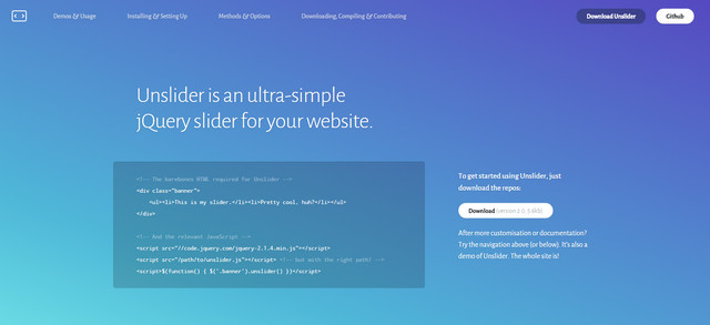
Unslider

unslider
Creator: idiot
License: WTFPL.

Ally.js

ally
Creator: Rodney Rehm
License: MIT.

Avalanche

avalanche
Creator: colourgarden
License: Declared as Free, no proper license given.
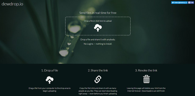
Dewdrop

dewdrop
Creator: Appioca LLC
License: Declared as Free, no proper license given.

Categories: Others Tags:

The Art Of The Intercept: Moving Beyond “Would You Like To Take A Survey?”

February 18th, 2016 No comments

Maxwell is a researcher at a design firm that is working on a mobile payment app. He wants to learn more about how users currently interact with point-of-sale terminals. Maxwell contacts a local grocery store to coordinate times to observe customers as they are checking out. He then asks every fifth customer who checks out to complete a brief survey. Maxwell is engaging in intercepts as part of his recruitment of research participants.
The Art Of The Intercept: Moving Beyond “Would You Like To Take A Survey?”

We often want information on what users and potential users of our designs think and how they behave in the context of where they will use our design. For example, if you are designing a new interface for an ATM, you would benefit from understanding how current users engage with ATMs in the context of spaces where ATMs are located. Intercepts allow you to engage users in a variety of settings to collect data to inform your design. It sounds simple, but there is a right way to ask people to stop and participate in a study. This article shares a method to design and carry out effective intercepts as part of your user research.

The post The Art Of The Intercept: Moving Beyond “Would You Like To Take A Survey?” appeared first on Smashing Magazine.

Categories: Others Tags: