Archive

Archive for February, 2016

Apple’s Tim Cooks Fights Back Against the FBI

February 18th, 2016 No comments
tim-cook-apple

tim-cook-apple

Today Tim Cook responded to a request by the FBI to a court order that would force them to compromise the security of one of iOS in an effort to gain information about the recent San Bernadino shoot. Here’s the letter in full.

February 16, 2016 A Message to Our Customers
The United States government has demanded that Apple take an unprecedented step which threatens the security of our customers. We oppose this order, which has implications far beyond the legal case at hand.

This moment calls for public discussion, and we want our customers and people around the country to understand what is at stake.

The Need for Encryption
Smartphones, led by iPhone, have become an essential part of our lives. People use them to store an incredible amount of personal information, from our private conversations to our photos, our music, our notes, our calendars and contacts, our financial information and health data, even where we have been and where we are going.

All that information needs to be protected from hackers and criminals who want to access it, steal it, and use it without our knowledge or permission. Customers expect Apple and other technology companies to do everything in our power to protect their personal information, and at Apple we are deeply committed to safeguarding their data.

Compromising the security of our personal information can ultimately put our personal safety at risk. That is why encryption has become so important to all of us.

For many years, we have used encryption to protect our customers’ personal data because we believe it’s the only way to keep their information safe. We have even put that data out of our own reach, because we believe the contents of your iPhone are none of our business.

The San Bernardino Case
We were shocked and outraged by the deadly act of terrorism in San Bernardino last December. We mourn the loss of life and want justice for all those whose lives were affected. The FBI asked us for help in the days following the attack, and we have worked hard to support the government’s efforts to solve this horrible crime. We have no sympathy for terrorists.

When the FBI has requested data that’s in our possession, we have provided it. Apple complies with valid subpoenas and search warrants, as we have in the San Bernardino case. We have also made Apple engineers available to advise the FBI, and we’ve offered our best ideas on a number of investigative options at their disposal.

We have great respect for the professionals at the FBI, and we believe their intentions are good. Up to this point, we have done everything that is both within our power and within the law to help them. But now the U.S. government has asked us for something we simply do not have, and something we consider too dangerous to create. They have asked us to build a backdoor to the iPhone.

Specifically, the FBI wants us to make a new version of the iPhone operating system, circumventing several important security features, and install it on an iPhone recovered during the investigation. In the wrong hands, this software — which does not exist today — would have the potential to unlock any iPhone in someone’s physical possession.

The FBI may use different words to describe this tool, but make no mistake: Building a version of iOS that bypasses security in this way would undeniably create a backdoor. And while the government may argue that its use would be limited to this case, there is no way to guarantee such control.

The Threat to Data Security
Some would argue that building a backdoor for just one iPhone is a simple, clean-cut solution. But it ignores both the basics of digital security and the significance of what the government is demanding in this case.

In today’s digital world, the “key” to an encrypted system is a piece of information that unlocks the data, and it is only as secure as the protections around it. Once the information is known, or a way to bypass the code is revealed, the encryption can be defeated by anyone with that knowledge.

The government suggests this tool could only be used once, on one phone. But that’s simply not true. Once created, the technique could be used over and over again, on any number of devices. In the physical world, it would be the equivalent of a master key, capable of opening hundreds of millions of locks — from restaurants and banks to stores and homes. No reasonable person would find that acceptable.

The government is asking Apple to hack our own users and undermine decades of security advancements that protect our customers — including tens of millions of American citizens — from sophisticated hackers and cybercriminals. The same engineers who built strong encryption into the iPhone to protect our users would, ironically, be ordered to weaken those protections and make our users less safe.

We can find no precedent for an American company being forced to expose its customers to a greater risk of attack. For years, cryptologists and national security experts have been warning against weakening encryption. Doing so would hurt only the well-meaning and law-abiding citizens who rely on companies like Apple to protect their data. Criminals and bad actors will still encrypt, using tools that are readily available to them.

A Dangerous Precedent
Rather than asking for legislative action through Congress, the FBI is proposing an unprecedented use of the All Writs Act of 1789 to justify an expansion of its authority.

The government would have us remove security features and add new capabilities to the operating system, allowing a passcode to be input electronically. This would make it easier to unlock an iPhone by “brute force,” trying thousands or millions of combinations with the speed of a modern computer.

The implications of the government’s demands are chilling. If the government can use the All Writs Act to make it easier to unlock your iPhone, it would have the power to reach into anyone’s device to capture their data. The government could extend this breach of privacy and demand that Apple build surveillance software to intercept your messages, access your health records or financial data, track your location, or even access your phone’s microphone or camera without your knowledge.

Opposing this order is not something we take lightly. We feel we must speak up in the face of what we see as an overreach by the U.S. government.

We are challenging the FBI’s demands with the deepest respect for American democracy and a love of our country. We believe it would be in the best interest of everyone to step back and consider the implications.

While we believe the FBI’s intentions are good, it would be wrong for the government to force us to build a backdoor into our products. And ultimately, we fear that this demand would undermine the very freedoms and liberty our government is meant to protect.

Tim Cook

Read More at Apple’s Tim Cooks Fights Back Against the FBI

Categories: Designing, Others Tags:

Getting started with Flexbox grid systems

February 17th, 2016 No comments

So what’s going on with grid systems? I mean Flexbox is here. It’s ready, the browsers are (more or less) ready. It’s about time. We can vertically and horizontally center anything without CSS transform hacks!

Plus, there’s all that other stuff Flexbox can do. Let’s not kid ourselves, though. We’ve been waiting for that centering thing for a long time.

Maybe you’ve been watching the brilliant What the Flexbox?!, series, and you’re all ready to go. If you haven’t seen that, you should.

So… are we ditching grid systems now? Well, in many ways, we could. Especially if you hate class soup as much as I do. However, Flexbox-based grid systems are already a thing, and they can still be useful.

For example, they might help you stick to a CSS methodology like Object-oriented CSS or BEM. Maybe you just like using the classes. Or maybe you’re just getting used to Flexbox, and having the old twelve-column grid would help you adapt.

Maybe it’s just faster to use a pre-defined system than to custom-code every Flexbox grid that you need.

Whatever the reasons, grid systems aren’t going away; and you can have the best of both worlds. So why shouldn’t you?

The “big two”

I’d be remiss if I didn’t mention that Foundaton 6 is out, and it has a Flexbox version of its grid as an option. Ditto the yet-to-be released Bootstrap 4.

They’re keeping the old grids around for the people who need to support less-compliant browsers, but they’re ready to make the switch.

Flexbox Grid

This aptly-named grid system keeps to ye olde twelve columns. It has all of the familiarity of 960.gs, all of Flexbox’s advanced layout capability, plus the responsive-ready classes (extra small, small, medium, and large) that we’ve come to expect.

Solved by Flexbox

Solved by Flexbox was basically made as a demo. Still, it’s a rather complete and functional demo which could be used as the basis for many a project.

Gridlex

Gridlex lives up to its slogan, “Just a Flexbox Grid System”. There’s not a lot to differentiate it from Flexbox Grid. Choose the one with the better class names, I guess.

sGrid

sGrid is a bit different. Specifically, it’s built with Stylus. I know, right? Thought we were all just using SASS now. Anyway, it’s also designed to be integrated with a number of other technologies: Meteor, Grunt, React, and NPM.

scss-flex-grid & sass-flex-mixin

Oh there we go. scss-flex-grid and sass-flex-mixin are two separate SASS-based Flexbox grids. You can clone either from their repository, or install scss-flex-grid via NPM.

Conclusion

The tools are out there. So far, I haven’t been able to identify a “fan-favorite”. Chances are, people will just use what comes with their favorite CSS frameworks, for the most part.

In any case, there is little excuse any longer not to get stuck into Flexbox.

Unlimited HD Motion Graphic Clips, Animations and Footage – only $19!

Source

Categories: Designing, Others Tags:

10 Free Minimal Magazine WordPress Themes

February 17th, 2016 No comments
oblique

There is no shortage of amazing free themes for WordPress users. No matter what type of website you are looking to create, you can find a great selection of free and amazing WordPress themes that you can choose from.

Minimalism has been in vogue for quite a while now, and if you are looking for a free minimal WordPress theme for your magazine or news website, you have come to the right place. In this post, we have put together some of the best free minimal magazine WordPress themes.

So without wasting any further time, let us get started with the themes!

10 Free Minimal Magazine WordPress Themes

1. FlyMag

flymag

FlyMag is an impressive free WordPress theme that can be used to power a wide genre of websites, especially news and magazine sites. It is fully responsive and translation ready. However, even more so, it is loaded with customization options and features that you can choose from, such as custom logo, social links, custom colors and layouts, and a lot more.

Demo | Download

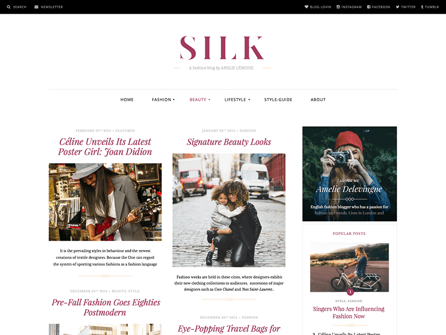
2. Silk Lite

silk-lite

Silk Lite is a magazine WordPress theme primarily meant for fashion magazines. It is responsive, features custom animations and a grid-like layout, and also has a Pro version with additional features.

Download

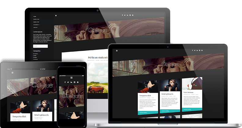
3. Oblique

oblique

Released by Theme Isle, Oblique is a magazine theme with a masonry layout. It is responsive, translation ready, and offers a lot of customization options. Plus, Oblique sports a rather modern and minimal look that can suit the needs of any magazine or regularly updated site, such as popular blogs.

Demo | Download

4. MH Edition Lite

mh-edition

MH Edition Lite offers a minimal and sophisticated layout. It is responsive and translation ready, and also offers custom page templates and ad widgets for you to build your website.

Demo | Download

5. NewsAnchor

newsanchor

As the name suggests, NewsAnchor is a WordPress theme catered towards the needs of news websites. It is responsive, and offers a fluid layout with a homepage that you can customize to either display posts in a masonry layout, or in the traditional blog layout.

Demo | Download

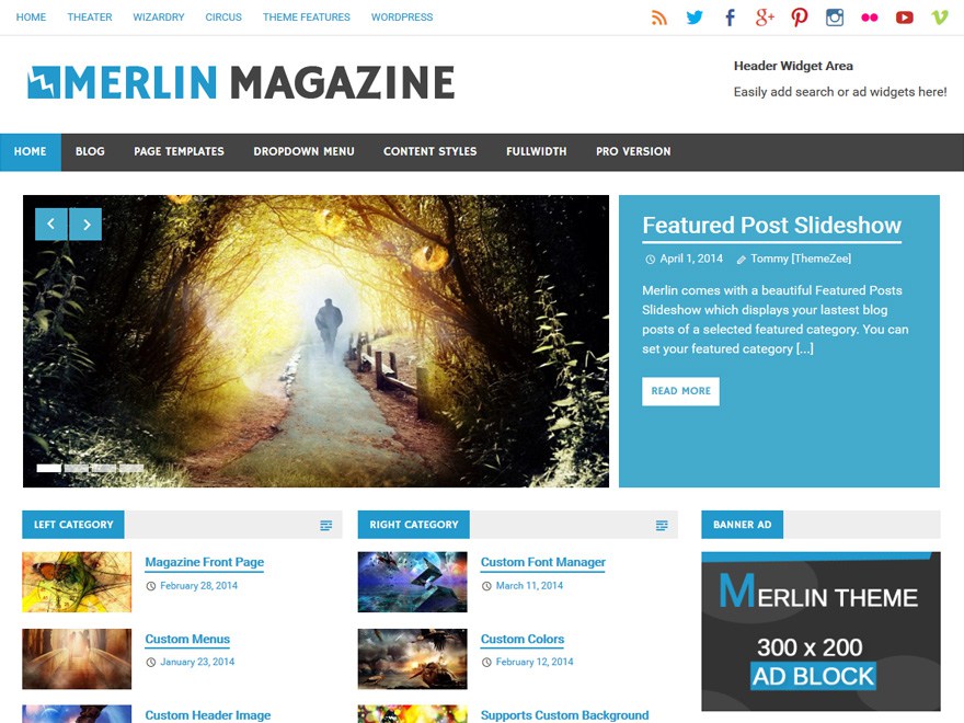
6. Merlin Magazine

merlin-magazine

Merlin Magazine is a responsive WordPress theme with a custom homepage template, custom slider as well as header widget areas. It relies heavily on clean typography, and if you need features such as a widgetized footer, you can purchase the Pro version.

Download

7. Apostrophe

apostrophe

“A clean, no-nonsense magazine theme” — Apostrophe is responsive, translation ready, supports microformats, and offers a content-centric minimal layout.

Demo | Download

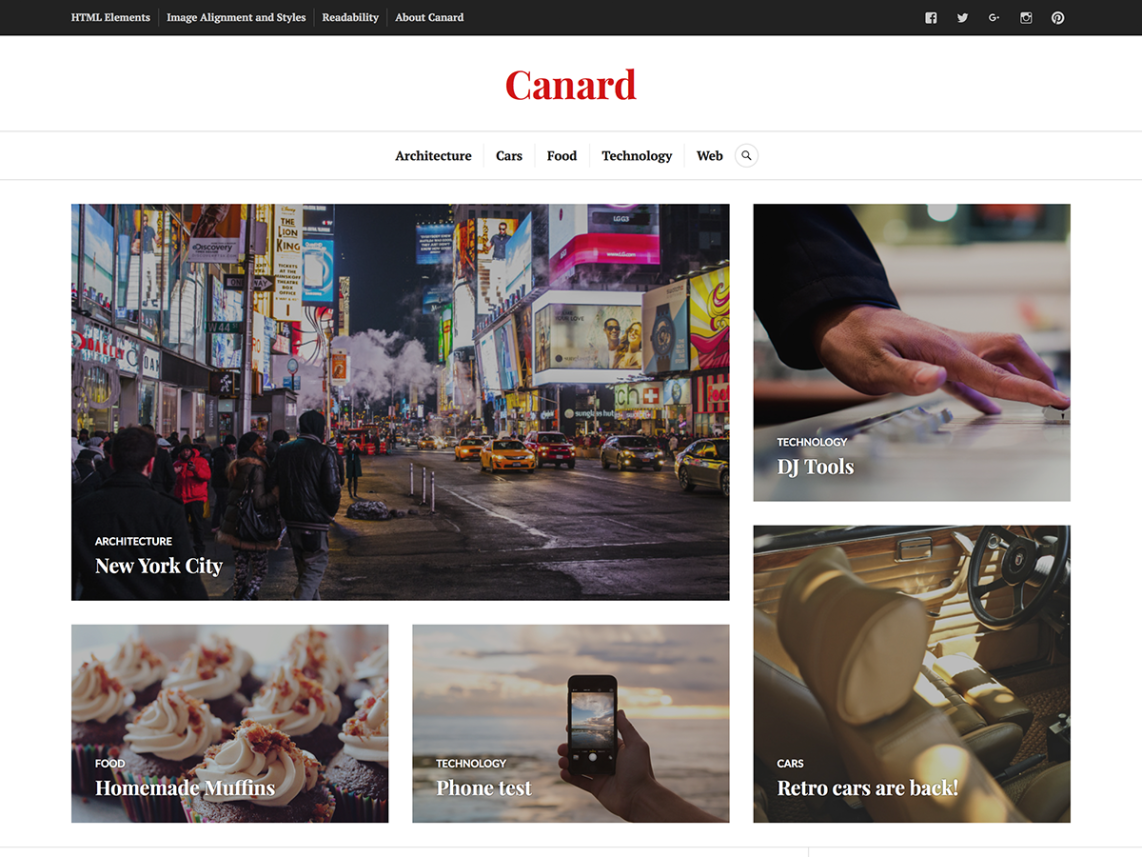
8. Canard

canard

Canard is a multipurpose and dynamic theme that can suit a number of sites: magazines, news sites, blogs, and so on. It is translation ready and responsive, and relies on large featured images to present the content to your readers.

Demo | Download

9. Origamiez

origamiez

Origamiez is a responsive WordPress theme with both fluid and fixed layouts. It is translation ready and comes with custom page templates.

Download

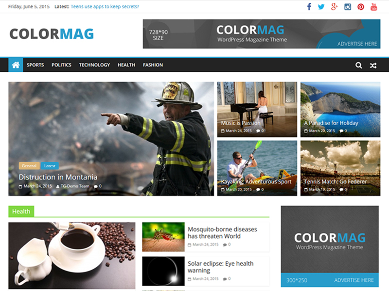
10. ColorMag

colormag

ColorMag is a responsive WordPress theme meant for news and magazine sites. It offers custom homepage layout with a featured slider, as well as custom ad widgets.

Demo | Download

What do you think of these free minimal magazine WordPress themes? Which one is your favorite? Share your views in the comments.

Read More at 10 Free Minimal Magazine WordPress Themes

Categories: Designing, Others Tags:

Making a Simple Image Resizing/Optimizing Service in Automator

February 17th, 2016 No comments

As I was using Photoshop to resize my eleven billionth image, it occurred to me I should probably simplify this process. AppleScript, perhaps? Photoshop scripts? Some already existing little app? A little pontification on Twitter resulted in a number of suggestions to try OS X’s Automator. Turns out it’s a pretty easy thing to do, at least in a limited way.

Open Automator, then…

1. Make a Service

This is really up to you. You might prefer an app that you can drag things onto. Or a hot folder you can just drop things into. I like services since I can use them from the context menu anywhere.

2. Add “Scale Images” Action

It’s under “Photos”.

It will ask if you want to make a copy of the image or not. You probably do, so you can keep the original in case it doesn’t turn out how you want.

3. Add “Open Finder Items” Action

Open it with ImageOptim. In my case I’m scaling the images for the web, so of course I want them to be as optimized as they can.

4. Save It

I like calling it something super obvious (to me), like simply “500” or whatever the max size of the scaling is.

5. Done! Now it’s available as a service for any file in the Finder no matter where it is.

This is pretty rudimentary

  • It has zero logic. So if you drop a 437px image into a service that scales to 1000px, it’ll scale up which you almost certainly don’t want.
  • It keeps whatever format it’s currently in. Perhaps your PNG makes more sense as a JPG, this can’t help.
  • It not always the greatest quality. I might look into attempting an Acorn or Photoshop thing instead since they seem to keep quality higher.

Would love to hear about your photo resizing workflows.


Making a Simple Image Resizing/Optimizing Service in Automator is a post from CSS-Tricks

Categories: Designing, Others Tags:

Using calc() to fake a media query

February 17th, 2016 No comments

A bonafide CSS trick by Rémi Parmentier. It’s used in the context of emails here, but it’s a clever trick in it’s own right.

This is the trick:

/* When parent is 500px wide... */
.block {
  min-width: 50%;   /* 250px WINNER */
  max-width: 100%;  /* 500px */
  width: calc(480px - 100%) * 480); /* -9600px */
}

/* When parent is 400px wide... */
.block {
  min-width: 50%;  /* 200px */
  max-width: 100%; /* 400px WINNER */
  width: calc(480px - 100%) * 480); /* 38400px */
}

Reduced demo.

Direct Link to ArticlePermalink


Using calc() to fake a media query is a post from CSS-Tricks

Categories: Designing, Others Tags:

Free Photoshop Tools For Web Designers

February 17th, 2016 No comments

Photoshop is still a favorite among a lot of web designers, and the right tools make it even more powerful as it already is. To help you boost productivity, save time, and, obviously, nerves, we have picked some valuable Photoshop resources, plugins, and scripts for you.

Photoshop toolbar

Some of them will speed up routine tasks so you can concentrate more on your actual work, others build a bridge between Photoshop and code so your design mockups can benefit from the best of both worlds. All resources are free to use.

The post Free Photoshop Tools For Web Designers appeared first on Smashing Magazine.

Categories: Others Tags:

Adsvise: Common Advertising Formats at Hand

February 17th, 2016 No comments

This is useful. Adsvise is a free-to-use website, that makes the content specifications of the different services out there available as clear and concise as possible. You are not sure which formats, measurements, and sizes you can use for an HTML5 ad on Google Adwords? Ask Adsvise.

“Stopping advertising to save money is like stopping your watch to save time.” – Henry Ford

Designers need to make money off of something as well, and thus, who could blame them for creating advertisements? The advertisement industry is still one of the better payers. In contrast to the owner of your local pizza place, the ad customer is fully aware of the design’s evanescence. To put it in other words: You don’t need to discuss about the appearance for hours. The owner of Luigi’s Pizza Palazzo has a very different point of view on that.

Adsvise: Common Advertising Formats at Your Hand

In most cases, the difficulty in designing ads isn’t based on the creative or communicative aspect. The bigger problem is the heterogeneity of possible target platforms.

Adsvise: What’s Up With Adwords, Facebook and Co.

The service Adsvise, which launched just a few days ago, specifically deals with this issue. Adsvise informs the user about the specifications of Google Adwords, Facebook, Instagram, Twitter, Youtube, Google+, and LinkedIn in a very clear way. The amount of included service specifications is supposedly going to increase continuously. The most important target platforms, however, are already included, above all others Google Adwords and Facebook.

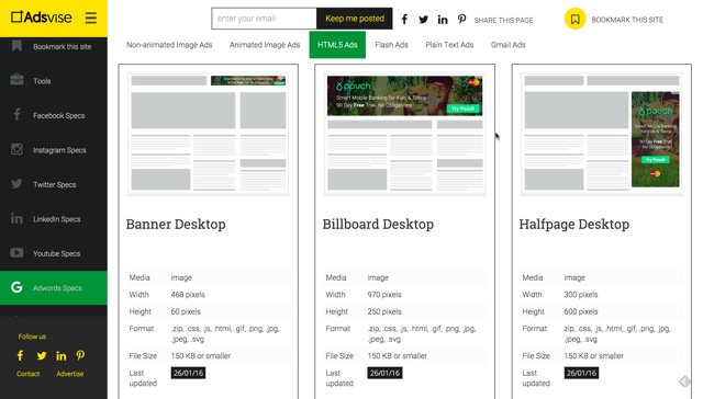
You’ll receive a composition of the possible types of ads for each platform. The format is then presented once again, in a compact manner, as you can see in the following image:

Adsvise: Common Advertising Formats at Your Hand

Besides a display of the appearance in their respective format, you’ll find information on the media format, the measurements in pixels, the file formats, the file weight, and important additional information, for example, that a ZIP file, including all remaining content, needs to be created for the Adwords ads.

PSD templates are provided for many of the listed ad sizes, and allow you to quickly create compatible results.

Adsvise Also Offers Information on the Header and Profile Picture Conventions

Besides advertisement formats, Adsvise informs about generally useful specifications, such as the measurements of profile and header images for Facebook and other social media.

For every overview, there is a comment feature available, which can be used to communicate with the team and ask questions. You will not wait for replies in vain.

If you want to be instantly notified about new and/or altered specifications, you can subscribe to the Adsvise newsletter, or follow the owner’s social profiles on Facebbok, Twitter, LinkedIn or Pinterest.

By the way: In this article, we’ve taken a look at HTML5 as a base for advertisements.

(dpe)

Categories: Others Tags:

Cloudinary releases easy breakpoints tool

February 17th, 2016 No comments

One of the biggest gripes that designers and developers face today is working with responsive design. While this design style is a boon for users everywhere—ensuring that they see content displayed properly across all devices—designing for it can be a bit of a headache.

This is particularly the case when one considers how images fit (or don’t) into the responsive-design model. As designers well know, one of two things usually happens when they work with images in responsive design. Either the images end up being super-large and so slow sites down, or they end up with a multitude of different image sizes to try and accommodate different screens, which is pure chaos. Either reality isn’t good enough from the perspective of designers.

Now, there’s an image-service company that seems to be listening to these designers’ frustrations.

Cloudinary, recently debuted its intelligent responsive-image breakpoints solution. Improvements to its already existing cloud-based, image-management APIs, these additions go right to the heart of the problems designers have experienced when attempting to figure out the correct image dimensions for their responsive-site designs.

Instead of designers continuing to either design images that are too big or too many, they’ll now be able to rely on Cloudinary’s technology that assists them in automatically locating the optimal image dimensions required for the best viewing experience on both mobile and web apps in a range of screen sizes. Designers now have access to the company’s Responsive Image Breakpoints Generator. This open-source tool lets designers interactively study their images and create responsive image breakpoints.

Here’s how it works: designers can quickly and simply generate the best-matched breakpoints for every image they upload to the tool, based on their given thresholds. Retina display customizations and multiple aspect ratio adaptations give designers additional room to customize their images.

Cloudinary’s tool encourages designers to determine image width values that seriously decrease file sizes, which is always welcome to ensure that sites don’t lose their speed. The company’s algorithms interpret the images to always locate the best breakpoints. This gives designers the freedom to come up with contemporary picture, as well as img, HTML5 elements based on the calculated breakpoints.

This freedom means that designers have the responsive-image breakpoints generation abilities through an API, which makes it easy for them to instantly create breakpoints for every popular image format: JPG, GIF, WebP and PNG. These can be created either in their original format or a new format determined in image transformation settings.

Thanks to this tool, designers now have the luxury of not having to rely on their best guesses when it comes to getting their image sizes right for their responsive-design sites.

Unlimited HD Motion Graphic Clips, Animations and Footage – only $19!

Source

Categories: Designing, Others Tags:

High-Impact, Minimal-Effort Cross-Browser Testing

February 17th, 2016 No comments

Cross-browser testing is time-consuming and laborious. This, in turn, makes it expensive and prone to human error… so, naturally, we want to do as little of it as possible. This is not a statement we should be ashamed of. Developers are lazy by nature: adhering to the DRY principle, writing scripts to automate things we’d otherwise have to do by hand, making use of third-party libraries — being lazy is what makes us good developers.

High-Impact, Minimal-Effort Cross-Browser Testing

The traditional approach to cross-browser testing doesn’t align well with these ideals. Either you make a half-hearted attempt at manual testing or you expend a lot of effort on doing it “properly”: testing in all of the major browsers used by your audience, gradually moving to older or more obscure browsers in order to say you’ve tested them.

The post High-Impact, Minimal-Effort Cross-Browser Testing appeared first on Smashing Magazine.

Categories: Others Tags:

Google Has Open Sourced its iOS Testing Framework

February 17th, 2016 No comments

Google has recently open sourced its testing framework for iOS app development, and you can start working with it right away. Named EarlGrey, this framework comes with several features suited for iOS app development.

Google has been making use of EarlGrey iOS testing framework for the development of several apps for iOS devices, including YouTube, Google Photos as well as Google Calendar. EarlGrey comes with built-in synchronization and extensible components, making it easier for iOS developers to work with element selection and interaction. To quote the Google Developers blog:

Brewing for quite some time, we are excited to announce EarlGrey, a functional UI testing framework for iOS. Several Google apps like YouTube, Google Calendar, Google Photos, Google Translate, Google Play Music and many more have successfully adopted the framework for their functional testing needs.

This is not the first time that Google has open sourced a framework meant for mobile app development. Earlier, it had released j2objc, a toolkit that lets developers convert their JAVA code to Objective C, possibly with the intention of porting existing Android apps to iOS. Clearly, Google does realize the growing importance of iOS devices, and is keen on tapping the iOS app development domain.

EarlGrey comes with an Apache License, and you can find it on GitHub.

Categories: Others Tags: