Archive

Archive for February, 2016

Creating Content Wireframes For Responsive Design

February 16th, 2016 No comments

As I was leading my course in responsive web design between 2011 and 2012, I kept stumbling over the process of wireframing. My students tended to focus on the wireframe as being the end game in the planning process. They didn’t understand that responsive design focuses on how users will access the content.

How To Create Content Wireframes For Responsive Design

You can only imagine my relief when I happened to come across a video by Stephen Hay speaking at the Beyond the Desktop conference in 2012. There, in his talk on responsive design, he presented the concept of the content wireframe. This was a huge relief to me. I just knew there was a step before the process got real, but I couldn’t articulate it. In this post, I’ll describe the methods I use to get from content to responsive wireframe — and how you can, too.

The post Creating Content Wireframes For Responsive Design appeared first on Smashing Magazine.

Categories: Others Tags:

I Heart CSS

February 16th, 2016 No comments

I like to think of CSS as a love language. If written well, it can be as lovely as poetry. There are rules, semantics and, like love itself, it can be communicated in many ways. Consider the variety of options we have to write black in CSS:

  • #000000
  • #000
  • rgb(0, 0, 0)
  • hsla(360, 100%, 0%, 1)
  • black

In the spirit of Valentine’s Day, I thought it would be fun to push this concept a little further with the many ways we can make hearts in HTML & CSS.

A Plain ol’ Background Image

We can call an image of a heart and set it as the background of an element.

.heart {
  background-image: url("heart.png");
  background-size: 100%;
  background-repeat: no-repeat;
}

See the Pen I Heart You – Background Image by CSS-Tricks (@css-tricks) on CodePen.

HTML & ASCII Symbols

That’s right. We can let the web do the drawing for us.

.heart {
  content: '&#9829';
}

See the Pen I Heart You – ASCII by CSS-Tricks (@css-tricks) on CodePen.

CSS Shape

Hearts are complicated in real life but they’re just two circles and a rotated square in CSS:

We can draw that with a single element, thanks to the ::before and ::after pseudo elements.

.heart {
  background-color: red;
  display: inline-block;
  height: 30px;
  margin: 0 10px;
  position: relative;
  top: 0;
  transform: rotate(-45deg);
  width: 30px;
}

.heart:before,
.heart:after {
  content: "";
  background-color: red;
  border-radius: 50%;
  height: 30px;
  position: absolute;
  width: 30px;
}

.heart:before {
  top: -15px;
  left: 0;
}

.heart:after {
  left: 15px;
  top: 0;
}

See the Pen I Heart You – CSS Shape by CSS-Tricks (@css-tricks) on CodePen.

Icon Font

Icon fonts got pummeled in a cage match with inline SVG, but they still do the trick here. We would need our heart icon in various font file formats and apply it using @font-face, but we’ll use the We Love Icon Fonts site to generate that for us.

@import url(http://weloveiconfonts.com/api/?family=entypo);

[class*="entypo-"]:before {
  font-family: 'entypo', sans-serif;
  color: red;
}

See the Pen I Heart You – Icon Font by CSS-Tricks (@css-tricks) on CodePen.

Inline SVG

OK, well, this isn’t exactly CSS but we love SVG around here at CSS-Tricks.

I 

<svg class="heart" viewBox="0 0 32 29.6">
  <path d="M23.6,0c-3.4,0-6.3,2.7-7.6,5.6C14.7,2.7,11.8,0,8.4,0C3.8,0,0,3.8,0,8.4c0,9.4,9.5,11.9,16,21.2
	c6.1-9.3,16-12.1,16-21.2C32,3.8,28.2,0,23.6,0z"/>
</svg> 

You

Let’s add a pulse animation just as an excuse to sprinkle in some CSS.

.heart {
  fill: red;
  position: relative;
  top: 5px;
  width: 50px;
  animation: pulse 1s ease infinite, 
}

@keyframes pulse {
  0% { transform: scale(1); }
  50% { transform: scale(1.3); }
  100% { transform: scale(1); }
}

See the Pen I Heart You – SVG by CSS-Tricks (@css-tricks) on CodePen.

Share the Love

There are undoubtedly more ways we can go about this. Share your Pens in the comments and we’ll add them to the collection.

And, of course, happy (slightly late) Valentine’s Day!


I Heart CSS is a post from CSS-Tricks

Categories: Designing, Others Tags:

Designing for gestures

February 16th, 2016 No comments

With mobile becoming the platform of choice for more users these days, gestures are becoming more relevant than ever. Those little actions that enable interaction with a mobile device, gestures are given little thought by users because they’re focusing more on the results of their gestures on the screen.

You should understand two distinct aspects to understand the concept of gestures: touch mechanics and touch activities; they relate to the initiating gesture and its ensuing outcomes. Gestures are also intimately tied to the all-important user experience on a mobile device. Screw up the user interface and how users use gestures, and you’re screwing up their user experience. Thus, gestures have huge significance when it comes to your tablet and mobile device users.

Here’s all you need to know to have a working understanding of gestures on mobile…

Defining gestures

Gestures are the very basis of how you interact with your mobile devices. Look at them as two-parters: the touch mechanics and the ensuing touch activities.

Touch mechanics are what a user’s fingers do on his screen. For example, if you tap (one of the most basic gestures) on a menu item, you’ve performed a touch mechanic.

Touch activities are the results of the preceding touch mechanics. For example, if you typically double-tap on a section of written content, the mobile screen will zoom in on said content.

Touch activities can result from combinations of different touch mechanics as well. For example, before you find a section of written content that interests you enough to want to zoom in on it (second touch mechanic), you’d have to first scroll down the screen by performing a swipe (first touch mechanic).

Types of Touch Mechanics and Touch Activities

There are a lot of touch mechanics in spite of the fact that many users are probably only familiar (at least consciously) with tapping and swiping.

Tapping

The most popular and basic one is tapping, which is when you touch the screen to perform an action like opening up your email app. Tapping is characterized by a simple press of one finger and then a lift.

Double-tapping

Then, there’s double-tapping, where users immediately repeat the action of tapping back-to-back. This is usually linked to making things appear bigger on a screen.

Swiping

Now, we get to swiping, which many people are familiar with. Swiping is typified by pressing your finger down, moving an on-screen element, and then lifting your finger again. The perfect example of this is your iPhone’s lock screen, which necessitates swiping to get to the screen where you have to enter your code to access the homepage or screen.

Dragging

However, there’s also dragging, which involves the same touch mechanics, but at a different speed. If you want to drag app icons to different parts of your home screen, you are dragging instead of swiping.

Flinging

Loosely connected to both swiping and dragging is flinging. Again, the touch mechanics are the same as a swipe, but the speed’s different. With flinging, you’re moving your finger very fast, as when you fling up on the screen to get rid of someone’s profile image that you clicked on in your Twitter app.

Long Pressing

Long pressing is when your finger touches down on a screen element, holds for a moment, and then lifts off the screen. A resulting touch activity could be opening up the copy box to copy a section of written content.

Long Pressing & Dragging

This is when you press with your finger, hold, move and then lift your finger again. If you’ve ever reordered the arrangement of app icons on your mobile screen, then you’ve done this gesture combination many times!

Double-tapping & Dragging

This one’s a bit more intricate: You press your finger on the screen, lift, press again, move, and then lift your finger for the last time. This touch mechanic can occur when you zoom in on content in one area of the screen and then zoom out again in another area.

Pinch-Open

Another touch mechanic that’s good for zooming in on your mobile screen, pinch-open requires you to press with two fingers simultaneously, then move your fingers away from each other, and finally lift both fingers.

Pinch-Closed

The opposite touch mechanic and touch activity, pinch-closed involves pressing with two fingers simultaneously, then moving your fingers closer to each other, and finally lifting both fingers. The resulting touch activity is usually zooming out.

Tapping (two fingers)

Here, you press with two fingers simultaneously before lifting both fingers off the screen. This is usually another way to zoom out on content.

Swiping, Dragging or Flinging (two fingers)

This requires you to use two fingers as you tap, move and then lift your fingers. It’s good for choosing multiple elements on-screen or tilting or panning.

Long Pressing & Dragging (two fingers)

With this gesture, you press with two fingers, hold, move and then lift your fingers. This touch mechanic is good for when you’re working with an interface requiring you to rearrange list items or reorder cards in a collection.

Double-tapping (two fingers)

This is where you use two fingers to tap, lift, tap and then lift both fingers again. It’s generally used for zooming out on your screen.

Rotation

Sometimes, you’ll encounter moving content or animation on your mobile devices, which is where rotation is useful. This is where you’ll press down with two fingers around a central object, then orbit your fingers around it, and, when done, finally lift both fingers.

Using Google Maps when out and about requires you to constantly rotate around significant screen elements to get a better sense of your orientation.

The importance of gestures

The whole concept of the user interface on mobile is built on gestures. That’s why they’re also central to the user experience. With such limited screen space to work with, designers and developers have to continually ensure that they’re using such minimal actions in the most efficient and intelligent ways possible.

If they do, users can easily do what they want to do on their mobile devices and apps in a heartbeat, which is the epitome of a great user experience. As soon as a gesture fails to be intuitive—as in users wouldn’t naturally be compelled to perform that action to interact with their mobile devices to achieve a certain goal—then it fails to be a good or advisable gesture. As a result, the design of the interface will take a hit.

By remembering these basics of gestures, designers will be able to create mobile interfaces and experiences that people will love.

Featured image uses gesture icons image via Shutterstock.

35,000+ Futuramo Vector Icons with a Powerful WebApp – only $27!

Source

Categories: Designing, Others Tags:

Wix 2016: Brand-new Editor, Music Store, and More

February 16th, 2016 No comments

Wix is a website builder made to simplify and professionalize the creation of contemporary websites for several years already. Plenty of templates and extensive editing options are essential characteristics of the tool. As trends and techniques change fast in the web design and development sector, Wix has recently published its rehashed editor with new features. Now, Wix supports the trend of using videos as the background, as well as the popular parallax scrolling.

Choose a Template and Get Started

Once you’ve signed up with Wix for free, you first need to choose one of the plethora of templates. These are categorized and allow you to quickly determine a template for the respective branch that fits your business or brand. If you prefer starting without a predefined design, you can certainly do so. Choose an empty template and start from scratch. In this case, you’ll receive a basic layout that roughly defines the arrangement of the elements.
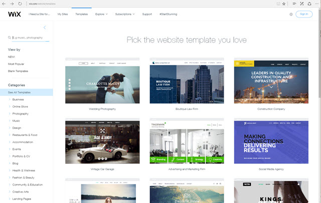
wix_templates
Template Gallery

While some templates are free, others are only available via subscription. All of the templates are created using HTML5 and have a responsive design. On the preview page, you’ll find both a desktop and a mobile view for the templates. Once you’ve decided on a template, just switch to the editor to edit a website based on that design.

Editor With a Clean Design Roster

One of the strengths of the Wix Editor is its clear user interface. A Wix site is usually divided into a header, stripe, and footer. While the navigation can be found in the header, the actual content is meant to be placed in the so-called stripe. The single sections are divided by roster lines.
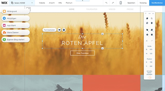
wix_editor
Clean and Modern Editor

A page’s elements can be moved and scaled as you wish. The editing bar helps you to align elements along the roster lines automatically, as well as with moving them into the back or foreground. Being familiar with other editors such as InDesign or Photoshop you will most likely recognize a lot of these features.

Additionally, there’s an editing menu for every chosen element. Extensive ways to format font and text are provided. You can choose between plenty of web fonts, define text size and color freely and determine the orientation of the text. You can also add different drop shadows to a text.
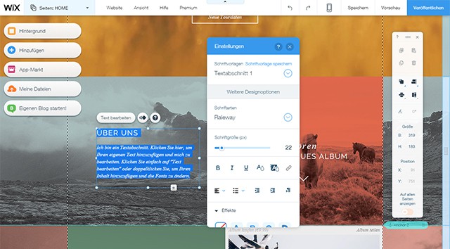
wix_text
Integrated Text Processing

There are tons of editing options for images as well. You can crop, rotate and mirror images. Thanks to predefined effects, you apply different color schemes to the pictures. Classic corrections to define brightness, contrast and saturation are available as well.

wix_bild
Integrated Image Editor

Overall, the ways of editing texts and pictures are very extensive and easy to use. If you have experience in text and image editing, you’ll have no problems using this.

Videos and Parallax Effects for the Page Background

As of late, adding format-filling background pictures or videos to websites has become a trend. Hop on it, and choose one of the many high-quality images and videos provided by Wix. Pictures and videos that you set as a background are always scaled to fill the entire browser window.

Filmed recording, as well as effects rendered via computers are among the videos. This comprises atmospheric nature recordings, humans during free time and at work as well as three-dimensional textures. The duration of the videos varies from only a few to 30 seconds. Additionally, you overlay a video with a subtle pattern should you wish to.
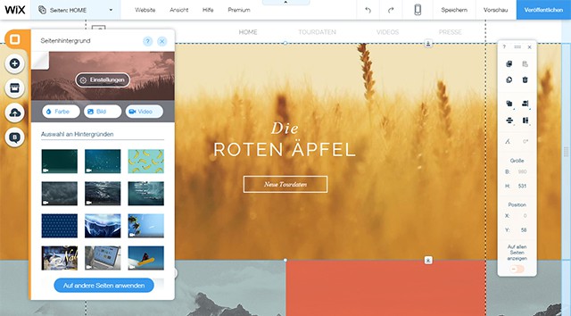
wix_video
Implementing a Video as Background

Choose whether you want videos to be played in a loop or only once as well as its playing speed. Reduced speed is often fitting for background videos. The videos provided by Wix can all be played in a loop. They are perfectly cut so that no sharp, visible image changes occur when they repeat.

If you decide on a format-filling image as your background, you can add a parallax effect. Here, the background image is moving slower than the rest of the page when scrolling. This creates the impression that back and foreground are separated spatially. Blurring fore and background leads to the impression of a 3D effect, which is often used with parallax scrolling.

wix_parallax
Parallax Effect Possible for Background Images

Of course you can also upload your own videos, as long as their size doesn’t exceed 50 megabytes. As mobile data volume is limited in most cases, Wix makes sure that background videos are not played on mobile devices.

Add Unlimited Content: Texts, Pictures, Videos

Good looks are not all that counts when it comes to websites. Of course, the content is decisive. Wix has a lot to offer here as well. Texts and images are just some of many options. The editor provides a plethora of exemplary formattings that you can adjust as desired.

For pictures, you can either upload your own or choose from the vast collection Wix comes with. Besides photos, clip arts are included as well. Those that don’t find anything on both their own computer and the Wix collection access the stock provider Bigstock directly from the editor and license photos for their website. If you grant Wix access to your Facebook or Instagram profile, you also comfortably integrate the pictures uploaded there.
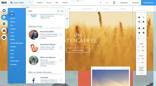
wix_inhalte
A Variety of Content Types is Available

Besides adding individual pictures, you create extensive galleries as well. Clicking one of the gallery preview thumbnails opens the chosen image in an overlay above the page content.

Wix supports the two large video platforms YouTube and Vimeo for the integration of videos. Just enter the address of the desired video and, depending on the platform, different layout options are given.

There is plenty of other content available apart from texts, pictures, and videos. You can set up forms, lists, and menus. Links to social networks are also implemented easily.

You could even set up your own shop or blog in no time. Similar to other blog systems, you create articles, categorize, prepare for publishing, and allow comments to them.

Integrating and Selling Music Thanks to Wix Music

Another new feature of the website builder is Wix Music. It lets you upload your own music and implement it into your site using a player. If you as a musician prefer to sell your music by yourself instead of using one or all of the large music platforms, Wix Music has everything you need.

Just recently, we’ve written about the trend of going back to more sound in web design.
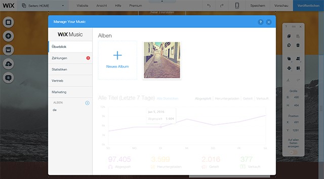
wix_music1
Creating Albums and Uploading Music

Using Wix Music is easy. Create an album with a cover and upload your music files. Afterward, integrate your music into your website directly having a player alongside it. Of course Wix also provides a music shop, which you can use for selling your music. You either decide on a price or distribute your music for free.

The basic pack of Wix Music is free. However, if you want to use PayPal as a payment method, you need the premium package for about $10 a month. Wix doesn’t take any provision of your sales.
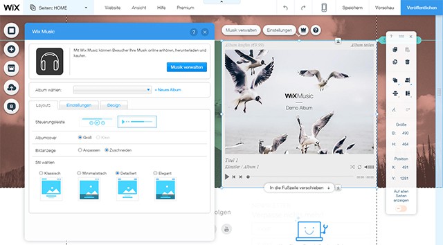
wix_music2
Integrating and Setting Up a Player

You’re kept up to date with the number of times people listened to or bought your music via a detailed statistic.

Custom Domain and Premium Bundles

Once finished, it’s time to publish your website. By default, it is made available using a Wix subdomain. However, you can also link it to your own domain or register a domain directly with Wix.

One of the premium bundles is necessary to be able to use a custom domain. These are available starting at about $4 a month. In total, there a four different premium packages. Bandwidth and available storage vary and, depending on the package, further features like the above-mentioned shop are available.
Conclusion

Wix is one of the best website builders out there. Due to the plethora of features, the sophisticated templates, and the easy-to-use interface, you will get going quickly. Wix is thoroughly suitable for professional use as well, as it supports contemporary trends and techniques.

Wix allows you to create individual websites because of its flexibility when it comes to design and content. Even if you don’t have any experience in web development, you can still create appealing web projects using it.

Not to forget, especially musicians have a reason to take a closer look at Wix.

(dpe)

Categories: Others Tags:

Getting Ready For HTTP/2: A Guide For Web Designers And Developers

February 16th, 2016 No comments

The Hypertext Transfer Protocol (HTTP) is the protocol that governs the connection between your server and the browsers of your website’s visitors. For the first time since 1999, we have a new version of this protocol, and it promises far faster websites for everyone.

Getting Ready For HTTP/2: A Guide For Web Designers And Developers

In this article, we’ll look at the basics of HTTP/2 as they apply to web designers and developers. I’ll explain some of the key features of the new protocol, look at browser and server compatibility, and detail the things you might need to think about as we see more adoption of HTTP/2. By reading this article, you will get an overview of what to consider changing in your workflow in the short and long term. I’ll also include plenty of resources if you want to dig further into the issues raised.

The post Getting Ready For HTTP/2: A Guide For Web Designers And Developers appeared first on Smashing Magazine.

Categories: Others Tags:

Adobe Has Released A Fix For Creative Cloud File Deletion Problem

February 16th, 2016 No comments

Adobe has released a fix for the file deletion problem that had surfaced with the last update of Adobe Creative Cloud, and users are encouraged to install the fix at the earliest, in order to prevent loss of crucial files.

Last week, following the updated release of Adobe Creative Cloud version 3.5.0.206, users encountered a weird and serious problem: Creative Cloud was deleting folders located in root folders on Mac machines, sans any authorization. While it was initially thought to be a problem limited only to users of online backup service Backblaze, it was soon discovered that this file deletion bug had put virtually all users of the latest CC version at risk.

Adobe soon became aware of the issue, but only after repeated reports from different customers and online publications. The file deletion problem existed only in version 3.5.0.206, and users who had not updated to this build were safe. Plus, the bug was in effect only after you launched Creative Cloud, and the file deletion in the root directory seemed to be done in an alphabetical manner.

The fix has since been released, and version 3.5.1.209 is now available for immediate download. To quote the release notes:

Fixed an issue in the Creative Cloud for desktop app for Mac where in some scenarios the application may incorrectly remove files with user writeable permissions from the system root directory.

If you are using Creative Cloud desktop app on Mac, and have not done so already, be sure to update and apply the patch before you run Creative Cloud.

What do you think of the controversy surrounding this latest file deletion bug in Adobe Creative Cloud desktop app? Share your views in the comments below!

Categories: Others Tags:

5 Things to Include When Designing a Site for Ecommerce

February 16th, 2016 No comments

Continuously increasing numbers of shoppers are heading online to compare prices, read customer testimonials, and verify the businesses they’re purchasing from are reputable and deliver high-quality goods. Ecommerce sales have been and are projected to steadily increase, with eMarketer predicting a growth to $2.489 trillion in 2018 from $1.077 trillion in 2013. For website design for a retailer, ecommerce options are a vital component.

Increasing sales through an online platform only works when certain security, payment, and product features are in place, though. Whether a Web developer uses an ecommerce design template or designs a site from scratch, here are five essential factors to integrate into an ecommerce website.

1. Secure Payment

A hack of an ecommerce site can cost companies millions, as retailer Target found out during a 2013 data breach that exposed the debit and credit card information of 40 million customers. The retailer settled a lawsuit for $10 million, which makes this a significant example of why security is so important for brands to maintain their clients’ trust and save the business money.

5 Things to Include When Designing a Site for Ecommerce

During the check-out process, customers should be using a secure connection for purchasing. Secure Sockets Layer authentication encrypts data while it’s transmitted, protecting data from being stolen. The PCI Security Standards Council recommends keeping only a minimal amount of consumer data for refunds and charge-backs and not storing consumer data long term.

2. Responsive Design

If a website isn’t mobile-friendly, potential customers will purchase somewhere else. A 2012 study by Google reported 67 percent of users are more likely to buy from a mobile-friendly site while 61 percent of people said they’d quickly leave a site if it weren’t mobile-friendly. It’s imperative to responsively design your ecommerce website to have products that are both easily viewable and purchasable from any device, including desktop, laptop, smartphone, and tablet devices.

Important factors to include in responsive design are making sure the site is easy to read and easy to navigate, ensuring buttons are easily clickable, and making sure scrolling and panning function correctly. The site should load quickly on any device, and be easy to navigate on smartphones.

3. Customer Data Capture

While an ecommerce business should not hold on to sensitive financial payment data, other data gathered during the sales process can give a business clues as to where drop-offs are occurring. You need to be paying attention to form field data, which can offer insight into how businesses can better lay out their form fields both on the page and how to evolve form field content. There are also services available, including Click Tale and Crazy Egg, that can help a business track data.

Also, entice customers who don’t make a purchase the first time around to come back by prominently featuring a special offer in exchange for signing up for an email list. While a business could just have visitors input a simple email, going a step further by asking them a question or two about the types of products they like allows the business to better optimize their email marketing, including the products promoted and the deals offered.

5 Things to Include When Designing a Site for Ecommerce

4. Analytics

Constantly testing and evolving a business site is crucial, and built-in analytics in Web design allow businesses to better refine their ecommerce platforms. Analytics allow a business to learn where their traffic is coming from, what keywords they’re searching for when they find the business, what pages of an ecommerce store are most popular, and where a business is losing customers within the site.

Google Analytics is a must-have. In 2014, 93 percent of worldwide online and mobile Web organic traffic came from Google. Google Analytics provides insights including real-time activity, the demographics of website visitors, where visitors came from (referrals versus direct traffic), what pages visitors head to and in what order on a website and sales funnel actions. The search engine walks developers through how to set up Google Analytics for an ecommerce site here.

5. Easy Update Capabilities

Once the ecommerce site is designed, it needs to be adaptable for customizations including:

  • New featured products
  • Deals and specials
  • Removal of discontinued products
  • Addition of new products
  • Inclusion of new payment forms

The Web design should allow for simple, instant updates, so the ecommerce store always stays current and customers can be immediately notified about recalled products.

Bolster these ecommerce features by adding a space for customer testimonials. A constantly updating social media feed featuring hand-picked, positive Facebook posts, Instagram photos, or Tweets touting the benefits of a brand encourages visitors to get in on the conversation through social media.

Prominently featuring a customer support channel shows website visitors a brand is always there to help, and integrating a live chat option allows potential customers to instantly get answers to questions they have.

(dpe)

Categories: Others Tags:

50 Unique Business Cards That Will Make Your Mind Explode

February 16th, 2016 No comments
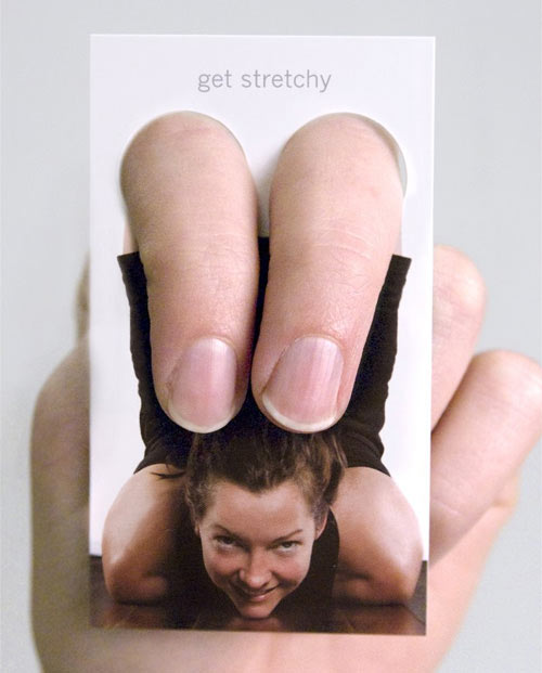
yoga_one

Business cards are sadly often overlooked, resulting in dull and boring cards that are easily forgotten. At MOO we know business cards can give you the opportunity to stand out from the crowd, be unique, and say something about yourself and your brand.

But business cards needn’t be dull or boring – in this post we will take a look at the opposite end of the scale. OK – your mind might not actually explode, but we’ve collected some of the most fascinating, creative and truly unique business cards that stretch the limits of design and imagination, grabbing your attention like a dropkick to the head.

These designs may not be ‘right‘ for many brands, or indeed always work in the real world due to time or cost constraints, but they should help inspire you, and encourage you to think a little more creatively!

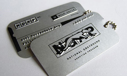
1. 3D Business Cards – If you work in 3D design, what better way to show off your work than with 3d glasses in your business card!

2. Jack Sparrow – Even pirates need a business card…

3. Dept Of Energy – Unique, although perhaps not for the wallet!

4. Multi Purpose

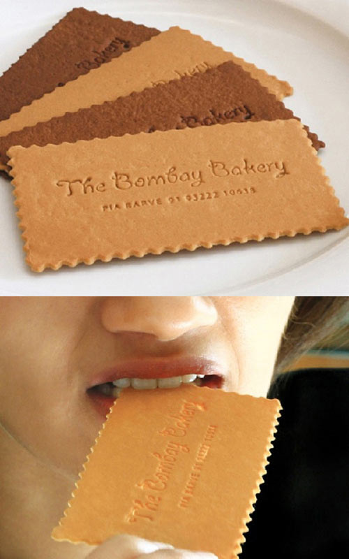
5. Hungry? – Edible business cards.

6. Brushed Steel – Smooth. Classy.

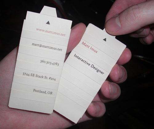
7. Folders – The Tiniest Pocket of Information

8. Wooden – Ideal if you work in carpentry…

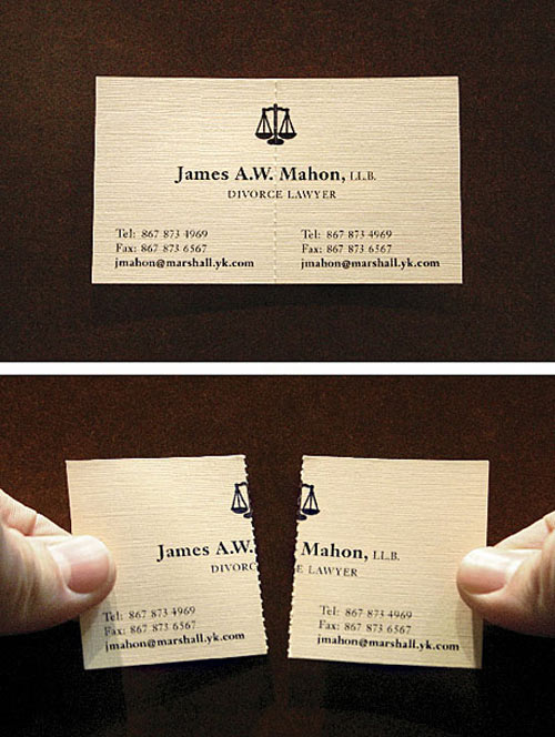
9. Torn In Half – Like your marriage.

10. Folding Cards

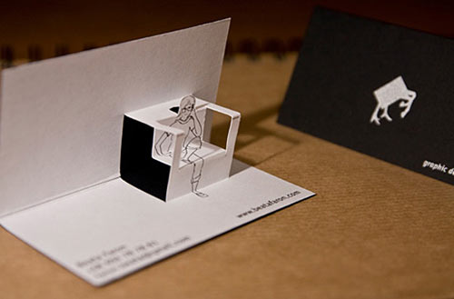
11. Pop-Up Cards – Cute.

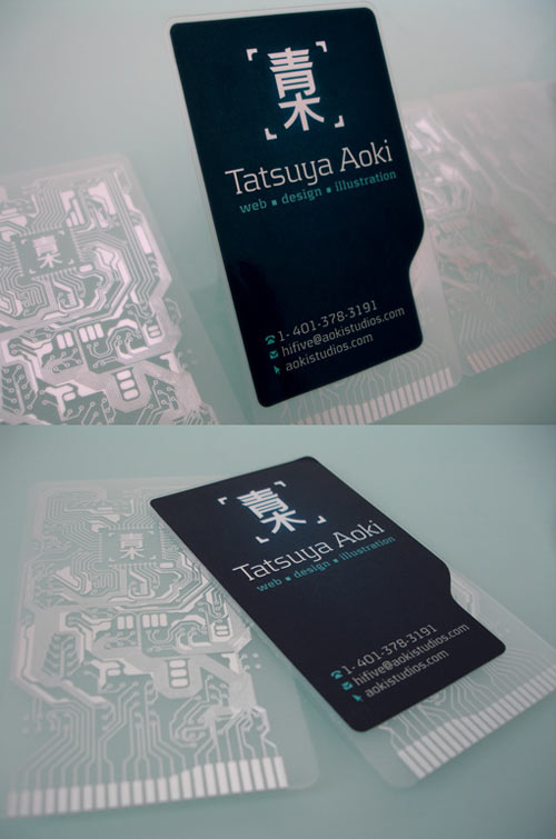
12. The motherboard – Beauty in design can be found in the strangest places.

13. Dog tags – The dogs.

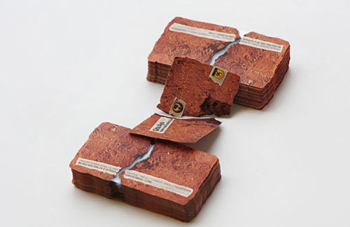
14. Broken Card – Hi Yah!! Karate cards.

15. Transparent

16. On Fire – Literally.

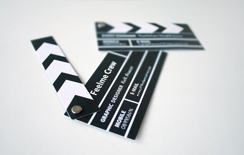
17. Cut! – This would be cool for a film company. A little fragile though?

18. Google Me – Your SEO better be good…

19. Cassette Cards – with the cassette case as the card holder? Cool.

20. Easel – Stand your cards up to stand out!

21. Pop Out Cards

22. Ninja Stars – Everyone loves a ninja.

23. Break The Ice – say hello like Chris Spooner.

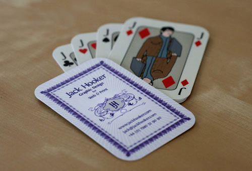
24. Playing Cards – Ace. Oh, they are all jokers.

25. Comb – Very cool for hairdressers.

26. Interactive Cards

27. On A Peg?

28. Ticket Stubs

29. Like A Tramp

30. Teabags or Confetti – Just don’t get them mixed up.

31. Use Humour

32. Cat Flap

33. Advanced Laser Cutting

34. Saw Blades

35. Map Your Card

36. Sweet!

37. Sponge

38. X-ray – Ouch.

39. Fill Your Card – Sweet.

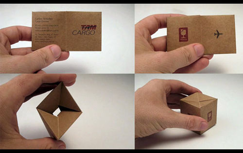
40. TAM Cargo Boxes

41. Plastic Cards?

42. Tiger Beer – Stunning cards.

43. Coupon Cards

44. Penny Shooter

45. Secret Agent Man

46. Nissan Skyline

47. Another Blooming Designer

48. Beaten, Unbeaten

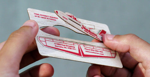
59. Model Aircraft

50. Emerson Taymor – Who? Well, you won’t forget with this card.

Read More at 50 Unique Business Cards That Will Make Your Mind Explode

Categories: Designing, Others Tags:

Nissan Creates Self Driving Office Chairs

February 15th, 2016 No comments
nissan-self-driving-office-chair

We’re disappointed we didn’t think of this here at the office. Nissan has revolutionized the office chair.

Read More at Nissan Creates Self Driving Office Chairs

Categories: Designing, Others Tags:

An Interview with Andy Fitzsimon about logomono

February 15th, 2016 No comments

I got an email from Andy Fitzsimon the other day about some projects he’s working on. One of which was logomono, something I thought looked pretty interesting and shared the other day. I thought, rather than trying to figure things out and re-explain them myself, I’d just ask Andy himself to answer my questions. Interview style.

My questions as headers; Andy’s replies follow.

Can you give us a quick explanation of exactly what logomono is and what the motivation is behind it?

logomono is a big(ish) and growing GitHub repo of one-color SVG logos. The project exists to promote care for how we use and reference logos on the web.

The site also covers some techniques, a few tools, and some tutorials aimed at making it easier for designers and developers to use logos.

To keep things super simple, all the SVG’s are made of only a few flat s and no color.

The first thing presented on the logomono homepage is an idea for making logos work on dark or light backgrounds. Is that a problem you’ve faced? Do you think that’s a prereq for any truly robust logo?

For so many existing logos, inverting correctly is certainly a polite and a nice thing to consider. It is a feature of logos that is largely ignored today. If the logo you use features shading (or a handful of other considerations), there likely a different version and you should use on dark backgrounds. For logo designers, it’s a commitment to make multiple variants of logos to work for both light and dark situations, but it’s a fairly common need. Remember your logos aren’t always exclusively used by you.

logomono was was born from frustrations at my day job as a brand manager at Red Hat. Shadowman (the icon in the Red Hat logo) has a shadow cast over his eyes. It doesn’t really work when the same fills are inverted on dark. He’d be more a laser-eyed man with those dark bits filled in white.

The same can be said for my two favourite open source project logos:
Inkscape (which features inky the splotchy mountain) and Linux (with Tux the penguin)

We know Penguins have black wings and white bellies. We know that ice caps on mountains need to be lighter than the mountain. It’s amazing that this detail can be so looked over.

To help with this problem, we could tell this a million times to a million designers through our lifetimes. Or, we could write it down and try make it useful enough to remember. That’s why logomono exists.

At work I’m always getting proofs of things from customers, partners or staff using a wrongly inverted one color Red Hat logo. It hurts double time. One, because it’s the wrong logo. Two, because some poor bugger had to go to the effort of making it from the full color logo they probably found on Wikimedia. Maybe they even guff up the coordinates. Maybe our logo loses it’s nose.

Some designers search “one color [company name] logo” and find the right thing for the right background. But today, all they get are sites like Brands of the World and Wikimedia. Not to mention there are nasty sites out there with downloadable files created from auto-traced vectors and very old logo versions that just won’t die. I want to proactively serve them the better versions. I want to raise awareness that inversion is a thing the folks behind the logo would like to be considered.

Being mono-color is part of the deal, too. In my case, I want our red hat to be, well, red, but when stacked next to other company logos I can understand the the need for visual harmony.

It looks like an inversion-ready logo requires some hide/show flip-flopping and sometimes additional elements. Is resource size any concern there? Or the embedding technique?

I suggest two optional classes for potentially three types of s:

  1. Normal paths. No classes needed. They should show all the time. Usually logo text and, for many brands, the entire logo outline. Nike, IBM, Intel… You lucky brands!
  2. Only light backgrounds. Use class="only-light-background" for shapes that should be rendered as darker fills on lighter backgrounds.

    Think: anything with eyes. You want the path that draws the pupils dark. Look at brand marks for Hadoop, Tux, or even companies without mascots like Ford that prefer their name be written as light text and inverted accordingly.

  3. Only dark backgrounds. Use class="only-dark-background" for paths that only work as a light fills on a dark background.

Defaulting to the assumption of a light background is how we’re storing them in the repo. That way the files are still usable in their raw form. That means inline style="display: none;" is in use on the paths for only dark backgrounds. This can be removed in the build process.

How you use logomono could be different depending on what you need to do. If you have some interactivity that inverts the background, then it makes sense to keep all paths together in the SVG and overwrite the display, opacity or visibility values in your CSS to flip the light and darks as you need them.

If you only need one version (a dark or light version) then you could use logomono logos but have a tool like Gulp or Grunt run a task that strips the paths you don’t need.

You suggest using a viewBox but not height or width attributes. Is that recommended in production, or do you mean those can be added later? I’ve found without a default width/size, the SVG will be as-wide-as-it-can-be until CSS resizes it, which can be an unfortunately janky loading experience.

It’s to keep the repo lean and mean. We want width and height to stay away until the user knows what they want.

If you take every logomono file and add some random dimensional attributes like width="100px" height="76px" to the , nothing will break. You’ll have every logo in the size you declared and avoid the janky load. That can’t be said for a folder full of different sized logos. We can’t know your preferred dimensions ahead of the time, so we don’t add them (but you can).

Sites like Slides.com do this in a nice way, if you upload a viewbox-only SVG, the importer adds width and height attributes using the viewbox dimensions.

Another thing you recommend is 4% spacing around the logo because of aliasing. Can you elaborate on that? I would worry that aligning logo exactly to an edge then requires potentially frustrating pixel by pixel nudging.

This is something I’d like more feedback on. The problem is antialiasing overflows.

At first I was like “let’s make the source repo SVG’s go straight up against the wall: 0 0 min and max of their viewBox!”.

My thinking was that we could always use post processing to add the same gap dims to the viewbox to avoid antialiasing overflows. So for example, say a logo has viewBox=”0 0 120 150″. The processing makes it viewbox="-4 -4 124 154". Say another has viewBox="0 0 50 70". It becomes viewBox="-4 -4 54 74". This dodges the potential overflows.

But then I got thinking that adding and removing 4 to each axis in the viewBox would be different for SVG’s that have “big” coordinate systems versus “small” coordinate systems. Maybe it has to be based on a calculated percentage of the total of the viewBox lengths.

Then I realized doing all this in post processing would mean the source logos in repo would all be prone to the scaling aliasing issues as-is, which is a no-go because these files must be useful in their own right.

Then I got to thinking that this “4%” suggestion gives logo contributors a very small amount of discretion for optical adjustments.

Even if we lived in a magical land where scaled SVG had no hard edge aliasing problem, logos are like typography. Round forms and angles like O’s and W’s need to be nudged over the perceived edge lines to appear straight. 4% seemed like the easiest compromise.

For now, we’re throwing this whole idea into the “too hard basket”. Maybe we’ll re-compute the coordinates for the existing logos, but not today.

We designers are doomed to do the nudging when we layout our work. Hopefully with 4% as a general rule this becomes as minimal as possible. For the life of me, I can’t find out the right way to store and respect all the balancing factors at play that designers want to juggle:

  • Logo and text along a baseline
  • Thickness and weight balance
  • Left/Right optical alignment

All while making these files “raw” enough to be basic building blocks of the web: easy to contribute; easy to use. At least now they’ll be close enough for forgiving eyes to deal with. Nudge away, soldier!

Maybe in the future when the web has wonderful things like element media queries we can expand logomono to include a general rule of thumb for vertically or horizontally stacked logos, or logos that collapse to an icon. For today, let’s keep things simple.

Can anyone contribute? If they can, what would be the most useful work?

Anyone can contribute:

  • Mono-color Logos. By far the most useful contribution. Find the logos that are missing and send a pull request. Boolean those clip paths, outline that text, combine those duplicate control points.
  • Tool and project page improvements.
  • Awareness that some logos need inversion love.

It helps greatly if you are responsible for the brand in question so that the files can be optimised exactly as you want. But don’t let that stop you if you’re looking to add another logo.


An Interview with Andy Fitzsimon about logomono is a post from CSS-Tricks

Categories: Designing, Others Tags: