CSS Shapes: How to Line up Images and Texts
In applications such as InDesign or QuarkXPress, letting letters flow along paths is a long established standard for lining up images and text. With CSS3 CSS Shapes allow you to create the same behaviour in the browser. To do so, you can define paths which the text is supposed to follow, as well as define cut-out images, which the text is meant to place itself along.
Defining Circles, Ellipses and Polygons for an Outline
If you want to create a text outline with simple paths, you first need an element which the text will follow. Here, a “
<div></div> <p>Lorem ipsum …</p> |
Until now, you have a classic rectangular element. Using the shape attribute “shape-outside”, you now define a path that creates the text outline instead of the rectangular shape.
div { width: 300px; height: 300px; float: left; shape-outside: circle(50%); } |
In the example, the circle is defined with a radius of 50 percent. Additionally, you can also determine the center of the circle if you don’t want it to be in the element’s center.
div { shape-outside: circle(50% at 50px 100px); } |

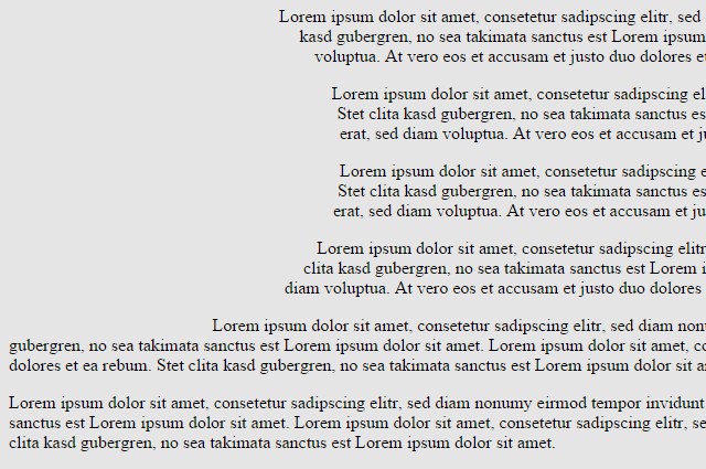
Text Flows Around a Simple Circle
In the second example, the center is 50 pixels away from the left and 100 pixels away from the upper border of the element. By the way, “shape-outside” only creates a path for the text outline. For example, if you assign a background color to the “
Instead of circles, ellipses, for which you enter two radii, are possible as well.
div { shape-outside: ellipse(50% 25% at 50px 100px); } |
The paths defined via “shape-outside” don’t need to cover the element’s entire space. They can be significantly smaller as well. Text will solely orientate itself alongside this path and completely ignore the actual size of the “
You can create a polygon, for which you need to define the coordinate pairs separated from each other by commas, for more complex shapes.
div { shape-outside: polygon(150px 0, 179px 41px, 225px 20px, …); } |
Using Images as Shapes
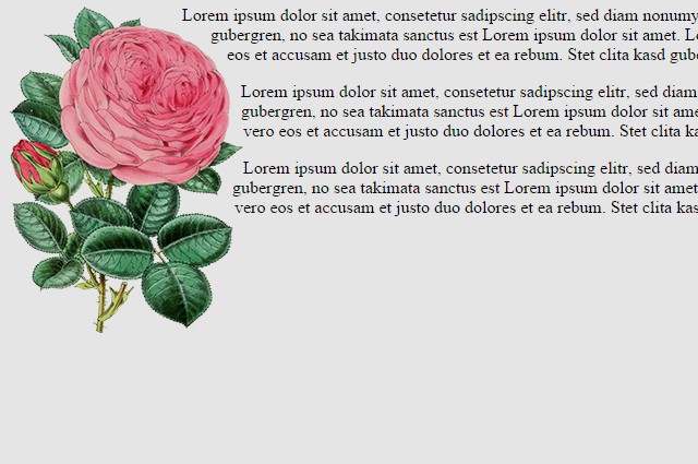
In many cases, you want your text to flow around a cut-out image instead of a simple geometric shape. To do that, you don’t need to draw the shape of the picture with a path. You can simply use “shape-outside” to directly transfer a cut-out image. The only requirements are, that the image has an alpha channel and that the area around the cut-out object is transparent.
<img src="rose.png" /> <p>Lorem ipsum …</p> |
In the example, an image is set instead of a simple “
div { float: left; shape-outside: url("rose.png"); shape-image-threshold: 0.5; shape-margin: 10px; } |

Cut-Out Image With Text Floating Around it
The additional attribute “shape-image-threshold” determines how much transparency is needed for it to be considered for the text outline. The value 0 means that only areas that are 100 percent transparent are considered. In the example, a transparency of 50+ percent is accepted. Furthermore, the attribute “shape-margin” is used to define the distance between image and text.
This way, you can quickly create text outlines, which was only possible in layout applications before.
Chrome Extension for CSS Shapes

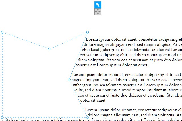
Chrome Extension Complements “Shapes” Tab
If you want to be able to change size and placement of CSS shapes directly within the browser, you can use the Chrome extension “CSS Shapes Editor”. Once installed, you’ll find a tab named “shapes” in the “elements” section of your developer tools. When choosing an element marked via “shape-outside”, you’ll see this attribute in the “shapes” tab.

Drawing Shapes Directly Within the Browser
In the browser, the area of the path, which is usually invisible, is highlighted in color. You can also change size and position of the path or create new ones. This allows you to add a polygon and draw it in the browser. Afterwards, simply copy the shape’s values and enter them into your source code.
If you’re using the free editor Brackets, which we’ve (among others) presented in this article, you can also use an expansion which allows you to comfortably create and edit CSS shapes here.
You can find an impressive demo on how to use CSS shapes at Adobe: Alice in Wonderland.
Browser Support
Currently, Chrome, Safari, and Opera support the attribute “shape-outside”. Firefox, Internet Explorer, and Edge can’t work with CSS shapes yet.
(dpe)
- CSS3: InDesign-Like Text Formatting with Exclusions and Regions
 Text Effects With SVG: Patterns, Masks and Clipping Paths
 SVG: How to Work With Text and Font
 Web App: Drawing SVG Online with Method Draw
 Adobe’s Snap.svg: Animations With HTML 5, Without Flash
 Tridiv: Useful CSS3 Editor for 3D Objects