Archive

Archive for March, 2016

How to choose an accessible typeface

March 11th, 2016 No comments

Inclusive design is a hot topic and choosing an accessible font for your website is important for all brands, not just public bodies and charities. But how can you tell which typefaces are accessible and does this mean a compromise in terms of design? Here are my top tips:

1: Don’t fall into the trap of selecting a design that appears childlike, as there is no need. This may sound obvious but is a very common mistake. Personality is just as important so look for a typeface that balances great design with practicality.

2: It is really important to avoid styles where there is ambiguity between certain characters. The main ones to look out for are the “8” and the uppercase “B”, the capital “I”, lowercase “l” and the “1”. Look for a serif on the lowercase “i” as this also helps to differentiate it from the uppercase “I” at smaller screen sizes. Choosing a typeface with a two-tiered lowercase “a” helps to eliminate confusion with the “o”.

3: If you’re using small amounts of text at 16pt and above (eg. for headings or captions), then a sans serif with large open counters is considered the most suitable.

4: Look for a typeface with a large x-height (this is important for webfont selection). Extended ascenders and descenders will help to make the letter shapes clearer. Ascenders should be slightly higher than the cap height.

5: Look for open counters and terminals as they aid clarity, if they’re too closed they start to fill in at smaller sizes.

6: Numbers need to be distinctive, in particular the “0” from the uppercase “O”. The “6” and “9” should also have open terminals.

7: There is an optimal ratio between the x-height and the stroke width. To achieve maximum legibility the character stem stroke should be 17-20% of the x-height.

8: A wider through bar on the lowercase “t” aids definition.

9: A capital “Q” tail that follows through the main bowl enhances legibility.

10: Spacing between the letterforms should be evenly balanced and rhythmic to aid character recognition.

11: Test the typeface on a dark background to check how it performs. Spacing tends to look tighter, letter shapes appear to “glow” making the font seem heavier than it is, so you may need a lighter weight.

12: Choose a typeface that has a wide range of weights; as rendering on different devices will give varying results and a selection of weights can help to achieve the correct feel.

<

p class=”p1?>It’s important to remember that inclusive design shouldn’t mean a compromise in elegance or style. A well designed accessible typeface should be elegant and have personality, but at the same time have legibility at its core, in order to include as many end users as possible.

The Retro Comic Book Tool Kit – only $7!

Source

Categories: Designing, Others Tags:

A Never-Ending Story On Ad-Blockers

March 11th, 2016 No comments

Desperate times call for desperate measures. In attempts to fight back against the growing adoption of ad-blockers, many publishers and ad-dependent websites adopt all kinds of techniques from introducing “light” paywalls to limiting access to the site to fully blocking ad-blocker users from accessing the content altogether.

The vast minority of our readers doesn't use ad-blockers.

It seems a bit ironic that a website would send away potential customers that are taking measures to actually access the site faster, and read the content published on the site without annoying distractions. Don’t get me wrong: publishers need to earn money, and in most cases advertising is still the most efficient way of doing this. We know it better than anybody: with our smart tech-savvy audience, the ad-blocker usage has grown from 12% in 2012 to 55% today (as of March 2016). That’s a huge growth, and it’s a tendency that hurts us massively.

The post A Never-Ending Story On Ad-Blockers appeared first on Smashing Magazine.

Categories: Others Tags:

Flexbox: How to Create a Responsive Comment Section with HTML5 and CSS3

March 11th, 2016 No comments

Very often, when you surf the web, it is likely that you may have noticed how responsive comment sections are more and more becoming a common thing. These are mainly a lot more popular in blogs and some sites that belong to the social media bracket. Here, we shall take a look into how one can easily construct such a responsive comment section with the help of Flexbox, which is a new layout model in CSS3.

What is Flexbox?

Simply put, Flexbox is basically a new method for building powerful layouts, which can make many challenging areas of web development seem rather easy. Almost every browser that is largely used at present is known to support it, so it can be a good way to develop your front-end work.

Now that we know what Flexbox is, let us also see a few important parts that it is comprised of. This will enable you to implement powerful features in a manner that serves your needs.

Flexbox CSS Properties We Shall Implement

There are quite a few CSS properties that we are going to be using in our quest to develop a responsive comment section.

display: flex
This is a feature that is responsible for the activation of the flex layout and also makes the element, with its categories, follow Flexbox rules.

justify-content
Just like text is aligned, this property ascertains the alignment of the elements under Flexbox’s rules.

order
This particular property allows one to position elements accordingly to where they need to be displayed. This is used for switching text and photo in the comment section.

flex-wrap
It helps in the wrapping of elements that are within the flex element. This feature has use in small screens where avatars are displayed below the comment text.

Layout of the Comment Section

The layout of the comment section shall have:

  • a comment body, with name, time and the avatar.
  • two types of comments – one for the author, which shall bear one particular color, and another for other comments.
  • for both types of comments, the HTML markup needs to be as similar as possible. This will permit easy generation of comments via code.
  • the entire section needs to be completely responsive.

Taking on the HTML Code

The HTML portion is pretty simple. It will have a list of comments, with the option to write new comments (a basic form) at the end.

Listing 1: HTML Code

1
2
3
4
5
6
7
8
9
10
11
12
13
14
15
16
17
18
19
20
21
22
23
24
25
26
27
28
29
30
31
<ul class="comment-section">
	<li class="comments user_comments">
 		<div class="information">
 		<a href="#">Anita Boston</a>
      	<span>7 hours ago</span>
       </div>
      	<a class="avatar" href="#">
      	<img src="images/avataruser_one.jpg" width="30" alt="Profile Avatar" title="Anita Boston" />
		</a>
     	<p>I think this shall work.</p>
  	</li>
  	<li class="comments author_comments">
       <div class="information">
      	<a href="#">Jackie Sharp</a>
      	<span>5 hours ago</span>
     	</div>
     	<a class="avatar" href="#">
      	<img src="images/avatarauthor.jpg" width="30" alt="Profile Avatar" title="Jackie Sharp" />
		</a>
      	<p>Sure enough! With a little bit of effort, everything is possible.</p>
    </li>
<!—Add more comments in this section--><br />	<li class="write_new">
       <form action="#" method="post">
       <textarea placeholder="Please add your comment here" name="comments"></textarea>
		<div>
    	<img src="images/avataruser_two.jpg" width="30" alt="Profile Brad Jonas" title="Brad Jonas" />
		<button type="submit">Submit</button>
       </div>
       </form>
    </li>
</ul>

Now, if you have carefully looked into the HTML portion of the code, you will notice that both types of comments are basically the same, except that they have different class names. The stylistic aspect, as such, shall be applied with the help of CSS.

CSS Part of the Code

The first step here is to use display: flex, as that’ll bring all comments under it and allow us to implement Flexbox features.

1
2
3
.comments{
  display: flex;
}

After this, the next step is to have the elements in the container in the reverse order. Here, the message will come first, followed by the avatar and then the comment. We use the order property to apply this.

1
2
3
4
5
6
7
8
9
10
11
.comments.author_comments .information{
  order: 3;
  }
 
.comments.author_comments .avatar{
  order: 2;
  }
 
.comments.author_commentsp{
  order: 1;
}

Now that we have implemented the comment section, there is still one little task to do. This certainly is the readjustment to the comment section for narrow screens or small devices.

With the help of a media query, we shall expand the comments paragraph, so that it takes up the entire width of the container. The user information, along with the avatar moves to the next line, as comments have the flex-wrap property set up for wrap.

Listing 2:CSS for small devices

1
2
3
4
5
6
7
8
9
10
11
12
13
14
15
16
17
18
19
20
21
22
23
24
25
26
27
28
29
30
@media (max-width: 700px){
  /* Reversing order of elements in user comments,
  such that avatar and information appear after text. */
 
  .comments.user_comments .information{
    order: 3;
    }
 
  .comments.user_comments .avatar{
   order: 2;
   }
 
  .comments.user_commentsp{
   order: 1;
   }
 
  /* Making the paragraph in the comments utilize up the entire width,
  making avatar and user information wrap to next line*/
 
  .comments p{
    width: 100%;
    }
 
  /* Aligning towards the beginning of the container (i.e. towards the left)
  all elements inside author comments. */
 
  .comments.author_comments{
   justify-content: flex-start;
   }
   }

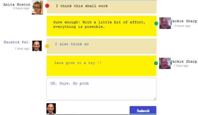
Following is the output of the application. It shows how the users can comment through the application built using Flexbox.


Output of the Comment Window

Conclusion

Our little tutorial explains how you can easily implement Flexbox for the development of responsive comments layout. The use of Flexbox makes its development easy, which otherwise can seem to be difficult.

This article is provided by VoucherBin.

Categories: Others Tags:

A Year Without jQuery

March 11th, 2016 No comments

Patrick Kunka writes about his experiments in making a large-scale web app without jQuery:

In my mind, ES6 is for the most part a much-needed syntactical progression of the JavaScript language and jQuery is for the most part, a DOM manipulation library with a beautifully designed API. These two things actually have very little in common so I wanted to write this article primarily to prove that you can stop using jQuery today – and you don’t need ES6 or Babel to do it.

Direct Link to ArticlePermalink


A Year Without jQuery is a post from CSS-Tricks

Categories: Designing, Others Tags:

Adobe Post 2.0 Has Been Released

March 10th, 2016 No comments
adobe-post

Today, Adobe announced the release of Adobe Post 2.0, the popular app for creating social graphics within minutes. Adobe Post 2.0 is the latest version of Post, which was released back in 2015.

The new version comes with several new features, such as:

  • Support for Different Sizes: You can use custom sizes for different social networks, such as Twitter, Instagram, Pinterest, YouTube thumbnails, LinkedIn banners, etc.
  • Auto Resize: You can resize graphics to a custom size with a single tap.
  • New Filters: Such as colors, text, and so on.
  • Line Break Support: You can control how your text flows and highlight specific words as well as create multiple text boxes for date, time, location etc.
  • Right to Left Languages: Adobe Post 2.0 supports languages such as Arabic, Hebrew, Farsi, Urdu, etc.

You can learn more about Adobe Post 2.0 on the official blog post. Plus, you can download it from the App Store.

What do you think of Adobe Post 2.0? Share your views in the comments below!

Read More at Adobe Post 2.0 Has Been Released

Categories: Designing, Others Tags:

123ContactForm introduce CaptainForm WordPress plugin

March 10th, 2016 No comments

Building forms is one of the most time-consuming processes on any website build; you need to code the inputs, validate the data, and securely capture information in a format that you can use. Multiply the complexity by ten when you factor in WordPress.

Because WordPress is so popular, a number of plugins have been developed over the years that potentially make the transfer of data on your site a two-way street. One of the most recent WordPress form builder plugins is 123ContactForm’s CaptainForm.

CaptainForm is an extremely flexible builder for WordPress that’s user-friendly for beginners and feature-packed for power users. Developed as a standalone platform, CaptainForm allows you to easily create almost any kind of form and add it to your WordPress site.

Easy to install, add it to your dashboard like any other plugin, simply click the New Form option that it adds to your dashboard menu to start building forms. You can start with a blank form, or choose to customize one of the templates that are included.

The main reason CaptainForm is so easy to use is that the editor features drag-n-drop support; you don’t need to know how to code, or even configure a lot of settings, just pick the inputs you want and drag them into place. It’s an intuitive system that will have most users up and running in minutes.

A wide-range of data types are available, from the usual telephone and email inputs, to advanced inputs like digital signature support, Google Maps, and even social media buttons. There are calculation features for order forms. There are even multilingual options for designers who need to support global customers.

Forms can be styled by selecting one of the built-in visual themes, or by creating a custom style of your own; backgrounds, field highlights, error messages, and inputs, can all be customized to fit your brand.

Version 1.0 ships with over 30 pre-built templates that you can use as-is, or customize to jump-start your own form design. There are newsletter subscription templates, payment form templates, and even guest-post submission templates for your blog.

CaptainForm also integrates with a comprehensive set of 3rd party services, including Google Drive, MailChimp, Dropbox, Salesforce, ActiveCampaign, Campaign Monitor, and Smartsheet. These integrations take a lot of heavy lifting away from the admin of your site, automatically adding form users to lists or services so that you can keep the communication flowing and turn casual browsers into customers.

Security is, of course, a primary concern for everyone. CaptainForm uses Captcha, password protection, virus protection, malware protection, all submissions are backed up and recoverable from AWS servers, and all data is stored using SSL encryption.

CaptainForm also offers comprehensive, support for all users, including those on the free plan.

There are a number of price plans for CaptainForm WordPress form plugin ranging from the free option, which allows you to build 3 forms, with 15 fields, on 1 domain; to the Hero plan that offers 10Gb of storage, 100k secured submissions, and unlimited forms, fields, and domains.

[– This is a sponsored post on behalf of 123ContactForm –]

LAST DAY: Port Vintage Font – 10 High End Luxurious Fonts – only $24!

Source

Categories: Designing, Others Tags:

Easily Editable Vector Globes in Adobe Illustrator

March 10th, 2016 No comments

There can be a time that you are working on a design that would go well with a globe of the earth. Where to start? Searching for the perfect globe clip art can be a tedious task. Not to mention it would sure need to be in your custom style, with individual line widths, colors and probably rotated to your preferred location. One Stop Map has released a free vector globe that can do exactly that. Let us introduce you to it.

The PowerGlobe for Illustrator is a free download that can get you up and running in no time with your next project. The globe itself is an Adobe Illustrator CS6 file (compatible up to the latest version of Creative Cloud) that lets you quickly edit the looks and content of your globe. With just one click you can rotate it to the location you need. Three distinct map styles are already included, but nothing is stopping you from altering the content the way you want.

The Blueprint Globe Project

I am going to show you just how easy it is to change the look of the globe.

Make a globe in blueprint-style in a matter of minutes

We are going to create a globe with a look inspired by blueprints.

You can read all the details on how to work with the PowerGlobe on the product page itself, or you can follow along as I demonstrate just how easy it is to edit this globe.

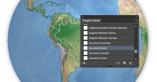
Rotate the globe by clicking on the graphic style of your choice

Open up the PowerGlobe in Illustrator. Select everything on the layer ‘PowerGlobe’ and click once on the graphic style ‘(country) Brazil’. This will rotate the globe, so Brazil is in the center of it.

You can quickly select all objects on one layer by clicking on the layer name while pressing the ALT-key.

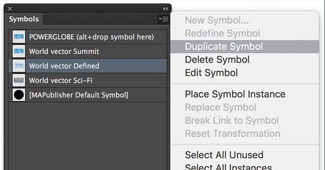
Duplicate the symbol 'World vector Defined' and call it 'Blueprint'

Now go to the Symbols palette and duplicate the symbol ‘World vector Defined’ by selecting it and choosing ‘Duplicate Symbol’ from the Symbols palette options menu. Rename the copied symbol to ‘Blueprint’ by double-clicking its name.

One important thing to know is that you should never alter the primary symbol ‘POWERGLOBE’ directly. That’s the symbol that is used in the actual globe. We always change one of the other symbols and will make it active as soon as our edits are done.

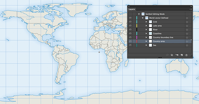
Open up the symbol 'Blueprint' in editing mode

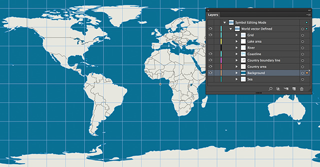
Now it is time to edit our newly created symbol ‘Blueprint’. Double-click on the symbol name to open it in editing mode. As you can see the symbol itself contains several map layers like ‘Country area,’ ‘River’ and more.

For our purpose, we don’t need the layers ‘Lake area’, ‘River’ and ‘Sea’. So set those layers invisible.

Create a new layer 'Background' and give it a fill

Create a new layer and call it ‘Background.’ Drag this layer under the layer ‘Country area’. Draw a rectangle that precisely fits the grid (if it’s not enabled turn on snapping by hitting CTRL+U or CMD+U on a Mac) and give the rectangle a fill of 90/50/25/5 (CMYK) or 7/110/149 (RGB). Set the outline of the rectangle to none.

Alter the properties of the paths

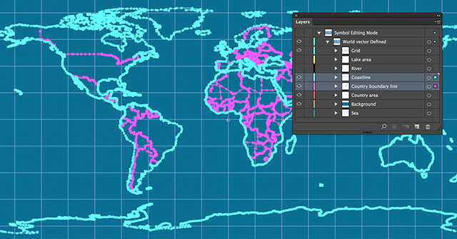
Select all objects on the layers ‘Coastline’ and ‘Country boundary line’. As mentioned before, you can quickly select all objects on one layer by clicking on the layer name while pressing the ALT-key. By pressing SHIFT and ALT together, you can click on subsequent layers to select everything on it.

With everything selected set the stroke width to 0.5 pt, be sure the fill is set to None and set the color of the stroke to 35/15/10/0 (CMYK) or 165/192/211 (RGB).

Next select all objects on the layer ‘Country area’ and give them no fill.

Make a custom fill for the country of Brazil

Now we are going to emphasize Brazil by creating a fill that works well with this Blueprint style.

Make the layer ‘Country area’ active by selecting it in the Layers palette. Draw a line to the left of Brazil that’s 45 degrees rotated by pressing and holding SHIFT as you draw. We want this line to have the same properties as the ones on the layers ‘Country boundary line’ and ‘Coastline’. With the line selected click on the Eyedropper Tool and then click somewhere on the coastline to grab its properties.

Make a copy of this line to the right of Brazil by dragging the line to the left while pressing ALT and SHIFT together.

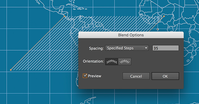
Select both lines and click the Blend Tool. With the Blend Tool selected click once on the left line and click once on the right line. Now double-click on the Blend Tool. This will bring up the ‘Blend Options’ dialog box. Turn on the Preview checkbox to see what is going on. Set the ‘Spacing’ to ‘Specified Steps’ and enter the number 35. Leave the rest as it is and click OK.

Create a clipping mask with the path of the country Brazil

The layer ‘Country area’ contains shapes of every country. We are going to make a clipping mask of the lines and the shape of Brazil.
Lock all layers except ‘Country area’ and select the shape of Brazil.

Bring that shape to the top by right-clicking on it and choosing for Arrange / Bring to Front.

Select the lines and the shape of Brazil and go to Object / Clipping Mask / Make.

Make our edited symbol 'Blueprint' active by dropping it onto the main symbol

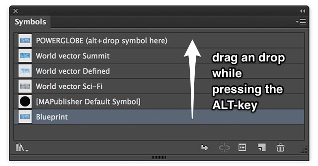
Double-click somewhere in the white area to close the editing mode of the symbol. We are going to make our edited symbol the active one by dragging and dropping the symbol ‘Blueprint’ onto the main symbol ‘POWERGLOBE’ while pressing and holding the ALT-key.

That’s it. Your globe should look like a Blueprint globe.

Create several variations of the same globe with just a few clicks

The End But Not the End: Edit On

Just by playing along with the ‘Lights’ layer, editing the drop shadow on the back, making layers in the symbol visible/invisible, you can quickly come up with all sorts of versions of this globe. All this is done in a matter of minutes.

It does not stop here. You know this is Adobe Illustrator, so you can edit the artwork any way you want. This was one simple workflow to quickly edit the looks of the globe, but you can do much more by using the tools you know in Illustrator and make this globe stand out.

One Stop Map offers free and premium printable and editable vector maps from places all over the world. They have hundreds of free layered maps for you to use in your design: a US state map of every state, country maps and more. All free maps come with a very generous Creative Commons License.

(dpe)

Categories: Others Tags:

Legal Guidelines For The Use Of Location Data On The Web

March 10th, 2016 No comments

Location-based services are growing in popularity every day, and beacon-based services are tipped to be the advertising goldmine of 2016. You may already be using location data and beacons to enhance your users’ experience with your websites, apps and wearables. However, the use of location data is not without limits.

A simple opt-in screen

Developers must become aware of international privacy laws, as well as industry codes of self-regulation, that govern its usage. Following laws and codes, while also adhering to best practice principles through frameworks such as privacy by design (PbD), will ensure public trust in your app as well as in your services as a developer.

The post Legal Guidelines For The Use Of Location Data On The Web appeared first on Smashing Magazine.

Categories: Others Tags:

Adobe Muse CC goes responsive

March 9th, 2016 No comments

Last month Adobe released an update to Adobe Muse CC, a popular visual web design tool that allows you to create websites without code. This new, powerful tool is included with the Creative Cloud.

As a traditional graphic designer, Adobe Muse opens new doors allowing you to work in a familiar interface, à la Adobe InDesign, for creating websites. A limitation of the application previous to this update was being locked into fixed-width layouts. Muse has supported adaptive design for some time and added a text-synching feature for easier management across alternative layouts, but was missing the critical component of responsive design. Now you have a choice—you can decide which approach (responsive or adaptive design) is best for your specific project.

How it works

When creating a new site, the option is front and center. Adobe redesigned the New Site dialog box giving you the option to create a fixed-width layout or a fluid width layout.

The obvious choice for responsive design is fluid width. Nothing has changed in the Plan Mode, but once in the Design Mode there’s a new interface feature specific for responsive design: the breakpoint bar. This workflow is similar to what Adobe offered in Edge Reflow and more recently Dreamweaver with its Bootstrap features.

Adding breakpoints

Adding breakpoints in Muse is simple and intuitive. On the right-hand side you will see a scrubber that allows you to resize the width of the page, simulating a browser resizing.

The idea is to add breakpoints when your design “breaks”, which could be elements overlapping, getting too small, or whatever the case may be. Ideally you would separate the idea of adding breakpoints for specific devices, and strictly focus on what the design requires. It’s really a balancing act; the main support for responsive design is to accommodate a wide range of screen sizes due to the proliferation of mobile devices. This is where being thoughtful and doing a little bit of planning can go a long way. You can add as many breakpoints as needed. Just be mindful that the more you have, the more you’ll have to manage.

To add a break point, you can click the small plus sign that appears on the breakpoint bar.

Once you add the breakpoint, the breakpoint bar becomes color-coded. You can manage breakpoint properties by right-clicking on the breakpoint bar and choosing the breakpoint properties option.

This will open the breakpoint properties dialog box. Here you can control specific properties, from the color and/or position of the breakpoint to adding column guides to appear for that breakpoint. Everything in this dialog box is specific to the current breakpoint and has no impact on any other breakpoints within the page.

You can quickly navigate between breakpoints by clicking on different sections within it. On each breakpoint you can begin to reformat the content to make better use of the browser width.

Master pages

Master pages have their own breakpoints, which respond independently of the pages they are applied to. This gives you specific control over the master page content, typically a header and footer.

These breakpoints appear on the breakpoint bar as small triangles, to indicate where the breakpoints are in the master. You can click on the triangles to quickly position the scrubber to that location.

Formatting content at breakpoints

When you add a breakpoint, you can reflow the content any way you’d like. Often times you’ll take an approach where you stack content, or resize the content so it’s larger making it easier to view on smaller screens. It’s not uncommon to show less content. As the screen gets smaller the content should get more specific. In the example below, you’ll notice that I went from a three-column layout for the larger breakpoint to a two-column layout for a smaller breakpoint. The images and text become larger, making it easier to view on a smaller screen.

There are a couple of important things to keep in mind. First, if you want less content to appear, you should not delete the unwanted content at the smaller breakpoint. You have to remember that this is one page; it reflows to change its layout for various screen sizes, but it’s still one HTML document. So deleting it at any given breakpoint deletes it from the page. Instead you can hide the layers for the content on a specific breakpoint, or right-click on the element and choose Hide on Breakpoint. This will make that piece of content invisible at the selected breakpoint, but unaltered on others.

It’s also important to understand how content re-sizes in Muse when working with this responsive feature set. By default, elements you create in Muse will scale width-wise. Elements placed into the document, like an image for example, will scale the width and height proportionally. You can control these settings in the control bar when an element is selected.

A behavior you might encounter is objects “floating” a bit when the browser window is being resized. For these circumstances, Adobe has added a new option called Page Pinning. This is not to be confused with the Browser Pinning options available in previous versions, which would “pin” an element to the browser; if the user scrolled down the page, the pinned element would stay locked into position with content scrolling underneath it. Page pinning is a bit different. The element that is pinned using this option will still scroll with the browser, but if the element is located in the center of the page regardless of what the browser width is, the element will stay locked to the center of the page, albeit still scaling in size when the sizing properties are set as such.

Migrating a site to responsive

If you’ve worked with Muse in the past, and have a fixed-width site, it is possible to migrate it to a responsive layout. What’s important is changing your site properties. To do this, select File>Site Properties to open the Site Properties dialog box. Here you can change the layout from Fixed Width to Fluid Width.

Next you need to change attributes of the elements that you want to be fluid. You can do this by removing any previously established pins. You should then right-click on the object and select resize. This will give you various responsive options to select from.

Conclusion

There are few things that aren’t ready for “responsive primetime” in Muse. Scroll effects are not supported just yet. Which means if you need to use these types of effects, you’ll be stuck with an adaptive solution for the time being. Also, not all widgets are responsive either, though the folks at Adobe are working on it and I would expect both of these limitations removed with future updates.

The new responsive feature set in Adobe Muse CC is a welcome addition to an already powerful visual web design tool. It offers designers the ability to create responsive content visually and in an environment that is intuitive and familiar.

Convert Photos to Stunning Paintings with Digital Painter – only $9!

Source

Categories: Designing, Others Tags:

Music as a Productivity Tool

March 9th, 2016 No comments
Spotify
Creativity is a strange beast. It is critical for great work yet impossible to quantify. Steve Jobs once said, “When you ask creative people how they did something, they feel a little guilty because they didn’t really do it, they just saw something.” Some can turn it on and off at will, others wait for inspiration to strike. One thing that everybody agrees on is that your environment is a critical driver for creativity.
With this in mind, many companies have shifted their approach to the physical work environment. It’s not secret that the days of cubical farms are gone in favor of open-layouts designed to encourage creativity and cross-functional exposure. While most agree that this has been a positive shift, there’s one area where it causes major trouble: privacy.
Almost every open-layout office has that one guy who talks a little too loudly on the phone or takes the lack of doors as an invitation to pop in and chat. Suddenly, those headphones on your desk look appealing.
Our advice: strap those headphones on. It will bring out the most creative and productive you.
It puts out the vibe. That guy who walks over to your table to chat? Headphones put out the vibe that you’re in the zone and you aren’t to be disturbed.
Science has your back. Peter Quily is an adult Attention Deficit Disorder coach. Quily says that listening to music boosts the levels of neurotransmitter dopamine, a chemical that can help people focus. Those who have trouble focusing or those who have ADHD often have low dopamine levels, so music is a healthy boost.
You’ve never had more access to great music. With Spotify Premium, you’ve got access to almost all of the music that you could ever want and with Pandora, you don’t even have to decide what your playlist looks like. The advanced technology that drives Pandora’s recommendation engine is built around you and your taste – they consider more than 450 distinct musical characteristics in each song that you offer a thumbs up or down to, and use that information to decide what you’d like to hear next.
Bonus: the Benjamin app has your music needs covered. In the widget below, you’ll see everything you need to get started: half-off Spotify Premium.

To buy, click the blue $. To view the next item, click the orange X. For more deals like this, install the benjamin app on your iOS or Android device by clicking here.

Read More at Music as a Productivity Tool

Categories: Designing, Others Tags: