Archive

Archive for March, 2016

40 Premium Responsive WordPress Themes to Opt for in 2016

March 8th, 2016 No comments
gallery-image-1-1024x1024

Picking a responsive WordPress theme for your personal blog is an exciting activity, mostly because no one is controlling you. You can try out different designs and change some design elements at your own discretion. But if you have to redesign a corporate website you can’t just switch off an official website of a Fortune 500 company in order to replace the social media buttons. In this case you should plan everything in advance. This applies to any commercial website, even for a personal site, if it’s established, and makes profit. That’s why, if you want to create a profitable website, you need a sustainable template with a modern design, so you won’t have to refresh its look for a long time. Also, it should necessarily be responsive and mobile-friendly for the convenience of mobile users (their number is growing every year).

Since many websites are being powered by WordPress, we’ve decided to make things simpler for you, and have created a list of 40 top-notch premium responsive WordPress themes suitable for almost any possible topic.

If that’s not enough for you, check out one of the largest collections of premium WordPress themes on the web.
But first, let’s see what we’ve picked for you.
***

1. Supreme

Demo | More Info

Supreme is a next generation responsive WordPress theme for fashion-related websites. Its features include built-in sliders, background videos, integrated interactive maps, and complex customizable mega menus. It also boasts four gallery layouts. Supreme looks clean and neutral, so it will be a breeze for you to adjust its design to your brand’s general style.

2. FinAdvision

2-premium responsive WordPress themes

Demo | More Info

FinAdvision is one of those WP themes, which are ready to use out of the box. Besides the smart layout of the homepage, it boasts a large number of readymade pages designed for various purposes. If you are a solopreneur, who deals with finances, SEO, marketing, and such, this theme is for you.

3. SM Consulting

3-responsive WordPress themes

Demo | More Info

SM Consulting is a bright, colorful responsive WordPress theme for marketing agencies. With predesigned pricing tables, newsletter subscription forms, and testimonials it is a universal solution for many kinds of businesses.

4. Plumbing Co.

4-responsive WordPress theme

Demo | More Info

Plumbing Co has been developed specifically for maintenance companies to add some color to their overly run-of-the-mill business. The layout of this responsive WordPress theme may look simple, but the multicolored progress bars and call-to-action buttons are sure to grab the attention of your visitors.

5. IT Company

5-responsive WP theme

Demo | More Info

This responsive and mobile-friendly WordPress theme with flat design is much more beautiful in action, than appears in the screenshots. That’s why you should check out its live demo. It has been created for modern IT companies, for whom the lion’s share of success depends on the design of their websites. This theme is based on flat design, and features large illustration-based sliders of extraordinary shapes.

6. Handyman

6-55705-original

Demo | More Info

Handyman is a vintage-looking WordPress theme with modern functionality under the hood. It is based on Cherry Framework 4, which means its code is polished, and the theme itself is compatible with all modern browsers and mobile devices. Handyman is a good choice for interior design and furniture websites.

7. Monstroid

7-55555-original

Demo | More Info

Monstroid, one of the biggest releases in the WordPress world in 2015, is a colossal premium WordPress theme constructed using Cherry Framework 4. It comprises 20+ plugins with independent structure, lots of free child themes, and compatibility with various third-party extensions. This set of features makes it one of the most versatile and flexible themes around.

8. Obrus

8-55425-original

Demo | More Info

Obrus is a responsive WordPress theme with a polished design oriented towards large corporations. It boasts an impressive branded sticky mega menu, dynamic circular progress bars, ghost buttons, and a set of business-oriented page layouts with pre-adjusted elements. Obrus is not that versatile and multi-topic, but it is perfect for the niche for which it has been designed.

9. Fishing Club

9-responsive WordPress themes

Demo | More Info

Fishing Club is a premium WordPress theme with a lot of advantages. First of all, it is mobile-friendly: not only responsive, but designed with usability on mobile devices in mind. Secondly, it is packed with a number of plugins – native and third-party. And since it’s a theme, it should look neat and stylish – and it does. Fishing Club will be a smart choice for websites dealing with activities, sports and hobbies.

10. Gitex

10-54794-original

Demo | More Info

Gitex is a robust WordPress theme for a wide range of businesses, primarily – financial, marketing, and law. Its structured format is seasoned with modern design techniques: transparency, diagonal lines, parallax scrolling effect for images, and so on. All you need to launch a highly efficient website with Gitex is to upload it to your server, and to replace the sample data with your own content.

11. Design

11-responsive WordPress theme

Demo | More Info

If you are looking for an utterly unusual design for your WordPress website, this responsive theme may be just the thing. Behind the long scrolling layout of its homepage there are awesome gallery options, possibilities of presenting your creative works, and many more.

12. Hypnosis

12-55142-original

Demo | More Info

Hypnosis is a nice and friendly WordPress theme from the Monstroid inventory. It features an eye pleasing color palette, a touch of material design, easily readable text blocks, and social media options. One more advantage of its simplicity is that this theme is very easy to customize.

13. Houston

13-57875-original

Demo | More Info

Houston is a classy WordPress theme with an incomparable retro look. This theme has been designed as a photographer’s portfolio, but it will appeal to everyone who loves black & white photos and grunge overlay effects.

14. Apartments

14-responsive WP themes

Demo | More Info

Apartments is a truly remarkable WordPress theme for those who are involved in building, selling or renting houses. This image-rich design will be a great online ambassador for your business, thanks to the integrated pages, advanced galleries, and intuitive contact forms.

15. Sky-High

15-55048-original

Demo | More Info

This responsive WordPress theme with unusual typography is intended to become a reliable launching pad for a wide range of creative businesses. Indeed, it is not suitable for websites of classic financial companies, but you won’t find a more memorable design for a design studio, or a marketing company.

16. Real Estate

16-responsive WP themes

Demo | More Info

This exquisite WordPress theme with an image-focused appearance has been designed for real estate agencies. The long scrolling layout of its homepage contains sliders, maps, blocks with company features, masonry gallery previews, and many more. The pull-out sidebar menu is brought up by clicking the hamburger button in the top right corner of the screen.

17. Ice Hockey

17-55579-original

Demo | More Info

To launch a sports-oriented blog or website use this responsive Monstroid WordPress child theme. Its landing page layout allows you to place your call-to-action buttons in the most effective way. This theme is heavy on large image areas with parallax scrolling effect and diagonal borders.

18. Paggani

18-55262-original

Demo | More Info

Paggani is an extremely elegant restaurant WordPress theme with a refined minimalist homepage. When your customers visit your website for the first time, they see an inviting page with nothing but your logo, social media buttons, a minimized menu, and a beautiful page-sized picture in the background.

19. SEO Company

19-responsive WordPress themes

Demo | More Info

This responsive WordPress theme for SEO companies is a dream for any webmaster. Simple, user-friendly, and clean, it will make a great blog or corporate website. This theme also features an integrated live chat, so you can set up technical support without any trouble.

20. 33 Channel

20-58365-original

Demo | More Info

This WordPress theme is a one-stop shop for media-related business. It provides you with a wide array of tools to display media content: video and audio players, galleries with various layouts, countdowns, etc. The design of this theme is pixel-perfect, so it will be suitable even for large companies.

21. Roof Repair Services

21-58408-original

Demo | More Info

If your aim is to build a trustworthy website for your company, check out this responsive WordPress theme for home repair companies. Its design is enhanced with subtle CSS effects, so your website will look not only professional, but also very dynamic.

22. Pool

22-responsive WordPress theme

Demo | More Info

Present your business with a splash via this responsive WordPress theme with impressive imagery. It combines all the best visual and functional features of modern website designs, offering you a solid company website template with a catchy look. Although the initial purpose of this theme is to power poor-themed websites, there is no harm if you apply it to a website covering any other topic.

23. Video Online

23-55716-original

Demo | More Info

Video Online is a content-first WordPress theme for video hosting and media-rich blogs. Its compact front page allows you to display as many categories and posts, as you need. The mega menu at the top of the layout makes the navigation easy and intuitive. The visual side of this theme is represented by beautiful slide-in effects and slight shadows.

24. Fine Art

24-premium responsive WordPress themes

Demo | More Info

This WordPress theme combines simplicity of layout and beauty of content, giving you a helping hand at creating a robust gallery website. The design is driven by simple geometric shapes, white background, and a large number of images.

25. Little Italy

25-56097-original

Demo | More Info

The layout of this restaurant WordPress theme resembles the one of a flyer: it is narrow, boxed, and strongly focused on call-to-actions. Circular image previews are great for displaying round-shaped food – for example, pizzas. The handwritten typography used for headers and sliders fits the design perfectly.

26. Boutique Consultants Group

26-58218-original

Demo | More Info

This is another well-thought-out WordPress theme for personal websites. The design is simple, but efficient, with compelling call-to-action elements and carefully adjusted testimonials. This theme is designed with the classic combination of black, white and gold colors, stimulating a sense of trust in your visitors.

27. Top Solutions

27-premium responsive WordPress theme

Demo | More Info

Top Solutions is designed in metro style using content blocks with semi-transparent layouts of various colors. It is ultra minimalist and incredibly flexible, so you can use it for a website covering almost any possible topic and purpose. This theme has no actual footer: there is a page-wide interactive Google map widget instead.

28. Dating

28-55820-original

Demo | More Info

This unique WordPress theme has been designed and optimized specifically for dating websites. It is visually profound, with lots of CSS-based enhancements such as parallax scrolling, on-hover animations, ghost buttons, etc. Its minimalist, yet informative, menu is minimized into a hamburger button, and appears on click.

29. Gourmet

29-55376-original

Demo | More Info

Gourmet is a delicious WordPress theme for restaurants, online delivery services, and other food-related websites. It features a large background hero image with blur effect, background videos and circular CSS3-powered images. Built with Cherry Framework, this theme is 100% responsive, and compatible with many popular WordPress plugins.

30. Essperto

30-responsive WordPress themes

Demo | More Info

Essperto is a visually advanced WordPress theme for financial institutions. It has been designed to look good on all screen sizes, making sure that your website satisfies the widest audience. Its flat design allows you to change the color scheme in minutes.

31. Tune Station

31-55722-original

Demo | More Info

If you need a template to present all the advantages of your mobile app, we recommend using this WordPress theme with its sleek responsive design. It has everything enabling you to use it as a landing page, plus some cool functionality to establish a full-featured business website.

32. Frutti Bar

32-55725-original

Demo | More Info

Frutti Bar is a responsive WordPress theme dedicated to organic food. It includes a set of vector illustrations, testimonials, and various forms. The navigation of this theme is powered by a convenient mega menu, which can be customized from the backend of your WordPress website.

33. Alexander

33-55761-original

Demo | More Info

This gorgeous WordPress theme will let you create an online representation of your restaurant in no time. Its old-fashioned background looks surprisingly modern against the impressive high-definition photography. The vintage font with thick stems and ultra thin serifs adds a comfortable feel to the design.

34. PixelStorm

34-responsive WordPress theme

Demo | More Info

PixelStorm is a multipurpose WordPress theme for creative agencies, game design studios, and other companies dealing with digital art. The all-caps font of its headers is intended to highlight the modern nature of this theme, whereas the nature-inspired image blocks add a handmade look.

35. New Born

35-56024-original

Demo | More Info

This business WordPress theme designed in dark colors will become a sustainable launch pad for your corporate website, web startup, or personal blog. It boasts plenty of image-based content areas, a rich mega footer, and a progressive gallery.

36. Hotel

36-56077-original

Demo | More Info

Hotel is a bright and cheerful responsive WordPress theme for travel websites. Just as with many other themes on this list, it has a sticky mega menu, and image blocks with parallax effect. Its design is additionally enlivened with CSS animations triggered by mouse hover.

37. Communication

37-premium responsive WordPress themes

Demo | More Info

Communication is a multipurpose and multi concept WordPress theme with a classic business-oriented structure. It makes use of very large photos, which cover the entire layout of its homepage, except for some content blocks with flat background. It comes shipped with a customizable slider, support of Google fonts, and a number of additional plugins.

38. Hunting

hunting

Demo | More Info

Hunting is a universal WordPress theme with its homepage optimized for newsletter subscription conversion. It has a complex homepage layout, several premade pages, and support of mega menu. In all other terms it is a neatly designed and easily customizable template.

39. Hang Gliding

39-55966-original

Demo | More Info

This responsive WordPress theme with lightweight design is a great way to present your business or event. It includes a Facebook-like timeline, which allows you to display the milestones of your progress in chronological order.

40. Dinosaur Park

40-responsive WordPress themes

Demo | More Info

You don’t have to own a real Dino park to be able to put this WordPress theme to use. In fact, it is quite multipurpose thanks to the extensive use of images. Just replace them with your own – and you will receive a unique design reflecting the spirit of your company.
***
This was an overview of the most notable responsive WordPress themes that can be used in 2016. Have we missed your website’s unique topic? Let us know – we will definitely find a theme that is suitable for you.
And if your company is not in the Fortune 500 list yet, check out the latest advice for beginner entrepreneurs on StartupHub.

Read More at 40 Premium Responsive WordPress Themes to Opt for in 2016

Categories: Designing, Others Tags:

Messenger on Android joins the rush to Material Design

March 8th, 2016 No comments

Rumored for the longest time, Facebook Messenger on Android has finally joined the Material Design club, with its latest update.

Taking virtually no one by surprise, this Material Design update is nonetheless welcome news for Android users who’ve been clamoring for a more usable interface on their smartphones. This update immediately applies to all Android users around the globe, making it a full rollout instead of just a careful test of certain markets.

In the interface, users will be able to spot the very noticeable changes straightaway. The most prominent is the vibrant, blue navigation bar on the top of the screen. This features buttons with several functions like settings, groups, chat and more.

This focus on streamlining the design is in line with the big tenets of Material Design

Where there was a blue bar on the bottom of the interface, now there’s simply a floating action button that users can spot at the bottom right of their screens. This button can be used to add contacts, make calls, perform searches and write messages. This is much greater simplicity and minimalism than all the buttons on the previous blue bar, which included individual buttons for making calls, searching and creating new chats. This focus on streamlining the design is in line with the big tenets of Material Design.

While the app’s usability has been improved by making the user interface simpler, the changes are still mostly visual.

Though this week’s rollout applies to all users around the world, it’s interesting to note that some people have already received a preview of these significant changes ahead of time. As early as January, a select few users have been helping Facebook test these changes to Messenger. At the time, it was uncertain if all users would be able to benefit from these changes, but now it’s clear that this update is global.

David Marcus, Messenger’s lead, explained why it’s taken Facebook a long time to finally debut this design on one of its most widely used and popular apps. According to Marcus, Facebook took an extra long time to apply Material Design to Messenger to ensure that the user experience from the changes would be high-quality. The fact that so many people around the world use Messenger added to the need to be extra careful in the design transition.

Encorpada: A Classic Collection of 34 Uniquely Elegant Fonts – only $17!

Source

Categories: Designing, Others Tags:

Graphic Design Trends That Will Rock 2016

March 8th, 2016 No comments

Graphic design is a genre of its own, and it has its own norms, conventions as well as trends. Much like web design, graphic design too evolves with time and is never static or rigid. That said, graphic design is as much about making a statement and leaving an impression as it is about focusing on user experience and ease of accessibility. So, what are some of the major trends in graphic design that we can expect to see in 2016? This article answers precisely this very question.

Graphic Design Trends That Will Rock 2016

Typography

Typography and the use of fonts is one of the most crucial aspects of graphic design. In the absence of proper type and lettering, even the best of graphics might fall flat.

The trend seems to be, among other things, for not just legibility but also big and bolder fonts. The goal behind typography in graphic design is not only to convey a message but to leave an impression; and for this purpose, bolder and bigger fonts tend to do well.

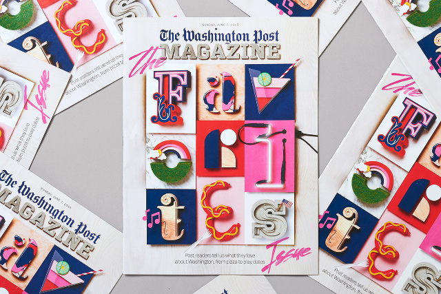
Consider the recent work by SNASK for The Washington Post Magazine. The typography surely is bold and vigorous, but it does not stop at just that — by making judicious use of color within typography, SNASK have emphasized the message being sent via their design — something fun and tactile.

graphic-design-typography

Going further into 2016, this trend of complementing typography with the help of colors and style will surely catch on even more.

Colors

Speaking in terms of color for graphic design, there are certain variables that need to be kept in mind.

First up, concepts such as Material Design and Flat Design have affected not only web and app, but also graphic design. Of course, flat isn’t always the best in graphic design, especially if you are looking for something purely for the printed media, but notwithstanding that, both Material Design elements and flat design are gaining favor in graphic design as far as the digital graphics are concerned.

As such, colors in graphic design tend to depend on those guiding concepts. Secondly, and more importantly, unlike web design where mute design principles such as reductionism and radical minimalism tend to do really well, graphic design at times needs to be “loud”, and eye-catching. Thus, brighter colors, such as pastels, neons, vibrant hues, etc. seem to be rising in stature this year, and they surely will dominate graphic design in 2016. Electric colors, pastel gradients and other similar shades too can be expected to be popular.

Abstract Design

Abstract design patterns have, for quite a while, been popular in art. However, in the past few months, abstract design has found favor in graphic design as well, both in the print and digital formats.

The most evident and popular application of abstract design in graphic design would be the use of geometric design patterns. Geometric shapes and patterns are rising steadily in graphic design, and have, in fact, become not just a trend but a design concept in themselves.

Concerning graphics, geometric shapes and patterns are often employed as supplements to chunks of text, logos, or as background graphics on the web. As such, geometric shapes are serving the dual purpose of being both illustrative as well as decorational.

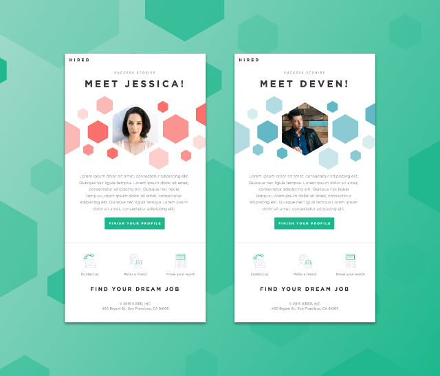
You won’t have a hard time finding such geometric patterns for inspiration, such as this one over at Dribbble.

graphic-design-geometry

The polygonal shapes, as you can see, are being used to both complement and highlight the pictures and text, as well as to fill up the otherwise blank space.

The Use of Negative Space

Negative Space has been around for quite many years by now, and it has become a staple component of any good design – be it a graphic, a website or even a newspaper layout. However, negative space application in graphic design seems to be rising in uncharted areas, where it was not so prominent earlier on.

For instance, negative space is being used more and more in sign boards and logos. Furthermore, the negative space in graphic design rarely equates to whitespace (in web design, it has become almost a standard practice to use “negative space” and “whitespace” as synonyms). In fact, in graphic design, negative space is often treated with a darker color, such that the primary graphics stand out and are visible from a distance.

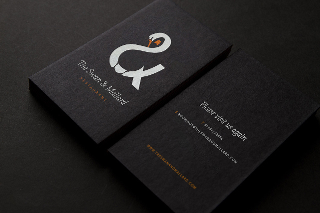
A good example would be this sample signboard and logo for a restaurant.

graphic-design-negative-space

The negative space is treated with a shade of black, so as to make the white logo stand out, and cast a clear but prominent impression on the viewer. Furthermore, the card also relies on negative space to make the white text noticeable.

These are the graphic design trends that are expected to be on the rise in 2016. What are your thoughts on these trends? Share them in the comments below!

(dpe)

Categories: Others Tags:

Building A Real-Time Retrospective Board With Video Chat

March 8th, 2016 No comments

If you’ve ever worked in an agile environment, chances are you’ve had your share of “retrospectives” — meetings where people write what made them “glad,” “mad” or “sad” onto different-colored notes, post them onto a board, arrange them in groups and — most importantly — talk about them.

How To Build A Real-Time Retrospective Board With Video Chat

These meetings are straightforward, as long as everyone is in the same room. But if you’re working with a locally distributed team, things can get a bit tricky. Let’s address this by creating a virtual version of our board to allow team members in different locations to hold their retrospective just as if they were in the same room.

The post Building A Real-Time Retrospective Board With Video Chat appeared first on Smashing Magazine.

Categories: Others Tags:

Learning to Use Google Analytics More Effectively at CodePen

March 7th, 2016 No comments

Here’s how most people use Google Analytics: you copy and paste the default tracking snippet into your templates. Look at the pageview data that comes in. That’s all good, but that isn’t the most useful analytics for many sites. Google Analytics can track just about anything. It’s very flexible and very powerful. Philip Walton and I co-wrote this article to show you how to do some custom GA stuff to help you collect data you maybe didn’t know you could collect and how you can look at that data in useful ways.

The Beginning

It’s fairly obvious you need some kind of analytics for any web app. At the most basic level, you need to know how many people are using the app, and if that number is going up or down.

The choice at CodePen was Google Analytics, because most of the team had used it before. It was free and easy to install. The team did what most people do when installing Google Analytics: we copied and pasted the default tracking snippet and that’s it. Nothing custom at all.

Data started coming in, and after a few days there is a general sense of what pages people were visiting on CodePen.

The problem is CodePen isn’t a really a pageview-based site, like, say a publication is. What pages people visit tells doesn’t tell the story about how users interact with CodePen. Much more interesting is to know what people are doing on those pages so optimizations can be made to improve their experience.

Unfortunately, none of the team really knew how to use Google Analytics to get the variety of information needed, so for a long time nothing was done.

Long story short: Chris meets Philip at CSSDevConf last fall. Philip says a lot of developers are in the same position — not taking advantage of the free, powerful tool at their fingertips. Part of Philip’s job is to teach developers, so in an epic tornado of wins, they partnered up to do smarter stuff with analytics at CodePen and share that with everyone.

What CodePen Wanted To Get From Analytics

Analytics data itself is meaningless if you haven’t figured out what problems you’re trying to solve or what questions you’re trying to answer. CodePen created a list of questions they thought would be useful to them and that would answer real questions they have about usage of the app.

Here’s a few quickies:

  • How many users are logged in (as opposed to using the site logged out/anonymous)? Is there a way to report on just the interactions of logged in users?
  • Of logged in users, how many of them have PRO accounts? How are the interactions of PRO users different from non-PRO users?
  • How many of total users have been active recently? What is the MAU, as they say (Monthly Active Users)?
  • When users change the layout of the Editor, which do they prefer: top, left, or right?
  • When users heart a Pen, what view are they in? What about when they leave a comment? These actions can be done from multiple places.
  • When users click on links to other sites, where are they going?

Understanding How Google Analytics Works

There is a couple of key concepts that make understanding everything else about Google Analytics much more clear.

Everything stems from knowing how to send data to Google Analytics. Then later, knowing how to get that data back in a meaningful way.

Sending Data to Google Analytics

You can send pretty much anything you want!

The normal thing (that the default tracking snippet) sends is the pageview. All you’re really doing is sending an HTTP request with some key/value data encoded in the URL or POST body. The keys are things like the page title, like “Explore Pens on CodePen”.

With the default tracking snippet, you’ll see these two lines at the end:

ga('create', 'UA-XXXXX-Y', 'auto');
ga('send', 'pageview');

The first line creates a tracker object, which is really just a JavaScript object that stores the key/value data we talked about above. The second line sends that key/value data via an HTTP request to the Google Analytics account (technically the “Property“) specified by the “UA-XXXXX-Y” number used in the previous line.

Google Analytics receives these HTTP requests (known as “hits“) and processes them. Based on the data in each hit, as well as the time and order the hits were received, Google Analytics is able to organize the data into a hierarchy of Users, Sessions, and Interactions.

In CodePen terms:

  • A user is anyone who visits the CodePen site.
  • An interaction is something they do on the site (e.g. visit their profile page or click the “heart” button on a Pen).
  • A session is a group of interactions by the same user that occur within a certain amount of time. If a user logs in to CodePen, creates a Pen, and then leaves, that would be one session. If they came back a few hours later in the day, that would be a different session.

A user can have many sessions, and a session can have many interactions.

Reporting on Data

Once Google Analytics has organized your data into users, sessions and interactions, you can query that data and get back a report.

Google Analytics has a lot of built-in reports. You are not limited to just those reports.

In fact, arguably the best way to improve your effectiveness with Google Analytics is to learn how to create your own reports (called “Custom Reports“), so you can query for whatever data you want. If you’re sending Google Analytics custom data specific to your application, there’s no way you’ll be able to answer all your questions with just the built-in reports.

Every report (whether built-in or custom) in Google Analytics is the result of querying for a set of dimensions and metrics. Since creating a custom report requires specifying the dimensions and metrics yourself, it’s important to understand what those are.

Metrics are a quantitative measurement of data, like total number of pages visited (pageviews) or average time on site (Avg. Session Duration). Metrics are always numeric. They’re usually counts but they can also be averages or ratios.

Dimensions are cross sections of your metrics, they’re how you subdivide your data further, for example you might want to subdivide total pageviews by the page URL to see which pages are popular, or you might want to subdivide average time on site by the different browsers people use to see if there are any correlations there. In these cases, Page and Browser are the dimensions.

The data comes back as a table. The dimension values are usually in the columns on the left, and their corresponding metric values are in the columns on the right. You can optionally apply filters to conditionally exclude rows from the results.

An Example of a Custom Report

The table below is an example custom report that shows data for the last seven days that illustrates all of these concepts. The report queries for the metrics Sessions and Avg. Session Duration and the dimensions Browser and Operating System. It then filters the results to only include rows where the Operating System value is “Windows”:

Browser Operating System Sessions Avg. Session Duration
Chrome Windows 598,713 00:03:54
Firefox Windows 127,904 00:02:49
Internet Explorer Windows 23,864 00:02:39
Opera Windows 11,436 00:03:04
Edge Windows 10,208 00:03:00

As you can see, Chrome is the most popular browser for Windows users, and Chrome users spend more time on CodePen than people who use other browsers.

Getting Answers to CodePen-Specific Questions

The first two questions in our list are about differentiating between users: logged in users vs. anonymous users and PRO users vs. non-PRO users.

Since Google Analytics doesn’t know anything about PRO accounts or the CodePen login system, there’s no way it can track this information by default. We can give it this information though!

Tracking Custom Data

If Google Analytics doesn’t have a built-in field for tracking the information you want, you can create your own field. These are known as “custom dimensions and metrics“.

We’ve already mentioned that dimensions are a way to subdivide metrics into relevant categories. A user’s logged in status as well as whether or not they have a PRO account is ultimately just a subcategory of the metric users, so we created custom dimensions to track both of these.


Custom dimensions have to be created in your Google Analytics account settings, and once they’re created, you can send values for them in the hits you send to Google Analytics.

The easiest way to send custom dimension data with your hits is to set their values on the tracker object. Since all hits sent from a tracker include all the key/value data it’s currently storing, setting custom dimensions on the tracker will ensure those values get sent with all future hits.

Here’s the change we made to our tracking code to set the “Logged In” and “PRO” custom dimensions:

ga('create', 'UA-XXXXX-Y', 'auto');

ga('set', {
  dimension1: __isUserLoggedIn__,
  dimension2: __isUserPro__
});

ga('send', 'pageview');

The variables __isUserPro__ and __isUserLoggedIn__ are boolean values passed from Rails to the view templates (and ultimately turned into JavaScript variables), and the keys dimension1 and dimension2 correspond to the custom dimension index shown in our Google Analytics account settings.

Chris: this is big for us. Imagine for every single report you’ve ever seen in Google Analytics being able to be like “Now show me this same data, but only for PRO users.”

Now that we’re sending these two custom dimensions with all our hits, we can query for “PRO” or “Logged In” status in any of our reports.

An Example of a Custom Report with Custom Dimensions

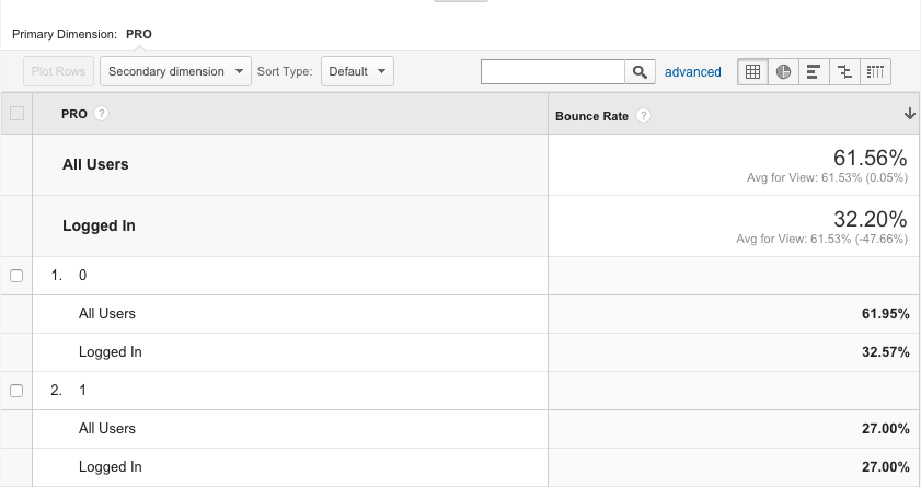
Here’s a report that displays the Avg. Session Duration and Pages / Session metrics subdivided by the “PRO” and “Logged In” custom dimensions.

PRO Logged In Avg. Session Duration Pages / Session
Yes Yes 00:09:08 6.51
No Yes 00:07:50 6.12
No No 00:02:43 2.53

Now that we have this data at our fingertips, we can see PRO and logged in users spend quite a bit more time using CodePen than anonymous users.

Here’s an example of the same kind of data, only looking at Bounce Rates across multiple dimensions:

More Accurately Tracking Users Across Browsers and Devices

By default, Google Analytics identifies users by storing a random ID value in your browser’s cookies. This works to identify returning users on the same browser, but it doesn’t work well if a user visits CodePen on multiple different browsers or devices, and since people who use CodePen often use it for cross-browser or cross-device testing, this happens a lot.

If your site has its own way of identifying users (such as a login system) Google Analytics lets you send that as the User ID in addition to the Client ID that’s stored in the cookies. Google Analytics can then do a much better job of determining that two users are in fact the same person, and not counting them twice.

To use the User ID feature with Google Analytics, all you have to do is enable the setting in your account and then set the value on the tracker object:

ga('create', 'UA-XXXXX-Y', 'auto');

ga('set', {
  userId: __userID__,
  dimension1: __isUserLoggedIn__,
  dimension2: __isUserPro__
});

ga('send', 'pageview');

Measuring User Activity

The third question in our original list was to figure out how many of our total users have been active recently. Google Analytics has an Active Users report that gives you active-users metrics for the past 1, 7, 14 and 30 days.

For example, the 30-day Active Users metric is a count of the total number of unique users who’ve interacted with your site at least once in the last 30 days. At CodePen we can look at our database to see how many total user accounts have ever been created, but a much better metric for getting a sense of our “real” user base is to know how many of them have been active recently.

As the chart above shows, on February 19, 2.6 million different people had used CodePen at least once in the previous 30-day period. On January 1, that number was only 1.9 million. Some of that difference is probably due to lower holiday traffic, but in general it’s clear that the number of active CodePen users is increasing.

Tracking User Interactions with Events

The default tracking snippet captures page loads, but it doesn’t track anything the user does while on that page. To capture more relevant data we needed to send more relevant interaction hits. We did this using events.

Having the initial list of questions we wanted to answer made it really easy to decide what events to start tracking. Here are the two we’ll focus on in this section:

  • When users change the layout of the editor, which do they prefer: top, left, or right?
  • When users “heart” or “comment” on Pens, what view are they in?

Starting with the first one, the CodePen Editor consists of three panes (HTML, CSS, and JavaScript) that can be either on the top, left, or right of the window. This placement can be changed by clicking the “Change View” button in the top right of your screen and then choosing one of the options under “Editor Layout”.

Since we have JavaScript code that runs whenever someone clicks one of those options, we can send an event to Google Analytics and include the chosen Editor Layout setting.

Here’s the basic gist of how we did that in our code:

function handleEditorLayoutChange(placement) {

  // Do the change...

  // Then report it:
  ga('send', 'event', {
    eventCategory: 'Editor Layout',
    eventAction: 'change',
    eventLabel: placement
  });

}

Now that we’ve started collecting these events, we can run a report for the metric Total Events and the dimension Event Label. We also have to filter the results to only include events with the Event Category dimensions set to “Editor Layout” and the Event Action dimensions set to “change”. Here’s what the results look like for the past 30 days:

Event Label Total Events
Left 73,186 (50.4%)
Right 37,204 (25.6%)
Top 34,794 (24.0%)

As you can see, the majority of the time people are changing the Editor Layout, it’s to display the code panes on the left.

To answer the second question, what view users “comment” or “heart” Pens from, we added logic to send an event whenever a user posts a comment or hearts a Pen.

The “view” a user is in can be found by inspecting the URL. For example a URL matching the pattern //pen/ is “Editor View” and a URL matching the pattern //details/ is “Details View”.

To figure out which view users typically leave comments from, we queried for the metric Total Events and the dimension Page (the URL path). We then filtered the results so the Event Category was “Comments” and the Event Action was “posted”. Lastly, we had to use a regular expression to get results for all URLs matching the “Pen View” pattern, and in a second query we used a different regular expression to get all URLs matching the details view pattern.

Based on CodePen data over the past 30 days, we can see that users add comments from the Pen View about three times as often as they add it from the Details View:

Page Total Events
//pen/ 2940 (73.5%)
//details/ 1058 (26.5%)
Chris: This was surprising to me at least. I thought Details View would be the go-to for commenting activity. Then again, the whole reason we created the “pop up” comments area in the Editor was to encourage commenting from there. So, win!

Drilling down into the data using segments

We’ve shown how you can use dimensions and filters to subdivide your metrics into categories. This is powerful, but in both cases your queries are still operating on your entire data set.

Another way to drill down into your data is to use segments.

Unlike report filters which exclude individual rows from a list of results after the query is run, segmentation filters out sessions or users before running the query. For example Google Analytics comes with some built-in segments such as “Organic Traffic” and “Made a Purchase”. However, just like with built-in reports, the most useful segments are going to be ones that are specific to your app’s data.

For example, in CodePen we might want to create a segment to only include (or exclude) any of the following:

  • Users who are coming to CodePen for the first time
  • Users who have hearted at least one Pen
  • PRO users using Professor Mode
  • Sessions where the user didn’t create a new Pen
  • Sessions where the user edited a pen on a tablet

Remember that Google Analytics uses a data model of users, sessions, and interactions. With segmentation you can remove entire sessions or users (and thus all the interactions that belong to them) for the data a query operates on. What makes this really powerful is you can apply a segment or any of the built-in reports or any of your custom reports.

To give a specific example of a report run on only a segment of the data, consider the following question: What are the most commonly visited pages by PRO users when they’re not creating new Pens?

Here’s a screenshot of how you might build that custom segment in Google Analytics:

And here are the results (filtering out pages of pens by a specific user).

Page Pageviews
/ 71565
/login 7789
/pens/ 6998
/picks/2/ 2145
/posts/ 2069
/patterns/ 1129

To ask another, slightly more complex segmentation question: Do PRO users heart more pens, percentage-wise, than non-PRO users?

To answer this question we have to create four segments and run four queries. For each of the segments in the table below we ran the query for the metric Sessions for the past 30 days (note, these queries didn’t have a dimension):

Segment Sessions
Sessions from PRO users 71337
Sessions from PRO users containing a “heart” event action 4945
Sessions from Logged-in, non-PRO users 832597
Sessions from logged-in, non-PRO containing a “heart” event action 36610

Then we do a little math and we get the percentages:

% of PRO user sessions containing a “heart” event action 6.93%
% of non-PRO user sessions containing a “heart” event action 4.39%

As you can see, it’s almost 60% more likely that a PRO user will heart a pen during a session than a non-PRO user.

Using a Plugin to Track Common User Interactions

The last question we had was about what links our users were clicking on that took them to other sites. The primary reason we wanted this data was to see what links people were clicking on our Job Board.

If you’ve ever installed Google Analytics on a site before, you’ve probably noticed it tracks link clicks to other pages on your site, but it doesn’t track links clicked to external sites. The reason is that Google Analytics uses first-party cookies to identify new and returning users, and first-party cookies can only be shared within the same domain.

If you want to track what external links users are clicking on, you have to track those clicks with events.

Instead of implementing outbound link tracking ourselves, we used the autotrack plugin to do this for us. Autotrack comes with a set of plugins for tracking common user interactions. Theres a bunch of things it can help with, but the main one we wanted was the outboundLinkTracker plugin.

To install autotrack we added the `autotrack.js` file to our main JavaScript bundle, and we added the following line to our tracking code. All together now:

ga('create', 'UA-XXXXX-Y', 'auto');

ga('require', 'outboundLinkTracker');

ga('set', {
  userId: __userId__,
  dimension1: __isUserLoggedIn__,
  dimension2: __isUserPro__
});
});

ga('send', 'pageview');

Once we had outbound link tracking set up, we could create a custom report for the metric Total Events and the dimension Event Label that filtered on the dimensions Event Category equals “Outbound Link” and Event Action equals “click”.

Here were the top five outbound link clicks. We’ve anonymized the job posting URLs for privacy reasons.

Link URL % Total Outbound Link Clicks
http://blog.codepen.io/ 24.29%
11.38%
http://blog.codepen.io/store/ 9.44%
7.13%
5.98%
Chris: It’s nice to see so many outgoing clicks going toward jobs, as that’s a big growth area for us. Three out of the top five most-clicked outbound links were to jobs. We may explore tracking those clicks even more specifically so we can provide that data to the companies who post jobs.

Conclusions

Honestly, the most surprising and refreshing part about upgrading the Google Analytics game at CodePen was how little code needed to change. It was mostly:

  • Add some custom dimensions and update the trackers to send them
  • Sprinkle some event tracking in important places
  • Build custom reports to see the data

We added the custom dimensions for PRO and logged in users, the autotrack plugin, and then a few lines of event tracking code, and we dramatically increased the types of reports we could run.

Once we learned how to create custom reports and custom segments, we suddenly felt like we were the ones in control and the ones asking the questions. Previously we mostly just clicked around the built-in reports, hoping some insight would jump out at us, and it usually didn’t.

If you want to improve your site’s analytics, hopefully this article piqued your interests and helped you get a sense of what’s possible.

If you want to learn more, here are a few places you should start:

  • Analytics Academy courses: these courses are a series of short video lessons that explain many of the core concepts of Google Analytics. Course 1 and Course 2 are great for getting a high level overview of how the platform works, and should help you better answer the questions specific to your situation.
  • The analytics.js developer documentation: The guides in the “Fundamentals” section in the sidebar give a great overview of how the analytics.js library works and what can be done with it. Also check out the field reference for a comprehensive list of what fields and options can be set on tracker objects.
  • Dimensions and Metrics reference: when you make custom reports (or make API requests), you have to tell Google Analytics what dimensions and metrics to use, which is difficult if you don’t know what the options are. This tools lets you browse and search through all the choices.
  • Query Explorer: if you want to automate running your custom reports, you’ll need to make API requests. The Query Explorer is a tool that helps you build API requests. And actually, for quick, one-time custom reports, you can often do them faster in the Query Explorer than you can in Google Analytics.

If you need help, the help page on Google Analytics Developers has links to point you in the right direction.

More in the video!

Here’s us chatting about all this and showing off a ton more about CodePen and Google Analytics:


Learning to Use Google Analytics More Effectively at CodePen is a post from CSS-Tricks

Categories: Designing, Others Tags:

An Introduction To Material Design

March 7th, 2016 No comments
material-design-3

When Google released Android Lollipop, it also brought into the market its whole new Material Design concept. Ever since its debut, designers and technologists everywhere are full of praise for the new design language, but for those who are new to it, here is a look at what Material Design is all about.

Basically, Material Design is a visual language for users, a set of design styles that blends the essence of the classic principle of good design with the innovation and opportunities of science and technology. But Material Design also has a far broader goal. It aspires to unite Google’s expansive product line under a rich set of design styles and principles, so that a uniform interface is found through all of Google products, everything from watches to cars. By developing a single underlying system, Material Design will allow for a unified experience across platforms and device sizes.

According to the Google’s manifesto, the concept of Material Design is based on three Principles:

“Material” is Just a Metaphor.

The whole design is based on the physical and material world, with the material metaphor being the unifying theory of a rationalized space and a system of motion. What it means to say that the material design is grounded in tactile reality, and takes it inspiration from the study of paper and ink, its motions and how it interacts. To sum up, Material Design brings an element of physical reality to the digital and yet remains technologically advanced and open to imagination and magic.

Speaking more on the subject, the surfaces and edges in Material design takes visual cues from the physical reality with the added flexibility of the digital material that creates some new affordances. It also makes use of the fundamentals of light, surface, and movement in its design, especially in the way objects move, interact, and exist in space and in relation to each other. These familiar tactile attributes resonate well with users.

material-design-2

Bold, Graphic, Intentional!

Moving to the second principle, Material Design makes use of all the basics of print design, that is typography, grids, space, scale, color, and use of imagery. But Material design does not take these elements just at the face value and aesthetic quality, it uses these elements to create hierarchy, meaning, and focus.

Material Design creates a bold and graphic interface by employing deliberate color choices, edge-to-edge imagery, large-scale typography, and intentional white space to provide a whole new experience to users. Importance is also given to user actions such that core functionality is evident immediately and also provides way-points for the user.

Motion Provides Meaning to Design.

Another salient feature of Material Design is that it gives attention to motion and respects and reinforces the user as the prime mover. It is the primary user whose actions are inflection points that initiate motion. All the actions and the motions thereof take place in a single environment without breaking the continuity of experience. To focus the attention, all motion is significant and appropriate and does not divert attention. Transition, which is yet another element of motion, is efficient yet coherent.

With the basics of Material Design and its principles out of the way, let’s take a look at the impact of material design and how it will appear to end-users.

material-design-1

Android

Simply from a visual perspective, Material Design will transform the look of the entire Android ecosystem. From the looks of the apps to its color palette, Google has set up a series of rules that influences it all. This is done by standardizing the graphic layout of Android and removing its complexity.

To ensure readability across all devices, Google has also set up a standard grid that dictates spacing across all sorts of shapes and sizes. Moreover, it is more vivid and simple!

Moving away from visual elements, an important aspect of Material design is its motion. Even in android, Material design introduces an important element in form of three-dimensional elements such that the apps in form of standard grids aren’t just a collection of white squares but is also embedded with the behavior of a real cardstock which is evident when it moves around the screen. This also applies to animated features which uses real life shadow and perspective to give depth to the design.

Beyond Android

One important thing to keep in mind about Material design is its broad outlook, that it is not just limited to Android and is always looking into new avenues of digital technology. From Glasses, Robots, Laptops, TVs to Houses, Google has its fingers on everything. And its latest material design language reflects this vision. Material Design is designed to be uniform across all platforms and devices, and is not limited to just tablet or phone screens. Material Design reflects an innovative yet systematic approach to its consumer-product interaction and aims to make it more simple and yet more lively!

What do you think of Material Design? Share your views in the comments below!

Read More at An Introduction To Material Design

Categories: Designing, Others Tags:

Zero-Configuration React Static Site Generator

March 7th, 2016 No comments

Clever use of React by Brent Jackson:

React is a great way to generate static HTML with a component-based UI. One of the biggest hurdles to working with React is the amount of boilerplate and build configuration it takes to get going. I wanted to make it dead-simple to start building static pages with React and without the need to install tons of npm modules and configure webpack.

Direct Link to ArticlePermalink


Zero-Configuration React Static Site Generator is a post from CSS-Tricks

Categories: Designing, Others Tags:

Best of 2015: 100+ Free Photorealistic Mockups to Make Headers and Presentations Rock

March 7th, 2016 No comments
macbook pro

For us, it is always about the first impression. We trust our instincts, so why not use this knowledge to achieve our goals. If you want to sell a product or increase conversion rates on your website, it is a really good idea to take care of the ‘wrap’. Any service or digital merchandise requires a proper environment to draw the readers’ attention. If it is a mobile application, then you certainly need several realistic iPhone mockups. If it is a WordPress theme, then a few clean browser frames will do the trick. If it is a website that requires some sprucing up, then you should take a gander at scene generators for crafting splendid hero images that naturally focus attention on vital things.

Today we have collected a ton of mockups from 2015 that were created to make presentations rock. There are also some resources that easily add some icing on the cake when it comes to enhancing header sections.

Macbook Pro Mockup

Creator: Mark Finn
License: Declared as Free, no proper license given.

Mockup iPad Pro Brainstorming

tablet mockup
Creator: Mocup
License: Personal use.

The New MacBook Minimalist Vector Mockup

macbook minimalist
Creator: MAX BRUNEL
License: Declared as Free, no proper license given.

PSD Retro Screen Mockups

retro screen mockups
Creator: designsrazzi
License: Declared as Free, no proper license given.

Realistic Mockups of Popular Devices

realistic mockups of popular devices
Creator: FACEBOOK DESIGN RESOURCES
License: Declared as Free, no proper license given.

iPhone 6 Perspective Vector Mockup

iphone perseptcie view
Creator: MIKE CIARLO
License: Declared as Free, no proper license given.

6 Realistic iPhone 6 Mockups

6 realistic mockups
Creator: DMITRY KURASH
License: Declared as Free, no proper license given.

Minimalist Chrome Browser Mockup

minimalistic chrome browser
Creator: THEMERAID
License: Declared as Free, no proper license given.

Floating iPhones PSD

floating iphones
Creator: Joshua Söhn
License: Declared as Free, no proper license given.

Apple MacBook Mockup PSD

apple mac
Creator: samirbitt
License: Attribution-NonCommercial-NoDerivatives.

iPhone Perspective App Screen Mockup

perspective screens for app
Creator: zippypixels
License: Free for personal and commercial use.

Apple iPhone 6S PSD Mockups

iphone 6s
Creator: zippypixels
License: Free for personal and commercial use.

Beautiful Free Perspective Website Mockup

perspective view for wd
Creator: zippypixels
License: Free for personal and commercial use.

Free PSD Android Mockups – HTC One M8

htc mockup
Creator: zippypixels
License: Free for personal and commercial use.

4 Free Flat Vector Apple Device Mockups

vector devices
Creator: zippypixels
License: Free for personal and commercial use.

Free iPhone 6S Mockup with 7 Unique Gestures and 8 Holding Positions

iphone with gestures
Creator: zippypixels
License: Free for personal and commercial use.

Macbook Pro Mockups

macbook pro 2
Creator: HeyBundle
License: Declared as Free, no proper license given.

The Ultimate Mobile Devices Pack

mobile device pack
Creator: Stanislav Hristov
License: For personal and commercial use.

MacBook Air PSD Mockup

macbook air
Creator: Konstantin Shcherbina
License: For personal and commercial use.

iPhone 6 Mockup

iphone 6 with business look
Creator: Andrej Zitnik
License: Declared as Free, no proper license given.

Free Black and White Office Mockup

office mockup
Creator: Nikita Zhitenev
License: Attribution.

10+ T-Shirt Mockups (Free – PSD)

t-shirt mockup
Creator: Wassim
License: Attribution-NonCommercial-NoDerivatives.

Elegant Vector Kit

vector set
Creator: Nasti Funny
License: Free for personal and commercial use.

Mall Ad Mockup

mall ad mockup
Creator: Isoarts
License: For personal and commercial use.

Amazing Workspace Mockup

workspace mockup
Creator: Dmitriy Markov
License: For personal and commercial use.

5 Signs & Facades

5 mockups
Creator: Vadim Sherbakov
License: For personal and commercial use.

Flying iPad Pro Mockup

flying ipad
Creator: Design Lazy
License: Declared as Free, no proper license given.

LG Android Phone Mockup

lg mobile phone
Creator: Md. Shamsuddin
License: Declared as Free, no proper license given.

iPhone 6 / Android Mockup

mockup with gestures
Creator: LazyCrazy
License: Declared as Free, no proper license given.

2 Hip Desktop Mockups

hipster desktops
Creator: Vadim Sherbakov
License: Declared as Free, no proper license given.

iPhone 6 Vector Mockups

iphone 6 vector
Creator: Dmitry Kovalenko
License: Declared as Free, no proper license given.

Creative Scene Generator

creative scene generator
Creator: All Design Talk
License: Declared as Free, no proper license given.

Free Photo Realistic Apple Device Mockups

apple device
Creator: Kaja Swierczynska
License: Declared as Free, no proper license given.

12+ Free iPhone 6 PSD Mockups

12 mockups
Creator: Tristan Gerrard
License: Free for personal and commercial use.

Device Mockups PSD

device mockups
Creator: Shahen Algoo
License: Declared as Free, no proper license given.

iPad Photo Mockup

ipad mockup
Creator: Creative Studio Form
License: Declared as Free, no proper license given.

Stationery Device Mockups

stationery device mockups
Creator: Mocup team
License: Declared as Free, no proper license given.

35 Free Apple Watch PSD Mockups

iwatch template
Creator: Marijana
License: Free for any personal or commercial use.

Android Device Mockups

android device
Creator: Wassim
License: Declared as Free, no proper license given.

Galaxy S6 Edge

galaxy phone
Creator: Gunno
License: Declared as Free, no proper license given.

Apple TV Mockup Shots

apple tv
Creator: Jens Kreuter
License: Declared as Free, no proper license given.

Wallderful: Free Frame Mockups

poster on a wall
Creator: Vadim Sherbakov
License: Declared as Free, no proper license given.

Iso. Art Scene Generator Free

art scene generator
Creator: Mockup Zone
License: Declared as Free, no proper license given.

9 Business Cards Mockups

branding mockup
Creator: Tomasz Mazurczak
License: For personal and commercial use.

Apple Watch Mockup (PSD)

iwatch mockup
Creator: Anders Jildén
License: Declared as Free, no proper license given.

iPhone 6S Free Mockup (4 Colors, 4 Angles of View)

iphone 6s mockups
Creator: Julia Bondarenko
License: Declared as Free, no proper license given.

3 in 1 Mockup PSD

3 in 1 mockup
Creator: Jameson McMaster
License: Declared as Free, no proper license given.

iPad Perspective Mockup

ipad perspective mockup
Creator: William Iven
License: Declared as Free, no proper license given.

Free Apple Devices Perspective Mockup

apple devices perspective
Creator: William Iven
License: Declared as Free, no proper license given.

Android L / iPhone 6+ Perspective App Mockup

android l perspective view
Creator: Khalid Hasan Zibon
License: Declared as Free, no proper license given.

Freebies

pack for presentation
Creator: Graphicsoulz
License: Declared as Free, no proper license given.

Web Page PSD Mockup

web page mockup
Creator: graphberry
License: Free for personal and commercial use.

Flying Business Cards Mockup Vol.12

flying b-cards
Creator: graphberry
License: Free for personal and commercial use.

Free Samsung Galaxy S6 Mockup

samsung galaxy s
Creator: graphberry
License: Free for personal and commercial use.

Free iPad PSD Mockup

ipad template
Creator: graphberry
License: Free for personal and commercial use.

Business Card Mockup In Binder Clip

b-card in a clip
Creator: graphberry
License: Free for personal and commercial use.

Free iPhone & iPad Photo MockUp

retro apple devices
Creator: Ferman Aziz
License: Attribution-NonCommercial-NoDerivatives.

Perspective Mockup – 100% Free

perspective web mockup
Creator: Sayed A
License: Use it anywhere without any restrictions.

Free Mockup Bundle

bundle mockup
Creator: Nishanth kunder
License: Attribution-NonCommercial-NoDerivatives.

Free High-Quality Poster Mockup PSD File

poster mockup
Creator: Zee Que
License: Attribution-NonCommercial-NoDerivatives.

Free iPad Mini Mockup Valentine

ipad on a wood
Creator: mockupdeals
License: Special License Agreement.

Free iPhone 6 Mockup Food

food iphone
Creator: mockupdeals
License: Special License Agreement.

Devices

collection of devices
Creator: Dean Hudson
License: Declared as Free, no proper license given.

Diverse Device Hands

iphone in a hand
Creator: Facebook
License: Free for personal and commercial use.

Devices

blue devices
Creator: Tim Parker
License: Declared as Free, no proper license given.

Flat Mobile Devices

flat mobile devices
Creator: Bas Dobbelaer
License: Declared as Free, no proper license given.

LG Nexus 5 in Sketch

nexus 5
Creator: Abinash Mohanty
License: Free for personal and commercial use.

Yotaphone 2 White PSD

yotaphone mockup
Creator: Chaotic
License: Declared as Free, no proper license given.

Free Version of Fancy Items Scene Generator

fancy scnee generator
Creator: Ruslan Latypov
License: Declared as Free, no proper license given.

Wooden Unusual Mockups

wooden mockup
Creator: Ruslan Latypov
License: Declared as Free, no proper license given.

Header Image Design

header image
Creator: Ali Sayed
License: Declared as Free, no proper license given.

Apple Devices Mockup Presentation

apple devices presentation
Creator: Roberts Ozolins
License: Declared as Free, no proper license given.

Free Apple Watch Mockup

apple watch device
Creator: Tomas Jasovsky
License: Declared as Free, no proper license given.

Day 029 — Clock

dark clock
Creator: Hezy
License: Declared as Free, no proper license given.

PSD from 360 Apple Watch Mockups

dark iwatch
Creator: 360 Mockups
License: Declared as Free, no proper license given.

Apple Watch Free Vector (Illustrator)

silver apple watch
Creator: Gavin Simpson
License: Declared as Free, no proper license given.

Free PSD iWatch Template

iwatch close-up
Creator: Ana Rebeca Perez
License: Declared as Free, no proper license given.

Apple Watch Flat Mockup

apple watch vectorCreator: Epic Pxls
License: Declared as Free, no proper license given.

Flat Chrome Browser Free

flat chrome browser
Creator: Manos Hatzidakis
License: Declared as Free, no proper license given.

Flat Browser PSD

flat browser
Creator: Youri Klijn
License: Declared as Free, no proper license given.

Wide Screen Browser Mockup

wide screen browser
Creator: Khalid Hasan Zibon
License: Declared as Free, no proper license given.

Chrome Browser Freebies PSD

chrome browser
Creator: Wassim
License: Declared as Free, no proper license given.

Safari Toolbar For OS X El Capitan (Sketch Template)

safari tollbar
Creator: Manny Larios
License: Declared as Free, no proper license given.

Browser Flat Kit Photoshop & Sketch Template

browser kit
Creator: MENO
License: Declared as Free, no proper license given.

7 Free Web & Mobile Browser Mockups

7 vector browsers
Creator: ZippyPixels
License: Declared as Free, no proper license given.

Free Stationery Mockup Scene Generator

stationery generator
Creator: zippypixels
License: Free for personal and commercial use.

8 Free Urban iPhone Mockups

8 urban mockups
Creator: COBE
License: Declared as Free, no proper license given.

Photo Frames on the Shelf

phot frames
Creator: GraphicsFuel (Rafi)
License: Declared as Free, no proper license given.

9 Free Apple Watch Mockup

9 iwatch templates
Creator: Selina Wu
License: Declared as Free, no proper license given.

Lenovo P90 Mock-up

lenovo 90
Creator: Barin Cristian
License: Declared as Free, no proper license given.

App Screens Mockup

app mockups
Creator: Rafi
License: Declared as Free, no proper license given.

Sony Xperia Z5 Mockup

sony experia
Creator: Barin Cristian
License: Declared as Free, no proper license given.

Nexus 5x Free PSD

nexus 5x
Creator: Tyler Gough
License: Declared as Free, no proper license given.

LG G3 Nature Mockup

lg g3
Creator: Barin Cristian
License: License included in a zip package.

Apple Devices Mockup PSD

4 devices
Creator: Rafi
License: Declared as Free, no proper license given.

Photo Frame Mockup

photo frames
Creator: Kaja Swierczynska
License: Declared as Free, no proper license given.

Macbook Air PSD Mockups

macbook workspace
Creator: Rafi
License: Declared as Free, no proper license given.

Free Macbook Workspace Mockup

workspace mockup 2
Creator: Bruno Marinho
License: Declared as Free, no proper license given.

Free Nexus 5X mockups

nexus 5x mockup

Creator: Gabe Will
License: Free for personal and commercial use.

9 Free PSD Responsive Browser Mockups

browser mockup
Creator: designsrazzi
License: Declared as Free, no proper license given.

(dpe)

Categories: Others Tags:

The best new portfolio sites, March 2016

March 7th, 2016 No comments

Welcome, readers, back to our monthly portfolio roundup. Have a look at the site’s we’ve featured, get inspired for the month, and start sketching!

If you’ve recently built yourself a great-looking portfolio site, tell us about it at ezequiel@webdesignerdepot.com

Note: I’m judging these sites by how good they look to me. If they’re creative and original, or classic but really well-done, it’s all good to me. Sometimes, UX suffers, for example many of these sites depend on JavaScript to display their content at all; this is a Bad IdeaTM, kids.

UI Viking

UI Viking is a fantastic example of taking what might look like a plain, boring design, and giving it a distinctive style.

Now, I’ll admit that the button that says “HIRE ME, or I’ll find you and send you to Valhalla.” gave me pause. I’m normally not one to begin the designer-client relationship with a death threat, joking or otherwise.

The UI Viking makes it hilarious, though, by keeping all of the copy on the site consistently over-the-top. I was amused. And yeah, I’d hire him.

Vincent Guillevic

Vincent Guillevic’s portfolio, aims for less violent imagery, favoring of simplicity and sophistication. Once you click through to a project, the minimalism gives way to a wealth of information about the creative process behind every project.

Fabio Muniz

Fabio Muniz’s portfolio drops the imagery altogether, on the home page. A text-only home page is always a risk, but it doesn’t hurt that the typography is beautiful.

In keeping with the theme, there’s almost more text than imagery in the case studies. For anyone who loves a good story about design, this portfolio is a good one to check out.

Alex Camp

Alex Camp’s portfolio is simple, pretty, and no-nonsense. It even (oh thank whichever-deity-you-like) works perfectly with JavaScript disabled. The lack of contrast on some of the text may come back to bite him, but overall, this is a great little portfolio site.

Studio Koto

Studio Koto has embraced the carousel as a way to showcase all of their work on one big single-page portfolio. It’s weird for me to say that a portfolio based on slideshows actually kind of works. But here I am, saying it.

Rauzi Design

Rauzi Design has fully adopted the “single-page-app” metaphor for building their portfolio; and it’s interesting to see that in action. Aesthetically, it looks great.

I am concerned that it’s not possible to share links to specific pages or projects. That could negatively impact them when people try to share something on the site with someone else.

David Bastian

I couldn’t help myself on this one. I’ve always loved side-scrolling portfolio sites, and this one looks fantastic, even elegant. Using this site, it feels sophisticated, and smooth.

Gonna have to take issue with the navigation on the desktop version of the site, though. You should be able to just scroll right without dragging on a red dot.

Camille Magnan

Camille Magnan’s site is another of those that takes an average layout and makes it shine with a distinct style. You’re unlikely to confuse her site with anyone else’s; and in this case, that’s a very good thing.

Jeffrey Peltzman

Jeffrey Peltzman’s portfolio is dark, relaxing, and kinda purple. Actually, it’s a testament to his use of this accent color that the whole site “feels purple” while there’s barely any on the page.

Browse through his portfolio, and you’ll see how he does that with other colors too.

Heather Weaver

The thing I like most about Heather Weaver’s portfolio is that it is clearly targeted at her customers. If you look through her work, they’re all corporate-style clients. Her work is made up of corporate-style websites (you know the design flavor I’m talking about). The final touch is that her portfolio looks like it was made by someone who does corporate-style design.

There’s not a hint of the all-too-common “I’m actually an artist but I also do corporate work” attitude; she knows what her strengths are, and she plays to them.

Patrik Huebner

Patrik Huebner’s portfolio is simple, elegant, and typographically strong. He doesn’t need anything more complex, because his algorithm-based animation does the rest of the sales work for him.

I love his use of contrast, too.

Aaron Porter

Aaron Porter is both a designer and a filmmaker. His site represents this with a minimalist design that uses a combination of animation and video footage to eye-popping effect.

It’s probably a little bandwidth-heavy. However, if you need his services, you most likely have that bandwidth to spare.

True

The people at True have achieved something remarkable. You know a designer is good when you’re not even sure what language the site is in, but it’s still fun, and easy, to browse.

My only complaint is that they hid the language switcher until you hit the hamburger button. Those things should be front and (maybe) center.

Villa

Welcome to another installment of “The Layout is Nothing Special, but that Style is Beautiful” featuring Villa! Gotta love any designer who can keep your attention with nothing more than an eye for color and good type.

Kodo Nishimura

Kodo Nisghimura is a makeup artist, so his portfolio is naturally designed for the world of high fashion. Elegant typography, beautiful, professionally shot imagery, along with a light dose of UI animation make up this site.

Pleid

Here’s a secret. You have a better chance of getting on this list if you can use the color yellow well. Yellow is tough.

At Pleid, it’s a destaurated, light yellow that provides the backdrop for their work. This otherwise normal portfolio site is made remarkable by actually pulling off the color scheme they use.

Akeo

The Akeo agency has brought back the sticky sidebar/header. Sort of. They mix minimalism with chaotic, half-grungy imagery to spice up what would otherwise be a serviceable, but rather plain portfolio.

Karina Twiss

While I am forced to admit that the navigation on Karina Twiss’ portfolio is entirely unintuitive, the site is pretty. Instead of giving you thumbnails of her photography, the site starts off by throwing you headfirst into individual photos.

The first thing you see is the beautiful details in her work. Then, if you want, you can zoom out and see the rest. It’s a novel approach, to be sure.

Meri

Meri, an agency, has adopted the split-screen style, combined with classic minimalism, and a modern aesthetic. Half website and half presentation, the site actually offers multiple ways to browse through their work. Click around and find out how they did it.

Elespacio

Elespacio’s agency site is vibrant, combining a minimalist design, bright colors, and big typography in a way that is both familiar, and unique to them. Every project page has its own art direction behind it, so the site is just plain fun to browse.

Myf Web Designer

Myf Web Designer uses the now-familiar polygonal style to great effect, alongside elegant typography. The subtle animation effect on the first part of this one-page portfolio is a nice touch.

Flavien Guilbaud

Flavien Guilbaud’s site starts off with a simple, asymmetrical layout showing his work. Hovering over the thumbnail reveals the project’s name in big, center-screen type that you just can’t miss.

Benjamin Walton

Benjamin Walton’s portfolio wastes no time showing off his work, starting with a masonry-style layout and little else.

Alessandro Giammaria

Alessandro Giammaria is an Italian designer with an impeccable sense of style. He showcases that sense of style in a minimalist design that starts out monochromatic, and gets progressively more colorful as you browse through his work.

Professional Logo Creation Kit Bundle with 500+ Elements – only 14!

Source

Categories: Designing, Others Tags:

Design App Pages For Better Conversion: Case Study Of Paper By FiftyThree

March 7th, 2016 No comments

When your design looks beautiful and polished, how do you know if it performs well? While it is easy to predict the appeal of a clean and simple UI, design that converts is always a shot in the dark for marketers and designers.

Design App Pages For Better Conversion: Case Study Of Paper By FiftyThree

We worked with the team at FiftyThree to test their app store landing page before they launched ads in China. After tweaking background color, graphics, screenshot order, and localization, we achieved a 33% increase in app page conversion. In this article, I’ll share some ideas about app page design. I’ll also argue that dropping your assumptions and testing is the only way to find content that not only looks and reads great, but also helps your bottom line.

The post Design App Pages For Better Conversion: Case Study Of Paper By FiftyThree appeared first on Smashing Magazine.

Categories: Others Tags: