Archive

Archive for March, 2016

Cartoon: A Great Opportunity

March 6th, 2016 No comments

We bring designers together from Berlin to Bombay. Ever heard a slogan like that? I am sure you have. There are platforms out there that try to sell you the international comparability of your designs as an advantage. Let me tell you a secret: It is not!

To be more precise: It is not an advantage should you be one of those designers that are facing the combination of the advantage of living in the western hemisphere and the disadvantage of the costs living in that location. Should you be one of those designers living somewhere in the Third World, the advantages of these platforms prevail. It needs no explanation that a competitor in a country where the average monthly earnings are 100 USD (and the costs accordingly) will always be able to offer at much cheaper rates than any average US or Europe citizen.

Whether or not you are living here or there, it is never a good idea to reduce design work to prices only. A stable customer relationship is important in these fast times. And these relationships cannot be built upon prices only.

Let me know what you think in the comments below.

By the way, we have numerous cartoons for you here.

Categories: Others Tags:

Popular design news of the week: February 29, 2016 – March 6, 2016

March 6th, 2016 No comments

Every week users submit a lot of interesting stuff on our sister site Webdesigner News, highlighting great content from around the web that can be of interest to web designers.

The best way to keep track of all the great stories and news being posted is simply to check out the Webdesigner News site, however, in case you missed some here’s a quick and useful compilation of the most popular designer news that we curated from the past week.

Note that this is only a very small selection of the links that were posted, so don’t miss out and subscribe to our newsletter and follow the site daily for all the news.

7 Google Changes that will Make or Break your SEO

Apple’s New iPhone has a Flexible Future

Show Me your Damn Pricing

Don’t Design What Users Want

The Designer’s Guide to Prototyping in Principle

A Simple Trick for Creating Color Palettes Quickly

Fullstack Design

Why Circular Profile Pictures Accentuate Faces

Confirmed: iPhone 7 will Be even Bigger

Frend – A Collection of Accessible, Modern Front-end Components

What’s Coming in WordPress 4.5 (Features and Screenshots)

Hey Designer, are You Working for the Right Company?

How a Designer’s 3-Year-Old Daughter is Humanizing Google

Foundation for Sites 6.2

Siri and Microsoft’s New Windows Vs Mac Campaign

Facebook Reactions Case Study

Facebook’s Product Design Director Explains One of its Biggest UX Changes in Years

Content ID and the Rise of the Machines

Medium.com Building in Monetisation

Designers: Robots are Coming for your Jobs

In 1998 Ana Voog was the Most Famous Person Online

Apple is Giving Non-employees Commit Access to Swift on GitHub

Inside Design: Capital One

Lessons Learned from Relaunching Our Website

Design Thinking Shakes up the Beige World of Enterprise Software

Want more? No problem! Keep track of top design news from around the web with Webdesigner News.

LAST DAY: 350+ Watercolor Design Elements & 100+ Stamp Brushes – only $17!

Source

Categories: Designing, Others Tags:

Obviously Just Use This Crazy Sexy Simple and Easy Content Tester

March 5th, 2016 No comments

Actually, don’t use most of those words.

Mapbox has open-sourced the content testing tool they use to automatically review all of their documentation, retext-mapbox-standard.

Think of it as a pedantic robot that makes sure we write simple English, use consistent terminology, and avoid insensitive language.

This “auto-nitpicker” uses rules for writing clearly and sensitively, gathered from sources like The National Center on Disability and Journalism, plainlanguage.gov, and our own list of words to avoid in educational writing.

Direct Link to ArticlePermalink


Obviously Just Use This Crazy Sexy Simple and Easy Content Tester is a post from CSS-Tricks

Categories: Designing, Others Tags:

Career Day Special with a Future Web Designer

March 5th, 2016 No comments

Karen McGrane answers questions of an 8th grader interested in web design, then turns the table on her.

Direct Link to ArticlePermalink


Career Day Special with a Future Web Designer is a post from CSS-Tricks

Categories: Designing, Others Tags:

CSS Shapes: How to Line up Images and Texts

March 5th, 2016 No comments

In applications such as InDesign or QuarkXPress, letting letters flow along paths is a long established standard for lining up images and text. With CSS3 CSS Shapes allow you to create the same behaviour in the browser. To do so, you can define paths which the text is supposed to follow, as well as define cut-out images, which the text is meant to place itself along.

Defining Circles, Ellipses and Polygons for an Outline

If you want to create a text outline with simple paths, you first need an element which the text will follow. Here, a “

” container for which you need to define a width and height as well as the “float” attribute, that makes sure that the following text will go alongside the element, is what you want to define.

<div></div>
<p>Lorem ipsum …</p>

Until now, you have a classic rectangular element. Using the shape attribute “shape-outside”, you now define a path that creates the text outline instead of the rectangular shape.

div {
  width: 300px;
  height: 300px;
  float: left;
  shape-outside: circle(50%);
}

In the example, the circle is defined with a radius of 50 percent. Additionally, you can also determine the center of the circle if you don’t want it to be in the element’s center.

div {
  shape-outside: circle(50% at 50px 100px);
}

CSS Shapes: How to Line up Images and Texts
Text Flows Around a Simple Circle

In the second example, the center is 50 pixels away from the left and 100 pixels away from the upper border of the element. By the way, “shape-outside” only creates a path for the text outline. For example, if you assign a background color to the “

” element, it will be applied to the rectangular shape of the element, not to the circle.

Instead of circles, ellipses, for which you enter two radii, are possible as well.

div {
  shape-outside: ellipse(50% 25% at 50px 100px);
}

The paths defined via “shape-outside” don’t need to cover the element’s entire space. They can be significantly smaller as well. Text will solely orientate itself alongside this path and completely ignore the actual size of the “

” element.

You can create a polygon, for which you need to define the coordinate pairs separated from each other by commas, for more complex shapes.

div {
  shape-outside: polygon(150px 0, 179px 41px, 225px 20px,);
}

Using Images as Shapes

In many cases, you want your text to flow around a cut-out image instead of a simple geometric shape. To do that, you don’t need to draw the shape of the picture with a path. You can simply use “shape-outside” to directly transfer a cut-out image. The only requirements are, that the image has an alpha channel and that the area around the cut-out object is transparent.

<img src="rose.png" />
<p>Lorem ipsum …</p>

In the example, an image is set instead of a simple “

” container, while “float” is used to ensure that the following text flows along the path. Not a geometric shape but the image address is assigned to the attribute “shape-outside” via “url()”.

div {
  float: left;
  shape-outside: url("rose.png");
  shape-image-threshold: 0.5;
  shape-margin: 10px;
}

CSS Shapes: How to Line up Images and Texts
Cut-Out Image With Text Floating Around it

The additional attribute “shape-image-threshold” determines how much transparency is needed for it to be considered for the text outline. The value 0 means that only areas that are 100 percent transparent are considered. In the example, a transparency of 50+ percent is accepted. Furthermore, the attribute “shape-margin” is used to define the distance between image and text.

This way, you can quickly create text outlines, which was only possible in layout applications before.

Chrome Extension for CSS Shapes

CSS Shapes: How to Line up Images and Texts
Chrome Extension Complements “Shapes” Tab

If you want to be able to change size and placement of CSS shapes directly within the browser, you can use the Chrome extension “CSS Shapes Editor”. Once installed, you’ll find a tab named “shapes” in the “elements” section of your developer tools. When choosing an element marked via “shape-outside”, you’ll see this attribute in the “shapes” tab.

CSS Shapes: How to Line up Images and Texts
Drawing Shapes Directly Within the Browser

In the browser, the area of the path, which is usually invisible, is highlighted in color. You can also change size and position of the path or create new ones. This allows you to add a polygon and draw it in the browser. Afterwards, simply copy the shape’s values and enter them into your source code.

If you’re using the free editor Brackets, which we’ve (among others) presented in this article, you can also use an expansion which allows you to comfortably create and edit CSS shapes here.

You can find an impressive demo on how to use CSS shapes at Adobe: Alice in Wonderland.

Browser Support

Currently, Chrome, Safari, and Opera support the attribute “shape-outside”. Firefox, Internet Explorer, and Edge can’t work with CSS shapes yet.

(dpe)

Categories: Others Tags:

Comics of the week #329

March 5th, 2016 No comments

Every week we feature a set of comics created exclusively for WDD.

The content revolves around web design, blogging and funny situations that we encounter in our daily lives as designers.

These great cartoons are created by Jerry King, an award-winning cartoonist who’s one of the most published, prolific and versatile cartoonists in the world today.

So for a few moments, take a break from your daily routine, have a laugh and enjoy these funny cartoons.

Feel free to leave your comments and suggestions below as well as any related stories of your own…

They’re good for business

In the big picture

Over delivering on the home front

Can you relate to these situations? Please share your funny stories and comments below…

32 Mighty Fonts and 50+ illustrations – only $12!

Source

Categories: Designing, Others Tags:

Templates are easy to change. Content usually isn’t.

March 4th, 2016 No comments

There are two kinds of HTML:

  1. HTML that makes up templates
  2. HTML that is content

I feel like some discussions about HTML are clouded by not making this distinction.

For example, I like Harry Roberts approach to classes on header elements. Harry was talking about “apps”, so perhaps it was implied, but let’s put a point on it: those classes are for headers in HTML templates, not HTML content.

(This is just a little random example I thought of, this concept applies to broadly.)

WordPress being used here as an example, but any system of content and templates applies.

If it’s a chunk of HTML that goes in a database, it’s content

It’s not impossible to change content, but it’s likely much harder and more dangerous.

Websites can last a long time. Content tends to grow and grow. For instance on CSS-Tricks there are 2,260 Posts and 1,369 Pages. Over the years I’ve sprinkled in classes here and there to do certain stylistic things and over time I always regret it.

Why the regret over classes in content?

Maybe you’ll find you named the class wrong and start hating it.
Maybe you’ll change the class to something you like better.
Maybe you’ll stop using that class.
Maybe you’ll forget that class even existed, and not address it in a redesign.
Maybe you’ll use that old name again, only it does something new now and messes up old content.

Those are just a few possibilities.

But the pain comes when you decide you’d like to “fix” old content. What do you do? Find all old content that uses those classes and clean them out? Try to run a database query to strip classes? Tedious or dangerous work.

Content in Markdown Helps

Markdown is comfortable to write in, once you get the hang of it. But its best feature is that it doesn’t put, or even allow you to put, classes on any of the HTML it generates. Unless you write HTML directly in the Markdown, which always feels a little dirty (as it should).

Styling Content

How do you style the content then, without classes? Hopefully content is fairly consistently styled. You can scope styles to content.

.content h2 { }
.content figure { }
.content table { } 

Say you absolutely need different variations of things in content

If you have to break the “rule” of no classes in content, perhaps you can still apply some smarts to how you handle it.

  • If you’re using a CMS, perhaps it has some default classes that are likely to stick around. For example, WordPress spits out classes like align-right on images if you choose it.
  • Can you insert the content in such a way it isn’t just a part of a “blob” of content? Like a custom field?
  • Can you insert the content via an abstraction? In WordPress parlinance, like a shortcode? [table data="foo" style="bar"]
  • If you have to use a class, can you name it in a way that feels forever-proof-ish?

Templates are easy to change

That’s what they are for! You probably have a handful of templates compared to how many pages they generate. Change them, and all content using them is updated. The HTML that surrounds the content will all have whatever useful classes you use.

So

  • HTML for templates = classes, yay!
  • HTML for content = keep it raw!

Templates are easy to change. Content usually isn’t. is a post from CSS-Tricks

Categories: Designing, Others Tags:

Sketch 3.6

March 4th, 2016 No comments

There’s some great improvements in the latest release of Sketch which you might not have noticed: baseline fixes, better control over character spacing, masking improvements and more compact SVG exports are just some of the features here.

It’s nice to see that the team has a number of typography improvements planned for this year, too.

Direct Link to ArticlePermalink


Sketch 3.6 is a post from CSS-Tricks

Categories: Designing, Others Tags:

Combat clutter to boost conversions

March 4th, 2016 No comments

When we design websites, we do so to get a message across to our audience. However, one of the biggest hurdles that we often have to overcome in order to get that message to our visitors is clutter.

When visitors come across a website that they perceive to be cluttered, some of them just up and leave; a survey from Burst Media shows that 30% of all respondents will immediately abandon a website if they feel it is too cluttered.

A website that’s cluttered makes you customers feel anxious. They have a goal to achieve but you’re making it harder for them to trust you. If your website is a mess, will working with you be the same? — Joe Ardeeser, Jordan Crown Design

But how do you know if your web site is cluttered? After all, no one designs a site with the intent of confusing or irritating their audience.

Checking for website clutter

There are several ways to tell if you built a cluttered website. User testing is always a preferred method because you get real feedback from actual people. However, they won’t always use the term “cluttered” to describe your website. They may tell you: that the site is too busy, that it is too hard to find information, that they don’t know what to click on or that there is just too much stuff.

Basically, if the user is overwhelmed and doesn’t know where to look, then your site is cluttered. The drawback to this is that setting up user testing can be expensive and time consuming. There are premium testing options available, but you will need very deep pockets.

Other tools that help you tell if your site is cluttered are the Five Second Test that presents a web page to a tester for a total of five seconds. After that, the tester can no longer see the page but they are asked questions about what they recall from the page they just saw. The goal is to present information in a way that people can remember; if your site is cluttered odds are they won’t recall the most important information you are trying to get across to them. There are free options as well as the ability to create a pro account.

For a completely free test there is the Clutter Test; using an algorithm, the test measures the amount of clutter. According to their research, anything below 50 percent clutter is good. For an idea of how sites are measured, Google earned a 16 percent while Yahoo! earned an 86 percent.

Preventing clutter

A cluttered website is usually the result of trying to give the visitor too much information on one page. As professionals either we, or the client, feel that certain things need to be highlighted. When there are too many things that fall into this category, it is easy for things to get cluttered.

Joe Ardeeser‘s method of preventing a site from becoming cluttered requires proper planning and a good review. Some tips he offers are:

  • prioritize features, you can style items differently to create priority;
  • remove unneeded items;
  • create wireframes and designs that are intentional;
  • hide deeper, less important items, but have strong, clear navigation so that these items are “discover-able”.

When you have too much “important” information on a single page, everything is fighting for the attention of the visitor and they are often distracted from the real purpose. Art Webb said it best when he pointed out the obvious:

If you make everything bold, nothing is bold.

Reduce the clutter

Whether you have determined that a site you built suffers from too much clutter, or you are redesigning someone else’s cluttered site you have to take a strategic approach to cleaning things up.

The first step to take is to prioritize what is important. There are some who believe that every page should be accessible from every other page—this can be achieved with well organized menus and site maps; everything doesn’t have to be crammed on to one page. Set a goal for each page and only include information that helps achieve that goal.

Once each page has it priority, start to minimize. Cut out everything that isn’t necessary to help achieve the goal of that page. Understand the less is more concept of minimalist design and really put that into practice.

After you have pruned everything that you feel is unnecessary, run your tests again. If things are still coming up as cluttered, you need to go back to square one. This time take an honest look at what you can remove without hurting the purpose of the website. If you are happy with the feedback you receive then great, but make sure that you don’t let things get cluttered as time goes on.

Clutter happens, and we know that clutter hurts. It hurts a website’s traffic, it hurts its reputation and it hurts important metrics like conversion rates. When we are designing websites we have to keep in mind that they are not a collage of content but rather a tool to communicate. They need to make their message clear to any visitor the moment they land on the site. Users are only willing to spend so much of their attention on a website, make sure that you are doing what you can to capture that attention and point them in the right direction.

Featured image uses iMac image and UI image via Shutterstock.

450+ Pro Lightroom Presets Bundle – only $14!

Source

Categories: Designing, Others Tags:

We Hire the Best, Just Like Everyone Else

March 4th, 2016 No comments

One of the most common pieces of advice you’ll get as a startup is this:

Only hire the best. The quality of the people that work at your company will be one of the biggest factors in your success – or failure.

I’ve heard this advice over and over and over at startup events, to the point that I got a little sick of hearing it. It’s not wrong. Putting aside the fact that every single other startup in the world who heard this same advice before you is already out there frantically doing everything they can to hire all the best people out from under you and everyone else, it is superficially true. A company staffed by a bunch of people who don’t care about their work and aren’t good at their jobs isn’t exactly poised for success. But in a room full of people giving advice to startups, nobody wants to talk about the elephant in that room:

It doesn’t matter how good the people are at your company when you happen to be working on the wrong problem, at the wrong time, using the wrong approach.

Most startups, statistically speaking, are going to fail.

And they will fail regardless of whether they hired “the best” due to circumstances largely beyond their control. So in that context does maximizing for the best possible hires really make sense?

Given the risks, I think maybe “hire the nuttiest risk junkie adrenaline addicted has-ideas-so-crazy-they-will-never-work people you can find” might actually be more practical startup advice. (Actually, now that I think about it, if that describes you, and you have serious Linux, Ruby, and JavaScript chops, perhaps you should email me.)

I told that person the same thing I tell all prospective job candidates: “come with me if you want to live”

— Jeff Atwood (@codinghorror) May 24, 2015

Okay, the goal is to increase your chance of success, however small it may be, therefore you should strive to hire the best. Seems reasonable, even noble in its way. But this pursuit of the best unfortunately comes with a serious dark side. Can anyone even tell me what “best” is? By what metrics? Judged by which results? How do we measure this? Who among us is suitable to judge others as the best at … what, exactly? Best is an extreme. Not pretty good, not very good, not excellent, but aiming for the crème de la crème, the top 1% in the industry.

The real trouble with using a lot of mediocre programmers instead of a couple of good ones is that no matter how long they work, they never produce something as good as what the great programmers can produce.

Pursuit of this extreme means hiring anyone less than the best becomes unacceptable, even harmful:

In the Macintosh Division, we had a saying, “A players hire A players; B players hire C players” – meaning that great people hire great people. On the other hand, mediocre people hire candidates who are not as good as they are, so they can feel superior to them. (If you start down this slippery slope, you’ll soon end up with Z players; this is called The Bozo Explosion. It is followed by The Layoff.) — Guy Kawasaki

There is an opportunity cost to keeping someone when you could do better. At a startup, that opportunity cost may be the difference between success and failure. Do you give less than full effort to make your enterprise a success? As an entrepreneur, you sweat blood to succeed. Shouldn’t you have a team that performs like you do? Every person you hire who is not a top player is like having a leak in the hull. Eventually you will sink. — Jon Soberg

Why am I so hardnosed about this? It’s because it is much, much better to reject a good candidate than to accept a bad candidate. A bad candidate will cost a lot of money and effort and waste other people’s time fixing all their bugs. Firing someone you hired by mistake can take months and be nightmarishly difficult, especially if they decide to be litigious about it. In some situations it may be completely impossible to fire anyone. Bad employees demoralize the good employees. And they might be bad programmers but really nice people or maybe they really need this job, so you can’t bear to fire them, or you can’t fire them without pissing everybody off, or whatever. It’s just a bad scene.

On the other hand, if you reject a good candidate, I mean, I guess in some existential sense an injustice has been done, but, hey, if they’re so smart, don’t worry, they’ll get lots of good job offers. Don’t be afraid that you’re going to reject too many people and you won’t be able to find anyone to hire. During the interview, it’s not your problem. Of course, it’s important to seek out good candidates. But once you’re actually interviewing someone, pretend that you’ve got 900 more people lined up outside the door. Don’t lower your standards no matter how hard it seems to find those great candidates. — Joel Spolsky

I don’t mean to be critical of anyone I’ve quoted. I love Joel, we founded Stack Overflow together, and his advice about interviewing and hiring remains some of the best in the industry. It’s hardly unique to express these sort of opinions in the software and startup field. I could have cited two dozen different articles and treatises about hiring that say the exact same thing: aim high and set out to hire the best, or don’t bother.

This risk of hiring not-the-best is so severe, so existential a crisis to the very survival of your company or startup, the hiring process has to become highly selective, even arduous. It is better to reject a good applicant every single time than accidentally accept one single mediocre applicant. If the interview process produces literally anything other than unequivocal “Oh my God, this person is unbelievably talented, we have to hire them”, from every single person they interviewed with, right down the line, then it’s an automatic NO HIRE. Every time.

This level of strictness always made me uncomfortable. I’m not going to lie, it starts with my own selfishness. I’m pretty sure I wouldn’t get hired at big, famous companies with legendarily difficult technical interview processes because, you know, they only hire the best. I don’t think I am one of the best. More like cranky, tenacious, and outspoken, to the point that I wake up most days not even wanting to work with myself.

If your hiring attitude is that it’s better to be possibly wrong a hundred times so you can be absolutely right one time, you’re going to be primed to throw away a lot of candidates on pretty thin evidence.

Before cofounding GitHub I applied for an engineering job at Yahoo and didn’t get it. Don’t let other people discourage you.

— Chris Wanstrath (@defunkt) May 22, 2014

I’ve been twitter following the careers of people we interviewed but passed on at my last gig.

Turns out we were almost always wrong.

— Trek Glowacki (@trek) January 26, 2016

Perhaps worst of all, if the interview process is predicated on zero doubt, total confidence … maybe this candidate doesn’t feel right because they don’t look like you, dress like you, think like you, speak like you, or come from a similar background as you? Are you accidentally maximizing for hidden bias?

One of the best programmers I ever worked with was Susan Warren, an ex-Microsoft engineer who taught me about the People Like Us problem, way back in 2004:

I think there is a real issue around diversity in technology (and most other places in life). I tend to think of it as the PLU problem. Folk (including MVPs) tend to connect best with folks most like them (“People Like Us”). In this case, male MVPs pick other men to become MVPs. It’s just human nature.

As one reply notes, diversity is good. I’d go as far as to say it’s awesome, amazing, priceless. But it’s hard to get to — the classic chicken and egg problem — if you rely on your natural tendencies alone. In that case, if you want more female MVPs to be invited you need more female MVPs. If you want more Asian-American MVPs to be invited you need more Asian-American MVPs, etc. And the (cheap) way to break a new group in is via quotas.

IMO, building diversity via quotas is bad because they are unfair. Educating folks on why diversity is awesome and how to build it is the right way to go, but also far more costly.

Susan was (and is) amazing. I learned so much working under her, and a big part of what made her awesome was that she was very much Not Like Me. But how could I have appreciated that before meeting her? The fact is that as human beings, we tend to prefer what’s comfortable, and what’s most comfortable of all is … well, People Like Us. The effect can be shocking because it’s so subtle, so unconscious – and yet, surprisingly strong:

  • Baseball cards held by a black hand consistently sold for twenty percent less than those held by a white hand.

  • Using screens to hide the identity of auditioning musicians increased women’s probability of advancing from preliminary orchestra auditions by fifty percent.

  • Denver police officers and community members were shown rapidly displayed photos of black and white men, some holding guns, some holding harmless objects like wallets, and asked to press either the “Shoot” or “Don’t Shoot” button as fast as they could for each image. Both the police and community members were three times more likely to shoot black men.

It’s not intentional, it’s never intentional. That’s the problem. I think our industry needs to shed this old idea that it’s OK, even encouraged to turn away technical candidates for anything less than absolute 100% confidence at every step of the interview process. Because when you do, you are accidentally optimizing for implicit bias. Even as a white guy who probably fulfills every stereotype you can think of about programmers, and who is in fact wearing an “I Rock at Basic” t-shirt while writing this very blog post*, that’s what has always bothered me about it, more than the strictness. If you care at all about diversity in programming and tech, on any level, this hiring approach is not doing anyone any favors, and hasn’t been. For years.

I know what you’re thinking.

Fine, Jeff, if you’re so smart, and “hiring the best” isn’t the right strategy for startups, and maybe even harmful to our field as a whole, what should be doing?

Well, I don’t know, exactly. I may be the wrong person to ask because I’m also a big believer in geographic diversity on top of everything else. Here’s what the composition of the current Discourse team looks like:

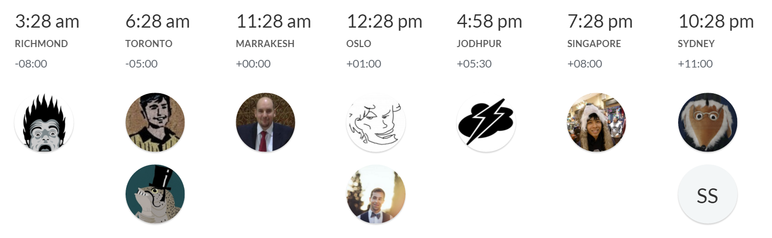
I would argue, quite strongly and at some length, that if you want better diversity in the field, perhaps a good starting point is not demanding that all your employees live within a tiny 30 mile radius of San Francisco or Palo Alto. There’s a whole wide world of Internet out there, full of amazing programmers at every level of talent and ability. Maybe broaden your horizons a little, even stretch said horizons outside the United States, if you can imagine such a thing.

I know hiring people is difficult, even with the very best of intentions and under ideal conditions, so I don’t mean to trivialize the challenge. I’ve recommended plenty of things in the past, a smorgasboard of approaches to try or leave on the table as you see fit:

… but the one thing I keep coming back to, that I believe has enduring value in almost all situations, is the audition project:

The most significant shift we’ve made is requiring every final candidate to work with us for three to eight weeks on a contract basis. Candidates do real tasks alongside the people they would actually be working with if they had the job. They can work at night or on weekends, so they don’t have to leave their current jobs; most spend 10 to 20 hours a week working with Automattic, although that’s flexible. (Some people take a week’s vacation in order to focus on the tryout, which is another viable option.) The goal is not to have them finish a product or do a set amount of work; it’s to allow us to quickly and efficiently assess whether this would be a mutually beneficial relationship. They can size up Automattic while we evaluate them.

What I like about audition projects:

  • It’s real, practical work.
  • They get paid. (Ask yourself who gets “paid” for a series of intensive interviews that lasts multiple days? Certainly not the candidate.)
  • It’s healthy to structure your work so that small projects like this can be taken on by outsiders. If you can’t onboard a potential hire, you probably can’t onboard a new hire very well either.
  • Interviews, no matter how much effort you put into them, are so hit and miss that the only way to figure out if someone is really going to work in a given position is to actually work with them.

Every company says they want to hire the best. Anyone who tells you they know how to do that is either lying to you or to themselves. But I can tell you this: the companies that really do hire the best people in the world certainly don’t accomplish that by hiring from the same tired playbook every other company in Silicon Valley uses.

Try different approaches. Expand your horizons. Look beyond People Like Us and imagine what the world of programming could look like in 10, 20 or even 50 years – and help us move there by hiring to make it so.

* And for the record, I really do rock at BASIC.

[advertisement] Building out your tech team? Stack Overflow Careers helps you hire from the largest community for programmers on the planet. We built our site with developers like you in mind.
Categories: Others, Programming Tags: