Google Photos, Google’s picture and video-sharing and storage service, has been upgraded to give users a bunch of new features aimed at improving ease of use. The changes affect both the desktop-web version and Android.
First up is what’s happening on desktop. Users who’ve been upset by Google Photos’ decision to abandon the Snapseed-based picture-editing tool of Google+ when Photos broke away from the faltering Google+ now have a reason to rejoice: the company has redesigned Photos’ editing tool, offering users more flexibility.
Previously, Google+ users had a fair answer to Adobe’s Photoshop when it came to the editing prowess of Google+’s Snapseed-based tool. While Snapseed is still around as an Android app, web users of Photos can now edit in a more practical way.
You’re now able to move between different images that you’re editing, and you won’t lose work completed. Photos will just save the changes, and, when you’ve finished making edits, you can click on either “Done” or “Revert to Original,” should you choose not to keep the changes.
A new aspect ratio selector brings more flexibility into the mix as well. It allows users to crop to four, distinct sizes: square, original size, 4:3 and 16:9.
Before these updates, Photos had some picture-editing options, but they were limited. For instance, you were able to manually change brightness and color and apply a few predefined filters. Images could be cropped, rotated vertically or horizontally, angled up to 45 degrees to the left or right. All of your changes could then be applied and permanently saved or discarded by returning the image to its original condition.
The company also announced on the same day design changes to its Android app. The biggest addition is the presence of a new bottom bar that makes switching between features like Assistant, new Albums and Photos a cinch. The end result: You can use more of your time to look at pictures instead of flipping between these menus. Even tapping your selections has been made more efficient due to the addition of bigger buttons at the top of the screen in Assistant.
Albums used to be known as Collections, a change made to reflect user feedback. Albums comes with a scrolling carousel on top that provides instant access to shared places, people, albums, device folders, movies, collages and animations. The company promises that these changes will be made available on iOS soon.
Earlier, these features were stashed off to the side in a sidebar, but the new interface means greater accessibility, as simply getting them right from the footer menu will be a boon to app navigation.
Initially, Google built Photos into the Google+ social network, but its failure to ever really find traction and begin competing with a powerhouse like Facebook caused the company to focus instead on Photos, leading it to be offered as a standalone service. With these new features, the company is certainly reinforcing its commitment to its picture and video-sharing and storage service.
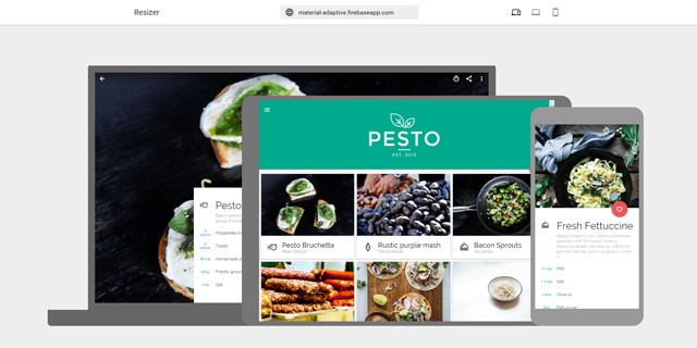
Thanks to plenty of types of mobile devices, contemporary websites need to be designed for different resolutions and orientations. However, to see how a site looks on a tablet, smartphone, or a standard monitor, it’s not necessary to have all devices ready at all times. Google Resizer is a handy web tool which will easily show you a website for many different types of devices and resolutions.
Enter Adress and Get Started
Using Google Resizer is as easy as it gets. Simply enter the address of the website that you want to test on responsitivity, and you’ll instantly receive a display of your site on the three standard device classes desktop, tablet, and smartphone. Via Iframe, the website appears in the resolution fitting to the respective device. This means that you can navigate through your site as usual and appropriately test each page.
Display on Desktop, Tablet and Smartphone at One Glance
Google has developed this tool specifically for its Material Design. It’s supposed to help web designers and developers test breakpoints, as well as responsive rosters on the different resolutions. But any other website, which is not based on Google’s Material Design can be tested on various devices via Google Resizer.
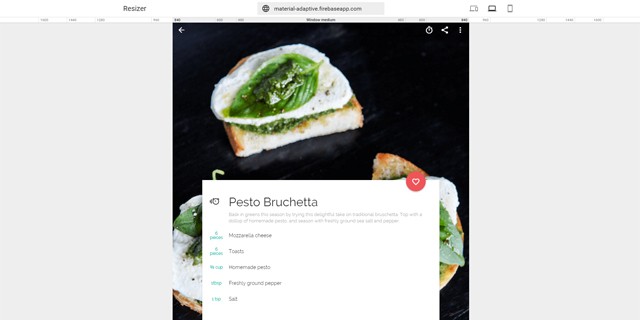
Considering Different Desktop Resolutions
Besides the joint display of all three devices, there are different pages for desktop and mobile device, respectively. A ruler with common resolutions is displayed for the desktop page. There are seven different widths to choose from, ranging from 1600 pixels to 480 pixels. A click on the ruler changes the resolution and adjusts your website accordingly.
Display on the Desktop With Different Breakpoints
This way, you can quickly see how your website reacts when it appears on larger or smaller monitors or browser sizes. The sizes are obtained from the guidelines of Google’s Material Design. There, seven breakpoints, which are named accordingly, are defined. Thus, there are different breakpoints between “Window xsmall” and “Window xlarge”.
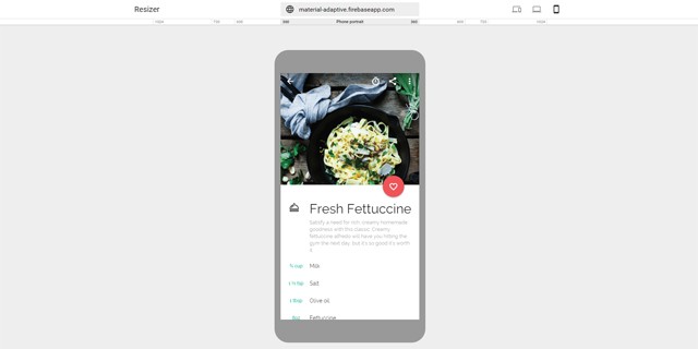
Testing for Mobile Devices
You can check how your website looks on smartphones and tablets on an own page. There, you’ll find another ruler with typical resolutions, in this case however; they are specifically used for smartphones and tablets.
This allows you to test your website on a standard smartphone with a resolution of 360 pixels in width.
Display on a Smartphone
Apart from the screen in portrait mode, Google Resizer also offers the respective landscape mode. The largest available resolution is 1024 pixels wide, which is the resolution of a conventional tablet.
Using Developer Tools or Google Resizer
Most web developers should be used to the developer tools available in Chrome and Firefox, for example. These are also options to test your website for different resolutions. Additionally, the developer tools allow you to simulate touch displays, and to test a programmed gesture control directly at the desktop.
(Unfortunately,) Google Resizer can only test responsive designs, which usually is not enough for an extensive website test. Nonetheless, Google Resizer is an excellent tool to present a website’s responsive design to clients. The tool also eases the cooperation with designers that don’t have the necessary knowledge of developer tools, as Google Resizer is clear and easy to operate.
When it comes to “only” checking a responsive web layout on its correct display, or to present it, Google Resizer is a good and fast option.
(dpe)
* You might also be interested in the following articles
Our objects are becoming increasingly connected. My watch is connected to my phone, which is connected to the speaker in my living room, which I can also connect (or not) to the speaker in my bedroom. When I go out to dinner with friends, we have to make a concerted effort to keep our handheld and wearable devices silenced or otherwise placed “in the background” of our social experience, so that we can focus on each other.
As our artifacts and everything around us become more connected, we run the risk as humans of becoming increasingly disconnected from each other — not in a tragic, dystopian kind of way per se, but in a real way that we need to take into consideration when designing for these experiences. We have a responsibility as interaction designers and user experience researchers to consider the ways in which we create interfaces for everyday experiences in the home, at school, out and about, and with our trusted advisors such as financial planners, doctors and educators.
It is hard work. Harder than you might think but design is very powerful.
Keith Miller, ESPN’s Art Director of Digital Media
The World of Sports and Graphic Design are irreversibly linked. Where would the NFL, or the NBA be without their iconic logos, which rank in some of the highest national brand recognitions. In the space of sports media, no brand comes to mind quicker than ESPN. Keith Miller is a man driven to bring these two industries closer together.
Sports and technology, including graphic design and UX, are the two passions one can derive from examining Keith’s career. Keith’s contributions to Yahoo! as a Senior Designer helped lead his team in driving Yahoo!’s sports brand in innovation, passing global sports brand leader ESPN, as the most trafficked sports site in 2006. For a little more than five years, Keith Miller lead the charge in the innovation and dedication, and saw the coming trend of fantasy sports.
Leaving Yahoo in May of 2009, Keith joined Fastpoint Games as their creative director, where he worked to provide a better solution to online fantasy sports. Keith was only there for two crucial years before an old rival came calling. This time, however, as an employer. Keith joined ESPN, where he became a leading member of their UX design staff, setting himself apart with a distinguished production legacy. He would leave this all behind after three and a half years, joining Amazon’s team where he worked tirelessly to contribute, develop, and maintain a system that could help their customers by anticipating their needs before they even thought about it.
Brilliant Design- In Action
Though a brief tenure was in the cards for Keith at Amazon, Keith returned to ESPN, this time to take the prestigious position as Art Director for Digital Media. A trailblazing pioneer, Keith Miller found time to go over his feeling about the design industry and it’s future.
What’s you opinion on the current trends?
As a designer classically trained in graphic design specifically the swiss style I was always taught to strive for a balance between simplicity and beauty when designing. The fundamentals we were taught were based on the Basel school in Switzerland. With a strong emphasis on typography, gestalt psychology, where the sum of the parts equals the whole, and reductive drawing it was all about visual communication in the most direct and beautiful way. It is for this reason that I am encouraged by the simplicity and beauty of using flat design and basing design off of real work physics and materials in material design. Google has created a visual language that continues to unify its products in meaningful ways. I believe Immersive Design is also a powerful tool for creating meaningful experiences where appropriate especially in the TV space and emerging technologies such as V.R. My opinion on the current trends is that we are headed in the right direction. Gone are the days of skeuomorphic software design. As the world speeds up Responsive and flat design has been born out of necessity to simplify and unify.
Why has it taken so long for mobile optimization to become an important factor, and push for more than just integration? With mobile technology growing every year, when will we see a unified design “language”?
The collective ‘everyone’ seems to generally resist change because change requires a certain level of investment. But what was once a group of outliers pushing mobile first has now become the obvious business strategy because the growth has exploded. More people have greater regular access to more types of devices. The Material Design team at Google has done an excellent job designing a new language and structuring the new language in a presentation which allows it to be easily learned. Apple is doing the same thing with iOS and I feel these are the two leading design languages that we have right now. We may never be able to have one but two is far greater than twenty.
Where do you see the industry’s direction going towards?
I definitely see mobile first and even phone first being the strategy that continues to grow. There have been debates as it grows around Native apps vs. Web views. Both approaches have benefits and drawbacks. Native apps take more time to design and implement but provide a richer experience and allow us to leverage the device toolkits and OS. Web views are much easier and faster to implement because the code can be HTML5 and CSS. But Web views are somewhat limited. The are lightweight but not as flexible.
Photo by Rich Arden / ESPN Images
What trends do you hope to see more of and continued to be developed upon?
I hope to see Material Design spread and the design language to continue to become more agnostic to the platforms people use. I hope to see continued synthesis between content and design when it comes to video and direct to consumer experiences as well as a style that is expressive but simple. Apple TV, Snapchat, Facebook but also Lifestyle design. I.E. in home, in auto digital integration. On the opposite side It is also a breath of fresh air when I see design that is well crafted in the physical world. Print design still has a place.
What would you like to tell someone who is just starting, or have a desire to start getting into design?
It is hard work. Harder than you might think but design is very powerful. Try to learn to be a ethical and responsible designer. Avoid the eye candy, unless it’s appropriate, and always ask why. Learn to learn quickly. The most successful designers become experts in the subject matter of the problems they are trying to solve for their clients.
What one Sci-Fi technology would you want to have right now, and what would you do with it?
I think I would like to have a Virtual Reality technology in my house. Imagine the freedom to be creative in any environment you choose with easy access. I think of Tony Stark in IronMan breaking technology down deconstructing and innovating and creating new technology. It’s an amazing prospect of an idea.
If you could give the person you were when you began on your career one piece of advice, what would you tell yourself?
One thing I would tell myself is don’t stress. Work hard but have fun too. Keep up with drawing and playing the guitar as creative outlets. I guess its never too late to pick those backup.
It is hard work. Harder than you might think but design is very powerful.
Keith Miller, ESPN’s Art Director of Digital Media
The World of Sports and Graphic Design are irreversibly linked. Where would the NFL, or the NBA be without their iconic logos, which rank in some of the highest national brand recognitions. In the space of sports media, no brand comes to mind quicker than ESPN. Keith Miller is a man driven to bring these two industries closer together.
Sports and technology, including graphic design and UX, are the two passions one can derive from examining Keith’s career. Keith’s contributions to Yahoo! as a Senior Designer helped lead his team in driving Yahoo!’s sports brand in innovation, passing global sports brand leader ESPN, as the most trafficked sports site in 2006. For a little more than five years, Keith Miller lead the charge in the innovation and dedication, and saw the coming trend of fantasy sports.
Leaving Yahoo in May of 2009, Keith joined Fastpoint Games as their creative director, where he worked to provide a better solution to online fantasy sports. Keith was only there for two crucial years before an old rival came calling. This time, however, as an employer. Keith joined ESPN, where he became a leading member of their UX design staff, setting himself apart with a distinguished production legacy. He would leave this all behind after three and a half years, joining Amazon’s team where he worked tirelessly to contribute, develop, and maintain a system that could help their customers by anticipating their needs before they even thought about it.
Though a brief tenure was in the cards for Keith at Amazon, Keith returned to ESPN, this time to take the prestigious position as Art Director for Digital Media. A trailblazing pioneer, Keith Miller found time to go over his feeling about the design industry and it’s future.
What’s you opinion on the current trends?
As a designer classically trained in graphic design specifically the swiss style I was always taught to strive for a balance between simplicity and beauty when designing. The fundamentals we were taught were based on the Basel school in Switzerland. With a strong emphasis on typography, gestalt psychology, where the sum of the parts equals the whole, and reductive drawing it was all about visual communication in the most direct and beautiful way. It is for this reason that I am encouraged by the simplicity and beauty of using flat design and basing design off of real work physics and materials in material design. Google has created a visual language that continues to unify its products in meaningful ways. I believe Immersive Design is also a powerful tool for creating meaningful experiences where appropriate especially in the TV space and emerging technologies such as V.R. My opinion on the current trends is that we are headed in the right direction. Gone are the days of skeuomorphic software design. As the world speeds up Responsive and flat design has been born out of necessity to simplify and unify.
Why has it taken so long for mobile optimization to become an important factor, and push for more than just integration? With mobile technology growing every year, when will we see a unified design “language”?
The collective ‘everyone’ seems to generally resist change because change requires a certain level of investment. But what was once a group of outliers pushing mobile first has now become the obvious business strategy because the growth has exploded. More people have greater regular access to more types of devices. The Material Design team at Google has done an excellent job designing a new language and structuring the new language in a presentation which allows it to be easily learned. Apple is doing the same thing with iOS and I feel these are the two leading design languages that we have right now. We may never be able to have one but two is far greater than twenty.
Where do you see the industry’s direction going towards?
I definitely see mobile first and even phone first being the strategy that continues to grow. There have been debates as it grows around Native apps vs. Web views. Both approaches have benefits and drawbacks. Native apps take more time to design and implement but provide a richer experience and allow us to leverage the device toolkits and OS. Web views are much easier and faster to implement because the code can be HTML5 and CSS. But Web views are somewhat limited. The are lightweight but not as flexible.
What trends do you hope to see more of and continued to be developed upon?
I hope to see Material Design spread and the design language to continue to become more agnostic to the platforms people use. I hope to see continued synthesis between content and design when it comes to video and direct to consumer experiences as well as a style that is expressive but simple. Apple TV, Snapchat, Facebook but also Lifestyle design. I.E. in home, in auto digital integration. On the opposite side It is also a breath of fresh air when I see design that is well crafted in the physical world. Print design still has a place.
What would you like to tell someone who is just starting, or have a desire to start getting into design?
It is hard work. Harder than you might think but design is very powerful. Try to learn to be a ethical and responsible designer. Avoid the eye candy, unless it’s appropriate, and always ask why. Learn to learn quickly. The most successful designers become experts in the subject matter of the problems they are trying to solve for their clients.
What one Sci-Fi technology would you want to have right now, and what would you do with it?
I think I would like to have a Virtual Reality technology in my house. Imagine the freedom to be creative in any environment you choose with easy access. I think of Tony Stark in IronMan breaking technology down deconstructing and innovating and creating new technology. It’s an amazing prospect of an idea.
If you could give the person you were when you began on your career one piece of advice, what would you tell yourself?
One thing I would tell myself is don’t stress. Work hard but have fun too. Keep up with drawing and playing the guitar as creative outlets. I guess its never too late to pick those backup.
Among all the types of fonts existing today, handwritten fonts are one of the most useful and multipurpose. Depending on the task you have, you may use handwritten fonts almost everywhere. Finding the right match for a particular project you have is always a difficult time-consuming deal, so we decided to help you out with this.
Here I put together 20 amazing handwritten fonts to use in your future designs. All these fonts are completely free to download so go nuts!
Sketch 3.6 is already here, and it comes with better text rendering and SVG improvements. This update is free for existing Sketch users, so yeah, you have no reason not to download it.
But just in case you are wondering what can Sketch 3.6 do for you, well, here it is!
Sketch 3.6 now comes with better rendering for text layers — when you add a text layer, the line height is now automatically adjusted. You can also set the character spacing to auto — this is allow the font’s native kerning to be applied. Definitely a handy feature when you want automatically adjusted spacing for your text layers!
Furthermore, you can now create Masks in a more intuitive manner. Sketch 3.6 also comes with better SVG handling. Consider this:
Sketch now exports much more compact SVG files, by doing away with unnecessary prefixes. In addition, SVG importing and exporting now supports blend modes and includes shadows on groups when exporting.
Even more so:
You will notice better performance when zooming, scrolling, and moving shapes and Artboards in the Canvas. This is especially true when using large documents or when working with an external display. This update also boosts general drawing performance and reduces CPU power consumption.
High-DPI images are now automatically scaled down to a logical size.
Sketch 3.6 also offers many bug fixes and other minor tweaks. It requires Mac OS 10.10 or higher to run.
What do you think of Sketch 3.6? Share your views in the comments below.
The most inspirational things are often right in front of us. It might be the typography on a book cover, the colors of your favorite music album, the opening titles in that movie you saw yesterday. To celebrate all those little moments of inspiration, we have compiled some resources for you which honor the beauty of graphic design and the ideas behind it. Perfect to squeeze into a short coffee break. Enjoy!
We learned not to judge a book by its cover, but, honestly, there is nothing quite like browsing through a bookstore, soaking up covers, their colors, their typefaces, their layouts, every little detail. The variety is endless, and sometimes you’re lucky and find a little piece of art shining through the sheer mass.
One of the biggest clashes in design has been the question of whether to strip down your landing page to the point where it’s so minimal that it has no navigation at all. Proponents argue that the only thing on a landing page should be the call to action button, so as to eliminate all distractions and increase conversions; opponents will say that’s too extreme. So how do designers know what the best course of action is when it comes to landing page design?
In general, your landing page should absolutely be as minimal as you can make it because distractions (ie. anything that takes users and leads away from your page goal) will cost your site money.
Remove navigation
One of the reasons this discussion still exists today is the fact that many landing pages still have navigation bars, sad to say. Just 16% of all landing pages are free of navigation, which is alarming because of all the lost conversion opportunities. Designers who include navigation on their landing pages aren’t looking out for the best interests of their clients.
If you happen to have a client who insists on navigation on the site’s landing page, it’s your job as the designer to educate him. Point him to numerous studies like this one, backed by hard data, that show that taking navigation away from a landing page increases conversion rates. This is true for any type of content that the page is offering, from free trials and demos to ebook templates and content-creation kits.
Sure, your client may push back because of various reasons such as disbelieving the data, branding (company logo on the navigation menu), or refusing to prioritize the importance of removing the navigation on a landing page. In all these situations, gently persuade your client by consistently impressing him with case study after case study:
The Light Phone site gives you two simple options: pre-order, or scroll for more information.
Drop stock images
With the navigation menu gone, the next thing on your list to ax is stock images. These dreaded and generic nightmares that celebrate insincerity will hurt your clients’ conversion rates, too. Stock images fail to inspire trust on a landing page because it’s almost like a business concealing who’s behind it.
So on your landing page, be sure to use real images of the people behind the product or service, as nothing inspires conversions like credibility.
Further, be sure to place images on top of the landing page headline. This is highly important, as marketing guru David Ogilvy himself found when he conducted research, headlines underneath images are read by 10% more viewers. Of course, when more people read your page’s headline, more continue reading down the page.
Now that you have images under control, you have to make your page’s flow work its way toward the all-important call to action button.
Irving Farm’s site uses real photographs to pack the site with the company’s brand personality.
Focus on calls to action
One of the hardest things to possibly design on a landing page is the call to action button. It requires a lot of thought and consideration because it is the star of your page, the whole reason it exists. If your page flow and information architecture make your offer persuasive and clear, then visitors should have no problem clicking on the button.
There are a couple of things to get right.
First, there’s the color: it should feature good color contrast so that your visitors can easily find and click it.
Then, there’s the size: it has to be big enough to be easily read.
You can also add a directional cue next to the button to make it all the harder to miss.
Don’t neglect the button copy. It should be persuasive and use a sense of urgency. This means using action-based words like “hurry,” which is also one of the most persuasive words in the English language, and “now,” which also speaks of urgency.
Google’s Jigsaw delivers a very clear call to action.
Downplay other links
We spoke of eliminating the navigation menu from the very beginning of this article, yet the goal of a high-converting and successful, landing-page design should involve getting rid of as many links as possible. When you remove the navigation, there may still be other links on the page that you need to deal with to make the page as much of a single-action environment as possible and support your conversion funnel.
Another clever tactic is to make any necessary links as unnoticeable as possible. After all, the fewer links on the page, the fewer elements will compete for your clients’ leads’ attention on the page. And when there are fewer distractions, there are greater chances for conversions.
Charles Haggas’ site prompts you to hire him; nothing else on the site matters as much.
Minimalism and conversion rates
Designers should always keep in mind that they’re designing for consumer psychology when they’re designing for landing pages. Many studies have been done that prove how consumers are simply overwhelmed and experience decision-making problems when faced with too many choices. The notorious jam experiment of a few years ago springs to mind; in it, people bought less jam from a table with more jam choices than the table with fewer choices.
Thus is the case with landing pages as well. When your clients’ leads arrive on your landing page and are greeted with way too many links and a navigation menu, they’re likely to go elsewhere and fail to complete the conversion. Combine that with horrible stock images and poorly designed call to action buttons, and you’ve designed a low-converting disaster for your client.
That’s why you have to think minimalism when designing your landing page. From the initial conception to the wireframe to the final testing, the landing page you design must have few choices so to only emphasize to visitors and leads the one and only goal of the entire page: to convert by clicking on the product or service offered. And that’s it!
Before this new CSS I’m about to introduce existed, locking an element into the viewport on scroll required rigging up some JavaScript. As you may know, JavaScript has a well-earned reputation to be tricky when paired with scrolling behavior.
The new CSS Scroll Snap Points spec promises to help, allowing for this kind of behavior using very few lines of CSS.
As happens with very new web tech, this spec has changed over time. There is “old” and “new” properties and values. It’s promising though, as supporthas shot up quickly. I’ll teach you how to get the widest support in this in-between stage.
Polyfilled Demo
The demo below has horizontal scrolling. It’s responsive: each “panel” is the width and height of the viewport (thanks to vh and vw units).
It uses a polyfill, but in order to use it (and support is still low enough that I suggest you do), you have to support the “old” values, which is why I’ll cover them, too.
If you’re looking in Firefox: it has the best current support, so you can mostly clearly see how the native behavior looks and feels.
If you’re looking Chrome or Opera: don’t have any support, so any behavior you notice in those browsers can be attributed to the polyfill entirely.
If you’re looking in Edge or IE: it probably won’t work at all. These browsers have partial support, but apparently not enough to make this work.
If you’re looking on a mobile device: iOS 9 supports it (tested on an iPhone 6), but I’ve seen the easing behavior act pretty weird. No Chrome/Android support, but the polyfill kicks in and handles it pretty well (tested on a Android Nexus 6).
Note I’m using Autoprefixer in the Pen to automatically give me all the necessary vendor prefixed properties.
Pretty slim! Let’s break down these properties one by one.
Current CSS Scroll Snap Properties
scroll-snap-type
scroll-snap-type: none | mandatory | proximity;
A mandatory value is what you might think it would mean: that the element must come to rest on a snap point even when there are no active scrolling actions taken. If content is somehow modified or updated, the page finds the snap point again.
The proximity value is close to mandatory, but less strict. If the browser changes in size or content is added, it may or may not find the snap point again, depending on how close to a snap point it is.
From what I’ve seen playing around with this, mandatory is more commonly supported in browsers at this time with more consistent behavior.
scroll-snap-align
scroll-snap-align: [none | start | end | center] [none | start | end | center];
This property refers to how an element’s scroll snap margin aligns with its parent scroll container. It uses two values, x and y, and if you only use one value it will be read as shorthand and repeated for both values (sort of like padding where padding: 10px; equals padding: 10px 10px 10px 10px;). This property isn’t animatable.
scroll-snap-padding
scroll-snap-padding: <length> | <percentage>;
This property relates to the scroll container in the visual viewport. It works much like normal padding, with the same kind of value order. For example, scroll-snap-padding: 75px 0 0; would be top padding of 75px and all others 0. This property is animatable, so if you need to move scroll snap align, this would be a good way to do so.
Older CSS Scroll Snap Properties
As mentioned, the spec has been changing rapidly in the past year and there are already properties that are considered outdated, though are still good to know from a legacy support standpoint.
scroll-snap-points
scroll-snap-points-<x or y>: none | repeat(<length>);
scroll-snap-point addresses the axis that is the direction of the scroll. In the first Pen we saw, this property is set on the x axis. Here, we have it on the y axis (since it’s a vertical scroll) using scroll-snap-points-y: repeat(100%); The percentages refer to the padding box of whatever you’ve defined as the scroll container.
This property and scroll-snap-coordinate are very similar as far as values go. Where scroll-snap-destination refers to the parent element, scroll-snap-coordinate refers to the element itself. You might only need scroll-snap-destination to be specified if the snapping point is specified purely by the element rather than the container it sits in.
scroll-snap-destination: <position>;
This property allows you to specify at what point in the viewport the scroll should snap. For instance, say you want to cheat out your content by 100px so that two one panel is teased to one side of the other. The diagram below shows how it the scroll snap destination will allow you to easily adjust this parameter.
When defined as a percentage, the point is relative to the width and height of the scroll container.
scroll-snap-coordinate
Scroll-snap-coordinate: none | <position>;
This property allows you to specify where the scroll should snap to an element. The position amount refers to the element’s border box. You might not need it unless you’re doing something pretty fancy. scroll-snap-coordinate is the only value that can apply to all elements on the page, all other scroll snap properties apply only to scroll containers.
These last two properties, scroll-snap-destination and scroll-snap-coordinate are animatable properties, while scroll-snap-type and scroll-snap-points — are not — which makes sense.
At the time of this post, the spec was updated about a month ago and is still moving. Support isn’t ubiquitous yet, but even if you have to account for the older values that the polyfill requires, the code to make this work is small and sweet. It’s incredibly fun to see what’s coming up in CSS, and if you run experiments, by all means let the spec authors know what you’re doing and what you find—it does affect what they work on. I’m still on the fence about using something like this in production yet. It would depend on how willing you are to iterate on that code if things change around in the future. In the meantime, though, the polyfill performs pretty well and it’s exciting to see this kind of thing land in CSS.


