Archive

Archive for March, 2016

Five Web Design Business Owners Share Which WP Theme Makes Their Enterprise More Lucrative and Why!

March 23rd, 2016 No comments
featured

Whether you’re starting your own web design agency, digital marketing company, business consulting firm, or a mixture of the three, your website building technology of choice is going to play a key role in running a lucrative business! So, what do you really need from your business WordPress theme of choice? We brought together five seasoned professionals with over 20 years of experience in SEO optimization, digital marketing, web design, and scaling businesses to share with you exactly what to look for when theme shopping!

Trent and Kristen Blizzard
co-founders of BlizzardPress
Colorado, USA

Trent and Kristen Blizzard are co-founders of BlizzardPress, an agency dedicated to helping small enterprises based in Western Colorado scale their businesses with targeted social media marketing, impeccable website design, organic search engine optimization, and over 15 years of professional experience in the marketing sector.

curtis

Curtis Hays
Founder at Curtis Hays Consulting
Michigan, USA

Curtis Hays who brings over 15 years of experience in the web design and marketing industry is founder of Curtis Hays Consulting, an agency based in Michigan, USA which focuses delivering search marketing, conversion rate optimization and other digital services.

micah

Micah Blumenthal
Founder at CIX Designs
New York, USA

Micah Blumenthal from New York, USA is founder of CIX Designs which specializes in Graphic Design, Web Design, Photography, and Branding for a wide range of local organizations and community projects looking to expand their outreach.

jose

José Rosado
Freelancer
Dominican Republic

José Rosado is a graphic and web designer from the Dominican Republic. José has spearheaded web design projects across a broad range of sectors for clients from all professional backgrounds and countries while also running a nonprofit organization, The Music Corner, in the DR which promotes music education for children.

Find the business WordPress theme that fits every sector

Most likely your clients aren’t from just one sector or background. Even if they are, they may be at varied stages of growth and will probably have completely different visions for what they want their site to look like. This makes it absolutely necessary to find a WordPress theme that you can use for a variety of different sectors repeatedly without having any one site identical to the other. What that also means for you is that instead of keeping track of numerous themes you’re using, which can be much more work-intensive, you’ll have just one WordPress theme at the core of all of your products. Here, our guests share with us the scope of businesses they work with and how versatility ended up being the most important feature of their theme.

templates

Kristen & Trent: We use Jupiter across the board – professional services, public services, local retailers, nonprofits and companies that are either just emerging or are well-established and want to revamp their website. Out of the box, Jupiter’s functionality set is very comprehensive. Without adding too many plugins, businesses can display beautiful visuals and organize data in a way that makes sense and is easy to manage.

Jose: I work with people and companies from all over the place. Lawyers, nonprofit organization, pastry shops, artists, private firms—actually I made my own site for the music organization The Music Corner which my wife and I founded. I was able to make completely different sites that perfectly reflected each of my client’s vision using Artbees Themes. The Jupiter’s just really flexible and makes my work a lot easier.

Curtis: I’m usually working with both emerging companies and companies that already have a foundation and are just looking to revamp their site. In both cases, each company wants to increase their return on investment and online marketing presence. The Jupiter allows me to work toward that goal while catering to all of them with ease

Micah: I am pretty community-driven and prefer to do web and graphic design for local businesses, nonprofits, NGOs, artists, educational programs and projects so I needed a theme that would allow me to capture the spirit of each of those ventures. The Jupiter has the broad capability coupled with the aesthetic that helps put these types of institutions which usually have less sophisticated sites on par with the latest trends and updates.

Make sure your WP theme is easy to use for your clients

A great selling point for your business is the capability you can give your clients to join the website design process. Find a WordPress theme that will allow your customers to have a bigger role in the construction and design of their website and that empowers them to edit and modify content themselves in the future. Yes, even for your most technically challenged customers, there are business WordPress themes out there that are easy to learn. Here, our guests describe first hand how this dual ownership can be a win win for both you and your client:

3

Kristen & Trent: The Jupiter interface is very simple which makes our customers feel comfortable managing or updating any part of their site on their own. We’re aware that they don’t want to have to call their web developer every time they have a small change so I think that using something like Jupiter allows for that kind of client versatility as well versus the custom theme route where they have to call somebody every time they want to change something.

Micah: When you decide to use a WordPress theme, you’re saying that this whole framework is in somebody else’s hands so if that theme developer abandons that theme and starts working on another theme, then you’re stuck beholden to somebody else’s work with no way out. My customers are relieved and delighted when they learn that they can easily learn how to edit and play around with the website I’ve created for them without having to solely rely on me.

Jose: Well actually one great example of how easy the Jupiter is to use for people of all different skill levels is from a few months ago when I was working with a non profit organization that works with people in their 60s and 70s and not familiar with web design at all! I had to train them and surprisingly they had no problem learning the interface! This showed me that the Jupiter is able to remain accessible to everyone while creating sophisticated, high-speed products!

Pick a theme that increases conversion rate, user engagement and overall ROI

Your goal is pretty straight forward. Help your customers share their story, expand their outreach and increase their conversion rates! This means you’ll want a business WordPress theme that has fast loading times and easy to edit features that let you tailor-make a site that fits your client’s target market and increases their ROI. Our guests explain how this can greatly impact profits for you and your customers:

jupiter-business-wordpress-theme-mockupzone-comparisonCurtis: Speed has been a huge factor in obtaining high conversion rates and I’ve seen across the board that most sites have dropped their load times literally in half with the Jupiter. That’s going to help improve rankings because it’s going to keep the user on the site, lower bounce rates and get them converted! Especially in our business, we aim to get visitors on the site, get them to what they’re look for quickly and then convert them.

Kristen & Trent: For us, Jupiter makes life more profitable thanks to the efficiency of using the same theme environment with versatile tools. We’re able to deliver modern sites with varied designs and high functionality for a reasonable cost to the client. The price of the Jupiter theme coupled with the time we save using it allows us to offer more competitive pricing that always surprises our customers!

Make sure your WordPress theme has a reputation for its extensive Support

Sure, having a business WordPress theme that rarely forces you to call Support is ideal, though when you do need help, you want one to one around the clock Support for you and your customers. Equally important, you want a Support team that is responsive to your feedback and that is constantly updating your theme with the latest trends and technology. Our experts point out just how important it is to have a solid Support team:

support

Curtis: Artbees Support has always been great. The documentation is really well done and the great thing about Artbees Support is that they’re always responsive and I pretty much see an update to Jupiter come into Envato about every two weeks. When other developers ask me what themes to use for their clients I always point to Jupiter first because it’s always being updated, I know Artbees hasn’t abandoned that theme and it’s a theme developers can stick with for a long time.

Jose: Actually so far with Artbees Themes I haven’t even had to contact their Support so that’s already a testament to their product by itself. What I would emphasize for other web designers is that finding a theme that has a legacy of constant support and a long-term commitment to continuously improving and updating the theme is a rarity and will save you a lot of time and money in the long-run!

Find one business WordPress theme that has it all!

Work with a business WordPress theme that already includes some of the most popular plugins and widgets in the market and also allows you to easily add extra plugins you may want without compromising the site’s loading speed. As you’ll learn from our web design business veterans, working with a business WordPress theme that comes fully equipped will save you the hassle of adding features yourself and save your final product from being over bloated and slow.

jupiter-v5

K & T: In Jupiter, functionality is already built in as it comes ready to enable if you need to use plugins like Yost or GravityForms. This along with many included plugins or widgets – SEO, Forms, Anti-Spam, Analytics – tend to be enough to cover most business needs. Oftentimes with Jupiter we don’t even have to use a lot of additional plugins because they’re so many core features already built into it while staying really light, not bloated and running quickly!

Micah: Well, the template demos themselves are a really big help to give me different creative ideas of what I can do with the Jupiter and what I’ve found is that I can create over 50 websites and have them all look completely different from one another. The variety of templates combined with the different combinations of shortcodes and post-types you can use guarantee an unlimited space for creativity and, honestly, for you as a developer, it gives you more playspace to have fun. From a cost-effective standpoint, having this all in one business WordPress theme saves me time because it reduces my own learning curve not having to be an expert in 10 different themes and allows me to build beautiful sites quickly!

The next step toward a more efficient, productive and profitable business

As a business owner the question you’re probably always asking yourself is how you can improve your services and products for your customers in a more efficient, cost-effective manner. We’ve shared with you the seasoned experience of five individuals whose expertise range across many branches of the web design sector in the hopes of providing for you some insights and first-hand knowledge on how you can use one business WordPress theme to dramatically increase your business’ overall capacity. Using a tool that is as versatile, easy-to-use and results-oriented as the Jupiter WordPress theme can transform your workflow and enable you to create top-notch websites in a timely manner. Take advantage of what can be a great mutual benefit to you and your customers and find out what you’re capable of when you have the right theme behind you.

Read More at Five Web Design Business Owners Share Which WP Theme Makes Their Enterprise More Lucrative and Why!

Categories: Designing, Others Tags:

Receive your custom-written essay today!

March 23rd, 2016 No comments

Receive your custom-written essay today!

Thank-you for visiting with on your custom dissertation writing needs. Whether you need publishing jobs done to your senior school class or school program, we’ve the skilled writers who can obtain the job done to the specs you’ll need. We understand that you have several choices when you’re looking for composition writers online, so we’re happy that you just have picked to work well with our authors. If you order an article from us, you not only get yourself a task accomplished by our experienced and qualified writers, but you also obtain a significant number of added advantages, also. Why we are the most effective 100% Discretion Billing information and your own personal is held private. Experienced authors that were instructional Skilled organization writers for hire & academic. 24/7 support Contact our team time or night. Critical/Overnight shipping Making powerful documents in 3 hours or less. Specialists in every academic areas Regardless of your paper subject, we are able to manage it. 100% Custom reports All documents are tailormade and initial. Contact our Customer Care Office If you are not unready to use our article publishing companies, the first step entails calling our customer service office. We’re open to help you 24-hours daily and seven days each week because we are alert to the long hours today that pupils keep. Our customerservice professionals will request you queries about the project and they’ll compile a summary of writers who are skilled inside your assignment’s curricular area. This enables us to make essays that include the right info, too, although not just tailored essays. Work Immediately with Your Personal Writer We will send the info for your own author to you after you pick your own university composition authors. This enables you and your author to talk directly so the piece may include your special requirements as well as your voice. The writer you choose wil craft your customized documents just for you, totally from damage. Our writers work hard to make certain http://courseworkservice.com/coursework-help the customer, you, never has to bother about any issues regarding plagiarism. This can be just one of our rewards that accompany your purchase. Article from Scratch and Free Updates If an article published completely from-scratch isn’t enough to get you to pick for your composition writing needs, we’ve benefits that are different, also. Every essay writing project includes alterations that are free. We’re conscious that lots of class instructors enable their pupils with an chance ahead of the final level is granted, edit and to revise their reports. As a way to ensure one’s paper’s style stays constant, revisions that are free are provided by us. Your writer may cheerfully make the changes that are mandatory to help you earn the very best level possible on your task. Meeting Your Deadlines Easily Another useful benefit that we offer will be the ability to match all deadlines. Whether you contact us days ahead of time to engage composition authors online one night or you supply us, we could complete tasks of all sizes. Take into account the additional time we’ve, the more venture we could do about the project with you. Nonetheless, because we are staffed 24/7, we always have authors available for deadlines that are tight. Your custom school dissertation is essential to us.

The post Receive your custom-written essay today! appeared first on Visual Swirl Design Resources.

Categories: Designing, Others Tags:

Some of The Difficulties In Enhancing A Thesis On Enterprise

March 23rd, 2016 No comments

Some of The Difficulties In Enhancing A Thesis On Enterprise

These days possessing fantastic company writing competencies is nearly as crucial as getting an experienced in your sector. Business crafting expertise are necessary for producing stories, resumes, company letters and naturally, application letters. Any time you utilize for just a position, the primary thing your employer sees is your resume cover letter. Whether it is prepared within a poor fashion, with blunders and uncertain concepts, you are going to in all probability in no way be invited to an interview. Needless to say, should you lookup the online you’ll discover numberless software letter samples and create your personal letter by rewriting them. But this is simply not the proper issue to try and do, since in that situation your letter won’t really convey who that you are and may be very poor and uncertain. If you publish your personal letter inside your very own way, making use of specified enterprise creating abilities, you’ll show oneself like a professional and draw the readers’ consideration and people will need to meet you. So, exactly what does it take to write down a killing software letter? Examine out the subsequent suggestions, which can be certain to make it easier to. 1st of all, any time you sit down to put in writing an application letter, assume of why you happen to be crafting it. Make the primary level of one’s letter apparent on the reader. Just commence with all the cause why you might be producing. Recall concerning the folks who are going to read through your letter. That is like advertising and marketing: feel of the things they need to get from you, what is going to make them interested, what are their anticipations. Compose with regard to the advantages the employers will get if they employ the service of you. But not surprisingly, every little thing you publish should be truthful. Feel on the inquiries which will crop up inside the reader, and give solutions to them. How would you talk, if the human being you’re creating to was standing in front of you? Compose just the same way. Really do not generate abstractly. Write your letter inside a plain design, continue to keep it basic. Never use fancy words and phrases and lengthy tangled sentences and other people will appreciate it. Hold it small, really do not use phrases which don’t include this means in your letter. You may need truly handful of terms to precise your main thought, and www.assignmenthelponline.co.uk that is what exactly the reader desires. Also publish in active voice, it is additional organic and other people will comprehend you far better this way. Once you have leisure time, compose application letters to on your own. Then read through them and decide, are you enthusiastic about that man or woman? Do you like him? Did he respond to all your questions? This exercise is fun, and it’ll enable you to transform your business writing capabilities. Thinking about operating abroad? There are many roadways to a world career. A single street to contemplate is definitely the Global MBA. This is the graduate small business college program that offers research or perform expertise overseas as portion of its academic plan. Method choices, formats, and curriculums for future pupils are really diverse and rely on students’ pursuits. Wish to seek the advice of in China? Need to analyze in London? There is certainly adequate selection to sate any desire. While using the growing value of world influence on day by day residing, worldwide practical experience is a occupation booster. These packages develop good cross-cultural experience inside their individuals. More and more, together with the quantities of personnel from diverse cultural backgrounds, U.S. corporations begin to see the need to have for administrators with sensitivities to, knowledge with, and functional knowledge in interacting with diverse cultures. Grads can anticipate to work as “purchasing agents, HR administrators, provide chain mangers, corporate methods professionals, contact middle administrators, management analysts or major executives.” To qualify for the international MBA system, you very first ought to fulfill the organization school’s entrance demands. The fundamental demands involve an undergraduate diploma, acceptable GMAT scores, and an curiosity in worldwide cultures along with a motivation for your organization or finance occupation. Then, GMBA college students can examine worldwide politics, non- governmental businesses, take part as consultants and complete small business reports as component in their training. GMBA courses can be in a traditional location or on the web via digital lecture rooms. Salaries for world wide MBAs regular about very low $60,000s. Genuine setting up salaries and salaries for profession grads on the whole, depend on the placement, enterprise, field, and placement. Traits present that global small business grads fare much better than frequent MBA graduates. It truly is a chance to learn various cultures and even now achieve useful, worldwide enterprise techniques.

The post Some of The Difficulties In Enhancing A Thesis On Enterprise appeared first on Visual Swirl Design Resources.

Categories: Designing, Others Tags:

9 essential rules for responsive image galleries

March 23rd, 2016 No comments

Responsive design is an essential and necessary part of web development. One of the biggest issues with responsive web design as of late has been images. Many debate the best way to display images on a responsive site. And then, what about image galleries?

Image galleries feature far more complexity than single images; there are even more variables and things to think about when implementing entire responsive image galleries on your website. Let’s take a look at some helpful tips for implementing responsive image galleries the right way.

1) Slideshows: hide nav whenever possible

You might not have navigation elements on a tablet or mobile device, but on a desktop, it is a good idea to hide those elements until they are needed. Items like forward and back arrows and navigational dots should be set to only display when someone mouses over the sliding image gallery. This avoids distractions, and you avoid conflicts between content and nav elements. The entire experience feels less jumbled.

2) Avoid too many portrait images

If you are implementing a gallery that is a grid of images, you’ll want to choose images that are landscape oriented, or square if possible. This makes it easier to view them on a small screen. Portrait images would be fine on a smart phone in portrait mode, but the wide viewing area of a landscape oriented phone makes it tough to view portrait images. Landscape is best, but you can settle for square if landscape isn’t an option. All images can be set to fit within a viewing area, but portrait images on a landscape screen will appear very small. Your images won’t be viewed as intently as square or landscape images, which will fill more area of the screen and appear larger. When selecting images, be sure to keep the person viewing them in mind.

3) Use gestures on tablets & mobile

People love to use gestures on their touch screens. They feel more empowered when it feels like they are sliding an image, because the experience is more immersive. Trying to tap tiny arrows or navigational dots on a mobile device is too tedious. It is much more natural to be able to take your finger and swipe an image up, down, left, or right.

4) Avoid lightboxes: disable them on mobile

If you have images of products, like machinery or items that should be viewed in more detail (fabric, jewels, etc.), then a lightbox with larger images makes sense. Even then, they should only be used on the desktop. When you break down to tablet and mobile screen sizes, lightboxes should be disabled. They can cause a number of user experience problems. If something happens and the lightbox doesn’t size correctly, then they may not be able to access the exit button, or images may not display properly.

5) When using nav elements, make them unobtrusive

If you have a sliding image gallery with a significant number of slides, then navigation makes sense. You don’t want to make users wait to cycle through everything. They can easily click through at their own speed, get in, get what they need, and get out. When using these elements, make sure to tuck them in places that are out of the way. Don’t have navigational dots going over text or other links. Also, avoid overly complex controls. These take up a lot of space, distract users from the content, and create a cluttered look. Having dots that users can click to cycle through or skip to certain images, and having forward and back arrows is plenty. Don’t overdo it!

6) Don’t mix images & videos

Mixing different media is usually okay, but mixing videos in where they aren’t expected can cause problems. You don’t want a user to accidentally initiate a video, which plays sound for all to hear. Separate videos and images, so they know what to expect. No one likes those types of surprises.

7) Make sure images don’t scale beyond their maximum width

This is important, because you can avoid pixelated scaling of images that are too small for a space. Images should be large enough to fill 100% of a mobile device (for most cases), but desktop sized sites should set only the maximum width to 100%. I’ve seen some cases where someone has one of those large 27” displays, and when they drag out the browser width, the image scales with it, past its intended size.

8) Image scaling

If you have images scale, make sure they scale down, not up. It’s best to set exact dimensions for your images. Many times, a percentage is used for one dimension, while the other dimension is set to auto. For example, if you want an image to span 50% of the width of the browser, you’d set the image’s width to 50% and the height to auto.

9) Avoid using image captions

Image captions or any other accompanying text can cause all sorts of problems for you and your users. The first problem is that it is tough to fit the text on a mobile device. With smartphones, you have limited space as it is, but trying to add text can make the entire experience feel cluttered and crammed together. Another issue is that you are limited in the amount of text you can use. Adding a caption, or any extra text, adds the variable of responsive text into the mix. You have to consider word breaks, and how multiple lines of text will end up looking along with your image. If the text is used as an overlay, you also have to concern yourself with where it falls over the image. Light text over light area of the image will make the text unreadable. Contrast is key, and every image is different.

Conclusion

The bottom line when it comes down to any aspect of web design is that it has to work well, and have the user in mind. If no one can use your website, they won’t come back. Following these simple dos and don’ts of responsive image galleries will make it so that users won’t run into common problems when viewing your images.

Choose Any 50 Royalty-Free Sound Effects from a Library of Over 175,000 – only $49!

Source

Categories: Designing, Others Tags:

Using Web Fonts at All: Point/Counterpoint

March 23rd, 2016 No comments

Adam Morse makes the case against webfonts:

Typography is not about aesthetics, it’s about serving the text. If even a small percentage of people don’t consume your content due to a use of webfonts, your typography is failing.

All this being said I care deeply about aesthetics, and I’ve found the following two sentiments to be true: System fonts can be beautiful. Webfonts are not a requirement for great typography.

I’ve argued in their defense. Also, I reveal a lot of my own biases as a type geek:

I don’t believe that all of human experience can be elegantly communicated via Helvetica, Times, Georgia, or San Francisco. And when I read that “typography is not about aesthetics” then I sigh deeply, heavily and come to the conclusion that 1. yes it is and 2. aesthetics is a problem for the reader. The more ugliness that is pressed upon us, the more lazy we become. Beauty, legibility, subtlety, these are the qualities that are possible with the help of web fonts and without them we are left with a dismal landscape devoid of visual grace or wit.


Using Web Fonts at All: Point/Counterpoint is a post from CSS-Tricks

Categories: Designing, Others Tags:

Top Ten New, Free WordPress Themes of March 2016

March 23rd, 2016 No comments
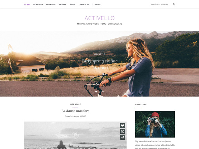
Activello WordPress Theme

WordPress is the most popular content management system of them all. The main reason for that is how fast it can be adjusted to its users needs. A boring design that you don’t want to look at any longer is gone within seconds. You can install and customize a new theme fast and easy, giving your website an all new and fresh look. And to allow you to do just that, I searched through the theme index once again, bringing you the most interesting and beautiful themes of this month.

1 – Activello

Activello is the right theme for any private blog, as its design is appealing and tender. It can also be extended to become a shop, as it’s prepared for the popular WooCommerce plugin.

  • Created by: Silkalns
  • License: Free for private and commercial purposes | GNU General Public License
  • Prepared for Language Localization: Yes
  • Demo: Activello Demo
  • Download on WordPress

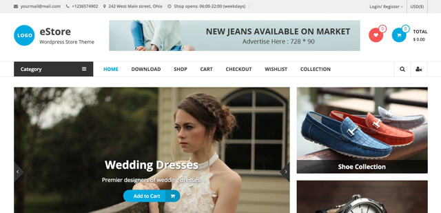
2 – eStore

eStore Theme

The eStore theme is one of the most appealing free shop themes on the market. It comes with everything the heart desires, including ten additional widgets, a slider, and preparation for the new »YITH WooCommerce Wishlist” plugin that can create a wishlist for WooCommerce.

  • Created by: ThemeGrill
  • License: Free for private and commercial purposes | GNU General Public License
  • Prepared for Language Localization: Yes
  • Demo: eStore Demo
  • Download on WordPress

3 – Happenings

Happenings

Happenings is touted as an event magazine for music events or similar things. However, its functionality labels it as more of an individual blog theme. It seems to fit in this area perfectly.

  • Created by: Rich Quigley
  • License: Free for private and commercial purposes | GNU General Public License
  • Prepared for Language Localization: Yes
  • Demo: Happenings Demo
  • Download on WordPress

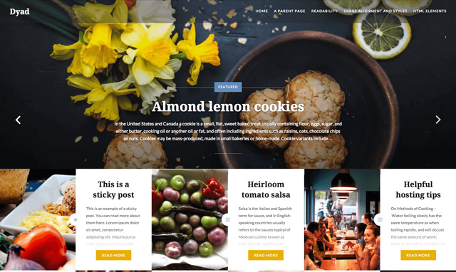
4 – Dyad

Dyad Theme

Dyad is the new theme by Automattic, the company behind WordPress. Its design is unique and appealing. You can use it well for private blogs, portfolio websites, restaurants, cafes, and other websites that like to combine photos and text.

  • Created by: Automattic
  • License: Free for private and commercial purposes | GNU General Public License
  • Prepared for Language Localization: Yes
  • Demo: Dyad Demo
  • Download on WordPress

5 – LiveBlog

LiveBlog

LiveBlog is another blogging theme. The theme is suitable for professional blogs, as it provides a slider, customizable colors, different header styles, and is prepared for ad banners. A close look at the theme is well worth it for (semi-)professional bloggers.

  • Created by: ThemesPie
  • License: Free for private and commercial purposes | GNU General Public License
  • Prepared for Language Localization: Yes
  • Demo: LiveBlog Demo
  • Download on WordPress

6 – Enliven

Enliven

Enliven is a so-called multi-purpose theme. It can be used as a business theme, but using it as a portfolio works just as well. Private blogs are also possible options. It comes with seven widgets, and allows you to easily adjust many things via the Theme Customizer.

  • Created by: Pubudu Ranjan Malalasekara
  • License: Free for private and commercial purposes | GNU General Public License
  • Prepared for Language Localization: Yes
  • Demo: Enliven Demo
  • Download on WordPress

7 – Llorix One Lite

Llorix One Light

Here, you’ll get an elegant, appealing theme for your business. Llorix One Lite is a one-pager. It’s used for the presentation of brands and has no functionality outside of that.

8 – WEH Lite

WEH

WEH Lite is an appealing blog theme with a very unique slider. However, you can also use the theme for other purposes, like a magazine or a photography website.

  • Created by: themesawesome
  • License: Free for private and commercial purposes | GNU General Public License
  • Prepared for Language Localization: Yes
  • Demo: WEH Lite Demo
  • Download on WordPress

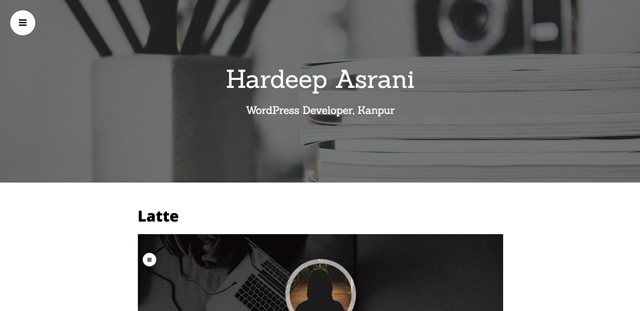
9 – Latte

Latte Theme

Latte is a one-page parallax theme for designers, developers, and freelancers. It comes with many customization options, all of which can be set using the Theme Customizer. Latte could be the right theme for you if you’re a freelancer that wants to present his profile as detailed as possible.

  • Created by: Hardeep Asrani
  • License: Free for private and commercial purposes | GNU General Public License
  • Prepared for Language Localization: Yes
  • Demo: Latte Demo
  • Download on WordPress

10 – Poseidon

Poseidon Theme

Poseidon sees itself as a magazine or news theme, and comes with a ton of features. The template for the landing page is fully customizable, content can be displayed the way you want it to be. Some unique widgets are also included.

  • Created by: ThemeZee
  • License: Free for private and commercial purposes | GNU General Public License
  • Prepared for Language Localization: Yes
  • Demo: Poseidon Demo
  • Download on WordPress

(dpe)

Categories: Others Tags:

Drawing A Cartoon In Illustrator

March 23rd, 2016 No comments

Drawing a cartoon is no trivial pursuit. It turns us into a director, writer, narrator. Through a cartoon or comic, you tell a story that takes place in a certain time, a certain environment, with certain characters. This is why you will learn here not just how to draw a cartoon in Adobe Illustrator, but how to decide on character, place and situation.

Drawing A Cartoon In Illustrator

Before grabbing your pencil or software tool, ask yourself, “What will be my topic?” How many characters you will use, and who will they be? What background will they move against? What era will they live in? In what scene will you put them? Through the steps in this tutorial, I will explain to you my own choices. Let’s begin.

The post Drawing A Cartoon In Illustrator appeared first on Smashing Magazine.

Categories: Others Tags:

How to ensure MailChimp emails actually reach your users

March 22nd, 2016 No comments

This tutorial will help you with the most important thing you probably aren’t doing for your MailChimp newsletter: ensuring its delivery. If your newsletter isn’t being delivered, then no training, or tips, or marketing tactics will matter.

Ensuring delivery basically means that you’ve got to prove that you are who you say you are, where your email address is concerned; because spammers and spoofers like to use other people’s email addresses to push their evil agendas. To avoid this, you’ve got to use MailChimp’s authentication methods, which is like a license plate for your email. It provides a trackable identifier that shows your subscribers that you’re legit.

Email hosts like Gmail, Hotmail, and even AOL all look to see if your email domain has a DKIM record (see: Authenticating your domain further down in this post to learn how to use it).

According to OpenDKIM, email authentication has jumped from 53% in 2015 to 67% so far in 2016. So, if you haven’t both verified and authenticated your email domain for your newsletter, you’re in the minority. ISPs are even talking about blocking unsigned email blasts, due to the massive amounts of email phishing that currently exist.

Thankfully, all it takes is a bit of proof. Or rather, proving that your email address and domain belong to you. You only have to do this once (unless you change your domain name).

Why it’s important to verify and authenticate

  • Authenticating your domain and email proves to your subscribers that you are who you say you are.
  • It also proves to MailChimp that they can trust you enough to show your email address without a bunch of “via mail13.wdc01.rsgsv.net” that typically shows up beside your name in Gmail, like the image below.
  • Speaking of Gmail, if you authenticate your domain, then Gmail will trust your emails enough to automatically load images (instead of asking your subscribers if they want to every time). They even wrote about it here.

Holy benefits, right?

What do you need?

  • Domain registrar access.
  • Enough knowledge about DNS records to add a TXT and CNAME record to your domain.
  • Patience, since even though you only have to do this once, it can take up to 24 hours for the changes to take effect.
  • Note first that domain authentication is only available if you send emails from a custom domain (e.g. john@johnsmith.com, not john@gmail.com).

Authenticating your email

Log into your MailChimp account and click on your name in the top right navigation. From this dropdown, click on the Account panel. Then click Settings and pick Verified Domains.

Click the Verify an Email Domain button. Next, type in the email address you use to send emails to your list and then click Send Verification Email. You’ll get an email with a code in it, so go to your inbox. Copy and paste that code into the Enter Verification Code field back in MailChimp.

Boom, you’re done. You’ll now see “Verified” under your domain on that screen.

Authenticating your domain

Now that your domain is verified, you need to authenticate it. On that same Verified Domains screen, click Authenticate beside your domain.

You’ll see a TXT record to add to your domain. It’ll be a code similar to (but not this exact code): “v=spf1 include:servers.mcsv.net ?all” Copy and paste that into a TXT record as a value in your domain’s DNS settings.

Next, scroll down to #2 on that screen and copy the CNAME and value to your domain. It’ll be similar to “k1._domainkey” as the hostname and “dkim.mcsv.net” as the value.

Click Authenticate Domain, and you’re done! (Note that it may not be instant since your domain registrar can take a few hours to update.)

This is what it looks like when everything’s gone according to plan:

Now your emails are much more deliverable.

Once you’re finished, images will load by default in Gmail, your email address won’t include a bunch of gibberish, and your emails will be much less likely to go to Spam or Promotions.

Happy emailing!

A Collection of 32 Photoshop Felt Styles & 10 Stitch Effects – only $7!

Source

Categories: Designing, Others Tags:

US highways embroiled in typography battle

March 22nd, 2016 No comments

We live in a world where every startup and its dog promises to change your life through design. The most important works of design, however, are the ones that many of us barely even think about. In this case, I’m talking about highway signs.

I don’t drive, but I used to be on the road a lot when I was a kid in Mexico. I practiced my Spanish pronunciation by reading off every sign out loud, much to my siblings’ dismay.

Beyond educating young children, highway signs are also responsible for helping drivers figure out where they want to go, and preventing accidents. In the United States of America, this has prompted an argument over typefaces.

As you might imagine, the importance of typography takes on a whole new meaning when people are driving down a highway in heavy metal machines. Drivers sometimes only have a split second to make decisions; if they can read a sign from farther away, they have an extra split second or two to react.

Highway Gothic (left), and Clearview (right).

The face causing all the drama is called Clearview, and it was designed by Donald Meeker. He started designing it in 1991 after deciding that he wasn’t happy with highway signs in Oregon. He worked with researchers at Penn State University to design a new face, hoping to increase the readability of signage.

Early studies indicated that he had been successful. In 2004, the Highway Administration gave his work their provisional endorsement. Many highway signs were changed or replaced.

However, further studies failed to support the conclusions that led the Highway Administration to endorse Clearview. In some cases, it was found to actualy reduce the readability of signage. Others posited that the initial increase in visibility had more top do with what the signs were made of, rather than the lettering.

The Highway Administration has since rescinded their endorsement, though they are not requiring the new signs to be replaced yet again. There just won’t be any new signs featuring Clearview.

Clearview’s proponents are disappointed to say the least, and have made their objections known. Naturally, with human lives in the balance, the argument is intense, for a debate about typefaces… as it should be.

A Collection of 32 Photoshop Felt Styles & 10 Stitch Effects – only $7!

Source

Categories: Designing, Others Tags:

Accessible, Simple, Responsive Tables

March 22nd, 2016 No comments

There is no single solution to make any

appropriately responsive. That’s what I like about this post by Davide Rizzo: it admits that, then gets on with some solutions. This is a great addition to territory we’ve been treading for a while.

Content and Comparison tables

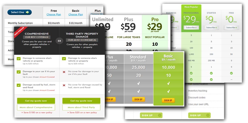
There are many types of tables on websites where content can vary as wildly as the approaches used to make them responsive. The tables I find most frustrating are comparison tables or normal content layout tables, there are really no comprehensive CSS based solutions for making these types of tables responsive.

I set out to find a flexible and simple solution that could work as a reusable web component, regardless of the content within.

Examples of comparison tables

Is table markup still working for us?

Standard table markup seems to make semantic sense and does a pretty decent job of aligning cells. One of my main concerns was accessibility. Surely native table markup helps a user with a screen reader understand the order content should be read in and navigated through?

I did some tests with a simple best practice table. Using a few screen readers (Chrome Vox and VoiceOver), I attempted to navigate the markup:

  1. ChromeVox tells you that you are on a table, while VoiceOver also tells you how many columns and rows the table has (which is helpful).
  2. Neither CromeVox or VoiceOver tells you when you are on a table heading.
,

wrappers lock it in. We either have to change the markup or start manipulating with JavaScript.

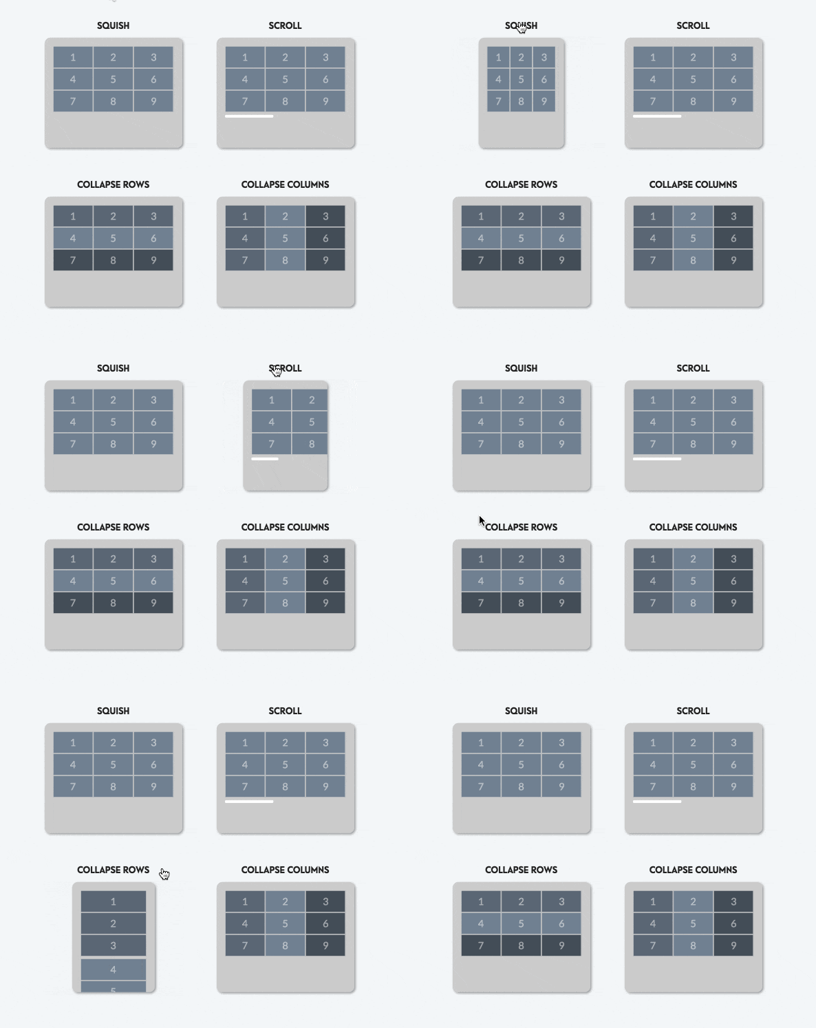
Visual examples of those four possibilities.

Not recommended ways to build a responsive table

Through trial and experimentation, I discarded these methods:

  1. Generating a second narrower table via JavaScript and hide/show alternately by breakpoint.
    Why? Content duplication, no better than an ‘.m’ site. Will break any unique IDs inside a table. Poor idea for Styleguide driven components.
  2. Using normal table markup and JavaScript at a breakpoint to rearrange the table into a responsive version.
    Why? Requires different markup for vertical and horizontal tables. Will break any JS initialisation of table content. Requires lots of JS event listeners and DOM manipulation.
  3. Keeping table markup but switch to display:flex for vertically aligned table content.
    Why? Not possible to align cells across rows with
type wrappers and display: table-cell overrides the flex-item.

Responsive tables with flexbox

1a) For row-oriented tables…

  • Order markup exactly how a mobile or screen reader should read it, use semantic headers and content.
  • Abandon all concept of ‘row’ wrappers.
  • Set the width of each cell as a percentage based on number of columns or rows.
    Auto sizing column widths is not possible.

See the Pen Responsive Tables (By rows) by CSS-Tricks (@css-tricks) on CodePen.

1b) For column-oriented tables…

  • Set the flex order by row to instantly create a vertical table. This must be inline otherwise we would need a unique class for every row. Fairly easy to do manually, or very easy for a CMS or JavaScript to apply.

See the Pen Responsive Tables (By columns) by CSS-Tricks (@css-tricks) on CodePen.

2) Style to help make connections

  • Style cells individually in any pattern you require.
  • Fix cell border duplication with negative margins.

See the Pen Responsive Tables (Cell styles) by Davide Rizzo (@davidelrizzo) on CodePen.

3) Collapse to blocks on small screens

In a small-screen media query, set everything to display: block. That gives us responsive tables!

See the Pen Responsive Tables (Collapse) by CSS-Tricks (@css-tricks) on CodePen.

3b) Collapsing to Tabs or Accordions

  • Tab and accordion markup is inside the table in a logical position
  • Toggle either row or column depending on the cell order
  • Use display: none to toggle for both visual users and screen readers

See the Pen Responsive Tables (Tabs & Accordions) by CSS-Tricks (@css-tricks) on CodePen.

Other enhancements


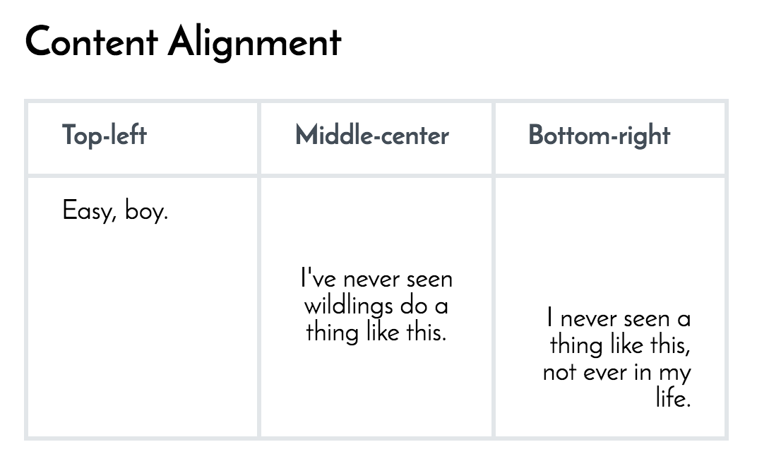
Align cell content

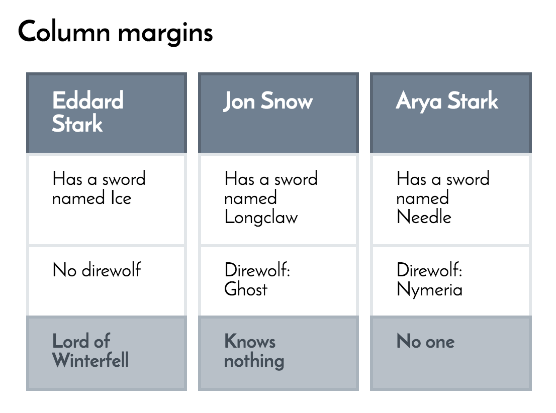
Add column margins by offsetting cell widths

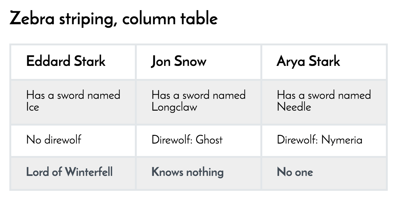
Zebra stripe the table

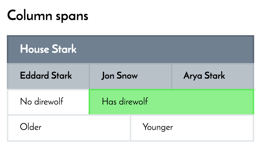
Emulate column spans with manual cell widths.
Limitation: There is no way to do rowspans on a flex table.

You can use the same cell styling for other types of markup

Even standard table markup!

See the Pen Responsive Tables (Alternate markup) by CSS-Tricks (@css-tricks) on CodePen.

Fallbacks for no-flexbox

IE9 and below does not support flexbox. For older browsers, you can detect flexbox (with Modernizer) and show the mobile version, which is a good example of graceful degradation.

.no-flexbox .Rtable > .Rtable-cell { 
  display: block; 
}

Conclusion

Overall this method offers so much flexibility that you might consider replacing all your content tables with these techniques. You can continue to add different themes and styles with ease in CSS and designers will be much more effective if they understand upfront what responsive tables are capable of.

Other Responsive Tables Resources


This post was originally published on CodePen.


Accessible, Simple, Responsive Tables is a post from CSS-Tricks

Categories: Designing, Others Tags:
and even scope="row|col" don’t seem to do anything! The only way to get it to recognise a heading is to wrap it in an tag.
  • The reader steps through the table via rows no matter how your content is arranged. VoiceOver at least allows you to navigate in any direction using arrow keys, but you still have no indication which order you should navigate in.
  • In essence, nothing in the markup tells the screen reader user if the content should be read via rows or columns. The most meaningful markup still comes from non-tabular semantic content.

    Approaches for Responsive Tables

    Let’s think about the different ways a table could behave responsively:

    1. Squash: If columns have little content they might squash horizontally with no issues on a mobile screen so not changing the layout needs to be a valid option.
    2. Vertical scroll: If the layout and content is exact and critical, a user could scroll to the left or right. This is trivial in CSS with an overflow="auto" wrapper.
    3. Collapse by rows: Split each row into its own single column mini-table on small screens. Switching display:table into display:block will cause this with normal table markup.
    4. Collapse by columns: This is where things get tricky. You can’t do this with normal table markup in pure CSS because the code order is by rows and the