Archive

Archive for April, 2016

High Speed: Really Accelerate WordPress Websites [#3]

April 30th, 2016 No comments
Really Accelerate WordPress Websites

ghIn this series, we talk about the things that really accelerate WordPress websites. The goal is not to achieve the infamous 100/100 points on Google Page Speed, as these mentioned aspects often leave a lot of potential behind. We want to get as much speed out of the website as possible and dig into the millisecond area when it comes to loading times. We’ve already laid the foundation in the first and the second part.

Turning Off WordPress Performance Eaters

If you want to get lots of speed out of your WordPress, you should shut down a couple of features of the content management system. WordPress is not really one of the fastest of its kind. Many things have been put into the core, even though they are not thought out, and slow down the CMS more than necessary. That may be unfortunate, but you don’t have to live with it.

1 – WordPress Heartbeat API

The Heartbeat API controls all Ajax calls within WordPress. On top of that, it’s also responsible for the caching while writing an article in the backend. However, it does that very regularly, like a human’s heartbeat. These frequent calls to the server heavily burden the CPU and eat too much performance. At the same time, the Heartbeat API also has its advantages. These can only be taken advantage of when you don’t own a static website, but a blog or a magazine.

Thus, I’m bringing you two code snippets, one allowing you to deactivate the API entirely, and the other allowing you to disable it outside of the posts only. Automatic caching still works with the second one. Additionally, the admin-ajax.php can still be used through plugins. The comment plugin de:comments requires the file, which is why the Heartbeat API is only deactivated using the second snippet on my WordPress. The fragment belongs into the theme’s functions.php or a custom site plugin.

Click Below to Open the Gist at Github

2 – Turning Off wp-cron.php

One of the biggest performance brakes within WordPress is the wp-cron.php which is responsible for planned tasks within the CMS. That means it makes sure that tasks that were defined in advance will be started at a certain time. In general, that wouldn’t be a problem if it didn’t do that on every (!) site view. Every single page call within back and frontend causes a request. Of course, when there is not a lot of traffic on the server, that won’t make too much of a difference. However, with many visitors, this can cause the server to break down.

A much better solution is, to completely stop using the wp-cron.php, and then accessing it every 15 minutes using a real cronjob. Your planned articles might be published 15 minutes later than before, but does that really matter? Remember, in doing so, you really accelerate WordPress websites. Enter the following code in the wp-config.php.

Really Accelerate WordPress Websites

Handling Website Logos

Logos are important. A cool logo gives your site the right kick and makes it unique. If you want speed, there are two ways to handle the logo. You either design it so it perfectly fits the surrounding container and save it lossy, which won’t look beautiful. Or you do it like I do, and display a retina logo which is displayed in a reduced way via CSS, and thus is tack-sharp. However, the original file shouldn’t be too large (file size, not measurements). My website’s logo has the measure 1,160 x 243 pixel, and a size of 13 KB as a PNG.

My website already delivers the logo to the browser via CSS (div with background image). To make sure that the CSS doesn’t have to load the logo file from the folder “images” first, I coded it in Base64 and directly implemented it in the CSS. While this does minimally increase the logo’s file size, it will be loaded significantly faster. Additionally, it doesn’t “jump” anymore while loading. You can find a good converter for this job here. This is what the code for the graphic looks like after the conversion:

Really Accelerate WordPress Websites

The Optimization of a Google Webfont

Google Fonts are extremely popular because even beginners can use them in themes rather easily. But even the great fonts have a notable disadvantage. Depending on the chosen font, the website’s loading time increases measurably. This is joined by potential performance problems of the Google servers. That doesn’t happen often, but now and then, it does. Everything has its advantages and disadvantages. Completely forgoing Google Fonts is definitely the fastest method, but certainly not the prettiest one. I wouldn’t want to forgo the beautiful fonts, but I also don’t want so many things to be loaded via foreign servers. Thus, I’ll show you my way of handling Google fonts today. I have them stored locally on my server, and access the font within my CSS. This accelerates my website measurably.

Storing a Google Font on Your Server

When you download a font and keep it locally on your server, it will generally load faster. So let me show you how to use fonts to really accelerate WordPress websites. First, you should choose a font you’d like to use. Then, you’ll receive a link element which you should copy into the header. But that’s exactly what you won’t do. Instead, you only take the link from the element, enter it in your browser’s URL window, and call it up. Next, you need the font file of the displayed code (only download woff or woff2).

Really Accelerate WordPress Websites

Rename the file. Use a short file name. In my case, I named it “varela-round.woff2”. Move the file into the CSS folder of your theme. Now copy the full @font-face code into you CSS file, and change it as follows:

Click to Open the Gist at Github
Really Accelerate WordPress Websites

Once you’ve done that, the font will be loaded from your server, and should be displayed super fast without delay. Also, if the CSS is cached correctly, it will only be loaded once.

Conclusion

Once again, we’ve completed some necessary tasks on our way to really accelerate WordPress websites. You probably guessed it already; this is far from completed. In the next part of our series (it will most likely have five parts), we’ll take a look at the most labor-intensive part, which will even make advanced users break a sweat: the optimal delivery of CSS and JavaScript. When you want your website to get to the millisecond area, everything has to fit. Most of it will have to be done manually, but I assure you: it will be worth it!

Sources:

(dpe)

Categories: Others Tags:

Comics of the week #337

April 30th, 2016 No comments

Every week we feature a set of comics created exclusively for WDD.

The content revolves around web design, blogging and funny situations that we encounter in our daily lives as designers.

These great cartoons are created by Jerry King, an award-winning cartoonist who’s one of the most published, prolific and versatile cartoonists in the world today.

So for a few moments, take a break from your daily routine, have a laugh and enjoy these funny cartoons.

Feel free to leave your comments and suggestions below as well as any related stories of your own…

Bring a white flag

A long term employee

A nice touch

Can you relate to these situations? Please share your funny stories and comments below…

2 Beautiful Modern Calligraphy Fonts – only $9!

Source

Categories: Designing, Others Tags:

Desktop Wallpaper Calendars: May 2016

April 30th, 2016 No comments

We always try to challenge your artistic abilities and create some interesting and inspiring artwork. As a matter of fact, we discovered the best source for inspiration: desktop wallpapers that are a little more distinctive than the usual crowd.

Desktop Wallpaper Calendars: May 2016

This creativity mission has been going on for eight years now and, like every month, artists and designers from across the globe got their creative juices flowing to produce desktop wallpapers for you to indulge in. The wallpapers all come in versions with and without a calendar for May 2016 and can be downloaded for free. A big thank-you to everyone who contributed their works! Now, could there be a better occasion to freshen up your desktop?

The post Desktop Wallpaper Calendars: May 2016 appeared first on Smashing Magazine.

Categories: Others Tags:

Can a design be “correct”?

April 29th, 2016 No comments

Design is about problem solving, whether that be visual, structural, conceptual, or any other ‘…al’. If there’s a problem, it follows that there is a solution.

When Steve Jobs hired design legend Paul Rand to design the brand identity for what would be named (by Rand) NeXT computers, he was expecting a few options. Instead, Rand delivered a highly detailed explanation of a single solution. Famously, according to Jobs, Rand said:

“I will solve your problem for you and you will pay me”

However, Rand followed that by saying: “If you want options go talk to other people.” Acknowledging that although Rand had delivered his “correct” answer, it wasn’t necessarily the correct answer.

Rand didn’t have the same access to user testing that we enjoy. The principle of A/B testing tells us that different solutions can be measured against one another, provided we have a definite goal. The practicality of A/B testing is questionable, but in laboratory conditions, we are able to prove that one solution outperforms another; test enough solutions and you will eventually find the “correct” answer.

However, design doesn’t exist in a laboratory, it reflects its context. Subjective viewpoints of different users may mean that the “correct” design for one, is “incorrect” for another. Even more than different users, different stakeholders commonly have different motivations, meaning that not only the context of the design, but the problem its designed to solve is frequently changing.

If a design brief is a problem, can it have a “correct” solution?

30 High-Quality Vintage Fonts with Bonuses and Extended License – $17!

Source

Categories: Designing, Others Tags:

They Have To Be Monsters

April 29th, 2016 No comments
The Scream by Nathan Sawaya

Since I started working on Discourse, I spend a lot of time thinking about how software can encourage and nudge people to be more empathetic online. That’s why it’s troubling to read articles like this one:

My brother’s 32nd birthday is today. It’s an especially emotional day for his family because he’s not alive for it.

He died of a heroin overdose last February.
This year is even harder than the last. I started weeping at midnight and eventually cried myself to sleep. Today’s symptoms include explosions of sporadic sobbing and an insurmountable feeling of emptiness. My mom posted a gut-wrenching comment on my brother’s Facebook page about the unfairness of it all. Her baby should be here, not gone. “Where is the God that is making us all so sad?” she asked.

In response, someone?—?a stranger/(I assume) another human being?—?commented with one word: “Junkie.”

The interaction may seem a bit strange and out of context until you realize that this is the Facebook page of a person who was somewhat famous, who produced the excellent show Parks and Recreation. Not that this forgives the behavior in any way, of course, but it does explain why strangers would wander by and make observations.

There is deep truth in the old idea that people are able to say these things because they are looking at a screen full of words, not directly at the face of the person they’re about to say a terrible thing to. That one level of abstraction the Internet allows, typing, which is so immensely powerful in so many other contexts …

“falling in love, breaking into a bank, bringing down the govt…they all look the same right now: they look like typing” @PennyRed #TtW16 #k3

— whitney erin boesel (@weboesel) April 16, 2016

… has some crippling emotional consequences.

As an exercise in empathy, try to imagine saying some of the terrible things people typed to each other online to a real person sitting directly in front of you. Or don’t imagine, and just watch this video.

I challenge you to watch the entirety of that video. I couldn’t do it. This is the second time I’ve tried, and I had to turn it off not even 2 minutes in because I couldn’t take it any more.

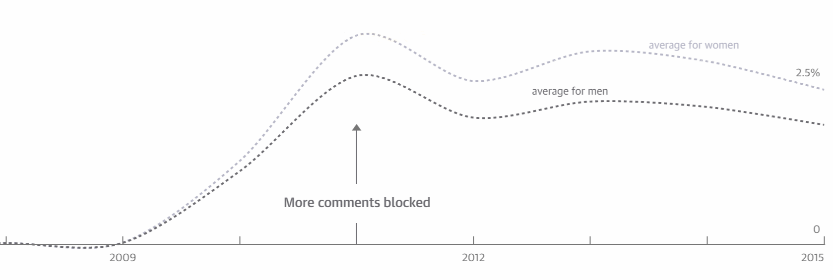
It’s no coincidence that these are comments directed at women. Over the last few years I have come to understand how, as a straight white man, I have the privilege of being immune from most of this kind of treatment. But others are not so fortunate. The Guardian analyzed 70 million comments and found that online abuse is heaped disproportionately on women, people of color, and people of different sexual orientation.

And avalanches happen easily online. Anonymity disinhibits people, making some of them more likely to be abusive. Mobs can form quickly: once one abusive comment is posted, others will often pile in, competing to see who can be the most cruel. This abuse can move across platforms at great speed – from Twitter, to Facebook, to blogposts – and it can be viewed on multiple devices – the desktop at work, the mobile phone at home. To the person targeted, it can feel like the perpetrator is everywhere: at home, in the office, on the bus, in the street.

I’ve only had a little taste of this treatment, once. The sense of being “under siege” – a constant barrage of vitriol and judgment pouring your way every day, every hour – was palpable. It was not pleasant. It absolutely affected my state of mind. Someone remarked in the comments that ultimately it did not matter, because as a white man I could walk away from the whole situation any time. And they were right. I began to appreciate what it would feel like when you can’t walk away, when this harassment follows you around everywhere you go online, and you never really know when the next incident will occur, or exactly what shape it will take.

Imagine the feeling of being constantly on edge like that, every day. What happens to your state of mind when walking away isn’t an option? It gave me great pause.

I admired the way Stephanie Wittels Wachs actually engaged with the person who left that awful comment. This is a man who has two children of his own, and should be no stranger to the kind of pain involved in a child’s death. And yet he felt the need to post the word “Junkie” in reply to a mother’s anguish over losing her child to drug addiction.

Isn’t this what empathy is? Putting myself in someone else’s shoes with the knowledge and awareness that I, too, am human and, therefore, susceptible to this tragedy or any number of tragedies along the way?

Most would simply delete the comment, block the user, and walk away. Totally defensible. But she didn’t. She takes the time and effort to attempt to understand this person who is abusing her mother, to reach them, to connect, to demonstrate the very empathy this man appears incapable of.

Consider the related story of Lenny Pozner, who lost a child at Sandy Hook, and became the target of groups who believe the event was a hoax, and similarly selflessly devotes much of his time to refuting and countering these bizarre claims.

Tracy’s alleged harassment was hardly the first, Pozner said. There’s a whole network of people who believe the media reported a mass shooting that never happened, he said, that the tragedy was an elaborate hoax designed to increase support for gun control. Pozner said he gets ugly comments often on social media, such as, “Eventually you’ll be tried for your crimes of treason against the people,” “… I won’t be satisfied until the caksets are opened…” and “How much money did you get for faking all of this?”

It’s easy to practice empathy when you limit it to people that are easy to empathize with – the downtrodden, the undeserving victims. But it is another matter entirely to empathize with those that hate, harangue, and intentionally make other people’s lives miserable. If you can do this, you are a far better person than me. I struggle with it. But my hat is off to you. There’s no better way to teach empathy than to practice it, in the most difficult situations.

In individual cases, reaching out and really trying to empathize with people you disagree with or dislike can work, even people who happen to be lifelong members of hate organizations, as in the remarkable story of Megan Phelps-Roper:

As a member of the Westboro Baptist Church, in Topeka, Kansas, Phelps-Roper believed that AIDS was a curse sent by God. She believed that all manner of other tragedies—war, natural disaster, mass shootings—were warnings from God to a doomed nation, and that it was her duty to spread the news of His righteous judgments. To protest the increasing acceptance of homosexuality in America, the Westboro Baptist Church picketed the funerals of gay men who died of AIDS and of soldiers killed in Iraq and Afghanistan. Members held signs with slogans like “GOD HATES FAGS” and “THANK GOD FOR DEAD SOLDIERS,” and the outrage that their efforts attracted had turned the small church, which had fewer than a hundred members, into a global symbol of hatred.

Perhaps one of the greatest failings of the Internet is the breakdown in cost of emotional labor.

First we’ll reframe the problem: the real issue is not Problem Child’s opinions – he can have whatever opinions he wants. The issue is that he’s doing zero emotional labor – he’s not thinking about his audience or his effect on people at all. (Possibly, he’s just really bad at modeling other people’s responses – the outcome is the same whether he lacks the will or lacks the skill.) But to be a good community member, he needs to consider his audience.

True empathy means reaching out and engaging in a loving way with everyone, even those that are hurtful, hateful, or spiteful. But on the Internet, can you do it every day, multiple times a day, across hundreds of people? Is this a reasonable thing to ask of someone? Is it even possible, short of sainthood?

The question remains: why would people post such hateful things in the first place? Why reply “Junkie” to a mother’s anguish? Why ask the father of a murdered child to publicly prove his child’s death was not a hoax? Why tweet “Thank God for AIDS!”

Unfortunately, I think I know the answer to this question, and you’re not going to like it.

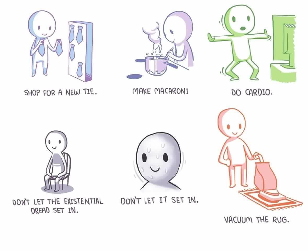
Busy-Work by Shen, owlturd.com

I don’t like it. I don’t want it. But I know.

I have laid some heavy stuff on you in this post, and for that, I apologize. I think the weight of what I’m trying to communicate here requires it. I have to warn you that the next article I’m about to link is far heavier than anything I have posted above, maybe the heaviest thing I’ve ever posted. It’s about the legal quandary presented in the tragic cases of children who died because their parents accidentally left them strapped into carseats, and it won a much deserved pulitzer. It is also one of the most harrowing things I have ever read.

Ed Hickling believes he knows why. Hickling is a clinical psychologist from Albany, N.Y., who has studied the effects of fatal auto accidents on the drivers who survive them. He says these people are often judged with disproportionate harshness by the public, even when it was clearly an accident, and even when it was indisputably not their fault.

Humans, Hickling said, have a fundamental need to create and maintain a narrative for their lives in which the universe is not implacable and heartless, that terrible things do not happen at random, and that catastrophe can be avoided if you are vigilant and responsible.

In hyperthermia cases, he believes, the parents are demonized for much the same reasons. “We are vulnerable, but we don’t want to be reminded of that. We want to believe that the world is understandable and controllable and unthreatening, that if we follow the rules, we’ll be okay. So, when this kind of thing happens to other people, we need to put them in a different category from us. We don’t want to resemble them, and the fact that we might is too terrifying to deal with. So, they have to be monsters.

This man left the junkie comment because he is afraid. He is afraid his own children could become drug addicts. He is afraid his children, through no fault of his, through no fault of anyone at all, could die at 30. When presented with real, tangible evidence of the pain and grief a mother feels at the drug related death of her own child, and the reality that it could happen to anyone, it became so overwhelming that it was too much for him to bear.

Those “Sandy Hook Truthers” harass the father of a victim because they are afraid. They are afraid their own children could be viciously gunned down in cold blood any day of the week, bullets tearing their way through the bodies of the teachers standing in front of them, desperately trying to protect them from being murdered. They can’t do anything to protect their children from this, and in fact there’s nothing any of us can do to protect our children from being murdered at random, at school any day of the week, at the whim of any mentally unstable individual with access to an assault rifle. That’s the harsh reality.

When faced with the abyss of pain and grief that parents feel over the loss of their children, due to utter random chance in a world they can’t control, they could never control, maybe none of us can ever control, the overwhelming sense of existential dread is simply too much to bear. So they have to be monsters. They must be.

And we will fight these monsters, tooth and nail, raging in our hatred, so we can forget our pain, at least for a while.

After Lyn Balfour’s acquittal, this comment appeared on the Charlottesville News Web site:

“If she had too many things on her mind then she should have kept her legs closed and not had any kids. They should lock her in a car during a hot day and see what happens.”

I imagine the suffering that these parents are already going through, reading these words that another human being typed to them, just typed, and something breaks inside me. I can’t process it. But rather than pitting ourselves against each other out of fear, recognize that the monster who posted this terrible thing is me. It’s you. It’s all of us.

The weight of seeing through the fear and beyond the monster to simply discover yourself is often too terrible for many people to bear. In a world of hard things, it’s the hardest there is.

[advertisement] At Stack Overflow, we help developers learn, share, and grow. Whether you’re looking for your next dream job or looking to build out your team, we’ve got your back.
Categories: Others, Programming Tags:

They Have To Be Monsters

April 29th, 2016 No comments

Since I started working on Discourse, I spend a lot more time thinking about how software can encourage and nudge people to be more empathetic online. That’s why it’s especially hard to read articles like this one:

My brother’s 32nd birthday is today. It’s an especially emotional day for his family because he’s not alive for it.

He died of a heroin overdose last February.
This year is even harder than the last. I started weeping at midnight and eventually cried myself to sleep. Today’s symptoms include explosions of sporadic sobbing and an insurmountable feeling of emptiness. My mom posted a gut-wrenching comment on my brother’s Facebook page about the unfairness of it all. Her baby should be here, not gone. “Where is the God that is making us all so sad?” she asked.

In response, someone?—?a stranger/(I assume) another human being?—?commented with one word: “Junkie.”

The interaction may seem a bit strange and out of context until you realize that this is the Facebook page of a person who was somewhat famous, who produced the excellent show Parks and Recreation. Not that this forgives the behavior in any way, of course, but it does explain why strangers would wander by and make observations.

There is deep truth in the old idea that people are able to say these things because they are looking at a screen full of words, not directly at the face of the person they’re about to say a terrible thing to. That one level of abstraction the Internet allows, typing, which is so immensely powerful in so many other contexts …

“falling in love, breaking into a bank, bringing down the govt…they all look the same right now: they look like typing” @PennyRed #TtW16 #k3

— whitney erin boesel (@weboesel) April 16, 2016

… has some crippling emotional consequences.

As an exercise in empathy, try to imagine reading some of the terrible things people say to each other online to a real person sitting directly in front of you. Or don’t imagine, and just watch this video.

I challenge you to watch the entirety of that video. I couldn’t do it. This is the second time I’ve tried, and I had to turn it off not even 2 minutes in because I couldn’t take it any more.

It’s no coincidence that these are comments directed at women. Over the last few years I have come to understand how, as a straight white man, I have the privilege of being immune from most of this kind of treatment. But others are not so fortunate. The Guardian analyzed 70 million comments and found that online abuse is heaped disproportionately on women, people of color, and people of different sexual orientation.

And avalanches happen easily online. Anonymity disinhibits people, making some of them more likely to be abusive. Mobs can form quickly: once one abusive comment is posted, others will often pile in, competing to see who can be the most cruel. This abuse can move across platforms at great speed – from Twitter, to Facebook, to blogposts – and it can be viewed on multiple devices – the desktop at work, the mobile phone at home. To the person targeted, it can feel like the perpetrator is everywhere: at home, in the office, on the bus, in the street.

I’ve only had a little taste of this treatment, once. The sense of being “under siege” – a constant barrage of vitriol and judgment pouring your way every day, every hour – was palpable. It was not pleasant. It absolutely affected my state of mind. Someone remarked in the comments that ultimately it did not matter, because as a white man I could walk away from the whole situation any time. And they were right. I began to appreciate what it would feel like when you can’t walk away, when this harassment follows you around everywhere you go online, and you never really know when the next incident will occur, or exactly what shape it will take.

Imagine the feeling of being constantly on edge like that, every day. What happens to your state of mind when walking away isn’t an option? It gave me great pause.

I greatly admired the way Stephanie Wittels Wachs actually engaged with the person who left that awful comment. This is a man who had two children of his own, and should be no stranger to the kind of unbearable pain involved in your child’s death. And yet he felt the need to post the word “Junkie” in reply to a mother’s anguish over losing her child to drug addiction.

Isn’t this what empathy is? Putting myself in someone else’s shoes with the knowledge and awareness that I, too, am human and, therefore, susceptible to this tragedy or any number of tragedies along the way?

Most would simply delete the comment, block the user, and walk away. Totally defensible. But she didn’t. She takes the time and effort to attempt to understand this person who is abusing her mother, to reach them, to connect, to practice the very empathy this man appears incapable of.

Consider the related story of Lenny Pozner, who lost a child at Sandy Hook, and became the target of groups who believe the event was a hoax, and similarly selflessly devotes much of his time to refuting and countering these bizarre claims.

Tracy’s alleged harassment was hardly the first, Pozner said. There’s a whole network of people who believe the media reported a mass shooting that never happened, he said, that the tragedy was an elaborate hoax designed to increase support for gun control. Pozner said he gets ugly comments often on social media, such as, “Eventually you’ll be tried for your crimes of treason against the people,” “… I won’t be satisfied until the caksets are opened…” and “How much money did you get for faking all of this?”

It’s easy to practice empathy when you limit it to people that are easy to empathize with – the downtrodden, the undeserving victims. But it is another matter entirely to empathize with those that hate, harangue, and intentionally make other people’s lives miserable. If you can do this, you are a far better person than me. I struggle with it. But my hat is off to you. There’s no better way to teach empathy than to practice it, particularly toward those who appear to have none.

In individual cases, reaching out and really trying to empathize with people you disagree with or dislike can work, even people who happen to be lifelong members of hate organizations, as in the remarkable story of Megan Phelps-Roper:

As a member of the Westboro Baptist Church, in Topeka, Kansas, Phelps-Roper believed that AIDS was a curse sent by God. She believed that all manner of other tragedies—war, natural disaster, mass shootings—were warnings from God to a doomed nation, and that it was her duty to spread the news of His righteous judgments. To protest the increasing acceptance of homosexuality in America, the Westboro Baptist Church picketed the funerals of gay men who died of AIDS and of soldiers killed in Iraq and Afghanistan. Members held signs with slogans like “GOD HATES FAGS” and “THANK GOD FOR DEAD SOLDIERS,” and the outrage that their efforts attracted had turned the small church, which had fewer than a hundred members, into a global symbol of hatred.

Perhaps one of the greatest failings of the Internet is the breakdown in cost of emotional labor.

First we’ll reframe the problem: the real issue is not Problem Child’s opinions – he can have whatever opinions he wants. The issue is that he’s doing zero emotional labor – he’s not thinking about his audience or his effect on people at all. (Possibly, he’s just really bad at modeling other people’s responses – the outcome is the same whether he lacks the will or lacks the skill.) But to be a good community member, he needs to consider his audience.

True empathy means reaching out and engaging in a loving way with everyone, even those that are hurtful, hateful, or spiteful. But on the Internet, can you do it every day, multiple times a day, across hundreds of people? Is this a reasonable thing to ask? Is it even possible, short of sainthood?

The question remains: why would people post such hateful things? Why would they reply “Junkie” to a mother’s anguish? Why would they ask a father of a murdered child to publicly prove his child’s death was not a hoax? Why would they tweet “Thank God for AIDS!”?

Unfortunately, I think I know the answer to this question, and you’re not going to like it.

I don’t like it. I don’t want it. But I know.

I have laid some heavy stuff on you in this post, and for that, I apologize. I think the weight of what I’m trying to communicate here requires it. I have to warn you that the next article I’m about to link is far beyond anything I have posted above, maybe even on this blog, ever. It’s about the legal quandary presented in the tragic cases of children who died because their parents accidentally left them strapped into carseats, and it won a much deserved pulitzer. It is also one of the most harrowing things I have ever read.

Ed Hickling believes he knows why. Hickling is a clinical psychologist from Albany, N.Y., who has studied the effects of fatal auto accidents on the drivers who survive them. He says these people are often judged with disproportionate harshness by the public, even when it was clearly an accident, and even when it was indisputably not their fault.

Humans, Hickling said, have a fundamental need to create and maintain a narrative for their lives in which the universe is not implacable and heartless, that terrible things do not happen at random, and that catastrophe can be avoided if you are vigilant and responsible.

In hyperthermia cases, he believes, the parents are demonized for much the same reasons. “We are vulnerable, but we don’t want to be reminded of that. We want to believe that the world is understandable and controllable and unthreatening, that if we follow the rules, we’ll be okay. So, when this kind of thing happens to other people, we need to put them in a different category from us. We don’t want to resemble them, and the fact that we might is too terrifying to deal with. So, they have to be monsters.

This man left the junkie comment because he is afraid. He is afraid his own children could become drug addicts. He is afraid his children, through no fault of his, through no fault of anyone at all, could die at 30. When presented with real, tangible evidence of the pain and grief a mother feels at the drug related death of her own child, and the reality that it could happen to anyone, it became so overwhelming that it was too much for him to bear.

Those “Sandy Hook Truthers” harass the father of a victim because they are afraid. They are afraid their own children could be viciously gunned down in cold blood any day of the week, bullets tearing their way through the bodies of the teachers standing in front of them, desperately trying to protect them from being murdered. They can’t do anything to protect their children from this, and in fact there’s nothing any of us can do to protect our children from being murdered at random, while at school any day of the week, at the whim of any mentally unstable individual with access to an assault rifle. That’s the harsh reality.

When presented with evidence of the crippling pain and grief that parents feel over the loss of their children, due to utter random chance in a world they can’t control, they could never control, maybe none of us can ever control, the overwhelming sense of existential dread is simply too much to bear. So they have to be monsters. They must be.

And we will fight these monsters, tooth and nail, raging in our hatred, so we can forget our pain, at least for a while.

After Lyn Balfour’s acquittal, this comment appeared on the Charlottesville News Web site:

“If she had too many things on her mind then she should have kept her legs closed and not had any kids. They should lock her in a car during a hot day and see what happens.”

I imagine the pain that these parents are going through, reading these words that another human being typed to them, just typed, and something breaks inside me. I can’t process it. But rather than pitting ourselves against each other out of fear, recognize that the monster who posted this terrible thing is me. It’s you. It’s all of us.

The ability to see through the fear and beyond the monster to simply see yourself is often too terrible for many people to bear. In a world of hard things, it’s the hardest there is. And we could sure use each other’s help and understanding in the process.

[advertisement] At Stack Overflow, we help developers learn, share, and grow. Whether you’re looking for your next dream job or looking to build out your team, we’ve got your back.
Categories: Others, Programming Tags:

Icons and Teams

April 29th, 2016 No comments

Say you’re working on a website that uses an icon system. Lots of people who work on the site interact with the icon system. Designers create new icons, they tweak existing ones, they have ideas on what they want the icons to do. Developers building out the pages of the site use the system.

Say you’re the front-end developer. You’re implementing this system. You’re the middle man. You’re the creator and consumer of this system.

What do you ask of the designers?

Option 1) “Please do exactly these things.”

Something like:

Design your icons in all black on a 100×100 artboard in Illustrator. Save the file in this particular folder named “icon-NAME.svg” with this exact set of options. Make sure to optimize what you can in Illustrator first, like combining paths and reducing points. When a new one is ready, run `gulp svgstore` from the project root, that will ready the icon for production. Make commits to the project pertaining to new icons separate from blah blah etc you get the point.

Option 2) “Please follow these basics.”

Something like:

Icons on our site are single-color and square. We have a folder in Dropbox where we keep the originals. If you have a new one or changed old one, do it there and let me know.

Option 3) “Give me whatever, I’ll take care of it.”

Something like:

Work in vector if possible, but otherwise work however you best work and I’ll make it work for our system.


Have you been in a position like this? How are you orchestrating the team?


Icons and Teams is a post from CSS-Tricks

Categories: Designing, Others Tags:

MH Magazine – a WordPress Theme for Online Publishers

April 29th, 2016 No comments
MH Magazine - a WordPress Theme for Online Publishers

Multi-purpose themes are becoming more and more popular. Does this mean you should use one? Not exactly. Depending on your use case, there are other types of themes that might fit your needs better and faster. Today, we’ll introduce you to the premium theme MH Magazine by MH Themes, which is perfect for the entire field of editorial websites, such as blogs, online magazines or dynamic news portals.

This is the MH Magazine Theme

I don’t know about you, but I am not into themes for a wide application area, as most of them are created slovenly. Typically, the entire focus has been given to the creation of a beautiful landing page, while neglecting all other areas. The MH Magazine Theme is soothingly different. It sets itself apart from the masses in many ways. You can easily tell that a lot of development work has been put into the theme, just by looking at it. This is one unique selling point already, as these days, “complete” themes have become an exception.

By the way: The MH Magazine is one of the most successful themes out there. According to MH Themes, it is currently running on more than 40,000 websites. The lite version alone is installed and active on over 30,000 websites.

Nobody has to buy a pig in a poke; the theme can be tested in a reduced lite version before purchasing it. MH Magazine Lite is available as a free download from the official WordPress Theme Directory. Of course, the free theme doesn’t come close to the arsenal of features that are included in the premium version. Nonetheless, both versions of the theme are responsive and adapt to any screen resolution without issues.

The Flexibility of the MH Magazine Theme

The theme’s big advantage is its remarkably high flexibility. There are many different ways of using it. It is particularly fitting for professional blogs, online magazines, and dynamic news portals. It’s basically predestined for topics like lifestyle, gadgets, sports, food, fashion, traveling, technology. The entire landing page is based on widgets. Including the front page, the theme offers in total 26 different widget areas available for customization. This allows you to create a website that completely adjusts to suit your needs relatively quickly.

In general, you can use the theme to do anything that comes to mind, while it is optimally used for all editorial areas. The following image depicts its enormous flexibility:

Clicking the Graphic Opens a Full Resolution Version

However, even this graphic only provides a brief impression of the many options that this theme provides. The landing page alone is adjustable in diverse ways.

Learn More About the Theme

Inspiration Part 1 – The MH Magazine Showcase

MH-Themes-Showcase

If you want to find some inspiration on what’s possible using this theme, take a look at MH Theme’s showcase. Here, you’ll find plenty of examples of how the theme is used in different ways. The majority of the showcase entries displays the MH Magazine in various designs and divisions. A close look will definitely spark your inspiration.

The MH Themes Showcase

Inspiration Part 2 – The Many Demo Versions

Theme Demo One of Twelve
Die Demo 1 des MH Magazine Themes

The theme’s diversity and flexibility also becomes evident when browsing through the numerous demos that MH Themes has set up for MH Magazine. Twelve demo pages show you examples of what you can do with the theme.

The Following Demos are Available:

Some Screenshots of the Demos:

1 – Demo 3: Technology Magazine Theme Demo

Demo 3

2 – Demo 5: Food Magazine Theme Demo

Demo 5

3 – Demo 6: Travel Magazine Theme Demo

Demo-6

4 – Demo 8: Women Magazine Theme Demo

Demo-8

5 – Demo 10: Wildlife Magazine Theme Demo

Demo-10

The MH Magazine Theme’s Features

This theme is translation-ready and has already included translation files for a number of languages. This way, users don’t need to translate the theme on their own if the particular language is already available.

Let’s get to the important part: What does this theme offer? First, I should again mention the highly flexible landing page that I talked about earlier. On top of that, the theme comes with 23 custom widgets for all thinkable purposes. It offers the popular responsive FlexSlider 2, and is prepared for the use of child themes.

It is optimized for SEO, loads rather fast, and has included a collection of the most popular Google web fonts. All commonly needed functionality is already integrated. For instance, you don’t need an extra plugin for the author box below the article. Popular “share buttons” are available as well, and they perfectly fit the design.

The Differences Between the Lite and the Full Version

Theme Name MH Magazine lite MH Magazine
Theme Demo Demo 12 Demos
Download or Purchase Download Purchasing the Theme
Responsive Layout yes yes
Extended Layout Options no yes
Page Width 1080px 1080px / 1431px
Second Sidebar no yes
Widgetized Homepage Template yes yes
Amount of Widget Areas 12 26
Custom Widgets 4 (Basic) 23 (Full Version)
Custom Menus 1 5
jQuery News Ticker no yes
FlexSlider 2 With Touch Support yes yes
Integrated Breadcrumb Navigation no yes
Integrated Social Buttons no yes
Related Posts Feature no yes
Prepared for Advertisements no yes
Theme Options Simple yes
Color Options to Alter the Color Scheme no yes
Custom Google Webfonts no yes
Typography Options for Fonts and Size no yes
Extended Features no yes
Customer Support no yes

The Theme’s 23 Widgets

  • MH Slider – includes layout options to display dynamic content on the landing page.
  • MH Custom Slider – used to display specific content on the landing page. (premium)
  • MH Author Bio – displays authors, avatars, and biographic information. (premium)
  • MH Authors – shows a list of authors and the number of published articles. (premium)
  • MH Custom Posts – used to sort posts according to categories or tags.
  • MH Posts Grid – used to display a grid made of images/thumbnails. (premium)
  • MH Posts List – shows a list of posts with thumbnails. (premium)
  • MH Posts Large – lists the articles with a large thumbnail. (premium)
  • MH Posts Digest – displays the articles with thumbnails and an article overview. (premium)
  • MH Posts Focus – shows five articles with the focus on long pieces in the center. (premium)
  • MH Posts Horizontal – displays a grid with posts including titles and thumbnails. (premium)
  • MH Posts Lineup – shows a featured post and a list of other posts. (premium)
  • MH Posts Stacked – shows five posts including thumbnail, title, and metadata. (premium)
  • MH Carousel – displays a rotating slider with thumbnails. (premium)
  • MH News in Pictures – shows a small gallery of linked images. (premium)
  • MH Tabbed – shows the latest posts, tags, and comments in 3 tabs. (premium)
  • MH Facebook Page – used to display the Facebook page. (premium)
  • MH Social – used to show social media icons in the sidebar/footer. (premium)
  • MH YouTube Video – displays YouTube videos on the landing page or in sidebars. (premium)
  • MH Spotlight – presents a highlighted post on the landing page. (premium)
  • MH Recent Comments – shows the latest comments including the avatar. (premium)
  • MH Custom Pages – used to display pages filtered by IDs. (premium)
  • MH Posts Columns – shows columns with posts of certain categories. (premium)

Costs and Support

The Support and the Extensive Documentation

MH Themes cares for providing thorough support. If your native language is German you will be happy to hear that the support is available in your mother tongue as well. Besides personal support in English and German, you will find a comprehensive documentation as well as many tutorials on the various features of the MH Magazine Theme.

Support Center | Tutorials | Theme Documentation

The Theme’s Costs

The theme costs $49 USD, which is a decent price, considering the provided feature set. Those who want to test it first can download the lite version from WordPress, which will already be sufficient for many use cases. However, the premium theme offers a lot more freedom regarding design, simply because of the increased number of customization options. Instead of wearing out a new theme every year, you can simply change the colors and order of the custom widgets. This way, your website receives a fresh, new look. This can save you a lot of work when comparing it to moving to a new theme.

Buy the Theme from Here | Download the Lite Version from WordPress.org Here

Conclusion

MH Magazine is, without a doubt, a very interesting theme for all editorial purposes. The most important and commonly needed features are included in the premium version without causing bloat. Plus, the overall quality of the theme is very good. The latter also becomes apparent through the ratings of the lite theme on WordPress. High flexibility, paired with a very appealing look lets me wholeheartedly recommend this theme.

(ahe/dpe)

Categories: Others Tags:

Adobe packs Experience Design CC with new features

April 29th, 2016 No comments

This week Adobe announced the first update for Experience Design CC since its public preview. The update is a response to the feedback Adobe received from the design community.

In a blog post, the company made clear that some of these updates are still works in progress, but Adobe’s confident that users can create even richer designs more effectively thanks to new additions like grids.

Here’s a quick rundown of all the new features:

Grid support

The biggie in this update is definitely grid support, as this release allows designers to set a customized grid on any artboard. This is one of the features that garnered a lot of votes from the design community, which is why Adobe prioritized it in this update.

Now, users will be able to set up standard spacing on their designs, which will let them create more exact drawings and layouts.

Text enhancements

Users are able to change the line spacing for their area text component by utilizing a control within the properties inspector. Again, Adobe is responding to feedback from the design community that told them that this was very essential to proper design. More updates will follow in the future.

Enhancements to design

Experience Design CC’s preview allowed users to edit the radius of the four corners of a rectangle. Individual corners were also editable via the “alt” modifier. Now, users can alter the corners in the property inspector.

To help with designers’ productivity, this update lets users quickly choose anchor points for any path by utilizing marquee selection.

Drag and drop assets

Dragging and dropping is made easier in this update, thanks to the capacity to drag and drop your images from your browser right into your XD designs. This ought to allow users to also get assets onto their canvas more efficiently than ever.

It’s also possible for designers to drag plain text files right into XD designs. This will establish an area text or populate a Repeat Grid’s text controls.

Embedded images support

When users now copy or paste from Adobe Illustrator or if they import from SVG, Adobe will bring in embedded images. This will likely raise the fidelity of artwork that’s brought into XD from outside sources.

Improved sharing

The update allows designers to share various versions of their prototypes with stakeholders. Simply follow these steps:

  1. Click on the “Share online” button
  2. Click on the “Create link” button to create a link
  3. Complete modifications to the design for a second iteration
  4. Once more, click on the “Share online” button
  5. Create a new, public URL, by selecting “New URL”

Following these steps should result in you having two, public URLs for each iteration of your design.

These new updates and functionality are just the beginning. Adobe is already currently working on other highly requested updates from its design community, so stay tuned for more news on this release.

EXCLUSIVE! 1500+ Professional Vector Character Illustrations Mega Bundle – only $27!

Source

Categories: Designing, Others Tags:

Web Development Reading List #135: Boxy SVG, How To Keep Up, CSS Frameworks

April 29th, 2016 No comments

After spring has started marvelously, this week brought us some snow again. But today, the sun is shining, it’s getting warmer, and nature is flourishing. Inspired by the fresh green of spring, I’d like to announce The Evergreen List.

Una Kravets found a neat way to create visual diffs using CSS blend modes.

This is a sub-part of my reading list, collecting important links that stay relevant over a longer time so that you can find them more easily. Give the page a try and if you have feedback, just email me.

The post Web Development Reading List #135: Boxy SVG, How To Keep Up, CSS Frameworks appeared first on Smashing Magazine.

Categories: Others Tags: