Best Practices for Accordion Menus in Web Design
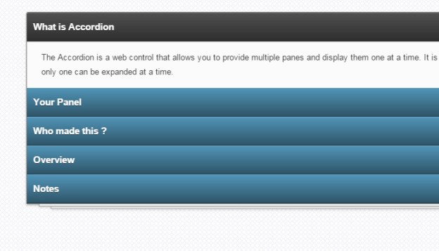
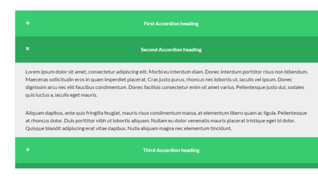
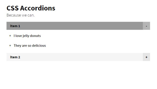
The word “accordion” typically conjures a mental image of your favorite polka band. Although polka music can offer a rip-snorting good time, the term is associated with something different in the realm of web design. User interface accordions might refer to menus, widgets, or content areas which expand like the musical instrument. These interfaces have grown a lot more popular in recent years with the expansion of JavaScript and more prominently jQuery.
I’d like to cover a series of examples and techniques for building accordion interfaces into any website layout. Accordions are popular because they allow developers to force large amounts of content into tiny spaces on the page. Granted these content displays also require dynamic effects for switching between page elements – so there are pros and cons to accordions. This post should outline the important concepts and topics related to accordion interface design.
Why use Accordion Menus?
I like to think of accordions as content management tools. When you have a page that’s broken into dozens of paragraphs, links, images, or just too many blocks of content… accordion menus to the rescue.
Not every website needs an accordion menu and you certainly won’t find them all the time. But that’s no reason to ignore the concept entirely. The purpose of an accordion menu is to manage an overabundance of content through dynamic switching. Each interface works differently based on the circumstances of the layout.
Nowadays the biggest concerning factor would be the total number of visitors who don’t have JS-supported browsers. Over the past decade this number has dwindled considerably low as more people are upgrading their computers. This means you should have almost no concern because even mobile smartphone browsers support JavaScript. If the content is viewable and the accordion is usable then where’s the harm?
Just be sure that each accordion component has a real purpose. There are times where I’ve found accordion FAQ pages that could have just listed content down the page without forcing me to click on each heading. Granted I understand the premise but if each answer can be surmised in a few sentences, hiding that content isn’t going to improve the user experience.
So when exactly should you use accordions? Mostly with larger menus or content which might behave cleaner using expandable sections. These could be sub-headings or even multiple levels – the point is to organize content in a way that makes navigation simpler than endless scrolling.
Sliding Menu Effects
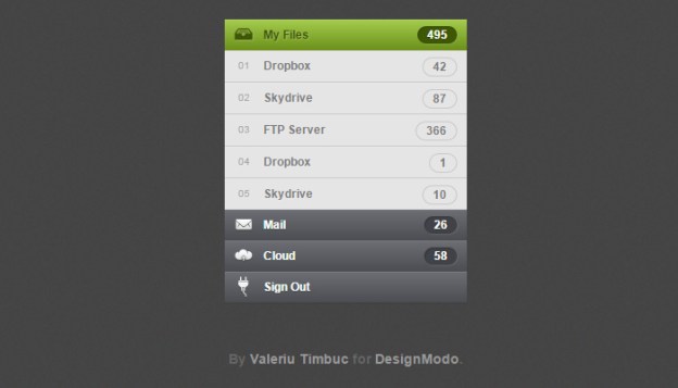
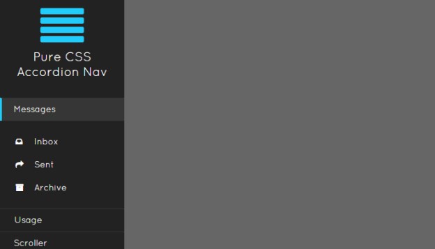
One of the most common interfaces you’ll experience is the sliding menu effect. This is usually vertical with a series of links hidden within sub-links. Clicking on a primary link will then expand the list of sub-links in a sliding animation.
Sometimes a website’s entire navigation menu is built on this accordion effect. Other common choices are dropdown menus which appear on hover – but accordion menus don’t slide over the page since they’re built into the page. So the effect is somewhat different and offers a different user experience by comparison.
Take a look at this Designmodo tutorial which explains the process of accordion development in a nice tutorial. The source code is free to download but it should really serve as an example describing how this interface might work. Designmodo has a live sample preview which demonstrates how the menu behaves in action.
Notice how the menu will automatically close when opening a new section. This is typical behavior when constructing an accordion menu because only one primary menu is open at any given time. But this is not a mandatory feature and, in fact, most accordion menus allow every section to be open. This choice depends largely on the website itself and how content is expected to behave.
CSS3 Tabbed Content
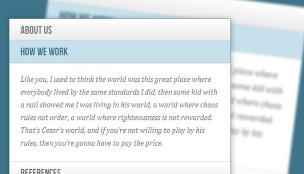
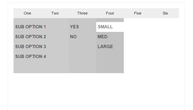
Another example of accordion content is based on tabbed widgets. So instead of having links listed vertically, tabs are used to manage shifting content. This is another really popular method of content management because JavaScript has made the process super easy. But since most developers are already familiar with JavaScript, I’d like to cover the more advanced techniques.
An alternative to JavaScript is the expandable accordion UI with CSS3. Granted they both seem like a risk but CSS3 has much less browser support. The only benefit is that CSS3 doesn’t require as much code and offers a simpler method of animation. If you prefer modern CSS3 animation check out the following tutorial:
Codrops publishes very high-quality content and their accordion CSS3 tutorial is no exception. The code is free and downloadable if you want to try it out yourself. Their live demo includes a couple different options which utilize checkboxes vs. radio buttons.
Checkboxes allow users to select multiple items at once. Using the checkbox method you can have many different content areas open at the same time. Radio buttons only allow one radio item to be selected. This means when opening a new section the previously-open section will close. Both work great and will vary based on the needs of each project.
Sliding Portfolio
Webpage content is managed via alternate pages for simplicity and ease-of-use. Visitors would rather browse through different pages rather than sift through a long single-page design. However working with collapsible accordion content makes the latter a lot more reasonable.
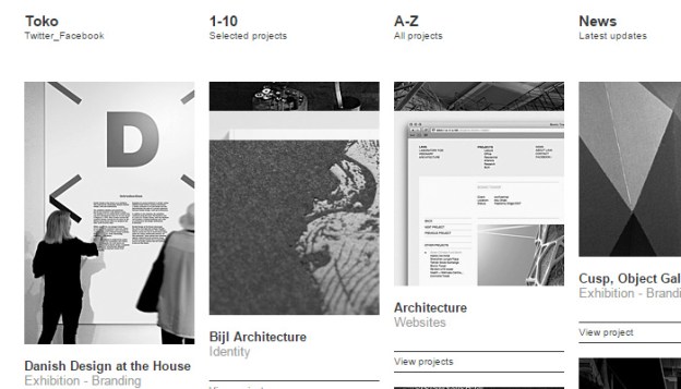
Take for example the homepage of Toko which uses a dynamic portfolio listing. As you click on each item the list will collapse smaller for an easier view of the project. This is by far an odd concept but it works great on their website. Why? Perhaps because of the minimalist design, perhaps because of the grid-like structure.
Either way portfolio sites can be an excellent choice for accordion widgets. Not every project should rely on accordions to best manage content. But think of the control you can offer visitors by organizing projects into larger categories and even sub-categories. Make use of this sparingly but keep it in mind.
Image Galleries
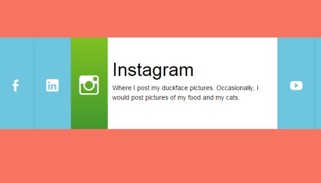
In a similar vein as the portfolio listing is a collapsable image gallery. In accordion-style this can take many forms as vertical, horizontal, slidable, tabbed, you name it! Touch-based interfaces have also allowed for swipeable image galleries that work nicely with computer mice too.
Getting back to Codrops I found another great tutorial covering an image accordion with CSS3. The effect is really cool and surprisingly supports click events. Each image is given some caption text which animates into view. What I like about this design is that it doesn’t rely on tabs or links or anything outside of the images themselves – so the content becomes the tabs. Pretty cool right?
Here’s a free jQuery plugin for building a responsive accordion image gallery. This example behaves similarly to the Codrops tutorial except all the animations are handled through jQuery. Also the caption text is a bit larger and seems more smooth. I’d like to state that either one of these effects could be duplicated and pushed onto the other – it’s simply a matter of recoding the design to fit the interface.
But my point is to demonstrate that both CSS3 and JavaScript can be used to create most of these effects. Unfortunately older browsers will never be backwards-compatible to support new CSS3 animation. Working with JavaScript is still the safest choice, but as more people upgrade their web browsers we can hope to see a future with primary support for CSS3.
Free Code Snippets
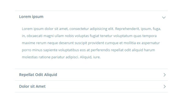
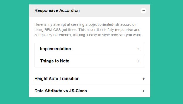
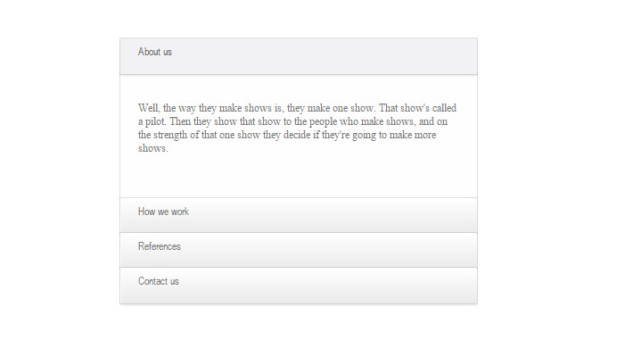
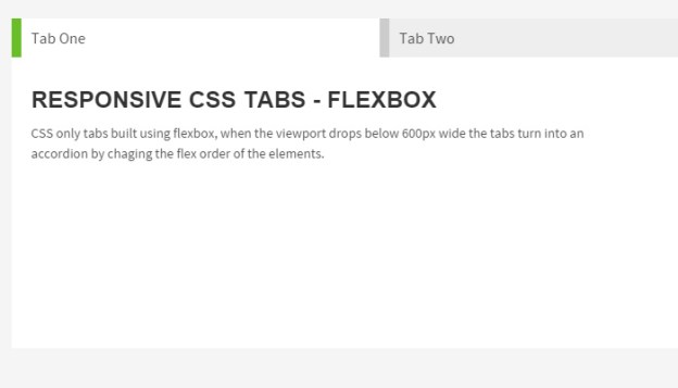
I’d like to wrap up this post by offering a collection of free open source code snippets. Each sample demonstrates the power of accordion content whether in a navigation, FAQ listing, or tabbed widget. All of these codes have been shared on CodePen and should be reusable on any project.
Granted you can always pick up a free plugin to rebuild something from scratch instead. Lots of developers release their code for free and try to help the community with free plugins. And of course there will always be those who prefer to build everything from scratch. But if time is a factor then I highly recommend working from these code snippets to ensure greater compatibility and a much quicker development schedule.
3D Accordion
Material List
Animated Accordion
CSS3 Dark UI
Full-Width Content
Multi-Level Accordion
Flyout Dropdown
Colored Bars
Multi-Level Accordion
Responsive Content
Sexy CSS Accordion
Dope Accordion Menu
Vertical Radios
Horizontal Radios
BEM Accordion
Pure CSS
Blue Accordion
Flexbox Tabs
Pure CSS Menu
Multi-Color Accordion
Read More at Best Practices for Accordion Menus in Web Design

