Archive

Archive for April, 2016

Finally, CSS In JavaScript! Meet CSSX

April 18th, 2016 No comments

JavaScript is a wonderful language. It’s rich, it’s dynamic, and it’s so tightly coupled to the web nowadays. The concept of writing everything in JavaScript doesn’t sound so crazy anymore. First, we started writing our back end in JavaScript, and then Facebook introduced JSX, in which we mix HTML markup with JavaScript. Why not do the same for CSS?

Finally, CSS In JavaScript! Meet CSSX

Imagine a web componentdistributed as a single .js file and containing everything — markup, logic and styles. We would still have our basic style sheets, but the dynamic CSS would be a part of JavaScript. Now this is possible, and one way to achieve it is with CSSX. CSSX is a project that swallowed my spare time for a month. It was challenging and interesting, and it definitely pushed me to learn a lot of new stuff. The result is a set of tools that allows you to write vanilla CSS in JavaScript.

The post Finally, CSS In JavaScript! Meet CSSX appeared first on Smashing Magazine.

Categories: Others Tags:

Instead of Instant Articles: Google’s AMP Accelerates Mobile Content

April 17th, 2016 No comments
AMP Plugin für WordPress

Google’s new project AMP (Accelerated Mobile Pages) exists since last October. The open source project AMP wants to reduce the loading times of websites significantly. Today’s websites are getting increasingly more bloated and carry weight, which often turns page loading on a smartphone into a waiting game. That’s why the goal is to reduce page load times down to milliseconds so that surfing on a smartphone becomes fun again.

AMP by Google was first introduced in October 2015. Google’s original target audience were the large publishing houses with own mobile appearances. However, every website owner can use the new, open source technology. AMP’s chief competition will be Facebook’s Instant Articles, which became open to all sites in April. However, only users of the Facebook app will benefit from the Facebook project. Among others, AMP is supported by ZEIT Online, the Frankfurter Allgemeine Zeitung, Twitter, Pinterest, and of course, by Automattic, the company behind WordPress.

Surfing on Smartphones is Painfully Slow

Google’s initiative wants to solve a widespread problem, the mobile internet usage. Especially weaker smartphones and tablets take a lot longer to load complex websites than the stronger desktop devices. A decisive factor when it comes to mobile speed are the types of advertisement that are hosted on other servers and need to load significant amounts of JavaScript. Loading a single Adsense ad takes longer than displaying the actual content. The New York Times has recently published an impressive article on that topic.

WordPress Supports AMP as Well

The WordPress team was one of the project’s first supporters and quickly provided a custom integration for AMP. WordPress.com automatically supports AMP; no manual intervention is needed. Now, there’s an option for self-hosted websites to benefit from the advantages of the high-speed framework for mobile view. You simply need to install a plugin, and from that point on, a self-hosted website automatically supports the mobile turbo. Settings are not necessary.

  • Developer: Automattic
  • Work in Progress: yes
  • Latest Version from: 02.24.2016
  • Costs: free on WordPress.org
  • License: GNU GENERAL PUBLIC LICENSE
  • Known Compatibility Issues: unknown
  • Developer Homepage: Unknown
  • Download on WordPress.org

AMP Test After the Plugin’s Activation

After the plugin was installed and activated, you can quickly test the function by adding an /amp/ to the end of an article’s URL. Here’s a demo of an AMP page without optimization, and another demo with some optimization. Only the actual article pages are transformed. Pages, landing page, categories, and other similar parts don’t work yet. The reason for that is the core idea of AMP, being able to access news articles faster.

Google Marks AMP Websites

Websites that support the new format are preferred within Google’s mobile search. The new format is pushed with all might. Google displays the search results that come in AMP format as “Top Stories” on mobile devices. This works really well already when searching with a mobile device’s browser.

AMP in der Google-Suche

Google’s AMP is Customizable for WordPress Users

AMP supports a broad palette of features, including advertising forms like Doubleclick and AdSense. Analysis tools can also be integrated. In addition to that, there are plenty of hooks for self-hosted WordPress websites, allowing you to create and customize your AMP template. In the future, a special customizing interface will be added. First for WordPress.com, then as a plugin for self-hosters.

Here’s an overview of all the customization options for WordPress.

The video on the topic:

Related Links:

(dpe)

Categories: Others Tags:

Introducing the new Framer

April 17th, 2016 No comments

Framer, the design and code tool from Facebook, has been updated with lots of new features.

I guess it’s Framer “js”, because the designs you create are formed from a code syntax that is vaguely JavaScript-like. Kinda looks like JSON in CoffeeScript. But you’re actually working in a native app.

It’s a wild time for design tooling. Sketch had become a dominant player for screen design. Adobe knows designers don’t turn to Photoshop like they used to and is making things from the ground up like Adobe XD and trying to figure out mobile. Webflow is getting it done in the browser and producing production-ready sites. InVision is also happening in the browser and focusing on teams and workflow. There are very niche tools like Lingo popping up.

The design tooling landscape in years to come will probably be as splintered as the web development tooling is now.

Direct Link to ArticlePermalink


Introducing the new Framer is a post from CSS-Tricks

Categories: Designing, Others Tags:

Popular design news of the week: April 11, 2016 – April 17, 2016

April 17th, 2016 No comments

Every week users submit a lot of interesting stuff on our sister site Webdesigner News, highlighting great content from around the web that can be of interest to web designers.

The best way to keep track of all the great stories and news being posted is simply to check out the Webdesigner News site, however, in case you missed some here’s a quick and useful compilation of the most popular designer news that we curated from the past week.

Note that this is only a very small selection of the links that were posted, so don’t miss out and subscribe to our newsletter and follow the site daily for all the news.

6 Ways to Make your Personal Website More Effective

Becoming a Full-Stack Web Design Freelancer

Site Design: Plane

Sketch, Illustrator or Fireworks? Exploring a New Free UI Design App: Gravit

What’s New in WordPress 4.5

A Brief History of Lens Flare

Museum Logos: Drawing the Line

100 Portraits that Tell the Stories of People Underrepresented in Tech

Noysi – Create a Teamwork Chat for Free

Thwock: An Interactive Presentation Tool

4 Lessons Google Teaches us About User Experience

Min: Minimal Web Browser

Onboarding to Land Clients

Jony Ive Designs Stunning One-off iPad Pro

Stashes.io – Start your own Curated Directory

The Future of Business is Design

Google Built an App that Critiques Other Apps

Designers Shouldn’t Code-they Should Study Business

Ignoring LinkedIn is Hurting your Career

Moleskine Launches Smart Writing Set

Man Erases Thousands of Websites with a Bad Command

Shopify Acquires Kit, the Artificially Intelligent Marketing bot

Cards Against Humanity Designer: “Graphic Design Doesn’t Have a Critical Dialogue”

Microsoft’s Blue Screen of Death is Getting an Update

House Passes Bill to Sabotage Net Neutrality

Want more? No problem! Keep track of top design news from around the web with Webdesigner News.

LAST DAY: The Fantastic Snow Text Generator – only $7!

Source

Categories: Designing, Others Tags:

How to Create Custom WordPress Widgets

April 16th, 2016 No comments
Die vier Grundbereiche eines Widgets

Aside from plugins, custom WordPress widgets are another great way of adding useful features to your WordPress. While most of the time, plugins provide specific features for the website, like displaying related articles, for example, widgets extend the possible features for your theme’s widget areas. You can think of many interesting features here, for example displaying an “about me” box or your latest tweets. In this article, we’ll use two examples to show you how you can easily create custom WordPress widgets.

What are WordPress Widgets and Why Should You Know That?

WordPress Widgets add content and additional features to your widget areas. There are plenty of options, as widgets can be placed in many different areas of a theme, for example, in the sidebar, the footer, or in particular widget areas within your theme’s special landing page. The features that can be provided are just as diverse as the possible placements.

If You Develop Themes, You Should Also Provide Widgets

Many people that deal with WordPress in-depth plan on creating their own themes at one point in time. The logical evolution of that is offering features via widgets. Generally, it’s a lot better to provide additional functions via plugins and widgets, as then, these features can still be used after the theme has been changed. This is done for the purpose of user friendliness, which will surely be rewarded by your visitors.

Developing WordPress Widgets – Getting Started

Those that plan on developing custom widgets should have knowledge in PHP. It’s just like it is with theme and plugin development. In-depth knowledge in PHP always creates good results as long as you stick to the WordPress coding standards. The two widgets that I’ll present here are both fairly straightforward, so even beginners should be able to work with them after a bit of practice.

Further Information:

Developing WordPress Widgets – the Basics

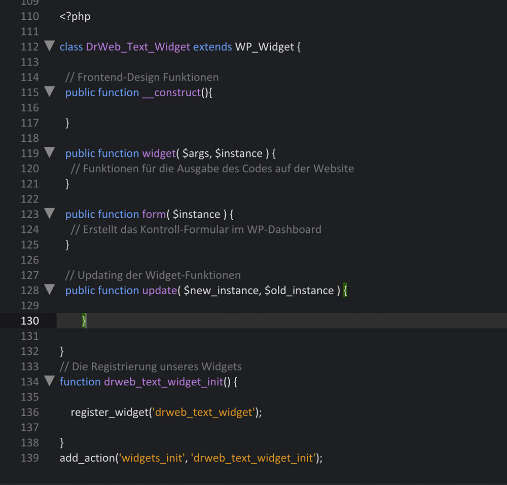
Since WordPress 2.8, widgets are set up by extending the widget class WP_Widget, which is unique to WordPress. Here, a widget is divided into five different basic areas:

1 – The Initialization – function __construct(). Here, the widget’s ID, name, and description are defined. Additionally, we can also set the default options in this area. Also, when JavaScript or stylesheets need to be referenced, the required function also comes from this area.

2 – The Frontend-Design – function widget(). This is the area into which the function for the disbursal of the code is placed. Thus, it’s the widget’s actual function area.

3 – The Backend-Design – function form(). The required features alongside the HTML for the widget’s control area in the WordPress admin area go into this area.

4 – The Update of the Settings – function update(). As the name already gives away, the function for the validation and the update of the widget settings is stored.

5 – The Registration – function init(). The widget is registered in WordPress, and can thus be activated like a plugin.

These five areas make up the core structure of a widget, as clarified by the following screenshot.

One Click Opens the GitHub Gist

The Most Important Step – the Plugin Header

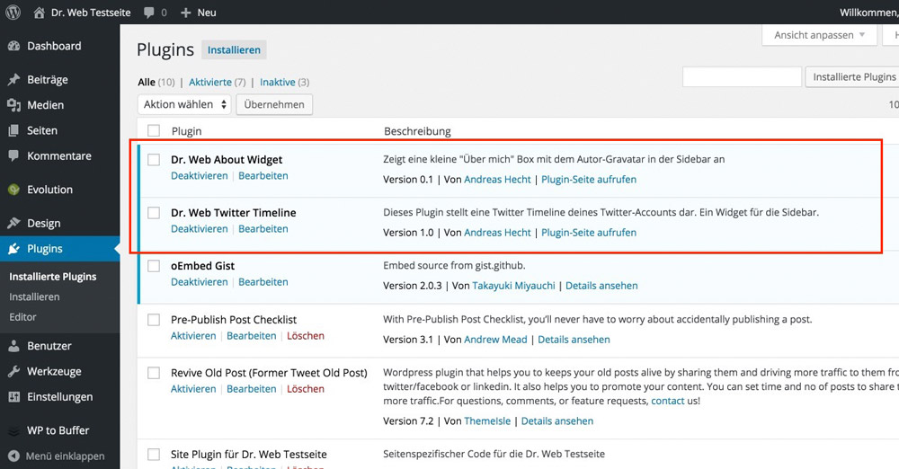
Before you can use your finished widget, it still needs a »Header”, so it can also be displayed in the plugin index under the menu item “Plugins”.

Der Header eines WordPress Plugins

As the widget is also handled like a plugin, there is no way around having a plugin header. When this step is forgotten, the widget will not appear in your WordPress’ plugin area, and thus, can’t be activated. With a header, however, it appears in the overview.

Die Dr. Web Plugins in der Übersicht

Two Example Plugins Including Download

Often, examples are the best way to learn something. Thus, I chose two widgets as examples and rewrote them. The level of difficulty is suitable for beginners, the »About me” widget is kept simple, the »Twitter Timeline” widget is a bit more sophisticated, as it adds a JavaScript file to the footer when used. However, the Twitter widget is also to be considered a beginner widget.

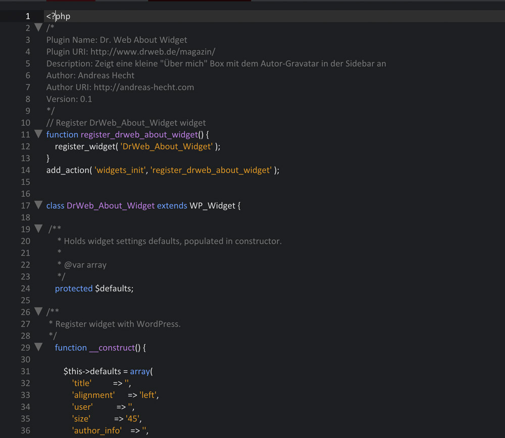
The »About me” Widget

This small plugin creates a simple “About me” widget, which can display a text about you as well as a Gravatar. The size of your Gravatar can be adjusted, as well as the page that the widget links to.

One Click Opens the Complete File on GitHub.
Das "Über mich" Widget

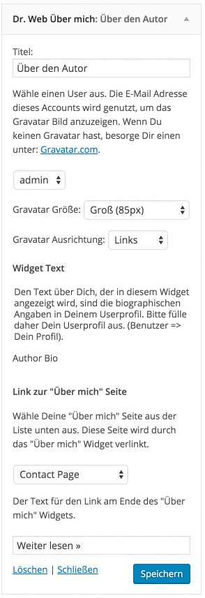
The Widget’s Settings

About Widget Einstellungen

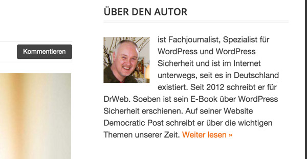
The Final Result on the Website

Das Endergebnis des About me Widgets

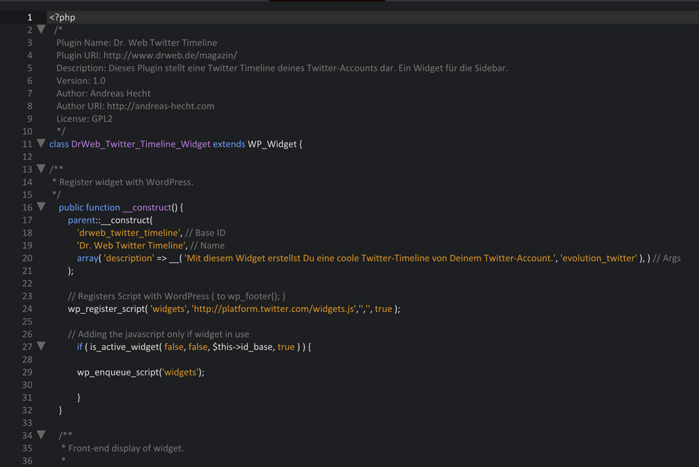
The Twitter Timeline Widget

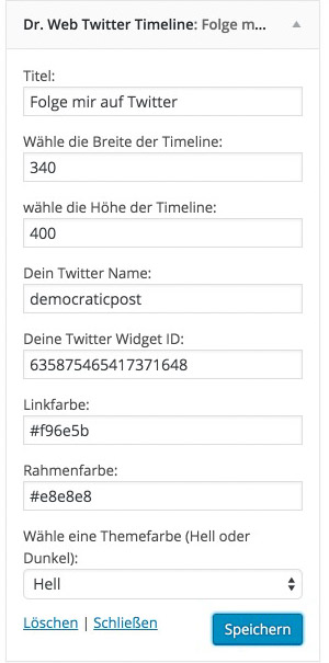
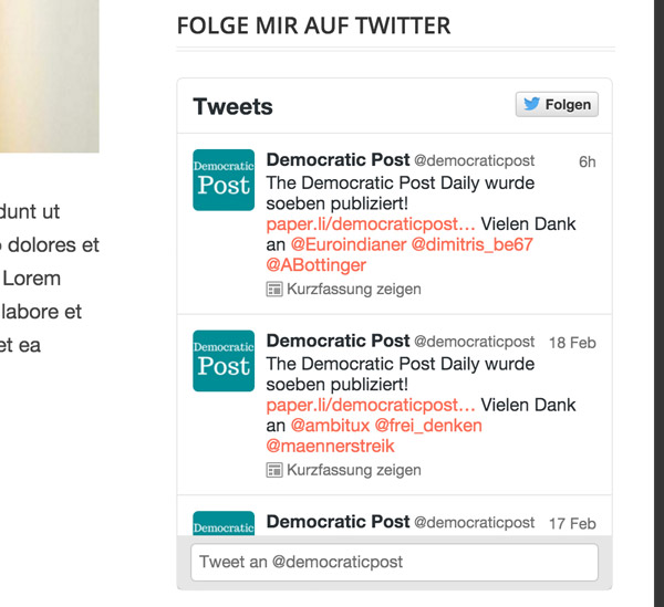
The Twitter timeline widget displays the popular Twitter timeline in the sidebar. This widget allows you to display your latest tweets in a rather appealing way. Additionally, your visitors can tweet you directly from within the application. You need a Twitter widget ID to be able to use the widget. This article (in German) explains how to receive it in a detailed way.

One Click Opens the Complete File on GitHub.
Der Code des Twitter Timeline Widgets

The Widget’s Settings

Twitter Widgets Einstellungen

The Final Result on the Website

das-twitter-widget

Finishing Touches on the Widget

After these WordPress widgets have been coded and tested on a local developing environment, they can be installed. To do so, create a folder with the (lower case) plugin names, for example, »noupe-about-widget“. The plugin file belongs in there. Subsequently, you can upload the folder to the plugin index (wp-content/plugins) via (S)FTP, and activate it just as you would with a plugin. Afterward, the widget appears in the list of available widgets and can be used.

Conclusion

You’ve gained basic knowledge on creating WordPress widgets in this article. The best method to learn how to build widgets is experimenting with the widget code of the two example files. Both widgets are fully functional and have been tested, meaning they will also work on the latest WordPress version, which is 4.5 at the time of this writing.

Download the Example Widgets

(dpe)

Categories: Others Tags:

Comics of the week #335

April 16th, 2016 No comments

Every week we feature a set of comics created exclusively for WDD.

The content revolves around web design, blogging and funny situations that we encounter in our daily lives as designers.

These great cartoons are created by Jerry King, an award-winning cartoonist who’s one of the most published, prolific and versatile cartoonists in the world today.

So for a few moments, take a break from your daily routine, have a laugh and enjoy these funny cartoons.

Feel free to leave your comments and suggestions below as well as any related stories of your own…

A fine line between tragedy and comedy

More conventional thinking

Come unarmed

Can you relate to these situations? Please share your funny stories and comments below…

Evolve Your Artwork with the Darwin Font Family – 20 fonts for only $15!

Source

Categories: Designing, Others Tags:

Twitter is Testing Material Design for its Android App

April 15th, 2016 No comments
twitter-mobile

Twitter is working on a new design and layout for its Android application, and if the opinion provided by beta testers is anything to go by, the new look of the official Twitter app shall be based on the principles of Material Design.

The new version of the app shall retain the basic structure of the current layout and design — Feed, Moments, Notifications and Direct Messages shall still be at the top. However, you can now navigate between them by scrolling left to right, or by clicking on their respective icons.

twitter-mobile

Furthermore, the Twitter app for Android might also now come with a slide-out menu that will replace the current ellipsis menu. Plus, much like GMail and Google+ apps, Twitter too might add a floating “new tweet” button, if reports by Android Police are to be trusted.

There is no word yet as to when this new version of the Twitter app for Android devices will be released, but it surely will be sticking to Material Design henceforth. In terms of interface, Twitter might probably not do a lot of innovative experiments, but the design and appearance will surely be revamped.

What do you think of this step by Twitter, of opting for Material Design for its Android application? Long overdue? Share your views in the comments below!

Read More at Twitter is Testing Material Design for its Android App

Categories: Designing, Others Tags:

I, Website

April 15th, 2016 No comments

There is a famous essay by Leonard E. Read called “I, Pencil“. This is a homage to that.


I am a website — the ordinary website familiar to all people who use the internet.

Presenting information is both my vocation and my advocation; that’s all I do.

You may wonder why I should write a genealogy. Well, to begin with, my story is interesting. And, next, I am a mystery — more so than a tree or a sunset or even a flash drive. But, sadly, I am taken for granted by those who use me, as if I were a mere incident and without background. This supercilious attitude relegates me to the level of the commonplace. This is a species of the grievous error in which mankind cannot too long persist without peril. For, as a wise man observed, “We are perishing for want of wonder, not for want of wonders.”

I, Website, simple though I appear to be, merit your wonder and awe, a claim I shall attempt to prove. In fact, if you can understand me — no, that’s too much to ask of anyone — if you can become aware of the miraculousness which I symbolize, you can help save the freedom mankind is so unhappily losing. I have a profound lesson to teach. And I can teach this lesson better than can an automobile or an airplane or a mechanical dishwasher because — well, because I am seemingly so simple.

Simple? Yet, not a single person on the face of this earth knows how to make me. This sounds fantastic, doesn’t it? Especially when it is realized that there are about 300 million of my kind produced each year.

Load me and look me over. What do you see? There’s some text, some images, a logo, navigation, perhaps a form, perhaps other media like video or audio.

Just as you cannot trace your family tree back very far, so is it impossible for me to name and explain all my antecedents. But I would like to suggest enough of them to impress upon you the richness and complexity of my background.

My family tree begins with what is in fact typography. Pure letterforms coming together as a system to communicate messages, born from from the desire to mass produce books as early as the 15th century. Typography has had a long road since then, only in very recent history manifesting as pixels on a screen. The people involved in that process are too numerable to mention. The thought behind it immeasurable. The culmination of skillsets massive. The tools used countless. Why, untold thousands of persons had a hand in every cup of coffee the designers drink!

How are these words delivered to you? Massive networks of wires! Fiber-optic undersea cables line all the oceans and seas and grip the Earth like a hairnet. A single cable crossing an ocean costs hundreds of millions of dollars to install. Imagine the slowly plodding boats, embedding these cables into the seabeds. Who captains these vessels? Who turns the crank releasing more cable to the depths. Who prepares the pork and beans? Who scrapes the barnacles from the boats hull? These legions are among my antecedents.

Don’t overlook what powers these lines. Perhaps we shall thank Benjamin Franklin flying a kite in a thunderstorm. Nod to Thomas Edison for his practical light bulb, making it ever-so-desirable to wire up this world. Light bulbs, no doubt, brightening the sketchbooks of every subsequent inventor. A high five to Alexander Graham Bell is due, for passing the first information along those wondrous wires.

As I travel through our enormous wires, so too I travel through enormous computers. The internet’s “core routers”—$1,000,000 or more in engineering and construction—are among the most powerful, capable, and expensive machines on the planet. Not to mention temporary. The rapid increase in demand for speed ensures a core router today isn’t a core router a decade from now.

What is it exactly that travels this network? My foundation is the ubiquitous Hypertext Transfer Protocol. If the computers of the world are to talk to one another, they need to agree on how. For that we can thank the Internet Engineering Task Force and the World Wide Web Consortium. We could thank those who planned those meetings. The cabbies who brought them together. The bartenders who were certainly… involved.

Bask in a traceroute, a pale visualization of a journey through our vast network.

traceroute to example.com (64.13.192.208), 64 hops max, 40 byte packets
1  72.10.62.1 (72.10.62.1)  1.000 ms  0.739 ms  0.702 ms
2  10.101.248.1 (10.101.248.1)  0.683 ms  0.385 ms  0.315 ms
3  10.104.65.161 (10.104.65.161)  0.791 ms  0.703 ms  0.686 ms
4  10.104.0.1 (10.104.0.1)  1.430 ms  1.310 ms  1.063 ms
5  10.0.10.33 (10.0.10.33)  2.652 ms  2.260 ms  5.353 ms
6  acmkokeaig.gs01.gridserver.com (64.13.192.208)  3.384 ms  8.001 ms  2.439 ms

We should remember Tim Berners-Lee, excuse me, Sir Timothy John Berners-Lee, a man knighted by Queen Elizabeth II for his pioneering work on the web. He was the first to implement Hypertext Transfer Protocol ever (the father of the web, we could easily say), and presides as director of the World Wide Web Consortium to this day, a team of some 70-odd people standardizing how I should work and my future.

My building blocks, while limitlessly complex, are few. Hyper Text Markup Language is my body. Cascading Style Sheets are my clothes. JavaScript is there for the version of me that breathe. All are similar, but no two of me are quite the same.

There are vast seas of practitioners specializing in the creation of me, each unique in their skills. One Front End Developer may be a master of my HTML and CSS. Carefully arranging a beautiful system to not just create me, but a system in which many more of me can be created efficiently. Another Front End Developer may be deeply focused on JavaScript, making me sing with glorious interactivity, but whose CSS skills leave something to be desired. Another developer may focus their skills on how to make me accessible to all others who may need me.

While HTML is my body, my bones, the very creation of it may pieced together by other practitioners. The keepers of data. The masters of the back end. Not to mention the artists who consider my colors, my feel, my gestalt. Not to mention the researchers who guard the usability of the site. Not to mention the managers who align the teams. The operators whose job it is to make me fast and keep my healthy. The steerers of ships. The people whose job is it to help people find me, use me, love me.

To be sure, I change over time. Oh, the places I’ll go. Right now, I’m lounging on a laptop screen at a coffee shop in Istanbul. In a moment I’ll grace the screen of a phone in Seattle. The afternoon I have an appointment on a television in Tokyo followed by a watch in Berlin. Fortunately, I’m built to travel. I’m an open format, after all. How the world chooses to digest me is up to it. I speak an open protocol. I am an entity. I am a Uniform Resource Locator.

Does anyone wish to challenge my earlier assertion that no single person on the face of this earth knows how to make me? Actually, millions of human beings have had a hand in my creation, no one of whom even knows more than a very few of the others.

An astounding fact: I have no master mind. No one person dictates or forcibly directs the countless actions which bring me into being. No trace of such a person can be found.

I, Website, am a complex combination of miracles.

The lesson I have to teach is this: Leave all creative energies uninhibited. Merely organize society to act in harmony with this lesson. Let society’s legal apparatus remove all obstacles the best it can. Permit these creative know-hows freely to flow. I, Website, offer the miracle of my creation as testimony.


I, Website is a post from CSS-Tricks

Categories: Designing, Others Tags:

20 Fonts Ideal for Big and Powerful Headings

April 15th, 2016 No comments
fonts_headings_17

Headings play a major role in the way users digest content. Through size and style, they help establish a hierarchy and make text easy to scan. Headings also help establish the mood created by a design. So it’s important to choose the right font to compliment the website’s style.

For this article, we’ve rounded up 20 fonts that are ideal for creating big and powerful headings for your web designs.

Franchise

Bebas

fonts

Insolent

fonts

Nevis

fonts

Molot

fonts

Gnuolane

fonts

Fertigo Pro

fonts

Alte Haas Grotesk

fonts

Vollkorn

fonts

PLAYFAIR DISPLAY

Screen Shot 2016-04-15 at 11.23.07 AM

Telegrafico

fonts

SORIA

Screen Shot 2016-04-15 at 11.18.32 AM

League Gothic

fonts

Forque

fonts

Romeral

fonts

Tertre

fonts

Bitstream

fonts

Communist

fonts

Old Sans Black

fonts

Sling

fonts

Read More at 20 Fonts Ideal for Big and Powerful Headings

Categories: Designing, Others Tags:

Interview: How Code and Theory built NY.Gov

April 15th, 2016 No comments

Successful web design hinges on good research, targeting the right demographic, identifying key problems and developing appropriate solutions.

But how you start when your target demographic is literally, everyone? How do you structure a site when it serves a vast array of disparate needs? How do you set about designing a site for a whole state? When they were approached to design NY.Gov for the state of New York, these are just some of the challenges Code and Theory faced.

We sat down with Matthieu Mingasson, Code and Theory’s Director of Creative Strategy, to ask him a little about how typical workflows stand up to the demands of such large-scale public projects.

Planning challenges

Webdesigner Depot: When you sat down for your first meeting, what’s the first question you asked? Where do you start with a project of this scale?

Matthieu Mingasson: Reimagining the way that constituents interact with local and state information requires a good understanding of the audience specificities and business requirements. We started with a set of questions that would help us to understand the needs and expectations of New York State constituents when it comes to interacting with their government, and more specifically the government’s website. i.e:

  • What do New York Constituents need from their State Government?
  • How do they generally interact with the NY.gov website?
  • What are the main needs per segments?
  • What are the main pain points that need to be addressed?

Understanding user needs and business goals is a critical phase of any project. It can spread across several weeks, during which we meet the main stakeholders and representative users.

WDD: New York State has close to 20 million residents, how do you set about prioritizing the needs of an entire state?

MM: It was a difficult task, indeed, as we had to define a solution that worked for everyone.

we defined…24 reasons why users visited the site…solving these queries would help more than 70 percent of the traffic

Since the beginning our approach was to identify user needs based mainly on data. This made the prioritization much easier. We did a search query analysis to help us identify what people searched for when visiting the existing site. From this analysis we grouped keywords based on affinity, and we defined a group of 24 reasons why users visited the site. We approximated that solving these queries would help more than 70 percent of the traffic.

We also worked closely with Rachel Haot’s team, (former) Chief Digital Officer of New York State to define areas where we could innovate and provide value to our users. This is demonstrated in our news distribution, emergency pages, and local resources provided in the site.

WDD: What was the planning phase like? Did you run workshops with key stakeholders for example?

MM: We had a 10 week definition phase. During the first 5 weeks we conducted user research, stakeholder interviews and data analysis. By the first five weeks we had collected all the information we needed, and started defining our creative strategy. We had strategic check-ins with the client. We had usability research sessions as early as possible; testing our assumptions with visual design comps.

Handling public sector clients

Webdesigner Depot: Was there a lot of red tape to cut through?

Matthieu Mingasson: Not at all. We worked with an extremely collaborative and available team. Governor Cuomo has a very talented team in charge of digital operations. We had full collaboration from agencies, technology and the new editorial team set in charge of maintaining ny.gov. Our challenge was mainly focused on how we could make the site more accessible to our users, which was very rewarding.

WDD: How does crafting an experience for such a huge client differ from regular projects?

MM: Our approach is very similar when working with big and small clients.The difference between a large and a small projects essentially comes down to time and depth dedicated to research and problem solving for complex system design.

The difference between a large and a small projects essentially comes down to time and depth dedicated to research and problem solving for complex system design

Our methodological framework allows us to design anything, large or small. One of the critical aspects of our approach is speed. We strongly believe in keeping a small, lean team to help us move faster. We also like working with constraints. We always make sure we have a definite launch date against which we can build our project plan.

For NY.gov, the process was very collaborative thanks to the amazing collaboration from the State team that was committed to launching the site on time.

WDD: Were there existing brand guidelines in place, or did you work on the identity as well?

MM: The brand guidelines were being redefined in tandem with our product development. We saw this as an opportunity to contribute to those guidelines. It is challenging to go back to changing the logo of the site. But this also gave us a lot of room to explore the brand and identify its digital presence.

After this project we had the opportunity to prepare the digital guidelines not only for NY.Gov but for all the different agencies in the State. We had to closely follow accessibility guidelines in order to be able to design for everyone, and this was a challenging but rewarding experience.

WDD: How did you coordinate content delivery from so many different departments?

MM: After we identified key services we prepared “one stops” for each to lead agency site owners. In some instances agencies needed to collaborate to create the content. We created content guidelines for them to follow, and provided with a collaborative documentation for them to work from. We asked the agencies to work directly from a shared documentation allowing our team and the NYS team to monitor and advise the agencies. Later we included all the “white listed cards” results—these are explanations on how to accomplish something within a card that usually deep-links a user to an agency site. These “white listed cards” also had their own content guidelines. The agency content owners helped us collect and categorize all this data by using a google form.

Building NY.Gov

Webdesigner Depot: Do you live in NY state? Did that affect your process?

Matthieu Mingasson: We all live in New York City but our team was very international. We had a German-Canadian, French, Russian, Mexican, Indian and also Americans from diverse states in the core team. We believe that having an outsider view helped us identify trends and challenges that locals may have missed. We had to make sure to interview many of our users from upstate to help stay in touch with other mindsets. But, we knew our design needed to be universal and speak to everyone.

WDD: You have a drop down menu on mobile, supplemented with a hamburger menu at key points; was that a decision based on user testing?

MM: Our goal was to build a system that could be adopted by a large number of agencies from New York. For this we had to establish a system of navigation and contextual elements. The universal navigation, the bar that clearly communicates to the user they are in a trusted site with resources and service information, uses the dropdown menu. The hamburger is brought in contextually for agency navigation. You can see an example in the Office of Governor Andrew Cuomo’s website (governor.ny.gov). This site extends the system we have created for NY.Gov and applies it to other New York State Agencies.

WDD: You built the site in Drupal, what made that the right choice for this project?

MM: The NY.gov project was the first site of a growing eco-system. From the very beginning we knew the centralized technology services agency was planning to have a common CMS platform for more than 150 websites. Drupal’s inherent extendibility is a perfect match for this challenge.

WDD: Was there anything you really wanted to include that the client vetoed?

MM: Not really. But we did build one of our favorite features that did not perform well on user testing so we had to remove from the site. This was an expandable universal navigation: In the dropdown panel users could preview and explore the most popular services, programs and news; users didn’t want to preview the content, they wanted to click and go to the page.

The results

Webdsigner Depot: Have you analysed how real people are interacting with the site? Are they using it as expected? Any surprises?

Matthieu Mingasson: We do, all the time. We see our friends looking up how to get a driver license or when an emergency happens, like the snow storm this January, ny.gov becomes the main source of information. Our biggest surprise was the universal navigation, and realizing how much people love being able to find events, job listings, and local information around them.

when an emergency happens, like the snow storm this January, ny.gov becomes the main source of information

WDD: If New Jersey calls tomorrow and says it needs a website, what are the biggest challenges it will face?

MM: Executive sponsorship and commitment is key to being able to launch a project like this. To overcome challenges of a government organization, the key is assigning a small but dedicated leadership team to collaborate with an agency. The best results come when our clients understand, accept and facilitate this change process. Transparent collaboration and openness is key to success.

Thanks to Matthieu for taking the time to answer our questions.

Featured image uses Marco Varisco’s New York State Capitol image.

LAST DAY: 2-Year Subscription to Vectorstate – Download 2400 Illustrations – 75% off!

Source
Categories: Designing, Others Tags: