Archive

Archive for April, 2016

Google To Display Warnings For Sites With Deceptive Content

April 12th, 2016 No comments
google-deceptive

In its bid to offer better search experience to its users, Google has been trying to implement Safe Browsing features in its offerings. We have Safe Browsing features that protect users from social engineering attacks, and carrying on with the trends, Google has now introduced a new one — henceforth, Google will now be blocking deceptive content and ads that lure users into clicking by disguising themselves as something else.

For example, the Download buttons that are actually advertisements, or something similar — soon to be blocked by Google!

Well, not really “blocked”, but you will receive a warning if you head towards such as a site. Something that looks like this:

google-deceptive

And to define what comes under the jurisdiction of such warnings, here is what Google had to state:

Embedded content (like ads) on a web page will be considered social engineering when they either:

  • Pretend to act, or look and feel, like a trusted entity — like your own device or browser, or the website itself.

  • Try to trick you into doing something you’d only do for a trusted entity — like sharing a password or calling tech support.

You can learn more about this feature on this page, as well as see samples of such deceptive content. Also, if your website is affected by these changes, it might be the best time to act early and fix the deceptive content and ads, lest your page rank might suffer badly.

Read More at Google To Display Warnings For Sites With Deceptive Content

Categories: Designing, Others Tags:

Introducing iframify

April 12th, 2016 No comments

Hugo Giraudel writes up why he created iframify, a script which grabs a DOM node and wraps it in an . It’s a nifty tool for displaying components in a style guide at a certain width and effectively faking element queries.

An iframe being an inner document, media queries fire based on the width of the iframe rather than on the actual screen size. Which is what we want. Yay!

Direct Link to ArticlePermalink


Introducing iframify is a post from CSS-Tricks

Categories: Designing, Others Tags:

Clarity 2016 Wrapup

April 12th, 2016 No comments

My writeup of Clarity conference (the recent conference about style guides). Not comprehensive notes, just the things that resonated with me.

Direct Link to ArticlePermalink


Clarity 2016 Wrapup is a post from CSS-Tricks

Categories: Designing, Others Tags:

A faster FT.com

April 12th, 2016 No comments

Clever testing strategy from the team at Financial Times: they used blocking CSS in order to test people’s behaviour when they’re faced with a slow loading web page:

We wanted to understand how much the speed of our website affected user engagement, specifically, the quantity of articles read, one of our key measures of success. Using that data we then wanted to quantify the impact on our revenue.

If you’re looking for more interesting reading about performance and how it affects people’s behaviour, see the collection of case studies over at WPO stats.

Direct Link to ArticlePermalink


A faster FT.com is a post from CSS-Tricks

Categories: Designing, Others Tags:

Rhythm: New Trendy Multi-Purpose WordPress Theme for Creatives

April 12th, 2016 No comments
1-rhythm-theme-review

Rhythm is a responsive trendy WordPress theme which can be whatever you want it to be. It’s an excellent tool for website creating for any kind of business. Rhythm offers over 50 different demos with single or multi-page format.

1-rhythm-theme-review

You can check out the demos on this page. If you own a photography business, a store, a blog, or any kind of company, this theme can increase your business chances of success.

Rhythm has minimalistic clean design making it suitable for anything you want. Despite its complexity and stack of features, the installation process takes less than 2 minutes and can be made in only one click.

Rhythm has won several awards already, and it’s a winner of honorable mention on Awwwards (that is huge!).

Rhythms is Suitable for Any Kind of Business

This creative flexible WordPress theme comes with various pages and elements to add and customize the theme for your own needs. For example, if you’re a photographer and you’re going to create a portfolio on Rhythm base, you can create wide, boxed, masonry, single, parallax and promo portfolio.

You can add different pages, such as landing page, about us, services, team, FAQ, pricing, contact, gallery, error 404 and more. All of these pages are already pre-designed for you. Just fill in your information and images, then you’re done.

2-rhythm-theme-review

If you’re a blogger, Rhythm will be a perfect choice for you. You can create classic, single, masonry, and columns blog with various sidebar options.

For the owner of an online store, it also provides lots of helpful features. Besides various page elements you can add while editing, the theme offers features such as buttons, feature boxes, grid, icons, sliders, tabs, messages, typography, and headers just to name a few.

4-rhythm-theme-review

Key Features of Rhythm

Here is a list of key Rhythm features:

  • One page and multi page demos
  • 50+ different demos
  • Lots of predesigned pages
  • Visual Composer
  • Over 40 Portfolio Pages
  • Over 10 blog pages
  • Header variations
  • 5 Single Project Pages
  • Light, Dark and Transparent Menu Bars
  • Slider Revolution
  • Easy to customize
  • Retina ready
  • Fully responsive
  • Font Awesome 400+ icons
  • Et-line 100+ icons
  • Parallax sections
  • Smooth animation
  • Powered with Bootstrap
  • 5 Posts variants
  • Powerful short-codes
  • Responsive video
  • Browser compatibility (IE9+, Chrome, Safari, Firefox, Opera)
  • Online Documentation
  • Clear and neat design
  • Accurate code
  • Layered PSD files
  • FAQ
  • Special Demos
  • RTL layouts, RTL-ready typography.

With Rhythm you can create both single and multi-pages website. Each demo is included on their page, so you can see them all in action.

Almost any page you may need for your website is already predesigned for you.

6-rhythm-theme-review

The theme also has Visual Composer built in, the #1 WordPress plugin for building websites and it’s drag-and-drop feature requires no coding skills at all.

There are lots of portfolio and blogging pages installed that allow you to create a website design which will fit perfectly with the needs of your business.

You can also play around with header and menu bar variations to personalize your website.

3-rhythm-theme-review

Rhythm features Slider Revolution WordPress plugin with powerful visual editor that makes creating a slider as easy as ABC.

With Rhythm you can customize literally any element of your future website, whether it be a single button or a whole page.

Along with the theme layout you’ll get over 400 awesome icons you can use on your website.

Great news for bloggers: Rhythm has five post variations, so you can create Text post, Image, Gallery, Video, and Quotes which means endless possibilities to present your information online.

The theme also includes special demos for creating construction, magazine and landing pages.

7-rhythm-theme-review

Rhythm allows you to insert a video on your website from almost any modern video platform, such as YouTube, Vimeo, Blip.tv, Viddler, and even Kickstarter.

Moreover, buying Rhythm you’ll get layered PSD files, so you can change the design in Photoshop yourself and then paste it on your website.

5-rhythm-theme-review

Usually, we have LTR (left-to-right) layout on our websites and devices. Due to the latest update, Rhythm has RTL layouts and typography which would be helpful for Arabic, or Hebrew. This should be useful for left-handed people too, in case they find the regular LTR layout too cumbersome.

6 Months Support

After buying the Rhythm theme you will also get 6 months of support for free. The theme developers are friendly and they consider new theme suggestions from their users.

If you like more hand-on experience, you can click on each demo and see the product in action.

With Rhythm theme you are backed by the power to extend your site as your business grows! So, don’t hesitate and buy Rhythm today for only $59! Let us know what you think of Rhythms in the comments below!

Read More at Rhythm: New Trendy Multi-Purpose WordPress Theme for Creatives

Categories: Designing, Others Tags:

Better Interface Design: Logins, Menus, Toggles And Other Fancy Modules

April 12th, 2016 No comments

CodePen has become the playground for developers. The sandbox where you can build whatever your imagination fancies. Practical things, experimental concepts — it’s a treasure chest, bound to fuel your ideas.

Modal window breaking into parts as soon as a user closed the window.

For this Quick Tip, we have done some digging around and found some interesting UI demos and concepts for you to indulge in and build upon: dialog and modal windows, signup and login screens, navigation and menus, sliders and toggles. Small bits of delight that make the user’s interaction with a website or app more pleasant. Enjoy!

The post Better Interface Design: Logins, Menus, Toggles And Other Fancy Modules appeared first on Smashing Magazine.

Categories: Others Tags:

Simple responsive one-page sites using Carrd

April 12th, 2016 No comments

“Simple, free, fully responsive one-page sites for pretty much anything.” That’s the entire premise of Carrd, and it delivers in a big way.

Who is it for? If you’re the kind of person who sells a variety of small products or services, all with varied branding, you might be very interested in this.

Most of the examples focus on creating personal pages, reminiscent of other services like about.me, but you can make a page for anything you like. That flexibility is probably the big selling point for this service.

Wanna use this for landing pages? You can! Want to profess your love for Justin Timberlake? Well… there’s an IP issue there if you use any photos you don’t own, but you can do that too! Show off your hobby, commemorate an event or a person, make a fan page for your little league team, it’s up to you.

Carrd is the brain child of a designer and developer whose name I cannot find; no, really: I’ve searched as much of their online presence as I can find, and all I get is the nickname “AJ”.

AJ is the person behind a number of awesome projects, ranging from jQuery plugins, to a CSS framework, to a free template collection, and a paid template collection. So far, we know two things about AJ: they like their privacy, and they love making awesome stuff for other designers and developers.

AJ’s latest offering does not disappoint. Its purpose is simple, and it gets the job done. Even better, it’s free.

Just go to the home page, click “Choose a A Starting Point”, and pick your template.

You only get one “content box” to work with sadly, but you can add as much content to it as you like. Naturally, you can customize the colors, images, content, and everything. The interface for all that is simple and straightforward.

02.png

Now, everything’s free so far, except for adding forms to your pages. For that, you’ll have to subscribe to the pro plan. The pro plan also allows for custom domains, favicons, and Google Analytics.

In conclusion: Carrd is a pretty nifty little product. It’s minimal, good-looking, fast, and easy. There’s a limit to how much it can be customized, but Carrd’s ideal customers don’t need a lot of options.

If minimal, good-looking, fast, and easy sound like what you need, give it a look.

Palette Cube: A Designer’s Perfect Color Capturing Tool

Source

Categories: Designing, Others Tags:

The Most Beautiful Layer Fonts and How to Use Them in Web Design

April 12th, 2016 No comments
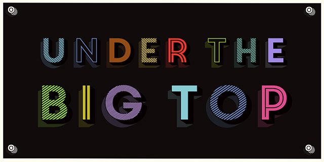
layer-fonts_core-circus

Multi-colored text is no invention of digital typography. In the 19th century already, there were some fonts that were divided into two or more cuts so that they can be printed above each other in different colors. The OpenType Format provides these so-called layer fonts for digital use as well. Especially for 3D and shadow effects, plenty of fonts that allow for multi-colored display are available. Thanks to these web fonts, you can even use the multi-colored texts in web design.

What Exactly Are Layer Fonts?

Layer fonts are special types of fonts for which the cuts are designed in a way that they can be overlapped. Often, decorative elements like shadows, contours or three-dimensional pages can be combined this way. When you assign a color to each of the font layers, this creates flashy headings and striking texts.

Drawing and desktop publishing programs like Illustrator and InDesign offer simple ways of using layer fonts. Later, I’ll explain how to use layer fonts in web design using CSS3. First, I’ll present some of the most beautiful and exciting multi-colored fonts that are available as web fonts.

Three Dimensional Fonts

Multi-colored display is especially useful for fonts with a three-dimensional appearance. The “Core Circus” is certainly one of the most interesting layer fonts for that reason. There are 20 different cuts that can be combined in a variety of ways. There are some that simulate three-dimensionality. These can be combined with one of the plethoras of flat cuts which can be used as the front of the 3D font, for example. Apart from lines and hatching, there are dotted cuts as well. Last but not least, there are several shadows you can add.

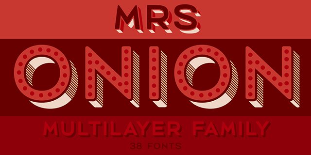
“Mrs. Onion”, which is structured similarly to “Core Circus”, offers a couple more cuts – 38 in total. Here, however, you have the option to display the individual sides of the three-dimensional font in different colors. There are separate cuts for the lower and the right sides. Additionally, shaded and dotted cuts are available for the front side.

You can combine up to six cuts without any problems, and thus, you receive very detailed multi-colored texts which are a perfect fit for spacious headings.

layer-fonts_mrs-onion

“Epilepsja” comes with a slightly different 3D look. The font plays with the illusion of three-dimensionality. This creates the impression of a 3D effect here and there. At some point, however, the font appears to be two-dimensional again.

There are three cuts which display contour, filling, and background. The “Epilepsja” is flashy in any way and is certain to create some confusion here and there.

layer-fonts_epilepsja

Historical Fonts

Alongside interesting 3D effects, layer fonts are always fitting to rehash historical fonts. Especially in times before digital typography, many typographic effects were created with large amounts of manual effort. Thanks to layer fonts, these effects can now be created in no time.

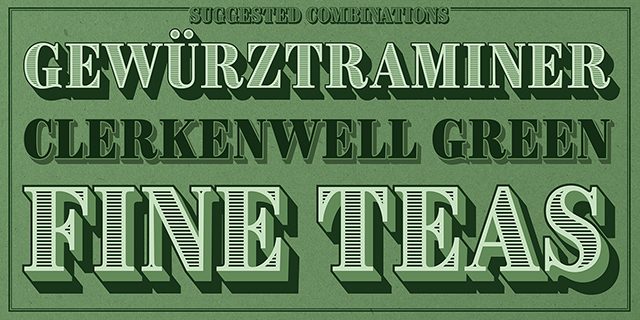
“Brim Narrow,” for example, is a font that orientates itself towards classic fonts of the 18th century. It reminds the user of detailed and delicately drawn fonts that you know from money bills and other valuable documents.

layer-fonts_brim-narrow

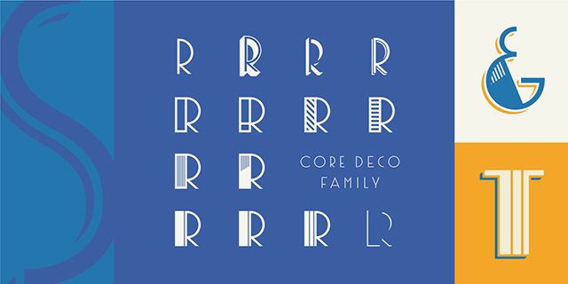
The “Core Deco” resembles the fonts of Art Déco. The font has the large curves and strict geometric alignment, which were typical for this style of typography. Hatching, shadows, and 3D effects are all available as own cuts so that they can be displayed in separate colors.

layer-fonts_core-deco

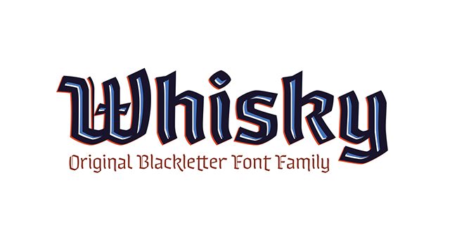
“Whisky” goes to prove that even fractured fonts can be interpreted in a contemporary way. There are different types of bold surface cuts that you combine with various strengths of contour cuts. This creates unusual effects which you can use to play around with the classic perception of fractured fonts.

layer-fonts_whisky

Handwriting

Handwritten or drawn texts are always very popular, both playful and with an elegant typography. Here, I’ll show you some layer fonts that shine with special effects.

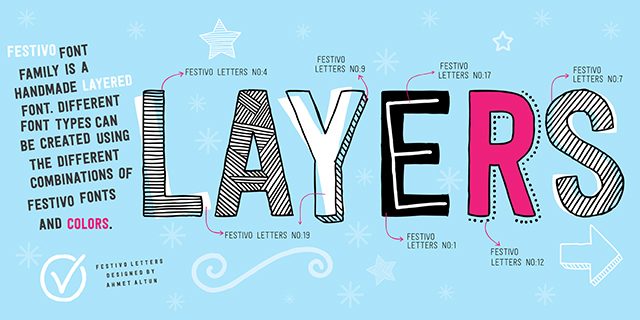
“Festivo Letters” simulates a pen-drawn font. Letters are partially shaded, partially outlined by dots, and hand-colored. The combination of different cuts allows you to integrate colors. This supports the playful character of the font.

layer-fonts_festivo-letters

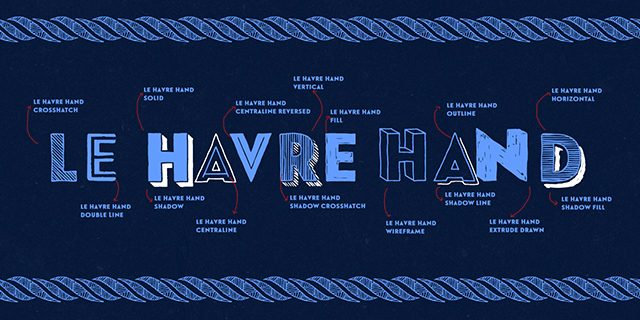
“Le Havre Hand” also simulates a hand-drawn font. Here, even a 3D look is available. Shading of different strengths is combined with contour drawings and creates massive letters which still have a playful look.

layer-fonts_le-havre-hand

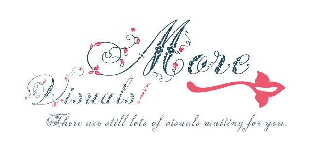
If you prefer a more filigree look, you might like the “Weingut.” The elegant font is decorated with floral elements and appears quite noble yet playful. For an individual look, there is a decorative cut which you can use to add floral elements in a different color.

layer-fonts_weingut

Using Layer Fonts in Webdesign

If you want to use layer fonts on your website, the respective cuts of the font are needed as a web font first. Now, of course you have the option to draw and overlay multiple elements with the same text. However, this variant is not recommendable as the same text would be present multiple times. Thus, the combination of the pseudo elements “::before” and “::after” with a data attribute are preferrable.

For that, the text set in the layer font is marked with just one element. This element receives an HTML5 data attribute which contains another copy of the text.

1
<p data-text="Noupe Magazine">Noupe Magazine</p>

Semantically, the value of the attribute “data-text” is irrelevant. It’s only required as you need to have access to the attribute’s content via CSS. Now, everything else is also done via CSS. Assign the cut that you want to display in the background to the “

” element using CSS.

1
2
3
4
p {
  font-family: "LayerFont 1";
  color: blue;
}

Then, make sure that the pseudo element “::after” gives out the content of the data attribute. The placement is absolute, so that it lies above the actual “

” element. Additionally, assign the font for the background and a different color to “::after”.

1
2
3
4
5
6
7
8
p::after {
  font-family: "LayerFont 2";
  color: red;
  content: attr(data-text);
  position: absolute;
  top: 0;
  left: 0;
}

If you want to add a third cut, additionally integrate “::before” and proceed according to how you did for “::after”. Then, your impressive web font is ready for prime time!

(dpe)

Categories: Others Tags:

The Beauty Of React Native: Building Your First iOS App With JavaScript (Part 1)

April 12th, 2016 No comments

The idea of building mobile apps with JavaScript is not new. We’ve seen frameworks like Ionic and PhoneGap take on the challenge, and to some extent succeed in gaining a fair amount of developer and community support.

These frameworks and the whole idea of building mobile apps with JavaScript never appealed to me, though. I always thought, why not just learn Swift/Objective-C or Java and build real apps? That definitely requires a significant amount of learning, but isn’t that what we developers do and should be good at? Quickly learn new languages and frameworks? What’s the point, then? For me, the advantages never outweighed the doubts.

The post The Beauty Of React Native: Building Your First iOS App With JavaScript (Part 1) appeared first on Smashing Magazine.

Categories: Others Tags:

Google Unveils New Icons For Play Family of Apps

April 11th, 2016 No comments
google_play_icons

Google has been known for redesigning its apps and paying great attention to detail. As such, when it comes to icon design, Google will not cut any corners, obviously. Recently, Google has released a new look for the Google Play family of icons for Android devices such as smartphones, watches and tablets.

The new icons pertain to apps and services such as Play Store in itself, Play Music, Play Games, Play Books, and other related applications. Here is how Google describes the changes:

Since launching Google Play four years ago, we’ve always had dedicated apps in addition to the Google Play store. Today, all our icons are getting an update to provide a consistent look across the entire family of Play apps.

You’ll start to see the new Google Play icons across devices and online in the coming weeks. We hope you’ll continue enjoying the Play family of products—now with a new look.

And this is a quick look of the new icons, that we shall soon see on our devices:

google_play_icons

To learn more about this update, check out the official Android blog.

What do you think of the new icon design for Google Play family of apps? Share your views in the comments below!

Read More at Google Unveils New Icons For Play Family of Apps

Categories: Designing, Others Tags: