Archive

Archive for April, 2016

Getting Started with CSS Modules

April 11th, 2016 No comments

There isn’t one single approach with CSS Modules to making the JavaScript templates, the CSS files, or the build steps to make them work. In this post, which is part of a series on CSS Modules, we’ll look at one approach. The goal of this post is to get a CSS Modules project up and running.

Article Series

Part 1: What are CSS Modules and why do we need them?
Part 2: How to get started with CSS Modules (You are here!)
Part 3: React + CSS Modules = ? (Coming soon!)

In the projects I work on, there is a requirement that CSS should never rely on client-side JavaScript to work, so the build step needs to process everything into working HTML and CSS before it is deployed. We’ll be using Webpack, a build system and module bundler. In the next post we’ll focus on making the code below suitable for a real life project that renders static HTML to the browser.

Let’s begin!

Installing Webpack

After installing NPM and node we need to setup an empty directory somewhere and run the following:

npm init --y

This will make a `package.json` file and fill it with a bunch of defaults. This is our dependency manifest – the instructions for what is downloaded and installed when other people npm install this project.

Webpack will be handling our build process. It will be watching our CSS, JavaScript, and HTML and performing all the magic in between. But what is Webpack? Maxime Fabre wondered if Webpack is a build system or a module bundler:

Well, it’s both—and by this I don’t mean that it does both I mean that it combines both. Webpack doesn’t build your assets, and then separately bundle your modules, it considers your assets to be modules themselves…that can be imported, modified, manipulated, and that ultimately can be packed into your final bundle.

If this sounds weird, don’t worry. Remember when Sass and Gulp and npm were all unfamiliar and scary? We’ll figure it out.

Let’s makes sure Webpack is “bundling” modules correctly by making one JavaScript file define a dependency so that we can import that chunk of code. First we need to globally install Webpack, which will give us access to the webpack command in our terminals:

npm install webpack -g

Once that’s finished we need to install Webpack locally in our project, like so:

npm i -D webpack

Now we need to make an `index.js` file in a `/src` directory. Typically I like to make a directory where all of the static assets reside (such as images, fonts, CSS files and markup). Any code that I write will typically live in a `/src` directory, whilst any code that is written by a machine or interpreted in a certain process should live in a `/build` directory. My thinking is that it ought to be totally OK to delete a `/build` directory and not suffer any problems whatsoever because we can just run a command and it will process the stuff from `/src` directory and entirely rebuild the /build directory. In this case, we want Webpack to take a look at everything in `/src`, perform a certain process, and then move that code into `/build`.

In the `/src` directory we can also add an empty `alert.js` file (we’ll return to it in a minute). We’ll also need a `webpack.config.js` file that sits at the root of our project, outside the `/src` directory so that our project structure should now look like this:

package.json
webpack.config.js
/node_modules
/src
  index.js
  alert.js

Inside `webpack.config.js` (a file for configuring Webpack), we can add the following:

module.exports = {
  entry: './src',
  output: {
    path: 'build',
    filename: 'bundle.js',
  },
};

Whenever we run the webpack command from here on out, Webpack will look at all of the assets in `/src` to build a dependency tree.

Returning to our `src/index.js` file we can add this:

require("./alert.js");

And inside our `alert.js` file we can write this:

alert("LOUD NOISES");

Now let’s make an `index.html` file in our root and add our bundle in a script tag just before the closes:

<!DOCTYPE html>
<html lang="en">
<head>
    <meta charset="UTF-8">
    <title>Document name</title>
</head>
<body>
    <h1>CSS Modules demo</h1>

    <script src="build/bundle.js"></script>
</body>
</html>

That `bundle.js` will be generated by Webpack. To generate it all we have to do is run the webpack command. To make this easier for ourselves, we can update our `package.json` file with a build script. This is what you should find in that file:

"scripts": {
  "test": "echo 'Error: no test specified' && exit 1"
},

Those are the defaults that npm gave us, but we can replace the above with the following code to make our own command line script that will run Webpack for us and open up a browser window:

"scripts": {
  "start": "webpack && open index.html"
},

So whenever we run npm start we’ll automatically run the webpack command and open up our index file in the browser. Let’s do that now and see what happens.

Hurray, something is working! This proves that our index.js file is importing our code from `alert.js` and that Webpack is bundling everything properly. If we now delete the `alert.js` file we’ll find an error when we run npm start again:

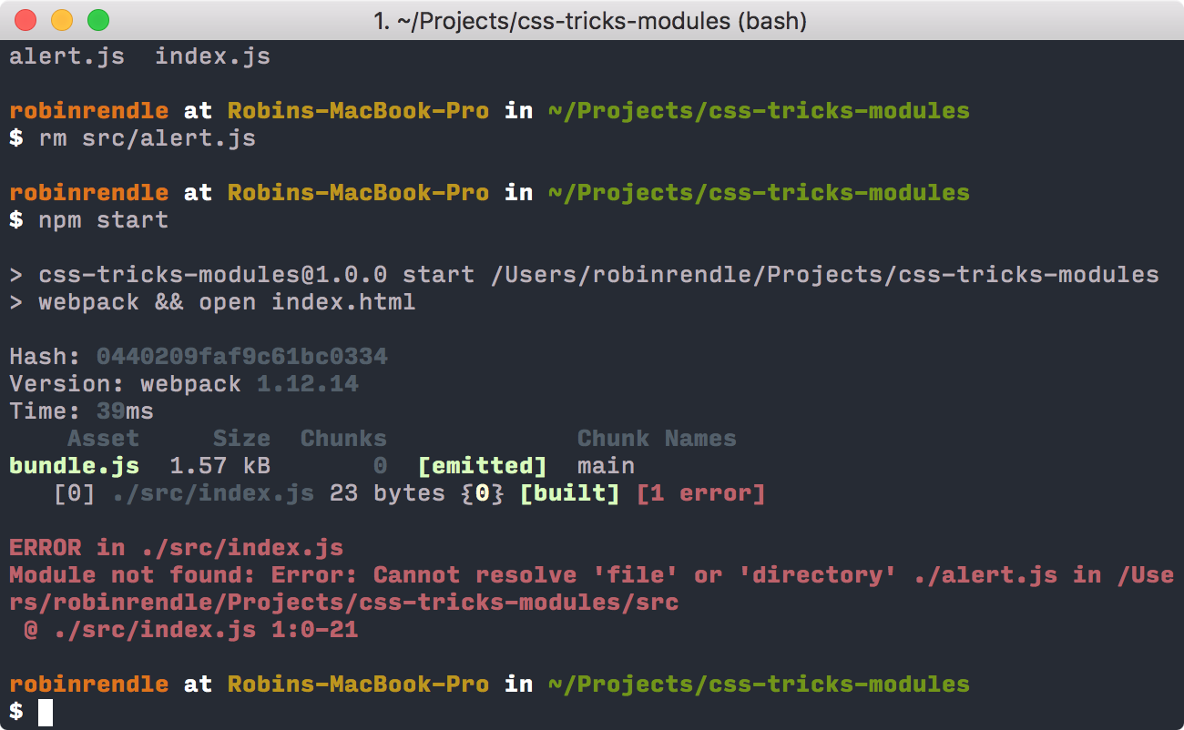
That’s the error that Webpack will reveal if it can’t find an imported module. But now that we’ve confirmed that all of this works we can scrap that require statement in our `index.js` file and move onto the next step in learning about Webpack.

Adding our First Loader

A loader in Webpack is really important. Maxime Fabre has this to say on the subject:

Loaders are small plugins that basically say “When you encounter this kind of file, do this with it”.

In Maxime’s tutorial he adds the Babel loader, which is a really good starting point because Babel allows us to use ES2015 and the latest improvements to the JavaScript language. So instead of the Common.js function that we used earlier to require another module we can use import instead. With Babel we can also use classes, arrow functions and a bevy of other cool features:

Tools like Babel allow us to write new ES2015 code today and perform a task called transpiling (much like preprocessing) to convert the code into a earlier version of JavaScript that has greater browser support. This is similar to how Sass works; initially writing your code in Sass syntax, and then a preprocessor compiles to standard CSS.

The following will install the Webpack babel loader and the dependencies we need to run Babel:

npm i -D babel-loader babel-core babel-preset-es2015

In a `.babelrc` file in the root of our project we can configure the preset to let others know which JavaScript syntax we’ll be using:

{
  "presets": ["es2015"]
}

Now we want to run Babel on all of our `.js` files but only the files that we write, any other dependencies that we install later might have their own syntax and we don’t want to mess with that code. This is where the Webpack loader comes into play. We can open up `webpack.config.js` file and replace that code with this:

module.exports = {
  entry:  './src',
  output: {
  path: 'build',
    filename: 'bundle.js',
  },
  module: {
    loaders: [
      {
        test: /.js/,
        loader: 'babel',
        include: __dirname + '/src',
       }
    ],
  }
};

That test key/value pair inside the loaders array is how we tell Webpack which type of file we want to perform an action on whilst include tells it precisely where in our project we want that action to be performed.

Let’s test that Babel is working in conjunction with Webpack. In a new file (`src/robot.js`), let’s write the following:

const greetings = (text, person) => {
  return `${text}, ${person}. I read you but I'm sorry, I'm afraid I can't do that.`;
}

export default greetings;

This JavaScript file is using a bunch of ES2015 specific features, like export, const and let, arrow functions, and template literals.

Now we can import that module into our src/index.js file, like so:

import greetings from './robot.js'
document.write(greetings("Affirmative", "Dave"));

Finally, all we need to do is run npm start again and our browser should pop back with the text: “Affirmative, Dave. I read you but I’m sorry, I’m afraid I can’t do that.” This simply confirms that Babel is working as it should.

Hurray! That’s not a CSS Module yet, although we’re certainly one step closer. But before we move on let’s delete `src/robot.js` and all the code from `src/index.js`.

Loading the styles

Now that we’ve got our templates almost working we’ll need to add two more loaders: css-loader and style-loader, which we’ll install:
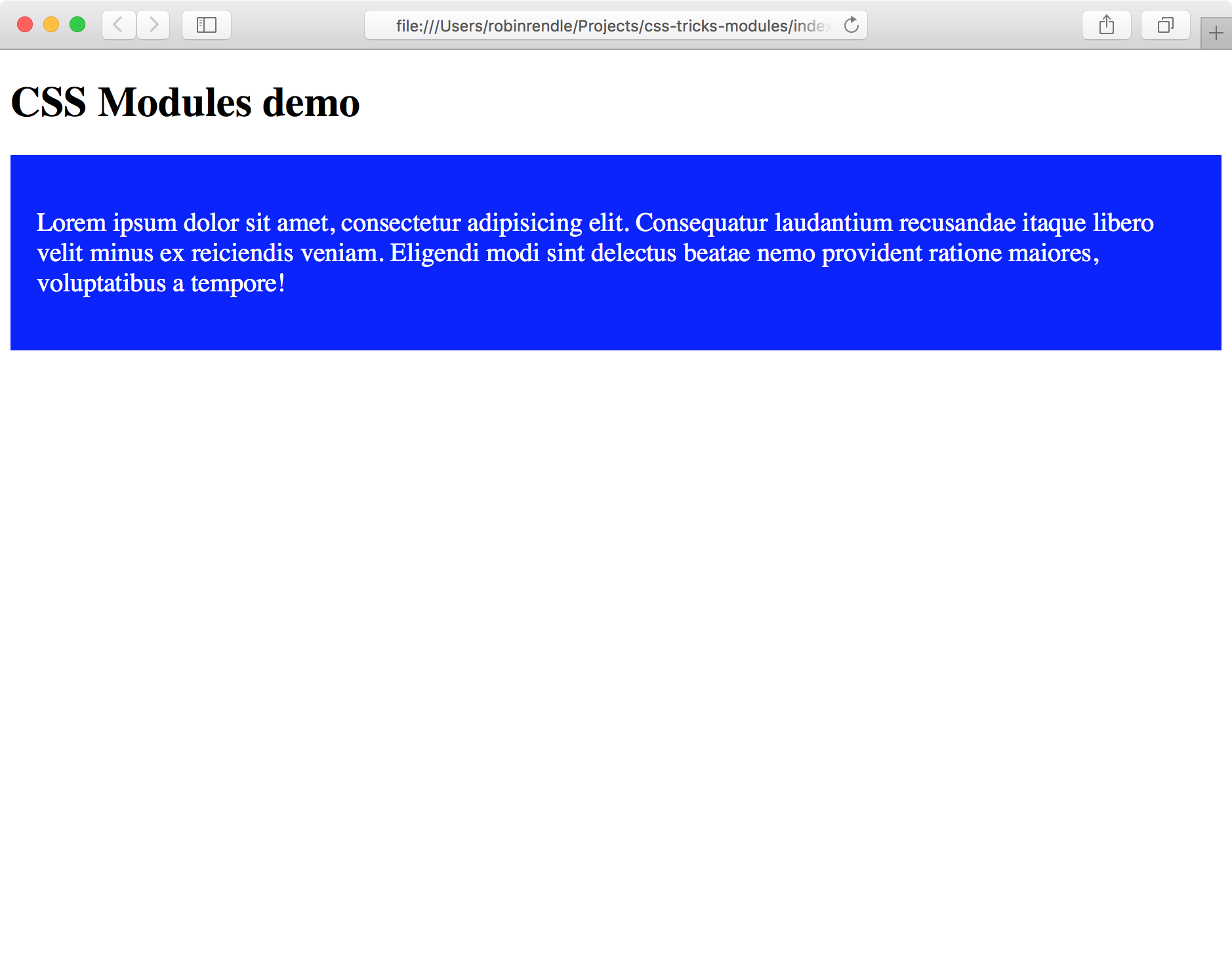
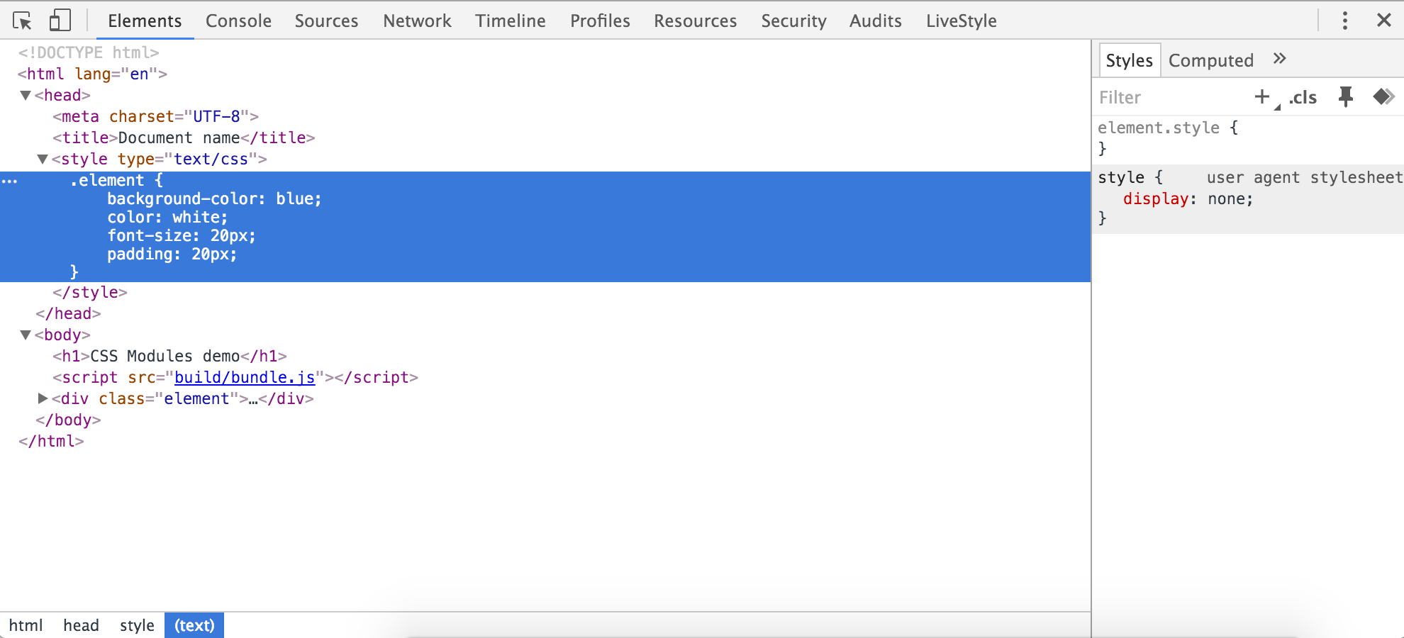
npm i -D css-loader style-loader

The css-loader takes a CSS file and reads off all its dependencies whilst the style-loader will embed those styles directly into the markup. Let’s test this by writing some CSS in src/app.css:

.element {
  background-color: blue;
  color: white;
  font-size: 20px;
  padding: 20px;
}

Then we can import that stylesheet into our `src/index.js` file:

import styles from './app.css'

let element = `
  <div class="element">
    <p>Lorem ipsum dolor sit amet, consectetur adipisicing elit. Consequatur laudantium recusandae itaque libero velit minus ex reiciendis veniam. Eligendi modi sint delectus beatae nemo provident ratione maiores, voluptatibus a tempore!</p>
  </div>
`

document.write(element);

Whoa, hang on! Did we just make a stylesheet a dependency of a JavaScript file? Hell yes we did. But before it works properly, and before we see why this is useful, we first need to reconfigure our webpack.config.js again:

module.exports = {
  entry:  './src',
  output: {
    path: 'build',
      filename: 'bundle.js',
    },
  module: {
    loaders: [
      {
        test: /.js/,
        loader: 'babel',
        include: __dirname + '/src',
      },
      {
        test: /.css/,
        loaders: ['style', 'css'],
        include: __dirname + '/src'
      }
    ],
  }
};

Running npm start will leave us with something like this:

Consequently, if we “Inspect Element” on our document we’ll find that the style-loader has placed that file into a tag in the of the document:

Let’s take stock of what just happened. We made a JavaScript file that requested another CSS file and that code was then embedded within a web page. So in a more realistic example we could create a buttons.js file and make buttons.css a dependency of it, and then import that JavaScript into another file that organises our templates and spits out some HTML. This ought to make a our code absurdly modular and easy to read!

Personally, just to keep things clean, I’d prefer to have a separate CSS file rather than adding all the code inline. To do that we’ll need to use a Webpack plugin called extract text which:

moves every require(‘style.css’) in entry chunks into a separate css output file. So your styles are no longer inlined into the javascript, but separate in a css bundle file (styles.css). If your total stylesheet volume is big, it will be faster because the stylesheet bundle is loaded in parallel to the javascript bundle.

We have to install that with npm:

npm i -D extract-text-webpack-plugin

Now we can update our `webpack.config.js` file again by requiring it and placing our CSS loader into it:

var ExtractTextPlugin = require('extract-text-webpack-plugin');

module.exports = {
  entry:  './src',
  output: {
    path: 'build',
    filename: 'bundle.js',
  },
  module: {
    loaders: [
      {
        test: /.js/,
        loader: 'babel',
        include: __dirname + '/src',
      },
      {
        test: /.css/,
        loader: ExtractTextPlugin.extract("css")
      }
    ],
  },
  plugins: [
    new ExtractTextPlugin("styles.css")
  ]
};

ExtractTextPlugin will now create a `styles.css` file for us!

You might’ve noticed that we’ve gotten rid of style-loader entirely. That’s because we don’t want those styles injected into our markup any more. So now if we open up the `/build` directory, we should find that a `styles.css` file has been created with all of our code inside. And within our `index.html` file, we can now add our stylesheet in the :

<link rel="stylesheet" href="build/styles.css">

Run npm start again and blammo! – our styles magically appear back on the page where they belong.

Now that we have our CSS and HTML working on the page, how do we manipulate the class names in order to get all the benefits of a local scope? All we have to do is update our webpack.config.js file like so:

{
  test: /.css/,
  loader: ExtractTextPlugin.extract('css?modules&importLoaders=1&localIdentName=[name]__[local]___[hash:base64:5]'),
}

This will add the crazy generated text to the end of the class name. That’s all that CSS Modules really is, a hash which changes the classes which can be added in Webpack via a CSS loader.

Next, we have to update our `index.js` file with the styles.element class:

import styles from './app.css'

let element = `
  <div class="${styles.element}">
    <p>Lorem ipsum dolor sit amet, consectetur adipisicing elit. Consequatur laudantium recusandae itaque libero velit minus ex reiciendis veniam. Eligendi modi sint delectus beatae nemo provident ratione maiores, voluptatibus a tempore!</p>
  </div>
`

document.write(element);

Look what happens! One more npm start and our code has now been processed by Webpack so local scope is no longer an issue, since the class that gets injected into the web page now looks like this:

<div class="app__element___1MmQg">
  ...
</div>

We’re still not really finished as there are many questions left unanswered. How could we write code like this in development? How do we get around that nasty document.write rule we’re using to inject the markup into the page? How should we structure our modules and files? Getting CSS Modules up and running is only half the work, next we have to think about how we might port a code base into it from another system.

In the next tutorial we’ll be taking a look at how React can help us generate tidy little modules, also we’ll see how we can generate static markup from a number of templates and how to add other features such as Sass and PostCSS to our project.


Article Series

Part 1: What are CSS Modules and why do we need them?
Part 2: How to get started with CSS Modules (You are here!)
Part 3: React + CSS Modules = ? (Coming soon!)


Getting Started with CSS Modules is a post from CSS-Tricks

Categories: Designing, Others Tags:

No Nonsense: What Really Accelerates WordPress Websites – [#1]

April 11th, 2016 No comments
Raidboxes - Premium WordPress Hosting aus Deutschland

Have you ever asked yourself, why there are websites with a ton of pictures on the landing page that still load in significantly less than a second? You read that correctly. Considerably less than a second. That’s possible, however, it requires a lot of expertise and, above all else, effort. For example, you can’t use a theme that updates automatically. A child theme is not an option either, as too many changes would have to be made. The effort is worth it, though, as the high speed is a real reason for Google to rank the website higher. Thus, this small series isn’t about the 100 out of 100 points for Google Page Speed but deals with the question how to make websites really fast.

Making Your Websites Extremely Fast

Typically, you’d set up a test page for a series like the one that started with this article. However, a test page can easily be optimized, as there are barely any plugins installed, few CSS and JavaScript files are loaded, and there are very few images implemented in the landing page. That’s why we wanted to prove that it is entirely possible to make a website load rapidly, even when it’s a live site with 28 images, some of them being in large format. The site I’m talking about is my Democratic Post. By the way, the final speed of your website often is diligent work, as many – sometimes even small – optimizations interlock.

First Test:

Der erste Test

Second Test:

Der zweite Test

Why We Don’t Consider Google Page Speed

Google Page Speed Insights is undoubtedly a really good tool for website speed optimization. Nonetheless, some rules are not only questionable, but even limit further speed potential. Especially the CSS, which Google likes to see as Inline CSS (the part of the CSS that is responsible for the display of the visible area), prevents faster loading times for some themes. A linked CSS file that can be cached perfectly, is generally faster, even when it’s only the case when accessing another website. Google also likes to nag about their own files, as they can only be cached for a short amount of time. That’s why we’ll focus on pure speed, measurable performance.

High-Speed Tip #1 – Choosing the Right Hoster

Choosing the right web host and a suitable solution for the hosting is critical, as the speed already starts there. WordPress already runs on affordable shared hosting packages, but that is the wrong choice when speed is what you want. On these web-hosting packages, a virtual server is sometimes shared by more than 100 websites. You’ll feel when other sites on the server have a lot of traffic. Thus, you need a proper solution which only costs a few bucks more. I’ll now briefly introduce you to two recommendable, affordable, paid solutions.

Managed WordPress Hosting

Raidboxes offers premium WordPress hosting from Germany. The hosting is a managed WordPress hosting. That means, you don’t need to take care of anything. Starting from the package “Starter”, your own virtual server that you won’t have to share with anyone is included. When choosing the right host, it’s important to know whether it saves the websites on SSDs or regular HDDs. For more speed, your choice always has to be SSD. Raidboxes generally only offers SSDs. The “Starter Package” costs 17,85 Euro a month, including added value tax. For that money, you’ll also receive good support that will move your website for you for free. You can test the Managed WordPress Hosting for free for 14 days at Radiboxes. This type of hosting is the right choice when you don’t know much about server configuration.

Managed Root Cloud Server by hostNET

Managed-Root-Cloud Server von hostNET

The Managed Root Cloud Server by the German company hostNET. Is my choice. hostNET takes care of everything related to security and general server configuration. When additional things need to be installed, you’ll have to do that yourself. The root cloud server provides an SSD that is displayed in a RAID5 system with hot-spare and additional HA-failover-cluster. This causes a real performance boost. In addition to that, you get your own IP adress, as a small extra service. The really interesting thing about this hosting option however, is that it grows alongside your website and the requirements. You can increase and decrease the storage space, the CPU amount, as well as the internal memory when needed. The calculations are done accurate to the second. The Root-Cloud server starts at 14,88 Euro, including added value tax, a month. The server can be tested for free for seven days. We’ve already presented the service in-depth at our German sister Dr. Web.

High-Speed Tipp #2 – Pay Attention to HTTP/2 When Choosing the Hoster

HTTP/2 is the future of the internet. This protocol – the successor of HTTP 1.1 – was developed for today’s modern and complex websites. The advantages are, that the new protocol allows the browser to load different files at the same time, and not after each other like it was the case for HTTP 1.1. HTTP 1.1 had to open a connection for each request, while the browser can load multiple resources at the same time on a TCP connection when using HTTP 2.2. This creates a large speed advantage. While Raidboxes still works with the “precursor” SPDY 3.1, hostNET already uses HTTP/2. This online tool allows you to test, which website already uses HTTP2.

Info: The advantages of HTTP/2 can only be used with an HTTPS certificate, as most browsers require this.

High-Speed Tipp #3 – Mucking Out the Plugins

screenshot-21-659x418

Most people have way too many plugins activated. Every added plugin slows down the website. Thus, clean out the dung and only keep the ones that are necessary activated and installed. Even plugins that you only use from time to time that are deactivated can still slow down your website, so delete them.

The plugin P3 (Plugin Performance Profiler) can quickly determine which plugins are performance eaters. These definitely need to be kicked out. Yoast SEO is one of the candidates that make a website slow. The fastest SEO plugin is wpSEO, by the way. However, it is not available for free. It starts at 23,79 Euro, including tax, and only one payment is required. You won’t get around using premium plugins when your website’s speed matters to you.

Checking Your Website’s Source Code

To be able to decide which plugins to throw out, take a look at your website’s HTML source code. This way, you can find out which plugins load how much additional CSS and JavaScript. Once again, less is more. If there are plugins that you need to keep at all costs, write them down. Later, I’ll show you how the files are only loaded where they need to be loaded.

High Speed Tipp #4 – Clearing Out Code in the WordPress Theme

Depending on which theme you’re using, it was either programmed well or poorly. Many themes carry an overhead of source code which slows them down. At this point, diligent work is needed, as you need to remove the unnecessary source code, and clean out the dung. To do that, you can check all templates of the theme, and see what’s needed and what can be deleted. Especially the expensive premium themes often carry unnecessary amounts of code, which is why you might want to switch to a very well developed, free theme. For example, Automattic and Anders Norén both provide very high code quality and usage.

High-Speed Tipp #5 – Cleaning Up the WordPress Header

Back then, there were few links in the WordPress header, now there is a broad array of them which are displayed depending on the website. There’s also added code for the emojis, a type of smileys. Since WordPress 4.2, these emojis are anchored in the core. Their scripts are delivered in both backend and frontend on every site access. It’s irrelevant if the emojis are used or not. Thus, this code also needs to be deactivated, as all it does is drain performance.

One Click Opens the Gist at GitHub
clean-header-659x518

Conclusion of the First Part

When you considered every aspect, especially the one dealing with clearing out your plugins, your website should be considerably faster already. When I switched from a shared hoster to hostNET, my website was already as fast as my old optimized one, without any optimizations. Maybe you’re not entirely sure why you should pay attention to the small things like cleaning up HTML source code and clearing out the header. But I assure you, these many small optimizations add up and contribute a lot to your loading speed. All the work interlocks in the end.

Related Links

(dpe)

Categories: Others Tags:

What’s new for designers, April 2016

April 11th, 2016 No comments
hugo

In this month’s edition of what’s new for designers and developers, we’ve included productivity apps, static website builders, stock photo sources, community resources, WordPress tools, open source tools, design apps, and much more. And as always, we’ve also included some awesome new free fonts!

Almost everything on the list this month is free, with a few high-value paid apps and tools also included. They’re sure to be useful to designers and developers, from beginners to experts.

If we’ve missed something that you think should have been on the list, let us know in the comments. And if you know of a new app or resource that should be featured next month, tweet it to @cameron_chapman to be considered!

Hugo

Hugo is an easy to use static website engine that aims to make website creation simple again. It’s great for blogs, docs, portfolios, and more.

Shopify for WordPress

Shopify is now available for WordPress! There are three free themes and a free plugin available, with monthly plans for just $9.

shopify

New Providence Landing Page

The New Providence landing page PSD is a free resource from Craft Work that includes handcrafted iPhone mockups.

new providence

Affinity for Windows

While it’s not availalbe yet, Affinity has announced they’ll be launching a Windows beta in the next 2-3 months. Sign up to be one of the first to get access to the free beta.

affinity

Nik Collection

Google has made the Nik Collection, created to professional photographers, completely free! It includes tools for creating black and white photos, HDR photos, adjusting color, and making all sorts of other edits.

nik collection

Vivaldi 1.0

Vivaldi 1.0 has finally been released, with all sorts of tools for better web browsing, including better tab organization, quick commands, and the ability to customize everything.

vivaldi

Just Good Copy

Need to create some amazing email copy and not sure where to start? Check out Just Good Copy for tons of email copy from great companies for ideas and inspiration.

just good copy

Pattern

Pattern is a new offering from Etsy that lets you turn your Etsy shop into your own website, for just $15/month (with a 30-day free trial).

pattern

May 1st Reboot

May 1st Reboot is an international relaunch of designer, developer, and maker websites and portfolios. It’s been around off and on since 2000.

may 1st reboot

Adobe Experience Design CC

Adobe Comet has become Adobe Experience Design CC (Adobe XD for short). It’s an all-in-one UX design tool that lets you design and prototype website and mobile apps.

adobe xd

Designer’s Block

Designer’s Block is a great site to check out if you’ve hit a roadblock in your design process. Just press the spacebar to get a new tip or idea.

designer's block

Design Facts

Want to increase your knowledge of the design world in quick, easy to absorb bites? Design Facts gives you quick bits of information about the world and history of design.

design facts

Squarespace Circle

If you build websites with Squarespace, then you’ll want to join Circle, their community for creatives who use Squarespace. You get access to unique perks and exclusive content, too.

circle

Comma

Comma is a free iPhone app for reading email newsletters in a less distracting interface than your normal email app.

comma

Build with Square

Build with Square lets you create ecommerce websites built on Square’s platform. It includes a complete payments ecosystem and integrates with the tools you already use.

build with square

Estimatr

Estimatr is a totally free tool for estimating accurate software. Stop using spreadsheets and equations to try to estimate things accurately.

estimatr

Brisby

Brisby is a bot that can help answer repetitive questions you get day after day. It works with both simple Q&As and more complex multi-step flows.

brisby

Medium for Publishers

Medium for Publishers is a powerful, networking publishing platform that’s perfect for bloggers, publishers, and organizations. They even have a revenue beta you might qualify for.

medium for publishers

Sharethrough Headlines

If creating engaging headlines is not your forte, then check out Sharethrough Headlines to score the headlines you’ve brainstormed to see which are most likely to work with your content.

headlines

Tweetcat for Twitter

Tweetcat for Twitter is a Twitter client that sorts your timeline into categories, to make it easier to explore the tweets that are important to you.

tweetcat for twitter

Meya

Meya is an easy way to build and host bots. It includes an NLP framework, messaging integrations, app integrations, and more.

Meya

Quant-UX

Quant-UX gives you visual analytics for improving your prototype designs. It helps you speed up your prototyping process and design, with tools to test and analyze in one.

quant-ux

Layout

Layout is a weekly podcast about technology, programming, design, and more. Recent episodes have covered things like portfolios, Sketch, the future of design tools, and more.

layout

Pic’nshot

Pic’nshot is a free stock photo site that posts new photos in a variety of categories regularly.

picnshot

Hacksplaining

Hacksplaining is a set of comprehensive security tutorials for developers to learn the most common security vulnerabilities for their website projects.

hacksplaining

Socialise.io

Socialise.io makes it simple to curate Twitter hashtages, tweets, and usernames surrounding an event in a single place. It makes it simple to see how much people are talking about a brand or product at your event.

socialise.io

Standup Bot

Standup Bot runs your standup meetings in Slack for you. It collects info about your team, organizes it, and posts it in an easy-to-find place.

standup bot

Schedul.io

Schedul.io lets you schedule messages for Slack. Increase their impact by scheduling them to send at the right time to actually get seen.

schedul.io

Escape

Escape lets you track all the unnecessary time spent on distracting websites. It gives you daily updates on your progress, too.

escape

One Big Thing

One Big Thing is a simple app that keeps you focused on the most important things on your to-do list. Track the big thing you need to get done, plus a few little things, as well as any other things you might get done.

one big thing

Achievr

Achievr is a daily habits tracking app that’s super easy to use and free. Set reminders at any time of day and set it to ask you about your progress, too.

achievr

Triangulart

Triangulart is a web app for easily creating isometric art. It has a simple color palette, eraser tool, and not much else.

triangulart

Peetch

Peetch is a free pitch deck for PC and Mac. It includes 42 slides specifically designed to catch VC attention.

peetch

Peace Sans

Peace Sans is a bold sans-serif font that has amazing curves and more than 8000 kern pairs.

peace sans

Soria

Soria is an art nouveau serif typeface. It’s also heavily inspired by Didot typefaces.

soria

Orkney

Orkney is a geometric typeface that was designed with legibility and clarity in mind.

orkney

Young Serif

Young Serif is a medium weight serif typeface with a strong vintage look.

young serif

Trawll

Trawll is an all-caps handwriting typeface that’s free for personal and commercial use.

trawll

Bureno

Bureno is a vintage and ornamental display font that’s perfect for retro headers or identity projects.

bureno

Little Cutie

Little Cutie is a free hand painted typeface that’s artistic and elegant.

little cutie

Helsinki

Helsinki is inspired by the typography found on the monument for fallen German soldiers of the Finnish civil war in 1918.

helsinki

Little Wizzy

Little Wizzy is a hand-drawn, all caps typeface with a whimsical look.

little wizzy

Stereo

Stereo is a free retro-inspired sans serif typeface with a full character set.

stereo

Mega Theme and Template Bundle from NRGThemes – 97% off!

Source

Categories: Designing, Others Tags:

Breaking Out Of The Box: Design Inspiration (April 2016)

April 11th, 2016 No comments

Editor’s Note: Some people simply have the magic touch for digging up design goodness. Today, we are proud to present the brilliant gems that Veerle Pieters has dug out, letting us explore a fresh breeze of photography, art, type, print as well as web design projects.

As designers, we have our good and bad days. Some days ideas come naturally. Other days we struggle or have moments where we are really stuck. We are in urgent need of inspiration. Let me help you get through these moments of pain and suffering. Let me nurture your creativity. Sit back, relax, and feed your appetite. Here’s your monthly dose.

The post Breaking Out Of The Box: Design Inspiration (April 2016) appeared first on Smashing Magazine.

Categories: Others Tags:

Popular design news of the week: April 4, 2016 – April 10, 2016

April 10th, 2016 No comments

Every week users submit a lot of interesting stuff on our sister site Webdesigner News, highlighting great content from around the web that can be of interest to web designers.

The best way to keep track of all the great stories and news being posted is simply to check out the Webdesigner News site, however, in case you missed some here’s a quick and useful compilation of the most popular designer news that we curated from the past week.

Note that this is only a very small selection of the links that were posted, so don’t miss out and subscribe to our newsletter and follow the site daily for all the news.

Hugo, a Fast and Modern Static Website Engine

Why Gray Text Should Never Exceed 46% Brightness

7 Signs your Design Style is Out of Date

Why I Don’t Use CSS Preprocessors

The Future of CSS

Rebranding in 5 Days

The Best Tools for Startups, Designers, Freelancers and More

I Love Ugly, Messy Interfaces, so do You

How to Create a Great Design Portfolio

“Next Generation” Apple Store Features a 37-foot Display

Creative Brains Need Time Off

5 UX Plays to Start your Design on Good Tracks

Everything You Need to Know About HD Design

Our Atomic Design Workflow

Cheap Vs Lean: The UX Culture Debate

Does your Site Pass the Honeycomb Test?

The Surprising Meaning Behind the Most Popular Flag Colors

DevOps is Dead. Long Live DevOps

The Next Hot Job in Silicon Valley is for Poets

What Every Browser Knows About You

Being Tired Isn’t a Badge of Honor

Learning from Tay’s Introduction

This New Moleskine Notebook Backs up to your iPad Instantly

Japan to Begin Testing Fingerprints as Currency

Eerie Illustrations of an Apocalyptical World

Want more? No problem! Keep track of top design news from around the web with Webdesigner News.

LAST DAY: 2100+ Beautiful Graphic Design Elements with Extended License – only $25!

Source

Categories: Designing, Others Tags:

Securityheaders.io: How Safe is Your Web Space?

April 10th, 2016 No comments
securityheaders.io

Security is often neglected by website owners. Everything is cared for, new features are implemented and a neat design is created. Then one day, your website gets hacked. To prevent this unpleasant scenario, a strategy and some effort is necessary. If you happen to own your own server, that’s just another reason to take care of security. In many cases, this is rather simple. To help you protect your website, I’ll now introduce you to the online tool securityheaders.io, which shows you the weaknesses of your server or shared space, and provides advice on how to remove them.

Securityheaders.io – Analysis of the HTTP Headers

Securityheaders.io is the name of the online service that can determine how safe your server is, judging by the sent HTTP response headers. Of course, there are many services that can analyse HTTP response headers. But the unique thing about securityheaders is its rating system, into which it sorts the results. The system orders the results in an area from A to F. Here; A is a perfectly protected server while F is given out for destitute protection.

The service and its operator Scott Helme want to contribute to more safety on the internet. Not only does it analyze the response headers, but it also gives solid advice on how to remove the security issues. Sending the right HTTP response headers leads to much better safety and should thus be looked into. This takes relatively little time. However, the potential increase in security is tremendous.

Many Servers are Potentially Unsafe

If you play around with the online tool for a bit, you should quickly notice that the majority of the tested servers are potentially endangered. No matter which domain I entered and checked, the shown result was always F. Even for my own websites. Until now I assumed that a managed server or a managed WordPress hosting was secure and that you didn’t need to take care of that area. Now I know that managed doesn’t automatically mean safe. Shared hosting systems are not any safer, as I got an F there as well.

a bad result at securityheaders

A potentially poor security is not only marked with an F but also colored in red to visualize the safety breach. Very safe servers are colored green, as shown in this scan of the securityheaders website.

a good result at securityheaders

Good Explanations of the Results and Tips on Improvements

Every (bad) scan result shows exactly which HTTP response headers are missing. A short description tells you, why these headers are necessary, and what can happen if they are missing.

Die Erklärungen zu den fehlenden Response-Headern
My Website’s Missing Response Headers

There are links for each result, which are providing additional substantial articles on each of the areas. This way, you can learn a lot about the respective headers. Afterwards, you’ll know exactly what to do and especially, why you should do it. Behind the missing header »Content-Security-Police”, you’ll find the article “Content Security Policy – An Introduction.” Additionally, there are good explanations on this area in other languages.

How HTTP Response Headers Increase Our Server’s Safety

TheContent-Security-Police-Header” is a good protection against the problem called cross-site scripting. So-called XSS or cross-site scripting attacks are some of the biggest security threats for web applications. Here, protection against code brought into the website from outside is required. The »Content-Security-Police” header allows you to determine which scripts can be accessed from outside. The default setting only allows for the execution of scripts that are on the local server. Additionally, define all scripts which have to be accessed. Google Adsense and Google Analytics Code, for example. Every other – external – code is ignored, and thus, not executed.

This is the case for images, frames and videos as well. Meaning all things that are not on your own server. Setting the exceptions is tedious. However, you’ll be rewarded with a tremendous increase in safety.

Other Response Headers

The scan of my personal website resulted in four missing HTTP response headers. Among others, the already mentioned »Content-Security-Header”, the »X-Frame-Options-Header”, the »X-XSS-Protection-Header”, and the »X-Content-Type-Options-Header”.

TheX-Frame-Options-Header” protects your website from being executed in a frame. There are people on the web that like to adorn themselves with borrowed plumes. These people create like to integrate other websites via iFrames. This way, they provide good content without writing it themselves.

TheX-XSS-Protection-Header” configures the internal “Cross-Site-Scripting-Filter”, which is integrated into most browsers already. The recommended configuration “X-XSS-Protection: 1; mode=block” protects your visitors from attacks on their computers. The following browsers support the filter: Internet Explorer, Chrome, and Safari (Webkit).

TheX-Content-Type-Options-Header” can only set the value “nosniff”. It prevents Internet Explorer and Google Chrome from searching for MIME types different from the ones defined by the declared content type (text/HTML for example). Google Chrome is also prevented from downloading extensions. Thus, so-called drive-by download attacks are not possible anymore. Your computer can not be infected with malicious code. Of course, this only applies to the website that set this response header.

Conclusion

The online service securityheaders can increase the security significantly. Not only were we able to secure our own server by using the appropriate HTTP response header, but we also improved our visitor’s safety. The online tool shows exactly where the security issues are and how they can be fixed.

Related Links:

(dpe)

Categories: Others Tags:

Comics of the week #334

April 9th, 2016 No comments

Every week we feature a set of comics created exclusively for WDD.

The content revolves around web design, blogging and funny situations that we encounter in our daily lives as designers.

These great cartoons are created by Jerry King, an award-winning cartoonist who’s one of the most published, prolific and versatile cartoonists in the world today.

So for a few moments, take a break from your daily routine, have a laugh and enjoy these funny cartoons.

Feel free to leave your comments and suggestions below as well as any related stories of your own…

One thing leads to another

Serving a niche market

And the mystery continues

Can you relate to these situations? Please share your funny stories and comments below…

UICons: Get 1400+Pixel Crisp Vector Icons (line and filled) – only $15!

Source

Categories: Designing, Others Tags:

Web Development Reading List #132: The Challenges In Our Field, Debouncing And The Contain CSS Property

April 8th, 2016 No comments

What has been your biggest web development challenge recently? Was it a development issue, a communication issue or an education issue in your team?

Alt-Text

Facing so many things that don’t work as expected these days in many different teams and projects, I now realize that we all are part of a very young industry, and by challenging not only our technical foundations but also traditional working habits, we have yet to find how we want to work. Share your challenges in the comments to this post, and enjoy the weekend!

The post Web Development Reading List #132: The Challenges In Our Field, Debouncing And The Contain CSS Property appeared first on Smashing Magazine.

Categories: Others Tags:

Tokyo 2020 logo shortlist revealed

April 8th, 2016 No comments

It’s just four years until the Tokyo Summer Olympics and Paralympics, and while the eyes of the sporting world may currently be set on Brazil, attention will turn to Tokyo once the torch is (literally) passed in 5 months.

For any city, even bidding to host the biggest sporting event in the world is a huge expense. To justify the investment, a city needs the event to showcase it to the world, and at the center of that process is the games’ branding.

After the original logos for Tokyo 2020, designed by Kenjiro Sano, were — probably unfairly — dropped amid claims of plagiarism, the Tokyo 2020 Emblems Selection Committee decided to hold a public competition that any Japanese resident could enter. (To protect the event from further potential accusations of copying, entrants have signed guarantees that their designs are original, and have had to submit working documents to show their creative processes.)

In the grand tradition of crowd-sourcing, most of the 14,500 designers who entered the competition will get nothing; the winning designer will only receive $9,200 (approx) and tickets to the opening ceremonies of the Olympic and Paralympic Games. It’s especially galling when designs commissioned for events such as these are often billed well into six-figures.

The competition has however, produced some interesting designs:

Design “A” is a checkerboard pattern that references the Ichimatsu Moyo pattern popular in Japan in the Edo period between the 17th and 19th centuries. The denim-blue it uses is also considered to be traditionally Japanese. Graphically it’s very strong, but the type has a distinctly European flavor.

Design “B” is a circle, and a swirl, designed to represent both “mental and physical strength” and “dynamic movement and speed”. They look very much like a traditional Olympics logo, and this safe option may swing it for the committee who have already weathered enormous criticism over their handling of the original logos.

Design “C” represents the gods of wind and thunder. More figurative than the other entries, this design shows athletes breaking the tape at the end of a race, or perhaps someone running away with 5 gold medals. There is something Olympic about it in spirit, but it’s very close to the Rio 2016 branding. In this instance the type feels far more Japanese.

Design “D” is the most distinctly Asian. Inspired by the morning glory flower which was popular in the Edo period (again) it represents athletes striving to attain their personal best. It suggests growth, development, and optimism. In this case also, the type has a distinctly Japanese feel.

The overall winner will be announced later in the Spring, once the committee have sounded out public reaction to the designs.

Get 4 Fantastic Script Fonts from Tooris Studio – only $9!

Source

Categories: Designing, Others Tags:

ES6 module loading: More complicated than you think

April 8th, 2016 No comments

Nicholas Zakas:

The differences between scripts and modules are subtle enough that it’s hard for developers to understand the restriction of declaring what a JavaScript file represents ahead of time. My hope is that this post clarifies some of the reasons why it’s not possible to autodetect modules from inspecting the source code and why tools such as ESLint ask you to specify the file type before executing. There will be a point in the future where ES6 modules are the dominant JavaScript file type and script files are left only on legacy applications, and at that point, it’s likely that tools will default to assuming that files are modules. In the meantime, we’re going through a difficult adolescence between scripts and modules where mixing the two is going to be a bit painful.

Direct Link to ArticlePermalink


ES6 module loading: More complicated than you think is a post from CSS-Tricks

Categories: Designing, Others Tags: