Archive

Archive for April, 2016

Comparison: Font Subscription Services for the Web

April 8th, 2016 No comments
Comparison: Font Subscription Services for the Web

Subscriptions are becoming more and more popular when it comes to digital content and applications. Whether it’s about music, software or fonts: Instead of buying or licensing once, offers are provided as some flat monthly rate. When it comes to web fonts, providers have been using a subscription model since the beginning, mainly to prevent font data from loading on foreign servers. By now, more and more font providers extend their subscription model to classic desktop fonts as well. Are these subscription services worth it? And where are the differences between the offers?

The First of Its Kind: Typekit

Typekit is one of the first and largest of its kind. Being a subscription service from the very beginning, it was at first limited to web fonts. After Adobe took over Typekit, and the gearing between Typekit and the Creative Cloud was created, desktop fonts became a part of Typekit’s supply.

ss
Typekit

As a Creative Cloud subscriber, you automatically gain access to the Typekit Portfolio plan, which would usually cost 49.99 Dollar a year. It contains about 2,500 desktop fonts, as well as over 5,000 web fonts. The installation of desktop fonts is different from the usual way, as it’s done via the Creative Cloud application. That’s because the fonts are only meant to be available to you as long as you keep your subscription alive.

However, the installed fonts are not only available in Adobe applications, but in all other programs as well, Microsoft Office applications, for instance. Using the portfolio plan, you can synchronize up to 100 fonts at the same time.

Things get more complicated when it comes to web fonts. You need to set up a so-called kit for each domain. Add all fonts that you want to use on the domain to said kit. After that, integrate a JavaScript, and use the fonts as usual via stylesheets.

The Largest of Its Kind: Monotype

Monotype is one of the largest font providers worldwide. The portal MyFonts, which offers both desktop and web fonts belongs to the company. In contrast to Typekit, both classic and web fonts are not only available in a subscription model. To be able to host them yourself, you’ll receive all of the MyFonts’ web fonts as files.

abovergleich_myfonts
MyFonts

While desktop fonts are usually licensed according to the amount of installations on different computers, the licensing of web fonts usually depends on estimated site views.

Thus, for some foundries, you have to accept automatic view counts and their transferral to the provider. This way, they can check whether the beforehand agreed on page views were reached or not. However, many foundries forgo this control.

Aside from MyFonts, Monotype also runs the portal fonts.com, specifically for web fonts. In the basic plan, you receive access to 3,000 fonts, which is 500 more than Typekit, for 60 dollars a year. In return, its price is 10 dollars higher.

Web designers that manage web fonts for their customers should use the standard plan for 120 dollars a year. Here, an unlimited amount of web projects is available, similar to Typekit. You also gain access to more than 40,000 fonts. The integration of fonts is not restricted to JavaScript anymore. Alternatively, you can host the fonts yourself.

abovergleich_monotype-library-subscription
Some of the Fonts That Come With the “Monotype Library Subscription.”

Recently released, the “Monotype Library Subscription” is a new subscription offer for desktop fonts. For the price of 119.99 Euro per year, you receive up to 9,000 fonts from 2,200 families for your desktop. Just like Typekit, the installation of the fonts is not done directly but via an application. In Monotype’s case, the app is SkyFonts.

The subscription’s offer includes modern classics like “DIN Next”, “Avenir Next”, “Neue Helvetica”, “Univers”, and “Gill Sans”. The service is rather expensive when comparing it to Typekit. But if you don’t want to forgo these classics, the “Monotype Library Subscription” is the way to go. They are not available in Typekit.

Font Subscriptions: Which Service is Worthwhile For Whom?

Of course, there’s a significant number of competing providers aside from Typekit and Monotype. Despite the steadily growing market, the comparison of the two largest suppliers should do for now. Deciding for one of them takes quite some pain out of the process. The services we presented are unlikely to be shut down shortly as was the case for the service WebINK, ran by Extensis, for example.

You can generally say that Typekit is a good fit for everyone that is looking for a broad array of fonts, but doesn’t mind not having access to classics. Typekit is probably the obvious choice for many web and graphic designers anyways, due to it being a part of the Creative Cloud.

The “Monotype Library Subscription” is the right choice for everyone that wants to have access to many modern, but also older font classics. In many cases, especially standard fonts are not available in Typekit, as they either have to be licensed one by one or can be added via the “Monotype Library Subscription.”

Licensing fonts individually will often be cheaper than receiving a larger supply via subscription. Thus, you should thoroughly consider whether you want to pay more than 100 dollars a year for a subscription or have this font permanently available for 20 to 60 dollar. Also, all fonts disappear from the computer after canceling the subscription. Those that you bought are yours forever.

(dpe)
Categories: Others Tags:

Vivaldi 1.0 unleashed

April 8th, 2016 No comments

It’s fitting that Opera’s ex-CEO is now releasing the finished Vivaldi browser. After all, some say that Vivaldi caters to the demographic that Opera left behind. There was a time that Opera was being designed for more specialized users than the average web surfer, but those days are long gone.

Jon von Tetzchner, Opera’s old CEO, has just debuted Vivaldi 1.0, a browser that promises to be for the “web’s most demanding users.” In a blog post the company notes that 1.0 is focused on three distinct attributes: fun, efficiency and productivity.

After already millions of downloads and longer than a year in public development, 1.0 arrives with great promise for power users that are fond of customizations, as well as shortcuts. Sure, it features one of Opera’s centerpieces in the form of Speed Dial, which allows users fast access to favorite sites from any new tabs, yet it also has a slew of new features that make it stand out from almost any other browser.

Instead of going the route of most browsers, which is stripping down their offerings, 1.0 gives users more options and features to enable a better user experience. Vivaldi’s philosophy has always been to create with and for the Internet. Its user interface utilizes Node.js, React and JavaScript. Pages are rendered very quickly due to the presence of Chromium in 1.0’s core.

The best way to understand a new browser is by taking a look at its features. Here they are:

  • Tab stacks – This feature lets users stack tabs on top of each other by dropping them, allowing a less cluttered interface and promoting order for users. Switching between tabs is easy, thanks to customizations.
  • Tab stack tiling – Tiling tab stacks lets users see multiple pages at once. Think of this feature as giving you multiple desktops.
  • Sessions – Save the set of tabs you use most as a session for future retrieval.
  • Notes – A research tool, this feature lets users mark a quote and then save it as a note. 1.0 will let you take screen shots, too.
  • Quick commands – Enjoy access to history, bookmarks, open tabs and settings.
  • Mouse gestures/keyboard shortcuts – Good for when you want to use 1.0 at lightning speed. Gestures and shortcuts transform flicks of the wrist and key combinations into almost any in-browser action.
  • Speed dial – Gain access to bookmarks and favorite sites from blank tabs.
  • Better bookmarks – Get to your bookmarks from the bookmark panel, bar, manager and the aforementioned Speed Dial.
  • Web panels – This lets you look at sites in the 1.0 sidebar. It’s perfect for attending to social media or chatting with someone right next to your main browser window.
  • Personalized – 1.0 adapts to users, which is why it’s customizable. Customer feedback is to thank for this.
  • Extensions – 1.0 supports Chrome add-ons to boost your work flow.

The finished release is out on Linux, Windows and OS X. Interested users can download 1.0 right from the Vivaldi homepage.

Get 4 Fantastic Script Fonts from Tooris Studio – only $9!

Source

Categories: Designing, Others Tags:

Sponsor: Flatiron School’s Online Campus

April 7th, 2016 No comments

Flatiron School’s Online Learn-Verified program guarantees the same outcomes that Flatiron School has been delivering for years: a career as a Web Developer. This robust curriculum is designed to teach students to think, and build, like a software engineer. Join a thriving, global community of programmers so that you’ll never need to go it alone. Get started with a free trial by taking the Intro to Programming course, then apply for the Learn-Verified program to be considered for a spot.

Direct Link to ArticlePermalink


Sponsor: Flatiron School’s Online Campus is a post from CSS-Tricks

Categories: Designing, Others Tags:

Adobe XD: What Can You Expect?

April 7th, 2016 No comments
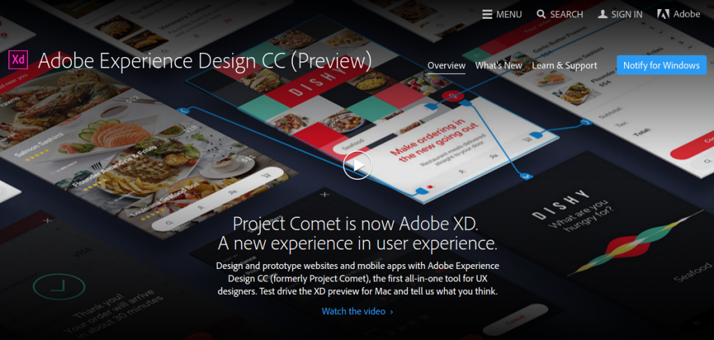
adobe-xd-main

Last year, Adobe announced what might be its most ambitious venture till date: Project Comet, an end to end prototyping, user experience and design tool that claims to be capable enough to solve all your designing needs. Under steady development, Project Comet is finally ready, and it is now known as Adobe Experience Design, or Adobe XD. That said, what exactly is Adobe XD all about? Furthermore, irrespective of the buzz surrounding it, will Adobe XD be able to live up to the hype?

What is Adobe XD fka Project Comet?

To begin with, let us first discuss what Adobe XD is all about. Here is how Adobe likes to describe it (note that this description was how Adobe first introduced it as Project Comet):

Project Comet is the latest offering from Adobe and it’s got its aims set high, promising an all-in-one tool to handle everything from wire-framing to visual design and rapid prototyping for all devices from within a single app.

Take your UX designs from start to finish with the cross-platform app that lets you do it all — wireframing, visual design, interaction design, prototyping, previewing and sharing. And because it’s built from the ground up, Comet delivers innovative tools and breakthrough performance to help you design in record time.

Or, you can watch this slightly dated but still relevant video about this:

In a nutshell, Experience Design strives to be an all-in-one tool that lets you create wireframes, mockups, prototypes, as well as work with UX design and interaction design. Naturally, this is not a minnow tool, but more of a mammoth multipurpose offering.

With XD, Adobe is trying to target the UX design and wireframing segment to the fullest.

Major Features

And what all does Experience Design bring to the table? Here is a brief run-down:

  • Tools for drawing, combining, editing and working with shapes and paths, as well as working with gradients and shadows and styling text
  • Ability to copy and paste vector content from apps such as Illustrator
  • Ability to import formats such as SVG, PNG, JPG, GIF and bitmap
  • Interactive prototyping tools
  • UI elements meant especially for designing mobile apps
  • Desktop-based previews for your prototypes
  • Ability to add team members as well as clients to your projects
  • Export content and assets to Web, iOS or Android

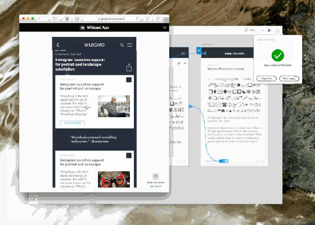
comet-2

Furthermore, Adobe Experience Design also allows you to work with layers, share content and assets via Creative Cloud, and make changes in real-time on mobile devices. Plus, you can also extend it via JavaScript APIs, install plugins and custom workflows, and work on responsive design as well as CSS code and documents.

Sounds too much already? Eventually, going beyond prototypes, Adobe XD intends to help you work with animations and transitions right from the native interface itself, in addition to tighter integration with Illustrator and Photoshop.

Naturally, as we can see, Adobe is trying real hard and has truly big plans for its latest offering. It is not yet another tool that will be a part of Creative Cloud Suite — instead, it is *the* tool that Adobe is counting on.

Question is: will the newly-released Adobe Experience Design deliver or has Adobe taken one risk too many?

Appraisal

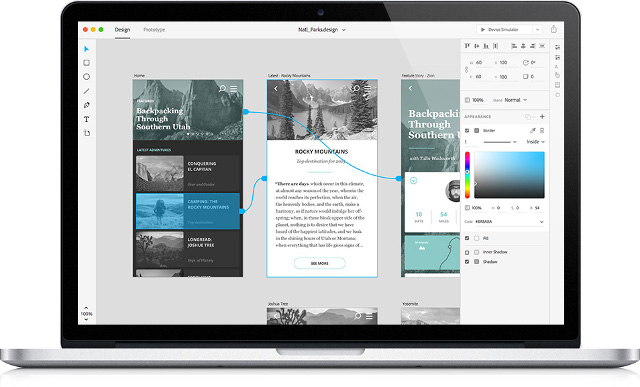
The design community, so far, has given mixed reactions to Adobe XD. Some are truly impressed, especially because there is a lot that it can do — it can serve as both a design app that lets you work with wireframes, and a prototyping app that helps you build interactive prototypes and animations.

comet-3

On the other hand, there are many who are not too impressed by Adobe XD so far — at the very least, there are genuine fears of Adobe ruining its most ambitious project simply by offering “integration” with its other products. Chances are high that Adobe might make XD as just another tool that lets you import vector X from Illustrator and export PNG Y to Photoshop, and if that happens, there will not be much to be happy about.

As of now, the design community uses a varied level of tools for the tasks that Adobe XD is trying to help you with — we have Sketch, Proto.io, UXPin and InVision, to name just a few of them. Each of these tools has a distinct modus operandi, and a clearly-defined purpose in a designer’s arsenal.

Experience Design, on the other hand, is looking to be a “master” app in its league, that plans to do everything that any of the above tools can do, and a bit more as well. This can probably work in XD’s favor, as any new designer might be tempted to try out the bigger app and not bother with two smaller apps. But chances are higher that it might go against Adobe XD in general — for prototypes, wireframes, UX and everything similar, folks prefer tools that are low on cholesterol, do not consume a lot of resources and try not to do everything and beyond. You’d want your wireframing app to create wireframes for you, nothing more. Adobe XD, on the other hand, is trying to do a lot many things, and this lack of laser-focus might not bear well with many designers.

Adobe XD is still barely a month old, and whether or not it will turn out to be a huge success is yet to be seen. What are your thoughts about XD? Share your views in the comments below!

Categories: Others Tags:

Adobe XD: What Can You Expect?

April 7th, 2016 No comments

Last year, Adobe announced what might be its most ambitious venture till date: Project Comet, an end to end prototyping, user experience and design tool that claims to be capable enough to solve all your designing needs. Under steady development, Project Comet is finally ready, and it is now known as Adobe Experience Design, or Adobe XD. That said, what exactly is Adobe XD all about? Furthermore, irrespective of the buzz surrounding it, will Adobe XD be able to live up to the hype?

What is Adobe XD fka Project Comet?

To begin with, let us first discuss what Adobe XD is all about. Here is how Adobe likes to describe it (note that this description was how Adobe first introduced it as Project Comet):

Project Comet is the latest offering from Adobe and it’s got its aims set high, promising an all-in-one tool to handle everything from wire-framing to visual design and rapid prototyping for all devices from within a single app.

Take your UX designs from start to finish with the cross-platform app that lets you do it all — wireframing, visual design, interaction design, prototyping, previewing and sharing. And because it’s built from the ground up, Comet delivers innovative tools and breakthrough performance to help you design in record time.

Or, you can watch this slightly dated but still relevant video about this:

In a nutshell, Experience Design strives to be an all-in-one tool that lets you create wireframes, mockups, prototypes, as well as work with UX design and interaction design. Naturally, this is not a minnow tool, but more of a mammoth multipurpose offering.

With XD, Adobe is trying to target the UX design and wireframing segment to the fullest.

Major Features

And what all does Experience Design bring to the table? Here is a brief run-down:

  • Tools for drawing, combining, editing and working with shapes and paths, as well as working with gradients and shadows and styling text
  • Ability to copy and paste vector content from apps such as Illustrator
  • Ability to import formats such as SVG, PNG, JPG, GIF and bitmap
  • Interactive prototyping tools
  • UI elements meant especially for designing mobile apps
  • Desktop-based previews for your prototypes
  • Ability to add team members as well as clients to your projects
  • Export content and assets to Web, iOS or Android

comet-2

Furthermore, Adobe Experience Design also allows you to work with layers, share content and assets via Creative Cloud, and make changes in real-time on mobile devices. Plus, you can also extend it via JavaScript APIs, install plugins and custom workflows, and work on responsive design as well as CSS code and documents.

Sounds too much already? Eventually, going beyond prototypes, Adobe XD intends to help you work with animations and transitions right from the native interface itself, in addition to tighter integration with Illustrator and Photoshop.

Naturally, as we can see, Adobe is trying real hard and has truly big plans for its latest offering. It is not yet another tool that will be a part of Creative Cloud Suite — instead, it is *the* tool that Adobe is counting on.

Question is: will the newly-released Adobe Experience Design deliver or has Adobe taken one risk too many?

Appraisal

The design community, so far, has given mixed reactions to Adobe XD. Some are truly impressed, especially because there is a lot that it can do — it can serve as both a design app that lets you work with wireframes, and a prototyping app that helps you build interactive prototypes and animations.

comet-3

On the other hand, there are many who are not too impressed by Adobe XD so far — at the very least, there are genuine fears of Adobe ruining its most ambitious project simply by offering “integration” with its other products. Chances are high that Adobe might make XD as just another tool that lets you import vector X from Illustrator and export PNG Y to Photoshop, and if that happens, there will not be much to be happy about.

As of now, the design community uses a varied level of tools for the tasks that Adobe XD is trying to help you with — we have Sketch, Proto.io, UXPin and InVision, to name just a few of them. Each of these tools has a distinct modus operandi, and a clearly-defined purpose in a designer’s arsenal.

Experience Design, on the other hand, is looking to be a “master” app in its league, that plans to do everything that any of the above tools can do, and a bit more as well. This can probably work in XD’s favor, as any new designer might be tempted to try out the bigger app and not bother with two smaller apps. But chances are higher that it might go against Adobe XD in general — for prototypes, wireframes, UX and everything similar, folks prefer tools that are low on cholesterol, do not consume a lot of resources and try not to do everything and beyond. You’d want your wireframing app to create wireframes for you, nothing more. Adobe XD, on the other hand, is trying to do a lot many things, and this lack of laser-focus might not bear well with many designers.

Adobe XD is still barely a month old, and whether or not it will turn out to be a huge success is yet to be seen. What are your thoughts about XD? Share your views in the comments below!

Categories: Others Tags:

Coding a Radar Chart in jQuery

April 7th, 2016 No comments
radar-chart

If you are into front-end development, you can’t escape from two things – jQuery and data visualization. jQuery is one of the most popular JavaScript libraries which is being used by more than 70% of top one million websites (source). And with the increasing amount of data, sooner or later you will have to get your hands dirty with making charts.

That’s why this article combines both – jQuery and creating charts. I am going to walk you through the process of creating beautiful charts using FusionCharts and its jQuery charts plugin. Although I am going to make a radar chart, you can use this process to make any other chart that is part of FusionCharts’ library of 90+ charts as well.

Creating a Radar Chart – 4 Step Process

I have divided the process of making our chart into four easy-to-follow steps. But before we begin, here is a quick look into what we are trying to make:

radar-chart

You can see the live version at this JSFiddle. To view the source-code, click the ‘Edit in JSFiddle’ button on top right of the screen.

Step-1: Get the Data

This is usually the first step for making any kind of chart or graph. For the purpose of this tutorial, I am going to to use dummy data representing allocated budget and actual spending of a company (Acme Inc.).

FusionCharts accepts both JSON and XML data formats. I am going to use JSON as it has now become the standard data exchange format of the web. First we need to define a category array which will contain all the categories under which budget was allocated. It will be an array of objects like this:

"categories": [{
  "category": [{
      "label": "Engineering"
    }, {
      "label": "Sales"
    }
    // more categories
  ]
}]

Next we need to put the data that we want to plot in dataset array. Inside dataset you can have one object for each series of data you want to plot. In our case we have two series – Allocated Budget and Actual Spend.

"dataset": [{
  "seriesname": "Allocated Budget",
  "data": [{
      "value": "10000"
    }, {
      "value": "16500"
    }
    // more data points for first series
  ]
}, {
  "seriesname": "Actual Spend",
  "data": [{
      "value": "8000"
    }, {
      "value": "9500"
    }
    // more data points for first series
  ]
}]

Step-2: Include Dependencies

Our project is dependent on following JavaScript files:

  • jQuery – download it from here or include it via CDN.
  • 3 FusionCharts JS files: fusioncharts.js, fusioncharts.charts.js and powercharts.js. You can download all the files from this page (see under JS folder).
  • jQuery charts plugin – download it from plugin page.
<!-- jQuery -->
<script type="text/javascript" src="jquery.js"></script>

<!-- FusionCharts files-->
<script type="text/javascript" src="fusioncharts.js"></script>
<script type="text/javascript" src="fusioncharts.charts.js"></script>
<script type="text/javascript" src="powercharts.js"></script>

<!-- jQuery plugin -->
<script type="text/javascript" src="jquery-plugin.js"></script>

Step-3: Create and Select a Chart Container

HTML

elements work best for housing a chart. You should have a separate

container for each chart on you page. This is how we define a container and select it via jQuery’s $ selector:

HTML:

<div id="radar-chart">Radar chart will load here.</div>

Selecting it via jQuery:

$("#radar-chart")

Step-4: Insert the Chart

We are almost there. Now we just need to use the insertFusionCharts method provided by the plugin to insert the chart into our page. Here is how we do it (explanation after code snippet):

$("#radar-chart").insertFusionCharts({
  type: 'radar',
  width: '100%',
  height: '500',
  dataFormat: 'json',
  dataSource: {
    "chart": {
      "caption": "2015 Budget for Acme Inc.",
      "captionFontSize": "22",
      // more chart configuration options
    },
    "categories": [
      // explained in step-1
    ],
    "dataset": [
      // explained in step-1
    ]
  }
});

Most of the terms in the above code snippet are self-explanatory, so I will keep the description short and to the point:

  • type sets the type of chart we want to plot.
  • width and height define the dimension of the chart.
  • dataFormat sets the format in which we will pass the data (json or xml).
  • dataSource contains chart configuration options and the data we want to plot. Chart configuration options will go inside chart object and are technically known as chart attributes (in FusionCharts). dataset and categories arrays were covered in step-1.

Quick Note on Improving Design

If you notice the above code snippet carefully, you will see that our chart object only had two chart attributes, while the source code for the chart has more than 20!

What is happening here?

Well, in reality there are more than 100 different attributes you can use to customize a chart. Since it is not possible to cover everything, I am going to leave you with a resource that will be immensely helpful if you try to customize a chart.

Open this page and type the name of the chart you want to customize. It will open up complete list of attributes that can be used on that chart, along with their short descriptions and acceptable values. For example, to customize a radar chart you will reference radar chart’s page.

That’s it! If you were following along and did everything I described above, you must have got a working chart by now. If not, head over to the JSFiddle demo I created and take few mins to understand where you went wrong.

Have any questions? Leave a comment below and I will be glad to help!

Read More at Coding a Radar Chart in jQuery

Categories: Designing, Others Tags:

The best new portfolio sites, April 2016

April 7th, 2016 No comments

Hey everybody, it’s time to look at other people’s portfolios and get slightly jealous again! And guess what? For the first time ever, the majority of the websites we feature come from our very own readers.

If I said I was proud of you guys, would that make this weird?

Anyway, if you want to be included in next month’s roundup, contact me at ezequiel@webdesignerdepot.com.

Note: I’m judging these sites by how good they look to me. If they’re creative and original, or classic but really well-done, it’s all good to me. Sometimes, UX suffers, for example many of these sites depend on JavaScript to display their content at all; this is a Bad IdeaTM, kids.

Pierre

I’ll be honest with you. I don’t know enough French to tell if “Leverrier” is Pierre’s last name, nickname, or some sort of adjective. I couldn’t find his full name in the site’s content.

The confusion around his name aside, the site is good-looking, usable, though heavily focused on animation. The imagery is good, and the vintage video background on the homepage is a nice touch, style-wise.

Zeh Fernandes

Zeh Fernandes has achieved the sort of minimalism that makes his one-page site calming to look at. Then again, I am maybe too easily calmed by black text on a white background.

Still, Zeh is a master of both code and design, and it shows.

Matt Weller

Matt Weller is yet another designer who takes a big risk by making his portfolio just one big carousel full of his work. Still, his skills as a graphic designer and illustrator make the show a pleasant one.

Matt Muirhead

Matt Muirhead combines an interactive sort of drawing toy, video footage, and animation into one rich, lovely, if somewhat distracting website experience. If a designer’s job is to draw the eyes in, and guide the user down a path, then Matt Muirhead knows his job well.

Dauntless

Dauntless’ website doesn’t do anything revolutionary with the layout or aesthetics, but it’s a Good DesignTM. That is, it’s usable, stylish, and pleasing to the eye.

It is perhaps ironic that their slogan is “Be Dauntless”, but for their decidedly business-oriented customers, this is a near-perfect design.

Jacob Stringfellow

Jacob Stringfellow takes a bold, rather risky approach to his portfolio. There’s no denying that the visuals are lovely (with yet another excellent example of a yellow-focused color palette), it’s the presentation.

Specifically, he hides his previous work in lightbox carousels, and the copy directly states that this site is his best work so far, but you can look at bits of his older work if you really must.

Despite that odd risk, the rest of his site is just plain beautiful.

Paul Johns

Paul Johns’ site is another one that I find calming to look at. Simple, usable, pretty, decent typography, lets the work speak for itself. I can’t ask for more.

Ryan Gittings

I love Ryan Gittings’ site because it’s a great example of progressive enhancement on top of a usable, fast, and good-looking design.

While the aesthetics and layout aren’t anything too original, turn off the JavaScript and watch how everything still works fine. All you lose is a couple of fancy animations. This is how it’s supposed to work!

Plus, it really does look good, in a conventional way.

Rotate

Rotate is a studio that takes the opposite approach. The site is fashionable, even kind of elegant, but I hate to see what would happen if someone wasn’t able to load the JS for any reason.

Still, I love the way they showcase their work, the “thumbnails” (click through, you’ll see what I mean), and the case studies themselves.

Mark Spurgeon

Mark Spurgeon is a 19-year-old up-and-coming designer, programmer, illustrator, and 3D artist. I’ll freely admit that he could stand to practice his use of white space and typography, but what caught my eye was the aesthetic.

It’s a vintage, minimalist design. Vintage design tends to be simplistic, but not minimalist. It is usually dominated by large photos, stylistic flourishes, and so on.

Seeing the two aesthetics combined is refreshing. With some tweaks, this could be the best portfolio of the month.

Nifty

It’s simple. It’s sleek. It’s Nifty! (Sorry, I had to.) It’s another one of those sites that does very little that’s new, but a lot that’s right. Click through, browse, enjoy the loads of great imagery.

Thick

Thick is a design studio in Australia.

[Don’t make an upside-down joke…Don’t make an upside-down joke…]

They’ve managed to turn design trends upside down [Dammit…] by using monospace fonts with lots of color. No, really. Nearly every time I see people using monospace fonts, it’s in a monochromatic design. Either that, or a mostly monochromatic design, lightly touched with accent colors.

It’s good to see that Thick has gone in a different direction, and made it look good.

Iaia Ioio

Iaia Ioio has the sort of “wacky” design that makes one think of the ’90s, only imbued with a less colorful palette.

I’ll admit, it always feels odd when I get to the landing page of a site and I can’t scroll. It’ll confuse more than a few users when they get there and they find out the navigation is in the four corners.

Once you figure that out, though, the design feels classic, like back when the Bauhaus style first began to filter into web design. It comes complete with monospaced fonts and what I could swear is a little Helvetica.

Ouur Media

Ouur Media has perfected an aesthetic that I’m going to call “Sepia Bauhaus” (not to be confused with the aforementioned “Vintage Minimalism”). Seriously, look at it. They’ve got that asymmetry thing going, and they ran the whole home page through a Sepia filter, and it’s working for them.

They’re also the people who made that really cool series of photos with the matchsticks.

Finesse

Finesse is a design studio with a distinctly high-fashion style that is reflected in both their own site, and all throughout their portfolio. Plus, they make red and black look really good.

(Fair warning, after the jump, there will be at least a couple of women in lingerie. Maybe don’t click this one while you’re at work.)

Mighty in the Midwest

Mighty in the Midwest is an agency in Michigan. Their site is practically a textbook on beautiful typography, the use of white space, and mixing unexpected stylized brush strokes and cursive script into an otherwise conservative design.

Sean Purdy

It’s rare to find a site as saturated with red as Sean Purdy’s portfolio and rarer to find one that looks this good. Now, there is one problem: after you get there, click on a project as fast as you can, ’cause those blinking .gifs hurt my eyes a bit.

Once you get past that (and it is a pretty big usability issue), the work is beautiful, the typography is good, and the navigation, while unconventional, is obvious enough to be usable.

Hello Trio

The Berlin-based Hello Trio combines illustration with fantastic typography in a simple website that does what it says on the label.

Groundswell

Groundswell uses their portfolio site to showcase their public relations case studies. They also use a lot of stock photography. But hey, if they couldn’t sell a concept with stock photos, I’m not sure I’d trust them to do my PR.

Tristan Gevaux

Using yellow well in web design is hard. Mixing yellow and blue and making it work is harder. Tristan Gevaux has managed this, along with great typography and a very distinct sense of style.

Bolden

Bolden is a design studio in Amsterdam. Their portfolio’s aesthetic uses animation and red and blue overlays to reveal information. It’s fairly distinct, definitely eye-catching, and very well-done.

Josh Sender

Josh Sender’s site is simple, largely monochromatic, understated. While I have always showcased at least a site or two for their bold color choices, I must admit that this sort of design is my first love.

Explainer Videoly

And we jump right back into the vivid colors with Explainer Videoly, a studio that makes explainer videos. You can watch their explainer video about it on their home page, because they really like making them.

Their site may not be prticularly unique layout-wise, and there’s no reason the text should be that small, but this site has personality, and a lot of it. Plus, it’s usable.

Darryl Snow

Darryl Snow’s site is another great one for showcasing personality. He doesn’t show so much of his work as he shows off the brands he’s worked for. Given the size of those brands, that’s probably enough for most clients.

But I especially like the way he puts a twist on old concepts, like the curved borders between the screen-sized content sections. It’s the little touches like that which can make a standard layout feel unique.

Create Stunning Halftones and Mosaics with SuperMosaic – only $9!

Source

Categories: Designing, Others Tags:

Why You Should Consider React Native For Your Mobile App

April 7th, 2016 No comments

Like many others, I was initially skeptical of Facebook and Instagram’s React. Initial demos of React’s JavaScript language extension, JSX, made many developers uneasy. For years we had worked to separate HTML and JavaScript, but React seemed to combine them. Many also questioned the need for yet another client-side library in an ocean full of them. As it turns out, React has proved tremendously successful, both on my own projects, and with many others around the web, including large companies like Netflix.

Why You Should Consider React Native For Your Next Mobile App

And now with React Native, the framework has been brought to mobile. React Native is a great option for creating performant iOS and Android apps that feel at home on their respective platforms, all while building on any previous web development experience. This article will explain why I think you should consider using React Native, by providing an overview of the framework and what I believe to be its best features.

The post Why You Should Consider React Native For Your Mobile App appeared first on Smashing Magazine.

Categories: Others Tags:

Debouncing and Throttling Explained Through Examples

April 6th, 2016 No comments

The following is a guest post by David Corbacho, a front end engineer in London. We’ve broached this topic before, but this time, David is going to drive the concepts home through interactive demos that make things very clear.

Debounce and throttle are two similar (but different!) techniques to control how many times we allow a function to be executed over time.

Having a debounced or throttled version of our function is especially useful when we are attaching the function to a DOM event. Why? Because we are giving ourselves a layer of control between the event and the execution of the function. Remember, we don’t control how often those DOM events are going to be emitted. It can vary.

For example, let’s talk about scroll events. See this example:

See the Pen Scroll events counter by Corbacho (@dcorb) on CodePen.

When scrolling using a trackpad, scroll wheel, or just by dragging a scrollbar can trigger easily 30 events per second. But scrolling slowly (swapping) in a smartphone could trigger as much as 100 events per second during my tests. Is your scroll handler prepared for this rate of execution?

In 2011, an issue popped up on the Twitter website: when you were scrolling down your Twitter feed, it became slow and unresponsive. John Resig published a blog post about the problem where it was explained how bad of an idea it is to directly attach expensive functions to the scroll event.

The suggested solution by John (at that time, five years ago) was a loop running every 250ms, outside of the onScroll event. That way the handler is not coupled to the event. With this simple technique, we can avoid ruining the user experience.

These days there are slightly more sophisticated ways of handling events. Let me introduce you to Debounce, Throttle, and requestAnimationFrame. We’ll also look at the matching use cases.

Debounce

The Debounce technique allow us to “group” multiple sequential calls in a single one.

Imagine you are in an elevator. The doors begin to close, and suddenly another person tries to get on. The elevator doesn’t begin its function to change floors, the doors open again. Now it happens again with another person. The elevator is delaying its function (moving floors), but optimizing its resources.

Try it for yourself. Click or move the mouse on top of the button:

See the Pen Debounce. Trailing by Corbacho (@dcorb) on CodePen.

You can see how sequential fast events are represented by a single debounced event. But if the events are triggered with big gaps, the debouncing doesn’t happen.

Leading edge (or “immediate”)

You may find it irritating that the debouncing event waits before triggering the function execution, until the events stop happening so rapidly. Why not trigger the function execution immediately, so it behaves exactly as the original non-debounced handler? But not fire again until there is a pause in the rapid calls.

You can do this! Here’s an example with the leading flag on:


Example of a “leading” debounce.

In underscore.js, the option is called immediate instead of leading

Try it for yourself:

See the Pen Debounce. Leading by Corbacho (@dcorb) on CodePen.

Debounce Implementations

The first time I saw debounce implemented in JavaScript was in 2009 in this John Hann post (who also coined the term).

Soon after that, Ben Alman created a jQuery plugin (no longer maintained), and a year after, Jeremy Ashkenas added it to underscore.js. It was later added to Lodash, a drop-in alternative to underscore.

See the Pen New example by Corbacho (@dcorb) on CodePen.

The 3 implementations are a bit different internally, but their interface is almost identical.

There was a time that underscore adopted the debounce/throttle implementation from Lodash, after I discovered a bug in the _.debounce function in 2013. Since then, both implementations have grown apart.

Lodash has added more features to its _.debounce and _.throttle functions. The original immediate flag was replaced with leading and trailing options. You can choose one, or both. By default, only the trailing edge is enabled.

The new maxWait option (only in Lodash at the moment) is not covered in this article but it can be very useful. Actually, the throttle function is defined using _.debounce with maxWait, as you see in the lodash source code.

Debounce Examples

Resize Example

When resizing a (desktop) browser window, they can emit many resize events while dragging the resize handle.

See for yourself in this demo:

See the Pen Debounce Resize Event Example by Corbacho (@dcorb) on CodePen.

As you can see, we are using the default trailing option for the resize event, because we are only interested on the final value, after user stops resizing the browser.

keypress on autocomplete form with Ajax request

Why to send Ajax requests to the server every 50ms, when the user is still typing? _.debounce can help us, avoiding extra work, and only send the request when the user stops typing.

Here, it wouldn’t make sense to have the leading flag on. We want to wait to the last letter typed.

See the Pen Debouncing keystrokes Example by Corbacho (@dcorb) on CodePen.

A similar use case would be to wait until user stops typing before validate its input. “Your password is too short” type of messages.

How to use debounce and throttle and common pitfalls

It can be tempting to build your own debounce/throttle function, or copy it from some random blog post. My recommendation is to use underscore or Lodash directly. If you only need the _.debounce and _.throttle functions, you can use Lodash custom builder to output a custom 2KB minified library. Build it with this simple command:

npm i -g lodash-cli
lodash-cli include=debounce,throttle

A common pitfall is to call the `_.debounce function more than once:

// WRONG
$(window).on('scroll', function() {
   _.debounce(doSomething, 300); 
});

// RIGHT
$(window).on('scroll', _.debounce(doSomething, 200));

Creating a variable for the debounced function will allow us to call the private method debounced_version.cancel(), available in lodash and underscore.js, in case you need it.

var debounced_version = _.debounce(doSomething, 200);
$(window).on('scroll', debounced_version);

// If you need it
debounced_version.cancel();

Throttle

By using _.throttle, we don’t allow to our function to execute more than once every X milliseconds.

The main difference between this and debouncing is that throttle guarantees the execution of the function regularly, at least every X milliseconds.

The same way than debounce, throttle technique is covered by Ben’s plugin, underscore.js and lodash.

Throttling Examples

Infinite scrolling

A quite common example. The user is scrolling down your infinite-scrolling page. You need to check how far from the bottom the user is. If the user is near the bottom, we should request via Ajax more content and append it to the page.

Here our beloved _.debounce wouldn’t be helpful. It only would trigger only when the user stops scrolling.. and we need to start fetching the content before the user reaches the bottom.
With _.throttle we can warranty that we are checking constantly how far we are from the bottom.

See the Pen Infinite scrolling throttled by Corbacho (@dcorb) on CodePen.

requestAnimationFrame (rAF)

requestAnimationFrame is another way of rate-limiting the execution of a function.

It can be thought as a _.throttle(dosomething, 16). But with a much higher fidelity, since it’s a browser native API that aims for better accuracy.

We can use the rAF API, as an alternative to the throttle function, considering this pros/cons:

Pros

  • Aims for 60fps (frames of 16 ms) but internally will decide the best timing on how to schedule the rendering.
  • Fairly simple and standard API, not changing in the future. Less maintenance.

Cons

  • The start/cancelation of rAFs it’s our responsibility, unlike .debounce or `.throttle`, where it’s managed internally.
  • If the browser tab is not active, it would not execute. Although for scroll, mouse or keyboard events this doesn’t matter.
  • Although all modern browsers offer rAF, still is not supported in IE9, Opera Mini and old Android. (A polyfill)[http://www.paulirish.com/2011/requestanimationframe-for-smart-animating/] would be needed still today.
  • rAF is not supported in node.js, so you can’t use it on the server to throttle filesystem events.

As a rule of thumb, I would use requestAnimationFrame if your JavaScript function is “painting” or animating directly properties, use it at everything that involves re-calculating element positions.

To make Ajax requests, or deciding if adding/removing a class (that could trigger a CSS animation), I would consider _.debounce or _.throttle, where you can set up lower executing rates (200ms for example, instead of 16ms)

If you think that rAF could be implemented inside underscore or lodash, they both have rejected the idea, since it’s a specialized use case, and it’s easy enough to be called directly.

Examples of rAF

I will cover only this example to use requestAnimation frame on scroll, inspired by Paul Lewis article, where he explains step-by-step the logic of this example.

I put it side by side to compare it to _.throttle at 16ms. Giving similar performance, but probably rAF will give you better results on more complex scenarios.

See the Pen Scroll comparison requestAnimationFrame vs throttle by Corbacho (@dcorb) on CodePen.

A more advanced example where I’ve seen this technique is in the library headroom.js, where the logic is decoupled and wrapped inside an object.

Conclusion

Use debounce, throttle and requestAnimationFrame to optimize your event handlers. Each technique is slightly different, but all three of them are useful and complement each other.

In summary:

  • debounce: Grouping a sudden burst of events (like keystrokes) into a single one.
  • throttle: Guaranteeing a constant flow of executions every X milliseconds. Like checking every 200ms your scroll position to trigger a CSS animation.
  • requestAnimationFrame: a throttle alternative. When your function recalculates and renders elements on screen and you want to guarantee smooth changes or animations. Note: no IE9 support.

Debouncing and Throttling Explained Through Examples is a post from CSS-Tricks

Categories: Designing, Others Tags:

Site of the Week: FS Untitled

April 6th, 2016 No comments

The FS Untitled micro-site is a digital playground packed with typographic experiments. Designed in-house by London-based type foundry FontSmith to advertise their new typeface of the same name, the site consists of dozens of experiments, from dynamic 3D typography, to interactive games.

The typeface itself, FS Untitled, is designed for use on screen, and features a wide-range of weights, so most of the experiments exploit that, easing from one weight to another. The playground shows off the flexibility of the typeface, and each of the experiments can be switched, from regular, to italic type. Graphically, the experiments are bold and colorful.

Some of our favorite experiments include FS Dare, FS Zombie (top score 34500), FS Afterlife, FS Metropolis, FS Boom, and FS Dare.

The idea of designing and building 48 unique interactive scenes seemed like sheer madness. But it has been a really exciting project and we think all the hard work has paid off. — Steve Jones, Fontsmith

The site is successful because it’s simple to use, and encourages you to explore; while you’re exploring you’re also examining the product on offer in great detail.

The best thing about the FS Untitled site, is that it’s proof-positive that web design does not need to limit itself to Bootstrap-style horizontal bands, and 12 column grid systems, in order to sell a product; if your target demographic is receptive, the web offers the opportunity to be both creative, and successful.

Quickly and Easily Customize your Mac with MacPilot 8 – only $14!

Source

Categories: Designing, Others Tags: