Archive

Archive for April, 2016

404: How to Create the Perfect Error Page

April 6th, 2016 No comments
http://www.tripomatic.com/404

When the server doesn’t find a requested page, it displays the error 404. It’s only a matter of time until this error pops up, as it’s the most popular error message on the internet. A single typo in the URL can already cause a 404. However, many websites forget about this important page and have the server default sight be displayed instead. Unfortunately, you are likely to lose visitors due to this bland page. To avoid that, we’ll show you what to consider when it comes to designing the perfect 404 error page.

In Which Situations do 404 Errors Occur?

404 errors always occur when the visitor made a typing error. Or when Google and other websites that link to one or more of your subpages try to connect to an outdated page which has been renamed, moved or deleted.

However, your visitor is to blame for most 404 errors, as typos happen quite often. A single letter swap is enough to cause the error. Your visitor will assume that he didn’t do anything wrong, though. That’s simply human.

Thus, it is important to support the user in this situation with important links and details, to stop his anger, and help him find what he’s looking for after all.

404: Three Types of Error Pages

In total, there are three main types of error pages. Number one has a very complex design, but it’s easy to use as it only presents a button that directs you to the landing page. This type may be pretty, but I wouldn’t recommend it.

Number two is also graphically complex. However, it provides a lot more ways of orientating oneself. That’s what a proper 404 error page looks like. The user receives a couple of links that may help him to find what he’s looking for.

https://www.airbnb.com/404

Version number three is kept very simple but provides all the important information. We will go into detail on that later on. If you prefer this one or the well-designed version is up to you.

https://www.democraticpost.de/404

Assistance for the Visitor: Important Elements of a 404 Page

The idea behind a really good 404 error page is assisting your website’s visitors. Oftentimes, they don’t know why they didn’t find what they were looking for. Thus, we need to support them with information and additional features, so that they are motivated to stay on our website and start a new search. That means that a good 404 error page helps the user orientate, and provides information on top of that.

Important Elements of a 404 Error Page

The following list will help you build your 404 error page. If you go through it step by step, you’ll end up with all the important elements of your error page.

1 – The 404 Error Message

“404 – Page Not Found” should pop up in every case on all the versions. That is a crucial start for the visitor’s orientation. It’s what tells them that something went wrong.

2 – A Linked Logo and a Slogan

Your error page should definitely be visually connected to your website. This includes a logo that links to the landing page as well as the website’s slogan. For Noupe, for example, the logo, as well as a slogan such as »Noupe – The Curious Side of The Web” would be placed. This way, the visitor instantly knows what website he’s on.

3 – The Search Function

This is an error page’s most important element. The immediate access to the search function has to be possible, directly visible, and usable without a link.

4 – Link to the Sitemap and to the Archives

A good 404 error page should always contain a link to a sitemap for visitors. By that, I don’t mean the Sitemap.xml for Google, but a sitemap specifically created for visitors, which contains the most important links. A link to the archives is appropriate as well, preferably to monthly archives. Both pages offer a couple of ways for the user to still find what he was looking for.

5 – A Hint at a Potential Typo

Typos can happen rather quickly when manually typing and accessing a URL. For this case, it is helpful to display a small, friendly hint at a potential typing error should it be a really common one.

6 – Name Ways to Contact You

Some of the visitors might want to help you, and forward the error to the website’s admin. To allow that to be done fast and easily, a way of contacting you should be mentioned. This can be done with a contact form or a linked email address.

Creating a 404 is This Easy

Today, most websites are running on Apache servers. Creating and displaying an error page isn’t all that difficult. Simply create a file named 404.php. You can then design this file the way you want to. However, please make sure that all important elements are located in this file. It’s up to you whether you want a simple and clean, or a complex design.

1 – Usage Without WordPress

After you’ve completed the file, it should be loaded into your server’s root index. Afterwards, you need to edit the .htaccess file. This is the file that controls the server. If the server is unable to immediately find a certain file, it will check the .htaccess, and, in our case, find the file.

The following code needs to be put in there:

ErrorDocument 404 /404.php

The .htaccess file also needs to be uploaded to the root index of the server. Every faulty access to your website should now end with the display of your 404.php file.

2 – Usage With WordPress

Here, a 404.php is created and designed the way you want it to be as well. You can either take a theme file, in which case the 404 page will look like the one in example number three, or you pick a graphically more complex version. After completion, the file goes into the root folder of your active theme. The .htaccess file doesn’t need to be altered. WordPress takes care of the display automatically.

Example: a 404 for Use With WordPress

I’ll link the most important, inner part of my own 404 error page as a Gist at GitHub. One click on the graphic opens the file. You can orientate yourself towards this file a little.

Code für eine optimale 404-Fehlerseite

404 – Some Graphic Inspiration

If you want your error page to be more graphically complex, you’ll find some inspiration here. However, to make your 404 page good and user-friendly, you should still follow the above-mentioned advice.

Yieldmo
Yieldmo 404

Urban Influence
Urban influence

TinyCarrier
TinyCarrier 404

BrandCrowd
BrandCrowd 404

(dpe)

Categories: Others Tags:

Top 20 Blogging WordPress Themes That Bloggers Should not Overlook

April 6th, 2016 No comments
wildride

Blogs, just like business or eCommerce web pages, should be functional and a pleasure to read. Responsivity is of the highest importance when it comes to building such a web resource. More and more web users prefer browsing sites and reading the latest news on mobile phones or tablets when on the go. That’s why the ability of your web page to adapt to any screen resolution plays a tremendous role today.

With the purpose of helping you build an impressive and responsive blog, we have hand picked 20 stunning blogging WordPress themes that are ready to go, out of the box.

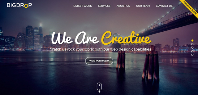
1. WildRide Blogging WordPress Theme

Demo | Details

WildRide is a clean and minimalist WordPress theme that is best suited for blogs and personal sites. Fully licensed under GPL v3.0, the theme can be used for as many websites as you wish. While tweaking its design to match various web projects that you are planning to launch, the theme can be used for multiple purposes, with no restrictions at all.
The theme is simple in both navigation and customization. With the purpose of facilitating its customization, the theme’s developers have added WordPress Live Customizer to the pack. The latter allows you to apply changes to the layout, the theme’s color scheme, positioning of different content blocks, and so much more, in real-time. The theme’s installation has been made no less simple and intuitive. Intended for users of all skill levels, the theme can be installed in three steps.
As a fully-fledged blogging theme, WildRide features multiple variations of blog layouts. Several header and footer options are available as well. It goes without saying that the fonts and colors of the theme are fully customizable as well. Custom widgets have been added to help you expand your blog’s functionality with ease.

2. Blogetti WordPress Theme

Blogetti - GPL WordPress theme for Bloggers

Demo | Details

Blogetti is a 100% GPL blogging WordPress theme that is best suited for restaurant and cafe blogs. Its two-column layout is perfect for organizing loads of data in a well-balanced way. Owing to the advanced Bootstrap functionality, the theme’s layout can adjust flawlessly to any screen resolution. It is compatible with such popular WordPress plugins as WPML, Google Analytics, Gravity Forms, WP Pagenavi, W3 Total Cache, and so many more. SEO optimization and lightweight design ensure higher ranking in search results.
The theme was made both user-friendly and visually impressive. Retina ready appetizing images of your culinary masterpieces will hardly leave true gourmets indifferent.

3. Style Park WordPress Theme

style-park - one of the most stylish blogging WordPress themes

Demo | Details

Style Park is one of the best blogging WordPress themes on today’s list. It was designed to appeal to true fashionistas. Just take a look at its bold layout. Rich in retina ready images and banners with hover effect, the theme is both easy to navigate and a pleasure to watch. Card-based content positioning, readable fonts of different colors and sizes, catchy headlines, and other smart tricks provide for better content hierarchy. Social sharing options, video integration, newsletter subscriptions, and other navigation elements have been organized into the right sidebar. Thus, the users will always have access to the sticky menu and other navigation options when reading your content. Btw, the theme is 100% GPL.

4. Fitnesys WordPress Theme

Fitnesys - blogging WordPress theme - GPL

Demo | Details

Fitnesys is a flexible responsive GPL WordPress theme. It comes with three homepage layouts – default, grid and masonry. Fitnesys makes use of a sticky navigation menu, which makes finding a specific category or page of your website a breeze for the visitors. This theme could be used for websites related to sports, health and similar topics.

5. Kustrix Blogging WordPress Theme

Kustrix blogging WordPress theme

Demo | Details

Fashion and beauty blogs will look amazing when built with the help of this GPL WordPress theme. Its two-column layout is fully responsive and will adapt smoothly to any screen resolution on which your website is viewed. A number of custom page templates and widgets have been included in the template for a quick start. Every element of the design is fully customizable, so you can tweak its look and feel just the way you want. Made super lightweight and user-friendly, the theme has been optimized for speed and SEO requirements which increases your chances of reaching the top of the search results. The theme can be managed by both design gurus and beginners equally well. A rich pack of customization options, detailed documentation and free 24/7 support will always come in handy.

Special Offer: WordPress Theme Bundle

blogging gpl wordpress themes bundle

Good news! The first 5 WordPress themes featured in this article are available as a bundle for only $45.

This means you can get 5 Blogging WordPress themes for the price of 1. Of course, these themes are built especially for bloggers. Moreover, they can be used multiple times as they’re 100% GPL.

But, if you want to save 80% on premium blogging WP themes you’d better hurry up because the offer expires on April 8th, 2016.

6. KingNews WordPress Theme

kingnews - one of the best blogging WordPress themes

Demo | Details

KingNews is a fully-fledged responsive blogging WordPress theme that was developed specifically for online magazines and news portals. Being also licensed under GPL v3.0, the theme can be used for a variety of web resources that you plan to launch or update. Just tweak the design and make it live.
With the purpose of helping you reach international audiences, the theme has been made translation ready. Just like the previous two themes, KingNews features an integrated WordPress Customizer, which allows you to see results of the theme’s customization in real-time, without the need to reload the page constantly.

7. HostPro WordPress Theme

hostpro WordPress theme

Demo | Details

Hosting companies and Internet providers can use this theme to their benefit. Focused on the effective presentation of your data in a clear and concise manner, the theme features an intuitive and easy to follow layout. Flat style and white space enhance the theme’s readability. Full-width images, enhanced with the parallax scrolling effect, harmonize perfectly with the minimalist design of the theme, providing for a more interactive browsing of the page.
The theme features everything that you need for a quick start to your site. Layered PSD files, custom page templates, a set of WordPress page templates, Google web fonts, several cool gallery scripts, and a whole lot of other smart features have been added to the package.

8. Effective IT Solutions WordPress Theme

effective-it-solutions - one of the best blogging WordPress themes

Demo | Details

When choosing this theme you will enjoy all the advantages of Cherry Framework 4. Intended to be easy to manage by users of all skill levels, the theme is both simple to install and customize. The installation Wizard plugin was integrated to help you get everything installed with a click. For more experienced users, there is also available an option to install all of the theme’s components manually.
WPML ready, the theme has been enhanced with such pro WordPress plugins as MotoPress Content Editor and MotoPress Slider. Available for the theme’s owners at absolutely no cost, these two will significantly speed up and facilitate the theme’s customization.
Demo | Details

9. Web Design WordPress Theme

web-design blogging WordPress theme

Demo | Details

Choose this theme to exude the professionalism of your web design agency. The fully responsive and retina ready layout of this theme will make your site look razor sharp on the latest generation devices. The parallax scrolling effect enhances the visual presentation of sliders and full-width backgrounds. Pre-loaded with several gallery scripts and cool animation effects, the theme will capture attention of every web user. WPML support, Contact form integration, a set of Google web fonts and Google map, a rich variety of custom post types and layout variations, and a host of other great options will help you attain the desired results in no time. Yes, this theme is great, but we have some more blogging WordPress themes to show you.

10. Adv Blogging WordPress Theme

adv blogging WordPress theme

Demo | Details

Advertising agencies will look professional and trustworthy when building their blogs or official websites with the help of this blogging WordPress theme. The clean, flat style of the theme allows you to bring content to the focus of attention. A fully customizable MegaMenu provides the users with quick access to all of your site’s pages. Though the theme’s header is not sticky, a back-to-top button will help them reach your site’s menu with ease. The theme is fully responsive and crossbrowser compatible. An integrated newsletter subscription form in the footer invites the users to stay updated regarding your latest news.

11. Supreme WordPress Theme

supreme - one of the best blogging WordPress themes

Demo | Details

The list of blogging WordPress themes would not be complete without Supreme. This theme runs on Cherry Framework 4. Compatible with all the latest WordPress versions, this theme ensures smooth performance across all devices and web browsers. The classic black and white color scheme of the theme will make your fashion or beauty related web resource look smart and casual. Placed on the minimalist layout, full-width images with the parallax scrolling effect and video backgrounds look even more captivating. Unlike the previous theme, Supreme boasts a sticky MegaMenu. The theme’s footer has been enhanced with built-in Google map with tooltips support. Social sharing options harmonize perfectly with the rest of the layout, providing the users with a quick way to share their preferred content on Facebook or Twitter.

12. Jo Invest WordPress Theme

jo-invest blogging WordPress theme

Demo | Details

As the name implies, the theme is best suited for investment, financial and business sites. The clean and concise layout brings your site’s content to the focus of the users’ attention. Neat niche-specific icons guide people through your content effortlessly. A drop-down menu is fixed to the top of the theme. The theme comes integrated with social media, so there will be no need to install third-party plugins on your blog. The contact form and newsletter subscription options will help you build a rapport with your audience.

13. Gadnews WordPress Theme

gadnews WordPress theme

Demo | Details

This theme is best suited for new portals, magazines and blogs. A card-based layout structure makes it both trendy and user-friendly. Content is surrounded by white space, which makes the design look more spacious and well balanced. Instead of the traditional carousel slider, the theme’s header features a banner representing the most-read blog posts. In addition to the section of the latest publications that occupy the central space of the theme, there is a carousel gallery above the theme’s footer, introducing the users to a sequence of the most trending topics on your blog.

14. Web Design Agency WordPress Theme

web-design-agency WordPress theme

Demo | Details

Tired of similar looking blogging WordPress themes? If you want to catch the users’ eyes once they land on your blog, integrate multi-colored polygons into its design. The technique serves as a great attention getter. Bold edgy shapes in the theme’s logo, backgrounds and footer simply cannot leave true web design fans indifferent. Filterable galleries and an easy to scan layout structure allow you to present your creative works in the most favorable manner.

15. Stone Blogging WordPress Theme

stone - one of the best blogging WordPress themes

Demo | Details

This responsive, WPML ready blogging WordPress theme includes a host of pre-designed pages and customization options, which are ready to go out of the box. Running on Cherry Framework 4, the theme includes a drag-and-drop page builder, MotoSlider, shortcode template editor, Installation Wizard, and a whole lot of other advanced functionality. The theme features flat style, which provides for better content readability. Fonts of different size and color, as well as multi-colored backgrounds, help to promote content hierarchy on the page.

16. Life Coach WordPress Theme

life-coach WordPress theme

Demo | Details

Education related blogs could use Life Coach WP theme to their benefit. Intended for content heavy web pages, the theme features a well thought-out layout structure, which is very easy to navigate. Bold coral colors guide the users’ eye to the most valuable pieces of information. In the theme’s header, the carousel slider is supplemented with a set of banners, inviting the audience to get to know your education programs better. Well-documented and featuring free 24/7 support, the theme will help you get started with your official web page effortlessly.

17. Redwoods Blogging WordPress Theme

redwoods - one of the most beautiful blogging WordPress themes

Demo | Details

Redwoods is another beauty on the list on blogging WordPress themes. It is a ready-made theme for summer camp and education blogs. Its streamlined and practical design will definitely attract crowds of readers. The theme can be installed and customized with no coding skills required. A pack of shortcodes has been provided to enhance readability of your publications. Since the majority of students and their parents prefer browsing the web from handheld devices, the theme has been made fully responsive.

18. Channel Blogging WordPress Theme

33-channel WordPress theme for bloggers

Demo | Details

The image-rich design of this WordPress theme makes it a perfect solution for media-related web resources. Counters, audio and video support will help you direct the users’ attention to your most recent creative projects with just a glance. The sticky menu and filterable gallery placed below a full-width header slider enhance the site’s usability. Photos feature hover effect, which allows you to introduce the users to additional information about your new shows without the need to navigate to other pages. The above mentioned facts make Channel one of the most adorable blogging WordPress themes on the list.

19. Fishing Club WordPress Theme

fishing-club WordPress theme

Demo | Details

The theme is best suited for travel, sport and adventure related web projects. Elements of metro style spice up its visual appeal. Parallax scrolling image and videos in the theme’s background add a touch of realism to the theme. Developed with valid code, this responsive WordPress theme runs on Cherry Framework 4. This means that in addition to seamless installation you will get a package of advanced customization options.

20. Centralfood Blogging WordPress Theme

centralfood - one of the best blogging WordPress themes

Demo | Details

We’re at the end of the list of top 20 blogging WordPress themes. And the last theme is perfect for cafe and restaurant sites. Appetizing retina ready images will captivate true gourmets at a glance. Card based content positioning, parallax scrolling backgrounds, neat fonts, banners with hover effect, counters, and other smart options have been included to add a more breathtaking presentation to your web page. The theme’s main navigation panel, as well as a set of social sharing options, remains fixed to the top as a user navigates your site. Custom page templates, widgets, multiple customization options, layered PSD files, documentation, and more elements were also added to the pack.

Final Words

These are 20 of the most stunning, feature-rich and visually pleasing blogging WordPress themes that we highly recommend you pay attention to. If you think that we have missed any cool designs that are worthy of being mentioned above, please feel free to share your thoughts below.

Read More at Top 20 Blogging WordPress Themes That Bloggers Should not Overlook

Categories: Designing, Others Tags:

Microsoft debuts new Edge browser extensions

April 6th, 2016 No comments

Users who’ve been clamoring for new features in Microsoft’s Edge browser finally have reason to be excited: the company recently announced in a blog post that there are new extensions for Edge, which was one of the most-requested features from Windows Insiders. Designers and developers now have a chance to see if these extensions can elevate Edge to become part of their design workflow.

The rollout of these extensions is significant because it symbolizes the first steps Microsoft is taking to make its browser a real alternative to the dominant Google Chrome, and popular Mozilla Firefox.

The extensions announcement was part of a whole series of new updates for Edge, both on PCs and mobile. However, the extensions are meant as desktop-only. At the moment, designers can only fiddle around with three extensions: Mouse Gestures, Translator (automatically translates webpages in more than 50 different languages), and the Reddit Enhancement Suite.

Only Windows Insiders users have the chance to test these extensions right now, but Microsoft plans to roll them out to all Windows 10 users shortly. Insiders can download and sideload said extensions as part of the initial test; eventually, all users will get a crack at the extensions through the Windows Store. Later this year, users will get their hands on widely used extensions from company partners like Evernote, Last Pass, Amazon, Adblock Plus, Adblock, and many more.

The company’s philosophy around extensions is one of commitment. In another blog post from Drew DeBruyne, Microsoft Edge’s General Manager, he spells out how the company realizes that extensions are vital to designer and developer innovation, which leads to better and more interesting scenarios for users.

Besides Mouse Gestures, Translator and the Reddit Enhancement Suite, there are also other updates. You can now pin tabs in Edge. To pin a tab, just right-click on a specific tab and select “pin tab”. Selecting “unpin tab” after right-clicking on any given tab will reverse this. A design feature that makes tabbing more usable in Edge is the absence of a close button, so you won’t accidentally close tabs. For peace of mind, tabs that are open when you close the browser will automatically reappear when you start Edge the next time.

Finally, the Map app gets an update as well. This build offers a Windows 10 update with a lighter, more scalable and consistent user interface. Besides architectural improvements, there are also new features like:

  • Accessing favorites offline and adding notes to them
  • One-tap gestures for search and directions on mobile devices
  • Layering of multiple search results and directions on the same map

Microsoft will continue to build up Edge to make it a viable competitor to Chrome and Firefox, so more design updates should follow.

In the meantime, you can learn more about Edge here.

Quickly and Easily Customize your Mac with MacPilot 8 – only $14!

Source

Categories: Designing, Others Tags:

Improve User Experience With Real-Time Features

April 6th, 2016 No comments

Real-time technology delivers information to your users as it happens. But how does it help improve your product and align with your customers’ expectations?

Improve Your User Experience with Real-Time

Only a few years ago words like WebSockets, low latency and real-time functionality were at the forefront of bleeding-edge development. Fast-forward a couple of years and this technology has become an integral part of many of our favourite apps: e.g. Facebook with its in-app notifications, or Uber with its real-time location tracking effect.

The post Improve User Experience With Real-Time Features appeared first on Smashing Magazine.

Categories: Others Tags:

HP unveil “new” logo

April 5th, 2016 No comments

Hewlett-Packard, that giant of computing, has just released its new logo. Um… again. Well, not really again. Sigh.

If you haven’t heard, there’s two Hewlett-Packard’s now, okay? Now, I’d really like to tell you that this is because of alternate time-lines crashing into each other, or because HP is going through its very own Spider-Clone Saga. The truth is much less entertaining, but has better continuity than the average comic book: the company split up last year.

The two Hewlett-Packards separated to focus on different demographics. Hewlett-Packard Enterprise is, as you might guess, focused on industrial-grade servers, and their many of their clients are as big as, or bigger than they are. They released their new logo last year, and it’s as imaginative as their company name. Nothing wrong with that; conventional wisdom says that the world of big business tends to like more “comfortable” branding.

The company more commonly and colloquially known as “HP” is focused on individual consumers. Since “edgier”, more stylised branding tends to go over better in this market, HP has finally chosen to begin using the superbly minimal logo that it’s had knocking around in the back of a drawer for the last few years.

The logo itself was designed by Moving Brands as part of a long-term collaboration with HP, some years ago. It seems that since they no longer have to advertise to two markets at once, HP decided that this logo’s time has come—at least on some of its higher-end products.

The defining signature of the [new logo] is the 13° angle. 13° represents HP’s spirit as a company, driven forward by ingenuity and optimism about the future and a belief in human progress.
— Moving Brands

Personally, I find myself feeling conflicted. I feel like only a company with HP’s existing brand recognition could get away with sticking this logo on their devices. If I knew nothing about them, I’m not sure I’d actually see the letters “H” and “P” at first glance.

That said, it’s really pretty, and they are well-known enough to pull it off. Were I in the market for a new laptop, I would not be ashamed to have this logo emblazoned on the back of my machine.

LAST DAY: Fluid Mask 3 – Professional Image Masking Tool – only $49!

Source

Categories: Designing, Others Tags:

Changing the Cursor with CSS for Better User Experience (or Fun)

April 5th, 2016 No comments

CSS can control the appearance of a cursor. There are a ton of options available to us and we’ve covered them pretty thoroughly in the ol’ Almanac here on CSS-Tricks.

Still, it’s easy to overlook cursors and their impact on the user experience of our sites. Remember when we learned ::selection was a thing and every site started using it to personalize the background color of text selections? Customizing cursors is just as easy and adds that extra bit of understated flourish when used correctly.

In this post I’ll cover two ways I think controlling the cursor in CSS an improve user experience.

Using the Correct Cursor on an Element

Some cursor changes are built into the User Agent Stylesheet. Look at links as an example. Even if we do nothing else in our CSS, links will have color: blue; and text-decoration: underline;. That’s a solid visual indicator that the hyperlinked text is clickable.

Browsers take it a bit further. Hover over the link and the cursor changes from the default black arrow to a hand with its index finger extended, otherwise known as a pointer.

There are some times where the default cursor behavior from the User Agent Stylesheet doesn’t cut it. In these cases, we ought to change the cursor to something that reflects the expected user interaction on that element.

Take the jQueryUI draggable() function. We can apply that to an element and it will allow a user to click and drag that element around the viewport, but the user never know that if the cursor remains in its default state. Adding cursor: move; to the element would help solve that.

See the Pen QNqMRp by Geoff Graham (@geoffgraham) on CodePen.

The same is true for any number of scenarios, whether we’re talking about form inputs, images, or just about anything else you can imagine. Always take the opportunity to match an element’s cursor to its behavior when the default arrow isn’t enough of a clue. Here’s a demo of everything currently available:

See the Pen The Cursors! by Chris Coyier (@chriscoyier) on CodePen.

Using a Custom Cursor to Enhance an Element

What about custom cursors, you ask? As in, an image of your own creation tha takes the place of a cursor. Of course that’s possible!

We can point the cursor property to an image like this:

.module {
  cursor: url('path-to-image.png'), auto;	
}

I find this comes in handy when adding just a touch of personalization fits, but the user might not expect it. For example, a form where the answer to a question corresponds to a specific emotion:

See the Pen qZjwGe by Geoff Graham (@geoffgraham) on CodePen.

I found working with emoji to be a bit of a trick in and of itself. You can copy and paste emoji from a site like this, then paste it into a text editor and save it as a PDF, which can then be opened in Illustrator. From there, I was able to select the image, paste it into Photoshop and create a PNG image with a transparent background. Boom!

For those of you curious about SVG, I’m happy to say it’s a go! The cursor property does accept SVG files in all its glory. No animated GIF’s though, sadly.

See the Pen QNgoQW by Geoff Graham (@geoffgraham) on CodePen.

So no animated cursors sadly, unless you do something crazy like hide the cursor (cursor: none;), track the mouse position with JavaScript, and display something entirely custom.

Um, like this!

See the Pen Animation following cursor by tamm (@tamm) on CodePen.

Other examples from around the web

It’s harder to find good examples of custom cursors than you might think. Perhaps it’s not as widely used as other CSS features or it is something we’re still trying to figure out, but here are a few sites where it’s been put to good use.

Additional Reading


Changing the Cursor with CSS for Better User Experience (or Fun) is a post from CSS-Tricks

Categories: Designing, Others Tags:

CSS containment

April 5th, 2016 No comments

Michael Scharnagl breaking down the new contain property:

If you build simple sites without tons of DOM nodes and widgets you probably don’t have to care about CSS containment. On the other hand, if you build more complex sites CSS containment will help to optimize the performance. It is also a good idea to set contain: strict; for third-party widgets to protect the performance of your site.

Direct Link to ArticlePermalink


CSS containment is a post from CSS-Tricks

Categories: Designing, Others Tags:

Inspiration: 20 Websites with Great Typography

April 5th, 2016 No comments
Big Drop

Being a webdesigner is a creative and amazing profession. We create and build and invent on a daily basis. To achieve this we need a solid base of knowledge but even more so a never-ending flow of inspiration. Dipping one’s toe in the flow of other people’s work is one of the better and easier variants of gaining new insights and inspiration. In the following article we will have you do just that 😉

1 – BigDrop

2 – University of Sydney

University-of-Sydney

3 – Gelateria del Biondo

Gelateria-del-Biondo

4 – Oribe

Oribe

5 – Benjamin Guedj Designer

Benjamin-Guedj

6 – True Digital

True-Digital

7 – EVS

EVS

8 – Le 28

Le-28

9 – Because Recollection

Because-Recollection

10 – Formula1Data

Formula1Data

11 – Webflow

Webflow

12 – Olympic Story

Olympic-Story

13 – Space Needle

Space-Needle

14 – Ante Meridiem

Ante-Meridiem

15 – HLK

HLK

16 – Paul Woods

Paul-Woods

17 – Lander

Lander

18 – Brand Aid

Brand-Aid

19 – Visage

Visage

20 – We Are Nation

Nation

(dpe)

Categories: Others Tags:

The value of version control

April 5th, 2016 No comments

Whether you are a designer, a developer, or both, chances are high that you have several versions or instances of the same project on your computer at any one time. The problem is, it can be hard to keep up with these items if you don’t have some sort of system in place.

Any system you use, whether it is your own or some sort of proprietary system, is called version control. It’s an essential part of the process, and if you don’t have one, you’re asking for trouble.

As a designer

How many times have you created a design file for a client in Photoshop or Illustrator, and ended up with around 10 different versions or variations of the same design? I sure have, but what we end up with is something like this:

  • Client File
  • Client File New
  • Client File Newest
  • Client File Final
  • Client File Final Final
  • Client File Ultimate Final

That’s not a good way to go when it comes to version control. For one thing, the client doesn’t know what to refer to, other than a physical description of what they remember the file looking like. You are likely to have to sift through every one of those folders in order to figure out which one they are referring to. Also, if you come back to a project months down the road, how are you supposed to remember which file version you are looking for?

The value of version control

It keeps you from overwriting working files

The last thing you want to do is save over the working copy of your files. What if something goes wrong? You’ll need a copy of your code that is saved at a good point where everything still works. Having a safeguard against overriding previous versions is a must, unless you want to start all over again.

Teams can share projects and work on the latest files

Having a version control system in place will allow teams to work on the latest files of a project. This keeps members from working on older versions that may have bugs in them that other team members may have addressed and eliminated. Version control keeps everything organized and reduces team-wide errors.

Accountability and user tracking

Version control enables you to keep track of who worked on a file and when. When a user makes changes and uploads those changes, they make notes, which enables the team to keep track of changes and when they took place in the development process. This is important, because if you discover a problem later, you can work backwards to the point where things went awry.

Then, you can look at the changes that were made, which can help diagnose the problem.

Communication

When a teammate makes notes, it can also help to keep track of the progress of a project. Let’s say a team member is responsible for four tasks, but they only mention three in their notes, it will prompt other members to check in to make sure everything was completed. This can keep you from having holes in your projects.

Branching and merging files or folders

Branching enables a user to create a separate copy of a selection of files or folders that they can work on exclusively. This allows developers to test things separately, without having to worry about breaking the original.

Once all of the bugs are worked out, you can merge those changes back into the core system. Having the ability to separate projects into different pieces enables team members to work on areas they are responsible for, without affecting others’ work. This is especially useful for specialty development, where a team can work on standard core features, while specialty features can be worked on separately and merged later. It speeds up development, helping projects to go faster.

Conflicts

Having multiple people working on different parts and pieces means that you’re dealing with a multi-faceted project. There are bound to be conflicts: team member 1 and team member 3 might create something that conflicts with each other, leaving the project broken. Version control counteracts this by allowing you to choose one path or the other.

As a team you can decide what is best, and move forward from that point. Then, like before, everyone receives the latest working files and everyone is on the same page with the project.

Locating differences in files

With so many people working on a project, and so many different versions, it can be tough to locate the differences in files without version control. Finding these differences is essential to diagnosing where something went wrong. You can make comparisons and find where there is a conflict, or a change that someone made that caused problems.

Otherwise, it’s tough, from a human perspective, to narrow things down. The whole process is less daunting when you can narrow your focus to specific areas of a project.

It just makes everything less of a headache

Similar to how a content management system works for a website, version control makes it easier to manage multi-part projects. It allows you to focus more on the project itself instead of managing the process. Having a system in place will make projects go more smoothly.

LAST DAY: Fluid Mask 3 – Professional Image Masking Tool – only $49!

Source

Categories: Designing, Others Tags:

Breaking Down Design with BBC’s Inez Torre

April 5th, 2016 No comments
Inez Torre

“Don’t be afraid to ask questions. When you’re just starting you can’t possibly be expected to know everything.”

Inez Torre: Designer, Creator, Innovator

Inez Torre can only be described as a result of what occurs when incredible talent and industrious work ethic collide in a perfect storm. The Portugal born, London based designer is an industry leader, with her take on creative design, sharing her talents with companies the likes of AKA UK, The Economist, Guardian Labs, and CNN.

Starting her path to success in the gorgeous city of Viseu and it’s Instituto Politécnico de Viseu, she learned how to craft her art in a spectacular fashion. Furthering her learning by attending the University for the Creative Arts in England, she left their Masters program to embark upon a more than stellar career.

Now Inez works as the Senior UX Designer for the British Broadcasting Corporation’s iPlayer website, and works to bring her talented view of design and vamp the broadcasting giant’s already illustrious organization. Inez Torre has taken this chance to express her take on the modern design industry.

What’s your opinion on the Design Industries current trends?

‘Trends’ would be considered a passing thing, and while they apply to visual styles, in terms of the user experience I see new techniques to create a greater immersion and fluidity of the designs as a constant evolution. They won’t disappear once the new trend comes along, they will influence it. Personally I quite like the simplicity of Material Design, it feels alive and allows for great flexibility.

Horror films are a personal favorite for Inez

Horror films are a personal favorite for Inez

Where do you see the industry’s direction going towards?

Design with the user as primary focus. UX Design is now so present in the industry, and it seems to be still expanding.

What trends do you hope to see more of and continued to be developed upon?

Interaction design incorporating motion graphics. VR is on the rise at the moment and as experiences become more and more immersive, the interactions within the user journey will be increasingly more important.

Courtesy of CNN International

Courtesy of CNN International

What would you like to tell someone who is just starting, or

have a desire to start getting into design?

Don’t be afraid to ask questions. When you’re just starting you can’t possibly be expected to know everything. And asking questions doesn’t mean you know little, it just means you want to know more.

What one Sci-Fi technology would you want to have

right now,and what would you do with it?

Tough to pick just one…but I’d probably go with teleportation as it’d save me all the time wasted commuting!

Chart designed for AIDS Day

Chart designed for AIDS Day

If you could give the person you were when you began on your

career one piece of advice, what would you tell yourself?

Remember what you love designing and do it! Starting as a freelancer, I often would overwork myself with projects that would completely kill my motivation. It would’ve been so much better for me if I took the time to also pursue my own projects. I eventually realized that and it does help balance things out!

Read More at Breaking Down Design with BBC’s Inez Torre

Categories: Designing, Others Tags: