Every week we feature a set of comics created exclusively for WDD.
The content revolves around web design, blogging and funny situations that we encounter in our daily lives as designers.
These great cartoons are created by Jerry King, an award-winning cartoonist who’s one of the most published, prolific and versatile cartoonists in the world today.
So for a few moments, take a break from your daily routine, have a laugh and enjoy these funny cartoons.
Feel free to leave your comments and suggestions below as well as any related stories of your own…
That explains it
No longer with us
Fashion statement
Can you relate to these situations? Please share your funny stories and comments below…
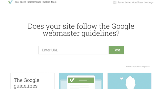
From time to time, I come across true gems on my strolls through the internet. Some of these tools ease my life as a webmaster, for instance. Today’s web sites need to meet plenty of requirements. They need to load fast, meet the newest Google webmaster guidelines, and also need to be optimized for search engines. Additionally, in many cases, optimization of the view on smartphones and tablets is demanded as well. Until now, many different tools were required to test websites. However, the new online tool varvy.com promises to cover all areas. It also offers many useful features, which is why I’ll introduce you to this tool toady.
Varvy.com offers plenty of tools to test and optimize websites with. Immediately after accessing it, you can check if the Google webmaster guidelines have been met. The results are presented very appealingly, and they are explained thoroughly. Additionally, every single aspect of the guidelines is equipped with linked areas, behind which elaborate explainer articles are hidden.
Why varvy.com is unique
Not only can the online tool be used to optimize a website’s speed and to meet Google’s guidelines, but it also communicates profound basic knowledge on the individual areas of website optimization. There’s a link to an article on every area of optimization which explains what the aspect is about. Thus, Varvy is the perfect tool for beginners and advanced users. However, even professionals will find features that make the tool interesting for them as well. While it’s not suited for professional optimizations, it’s optimal for a first overview. You can get a quick overview of all articles on the service’s Ssitemap.
The Tool’s Areas
Varvy is divided into the sections SEO, Speed, Performance, Mobile, and Tools. The website tests are done based on the relevant, well-known Google tools. The tool’s big advantage here is, that only one tool is needed for all the different tests.
Section SEO
In this area, the observance of the Google webmaster guidelines is tested. All important areas can be found here. After the test, you can see exactly which areas need improvement, and which areas are already optimized. However, the tool showed me an error message even though there was no error. The tool criticized a missing HTML sitemap for my website’s visitors. While it does exist on my website, it’s not named “Sitemap”. That should be the reason why it wasn’t found.
Section Pagespeed Optimization
Testing a website is done rather fast and is just as meaningful as a test done using the Google Page Speed Insights Tool. Here, the Google API is used to execute the tests. The results and the aspects that are tested are exactly the same. A test of my website as shown that Varvy and Google Page Speed both criticized the same two aspects of my sites. A CSS file that is loaded in the visible area (and speeds up the website better than the recommended Inline-CSS), and the optimization of images, precisely of one image. Both tools recommended a better compression, so that 552 Byte can be saved on this image.
Section Web Performance
In this section, no tests need to be done, but you’re informed about aspects that can lead to a performance boost of your website. Many articles are just waiting to be read. Professionals can learn from this section as well. Has anyone of you ever heard of »Brotli”? It’s a data compression format published by Google, which supposedly boasts significant advantages over GZIP.
Section Mobile SEO
This section provides the test on quality and speed of a website when it’s displayed on a mobile device, which is already included in Google Page Speed Insights. You’ll, once again, receive the same results that Google’s test comes to. However, Varvy provides plenty of background information when scrolling down on the page with the test result.
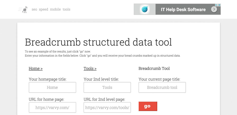
Section Tools
Just until recently, the section Tools was accessible via the main navigation, however, it can currently only be found using the Sitemap detour. All tools still work and can be accessed from the Sitemap. The website offers the following instruments:
Ask Google – The popular Google search in a new look
Base 64 image encoder – This tool creates a Base64 image code based on graphics. This code can be used for the performance optimization of images (a website’s logo, for example).
Every section shows how much effort the developer Patrick Sexton has put into this project. As a former very successful internet entrepreneur, Patrick now focuses entirely on the development of Varvy.com, which you can definitely feel when using the website and the tools. The effort put into it is tangible. The essence of fundamental tools in combination with the wealth of background knowledge are what makes this website unique. Varvy has found its way into my bookmarks.
(dpe)
* You might also be interested in the following articles
There are numerous web browsers out there, each with its set of advantages and disadvantages. Plus, every user has his or her preference when it comes to web browsers. A good number of users rely on Chrome, especially because it can sync your bookmarks and all other data with your Google account whereas many others choose Firefox. Similarly, Opera and Safari too, though less popular, are key players in the game.
A while ago, Microsoft announced the launch of a new web browser, named Edge. While Microsoft has had Internet Explorer for decades now, the company has finally realized that the days of IE are numbered, and even gone ahead and retired all versions of Internet Explorer except version 11. That said, how exactly will the new web browser Edge fare? Will it be able to compete in a crowded world of web browsers?
Microsoft Edge: Overview
First up, Microsoft Edge does not seem to be as bad as its ancestor, Internet Explorer. In all honesty, it is trying hard and will soon have a lot to offer for web developers. Take a look at these features:
Fetch API
Web Notifications
Beacon API
WOFF 2.0
High-Resolution Time Level 2
Future ECMAScript proposals
JavaScript pipeline improvements for future WebAssembly concepts
Sounds impressive so far? Edge also plans to focus heavily on modern HTML5 and CSS concepts to enhance accessibility features for users and offer a new set of developer tools meant exclusively for building and testing accessible websites.
The Ground Reality
But all of the shiny new features and ideas apart, how is Edge doing so far?
Well, Microsoft decided to offer Windows 10 as a free upgrade to most of the users around the world, and with that, Edge also got a chance to become the default browser on a lot of devices. Of course, being the default browser on an operating system does not mean the users will make it their default web browser, but it still provided Edge with a fighting chance. Several users do not bother changing the default web browser, or installing a new one, and might in fact just continue using Edge.
However, the idea, though pretty good, has so far been implemented poorly. Forcing or urging users to “give Microsoft Edge a shot” is a poor strategy. At best, it will make users annoyed with Edge even before they use it, and at worst, it will cause a domino effect and encourage users to turn towards alternative web browsers, and abandon Edge in total.
Thus, the road ahead for Edge is pretty steep, and its journey involves two major challenges:
1. Saturated Scenario
There are many already established and powerful web browsers out there — Chrome, Firefox, Opera, Safari, you name it! Edge will face a stiff challenge from some of them.
Safari can be ruled out — for the most part, Safari is what Apple fanboys use, and Edge is probably not going to target that user niche anyway. Chrome, Opera and Firefox, however, are a different story.
Edge is making some amends by taking things away from the local machine, and integrating with Windows and Microsoft accounts of users to help them sync their data. Similarly, steps such as open sourcing its ChakraCore Engine are the need of the hour, and this can help Edge get some minor boost in its bid to challenge Firefox. Mozilla has had an excellent reputation in the open source world (something Microsoft has never had), and by turning towards open source, Edge can get some love from the community.
However, browsers such as Opera, in spite of their relatively smaller user base, continue to be extremely relevant on account of one key aspect: mobile internet.
2. Mobile Devices
This is where Edge is repeating the flaws of its predecessor Internet Explorer — it has so far shown not so much interest in the mobile user base.
Agreed, Edge is going to be a standard feature on Windows mobile devices, such as tablets. However, unlike Chrome, Firefox or Opera, Edge is not in the least exhibiting any particular concern towards the mobile user base. In fact, so far, Microsoft has wanted to make Edge “the web browser of Windows users”, and not “the web browser of the masses”. MS has been asking users to make Edge their default browser, but the “outreach” aspect has just not been there — users are presented with Edge when they upgrade to Windows 10, but the same enthusiasm to try and bring Android users towards Edge is absent. And for what it’s worth, Edge can never dream of replacing or giving Chrome or even Opera a run for their money unless it is truly cross-platform and universally available.
Appraisal
As such, Edge does look promising and has a good deal of features in its arsenal. Unlike Internet Explorer 6 and some other versions, that proved to be a nightmare for web developers, in the long run, Edge is offering many features that can be of use for developers.
However, in the absence of a proper cross-platform usage strategy, Edge might just find itself relegated to the Windows 10 desktop, and much like Internet Explorer, it will fail to compete in the crowded web browser world.
Therefore, Microsoft should, once more, try to do something that it has rarely done — treat the other platforms with the respect they deserve. It has shown a lot of love to open source in the past few months, and carrying on with this trend it should try to bring Edge to the users of platforms such as Android or even Ubuntu. Otherwise, if it remains “exclusive to Windows 10”, Edge will be Internet Explorer encore.
What do you think of Microsoft Edge? Given it a spin yet? Share your views in the comments below!
* You might also be interested in the following articles
The following is a guest post by Garris Shipon. We’ve touched on the four types of CSS testing here before. Regression testing is the hardest. It’s the type where you’re trying to test if a change you made to CSS resulted in any unexpected visual problems. This is made more difficult with responsive designs. Garris built a tool for doing this as he embarked upon a new responsive design for a large scale site. Here, he’ll walk you through the whole thing.
This article was originally published in December 2014. It has been re-written, updated, and republished now in April 2016 because BackstopJS, the main tool presented here, as been updated.
A use-case for visual regression testing
Do a search for “CSS regression testing” and a common theme becomes clear: breaking CSS is easy, testing it is hard.
This was the case at the onset of a responsive CSS refactoring project I scoped for a large online retailer. Like many other web companies at the time, we were in the process of adding responsive behavior to a massive e-commerce web app, which was originally designed for 1024px desktop screens.
I realized this would be a regression-prone job. Retrofitting multiple breakpoint behaviors meant we would likely have a lot of hard-to-find display bugs. I needed a way for our engineers to automate bug discovery before slamming our QA team with hundreds of ticky-tacky little layout issues.
Where BackstopJS fits in
The solution I wanted had to play nice with web developers. That is, easy to install locally, use familiar web dev paradigms, and give a reasonable amount of confidence that a selector change made for mobile isn’t going to result in a hard-to-find bug in a desktop layout.
At the time, there wasn’t anything out of-the-box that quite fit the bill. This was the reason for creating BackstopJS.
BackstopJS is a visual regression testing app which wraps CasperJS, PhantomJS and ResembleJS in an easy-to-configure test matrix across multiple app-states (URLs), DOM elements and screen sizes.
The following is a 15 minute walk-through of an installation and initial configuration of BackstopJS.
A visual regression-test tutorial
This instructional will be based on a simple demo project (download ZIP here). It is taken directly from the Bootstrap example page.
Expand the simple demo
Unzip the project download. We will install the testing framework right into this example project:
Here is what you’ll see if you open up myCoolProject/index.html in a web browser… Remember, it’s responsive. So, make sure to resize the browser window down to see the most narrow layout!
Install BackstopJS with NPM
The rest of this tutorial will require the Node.js environment and it’s integrated package manager (npm). If you don’t have Node and npm installed you can get it here!
Now go to your project root (`/myCoolProject/`) and run:
$ cd ~/path-to-myProjects/myCoolProject
$ npm install backstopjs
Your directory should now look like this:
Install complete! Now let’s get to some basic testing…
Generating a BackstopJS configuration template
The basic configuration process is straightforward from here. To help with things, BackstopJS can generate a config file that you can modify for your project. From the `myCoolProject/node_modules/backstopjs/` directory run:
$ cd ~/path-to-myProjects/myCoolProject/node_modules/backstopjs/
$ npm run genConfig
This will add files to your project root: folders for BackstopJS screenshots, `backstop_data`, and generating a boilerplate configuration file `backstop.json`.
The configuration file is where you’ll specify your testing rules. Let’s look at that file.
In this configuration you can see three viewports objects. One for phone, tablet vertical, and tablet horizontal, each with name and dimensions properties. You can add as many viewports objects as you need. BackstopJS requires at least one.
Then we have scenarios which include the URLs and element selectors that BackstopJS will test. It’s useful to think of every scenario object as a test for a specific static page or global app state. Add as many scenarios as you need. BackstopJS requires at least one.
Inside each scenario is a list of selectors. Selectors accept standard CSS notation. For each selector you specify, BackstopJS will take a screenshot and test that area of your layout. Your selector area could be as small as a button or as big as the body of your page — check the documentation for more on using this feature with dynamic web apps.
You may notice that in the config we just generated, our URL is pointing to http://getbootstrap.com. That is what we would be testing if we were to run BackstopJS now. This is here to illustrate that BackstopJS can point to local or remote URLs, so it’s easy to imagine re-purposing the same tests for local development, QA, staging and production environments.
Modifying the configuration template
For our demo, make the following change and replace the scenarios node in `myCoolProject/backstop.json`.
From the `myCoolProject/node_modules/backstopjs/` directory run…
$ npm run reference
This task will create (or update an existing) screen captures representing all specified selectors at every breakpoint. When the process is complete, take a look inside `/myCoolProject/backstop_data/bitmaps_reference/`:
So far so good. We have our reference set. Now let’s run a test!
Running our first test
We are about to run our first test. But keep in mind, we haven’t changed anything in our CSS yet, so our tests should pass!
From the `myCoolProject/node_modules/backstopjs/` directory run:
$ npm run test
This task will create a new, timestamped-directory of test images inside `/myCoolProject/backstop_data/bitmaps_test/`.
Once the test images are generated, BackstopJS will open your web browser and display a report comparing the most recent test bitmaps against the current reference images. Significant differences (if any) are detected and shown.
In this instance, since we haven’t made any changes to our test page, BackstopJS should show all of our tests as passing. Now, let’s try changing our CSS and see what happens.
Updating our index file and running our second test
Here is what you’ll see if you open up our (unchanged) `myCoolProject/index.html` in a web browser. Notice the margin around the text:
Let’s mess that up! Open up `myCoolProject/index.html` and insert the following code just before the closing tag:
<style>
  .jumbotron {
    padding: 0px;
  }
</style>
Here’s what the page looks like now:
This is exactly the kind of thing that happens all the time during web development. Some unscoped code gets in and hoses your layout just enough that you might not notice 🙁
Now, From the `myCoolProject/node_modules/backstopjs/` directory run:
$ npm run test
Our test should run again and errors should be found. Scroll the report down to see a visual diff of the issues we’ve just created…
Our visual diff contains the reference capture, the most recent test capture and the visual diff file.
There you have it: regression found!
This is a very simple example. In real life, designers and engineers may find themselves working on very large and or complex CSS projects. That is when a system like this really improves the quality and consistency of our work. By automating the repetitive visual tasks we can confidently pursue more creative ones.
About workflow
There are many ways to integrate this kind of test into your workflow. You could fire off tests every time you build or you could manually run tests (as you work or just before pushing to your next stage). You could even integrate BackstopJS into your CI pipeline, if that’s your thing. All of these topics are outside the scope of this article. Check the documentation for more info.
Next steps
Since first releasing in 2014, BackstopJS has grown substantially. There are loads of newly added features developed by the community:
SPA testing support – Use Casper scripts and explicit web app triggers to ensure screenshots are captured at the correct time inside your web app (e.g. after API responses, after CSS animation completion, or wait for any other watchable async process).
Simulating user interactions – Use Casper scripting inside your scenarios to simulate interactions with your on-screen components.
CI pipeline integration – BackstopJS CLI features have enabled advanced users to make visual regression testing a part of their continuous integration process.
Active configuration files – Enables active (node module) logic inside your config files which you can use to change testing behavior based on environment or other conditions, point to different config files to use your BackstopJS instance as a centralized test server for multiple environments, verticals, profiles, projects, or whatever.
Since 2014, Google has been redesigning its apps and services according to its own Material Design principles. Yesterday it announced on its design blog that an upcoming release of its Chrome browser (version 49.2) will adopt Material Design as its default rendering.
Critically the new version of Chrome—dubbed Chrome MD—will override site-defined CSS in deference to the Material Design specification; colors, type, and even images will be rendered according to Google’s design language.
A pillar of the tech giant’s design strategy for almost two years, the leap to Material Design has proved successful for Google across its apps, and according to Google, imposing the design system on content displayed in its browsers will ensure a consistent and high-quality user experience for its customers:
We developed Material Design to provide our customers with the optimum user experience, and we believe they deserve that quality every time they use a Google product — Anjeet Singh, Asst. Director of Marketing Production, Google Design
In addition to rebranding the web in its own image, the primary impact of this update will be a radically faster web.
Speed
Google’s primary concern is for a faster web, and by limiting the variables its browser is forced to render, it expects to increase the initial render of pages by an average of 17%.
Chrome MD renders web pages faster than plain HTML with no CSS. This is because even when no styles are defined, browsers still need to poll for possible style definitions; Chrome MD simply skips this step rendering according to its internal style system.
Chrome MD marks a major adoption of AMP (Accelerated Mobile Pages), significantly reducing the browser’s workload. However the majority of performance gains have been found by restricting style options.
Color
Material Design’s color palette is restricted to 256 colors, and Chrome MD will not render any color other than those 256 hex values.
Where designers specify a hex value other than one of the 256 approved colors, Chrome MD will automatically translate it to its closest Material Design equivalent. For example, these two different reds will render as the same Material Design color:
p.material { color:#E53935; } /* renders correctly as #E53935 */
p.notMaterial { color:#EF2A39; } /* renders incorrectly as #E53935 */
The same principle applies to RGB values, RGBA values will be translated to the closest Material Design color based on the color they overlay.
Gradients will not render at all in Chrome MD. However, the closed-beta implementation (that gradients render as their average tonal value) is expected to be adapted to render the lightest tint found in the gradient.
Images
The same color restrictions also apply to images: every pixel in a bitmap images will be rendered as one of Material Design’s 256 defined colors—much like current .gif technology. SVG color values will also be automatically converted.
Google has provided a exception to the image rule for cases it describes as “color-critical”, by piggy-backing the -webkit-appearance setting:
img.default { -webkit-appearance:material; } /* the default Material Design rendering */
img.trueColor { -webkit-appearance:none; } /* the true color as defined in the image file */
However this workaround will only function with bitmaps and embedded SVG files, inline SVG will always render using Material Design colors.
Typography
Replacing default system fonts, all text in Chrome MD will render using a single embedded font-family. Due to language support it will not be Roboto as might be expected, but Noto.
Text will also render in 1 of 2 tones: black, or white; the tone will be automatically selected based on the background color. Gradations of tone will be determined automatically: on dark backgrounds H1–H6 will render at 100% opacity, all other text at 70% opacity; on light backgrounds H1–H6 will render at 87% opacity, all other text will render at 54% opacity.
Chrome MD will also enforce a rigid typographic scale for weights, sizes, and line height:
These styles will not be over-ridable, and notably, there is no italic option.
Floating action buttons
Perhaps the most radical decision is the mandatory inclusion of a single, call to action. This is defined with the id primary and will be rendered as a floating action button:
<a href="someLink.html" id="primary">Click Me</a>
(Text within the link, in this example “Click Me”, is included for accessibility.)
If a primary call to action is omitted, Chrome MD will render its own floating action button that links to Google search results for whatever term Googlebot determines is the primary keyword(s) for the page in question.
Breakpoints
Another key area for rendering performance is pre-defined breakpoints. Based on the sizing set in Google’s new Resizer app, the usable breakpoints are: 360px, 480px, 600px, 720px, 840px, 960px, 1024px, 1280px, 1440px, 1600px.
Any designer-defined breakpoint that does not fit will be rounded to the next highest breakpoint. For example:
@media only screen and (min-device-width:840px) { /* applies at 840px wide and above */ }
@media only screen and (min-device-width:841px) { /* applies at 960px wide and above */ }
Wide-ranging impact
Google has a long and proud history of imposing its will on web designers, from unannounced updates to its algorithm, to the adoption of AMP. However, imposing Material Design on the web is likely to have the greatest impact.
Of course, these changes only affect websites viewed in Chrome, however with more than 52% of global browser usage, it’s difficult to imagine a site that won’t be affected.
Our primary concern is for the quality of our customers’ experience. And so we recommend all web designers employ Material Design best-practices to ensure they deliver a consistent experience for their clients across all devices and platforms — Anjeet Singh, Asst. Director of Marketing Production, Google Design
Ostensibly Chrome’s MD update is about delivering a faster more consistent web experience, but in reality is likely to rebrand the entire web as a Google project.
The current version of Chrome is 49.0.2623.110, suggesting at least one minor update can be expected before Chrome MD rolls out in full force. However does today, April 1st, mark the point at which we finally embraced the homogeneous web?
Although it’s April 1st, and people go all crazy making up jokes and spreading hoaxes, I’m sending out this edition to you without any April fools. Instead, I want to challenge you to put more effort, more thoughts into your code.
Instead of blindly following a given path to build the solution with the least effort, what about thinking more about your users? Wouldn’t a lot more users benefit from you spending an additional hour on building a form on your own instead of relying on a third party that involves tracking? Wouldn’t they benefit from a smaller website that doesn’t contain big libraries? Many people and crawling extensions could also benefit from a better document outline. In the end, it’s your product and your work that users see — and I bet you want to be proud of what you’ve just built.


![The Truth about WordPress Performance [#1/2]](http://www.noupe.com/wp-content/plugins/contextual-related-posts-2.0.1/timthumb/timthumb.php?src=http%3A%2F%2Fwww.noupe.com%2Fwp-content%2Fuploads%2F2015%2F03%2Fwordpress-performance-partone-teaser.png&w=250&h=200&zc=1&q=75 "The Truth about WordPress Performance [#1/2]")


")


