Archive

Archive for April, 2016

A Quick Look at the Runner Sketch Plugin

April 26th, 2016 No comments

Runner is a plugin for the design tool Sketch. It lets you use your keyboard to run commands and order about other plugins. For example, by typing “vertical” into Runner then you can vertically align text much faster than moving your mouse to the button and clicking it.

I’ve seen some folks describe Runner as if it’s Sketch’s version of Spotlight or Alfred, as effectively their goals are one and the same: to speed up and organize your workflow. In the video below I briefly go over how Runner might speed up the design process:

Once you’ve downloaded it, you can start Runner inside Sketch by hitting cmd + ' and then tab to move through each section, like Export or Run.

If you’re interested in finding more plugins to tie into Runner, there’s an official list of all the Sketch plugins available.


A Quick Look at the Runner Sketch Plugin is a post from CSS-Tricks

Categories: Designing, Others Tags:

10 Fresh, Free WordPress Themes (April 2016)

April 26th, 2016 No comments
10 Fresh, Free WordPress Themes (April 2016)

Every month, I go and search for exciting, new, and free WordPress themes flicking through the recent additions to the directory. I do this so you can always give your blog a new look and separate it from the thousands of other websites out there. As always, all presented themes are responsive and adapt to any screen resolution.

1 – Passionate

Passionate is a theme that can be used for many purposes. It could serve as a business website, but also drive a personal blog. Passionate comes with a couple of individual widgets. Colors and the logo can be altered, and the landing page layout is editable as well.

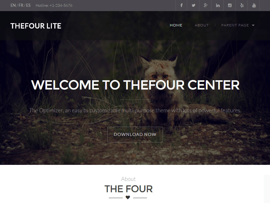
2 – TheFour Lite

TheFour

TheFour is a multi-purpose theme as well, and is suitable for a business website just as well as it can be used for a portfolio or a blog. The theme is customizable to suit your plan very well. The colors, the landing page’s hero image, and the logo can be changed. On top of that, it offers some special page templates. A lot of effort was put into the design of the blog area.

  • Created by: GretaThemes
  • License: Free for personal and commercial use | GNU General Public License
  • Prepared for translations: yes
  • Demo: TheFour Demo
  • Download on WordPress

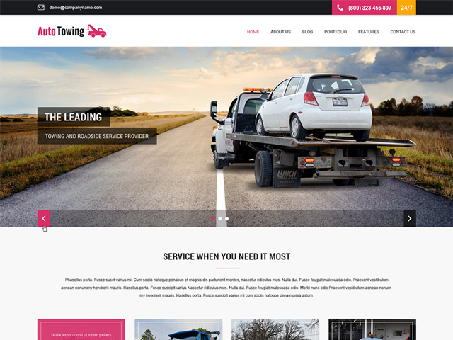
3 – SKT Towing

Auto-Towing

This theme was specifically developed for the car industry. However, it is definitely possible to use it for other purposes as well. It also works as a portfolio, a business website, or as a blog. This theme can also be the base for an online shop as it is prepared for the popular WooCommerce plugin.

4 – Pingraphy

pingraphy

The Pingraphy theme is soothingly different. It displays content in a fashion similar to Pinterest, and thus, it creates a unique blog that sets itself apart from others. The colors are adjustable.

  • Created by: Sophy – ThemeCountry
  • License: Free for personal and commercial use | GNU General Public License
  • Prepared for translations: yes
  • Demo: Pingraphy Demo
  • Download on WordPress

5 – Bloog Lite

Bloog Lite

Bloog Lite is a theme for blogs that work with large format images a lot. Thus, the article images are very large, and drag the focus onto them.

6 – Flat White

Flat White Theme

Flat White is a theme for fashion and design bloggers. However, it is also very suitable for photo blogs. Colors, logo, and the favicon can be customized, as well as the header image and the links to the social networks. A slider for the homepage is also included.

7 – Simona

Simona

Simona was developed for the most special day in the life of a man and a woman or a man and a man or a woman and a woman (as you like it). It was made to present a wedding as pretty as possible. Of course, other usage purposes are thinkable as well, maybe as a portfolio, blog, or photo website. It provides a header slider and allows you to use your own favicon.

  • Created by: Pasquale Bucci
  • License: Free for personal and commercial use | GNU General Public License
  • Prepared for translations: yes
  • Demo: Simona Demo
  • Download on WordPress

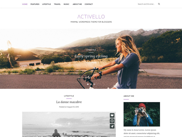
8 – Activello

activello

Activello is a blogging theme meant to be used with large photo formats. Thus, it’s an excellent theme for photographers and travelers. Portfolios can also find a home with this theme, however. Due to it being prepared for WooCommerce, it serves well as a shop. The theme comes with a lot of options to be adjusted via the theme optimizer.

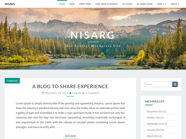
9 – Nisarg

Nisarg

Nisarg is a blogging theme. The header image, the background, and the colors, as well as many other settings, can easily be adjusted.

  • Created by: Falguni
  • License: Free for personal and commercial use | GNU General Public License
  • Prepared for translations: yes
  • Demo: project site
  • Download on WordPress

10 – Latte

Latte

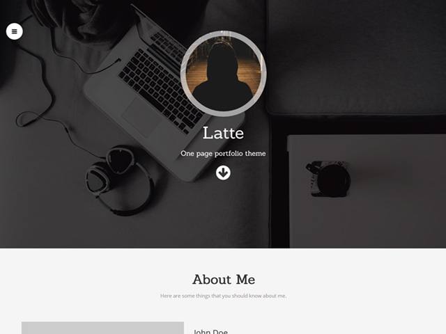
The Latte theme is a one-page portfolio theme for designers and other creative people. It comes with plenty of options that can all be adjusted via the theme customizer. Looking at the scope of features, it could easily be a paid theme.

  • Created by: Hardeep Asrani
  • License: Free for personal and commercial use | GNU General Public License
  • Prepared for translations: yes
  • Demo: Latte Demo
  • Download on WordPress

More Free WordPress Themes:

(dpe)

Categories: Others Tags:

Responsive Images and Performance Optimization using Cloudinary

April 26th, 2016 No comments
Responsive Images and Performance Optimization using Cloudinary

Using images on contemporary websites correctly is not the easiest task. Different devices with different resolutions and pixel densities require much more than just a default image file. Even though high-resolution displays require large images, the files have to be kept as small as possible due to limited data plans, especially on mobile devices. This is not an easy undertaking. However, the cloud-based image management solution Cloudinary turns it into one. Today, you’ll learn how simple image and performance optimization with Cloudinary can be.

Cloud-based Image Management Solution Cloudinary

Among the many cloud services, Cloudinary has specialized in image management and optimization. The service allows you to upload pictures, and integrate them in your website or blog in different resolutions, formats, and qualities.

In addition to that, you can add plenty of effects like vignettes and blurs, and alter contrast, brightness, and saturation on the fly. You can edit images from the Cloudinary interface, and then tie them into your web project via a generated URL.

Responsive Images and Performance Optimization using Cloudinary
Extensive Ways of Altering and Optimizing Images

The URL contains all information like image resolution, format, as well as all effects that you applied. Thus, you can also make adjustments directly via the URL.

http://res.cloudinary.com/demo/image/upload/c_fill,e_sepia,q_80,h_425,r_30,w_640/demo.jpg

The example shows how image settings are transferred via URL. “c_fill” (“c” for “crop”) makes sure that the picture is cropped to fill the entire image area and, if necessary, certain parts of the picture are cut out. “e_sepia” (“e” for “effect”) creates a sepia effect on the picture. There are more than 30 filters that are similar to the ones available in Photoshop, and other image editing applications.

“q_80” (“q” for “quality”) defines the image quality and the values “h_425” and “w_640” (“h” for “height” and “w” for “width”) determine width and height of the picture.

Responsive Images and Performance Optimization using Cloudinary
Example of a Manipulated Image

This way, you create suiting image versions without having to use the Cloudinary interface. However, using PHP or jQuery is also supported.

$.cloudinary.image("demo.jpg", {effect: "sepia", height: 425, quality: 10, radius: 30, width: 640, crop: "fill"})

The jQuery example generates the same image file as the URL example. For those that prefer working with PHP, there’s a proper PHP class that works similarly to the jQuery example.

Cloudinary: Considering Pixel Density

Modern displays have a much larger pixel density and can display images at a much higher resolution than conventional monitors. High-resolution images can also be defined in modern web design. To do so, the “srcset” attribute was added, which you can use to load images for different pixel densities.

Responsive Images and Performance Optimization using Cloudinary
Image for Different Pixel Densities

As modern smartphones and tablets usually come with high-resolution displays, it makes a lot of sense to distribute the image files for high pixel densities. Cloudinary also helps you with that. It doesn’t take much effort to have it give out files in different densities for each image. To do so, a pixel density is simply sent to the image URL via “dpr_x”.

http://res.cloudinary.com/demo/image/upload/c_fill,h_640,w_425,dpr_2/demo.jpg

In the example, an image with doubled image density is returned. Thus, the actual image resolution is not 640 x 425 pixels, but 1280 x 850 pixels.

The different image version should be implemented within the “” element via “srcset”.

<img src="http://res.cloudinary.com/demo/image/upload/c_fill,h_640,w_425/demo.jpg"
  srcset="http://res.cloudinary.com/demo/image/upload/c_fill,h_640,w_425/demo.jpg,
  http://res.cloudinary.com/demo/image/upload/c_fill,h_640,w_425,dpr_2/demo.jpg 2x,
  http://res.cloudinary.com/demo/image/upload/c_fill,h_640,w_425,dpr_3/demo.jpg 3x
" />

Image and Performance Optimization With Cloudinary: Unlimited Responsitivity

Those that use large format images when it comes to web design should use smaller image files on smaller displays, to avoid an unnecessary page load. Due to the “” element, different image files for different resolutions can be implemented rather quickly.

With Cloudinary, you can create different resolutions for your pictures and then integrate them into your website.

Often, however, images are not displayed in set widths but to adapt to the width of the viewport. I will use jQuery to show you how to reach that goal.

To do that, first, access the image file via the data attribute in an “” element. Assign the class “cld-respnsive”. Here, you don’t enter a width. Instead, set “w_auto”, for an automatic width.

<img data-src="http://res.cloudinary.com/demo/image/upload/w_auto/demo.jpg" class="cld-responsive">

Subsequently, a plugin is loaded via jQuery.

$.cloudinary.responsive();

The plugin assures that there will always be a generated image file for the picture’s current display size. This way, you can set up multi-column galleries, for example, which orientate themselves towards the browser window’s entire width.

Responsive Images and Performance Optimization using Cloudinary
Always Have Images in Galleries be Distributed Perfectly Fitting

For example, when an image is supposed to display at a width of 200 pixels, the images are generated and distributed with this exact width – done in the background by Cloudinary. This allows you to avoid the integration of unnecessarily large files, and helps you make your website slim and fast.

Those that also want to consider pixel density add “dpr_auto” in addition to “w_auto”.

<img data-src="http://res.cloudinary.com/demo/image/upload/w_auto,dpr_auto/demo.jpg" class="cld-responsive">

Furthermore, Cloudinary also loads the appropriate images when enhancing or reducing the browser window. By default, changes to the browser size starting at 10 pixels are considered.

Image Quality and Format

Displaying entirely appropriate image files without having to scale down pictures in the browser is a major step for optimal image display that saves resources. However, there are two other important adjusting screws for small file sizes.

For one, there’s the image format. JPEG and PNG files are the most common formats alongside the still popular PNG. Each has its advantages. JPEGs are mainly useful for photos and large images while PNGs are used for graphics, as well as everything that requires an alpha channel.

However, depending on the browser, there are other image formats available as well. For example, Google Chrome supports the WebP format, which creates significantly smaller files than JPEG and PNG.

Microsoft also has its image format called JPEG-XR, which has a much better compression, but is only displayed in the Internet Explorer starting from version 9, and Edge. Using Cloudinary, you don’t have to worry about the correct file format. Via “f_auto”, you let the service decide which format is the best.

http://res.cloudinary.com/demo/image/upload/f_auto/demo.jpg

In the example, a different format is used if needed, ignoring the file extension “jpg”. In Chrome, for example, the image is displayed as a WebP file, and in Internet Explorer, it is shown as a JPEG-XR.

On top of being able to determine the format, you can also define the image quality. For that, use a value between 10 and 100 (“q_80”, for example). Depending on the picture’s content, sometimes a stronger, and sometimes a weaker compression makes more sense.

Responsive Images and Performance Optimization using Cloudinary
“JPEGmini” to Always Have Optimal Results

Using the plugin “JPEGmini”, which is free for up to over 100 compressions, images are always optimally compressed. The plugin itself decides which compression is the best for each picture. You don’t need to manually try which quality makes the most sense.

Image and Performance Optimization With Cloudinary: Conclusion and Prices

Cloudinary is an extensive cloud-based image management service that is more than helpful when it comes to optimizing images for the web. Especially those that work without a content management system will find a valuable assistant in Cloudinary. Cloudinary will flawlessly and automatically compress and crop images, and adjust their formats for you.

Additional effects, text insertion, and other tools round up the service. Generating and loading of images are very fast as well. This is an important aspect that shouldn’t be underestimated.

Nowadays, different types of devices, resolutions, and pixel densities make it necessary to have one image prepared in a manually unmanageable amount of versions. Cloudinary does a good job here and is very easy to use.

On top of that, the service is free to use for most websites. Anyone that hosts up to 75,000 images, and doesn’t exceed the limit of 7,500 conversions a month, can use the service for free. 2 Gigabytes of storage and 5 Gigabyte of monthly bandwidth are included.

If you need more than that, you can choose from four offers from 44 to 224 dollars a month. There are no restrictions on features for any of the plans.

Disclaimer: This article is sponsored by Cloudinary. They took no influence on what we wrote, however.

(dpe)

Categories: Others Tags:

Online brand-building 101

April 26th, 2016 No comments

Building a brand online is a different task to traditional brand building. Of course it won’t hurt to combine the offline and online marketing techniques, and indeed for best results, you should do that. Too many times clients think that all they need to do is have a website made for them and then they can sit back and count the money as millions of visitors arrive at their site.

The reality of the situation is quite a bit different, as they soon discover. Then the force of their frustration is often directed at the website designer, as if to say that the design is the reason for the failure. Usually it is not the case that the design is to blame, but rather that the site owner has done nothing to promote the site either online or offline.

In this article, we’ll look at what designers or marketer can do to improve things for the success of their clients, or at least what advice you should be giving to your clients to avoid getting those nasty emails where they direct all their stored up frustrations at you.

1. Just building a site is not enough, unless you have one hell of a unique niche

Building a successful online presence with zero promotion is close to impossible. The only way you can really do it is by creating something so completely amazing that it markets itself just by being accidentally discovered. The chances of that happening are microscopically small, so it’s not a clever strategy. You must promote your site in some way. It does not necessarily mean that you have to spend money, but you have to do something. Just building a site does not ensure success.

2. Start with the name and go from there

Obviously with any brand, it’s all about the name, so it makes sense to start with that. Want some proof? When Prince decided to change his name to a symbol and have people refer to him as “the Artist Formerly Known as Prince” that generated instant long-term viral publicity, because it was talked about, parodied and mocked for days. All of that made Prince suddenly relevant again at a time people were not paying much attention to him.

Choose a good name, one that makes you stand out. An ideal name has some kind of positive association, is easy to remember, easy to spell, and universally possible to pronounce. That’s actually a lot harder to achieve than you may at first think.

Once you have decided on a good name, your first step should be to purchase the domain name. Then you can start worrying about other things like creating a logo or what color your stationery should be. Your name is your most important business asset, so give choosing it the respect it deserves.

3. Make your logo easy to scale, equally good in color or monochrome, and easy to recognize

Logos are also important, and because you’re going to be including your logo in your web design, it should be something that is easy to fit into a web design. Therefore obviously logos that will easily fit into a rectangular space are better than logos that contain huge circles, for example, because circles don’t scale down well. You get a lot of wasted space around the edges of the circle, because websites need everything to fit inside a rectangle. The size of a circle determines the size of the rectangle required to contain it.

A good logo also should be easy to identify even when it is not shown in its normal color scheme. It is a very common mistake for inexperienced graphic designers to create logos that are mostly based on color and derive their identity from color. Don’t make that mistake.

4. Create social media pages before you create the website

This may sound eccentric, but there is a good reason for doing it this way. You can use social media to build hype about your site (and brand) before the site is launched.

5. Build hype on social media, and invest in this as much as you can

No matter what else you do, the most important thing you are going to do before launching your brand’s website is to build hype about your brand first. Or at least make sure that people know your name and remember it.

John West (manufacturers of canned fish products) did this successfully in the late 1990s and early 2000s when they released a series of video ads that people felt compelled to share. Other brands have since followed suit, such as Panda dairy products.

Don’t waste your time on something small. Whatever you’re going to do, make it big. Make an impact. Make sure everyone is talking about it. Those ads I talked about are years old now, and yet here I am writing about them in this article, extending their virality. That’s the kind of notoriety you have to reach for.

6. Build an awesome “coming soon” page

Some experts will tell you to skip this step, and say it’s bad to have an announcement that your page is under construction. But what would those guys know? There’s every chance that stirred by the brilliant viral marketing campaign you unleashed in step 5, a lot of people will try to jump the gun and check out your website before you’re ready to show it off. That’s OK, as long as you have something there to keep them interested. Get them to bookmark you, ask them to subscribe to your RSS feed, get them to part with their email address… whatever you can do to make it easy to tell them when the site is ready for their viewing pleasure.

Just make sure you don’t do this by halves. You have to commit as heavily to this step as any other, and make a page that really creates buzz. Ideally people will be talking to each other about how awesome your “under construction” site is, and that will build anticipation in their minds that the real site will blow them away when it finally arrives. And they’ll want to be there to see that.

7. Build a website that’s every bit as good as you promised

If you’ve built up a lot of hype and momentum about your site while it was being constructed, it has to actually meet expectations. Whatever you’ve built it has to be big, it has to be relevant, and it has to be better than anything that has existed before it.

That is indeed a tall order, but it is vital if you are going to be successful in getting to the top of the heap and fending off all challengers. Your website obviously must look good, but it also shouldn’t have anything there that you can’t explain the purpose of. You should know exactly why anything that appears on your page is there. It should be easy to navigate and well written. Content is everything, and especially the text.

8. Make dealing with you a pleasant experience

Web users won’t excuse bad behavior. Be a good host and take care of your visitors. Your customer service should be of an excellent standard, and it should be easy for anyone to communicate with you. Keep up your social media presence as well, and hire dedicated staff to handle only that task if you can afford to.

Following the above tips should help you build a strong online brand that engages an audience and makes them like you. The key to it all is to keep your integrity, deliver what people want, and get attention by being the best.

Career Builder Library with 150+ Online Courses and Resources – 91% off!

Source

Categories: Designing, Others Tags:

SmashingConf Freiburg 2016: Some Things Are Just Too Special To Miss

April 26th, 2016 No comments

This upcoming September, SmashingConf Freiburg will be taking place on Smashing Magazine’s 10th birthday and, well, we definitely wouldn’t want to celebrate it all alone.

SmashingConf Freiburg 2016: Some Things Are Just Too Special To Miss

Freiburg is the smallest of all our conferences; this means a super-friendly atmosphere right at the foothills of the magical Black Forest, but also not that many seats! So, are you ready to celebrate with us?

The post SmashingConf Freiburg 2016: Some Things Are Just Too Special To Miss appeared first on Smashing Magazine.

Categories: Others Tags:

Sketch 3.7.2 Has Been Released

April 25th, 2016 No comments
sketch

Sketch, the popular design tool for Mac users, has just released its newest version 3.7.2

Sketch 3.7.2 comes with several new features and bug fixes.

Here is a run-down of what it brings to the table:

  • New Symbols created from Artboards are now named after the Artboard, rather than being renamed to ‘Symbol’
  • SketchTool now dumps Symbol overrides as a dictionary instead of a string
  • Fixes a crash that could occur when swapping a Symbol instance in the Inspector
  • Fixes a crash that could occur when reverting changes
  • Fixes a bug where printing Artboards resulted in blank pages
  • Fixes a bug where Sketch would hang after choosing ‘Paste Here’, having copied a layer style
  • Fixes a bug where Symbol instance layer styles would not be applied to the Group created when detaching an instance from its Symbol
  • Fixes a bug where Symbol instances could end up detached when reordering pages

sketch

You can purchase and download or upgrade Sketch from the official website (note that it is no longer available in the App Store).

Read More at Sketch 3.7.2 Has Been Released

Categories: Designing, Others Tags:

Intense: Multipurpose HTML5 Template to Streamline Web Development

April 25th, 2016 No comments
intense-ultimate-html5-template

Today, everyone seems to be nuts about faster web site building. Both professional developers and DIYers commonly opt for ready-made HTML5 templates, as they are enormous time-savers in web site development. However, many templates come only with standard features and pages that do not necessarily cover all of your needs. While you can save some time with a ready-made design, a limited feature pack still forces you to look for third-party functionality. TemplateMonster, a web design company with 14 years of experience, has come up with a solution to this problem. To overcome any limitations, its inventive team released Intense, a multipurpose HTML5 template with a zillion pages. Let’s explore this universal template in detail.

View Demo | More Info

Intense is a multipurpose HTML5 template meant for building corporate and personal sites, blogs, online stores, portfolios, landing pages, etc. In fact, all the pages are already pre-built for you. For your part, you just need to customize them a little bit. The template comes packed in an unexaggeratedly all-inclusive package, in which you can access 150+ HTML5 files, 150+ PSD files, 50+ shortcodes with 110+ components, child themes, and much more.

Free Lifetime Updates
The above-mentioned features represent the initial release of Intense. Later, this massive template will be subject to constant updates such as new pages, skins and child themes to embrace any possible niche. All the updates are completely free.

Free Lifetime Support
Just like any other product from TemplateMonster, Intense entitles you to free, lifetime support. You can contact a professional at any time, 24/7, and get detailed answers to all your questions.

* * *

Huge Choice of Pre-Designed Pages

intense HTML5 template

With an incredibly wide choice of pre-designed pages, Intense allows for much faster website development. Instead of building each page from scratch, just swap the default content with yours, edit colors and fonts, and the page is ready to deliver your message. The pages included with the template package serve many purposes. There are both standard options such as contacts, about info, and FAQs and extras such as coming soon, maintenance, and appointment. You can also access a 404 template that will come in handy when visitors try to enter a non-existent or already deleted page.

* * *

Multiple Niche Templates

intense-niche-templates

What makes Intense versatile for literally any user is a set of child themes. By means of these niche templates, it can embrace a wide range of industries. Whether you deal with finance or artwork, you will be able to find the skin already adapted to your specific activity. Currently, the package for Intense has 2 child themes, one for restaurants and one for photographers’ portfolios. But, as we’ve already mentioned, their number will constantly grow as a result of lifetime updates, to deliver a ready-made solution for almost any niche.

* * *

20+ Blog Pages

intense-blog-pages

Blog integration helps engage customers and fill pages with keywords for better SEO rankings. This is why Intense HTML5 template is integrated with a blog and has 20+ blog pages for it. Whether you prefer a classic or modern style, grid or masonry structure, you can pick the most suitable layout type for your taste. There’s also a separate design to cover your upcoming or past events.

Would you like to complement your posts with tags, search, list of categories, archive or even social media feed? Intense fulfills this task through sidebars. You can optionally use layouts with a sidebar on the left, right and both sides. It’s also possible to leave your blog pages without any sidebars at all if you like. Each layout type comes with a ready-made solution for a single post page.

* * *

15 Portfolio Pages

intense-portfolio-pages

When it comes to your portfolio presentation, Intense offers 15 pre-designed pages. Their layouts vary from wide and full-width to grid and masonry. Each layout is equipped with a filtering option, which lets customers explore your projects by categories. Depending on your preference, you can set up either vertical or horizontal categorization. Intense HTML5 template also has a ready-made layout to showcase a single project with images, videos, text, info about its author and related works.

To make your portfolio more engaging, Intense is supplied with 6 custom effects. On hover, they reveal some project details (its title, categories, short description, etc) and other elements (CTA button, commenting and rating options). The Apollo effect also gives a bluish tinge to the picture, while the classic one zooms in on the image. Each custom effect has its own mission.

* * *

10+ eCommerce Shop Pages

intense HTML5 template

Intense is an eCommerce-ready HTML5 template packed with 10+ pre-designed shop pages. You can choose from grid and list layouts with a left, right or no sidebar. In the sidebar area, shoppers can switch between different categories, brands, colors and sizes of your merchandise.

To show each item individually, there is a ready-made single product page. Its layout features everything required to present a certain item in full. There is a product gallery, accordion with info details, available colors, sizes, quantity, price, and add-to-cart button. To show customers more, you can display related products right above the footer.

Online merchants can also make use of pre-designed checkout and cart view pages. The latter shows all the items in the cart and has options to remove some of them or add more. On the checkout page, customers fill in their billing and shipping details, check all the ordered items, and choose the payment type.

* * *

Multiple Header and Footer Layouts

intense HTML5 template

The header is one of the most important layout areas, as it is the first thing visitors see when they enter your site. It can make or break your business introduction, which is why you must test different variations to choose the most effective one. With Intense, it’s easy-breezy. It provides numerous header types for experimentation, particularly a sidebar toggle, floated bar, top panel, etc. Moreover, you can choose from dark, light and sometimes transparent styles.

The finishing touch of your site is just as important as its introduction, which is why Intense offers various footer types. For example, the default version of the footer has a logo, social icons, subscription form, useful links, and latest news. Using the second variant, you can show your logo, address details, testimonials, social icons, and contact form. Each footer layout has its own set of elements, so choose the right one depending on the info you want to highlight in the end.

* * *

150+ HTML5 Files
The initial release of this powerful template contains a total of 150+ HTML5 files. Such a huge number of ready-made solutions allows you to create any layout you can imagine within a few moments.

* * *

150+ PSD Files
Along with 150+ HTML5 files, you will get a set of 150+ PSDs, which is cool stuff for designers. These layered PSD files can easily be edited in Photoshop.

* * *

50+ Shortcodes
What also adds to the usability of Intense is a set of 50+ scalable shortcodes with more than 110 components. Feel free to use them to supply your site with different content and functionality.

* * *

Extended Bootstrap Toolkit

intense-extended-bootstrap-toolkit

Powered by Bootstrap, Intense comes with the main components of this framework, but isn’t confined only to them. In addition to the standard components, the template offers an extended Bootstrap toolkit with elements that the framework lacks, but all the developers long for. They include alerts, animations, counters, dividers, timers, infographics, and much more. There are also 2,000+ font icons for various purposes, e.g. payment, currency, gender, and form control, to name a few. With Intense, you will have all the essentials at hand, without the need to browse the web for the missing parts.

* * *

Flexible RD Audio & Video Players
No text and imagery can create as strong an impact on customers as podcasts and videos. To make your site more impactful, Intense is integrated with audio and video players.

* * *

Social Integration
Social networks are known as powerful traffic drivers, which is why Intense was developed as a fully-fledged solution for social media integration. It features multiple social widgets, from Twitter and Facebook feeds to Instagram and Flickr galleries. Unlike many other HTML5 templates, Intense embeds these widgets into the layout elegantly so that they are able to blend well with its entire design.

* * *

What Customers Say about Intense

intense-reviews
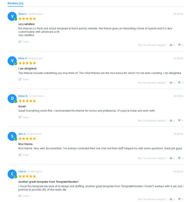
Do you wonder what people who’ve already used Intense think about it? In general, they left positive remarks about the template. You can check some of them yourself in this screenshot below.

* * *

Final Words about the Intense HTML5 Template

intense HTML5 template

With Intense, you can build a site of any type easily and quickly. Everything you’ll need for this is already included in the template’s package – pre-designed pages, layered PSD files, child themes, premium plugins, shortcodes, social widgets, standard and extra Bootstrap components. This huge package of this HTML5 template will also grow over time, providing you with more new pages, child themes and other features for free.

Read More at Intense: Multipurpose HTML5 Template to Streamline Web Development

Categories: Designing, Others Tags:

Some Of The Best Sketch App Freebies For Designers

April 25th, 2016 No comments
music-app-free-ui-kit-for-sketch
If you’re a UI designer, and you have yet to hop on board the free Sketch App Express, you’ve been missing out on a UI solution that is taking the design world by storm. Sketch is in some ways similar to Photoshop, but it is cheaper and better. Bohemian Coding’s Sketch 3 is better yet. It has deservedly been called the latest and greatest tool available for UI digital design; as is evident by its continual increase in market share.

If you are a newcomer to the web design world, a free Sketch app newbie, a Photoshop user who would like to make a change for the better, or a developer who would like to add UI design to your skill set, give this wonderful design tool a try. Before you do so, be sure to check out the selection of free Sketch App resources and free Sketch designs you’ll find at the end of this article.

Music App FREE UI Kit for Sketch

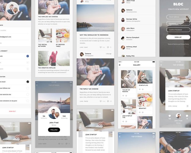
Blog UI Kit

Fair UI Kit FreebieView premium version

Recipe UI Kit for Sketch

Max UI Kit FreebieView premium version

Apple Watch GUI Sketch

Wild Full Website Freebie

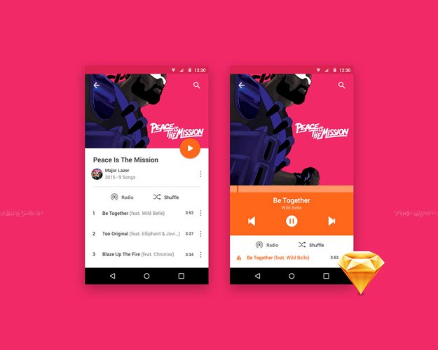
Android Music Player

Routes UI Kit FreebieView premium version

Icon Set

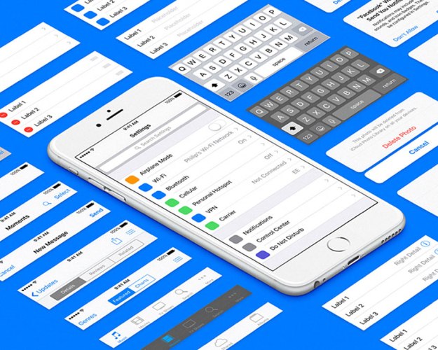
iOS 9 UI Template for Sketch

Phoenix UI: Vol 1 – for iPhone 6

Free Building Icons

iOS Music Identifier

Shopping Card

8 Minimal Weather Icons

Planner Dashboard Concept

Dompet – Wallet App

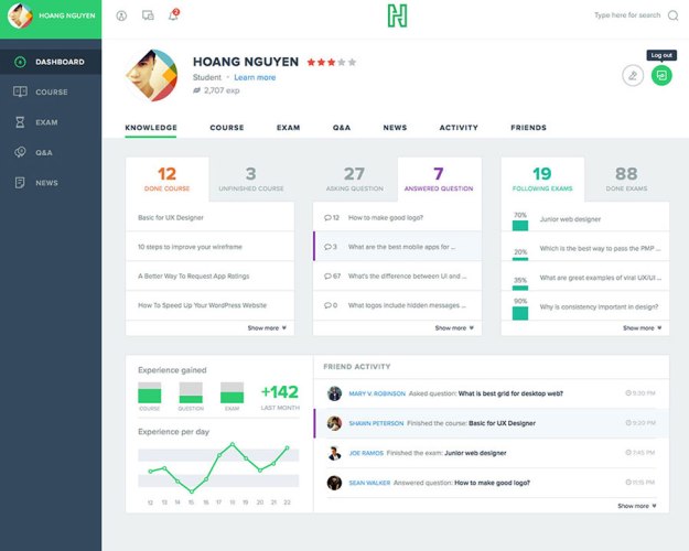
Course Dashboard for Sketch

Attractions Map Freebie

Flight UI Freebie

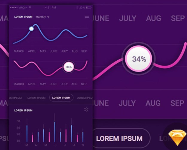
Sketch iOS App Analytics

Spotify Material Design

Sketch Icons

Fashion UI Kit for Sketch

Office Icons for Sketch

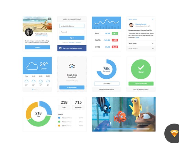
Clean UI Kit

Outdoor Icons

Movie Dashboard

Freebie UI Screens

Wind Turbine Apps

Quotes app (Sketch freebie)

CrowdPlayer Sketch Freebie

Sketch for Beginners

The use of vector-based drawing is the best and the most effective approach to website, icon, or interface design. Sketch is a vector drawing app that has been created for precisely these purposes. With Sketch, you can not only edit vector-based drawings, but you can also edit bitmaps, including blur and color corrections.

As a UI designer, you’ll appreciate the solutions this tool has in store for you. Since it is a single-window App, whatever design element or feature you may need when using it is always within easy reach. Multiple fills per layer is supported, as is text styling and rendering.

This is an ideal tool for anyone involved in iOS, Android, or Web design. It has the features you need, yet it requires only 41 MB of disk space; a minuscule amount compared to the 16 GB Photoshop requires.

Sketch gets you off to a perfect start. The instant you open it you’ll be presented with an infinite canvas. You don’t have to set up a canvas size, or specify the units you’ll be working with before you can get started. Sketch is not much different from any OS X app. You are presented with a familiar user interface that features a Toolbar and a Navigator and Inspector. There is never a need to go through a series of setups and maneuverings just to produce a basic design. You can simply choose among the Sketch app freebies to help you get started.

Comparing Sketch’s requirements for disk space to those of Photoshop might lead you to think that Sketch is a drastically pared-down adaptation of the latter. That is simply not true. When you first power up Sketch, what you will experience is a squeaky-clean, well structured, and uncluttered interface. This app is a tightly-focused piece of software, which is vastly different than being a pared down version of anything. It is also a joy to work with. Sketch gives you the features you need – and nothing more.

When an app doesn’t have every feature or capability you need, there is often a simple solution. It’s called a plugin. Free Sketch app resources and Sketch plugins make up for anything you might find lacking, and more. One design guru put off using any of the available plugins until he was completely comfortable with the app. He later related that the decision to do so was a huge mistake, since many of the plugins turned out to be tremendous time savers.

It’s Almost Ridiculously Simple to Work With

A stripped-down, pared-down, tightly-focused, and concentrated applications can be simply summed up as being one that is straightforward, clear-cut, and easy to use. As we mentioned earlier, Sketch does not have a lot of interface clutter you have to fight your way through. If you are in the habit of working in Zen mode, where focus and clarity of purpose prevails, you’ll love Sketch.

Smaller Files Are Time-Savers

As any veteran Photoshop user will tell you, working on large-scale web projects can involve working with a numbers of files, files that can be 100s of MB in size, with each one assigned to a screen you happen to be working on. This involves a good deal of juggling and switching among files, and any revisions you may incorporate will only add to the workload.

With Sketch’s infinite canvas, all of your Art-boards, as its screen designs are labeled, can reside in a single file. With Sketch, those hard drive-busting issues, resulting from outsized files, will become a thing of the past.

Vectors, Vectors Everywhere

Every single design element you produce within Sketch is a vector. For a UI designer, the use of vectors is essential. This is particularly true when your designs are destined to fit different screen sizes, where having the ability to rapidly resize elements without any loss in quality is a must.

Sketch is also “pixel-aware”. Whenever you create a shape, it will always snap to the nearest pixel – no blurry lines, no half pixels. If you need to switch from a vector to a pixel view – no problem.

The Joys of Exporting and Slicing

Exporting and slicing design assets can be a joy for Photoshop users, but only for those who are in love with difficult and painful processes. Exporting an element from a Sketch Art-board involves but a couple of clicks – a process that hardly could be described as painful, but one that is definitely a joy to perform.

Choose your element, click Export, and select SVG, PNG, or some other format. That’s all there is to it. Sketch has you covered for displaying your assets on all different devices.

CSS Anyone?

Bohemian Coding embraces CSS logic when they designed and developed Sketch. What this means to the user is that there is a lot less baggage to have to deal with than is the case with similar apps that do not rely heavily on CSS. The way Sketch operates is more in tune with the way in which today’s designers and developers go about their work. Sketch’s front-end coding mindset “feels” neater; but that is something you’ll want to discover for yourself.

A Work in Progress

Because of its newness, Sketch is still a work in progress. It has nevertheless become the go-to web design app for an ever-increasing number of designers, and it’s only going to improve. Features such as One Project, One File, an Inspector that understands math, and a design presentation where everything is a vector by default, will speed up your workflow and make your life easier.

Try a few of the free Sketch designs, and we guarantee this app will become your responsive web design tool of choice.

If you’re not yet convinced – check out the following Sketch app freebies.

Read More at Some Of The Best Sketch App Freebies For Designers

Categories: Designing, Others Tags:

Lingo

April 25th, 2016 No comments

Lingo is an app from the Noun Project team that groups images, icons, SVGs, and illustrations into a single place. It lets you browse them quickly, and then you can drop them into another application without any hassle.

I work a ton with SVGs and icons, so I’m always trying to find ways to reduce friction between different software and editing processes. One might think that the answer to this couldn’t be more software, but I’m really enjoying Lingo. In fact, there was a funny quote from someone a few years ago on Twitter, (my memory is too spotty to remember who said it) “Fun Fact! The average designer spends 10% of their life looking for the right icon.”
Direct Link to ArticlePermalink


Lingo is a post from CSS-Tricks

Categories: Designing, Others Tags:

Web Development Reading List #134: AI, Keyboard Interactions And Living Style Guides

April 25th, 2016 No comments

For a great project, we need a well-functioning team, solid style guides, smooth workflows and well-organized kick-off meetings. Last week, I found a couple of resources that help you achieve just that.

And, a bit further down the road, the developers shouldn’t miss out on anything either, of course, — having a proper workflow is essential to be productive, and that’s why it might be a good idea to start playing with Docker. Have a productive week ahead!

The post Web Development Reading List #134: AI, Keyboard Interactions And Living Style Guides appeared first on Smashing Magazine.

Categories: Others Tags: