Archive

Archive for April, 2016

Chocolatey For Business / Chocolatey Professional Coming May 2

April 23rd, 2016 No comments

This is a very exciting time for Chocolatey! Over the past 5 years, there have been some amazing points in Chocolatey’s history. Now we are less than 10 days from another historical moment for Chocolatey – when licensed editions become available for purchase! This is the moment when we are able to offer features that enable businesses to better manage software through Chocolatey and offer non-free features to our community! This also marks when the community (and organizations) take the next step to ensure the longevity of Chocolatey for the next 10-20 years. I started this process with a dream and a Kickstarter and now it’s finally coming to fruition!

Features

Here is a list of the licensed features that will be coming in May. I really think you are going to like what we’ve been cooking up:

  • Malware protection / Virus scanning – Automatic protection from software flagged by multiple virus scanners – …
  • No more 404s – Alternate permanent download location for Professional customers. …
  • Integration with existing Antivirus – Great for businesses that don’t want to reach out to VirusTotal.
  • (Business Only) Create packages from software files/installers – Do you keep all the applications you install for your business internally somewhere? Chocolatey can automatically create packages for all the software your organization uses in under 5 minutes!Shown as a preview in a March webinar (fast forward to 36:45)
  • Install Directory Switch – You no longer need to worry about the underlying directives to send to native installers to install software into special locations. You can simply pass one directory switch to Chocolatey and it will handle this for you.
  • Support and prioritization of bugs and features for customers.

Sold! But How Do I Buy?

While we are still getting the front end systems setup and ensuring all of the backend systems are in place and working properly, we are limiting availability to the first 500 professional licenses and 20 businesses (Note: we do not expect any issues with our payment processor). Because we are limiting availability, you must register for the Go Live Event at https://chocolatey.eventbrite.com if you are interested.

It bears repeating, the links for purchase will only be sent to folks who have registered for the event, so secure your spot now!

Categories: Others, Programming Tags:

Is Conversational UX the future of the web?

April 22nd, 2016 No comments

One of the biggest buzz phrases at the moment is “Conversational UX”. It refers to a user experience in which your interaction with a company, or service, is automated based on your prior behavior.

Contrary to the implication in the title, a conversational UX doesn’t have to be a literal conversation, the term refers to back and forth interaction in which both parties come to understand each other.

Most current conversational user experiences are based around small snippets of micro-copy. In a conversational user experience, you’ll never need to understand the hamburger menu, because there won’t be one, the app—web, or native—will simply adapt to your inquiries. And if device operating systems follow suit, you may not even download apps, your OS will simply determine which apps and services to use on your behalf, based on prior usage.

The economic reality is that any task that can be automated, will be automated

A conversational UX is more responsive than any existing app or site. A conversational UX can have the same interaction as a million call centers, without the need for hold music, security questions, or checking with its supervisor. A conversational UX doesn’t need onboarding and won’t suffer the same drop-off rates as apps, because it will adapt to the user’s (or programmer’s) needs. The economic reality is that any task that can be automated, will be automated.

The one weakness of a conversational UX is that we don’t trust AI. Trust is a core value of any successful user experience. Connecting on an emotional level is the ultimate tool of most design processes; one of the reasons the term “UX” has outgrown “UI” is that the former implies empathy, the latter implies mere utility. Whether it’s a luddite’s aversion to new technology, or too many ‘80s sci-fi movies, we always suspect an ulterior motive. As Ripley discovered, behind every Bishop there’s a Weyland-Yutani.

So we might allow a conversational UX to buy our weekly groceries for us, but would we let one buy our clothes? Book our vacation? Select our college major?

we like robots that can be readily identified as robots

We’re talking about conversational UX now, because the bots that power it are reaching the point of viability. No, they can’t pass the Turing Test, but they really don’t need to. In fact, the current obvious flaws in AI may be precisely what powers the bot revolution.

Conversational UX is so flawed at present, that mistaking a bot for a human is tantamount to being outwitted by a lamppost. The time is ripe for conversational UX, precisely because we can still identify it for what it is; we don’t feel deceived. As Asimov predicted, we like robots that can be readily identified as robots.

The key to conversational UX may be a transparently bot-like personality. Ironically, the most successful conversational UX may be the one that learns to act dumb.

The Design Deck – Playing Cards for Designers – only $14!

Source

Categories: Designing, Others Tags:

App Store Now Offers Business Advice To Developers

April 22nd, 2016 No comments
app-store-developer

Apple has recently updated its App Store Developer site and added a new section that talks about best practices and business growth ideas for freelance developers.

This new section aims to feature analysis, articles and videos to help app developers enhance their profit margin by building apps for iOS.

The ‘Discovery’ sub-section talks about how the App Store is curated, and ways in which you can help your app excel in the store and be discovered by potential users. Similarly, the ‘Using the Freemium Model’ sub-section talks about how to generate a steady flow of revenue using in-app purchases. The ‘Business Model’ sub-section too focuses more the same aspect, and lets you pick the best one between free, freemium, paid and paymium models for your apps.

app-store-developer

There are also sub-sections meant to help aspiring developers learn more about app analytics and insights, and so on. Considering the fact that the App Store has a lot many freelance app developers creating apps for the iOS devices, this new section on the Developer site will surely prove useful for such app makers and developers.

Learn more about the new App Store Developer site here.

Read More at App Store Now Offers Business Advice To Developers

Categories: Designing, Others Tags:

Poll Results: “front-end” and “front end”

April 22nd, 2016 No comments

The latest poll around here kicked off asking how you prefer spell this job we all do around here: frontend? front end? Front-End?

I asked because 1) I didn’t know if there was a “right” answer 2) Even if there is a right answer, it doesn’t seem adhered to.

Right now on the job board: FrontEnd (1), Frontend (2), Front End (6), Front-end (1). I see variations of it all over the place all the time.

So the poll let’s us figure out what people like. Maybe a little language cowpathing. In the conversation that happened around the poll though, it seems like there really is a right answer and that’s probably good to cover first.

The right answer seems to be…

Summarized well by Philip Walton:

The term “front-end” is correct when used as a compound adjective, and the term “front end” is correct when used as a noun.

Here’s some example sentences then:

Tom Harley also wrote in with a helpful explanation:

When nouns are grouped together to behave like an adjective, they use no hyphens if they are at the terminus of a sentence. They only use hyphens when they are prepositional to the noun they’re affecting. For example:

“That movie is three hours long.”
“That is a three-hour-long movie.”

“That guy designs for the front end.”
“That guy is a front-end designer.”

That seems correct. I’m sure it is. I don’t know how to verify it exactly. Seems like the bible for that kind of thing is the AP Stylebook, but you have pay to even see that, which kinda makes me not even care what it says. And it might not say anything at all, since this seems more like a rule than a specific case.

The poll results

The results of the poll, with over 56K votes, are widely split:

I had extra options in there for capitalization differences too, as I was thinking that since it’s kind of the name of a thing and sometimes used as a title, maybe it’s supposed to be always capitalized? That doesn’t seem to be the case though. So normalizing by that…

“frontend” = 22%
“front end” = 22%
“front-end” = 56%

That’s good, because I bet the most common use is the compound adjective format (“I am a front-end developer.”)

Still a good amount of votes for “frontend”, but I think we might have to throw in the towel on that one and admit it’s not a word.


Poll Results: “front-end” and “front end” is a post from CSS-Tricks

Categories: Designing, Others Tags:

Coca Cola Globally Showcases Its New Design Language

April 22nd, 2016 No comments

In a move that’s billed as worldwide brand unification, the Coca Cola Company announced a major redesign of its look this week. The new design language, pioneered in Mexico and soon to roll out globally throughout 2016 and 2017, will serve as a unifying rebrand.

The redesign covers classic Coca-Cola, Diet Coke, Coke Zero, and Coke Life. At the heart of this redesign is what the company is calling the Red Disc, which will unify its different drink lines. Already associated with the Cola brand by Coke drinkers worldwide, the color red is the powerful component on which this design language is based.

The red disc is essentially a bottle cap with the name “Coca-Cola” spelled out in the familiar brand lettering—lettering based on the handwriting of the Coca-Cola company’s first bookkeeper. The plan is for this new brand asset to show up on every single Coke that you buy, regardless of the exact drink in the bottle or can.

The red disk also has a history with the company’s branding from long ago; originally, the red disc was used in Coke ads from the 1930s; then in the 1940s it was utilized as a signage system in retail locations to tell the public where to buy ‘genuine’ coke. In practical terms, the company hopes that this means newer lines such as Coke Life will gain some of the credibility that the heritage of the classic line of Coke already enjoys.

Of course, different Coke products will still retain a small sense of uniqueness by displaying their own brand colors as part of the packaging. And the red disc will adapt to the specific context in which it is being presented on packaging.

The unified brand approach is significant because over the last three decades, Coke’s approach to branding has been to design in visual distinction to enhance the difference between their drink options. Changes in consumer tastes and an awareness of healthier options means that full sugar Coke is losing ground to Diet Coke; if the trend continues, the new brand approach means that in future we’ll still think of Coke red, rather than diet grey.

The Design Deck – Playing Cards for Designers – only $14!

Source

Categories: Designing, Others Tags:

Factors In Selecting A Mobile Prototyping Tool

April 22nd, 2016 No comments

Years ago, a kid was trying to fashion a bow by cutting a twig with a knife. Upon seeing this struggle, his grandfather handed him a saw, saying, “Always use the right tool for the job!” As the kid in the story, I learned a valuable lesson in craftsmanship: When you’re picking a tool to solve a problem, there are many good tools, but some are better suited to the task than others!

Factors In Selecting A Mobile Prototyping Tool

In recent years, new prototyping tools have emerged, many for mobile design. The landscape is constantly changing, with some tools losing favor with UX designers (or UXers) and others taking their place. While this article will not serve as a complete paint-by-numbers manual for selecting a prototyping tool, we will discuss important factors that influence the selection process.

The post Factors In Selecting A Mobile Prototyping Tool appeared first on Smashing Magazine.

Categories: Others Tags:

Modern SEO: The Google Ranking Factor HTTPS and Let’s Encrypt

April 22nd, 2016 No comments
Modern SEO: The Google Ranking Factor HTTPS and Let's Encrypt

From time to time, Google implements new ranking factors. In the year 2014, Google announced the encryption of websites with an HTTPS certificate as a ranking factor. Many websites have since switched to HTTPS, and can confirm first advantages in the ranking. Yes, it is already possible to measure gains in the ranking. The switch to the new protocol surely is complicated in many cases, however, the step should still be taken, to not get left behind by the competition. The project Let’s Encrypt eases the switch by providing free certificates for Google’s ranking factor HTTPS.

Ranking Factor HTTPS

Google wants to see fast and at the same time secure websites. That’s why the company decided to include the encryption of websites via HTTPS in the ranking. Of course it will take a while until webmasters can measure big advantages due to the switch. At the moment, Google wants to give the webmasters plenty of time to switch, which is why they implemented the encryption as a light ranking signal for now. However, advantages can already be measured, especially for strong brands and online shops. By now, the difference in SEO visibility of HTTPS websites in comparison to unencrypted sites is statistically significant. Differences of up to 5 percent visibility in the search results are currently possible
.

What’s HTTPS?

HTTPS is a communication protocol for data transfer on the internet. The difference to HTTP is in the encrypted and bugproof transfer of data via SSL/TLS, an encryption protocol. This means, that HTTPS provides your website’s users a safe way of communication between them and your website. The data exchanged cannot easily be read on its way to and from the site.

Info: HTTPS = HTTP + SSL/TLS

Without encryption, all transfered data on the internet could be looked into, and could be manipulated by third parties using a man in the middle attack. However, when an HTTPS certificate is used to encrypt the data, any communication with the website is safe and cannot be attacked. Of course, this brings up the question why owners of a simple blog are practically forced to switch to HTTPS. The compulsion will come, no doubt. At the moment, HTTPS is only a light ranking factor, but in the near future Google will change this factor’s significance.

In spite of everything, it’s still not clear why blogs and news websites should switch. It only makes sense, when a lot of sensitive customer information needs to be transferred. An online shop would be a fitting example here. Yet, Google will force a conversion for all websites, as everyone wants to have a good ranking. No website wants to see direct competition above them in the search results only because they have already converted to HTTPS.

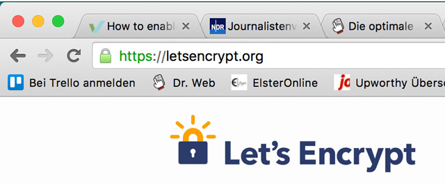
The Tagging of a Connection Encrypted via HTTPS in the Web Browser

A website encrypted using HTTPS can be recognized in the browser rather easily. The lock symbol and the written HTTPS protocol are the indicators.

Modern SEO: The Google Ranking Factor HTTPS and Let's Encrypt

Convert to HTTPS For Free Using Let’s Encrypt

Modern SEO: The Google Ranking Factor HTTPS and Let's Encrypt

The web service Let’s Encrypt promises certificates for everyone, and entirely for free at that. The project is, among others, sponsored by Mozilla, Facebook, and Cisco. The service, which is currently in an open beta stage, wants to provide HTTPS certificates for free to anyone who demands one. Every webmaster can create his own certificate for his domain, as long as the server meets the technological requirements.

Let’s Encrypt doesn’t settle with just giving out free certificates, but aims to automate the process, so that the certificates, which are currently only valid for 90 days, renew themselves. At the moment, the process needs to be pushed forward manually. This is best done via Cronjob or command line orders. It’s planned to lower the timespan of validity to 30 days. For that to work, certificates should renew themselves. This way, the project is supposed to be able to react faster to compromised or improper certificates.

Those that want one of these free certificates need to make preparations on their servers. A Let’s Encrypt client from the Github repo needs to be installed. The client requires Python 2.6 or 2.7, support for 3.0 is supposedly coming as well. The Let’s Encrypt client currently only runs on servers with Debian version 8.0 or newer, including all Debian derivatives, and Ubuntu from version 12.04 and up. Other operating systems are not supported yet.

Here are some first impressions of the HTTPS for anyone (German language).

Google’s Ranking Factor HTTPS: Conclusion

Sooner or later, you won’t be able to avoid an HTTPS certificate. Google will surely change the significance of this ranking factor soon. If you have knowledge on server administration, you’ll be able to secure a free certificate from Let’s Encrypt fast and easily. This way, you don’t need to spend money on certificates. HTTPS clearly is the future. Webmasters shouldn’t be afraid to switch. WordPress users even see further advantages, as the CMS itself makes sure that old HTTP URLs are redirected to the new ones with HTTPS certificate.

Related Links:

(dpe)

Categories: Others Tags:

Chrome OS Will Soon Be Rocking Material Design

April 21st, 2016 No comments
chrome-os-material-design

Recently, it was announced that with the latest update, Chrome 50, the web browser will be shifting to Material Design. However, Google does not seem to be stopping at just the web browser — Chrome OS too is moving towards Material Design, and these principles will soon be implemented in the operating system.

Considering the fact that Google wants Material Design to become a standard design concept on the internet and Chrome OS itself is heavily focused on the internet, it makes sense to bring Material Design to Chrome OS.

chrome-os-material-design

As of now, the plan is that Chromebooks should now have a hybrid layout, and the overall design should add more room between buttons and icons.

However, there will have to be certain changes, because not all devices running Chrome OS come with a touchscreen, and many users tend to prefer using the mouse to navigate in and within the operating system. That said, the basic principles and concepts of Material Design on Chrome OS are expected to be same as those on Android and elsewhere.

To learn more about this development, check out the blog post authored by Google’s Senior Designer Sebastian Gabriel.

Read More at Chrome OS Will Soon Be Rocking Material Design

Categories: Designing, Others Tags:

Plesk secures web app development

April 21st, 2016 No comments

Ten years ago, building a web site was a marketable skill; today, there are a myriad of site builders that can do the job, and increasingly web designers are finding themselves moving into the more advanced web application arena.

Web apps are increasingly popular, offering almost the same functionality as native apps, but with the added benefit of being cross-platform and powered by a single code-base.

However, for all the benefits of web apps, they’re not without their problems; especially when it comes to day-to-day maintenance, and more importantly, security.

WebOps and Plesk

WebOps is a general term for any server job that is part of the process of deploying and maintaining a web application—that might mean repairing a database, or securing the system.

WebOps are fundamental to the longterm success of any application, but can be prohibitively complex for web designers making the step up to web application development.

Solving the problem is Plesk, a hosting and WebOps platform that runs directly on your server. If you’ve ever been responsible for setting up shared hosting space, you’ve probably been given the choice of a couple of control panels, one of the choices was almost certainly Plesk—it’s currently deployed on more than 300,000 servers, runs more than 10,000,000 websites and handles 15,000,000 emails every single day.

Partnered with 50 of the top 100 hosting providers, if you’re using a quality service provider, then there’s a good chance Plesk is an option available to you.

What Plesk brings to the table

Once installed on your server, Plesk allows you to manage your server—even a virtual server—via a simple to use dashboard, creating a “ready-to-code” environment. You’ll find a fully featured online code editor, that allows you to navigate to files, and edit them, without ever leaving your server. There’s also one-click installs for WordPress, Drupal, and Joomla. You’ll find web app preview tools, full app isolation, and an added option for optimized VPS hosting.

Plesk even enables role-based access to your server setup so stakeholders can access the parts of the application that you want them to, without worrying about letting them loose on your proprietary code.

Plesk provides you with all the tools you need to deploy and maintain your web app, so that you can focus on developing features, refining UX, and designing your UI.

And of course, all this comes with rock solid security built in…

Plesk and security

According to research conducted by Plesk, only 1 in 10 web developers knew to properly secure their application before something went wrong, the other 90% left themselves vulnerable. Plesk combats this problem by securing websites and web apps automatically.

Server to site security is automatically in place to stop hackers, spammers, and botnets.

Take advantage of multi-factor authentication, single-sign-on, and minimum password strength. If you need or want even more security there are 3rd party authentication mechanisms such as social authentication, Google, LDAP, or Active Directory available.

Plesk secures WordPress

Plesk has recently introduced what it refers to as the WordPress Toolkit 2.0 which is a powerful WordPress management panel built into the Plesk dashboard.

Introduced to make managing WordPress installations as easy as possible, Plesk’s WordPress Toolkit 2.0 allows you to mass-manage WordPress installations, themes, and plugins; all while adding an extra layer of automated security.

In addition to WordPress management, you’ll find a whole heap of 3rd party extensions, many free, and a few premium options.

Plesk has just integrated Let’s Encrypt’s free SSL certificate as an extension, which allows you to validate, install, and renew your SSL certificates with a few clicks. What’s more, Plesk allows you to employ the latest security option, by moving all your domains to HTTP/2.

On top of this, Plesk is actively engaged with both the WordPress and Joomla communities, collaborating with them to build further extensions for Plesk, based on their own SDK, CLI, and API; and all open-sourced through Github.

The value of Plesk

Managing a server is a huge stumbling block for most web designers looking to create web apps. Plesk takes the labor out of the process, so that you can quickly and safely deploy your own web apps in no time.

Partnered with some of the biggest names in hosting, including Media Temple, 1&1, 123-reg, GoDaddy, Telefonica, and Amazon Web Services, Plesk is readily available on both Windows and Linux, providing full feature parity across operating systems.

If you’re ready to make the jump to web app development, and plan to handle your own WebOps, then you should check out Plesk.

[– This is a sponsored post on behalf of Plesk –]

LAST DAY: Hands Bundle of 4 Beautiful Brush Script Fonts – only $9!

Source

Categories: Designing, Others Tags:

What does simplicity in UX design look like?

April 21st, 2016 No comments

For over a decade, designers have debated what constitutes simplicity in user experience design.

As Robert Hoekman Jr. points out in his article When It Comes to UX Design, Simplicity is Overrated, the variation in semantics is confusing. Simplicity could refer to a clean design (then there’s the disparity of what “clean” actually looks like), the complexity of the experience, or even the required coding.

These definitions can vary further between users and designers, and clients and stakeholders.

“As designers, we assume we all agree on its meaning. To us, simplicity is a high goal of design,” Hoekman Jr. writes in the aforementioned article. “‘Simple’ is a relative word, granted. It has no definitive value; the simplicity of a thing can only be measured in comparison to something more complex.”

It turns out simplicity is actually quite complicated.

Looking for a good example of simplicity in UX design? Google it

When defining simplicity by aesthetic, perhaps there is no more perfect an example than Google. When a user goes to the website, they are presented with only one input: the search bar. This search bar then auto fills possible search queries based on complicated algorithms before pulling a list of relevant search results. Compare this to Yahoo, where a user is bombarded with information and options.

To the user, both Google’s interface and the experience are simple and self-explanatory even though the backend of the application is not.

“I think simplicity ties in a lot with intuition. That notion of whether the user experience is intuitive in nature makes the end result a very simple and delightful user experience,” said Dominic Wong, the head of experience design at Invoke. “Do I know instinctively what to do? And if I if I go out and do it, is it actually aligning to my behavioral expectations of an experience?”

The simplicity of Google is perhaps part of the reason why “Google it” became a part of our lexicon. The experience is designed in such a fashion that it is easy for a user to find what they are looking for—and find it quickly.

[UX] is threatened when the simplicity of an interface design comes at the expense of usability

User experience is threatened when the simplicity of an interface design comes at the expense of usability, such as when elements are buried, buttons are not labeled clearly, or the user is unfamiliar with the navigation. Even simple design needs to be strategic and take into account the users’ customs.

“Simplicity has to tie in with how to guide someone to intuitively make decisions,” Wong said.

User experience in the age of instant gratification

When it comes to simplicity and functionality, maintaining consistency in what a user innately expects from an experience is perhaps equally as important as accounting for the fact that today’s users are also accustomed to getting what they want right away.

Like it or not, we’re deep in the age of instant gratification and this needs to be taken into consideration when designing a user experience.

“People are expecting less flashiness and a certain level of utility,” Wong said.

“I think nowadays when the visual or stylistic elements become overbearing, it actually detracts from the experience.”

While there are opportunities to create lush user experiences and interfaces, they need to be appropriate to the end goal—both that of the user and of the design. You don’t want the user interface to distract from the user experience. Rather, you want to offer the user what they came for in a prompt manner that is easy to follow and understand.

“The best way to grab attention and build interest is to present a single core idea, fully fledged,” wrote Daniel Ritzenthaler on 52 Weeks of UX. “This allows the user to make a binary decision about it: ‘Am I interested or not?’ Introducing a feature in a way that people can instantly map it to a desired outcome will help them prioritize and be confident about their next step.”

Creating simple user experiences despite complex needs

One might think then that simplicity equates to minimalism, but it is more about giving users only what they need. When you give the user just enough, simplicity can prevail, even when dealing with complex applications.

Wong spoke of a recent project involving the redesign of a dental application that required numerous complicated, but essential elements. The experience needed to be simple to use without sacrificing the complexity of the interface. The team had to design the experience so that the application contained all the necessary elements, but only showed the user what was necessary for the desired outcome at that moment.

You don’t want to include anything that will distract or require someone to put more effort into obtaining what they need to obtain—Dominic Wong

While much of simplicity’s semantics continue to be debated, Wong says in the end it’s really about this one very thing: serving users what they need, when they need it in the most straightforward way possible.

LAST DAY: Hands Bundle of 4 Beautiful Brush Script Fonts – only $9!

Source

Categories: Designing, Others Tags: