Archive

Archive for April, 2016

Foundation for Emails 2: Responsive, Simple, Universal

April 20th, 2016 No comments
Foundation for Emails 2: Responsive, Simple, Universal

While you can use HTML5 and CSS3 in modern browsers without any issues, and assume that Chrome, Firefox, and Internet Explore or Edge display everything the way you expect them to, email services are a different story. Every program has its own idea of how to display HTML and CSS. “Foundation for Emails 2” is a new, extensive framework that allows for sophisticated emails that work in most programs as well as webmail interfaces.

Starter Kit With Eleven Templates

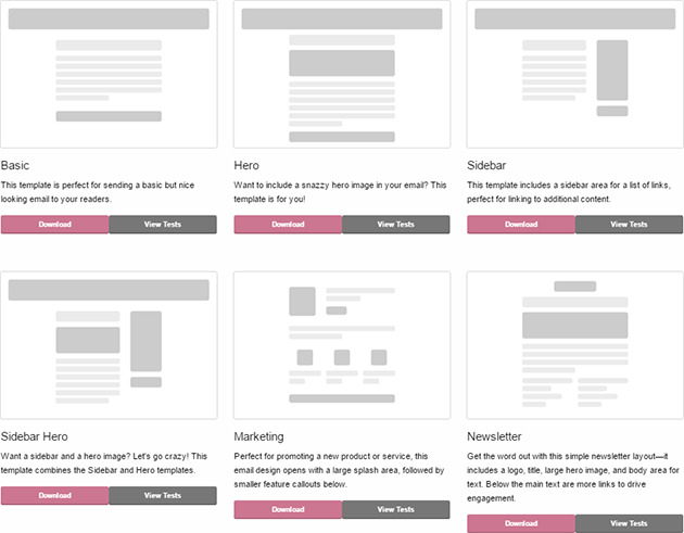
“Foundation” is a modern framework for responsive layouts, and recently, a new version for responsive HTML emails was released. “Foundation for Emails 2” is available in a CSS, and a SASS version. Once you’ve downloaded the starter kit, you’ll find eleven different templates for HTML emails.
Foundation for Emails 2
Preview on the Eleven Email Templates

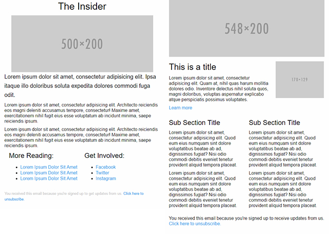
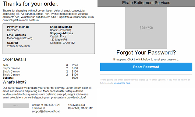
Among them, you’ll find rather simple templates, as well as multi-column templates for different purposes. For example, there are two unique newsletter templates with a larger header graphic, and one or two columns of text, depending on your choice. On top of that, you’ll find templates for common occasions, like order confirmations, and classic “forgotten password” emails, which usually contain a link to reset the password.
Foundation for Emails 2
Two Templates for Newsletter

All templates come with an external CSS file, in which all styles are saved. The layout of the templates is kept simple on purpose so that there’s a slim, clear CSS source text that can easily be adjusted to your own ideas.

Foundation for Emails 2: Simple Table Layout

Unfortunately, many email programs and webmail services don’t know much about modern web development. While there is a rather limited supply of browsers, the number of email programs and services is so large, that you need to find a tiny common ground.
Foundation for Emails 2
Templates for Orders and Forgotten Passwords

This common ground is that HTML emails are marked up as tables, just like in the old days before CSS and HTML5. The layout is not marked in a single table, however. Instead, multiple interleaved tables that are labeled with different classes are used.

The top table receives the class “body”. It defines the actual area of the email. It’s followed by tables with the class “container,” which represent a section of the mail. For multi-column tables, add another table with the class “row” within the container table. Within that class, you can then define columns with different widths.

A Grid of 12 for Responsive Display

As “Foundation” is based on a 12-column grid, you have the option to divide your columns in a flexible way. Two-, Three-, Four-, and Six-column layouts are possible without any issues. Due to different classes for large and small window or display sizes, you can simply decide how you want the columns to be displayed on small and large resolutions.

For example, for a three-column layout, assign the class “large-4” to your table cells for large resolutions. If you want them to be single-column for small resolutions, also assign the class “small-12”.

Predefined Buttons, Colors, and Fonts

To ease working with “Foundation for Emails 2”, many predefined components are available. Without much effort, you can integrate custom buttons into your email. Aside from primary and secondary buttons, there are specific buttons to display warnings and success actions.

Foundation for Emails 2
Different Predefined Buttons

There are CSS presets for headings, texts, and links as well, and of course, you can adjust and overwrite them, too. For the orientation of texts and images, the “Foundation for Email” provides classes that allow you to display text in a left- or right-adjusted, or centered way, and have text flow around the images on the left or right side.

Creating Inline Styles

Apart from the necessity to markup the layout of an HTML email as table construction, there is another thing to keep in mind. Many email programs only interpret stylesheets when they are defined as inline elements, meaning that they have to be set via “style” attribute directly within the HTML element.

As the inline markup takes a lot of effort and editing long emails afterward is very tedious, “Foundation” provides a “Web-Inliner”. Here, you copy both your HTML, and your CSS source text, and paste them into one text field each. With one click, the “Web-Inliner” creates an HTML source text for you, in which all attributes defined in the external stylesheet are transferred into the HTML source text as inline styles.
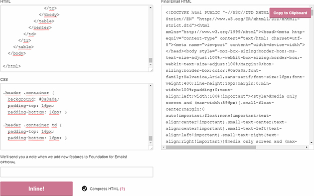
Foundation for Emails 2
Web Inliner Creates HTML Source Text With Inline Styles

In addition to that, word wraps and blanks are removed in the distributed source text, so that the source code is as slim as possible, even with inline styles. This source text can now be sent as an HTML email.

Only the media query rules are defined in its own “” element, as they can’t be marked inline via “style” attribute. However, the “” element is not placed in the HTML head as usual, but in the body, as some email programs remove all stylesheet blocks from the HTML header.

Foundation for Emails 2: Broad Compatibility With Common Email Programs and Web Services

Foundation for Emails 2” runs on many email programs, and not only their recent versions. For example, the framework supports Microsoft Outlook in versions 2000 to 2016. It also supports Version 7 and 8 of Apple Mail. The mobile default email applications of Android 4.4, and iPhone 5 and 6, the iPad, as well as the Android Gmail app, are supported.

As many emails are open via webmail interfaces, these are supported for the services Gmail, Office 365, Outlook.com, and Yahoo! on Chrome, Firefox, and Internet Explorer.

Overall, “Foundation for Emails 2” is very easy to handle, very flexible at what it helps you to achieve, as well as customizable. The vast compatibility with plenty of email applications makes it the framework of choice for HTML emails.

(dpe)

Categories: Others Tags:

Why You Should Stop Installing Your WebDev Environment Locally

April 20th, 2016 No comments

Have you heard of Docker but thought that it’s only for system administrators and other Linux geeks? Or have you looked into it and felt a bit intimidated by the jargon? Or are you silently suffering with a messy development environment that seems to break all of the time in various mysterious ways? Then read on. By the end of this article, you should have a basic understanding of Docker and have it working on your computer!

Why You Should Stop Installing Your WebDev Environment Locally

The first part of this article gives a bit of background to help you understand the concepts behind Docker through some metaphors. But if you just want to get started with the tutorial, skip to the “Time to Play!” section.

The post Why You Should Stop Installing Your WebDev Environment Locally appeared first on Smashing Magazine.

Categories: Others Tags:

Creating Wavescroll

April 20th, 2016 No comments

The following is a guest post by Nikolay Talanov. Nikolay wrote in to show me this demo and wanting to write about it (his first post in English, ever!). It’s an awesome demo, so of course I’m happy to pass it off to him now to take you through it. And make sure to check him out on CodePen too, he makes all kinds of other incredible demos.

This article is a walkthough of how I made this demo of a unique way scroll through panels:

See the Pen Wavescroll (drag background) by Nikolay Talanov (@suez) on CodePen.

The code in this demo is (hopefully) pretty straightforward and easy-to-understand. No npm modules or ES2015 stuff here, I went with classic jQuery, SCSS, and HTML (plus a little Greensock).

I got the idea from a random Twitter link

Browsing through my Twitter feed the other day, I saw link to jetlag.photos. I was amazed at the effect, and thought I’d try to recreate it without peeking at their source code.

Later on, when I did peek, I saw their implementation was based on , which I’m bad at anyway, so I’m glad I went with my skill set.

Let’s start with the HTML

We’ll need a full screen sized container with some containing blocks inside for each panel. We’re namespacing everything here with ws- for “wavescroll”.

<div class="ws-pages">
  <div class="ws-bgs">
    <div class="ws-bg"></div>
    <div class="ws-bg"></div>
    <div class="ws-bg"></div>
    <div class="ws-bg"></div>
    <div class="ws-bg"></div>
  </div>
</div>

We have an additional container, because later we’ll need a place to put our text headings.

And now do basic styling with Sass

We’re using the SCSS syntax here, and it’s helping make the namespacing part very easy:

.ws {
  &-pages {
    overflow: hidden;
    position: relative;
    height: 100vh; // main container should be 100% height of the screen
  }
  &-bgs {
    position: relative;
    height: 100%;
  }
  &-bg {
    display: flex;
    height: 100%;
    background-size: cover;
    background-position: center center;
  }
}

Now we need to create background slices. Each slice of the “wave” will be it’s own

. Our goal is to make them look like one big background, which is centered and resized with help of background-size: cover.

Every slice will be 100% of screen width (not just the visual width of a slice) and shifted to the left with each step.

.ws-bg {
  &__part {
    overflow: hidden; // every part must show content only within it's own dimensions
    position: relative;
    height: 100%;
    cursor: grab;
    user-select: none; // significantly improves mouse-drag experience, by preventing background-image drag event
    &-inner {
      position: absolute;
      top: 0;
      // `left` property will be assigned through JavaScript
      width: 100vw; // each block takes 100% of screen width
      height: 100%;
      background-size: cover;
      background-position: center center;
    }
  }
}

Then append the background slices with JavaScript

The slices we can create dynamically with a JavaScript for loop. I originally tried to do all of this in SCSS with loops and even using ::before elements to reduce the HTML, but this way is easier and better, because you don’t need to sync variables between SASS and JS:

var $wsPages = $(".ws-pages");
var bgParts = 24; // variable for amount of slices
var $parts;

function initBgs() {
  var arr = [];
  var partW = 100 / bgParts; // width of one slice in %

  for (var i = 1; i <= bgParts; i++) {
    var $part = $('<div class="ws-bg__part">'); // a slice
    var $inner = $('<div class="ws-bg__part-inner">'); // inner slice
    var innerLeft = 100 / bgParts * (1 - i); // calculating position of inner slice
    $inner.css("left", innerLeft + "vw"); // assigning `left` property for each inner slice with viewport units
    $part.append($inner);
    $part.addClass("ws-bg__part-" + i).width(partW + "%"); // adding class with specific index for each slice and assigning width in %
    arr.push($part);
  }

  $(".ws-bg").append(arr); // append array of slices
  $wsPages.addClass("s--ready"); // we'll need this class later
  $parts = $(".ws-bg__part"); // new reference to all slices
};

initBgs();

Near the end of this function we adding an s--ready class (s is for state, as controlled by JavaScript) to container. We need it to remove the static background-image from .ws-bg, which we show initially so the user sees something right away (perceived performance!).

After the slices are added, the background for original container becomes useless (and harmful, because they won’t be moving), so let’s fix that:

.ws-bg {
  .ws-pages.s--ready & {
    background: none;
  }
}
// Sass loop to set backgrounds
.ws-bg {
  @for $i from 1 through 5 {
    $img: url(../images/onepgscr-#{$i + 3}.jpg);
    &:nth-child(#{$i}) {
      background-image: $img;
      .ws-bg__part-inner {
        background-image: $img;
      }
    }
  }
}

Handling Mouse Movement

Let’s attach handlers for mouse swiping, which do the panel-changing.

var curPage = 1;
var numOfPages = $(".ws-bg").length;

// save the window dimensions
var winW = $(window).width();
var winH = $(window).height();

// Not debouncing since setting variables is low cost.
$(window).on("resize", function() {
  winW = $(window).width();
  winH = $(window).height();
});

var startY = 0;
var deltaY = 0;

// Delegated mouse handler, since all the parts are appended dynamically
$(document).on("mousedown", ".ws-bg__part", function(e) { 
  startY = e.pageY; // Y position of mouse at the beginning of the swipe
  deltaY = 0; // reset variable on every swipe

  $(document).on("mousemove", mousemoveHandler); // attaching mousemove swipe handler

  $(document).on("mouseup", swipeEndHandler); // and one for swipe end
});

var mousemoveHandler = function(e) {
  var y = e.pageY; // Y mouse position during the swipe

  // with the help of the X mouse coordinate, we are getting current active slice index (the slice the mouse is currently over)
  var x = e.pageX;
  index = Math.ceil(x / winW * bgParts);

  deltaY = y - startY; // calculating difference between current and starting positions
  moveParts(deltaY, index); // moving parts in different functions, by passing variables
};

var swipeEndHandler = function() {
  // removing swipeMove and swipeEnd handlers, which were attached on swipeStart
  $(document).off("mousemove", mousemoveHandler);
  $(document).off("mouseup", swipeEndHandler);

  if (!deltaY) return; // if there was no movement on Y axis, then we don't need to do anything else

  // if "swipe distance" is bigger than half of the screen height in specific direction, then we call the function to change panels
  if (deltaY / winH >= 0.5) navigateUp();
  if (deltaY / winH <= -0.5) navigateDown();

  // even if the panel doesn't change, we still need to move all parts to their default position for the current panel
  changePages(); 
};

// Update the current page
function navigateUp() {
  if (curPage > 1) curPage--;
};

function navigateDown() {
  if (curPage < numOfPages) curPage++;
};

Adding the Wave Movement

Time to add the wave!

Each slice is positioned according to the “active” slice (the one the cursor is on), based on the “deltaY” and “index” variables. The slices move on Y axis with some delay based on how far away it is from the active slice. This “delay” is not a static number, it is a number that decreases the further away from static slice it is, even down to zero (becoming flat).

var staggerVal = 65; // height difference between closest slide to the active one
var staggerStep = 4; // each slice away from the active slice moves slightly less
var changeAT = 0.5; // animation time in seconds

function moveParts(y, index) {

  var leftMax = index - 1; // max index of slices left of active
  var rightMin = index + 1; // min index of slices right of active

  var stagLeft = 0;
  var stagRight = 0;
  var stagStepL = 0;
  var stagStepR = 0;
  var sign = (y > 0) ? -1 : 1; // direction of swipe

  movePart(".ws-bg__part-" + index, y); // move active slice

  for (var i = leftMax; i > 0; i--) { // starting loop from right to left with slices, which are on the left side from the active slice

    var step = index - i;
    var sVal = staggerVal - stagStepL;

    // the first 15 steps we are using the default stagger, then reducing it to 1
    stagStepL += (step <= 15) ? staggerStep : 1;

    // no negative movement
    if (sVal < 0) sVal = 0;

    stagLeft += sVal;
    var nextY = y + stagLeft * sign; // Y value for current step

    // if the difference in distance of the current step is more than the deltaY of the active one, then we fix the current step on the default position
    if (Math.abs(y) < Math.abs(stagLeft)) nextY = 0;
    movePart(".ws-bg__part-" + i, nextY);
  }

  // same as above, for the right side
  for (var j = rightMin; j <= bgParts; j++) {
    var step = j - index;
    var sVal = staggerVal - stagStepR;
    stagStepR += (step <= 15) ? staggerStep : 1;
    if (sVal < 0) sVal = 0;
    stagRight += sVal;
    var nextY = y + stagRight * sign;
    if (Math.abs(y) < Math.abs(stagRight)) nextY = 0;
    movePart(".ws-bg__part-" + j, nextY);
  }

};

function movePart($part, y) {
  var y = y - (curPage - 1) * winH;

  // GSAP for animation
  TweenLite.to($part, changeAT, {y: y, ease: Back.easeOut.config(4)});
};

I’m using GSAP (Greensock) for animations. Usually I don’t use animation libraries, but in this case, we need realtime animation (e.g. pausing and restarting on every mousemove event) without losing smoothness and GSAP does a great job with that.

Here’s the actual function for changing pages:

var waveStagger = 0.013; // we don't want to move all slices at the same time, so we add a 13ms stagger
// we will remove the cumulative delay from animation time, because we don't want user to wait extra time just for this interaction

function changePages() {
  var y = (curPage - 1) * winH * -1; // position, based on current page variable
  var leftMax = index - 1;
  var rightMin = index + 1;

  TweenLite.to(".ws-bg__part-" + index, changeAT, {y: y});

  for (var i = leftMax; i > 0; i--) {
    var d = (index - i) * waveStagger;
    TweenLite.to(".ws-bg__part-" + i, changeAT - d, {y: y, delay: d});
  }

  for (var j = rightMin; j <= bgParts; j++) {
    var d = (j - index) * waveStagger;
    TweenLite.to(".ws-bg__part-" + j, changeAT - d, {y: y, delay: d});
  }
};

// call the function on resize to reset pixel values. you may want to debounce this now
$(window).on("resize", function() {
  winW = $(window).width();
  winH = $(window).height();
  changePages();
});

Now we can swipe! Here’s a demo of where we’re at so far:

See the Pen Wavescroll (drag background) by Nikolay Talanov (@suez) on CodePen.

Paginating with the mouse wheel and arrow keys

@EliFitch helped me name it “WaveScroll”. These these UX improvements make it feel more wave-like.

// used to block scrolling so one wheel spin doesn't go through all the panels
var waveBlocked = false;

var waveStartDelay = 0.2;

// mousewheel handlers. DOMMouseScroll is required for Firefox
$(document).on("mousewheel DOMMouseScroll", function(e) {
  if (waveBlocked) return;
  if (e.originalEvent.wheelDelta > 0 || e.originalEvent.detail < 0) {
    navigateWaveUp();
  } else { 
    navigateWaveDown();
  }
});

$(document).on("keydown", function(e) {
  if (waveBlocked) return;
  if (e.which === 38) { // key up
    navigateWaveUp();
  } else if (e.which === 40) { // key down
    navigateWaveDown();
  }
});

function navigateWaveUp() {
  if (curPage === 1) return;
  curPage--;
  waveChange();
};

function navigateWaveDown() {
  if (curPage === numOfPages) return;
  curPage++;
  waveChange();
};

function waveChange() {
  waveBlocked = true; // blocking scroll waveScroll
  var y = (curPage - 1) * winH * -1;

  for (var i = 1; i <= bgParts; i++) {
    // starting animation for each vertical group of slices with staggered delay
    var d = (i - 1) * waveStagger + waveStartDelay;
    TweenLite.to(".ws-bg__part-" + i, changeAT, {y: y, delay: d});
  }

  var delay = (changeAT + waveStagger * (bgParts - 1)) * 1000; // whole animation time in ms
  setTimeout(function() {
    waveBlocked = false; // remove scrollBlock when animation is finished
  }, delay);
};

Now all the parts have been put together and we have a final demo.

Mobile Performance

After I checked this demo on my phone (Nexus 5) I found some serious performance problems during drag event. Then I remembered that usually you need to optimise any move handlers (mousemove/touchmove), because they are firing too many times in small period of time.

requestAnimationFrame was the solution. requestAnimationFrame is a special browser API created for performant animations. You can read more about it here.

// Polyfill for rAF
window.requestAnimFrame = (function() {
  return window.requestAnimationFrame ||
    window.webkitRequestAnimationFrame ||
    window.mozRequestAnimationFrame ||
    function(callback) {
      window.setTimeout(callback, 1000 / 60);
    };
})();

// Throttling function
function rafThrottle(fn) { // takes a function as parameter 
  var busy = false;
  return function() { // returning function (a closure)
    if (busy) return; // busy? go away! 
    busy = true; // hanging "busy" plate on the door 
    fn.apply(this, arguments); // calling function
    // using rAF to remove the "busy" plate, when browser is ready
    requestAnimFrame(function() {
      busy = false;
    });
  };
};

var mousemoveHandler = rafThrottle(function(e) {
  // same code as before 
});

How could we handle touch events?

You can find this code in the demo. It’s just one additional handler for touchmove, which does same stuff as mousemove. I decided to not write about this in article, because even after the rAF performance optimization, the mobile performance kinda sucks compared to the original website (jetlag.photos), which works through . Still, it’s not too bad considering it’s images in DOM elements.

Some browsers have additional problems with black lines on the edges of the slices. This problem appears because of combination of width in % and 3D transforms during the movement, which creates sub-pixel rendering issues, and shows the black background through the cracks.

That’s all!

See the Pen Wavescroll (drag background) by Nikolay Talanov (@suez) on CodePen and feel free to follow him on Twitter.

If you have any suggestions on how I could have done anything better, I’ll be listening in the comments.


Creating Wavescroll is a post from CSS-Tricks

Categories: Designing, Others Tags:

Chocolatey Has a New Logo!!!

April 19th, 2016 No comments
new_icon

A designer started a conversation with us in December 2014 and we’ve recently come to a decision point on Chocolatey – a new logo (and soon a new website)! A special thanks goes out to Julian Krispel-Samsel!

Categories: Others, Programming Tags:

Chocolatey has a New Logo!!!

April 19th, 2016 No comments
new_icon

A designer started a conversation with us in December 2014 and we’ve recently come to a decision point on Chocolatey – a new logo (and soon a new website)! A special thanks goes out to Julian Krispel-Samsel!

Categories: Others, Programming Tags:

Best Practices for Accordion Menus in Web Design

April 19th, 2016 No comments
featured-accordion-dark-thumbnail

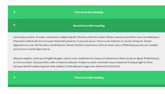
The word “accordion” typically conjures a mental image of your favorite polka band. Although polka music can offer a rip-snorting good time, the term is associated with something different in the realm of web design. User interface accordions might refer to menus, widgets, or content areas which expand like the musical instrument. These interfaces have grown a lot more popular in recent years with the expansion of JavaScript and more prominently jQuery.

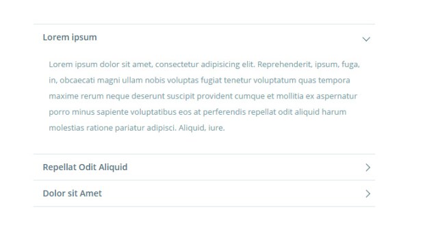
I’d like to cover a series of examples and techniques for building accordion interfaces into any website layout. Accordions are popular because they allow developers to force large amounts of content into tiny spaces on the page. Granted these content displays also require dynamic effects for switching between page elements – so there are pros and cons to accordions. This post should outline the important concepts and topics related to accordion interface design.

Why use Accordion Menus?

I like to think of accordions as content management tools. When you have a page that’s broken into dozens of paragraphs, links, images, or just too many blocks of content… accordion menus to the rescue.

Not every website needs an accordion menu and you certainly won’t find them all the time. But that’s no reason to ignore the concept entirely. The purpose of an accordion menu is to manage an overabundance of content through dynamic switching. Each interface works differently based on the circumstances of the layout.

Nowadays the biggest concerning factor would be the total number of visitors who don’t have JS-supported browsers. Over the past decade this number has dwindled considerably low as more people are upgrading their computers. This means you should have almost no concern because even mobile smartphone browsers support JavaScript. If the content is viewable and the accordion is usable then where’s the harm?

Just be sure that each accordion component has a real purpose. There are times where I’ve found accordion FAQ pages that could have just listed content down the page without forcing me to click on each heading. Granted I understand the premise but if each answer can be surmised in a few sentences, hiding that content isn’t going to improve the user experience.

So when exactly should you use accordions? Mostly with larger menus or content which might behave cleaner using expandable sections. These could be sub-headings or even multiple levels – the point is to organize content in a way that makes navigation simpler than endless scrolling.

Sliding Menu Effects

One of the most common interfaces you’ll experience is the sliding menu effect. This is usually vertical with a series of links hidden within sub-links. Clicking on a primary link will then expand the list of sub-links in a sliding animation.

Sometimes a website’s entire navigation menu is built on this accordion effect. Other common choices are dropdown menus which appear on hover – but accordion menus don’t slide over the page since they’re built into the page. So the effect is somewhat different and offers a different user experience by comparison.

designmodo accordion open source css3 menu

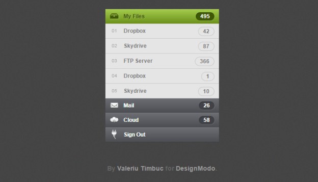
Take a look at this Designmodo tutorial which explains the process of accordion development in a nice tutorial. The source code is free to download but it should really serve as an example describing how this interface might work. Designmodo has a live sample preview which demonstrates how the menu behaves in action.

Notice how the menu will automatically close when opening a new section. This is typical behavior when constructing an accordion menu because only one primary menu is open at any given time. But this is not a mandatory feature and, in fact, most accordion menus allow every section to be open. This choice depends largely on the website itself and how content is expected to behave.

CSS3 Tabbed Content

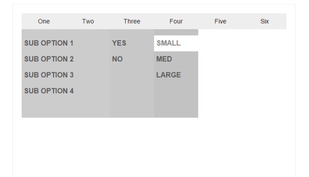
Another example of accordion content is based on tabbed widgets. So instead of having links listed vertically, tabs are used to manage shifting content. This is another really popular method of content management because JavaScript has made the process super easy. But since most developers are already familiar with JavaScript, I’d like to cover the more advanced techniques.

social media sliding accordion menu ui

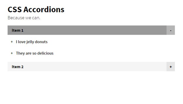
An alternative to JavaScript is the expandable accordion UI with CSS3. Granted they both seem like a risk but CSS3 has much less browser support. The only benefit is that CSS3 doesn’t require as much code and offers a simpler method of animation. If you prefer modern CSS3 animation check out the following tutorial:

vertical clean accordion codrops free

Codrops publishes very high-quality content and their accordion CSS3 tutorial is no exception. The code is free and downloadable if you want to try it out yourself. Their live demo includes a couple different options which utilize checkboxes vs. radio buttons.

Checkboxes allow users to select multiple items at once. Using the checkbox method you can have many different content areas open at the same time. Radio buttons only allow one radio item to be selected. This means when opening a new section the previously-open section will close. Both work great and will vary based on the needs of each project.

Sliding Portfolio

Webpage content is managed via alternate pages for simplicity and ease-of-use. Visitors would rather browse through different pages rather than sift through a long single-page design. However working with collapsible accordion content makes the latter a lot more reasonable.

toko accordion portfolio website layout

Take for example the homepage of Toko which uses a dynamic portfolio listing. As you click on each item the list will collapse smaller for an easier view of the project. This is by far an odd concept but it works great on their website. Why? Perhaps because of the minimalist design, perhaps because of the grid-like structure.

Either way portfolio sites can be an excellent choice for accordion widgets. Not every project should rely on accordions to best manage content. But think of the control you can offer visitors by organizing projects into larger categories and even sub-categories. Make use of this sparingly but keep it in mind.

Image Galleries

In a similar vein as the portfolio listing is a collapsable image gallery. In accordion-style this can take many forms as vertical, horizontal, slidable, tabbed, you name it! Touch-based interfaces have also allowed for swipeable image galleries that work nicely with computer mice too.

content image accordion css3 tutorial codrops

Getting back to Codrops I found another great tutorial covering an image accordion with CSS3. The effect is really cool and surprisingly supports click events. Each image is given some caption text which animates into view. What I like about this design is that it doesn’t rely on tabs or links or anything outside of the images themselves – so the content becomes the tabs. Pretty cool right?

open source flexslider plugin accordion images

Here’s a free jQuery plugin for building a responsive accordion image gallery. This example behaves similarly to the Codrops tutorial except all the animations are handled through jQuery. Also the caption text is a bit larger and seems more smooth. I’d like to state that either one of these effects could be duplicated and pushed onto the other – it’s simply a matter of recoding the design to fit the interface.

But my point is to demonstrate that both CSS3 and JavaScript can be used to create most of these effects. Unfortunately older browsers will never be backwards-compatible to support new CSS3 animation. Working with JavaScript is still the safest choice, but as more people upgrade their web browsers we can hope to see a future with primary support for CSS3.

Free Code Snippets

I’d like to wrap up this post by offering a collection of free open source code snippets. Each sample demonstrates the power of accordion content whether in a navigation, FAQ listing, or tabbed widget. All of these codes have been shared on CodePen and should be reusable on any project.

Granted you can always pick up a free plugin to rebuild something from scratch instead. Lots of developers release their code for free and try to help the community with free plugins. And of course there will always be those who prefer to build everything from scratch. But if time is a factor then I highly recommend working from these code snippets to ensure greater compatibility and a much quicker development schedule.

3D Accordion

jquery blue accordion open source

Material List

material design list open source accordion

Animated Accordion

responsive animated accordion content ui

CSS3 Dark UI

css3 accordion menu dark interface ui

Full-Width Content

fullwidth content animated accordion ui

Multi-Level Accordion

multi level accordion menu interface

Flyout Dropdown

accordion menu multi tier flyout

Colored Bars

large colored bars responsive accordion

Multi-Level Accordion

multi level collapse accordion open source

Responsive Content

responsive dark accordion content menu

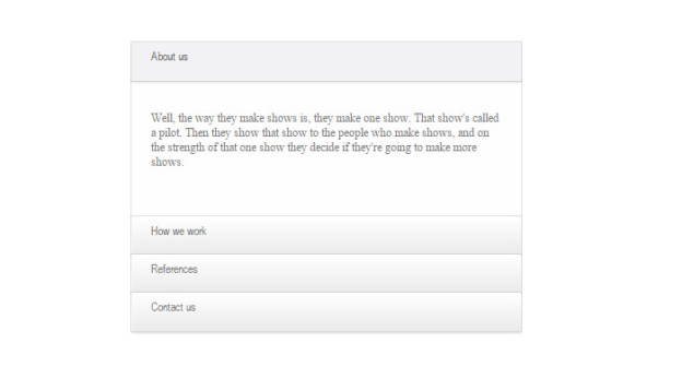
Sexy CSS Accordion

clean white sexy typography accordion open source

Dope Accordion Menu

dope accordion menu green ui

Vertical Radios

radio inputs clean accordion menu ui

Horizontal Radios

horizontal expanding collapsable content ui

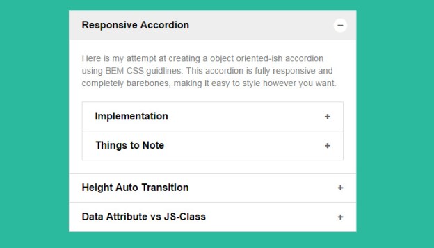
BEM Accordion

green simple minimalist accordion design ui

Pure CSS

pure css code open source accordion menu

Blue Accordion

blue vertical content accordion ui animated

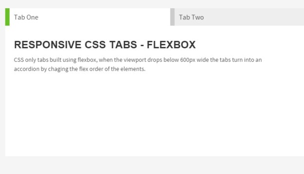
Flexbox Tabs

tabbed accordion content widget flexible responsive

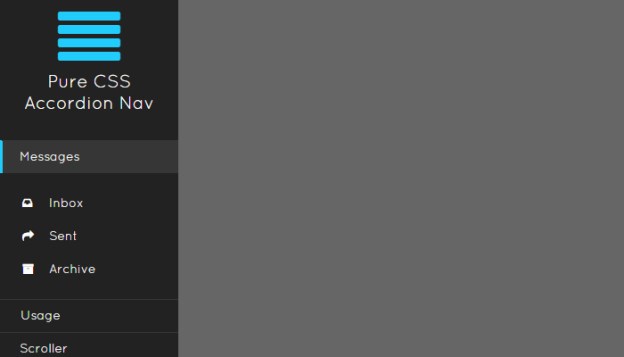
Pure CSS Menu

dark vertical css navigation menu open source ui

Multi-Color Accordion

multi colored shiny sleek accordion menu ui

Read More at Best Practices for Accordion Menus in Web Design

Categories: Designing, Others Tags:

Your Data Management Superhero – Interactive & Responsive Tables

April 19th, 2016 No comments
1

Do you work on a project with large amounts of data that need to be managed or manipulated in some way, and presented in charts or tables?

Given enough time, it is something you feel you could handle, although the task might not be an easy one. The trouble is, your client has thrown you a curve.

The data analysis needs to be in a format that is both interactive and responsive; and your client wants it done yesterday!

You’ve always been hooked on superheroes, but this is not a movie or a comic-book situation. This is reality; a place where superheroes can be hard to find. There is one that will free you from your dilemma however.

This superhero has the complete package; x-ray vision, super strength to move huge amounts of data, the ability to bend seemingly inflexible things into shape, and more.

Your superhero goes by the name of wpDataTables. It is a WordPress plugin that can resolve virtually any chart, graph, or table-building issue you are likely to encounter.

It can create interactive and responsive content with ease – and deliver it to your client yesterday.

Shapeshifting Features

wpMyDataTables can adapt to information in the format of your choice, and bend and fit it to serve your needs; just as easily as some superheroes can bend a steel rod into the shape of a donut.

The format in question can be from an Excel or a Google spreadsheet, JSON, an .xml or .csv file, or whatever. The end result will be responsive, and it will be correctly presented on any standard device display.

Super Strength

4

Handling 1.600.000 data entries is not an issue for wpDataTables

Intelligence isn’t always equated with strength, but in this case, wpDataTables’ ability to manage huge chucks of data with obvious ease is because it’s smart.

This superhero knows when to go outside for help, by joining forces with MySQL, or getting assistance from an Ajax request for sorting, filtering, and other tasks.

X-Ray Vision

2

Best 10 Marvel films at the box office, table created with wpDataTables

Seeing through vast accumulations of data such as a thick cloud of seemingly random numbers can be as difficult as attempting to see through a solid object.

Hidden within that cloud of numbers are charts, graphs, statistics, and other valuable pieces of information. They are just not easy to see.

The wpDataTables’ Table Constructor does a magnificent job of creating editable, interactive, and responsive tables, spreadsheets and charts.

Chart-Portal Creation Features

3

Not every superhero can create a wormhole or a spatial portal. A few can however, and wpDataTables is one of them.

You can apply the superpowers embedded in its intuitive dashboard to create awesome WordPress visualization charts in colors of your choosing, using Google Charts and High Charts skills.

Teleportation Powers

It’s super cool to be able to print a WordPress table or save it in a chosen format, whether it is .pdf, .csv, or Excel. Your superhero plugin makes doing so a snap.

It’s a form of teleportation, a talent many superheroes have in common; only it’s for WordPress.

This Superhero Plugin is Best Used for …

These superpowers are obviously good to have available, but what are they best applied to?

The answer is, they can be applied to a great many different needs. Financial and operation statistical analyses often involve huge sums of data, as do both agricultural and scientific statistics.

Advertising and marketing specialists will also find this plugin to be extremely useful. The number of uses is, for all practical purposes, unlimited.

If you want to see a mass of seemingly incomprehensible data morphed into something meaningful, let wpDataTables have a go at it!

A Data Manager with Super Features and Super Customer Support

6

wpDataTables is super user-friendly and intuitive. That is what 8 out of 10 its clients will tell you. A majority of them use its advanced filter capabilities and the MySQL data visualizing feature, 85% and 75%, respectively.

About a third of the clients report using several other features this plugin offers. As far as support is concerned, if you have a question, or in the unlikely event you run into a problem, the support team is always there for you and ready to help.

wpDataTables features include:

  • The ability to create a table in three easy steps – upload, configure, and publish.
  • The ability to create responsive charts and tables that can be viewed and edited from any standard device or display.
  • The Table Constructor, which allows you to create tables manually.
  • The Query Constructor, which you can use to quickly fetch WordPress or MySQL database data.
  • The Query Generator, if you need to generate MySQL queries.

Other useful features include an interactive chart generation capability, limited access table generation, customizable design capabilities, the use of shortcodes, and no coding.

There’s more to come, and as a wpDataTables user, you can count on automatically receiving updates and new versions, as they are released.

The Latest wpDataTables Updates

Here are two new features you will really like. As is the case with the other premium WordPress plugins, updates you receive are often the result of user requests and feedback.

  • The Conditional Formatting feature makes highlighting rows, cells, and columns, and changing CSS classes, easy to accomplish tasks.

7

  • The Sum/Totals Row give you the ability to display, in the table footer, numeric column totals.

The latest wpDataTables version, 1.6.1 is a large update. It introduces a total of 15 new features including the two aforementioned ones, plus a variety of stability and UX improvements and several bug fixes. Give it a try.

Read More at Your Data Management Superhero – Interactive & Responsive Tables

Categories: Designing, Others Tags:

Google Play Music Will Soon Have Podcasts

April 19th, 2016 No comments
google-play-music

Google has recently announced that it will soon allow and offer podcasts in Google Play Music, grouped by the nature of the content of the podcasts. Currently expected to be available only in US and Canada, podcasts will soon be rolled out for Android and Google Play users all around the world.

To quote the official Android blog:

People love podcasts. In fact, these days, there are so many podcasts to choose from, it can be hard to pick which one to listen to at any given time. That’s where Google Play Music comes in. Google Play Music already gives you the right kind of music for the right moment—whether you want to have fun at work, prepare for a dance party, or just need to focus—and now, that includes podcasts.

Starting today on the web and rolling out on Android in the U.S. and Canada, we’ll connect you with podcasts based on what you’re doing, how you’re feeling and what you’re interested in. Similar to our contextual playlists for music, we want to make it easy to find the right podcast—whether you’re a podcast aficionado or listening for the first time.

google-play-music

This development has been long due and much awaited. iTunes has been offering podcasts for years now, and even Spotify and other services are not lagging behind. As such, Google Play Music is surely late in joining the trend.

What do you think of this move by Google? Share your views in the comments below!

Read More at Google Play Music Will Soon Have Podcasts

Categories: Designing, Others Tags:

Google Analytics: How to Avoid High Bounce Rates

April 19th, 2016 No comments
Google Analytics: How to Avoid High Bounce Rates

If you own a website and use Google Analytics to keep track of visitors, you will quickly notice that the infamous bounce rate can shoot up pretty high. Bounce rates of over 60 percent are not a rare sight. High bounce rates are not always a bad thing. That’s why we’ll take a close look at what the bounce rate actually is, how it is formed, and how you can achieve a realistic bounce rate.

Exact Definition: This is the Bounce Rate

The bounce rate displays the percentage of visitors that leave your website after just one pageview without accessing any further pages of the site Google defines the bounce rate as follows:

The bounce rate is the percentage of visits on a single page (that means sessions, in which the user left your website on the landing page without interaction with the site).

Thus, if you have a bounce rate of 80 percent, that means that 80 percent of your visitors only looked at one single page, and left your website right after that without clicking anywhere else. However, a high bounce rate doesn’t have to be bad. Some types of websites will always have worse bounce rates than others due to their concept.

What Leads to a High Bounce Rates

Google Analytics: How to Avoid High Bounce Rates
Google and the Bounce Rate – Explained Comprehensibly.

The bounce rate of news websites is almost always worse than that of others. Many visitors only come to read a single article and then leave. Bloggers, however, shouldn’t know that problem, as in theory, blogs have a much better bounce rate than news magazines as they are more engagement-driven. But there are more, real factors that can create a seemingly poor bounce rate.

  • Bad Content: When the user doesn’t find the information he’s looking for, he’ll leave in no time. This will happen fast and constantly, as long as the content stays bad. The only thing that helps when that’s the case is revising the content.
  • Long Loading Times: Most visitors will not accept a long loading time of your website. If the content is not visible after two seconds at most, the user will leave the page. On top of that, it will also be harder to find the website using Google search.
  • Too Good SEO: Yes, even a (too) good search engine optimization can cause a high bounce rate. When the user instantly finds the information he’s looking for, he won’t click any further pages either.
  • Poor Webdesign: When your website’s layout isn’t all that inviting, or even looks sketchy, the visitor will quickly leave the page. An appealing layout is a must for every website.
  • Too Many Advertisements: If a website contains too many ads, this can scare away potential visitors. Less is definitely more in this regard!
  • Confusing Navigation: If your visitor simply doesn’t find his way around on your website, he’ll leave it quickly as well.

Google: Bounce Rates

Are High Bounce Rates Affecting the Ranking?

I think we can answer this question with a definitive yes very easily. Google analyzes the bounce rate in-depth, taking into account that a high bounce rate is not always bad. For that reason, the search engine will also take the duration of the visit on the page into consideration. Only then, a coherent picture is created. When a visitor leaves a website after a couple seconds, that’s always bad. However, if he leaves after five or ten minutes, that’s a very good sign. It only means that the visitor found just what he was looking for.

How to Achieve a Realistic Bounce Rate

Google considers every visitor that leaves the website after just one page a bounce. Thus, the bounce rate increases no matter how long the visitor stayed on that one page. He could be a regular reader, who accessed the page via the website’s feed only to read this one article, as he’s already read the others. It is also possible that the visitor came from Twitter. All direct visits to a website are a sign of specific interest. While this is generally a good thing, these users unfortunately also drive up the bounce rate.

I think that the standard way of measuring the bounce rate gives a false impression, and doesn’t display a website’s reality. A real bounce would be somewhere between five and twenty seconds. The bounce rate is supposed to be significant, as it’s a good tool for website optimization. It is supposed to help you find problems. This can only be done when the bounce rate is realistic. That’s why we need to adjust and “tune” it a little.

Using the following tracking code, by simply replacing the existing one, we decide, that only visits below twenty seconds are counted as a bounce.

Clicking the graphics opens the respective Gist at GitHub.

Adjusting the new Google Analytics Code – analytics.js

Google Analytics: How to Avoid High Bounce Rates

Adjusting the old ga.js Analytics Code

Google Analytics: How to Avoid High Bounce Rates

The Effects of the New Code

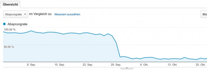
After a short time, we’ll have a more realistic bounce rate at hand. Only the real bounces below 20 seconds are displayed.

Google Analytics: How to Avoid High Bounce Rates

Conclusion

With a small adjustment to the tracking code, you have now achieved realistic, though probably still high bounce rates that will be displayed in Google Analytics. Using the new values, you can now revise the articles with “real” high bounce rates, and start working on the problems (if there are any).

Sources:

(dpe)

Categories: Others Tags:

Visual Studio Code reaches 1.0

April 19th, 2016 No comments

Microsoft knows how to keep eager developers waiting and waiting. For approximately one year, the company has kept its cross-platform text editor for developers in beta.

That all changed now that Microsoft has released version 1.0 of Visual Studio Code. In spite of the long delay, the text editor has already proven popular with developers. According to Microsoft’s own figures, two million developers have installed VSC, another half-million developers have been regularly using it every month.

What makes VSC so significant—in fact, what garnered it attention last year—is the unprecedented nature of Microsoft releasing a code editor for both Linux and OSX. Further, releasing this under the Visual Studio brand is, in and of itself, surprising.

Two major issues plagued the platform when Microsoft first launched it. Initially, the code for VS Code was not open source, and there was no extensibility. Both problems have been fixed by the company in time for the 1.0 release.

A lot has happened to make the 1.0 release a reality. In the months leading up to the release, Microsoft has been working with the VSC community to do more than improve features. Stability and performance have both been improved, with hundreds of bugs being addressed, and the entire editing process has been smoothed out. Further, in about half a year, more than 1000 extensions have been created by the community. These support nearly any runtime and language within VS Code. This is impressive when you consider that VS Code was originally created to help developers who were building web apps with TypeScript and JavaScript; you’ll now find it easier to write applications in PHP, Python, Node.js, C++, Go, and many more.

The result of this progress has been huge. Currently, everyone from mere startups to big Fortune 500 companies are more efficient with an editor that integrates well into their present tool chain as well as work flow. As a result, Microsoft has declared its VSC API stable, and is guaranteeing compatibility moving ahead.

Because of the worldwide community behind this release, it’s no surprise that 1.0 is also localizable, making it an accessible tool for every developer. It ships in nine languages including Chinese, German, French, and Japanese. Microsoft also open-sourced this application, making it available on GitHub only a few months after the initial release last year.

Great things look to be ahead in the future for VSC, too. The company has pledged full support to this platform, promising to invest in bettering developer productivity that’s influenced by feedback from the community. Working hand-in-hand with both the community and partners is essential to Microsoft’s plans to keep increasing support for additional languages in the platform. The developer community can expect exciting things through its collaboration with Microsoft.

Interested developers can download the new 1.0 release right here.

Ed’s Market Font Family by Laura Worthington – only $19!

Source

Categories: Designing, Others Tags: