15 Logos With Hidden Messages
Designing logos can be very difficult. When designing a logo you want it to stand out from the crowd yet still be really simple. Sometimes the designer is really clever and makes the logo very simple yet includes a hidden message within the logo that has deeper meaning. In this article we have 15 logos with hidden messages, some of which you will have heard of before and some maybe new to you but hopefully you will enjoy them all.
Amazon

The Amazon logo is an extremely simple logo and while the arrow may just look like a smile it actually points from a to z. This represents that Amazon sell everything from a to z and the smile on the customers face when they bought a product.
Baskin Robbins
The Baskin Robbins logo may look like it includes a simple BR above the name but if you take another look you will that it includes a pink number 31. This is a reference to the original 31 flavors.
Chick-fil-a
The Chick-fil-a logo incorporates a chicken into the C. Although this isn’t very hidden, it is still very clever.
Eighty20
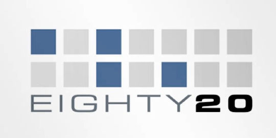
The eighty20 logo is a bit of a geeky one to figure out, the two lines of squares represent a binary sequence with the blue squares being 1’s and the grey squares being 0’s. Which makes 1010000 which represents eighty and 0010100 which represents 20.
F1
The F1 logo is a fairly simple one to figure out. The negative space in the middle creates the 1.
Facebook Places
If you didn’t already know Facebook Places, is Facebooks new geolocational product. Which is in direct competition with the current leader in that area Foursquare. Now if you take another look at Facebook Places logo you will notice it is a 4 in a square now is this a coincidence or a dig at Foursquare?
Fedex
The FedEx logo look like a plain text based logo but if you take a second look between the E and the x you will see an arrows which represents the speed and accuracy of the companies deliveries.
Milwaukee Brewers
The old Milwaukee Brewers logo may look like a simple catchers mitt holding a ball, but if you take a second you will see the team’s initials M and B.
Museum of London

The Museum of London logo may look like a modern logo design but it actually represents the geographic area of London as it as grew over time.
NBC
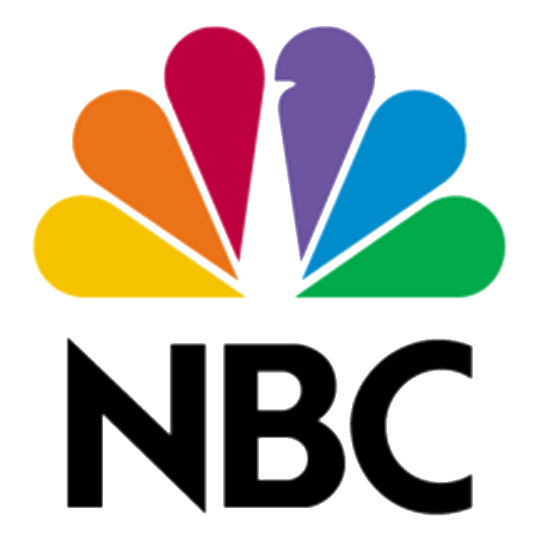
The NBC logo has a hidden peacock above the above text which is looking to the right, this represents the companies motto to look forward and not back, and also that they are proud of the programs they broadcast.
Northwest Airlines
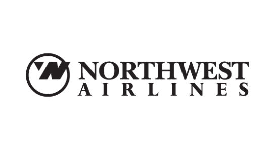
The old Northwest Airlines logo may look like a simple logo but if you take a closer look the symbol on the left actually represent both N and W and because it is enclosed within the circle it also represents a compass pointing northwest.
Piano Forest
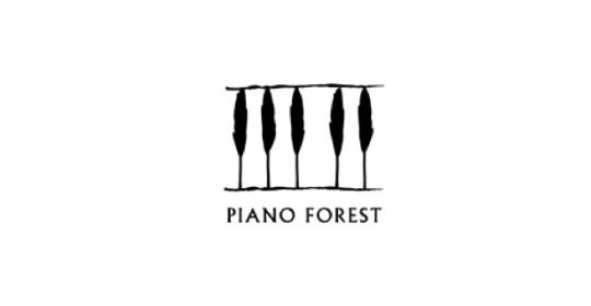
The Piano Forest logo may look like a simple text logo with trees above it, but if you take another look you will see that the trees actually represent keys on a piano.
Toblerone
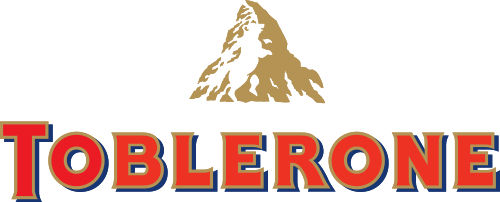
The Toblerone logo contains the image of a bear hidden in the Matterhorn mountain, which is where Toblerone originally came from.
Tostitos
The Tostitos logo includes two people sharing a chip and a bowl of salsa, this conveys an idea of people connecting with each other over a bowl of chips.
Treacy Shoes
The Treacy Shoes logo is very cute logo with a shoe hidden between the t and s.
Read More at 15 Logos With Hidden Messages
