UX Design Tips to Boost Conversion Rates Up to 2x
Every website owner often asks a question to himself/herself, “How can I improve my intended conversion rates?” Well, it’s a licit question to ask when you are into some business and rely on your website.
Several CMS based web platform allows easy site management and great customization power to its owners. Therefore, it has become the highly preferred platform for companies to rely for having a website.
However, earlier, people consider this platform suitable for blogs only. But, with the passage of time, technological advancement, and constant researches by numerous developers worldwide has explored its power to utilize this platform to its maximum.
No need to worry, some little tweaks and alterations in your website theme can do what you expect. And, I am here to give an answer to your “How.” But, before jumping on to the answer, first, understand about the conversion rate.
People engaged in different business set various goals for a specific timeline. Goals like get 1000 forms filled in 5 days, sell the first lot of product in the first week, and so on. Website designs or landing pages are created with the vision to meet that intended goal in the desired timeline.
A nicely-designed website is worthless until it achieve the desired conversion rate. So, to make it worthwhile for your business, let’s get started.
Humanize Your Site
Irrespective of the fact what kind of business you possess; every website is primarily designed with some common objectives:
• Boost website visits
• Grab and hold visitors
• Provide them something valuable to earn trust
• Convert visitors into permanent customers
Here, a question arises to the mind that how you can make your site notable so that first-time visitors would love to visit your site again. Well, it’s by providing a real-life touch to your site. Humanizing any website is a process of adding emotionally intelligent interactions that help you to build a great fan following for your site.
Being engaged in business, you need to be smart, and an intelligent entrepreneur first identifies how their buyers purchase and what they are looking for?
If you recognize the taste of your audience, then you have won half of the battle. You apply those insights into your website design to get it as per your buyers’ intent as it will make your site more appealing and authentic in their eyes. Your buyers will psychologically feel connect to your site with the hope their search ends at your website.
To know more about sites that offer emotionally intelligent interactions, you can go through this must-read link of Little Big Details.
Be Content Focused
Content is the only medium by which you can deliver the real value to your visitors and buyers. Therefore, take your time to analyze how better you can deliver your content. Customize your theme, if required and publish your content in forms to sustain the zest of your visitors. Convince them through your content, why your buyers should choose you over your competitors. By highlighting their pain areas, makes them realize that you want to help and have a genuine idea of the situation they are facing.
According to the News Cred, “FISHER TANK”, a company with almost seven decades of experience did business for more than 60 years through traditional calling and referrals from existing clients. But, when they planned to do it through content marketing campaign, their web traffic soared to 119 percent, traffic from social media by a massive 4800 percent, and leads conversions by 3900 percent. Further, they got several benefits by focusing on content marketing.
Use CTA But, in Style
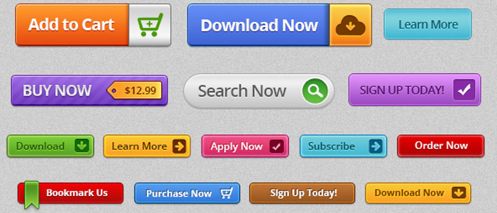
Call-To-Actions (CTAs) are pretty crucial when you aimed to attain high conversion for your website. It is a place where your visitors actually take actions to get converted. Improper placement can make it difficult for your buyers to find which may cause you to lose potential prospects. Additionally, the bad color combination becomes responsible for site abandonment.
Therefore, experts’ advice for businesses is to use a proper color combination to increase its visibility, and apt placement is necessary to make it easy to find. Place your CTAs where you provide information so that customers can take actions when they feel prepared.
According to the website Blastam.com, with the aid of Google Website Optimizer, “Nature Air” saw a tremendous increase of 591 percent in its conversions. On their 17 landing pages, they did a single A/B testing to make CTA prominent, but the efforts didn’t work out for them. Then, they decided to put the CTA in the content area and witnessed a massive improvement.
Provide Social Share
Unarguably, the real success mantra for business is promoting brand on/through social media channels. Thus, it is advised to provide social share button to allow your existing customers and first-time visitors to share your page or information to different social media channels. It will dramatically increase traffic to your website and boost your brand engagement which will increase the chances for conversion.
For instance, Advanced Micro Devices (AMD) did A/B testing and used ShareThis to achieve <a target="_blank" href=”https://vwo.com/blog/amd-3600-social-sharing-increase/”3600 percent increase in social sharing.
Make Your Design to Support Mobile Devices
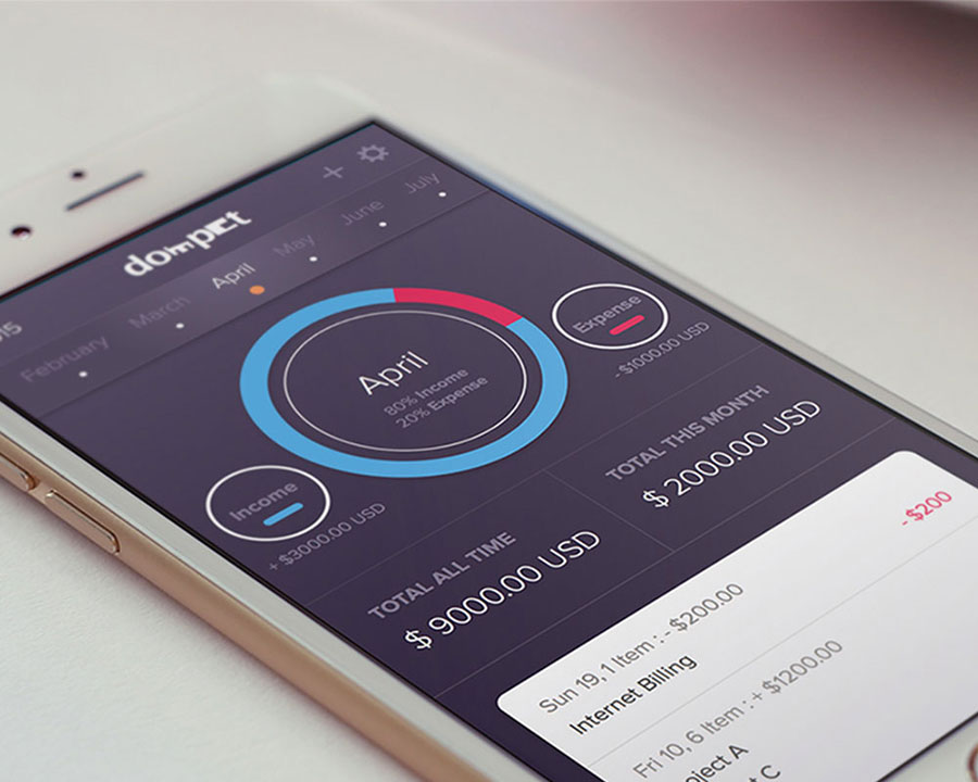
Overlooking mobile devices can take your business to the state of deep trouble. If you ignore mobile devices, you must be missing out its outstanding business benefits. Having known the fact that smartphones already surmounted traditional desktops regarding searches which portray that mobile is the future. Additionally, Google also recommends to make your website mobile friendly in order to improve the overall user experience and enable businesses to make their way to the top of Search Engine Result Pages (SERPs). So, get your website design to run smoothly on different mobile devices so that you could reach out to your mobile audience also.
Eliminate Site Errors

Broken links and unwanted 404 errors can ruin the user experience (UX) of your site. These errors can prove the biggest stumbling block that can curb your website conversion rate because modern users take seconds to abandon your site and switch to your competitors.
Therefore, analyze your site in a proper manner to fix all the broken links. However, you can provide a search tool for 404 pages so that users can navigate to some other useful page of your website.
To get an idea how to create a great 404 page for your site, you can follow a must read by Creative Bloq.
Create a Seamless Flow
Eventually, check your site to ensure seamless flow. You can’t entirely rely on your site design. When it comes to attaining high conversions, you have to give priority to Content, CTAs, Mobile platform, and several other factors that can affect your conversion rate.
A well-designed website with the seamless flow can yield fruitful results for your business.
Case Studies
Having highlighted all the essential points above, you can easily conclude that the web is powerful than ever but, all we need to do is to utilize it to its maximum for our benefits.
Here, I am mentioning a must read the link from STUDIO by UXPin that portrays few famous UX case studies to improve conversions.
EndNote
This write-up reveals how you can skyrocket your conversion rate. I hope these tips may prove helpful for your website. After all, it’s all about competition and to stay ahead of your competitors you shouldn’t miss a single shot.
Author Bio:
Abhyudaya Tripathi is a digital marketing expert with over 8 years of precious experience and presently he is an Associate Director at ResultFirst – Digital Marketing Company. He is extremely passionate about making information seekers and quest lovers aware about digital marketing.
Read More at UX Design Tips to Boost Conversion Rates Up to 2x
