Common Typography Mistakes: Apostrophes Versus Quotation Marks
A common mistake in typography is the use of apostrophes instead of quotation marks. A lot of people just get the two confused, using double apostrophes instead of actual quotation marks. It’s hard to mistake it the other way around, but it will be worth your while to learn the differences.

Quotation Marks

Quotation marks, or quotes, are used in punctuation to emphasize a phrase or word or to indicate speech. There are four types of quotation marks: single open, single closed, double open, or double closed.
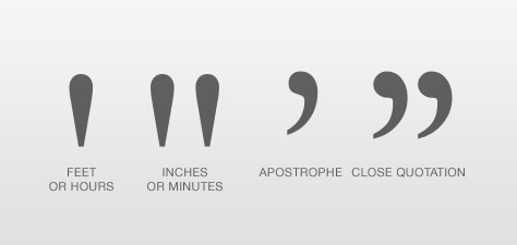
Opening quotations look like tiny little sixes, while the closing quotations look like nines. Most word-processing programs change them automatically, but always double check when you’re done.
Example of single quotation use:
“Henry said, ‘good morning,’ this morning,” said Ben.
Examples of double quotation use:
The doctor said, “Take your vitamins.”
“Oh, my gosh!” said the woman.
The apostrophe
One of the correct uses of an apostrophe is to show the possession of something. For example, “Sally’s ice cream” is the proper use of an apostrophe to indicate the ice cream belongs to Sally. You can also use apostrophes to form contractions. Not like the kind women get when giving birth, but the kind that makes “do not” into “don’t.”
Examples of contractions:
- I am to I’m.
- Do not to don’t.
- You are to you’re.
- It is to it’s.
Examples of proper apostrophe use:
- That is Stephen’s chair.
- John’s in the hospital.
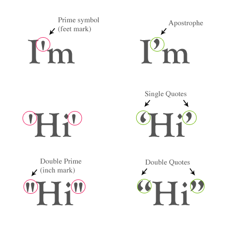
You get the idea, but it’s good to memorize these if you’re weak in this area of grammar. Another thing you should know about apostrophes is that they are not the same as prime symbols or accent marks.
The Apostrophe and Prime Symbol

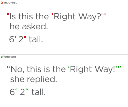
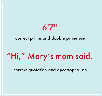
Another very common mistake in typography punctuation is using the prime symbol in place of apostrophes. The prime symbol ( ‘ ) looks similar to the apostrophe, but you should use it in mathematics and measurements. For example, 5? means 5 feet, and 2′ ‘ means 2 inches. Depending on the font you use, it can be impossible to tell the difference. But, you might be using a font that makes it painfully obvious. Check and double check all your apostrophes, prime symbols, and quotation marks. No matter how amazing your typography turns out to be, a little mistake like this can ruin the work.
Ditto marks

You may be asking yourself right now, “What the heck is a ditto mark?” A ditto mark looks like this ( ? ). It indicates that the line you are on is a repeat of the one above. The word “ditto” literally means “same as before” or “repeat.” The truth is, double quotation marks are usually used in the place of actual ditto marks. But again, it will show if you are using certain types of font.
For example:
Goat for sale …. $10
Sheep for sale …. ?
The sheep is the same price as the goat, $10.
In most cases, you can remember the difference between apostrophes and quotation marks by looking at their purpose in the text. If you are making a contraction or showing possession, use the apostrophe. If you are quoting someone, use quotation marks.
Sonia Mansfield is the content editor for PsPrint and editor of PsPrint Blog. PsPrint is an online printing solutions company, which you can follow on Twitter and Facebook.
Read More at Common Typography Mistakes: Apostrophes Versus Quotation Marks
