Tips For Using Fonts In Typography
Picking the right font and using it in the typography is a mystifying process for many people. There are endless choices of fonts, whether you are looking for a normal conventional looking font, or an innovative bunny or candy cane font. A few decades ago, designers were limited to very few web safe fonts, most of which looked pretty much the same, but now, there is an astonishing range of typefaces that you can use on your site, blog or print design. Here are a few tips for using fonts in typography.
Be informed about the diverse fonts

First of all, to choose the right font, you need to be aware of the primary groups of fonts so that you can select the right one. Basically, there are five groups: geometric sans, old style, humanist sans, slab serifs and transitional & modern.
-
Geometric sans are the combination of realistic, geometric and grotesk, and are made up of strict geometric strokes. The strokes are of same width, and the impression is clear, modern and objective. Examples include Gotham, Avant Garde and Helvetica.
-
Old Style fonts are old typefaces that are identified by curved strokes tilted to the left. Examples include Garamond, Palatino and Bembo.
-
Humanist sans are more casual in nature and resemble more of a hand-written piece. Examples include Frutiger, Verdana and Myriad.
-
Leaving the Old Style fonts behind, transitional and modern fonts are more virtuosic, sharp and geometric. They are known for their dynamic, strong and stylish appearance. Examples include Didot, Times New Roman and Baskerville.
-
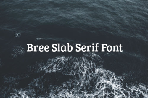
Slab serif fonts are characterized by a slight contrast between thick and thin, having rectangular solid box in the end. These look authoritarian and add a distinct twist to your presentation. Examples include Archer, Clarendon and Rockwell.
Add appeal by using contrasting fonts in varying sizes

A presentation with the same font all over will not create much impact. Instead, choose different fonts with contrast to each other. For instance, if you are creating a website from a web design template, use contrasting fonts for writing your web content and those sales pages. You need to use different font sizes as well to create a strong appeal. Headings have to be bigger, sub-headings should be smaller, and content message has to be even smaller.
Know the purpose of using the font

Tips to Help You Choose the Right Fonts
Different kinds of presentations require different genre of fonts. For instance, if you are creating a resume, you need to choose a font that looks strong and formal. Times New Roman does the job very well. But if you are making a template for a poster or pamphlet, then Wild West Style or Victorian will be a better choice.
Make sure that the font is clear and legible

If you are creating a long text body, then make sure that the font you use is clearly legible. No one is going to try hard to read what you have written. The font that you use should be aligned properly and should not give visual strain to the reader.
Positioning the text and aligning it

Once you have selected your fonts and their size, you need to use them properly on the layout as well. Depending on the background images of the presentation, position and align your text properly. It should be in sync with the rest of the body and also create the desired impact on the reader’s mind.
Fonts are powerful elements to carry your message across to your readers. Whether you are designing a greeting card, a resume, a website page or a magazine layout, use the right fonts to define your work and emphasize the main message. Use these tips to use the available fonts the right way.
Read More at Tips For Using Fonts In Typography
