How to Create Responsive Guides in Adobe XD
In this tutorial, we’re going to learn how to create guides for responsive design, in Adobe Experience Design CC (Adobe XD).
The Steps (1-12)
1. Create a new document 1920 x 1080 from the Start Screen.
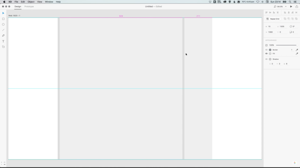
2. Create a shape that is 100% height, and 1170 pixels in width. This shape is going to represent the maximum site width that we will be designing for, and should be centrally aligned to the artboard. Give this rectangle a grey colour for now. Go to Object > Lock to lock this layer in position, so that we don’t select it by mistake when working through the steps to follow.
3. Create a thin vertical rectangle, that is 100% height and 15 pixels in width. This is going to form our site margin, and should be positioned on the inside left edge of the main rectangle. Duplicate this shape, and also position a copy on the inside right edge of the main rectangle. Give these shapes a slightly different shade of grey, so that we can easily distinguish the different shapes/elements, whilst working on the layout.

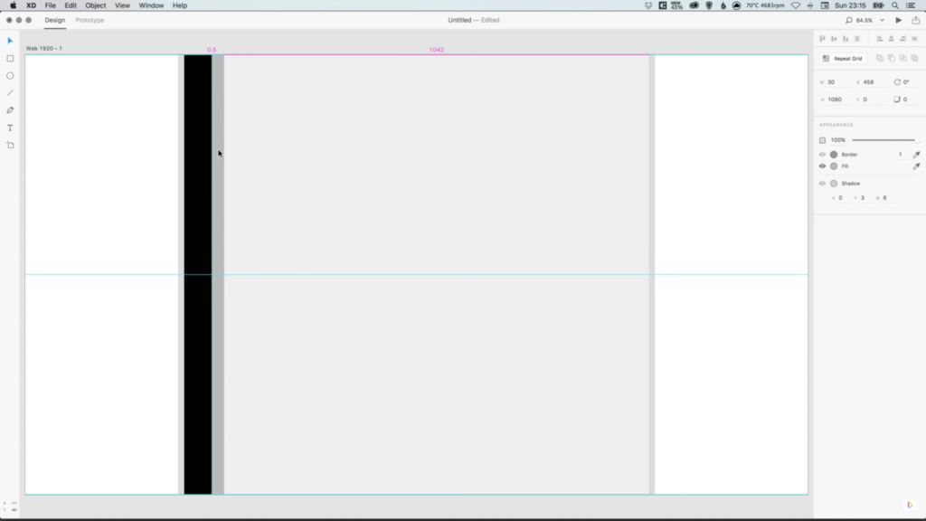
4. Create another vertical rectangle that is 100% height, and 67.5 pixels in width (70 pixels if you design your grid without the left and right margins). Colour this new shape black, and position this alongside the shape created in Step 3.
5. Create another vertical rectangle that is a different shade of grey to the two shades already being used by the other shapes, and position this alongside the shape created in Step 4. The three rectangle shapes should all be lined up alongside each other, with no gaps in between.
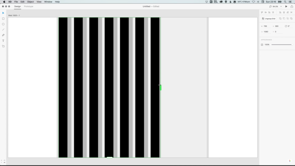
6. Using Shift to select these three shapes (excluding the main rectangle). Next, click on the Repeat Grid button in the Property Inspector on the right-hand side.

7. Your shapes should now have a set of green guides around them, allowing you to drag the slider on the right, until it touches the edge of the right margin that we created in Step 3.
8. When using the Repeat Grid Tool, Adobe XD automatically creates a gutter (spacing) in between the different objects that are being repeated. By selecting and clicking inside this space (the gap in between objects) you will see some pink guides appear, that allow you to adjust the gutter spacing. For this tutorial, reduce the spacing here to zero, so that there are no gaps between our shapes.
9. Once the gaps have been reduced, select the green right slider again, and drag this out to the right, until it lines up with our right-hand margin as before.

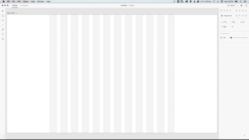
10. Double-click the Repeat Grid group, select the first 30 pixel shape that we created, and adjust the colour to white. You will see that all of the other clones of this shape also change in colour.
11. Use your mouse to drag over all of the shapes that we’ve created (the main rectangle should still be locked), and in the Appearance menu on the right-hand side, adjust the opacity to between 2-5%. Lock these layers, as we did with the main rectangle in Step 2. Keeping the opacity of the responsive grid less than 5%, allows it to still be visible enough to work on, but doesn’t interfere too much with any design elements that are being created, and you can even set the guides to 0% opacity to hide them completely.
12. Start designing an awesome and responsive site!

Download Adobe Experience Design CC (Adobe XD).
Read More at How to Create Responsive Guides in Adobe XD
