Archive

Archive for May, 2016

Top Six Tips for a Google PageSpeed Score of 90% or Higher!

May 16th, 2016 No comments
FEATURED-google-pagespeed-score

Alright all our fellow WordPress Website developers, we know at this point you’ve toiled over your site tirelessly. You’ve tested your site repeatedly on different devices, ensured that it’s SEO-optimised and have forced your friends and even 93 year-old grandma to give you feedback on the accessibility and aesthetics of your site. But is it ready? You’ve known this day was coming, the last judgement, the moment you’d have to submit your site to be meticulously examined by the infamous Google crawlers and be subjected to public praise or condemnation. We’ve all been there before and in the spirit of WordPress comradery, we’d like to lend a hand and go through with you, one by one, all the best ways to make sure your bloodshot eyes and sleep deprivation pay off!

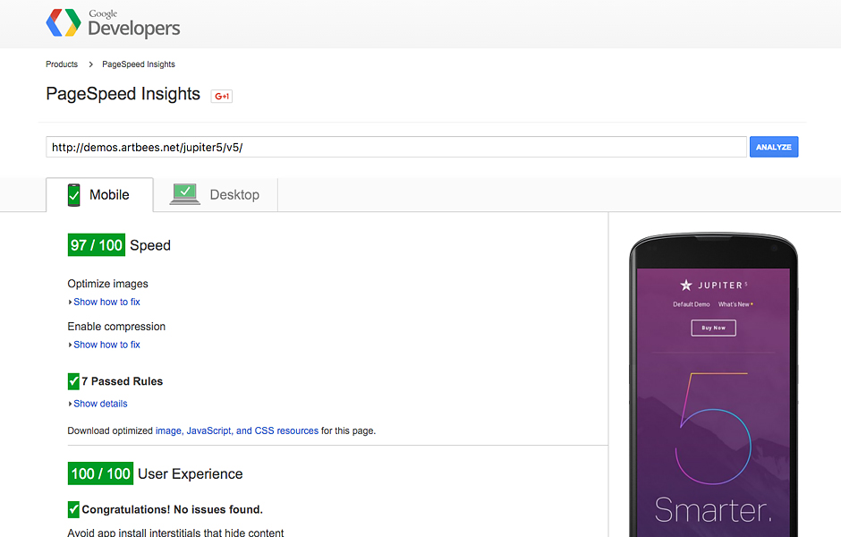
First, in case you don’t already know about Google PageSpeed Score, let’s get a handle on the nature of the beast. There are two major speed assessments used to measure website page speed, Google PageSpeed Insights and GTMetrix. Both of these use a double-fetch URL on both mobile and desktop devices and then based on a variety of categories, will assign your website a score from 0 to 100 based on its performance. According to our peers, a score of 85% already indicates good performance, but let’s shoot even higher for a 90% and above! And just in case you’re not already having unnerving flashbacks to high school standardized testing, GTMetrix also ranks your website in alphabetical ranking giving you a A, B, C, or (nope, we won’t even go there). They calculate this by overlapping your Google PageSpeed Score and Yahoo! YSlow Scores to determine the average of both.

So remember that computer nerd in your class, the over-achieving genius you saw sitting in the cafeteria at lunch hunched over his laptop, murmuring indistinguishable code to himself? Flash forward a few years and that’s us, except much more dashing of course. My point is, you always knew back then that one day we’d rule the world and now here we are, riding in on our website-optimizing horses ready to sweep your site off it’s server and bring it to top-tier performance. Don’t believe us? Take a look at the below chart reflecting Google PageSpeed score and GTMetrix tests conducted with several WordPress sites just a few weeks ago—numbers don’t lie!

Note:

  • This comparison was created on January 5th, 2016 and is liable to change in the future.
  • We used four main category scores, two from Google PageSpeed and two from GTmetrix, to calculate the average score for each of them.
  • Each theme’s main landing page or default demo has been tested by us.

Comparison of the major WordPress Themes of 2015 (January 5th, 2016)

Theme Google PageSpeed GTmetrix AverageScore
Mobile (%) Desktop (%) PageSpeed (%) YSlow (%)
Jupiter 97 98 96 84 93.75
Enfold 77 91 93 82 85.75
Avada 70 87 91 88 84
Divi 72 87 88 83 82.5
BeTheme 65 80 93 83 80.5
Bridge 71 71 89 78 77.25
X 65 75 57 77 68.5
Monstroid 41 56 87 70 63.5

Now that we’ve got your attention, we’ve picked the most effective six steps you should take to make sure your website gets a PageSpeed Score of 90% or higher. We’ve created this list based on our seasoned experience with various WordPress websites.

Let’s start off with the one tip that we’ve seen has the highest potential for boosting your score up to 70 points!

5 – 70 Point Boost with Image Optimisation:

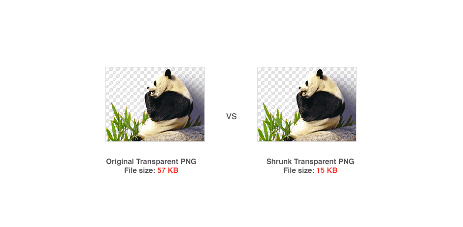
This one factor could very well be the difference that rockets your page past 90%. Of course you have a myriad of images on your page, but have you effectively optimised all of them? A sure way of decreasing the bytes of space you use and drastically increasing your page’s performance and speed is by optimising your images!

Don’t worry about compromising the quality of your images; given the likelihood that they’re all PNG or JPG files, you’ll be able to shrink their size substantially without sacrificing their quality. There are two options:

  • You can use Photoshop
  • Or if you’re scaling larger images, you can use another method of shrinking such as optipng or jpegoptim.

For the latter, though, you’ll first need to have root access to your server. All Windows Users, use PUTTY for terminal access. Mac and Linux users, use terminal.

If you hit a roadblock and can’t get root access to your server, not to worry. You can also use tools such as GIMP or Photoshop or even online tools like TinyPNG to optimize all images before they’re uploaded. You can also count on PageSpeed which will provide for you optimized images and assets after you run the test.tinypng-google-pagespeed-scoreConnected to your server with root access? Okay, next step is to install the following softwares:
in Ubuntu:

sudo apt-get optipng
 sudo apt-get jpegoptim

in CentOS:

yum install optipng
 yum install jpegoptim

See? Not so hard. Now you can go to Uploads or your Images Folder and use the below commands in order to optimize those images recursively. Just as a heads up though, note that although these commands will work just fine in optimizing your current images, for future reference you should create a cron job for recently changed files.

find . -name *.png | xargs optipng
 find . -type f ( -name "*.jpg" -o -name "*.jpeg" ) -exec jpegoptim --strip-all {} ;

And, for example, should it be the case that you optimize changed files in the last 120 minutes, you would need to add this parameter “-mmin -120”

find . -mmin -120 -type f ( -name "*.jpg" -o -name "*.jpeg" ) -exec jpegoptim --strip-all {} ;

Onward march, let’s move onto the next phase. This is the second highest method of increasing your PageSpeed points!

10 – 40 Point Boost Reducing Server Response Time:

We’ll be honest, if you’ve been fretting over the response time for your database queries and PHP operation to load onto the second page load, you should be! Having in place the proper caching tools for your WordPress website is going to be vital to having a fighting chance for a high PageSpeed score. So now that we’ve successfully frazzled your nerves a bit, here’s a tip to take the edge off. Plug-ins like Super Cache will be a big help by providing copies of page content and storing them in HTML file. In other words, the page will be cached until you either reset the cache or update the page yourself. You’ll be tickled, yes tickled, at the immediate effect this has on cutting down your response times for your database queries and PHP operations to load on the second page load! serverresponse-google-pagespeed-score

5 – 20 Point Boost with Minification:

It’d take hours of your time to really delve into the breadth of minification, but for now just think of minifying as finally cleaning out the closet of your website. A bit of a time-consuming process but an overall game changer in the functionality and utility of your site. For example, that unused code, formatting or other unused and unnecessary data sitting in there? One minifying sweep and the performance of your site would be optimised exponentially. What’s better is if your WordPress theme doesn’t already have this functionality built in, there are countless minification plugins at your disposal.

Three Minifying Steps toward that 90% PageSpeed threshold:

1- Minify Your CSS

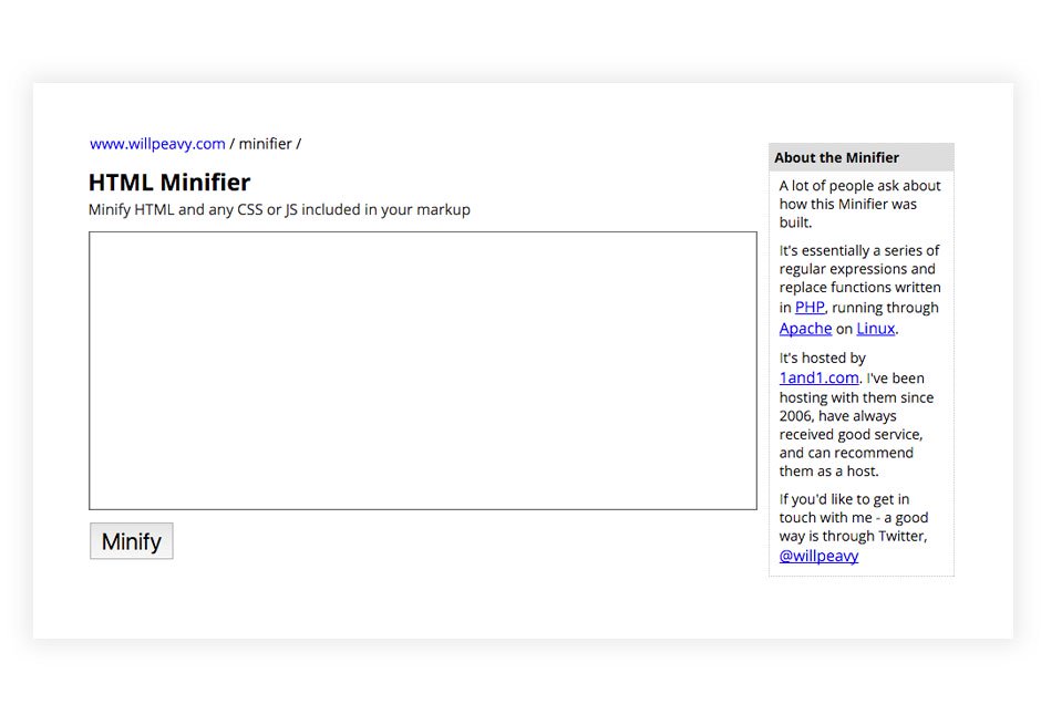
So there are some more glamorous tools like Atomic CSS that are offered, but actually you can get the same bang for your buck by Minifying your CSS the same as when you minify your HTML. Check out Clean-CSS and YUI Compressor library at Yahoo.com or alternatively this online tool will also work.htmlminifier-google-pagespeed-score
2- Minify Your HTML

Start by using WordPress Plug-ins or Online Minify Tools to clean up your HTML code, remove unnecessary comments, new lines and spaces.

3- Minify Your Javascript

This may result in incomprehensible code for you, but trust me, your bytes will be forever grateful if you minify your Javascript with Uglifying tools.

Just look at this before and after below and you’ll see what a big difference this one step can make.

Before being Uglified and Minified:

//this is simply a sample var
var sampleVar = "xyz";

//lots of comments
//this is just another comment
//such things should not be present in javascript
//waiting to see result after uglifying

//this is simply a sample function
function sampleFunction()
{
  var sampleLocalVar = "xzx";
  if(true)
  {
    //inserting some sample comments
    alert("in if block");
  }
  else
  {
    //inserting some sample comments
    alert("in else block");
  }
}

After the Uglifying and Minifying Makeover:

var sampleVar="xyz";function sampleFunction(){var a="xzx";if(true){alert("in if block")}else{alert("in else block")}};

10 – 20 Point Boost by Enabling Compression

Google just came right out and said it; by applying the proper settings in your hosting environment and enabling your gzip compression and you would be able to “reduce the size of the transferred response by up to 90% [reducing] the amount of time to download the resource, reduce data usage for the client, and improve the time to first render of your pages” (See source here). Your PHP server almost definitely falls into either of the two categories, Apache or nginx, both of which have their own ways of enabling gzip compression.

As you may know, most PHP servers use either Apache or nginx to serve their web pages. Naturally then, each calls for different methods of enabling gzip compression in them. Check out this Enabling Compression Guide and give it a try. If you’re having any trouble, let us know in the comment field below and we’ll help you out.

10 – 20 Point Boost with Browser Caching:

Stop holding onto your caching files for long periods of time! It’s time to purge your site of these space holders. According to Google, the majority of all websites only really need one week of caching for frequently changing components and up to one year for static assets. Face it, you’re not Amazon—you don’t need 15 years of caching, keeping your files cached until 2033 (see below). By narrowing down the length of time your files are cached, you will be blown away by the increased speed and performance of your site.logos-google-pagespeed-scoreSee, if you hold onto files for lengthy periods of time what that essentially means is that the file won’t be downloaded again until the information being sent to the User’s browser has been modified. If you change this setting, you will be able to use the cached file rather than wasting unnecessary bandwidth, web connection and server resources, thus directly increasing the loading speed after the initial load.
Think about it this way, you want to expedite the fetching process between client and server as much as possible. Google PageSpeed insights notes that “by specify[ing] a caching policy to help the client determine if and when it can reuse a previously fetched response” you can ensure a quicker rendering of page content, saving both time and money.

For both Apache and nginx servers, you can also prevent outdated files from being cached by using URL-based versioning or changing the names of your files, but before trying that out, be sure to have a backup of your current version of files! These codes may look relatively easy, but one little slip-up and you could end up with a 500 internal server error or nginx service messages on your plate. If that does happen, just ask your server administrator for help.

So once you’ve backed up your files, try this out: “styles.css?v=20151222 or styles_20151222.css”.

If you’re unsure of how to enable browser caching for your Apache server, just add the following lines to your .htaccess file:

<IfModule mod_deflate.c> 
SetOutputFilter DEFLATE 
SetEnvIfNoCase Request_URI  
.(?:gif|jpe?g|png)$ no-gzip dont-vary 
</IfModule> 
<IfModule mod_expires.c> 
ExpiresActive on 
ExpiresByType image/jpg "access 2 month" 
ExpiresByType image/gif "access 2 month" 
ExpiresByType image/jpeg "access 2 month" 
ExpiresByType image/png "access 2 month" 
ExpiresByType text/css "access 2 month"  
ExpiresByType application/x-javascript "access plus 2 month" 
ExpiresByType text/javascript "access plus 2 month" 
ExpiresByType application/javascript "access plus 2 month" 
ExpiresByType image/x-icon "access plus 12 month" 
ExpiresByType image/icon "access plus 12 month" 
ExpiresByType application/x-ico "access plus 12 month" 
ExpiresByType application/ico "access plus 12 month" 
</IfModule>

For nginx servers, you can use this nginx.conf file:

 location ~*  .(jpg|jpeg|png|gif|ico|css|js|woff)$ {
expires 30d;
add_header Pragma public;
try_files $uri @fallback;
}

Okay, final stretch! We’ve covered the big high-point tokens, but every point counts to get you to that 90% mark!

5 – 15 Point Boost by Prioritising Visual Content

If you’re not familiar with the process of prioritising your page-loading scenario, listen up! Having policies in place that prioritise the styles and assets related to the first shot of your website, in most cases the header section and first section of the body, can greatly reduce the amount of time your browser takes to load the rest of the page once your user requests a page.

Sorry to say this may require you to break up your existing layout, but Google PageSpeed Insights will place an eagle eye on this feature, testing the main content of your page to see how you’ve managed your page-loading scenario. So those big CSS and JS files you’ve got in the head section of your page? Well, they’re basically holding up traffic while the page renders.

So what’s the least painful way of dealing with this? While you’re waiting for the finishing page to load, prioritise and insert CSS rules into the head section. Thereafter, unless your theme does it automatically, you’ll need to manually modify the location of the assets from the header to the footer (see below) tag.

Read More at Top Six Tips for a Google PageSpeed Score of 90% or Higher!
Categories: Designing, Others Tags:

Tips for Aligning Icons to Text

May 16th, 2016 No comments

Icons. They’re popular. They help complement content (most of the time). And yet they can be a pain in the neck.

Once you’ve decided on a format (SVG or icon font?) and designed the set, there are still other considerations, many of which pop up while you’re coding.

Here’s an excellent question that comes up often along those lines:

@chriscoyier #smashingconf any recommendations on how to align #svg icons to text?

— Andreas Sahle (@pixelmord) October 20, 2015

Tricky, right? Aligning icons can be a tough task especially if you are not the one charged with designing the icons. I have to be honest and say that I thought this would be a simple question to answer and one that could be done in a tweet. However, there’s much more to finding the perfect alignment between icons and text.

Thankfully, there are a few universal tips we can put to use to ensure our icons always line up beautifully with text.

Tip 1: Decide on an icon format and stick to it

I take for granted that there are other ways to do icons other than SVG. There are actually quite a few methods, if you include ones that might be considered old, as in, “That’s soooo 2011!” A few examples:

Regardless of your preference (cough, SVG, cough!), the format of your icons will have a lot to do with how you align them to text. Let’s say all your icons are contained in a sprite. That means the icons are pretty much set at fixed dimensions (unless you start large and use background-size to scale down) and it would be much easier to adjust the size and line-height of your content to match that of your icons.

The beauty of something like SVG is that it is scalable by nature and affords you the ability to reply more on CSS to help align things rather than the design process.

The lesson here: choose one format for all icons and use that as the basis for how you will approach aligning them to text. Your code will much more maintainable and your designer (or your inner designer) will thank you.

Tip 2: Use similarly sized icons

Here’s an ideal situation: all icons are the exact same size. Let’s say all the icons in a set are 100px square. That tells us exactly how much space we’re dealing with and makes alignment a breeze.

We also know that is not always a practical rule. Icons can take up varying amount of space depending on what we’re communicating.

The map icon is narrower than the avatar icon which is narrower than the cart icon. If you’re like me, then you will eliminate the white space around an icon to ensure the smallest file size possible. That’s great, but now we have icons with different dimensions. That’s a-ok if we’re working with SVG but less desirable for non-vector formats, like PNG. We can tell SVG to occupy a fixed amount of space without losing resolution, but non-vector will stretch and distort the image if we are working with inconsistent dimensions.

The right thing to do here is to match your icon design specs to the format being used. If using SVG, then the icon can be any size, but try to use a consistently sized art board in Illustrator (or your design tool of choice). This will help keep future icons in the set to scale.

If using non-vector, then always use the same dimensions. The icons may differ in how much space they occupy, but it will ensure your icons are always crisp and proportional, regardless of the text next to it.

Tip 3: Match your font-size to the size of the icon set

Icons ought to be treated a lot like typography. They’re either used in conjunction with text or in place of it, so setting the size of the icon to the size of the text next to it is important for the same reason we like consistently sized letters: legibility.

This doesn’t mean icons need to be 16px if your content font size is also 16px. What it means is being aware of the font size and making sure your icons complement it nicely, whether it is larger, the same size, or smaller than the the text.

Here’s an illustration of the difference between an icon that has been aligned nicely to the size of the content versus one that has not.

See the Pen MyxBrQ by CSS-Tricks (@css-tricks) on CodePen.

The example on the left is much more consistent with the content font size and has better alignment than the right, despite both examples technically being aligned.

Tip 4: Use CSS to fine tune the appearance

When all is said and done, there is a solid and simple recipe for getting icons exactly where you want to line up with text:

.icon {
  position: relative;
  /* Adjust these values accordingly */
  top: 5px;
  left: 5px;
}

That is the difference between icons that look in perfect alignment with text and icons that look slightly off.

See the Pen YqBdxx by CSS-Tricks (@css-tricks) on CodePen.

Tip 5: Use class names for specific icons

The example above is great but you may have noticed that the location icon looks so gosh darn narrow and even further from the text labels than the music note. How annoying!

This is where CSS on a per-icon basis can bail us out.

<ul>
  <li><svg class="icon-user"><use xlink:href="#icon-user"></use></svg> Weezer</li>
  <li><svg class="icon-location"><use xlink:href="#icon-location"></use></svg> Santa Monica</li>
  <li><svg class="icon-music"><use xlink:href="#icon-music"></use></svg> Discography</li>
  <li><svg class="icon-sphere"><use xlink:href="#icon-sphere"></use></svg> weezer.com</li>
  <li><svg class="icon-cart"><use xlink:href="#icon-cart"></use></svg> Artist Store</li>
</ul>
/* Match any class name that starts with icon */
[class^="icon"] {
  width: 50px;
  height: 50px;
  position: relative;
  top: 15px;
  margin-right: 10px;
  fill: #fff;
}

/* Reposition the music note icon */
.icon-music {
  right: 5px;
}

Phew, that’s much nicer!
See the Pen QNoBVq by CSS-Tricks (@css-tricks) on CodePen.

Wrapping Up

If there’s a lot more to aligning icons to text than you expected, then you are not alone. The simple answer is that it really depends on what method you choose to create the icons. The CSS is pretty straightforward from there.

The answer to this question inly pertained to text but there are other elements where aligning icons comes into play, such as buttons, form fields, navigation and probably many other things. I mean, what about responsive designs, right?! Regardless of the scenario, I find that the five tips we covered here get me out of the weeds.


Tips for Aligning Icons to Text is a post from CSS-Tricks

Categories: Designing, Others Tags:

The best new portfolio sites, May 2016

May 16th, 2016 No comments

Hello readers, and welcome back. This month, we have lots of white space, minimalism, and absolutely no jokes related to the name of the month.

Really, though. It feels like the bright colors of Spring have passed, and people are using Winter tones as a sort of wishful thinking. I live in Mexico, so I’m on bored with this.

Note: I’m judging these sites by how good they look to me. If they’re creative and original, or classic but really well-done, it’s all good to me. Sometimes, UX suffers, for example many of these sites depend on JavaScript to display their content at all; this is a Bad Idea™ kids.

If you want to be included in next month’s roundup, contact me at [ezequiel@webdesignerdepot.com.

CIGA

CIGA is a branding, web, and graphic design studio. Their style of work is certainly familiar, yet it is also distinct. The same can be said of their site. It’s pretty, it’s simple, and it’s pretty good.

The only real flaw I can find (besides the inevitable JavaScript dependency), is that the placeholder text for the contact form inputs doesn’t show up right in FireFox… at least not for me.

Slayter

This month will bring us a few lovely, minimalist, asymmetrical designs. Slayter is but the first. Though the low contrast could be an issue for some, the site combines typography and gratuitous white space in a way that makes me happy in my soul.

Brian Li

Speaking of white space, Brian Li’s site goes all out with a huge chunk of it right at the top of his one-page portfolio. And I do mean white space. There’s no background color, no imagery, nothing.

The rest of his site is as professional as anyone can expect, but that big bunch of empty space at the top tells you a lot about his aesthetic style right off the bat.

Sadok

Sadok’s portfolio is, in some ways, a list of trends. It has big text, big pictures, and horizontal-and-vertical-scrolling parallax portfolio (don’t ask, just check it out and watch your scrollbar).

I find I don’t mind all of that, though, because it just looks that good, it runs smoothly, and his beard is lit with the light of the stars. No, really, I could watch that for a while.

Splinter Teal

You can tell that Konrad, the designer behind Splinter Teal had a very specific theme in mind when he named his company, and designed its site. The layout, imagery, and copy all scream “professional web designer”, but that heading font and animation says, “I’m probably a secret agent.”

Xavier Bourdil

Xavier Bourdil’s site shows you previews of his work on the right as you hover over the title on the left. It’s an effect that, despite my aversion to depending on JavaScript for anything essential, I really like.

Combined with elegant typography, animation that draws attention without being gaudy, and plenty of white space, I couldn’t help but like just browsing around this one.

Eurodance

Eurodance is a photography studio with minimalist work, and a matching site design. The whole of the browsing experience is clicking on things you like, then scrolling down, as it should be. Instead of fighting this principle of the web, as many portfolio sites do, Eurodance has embraced it whole-heartedly.

The only issue is the way they hid the contact info. You have to think of clicking on the logo to find it, and that doesn’t make any sense to me.

Nation Studio

Nation Studio’s site is simple, bold, and blue. Well, blue on white with some greenish… but whatever the case, there is a limited color palette at play, and it’s stylish. Even the imagery and animated backgrounds have had their colors pared down to the brand’s colors with one technique or another.

Combined with a solid, full-screen responsive layout and big typography, it’s a good look.

Prime Studio

“Cutting out” images of physical products and sticking them onto a plain background is one of the oldest graphic design trends… ever. But Prime makes it look great, and they should know how.

Product design is kind of their specialty.

The entire design of the site is geared toward giving the objects depicted an almost physical presence. They want you to feel like you could reach out and touch them. I’d say they’ve accomplished just that.

Confederation Studio

Confederation Studio’s site is big, simple, and beautiful. There’s nothing too unusual about it in terms of layout, but the imagery is good, the illustrations are better, and the whole thing is just… good. Also, they really do make pastels work for them.

FCINQ

FCINQ is a collection of 30 designers, animators, and artists, and their expertise is clearly shown off in their own website. Things are, perhaps, a bit more cramped together than I’d usually like, and it can be hard to pick which of the many images to focus on first, but this is an excellent example of the way a company’s brand can and should permeate every aspect of a site.

Woody Gooch

Besides having a name that’s really fun to say, Woody Gooch has a passion and a gift for taking photos of surfers in action. As you browse through the site, you are never shown more than one photo at a time (unless you choose the grid view specifically), allowing you to get the full effect of each one.

Snøhetta

Another beautiful example of asymmetrical design, Snøhetta approaches the portfolio as something of a collage. Mind you, this effect is reserved for the home-page only. They keep a good balance between their artistic sense and usability by providing a more structured overview of their work in the Projects section.

Irradié

Irradié brings us another full-page masonry-style, after the initial full-screen page section. This is another site that lets the imagery do the talking.

I will note that the text in each of the four corners at the beginning of the home page might be mistaken for navigation links (I’ve previously featured a site or two where that featured navigation in the corners). Clicking on them only to have nothing happen gave me a moment of confusion.

Otherwise, this site is a paragon of modern minimalist design.

Mambo Mambo

Mambo Mambo’s portfolio is perhaps the most colorful site on our list this month. They complement their eclectic sense of style with bits of cursive writing, beach-themed imagery, and one picture of a chihuahua. One need only take a look at their work, however, to know that they are versatile and can handle just about any work.

Xavier Truant

Xavier Truant’s portfolio complements his quirky, modern illustrations with an asymmetrical masonry layout. Bold serifs handle the little text that is necessary on a site like this, so everything is kept simple, and just out-of-balance enough to be stylish, without being distracting.

Ryan Garber

Ryan Garber’s photography portfolio keeps things dead-simple with a big image gallery on the home page. I like the way the title of each project is overlaid on the whole page when you hover over an image, but I wish he’d picked a color with better contrast. The black text tends to sort of disappear into some of the photos.

Studio Naam

Studio Naam’s site has gone and embraced thin letters in a big way. They’re used for headings, body text, and input elements. The typographic consistency works beautifully with the largely monochromatic design to create an feeling of both professionalism and sophistication.

Dogma

I’ll not lie. I like it when sites like Dogma just use enough text to tell the user what’s going on, and then let the images do the rest of the talking. I also love full-screen, dead-simple layouts.

I don’t love that I appear to just be saying the same thing over and over. Still, go see their site. It’s good, their work is good, you won’t regret it.

Marcus Eriksson

Marcus Eriksson’s portfolio consists of just two things: the all-important photography, and his contact info. That simplicity makes a great start, but I fell in love with the way the layout of the photo gallery seems to sort of zig-zag back and forth down the page as you scroll.

Tobias Thaden

Tobias Thaden goes all out with his portfolio by showing a full case study right under the hero-slideshow thing. If you like what you see, the site leads you deeper into his work, showing off one case study at a time.

Andy Hook

Andy Hook’s portfolio is another one that’s clean, simple, good. Nothing revolutionary, but still worth a look. If you need inspiration on how to present your work, this is a good place to start.

Austin Weight

The thing that really separates one minimalist portfolio site from the next is attention to detail. In Austin Weight’s case, those details are all in the low-key animation he uses.

Okay, so the constantly changing logo-thing is distracting me even as I write this. But go scroll over his work. Watch how the details slide in based on where your cursor hits the image. It’s all about those little touches, sometimes.

Ultimate Universe Bundle: 100+ Breathtaking Design Elements – only $18!

Source

Categories: Designing, Others Tags:

Content Strategies to Increase E-Commerce Success

May 16th, 2016 No comments
Content Strategies

Today’s article is about content strategies for online shops. In this post, we’ll tell you why it is wise to think long-term and goal-focused as an online shop, as well as which content strategies are recommendable to generate more traffic and achieve success.

The Basics of Long-term Content Marketing

The foundation of successful content marketing is usually created with a strategic placement of the shop on the market, a clear USP, and by communicating this USP through ads and other means of marketing communication. The brand itself should already be established on the market as well. Individual content marketing on this basis can boost authority and strengthen the brand.

Furthermore, the target audience should be defined. Only those that know their customers, and target them appropriately, can achieve significant success with marketing measures.

However, knowing your customers is not always an advantage, the opposite could also be the case. The potential clients can only build trust, and recognize the expertise behind the shop when they know who runs it. This can be done by informing your target audience with professional and trustworthy content, and by delivering expert knowledge on the branch on a regular basis. This way, you show that you are an expert on the topic, and, at the same time, you strengthen the bindings of your customers to your assortment. Regular blog posts and insights that report from the daily work routine (for example a post with images of the business’ Christmas party) help you build trust and underline your team’s humaneness.

Building on these basic marketing activities, there are several fitting content strategies that are authentic and convincing with true added value. In the following, we’ve collected some essential content strategies.

Content Marketing With a Strategy: How to Increase Your Traffic!

Strategy 1: Product Descriptions That Raise Excitement

Product descriptions might be toilsome, but their effects are certainly worth it. With an informative product description, you can display your every product as positive as possible. You should answer all questions on the product, directly communicate the asked-for information, and provide a decision-making help when it comes to the purchase. You should definitely avoid lists in note form as well as duplicate content. To strengthen trust, and to set yourself apart from the competition, you should include manufacturer or product information.

Strategy 2: Category Texts With Outlasting Information

Present a product assortment to your website visitors, inform them about offers, and strengthen the internal link structure of the shop using optimized category texts. Category texts can be characterized to be durable and informative, and are used for optimization, as well as the improvement of the usability.

Strategy 3: Provide Helpful Answers and Tips in a Blog or Guide

Internet users are always searching for information and solutions that can help them in their everyday life. All thinkable problems ranging from “how to get fuller hair” to “guide to the installation of program XY” are possible. Think about your assortment and put yourself into the user’s position. Which product-related or general questions come to mind? Authentic and informative solutions display a chance to convince shop visitors. On top of that, varied guides and articles that are commented and liked increase the social media presence of your business.

Strategy 4: Expert Knowledge From A-Z

The expertise is not only underlined by guides or blog posts: indices and lexica with helpful word explanations that suit the shop assortment’s branch can provide real added value and convince the visitors. The information boosts the trust in the store, and at the same time, the most relevant keywords can be covered. Another good alternative would be an FAQ area, which lists the most important customer questions. These relevant issues can be chosen from past customer questions, as well as from research results in forums, as common questions can increase the traffic significantly because the people that are looking for an answer to said question will end up in the shop as well.

Strategy 5: Binding Customers With Quality Content and Improving Rankings

Quality content with a diverse design, e.g. with a good mix of text, images, and videos, binds users. It increases the visit duration and lowers the bounce rate. According to the user behavior, Google can draw conclusions about your content’s relevance. Thus, your ranking can increase when the visit duration increases, putting the page at a higher spot in the search results, which will then be followed by increased visitor traffic.

Strategy 6: Finally, You Should Always Combine Variety and Dynamics

Not just the content should be diverse; you should also use different channels for its distribution.

Using a Combination of the Following Channels is Very Promising:
  • Corporate blog that is accessible directly from the online shop (via subdomain, for example)
  • Ebooks in PDF format that are available as a (free) download
  • Posts on Facebook and Google+, that are geared with each other
  • Videos on Youtube, that address potential customers on an emotional level

(dpe)

Categories: Others Tags:

Creating A Living Style Guide: A Case Study

May 16th, 2016 No comments

Living style guides are an important tool for web development today, especially in large, complex web applications. They help document styles and patterns, keep designers and developers in sync, and greatly help to organize and distill complex interfaces. Indeed, living style guides remain one of the best ways to communicate design standards to an organization.

Creating A Living Style Guide: A Case Study

Recently, our company went through the process of creating a living style guide. This is the story of how we developed our living style guide, the mistakes we made along the way, and why the current landscape of style guide generators did not suit our needs.

The post Creating A Living Style Guide: A Case Study appeared first on Smashing Magazine.

Categories: Others Tags:

8 Fresh Free Fonts for Your Designs

May 15th, 2016 No comments
fonts07

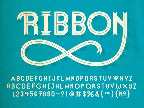
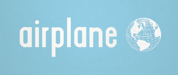
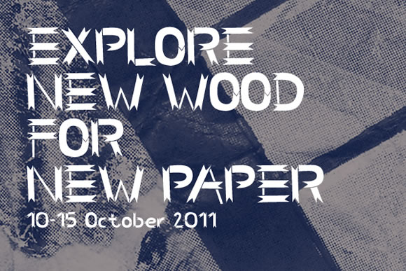
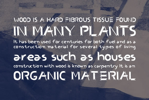
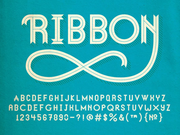
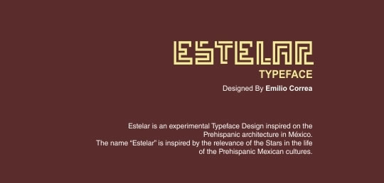
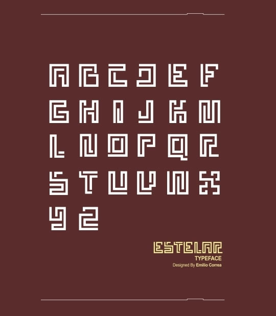
Here at WDL we love to hunt down nice freebies for our readers… and one of our favorites freebies to find are fonts. Since we know that a fresh font is always a great asset to any designer, here are a few new fonts to spice up your designs. Click at the images to go to each website to download the fonts, enjoy!

Bohema

New Fonts

Airplane

New Fonts

Homestead

New Fonts

CS Benwood

New Fonts
New Fonts

Ribbon

New Fonts

Estelar

New Fonts
New Fonts

RBNo2

New Fonts

Collator

New Fonts

Read More at 8 Fresh Free Fonts for Your Designs

Categories: Designing, Others Tags:

Popular design news of the week: May 9, 2016 – May 15, 2016

May 15th, 2016 No comments

Every week users submit a lot of interesting stuff on our sister site Webdesigner News, highlighting great content from around the web that can be of interest to web designers.

The best way to keep track of all the great stories and news being posted is simply to check out the Webdesigner News site, however, in case you missed some here’s a quick and useful compilation of the most popular designer news that we curated from the past week.

Note that this is only a very small selection of the links that were posted, so don’t miss out and subscribe to our newsletter and follow the site daily for all the news.

How to Design a Daring but Effective Split-Screen Layout

Google is Messing Around with the Color of its Search Results Links

17 Things People Absolutely Hate About your Website

The Designer of the Old Instagram Logo on the New One

A Free Browser Built for Browser-Based Development

How to Present Web Design to Clients like a Pro

80s Apple Beige Making a Comeback

Let’s Write Beautiful CSS Comments

Design Showcase: French Design

9 Ways to Boost Conversions on Landing Pages

The 36 Best Free Web Fonts

Make Better Logos

Optimizing for Large-Scale Displays

Why a Perpetual Learner Beats a Fancy CV Anyday

Facebook is Building AI that Can Build AI

The Information Age is Over, Welcome to the Experience Age

How Instagram Designed their New App Icon

Resource Cards – Selected Free Resources for Designers

The Secret of Creativity: Procrastination

JavaScript Conquered the Web. Now It’s Taking Over the Desktop

Saving Lives with Typography

What your Font Choice Says About You

Building Prototypes Content-First

Complete Beginner’s Guide to UX Research

Embracing Fluid Typography

Want more? No problem! Keep track of top design news from around the web with Webdesigner News.

Unlimited HD Motion Graphic Clips, Animations and Footage – only $19!

Source

Categories: Designing, Others Tags:

Cartoon: In Ten Years From Now

May 15th, 2016 No comments
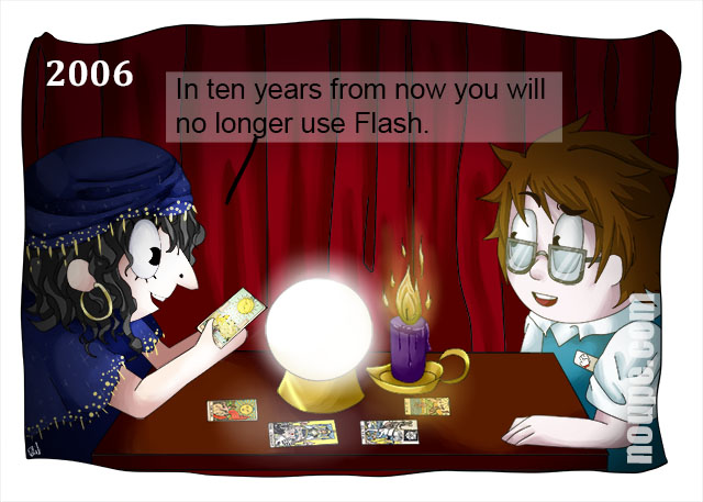
Cartoon: In Ten Years From Now

Today I refuse to work with any new tool that takes more than a little effort to learn it. The reason is simple. In the last 25 years of building web experiences for clients, I have learned one thing for sure. You never stop learning, and each new tool has a life span that’s shorter than that of the average mayfly. Putting too much effort into any tool is wasted time in the longer run, nowadays. In the past things were quite different.

Do you remember the days when Macromedia Flash was the next big thing? Okay, the browsers needed a plugin, and that was an obstacle at first. But after a relatively short while, almost any browser out there had been voluntarily equipped with the infamous Flash plugin and developing for it became a mega trend. Right from the start developing for Flash had absolutely nothing to do with web standards. Not at all. But still it made its way. Let me know what you think in the comments below.

There were even agencies who built their whole business model on Flash and specialized as much as they could. Where are these today? Flash is a good example of how a bad concept became way more successful than it should have. Its extinction was in its DNA right from the beginning. Anyway, should our fortuneteller have made this prediction ten years ago, you might have probably laughed about it.

Let me know what you think in the comments below. Were you one of those Flash developers that made everything move for no deeper sense at all?

By the way, we have many more cartoons for you here.

Categories: Others Tags:

17 Examples of Beautiful Typography in Web Design

May 15th, 2016 No comments
typography04

Back in May we showcased here 19 Inspiring Examples of Text Over Images in Web Design and we had a really good response on the designs we featured. So for this post, type will take the center stage again. This time showing you beautiful ways to draw attention to your text. We will show you more examples of text over images, and also other approaches to making beautiful typography in web design. From pretty clean and simple designs to colorful and bold ones, there are certainly some good type inspiration here to spark your imagination.

Dassel Und Wagner

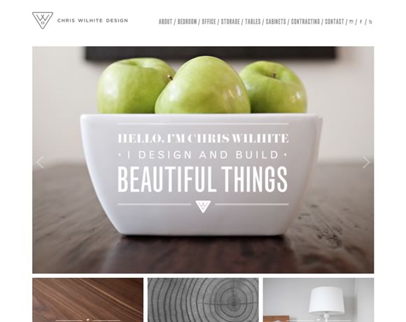
Chris Wilhite

17 Examples of Beautiful Typography use in Web Design

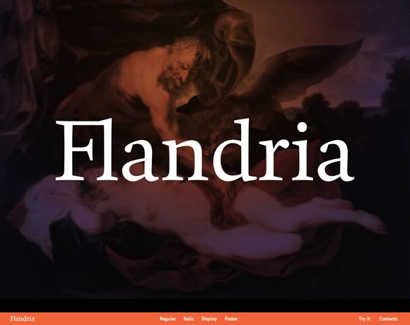
Flandria Type

17 Examples of Beautiful Typography use in Web Design

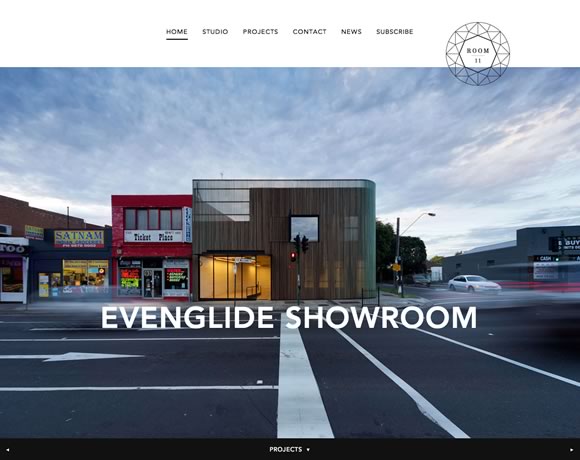
Room 11

17 Examples of Beautiful Typography use in Web Design

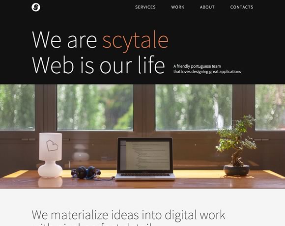
Scytale

17 Examples of Beautiful Typography use in Web Design

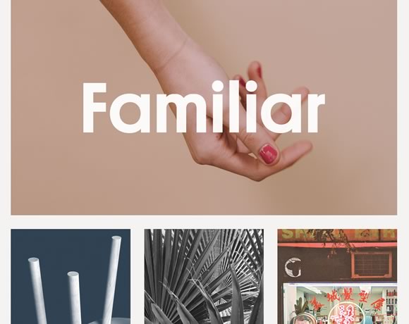
Familiar

17 Examples of Beautiful Typography use in Web Design

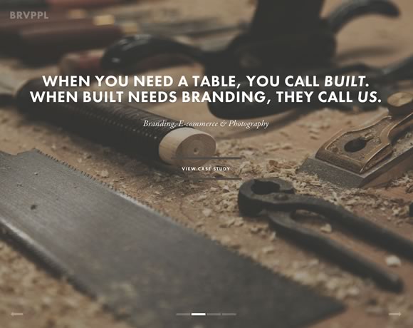
Brave People

17 Examples of Beautiful Typography use in Web Design

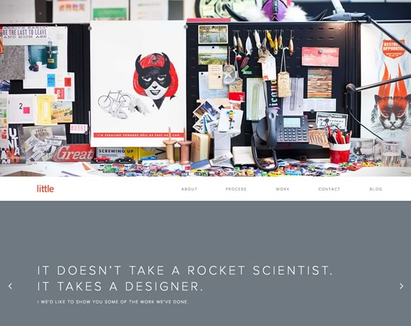
Little

17 Examples of Beautiful Typography use in Web Design

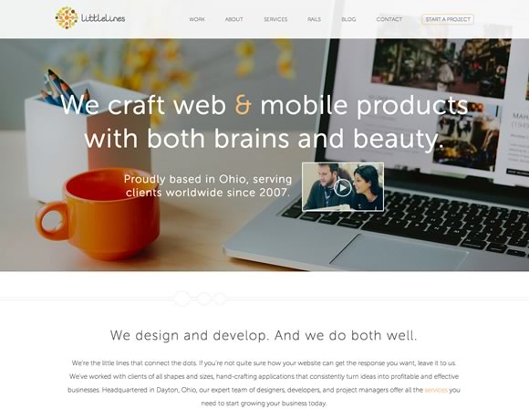
Littlelines

17 Examples of Beautiful Typography use in Web Design

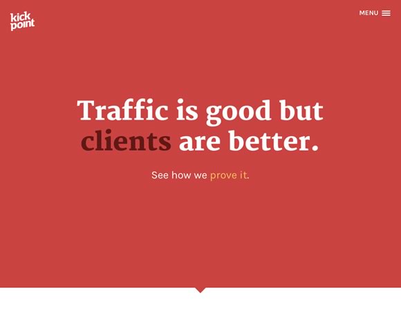
Kick Point

17 Examples of Beautiful Typography use in Web Design

Whiteboard

17 Examples of Beautiful Typography use in Web Design

Risk Everything

17 Examples of Beautiful Typography use in Web Design

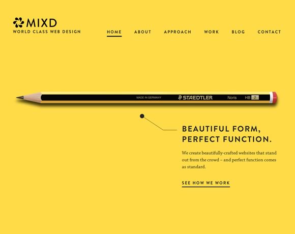
Mixd

17 Examples of Beautiful Typography use in Web Design

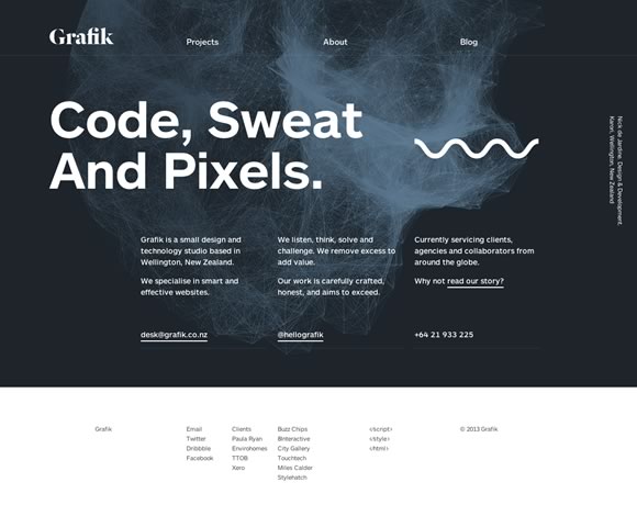
Grafik

17 Examples of Beautiful Typography use in Web Design

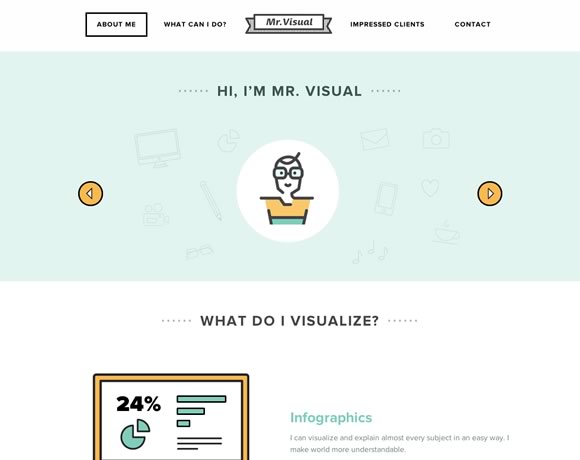
Mr. Visual

17 Examples of Beautiful Typography use in Web Design

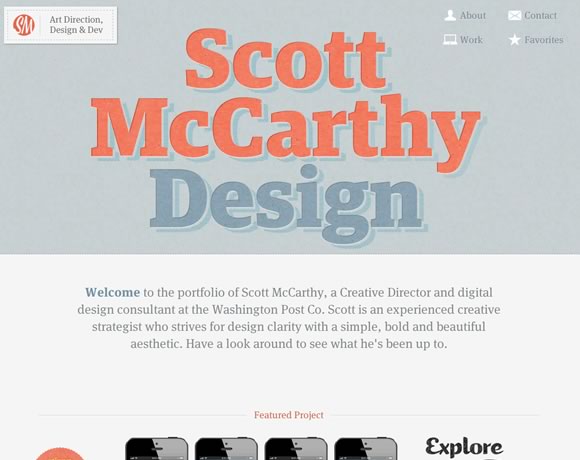
Scott McCarthy Design

17 Examples of Beautiful Typography use in Web Design

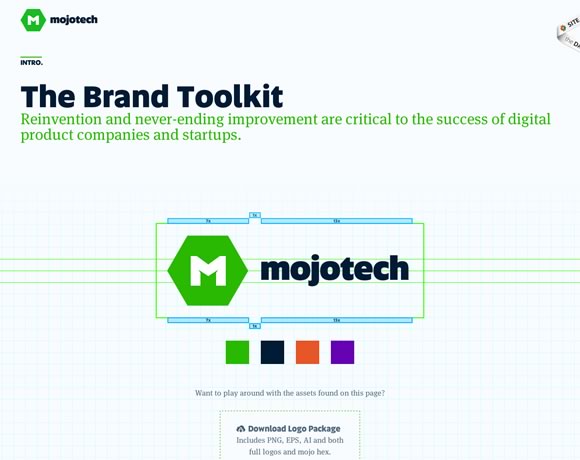
MojoTech – Brand Toolkit

17 Examples of Beautiful Typography use in Web Design

Read More at 17 Examples of Beautiful Typography in Web Design

Categories: Designing, Others Tags:

Comics of the week #339

May 14th, 2016 No comments

Every week we feature a set of comics created exclusively for WDD.

The content revolves around web design, blogging and funny situations that we encounter in our daily lives as designers.

These great cartoons are created by Jerry King, an award-winning cartoonist who’s one of the most published, prolific and versatile cartoonists in the world today.

So for a few moments, take a break from your daily routine, have a laugh and enjoy these funny cartoons.

Feel free to leave your comments and suggestions below as well as any related stories of your own…

Creeping doubt

An old problem

An easy solution

Can you relate to these situations? Please share your funny stories and comments below…

Slabs Condensed Font Family Bundle (10 Typefaces) – only $9!

Source

Categories: Designing, Others Tags: