Archive

Archive for May, 2016

SEO: 7 Rules of Thumb for Internal Links

May 14th, 2016 No comments
SEO: 7 Rules of Thumb for Internal Links

Internal linking is a great tool for any website owner, but its potential often is not maxed out. Thus, this article is supposed to give you an overview of the advantages on well thought-out internal links, as well as a couple of rules of thumb.

Internal Links and Their Purpose

Internal links, which are placed in the main menu, create an additional navigation option within the website, for both the users as well as the search engine’s crawlers. The internal links allow the user to quickly access the relevant pages. At the same time, a smart link structure shows the crawler which content on the website is the most important.

The second aspect could easily make you place as many internal links as possible, but that behavior will cause a conflict when looking closer at it. The user wants to find links that are relevant at that moment, meaning a connection to the content that he’s currently dealing with. If you randomly place links on the target pages, this will not be the case, as the chance of creating off-topic connections is high.

In general, you can say that the user should always be in focus when it comes to a conflict between optimization for the user, and optimization for the search engine. Thus, the first rule for internal links is the following:

1. Internal links have to be relevant to the topic, and should only exceed the topic border when the connection is logical.

To find appropriate connections, you should ask yourself which pages could be helpful for the user, and when in doubt, leave the link out.

To assure that the user can make optimal use of the alternative navigation, the links should be recognizable as such. While this highlighting is only a piece of advice for the user, it is a necessity for the search engine. As missing highlighting of a link is against the Google guidelines, the following applies:

2. Internal links have to be marked.

This can be done by underlining, changing the color, or similar highlighting.

The second advantage of internal links is that the crawler receives an overview of the most relevant keywords, as well as categorizing help of the target page from the anchor text before visiting them. The result:

3. The anchor text of an internal link should describe the target page as good as possible.

Here, using money keywords is recommendable, as they allow you to describe the link destination in the most accurate way. On a high amount of links, you should vary between money keywords, and other keyword groups, however.

Example:

Keyword Group Keyword Example
Money Keywords Audi A3, A3, the new Audi, Audi A3 Variant, …
Brand Keywords Audi, Audi AG, audi.com …
Compound Keywords Introduction of the new A3 by Audi …
Other Read our review of the new Audi A3 here

When it comes to external links, you should be careful, as using money keywords is rated negatively there.

It is a known fact that external links are an important ranking factor for Google. When a high-quality website links another page, this will positively affect the ranking of the latter. Of course, there are many sub-pages of a website, that are not linked to by external links, and thus, they can’t benefit from the strong quality signal.

Here is where the internal linking comes into play again, as the power that a page receives by a link directed to it can be transferred to any desired target by placing an internal link on it. This power is also called link juice. This way of distribution allows you to power up landing pages as well. The link juice inherited via internal links can be passed on through further internal linkings.

When placing the links, it is important to make sure that the most relevant pages get the biggest share of link juice, as otherwise, it can happen that sub-pages with similar keywords compete with each other in ranking.

4. The internal link structure should result in a clear prioritization of sub-pages.

To not lose the overview, you can create a table with prioritized topics, categories, or products, for example:

Priority 1 Audi #1: A3
#2: A6
#3: …
Priority 2 BMW #1: 316
#2: 520
#3: …
Priority 3 Volkswagen #1: Beetle
#2: Touareg
#3: …

However, you shouldn’t place too many links, as the power of a sub-page is distributed to all links that are placed on it. With an increasing number of links, each individual link becomes weaker. The correct link count on a sub-page depends on the size of the website. For instance, an average value for a shop’s product overview page is 300 to 400 internal links. If there are too many links, using pagination pages is recommendable. For a flowing text on a sub-page, the average is two to 10. Overall, you should stick to the following rule:

5. Only place as many internal links as necessary for a proper navigation.

Because of the distribution of link juice, I strongly disadvise from linking the same target on one content page multiple times. Due to the additional connections, all links on the page are weakened. At the same time, however, the search engine only counts the first link to a page, meaning that you lose valuable link juice.

6. A link to a specific target should only be placed once on a sub-page. Exception: When linking the same destination multiple times drastically improves the usability.

Additionally, you need to keep in mind that the internal links on a sub-page are rated differently by Google. The higher the chances of the user clicking the link, the better it will be rated. Links that are within the important content of the page have a much larger influence than links in the footer.

7. You should pay attention to a sensible placement of internal links.

As you can see, the topic “internal linking” comes with a variety of trip hazards. Aside from the mentioned aspects, a small negligence can cost valuable link power. Thus, to finish this article off, here’s an overview of mistakes that can be avoided easily:

  • Internal nofollow links: the transferred link juice is not counted.
  • Links to 404 pages, aka broken links: the link juice is led into the void.
  • Links to 302 redirections: the link juice is not passed on.
  • Placing canonical tags on paginated product overview pages that link to page 1: the links on the following pages are not counted anymore.

Although internal linking is a complex topic, it is a must for every page owner to deal with and make use of its high potential.

(dpe)

Categories: Others Tags:

Common Typography Mistakes: Apostrophes Versus Quotation Marks

May 14th, 2016 No comments
apostrophe-quotation-marks-01

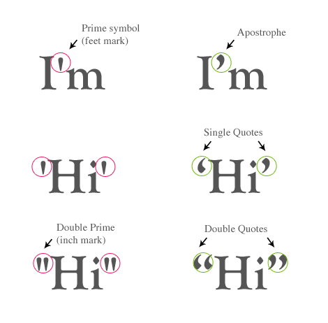
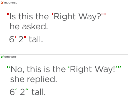
A common mistake in typography is the use of apostrophes instead of quotation marks. A lot of people just get the two confused, using double apostrophes instead of actual quotation marks. It’s hard to mistake it the other way around, but it will be worth your while to learn the differences.

Apostrophes Versus Quotation Marks

Quotation Marks

Quotation Marks

Via Typographic literacy

Quotation marks, or quotes, are used in punctuation to emphasize a phrase or word or to indicate speech. There are four types of quotation marks: single open, single closed, double open, or double closed.

Opening quotations look like tiny little sixes, while the closing quotations look like nines. Most word-processing programs change them automatically, but always double check when you’re done.

Example of single quotation use:

“Henry said, ‘good morning,’ this morning,” said Ben.

Examples of double quotation use:

The doctor said, “Take your vitamins.”

“Oh, my gosh!” said the woman.

The apostrophe

One of the correct uses of an apostrophe is to show the possession of something. For example, “Sally’s ice cream” is the proper use of an apostrophe to indicate the ice cream belongs to Sally. You can also use apostrophes to form contractions. Not like the kind women get when giving birth, but the kind that makes “do not” into “don’t.”

Examples of contractions:

  • I am to I’m.
  • Do not to don’t.
  • You are to you’re.
  • It is to it’s.

Examples of proper apostrophe use:

  • That is Stephen’s chair.
  • John’s in the hospital.

You get the idea, but it’s good to memorize these if you’re weak in this area of grammar. Another thing you should know about apostrophes is that they are not the same as prime symbols or accent marks.

The Apostrophe and Prime Symbol

The Apostrophe and Prime Symbol

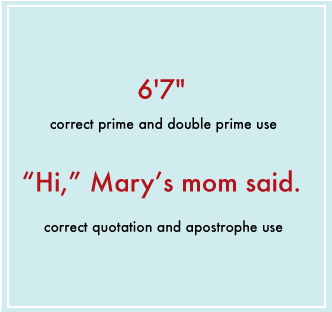
Another very common mistake in typography punctuation is using the prime symbol in place of apostrophes. The prime symbol ( ‘ ) looks similar to the apostrophe, but you should use it in mathematics and measurements. For example, 5? means 5 feet, and 2′ ‘ means 2 inches. Depending on the font you use, it can be impossible to tell the difference. But, you might be using a font that makes it painfully obvious. Check and double check all your apostrophes, prime symbols, and quotation marks. No matter how amazing your typography turns out to be, a little mistake like this can ruin the work.

Ditto marks

Apostrophes Versus Quotation Marks

You may be asking yourself right now, “What the heck is a ditto mark?” A ditto mark looks like this ( ? ). It indicates that the line you are on is a repeat of the one above. The word “ditto” literally means “same as before” or “repeat.” The truth is, double quotation marks are usually used in the place of actual ditto marks. But again, it will show if you are using certain types of font.

For example:

Goat for sale …. $10
Sheep for sale …. ?

The sheep is the same price as the goat, $10.
In most cases, you can remember the difference between apostrophes and quotation marks by looking at their purpose in the text. If you are making a contraction or showing possession, use the apostrophe. If you are quoting someone, use quotation marks.

Sonia Mansfield is the content editor for PsPrint and editor of PsPrint Blog. PsPrint is an online printing solutions company, which you can follow on Twitter and Facebook.

Read More at Common Typography Mistakes: Apostrophes Versus Quotation Marks

Categories: Designing, Others Tags:

Learn the Basics of Adobe XD

May 13th, 2016 No comments
Adobe XD (Preview) The Basics of Adobe Experience Design

Let’s take a look at some of the tools available in the preview build of Adobe Experience Design CC (Adobe XD).

Adobe XD Overview

Select a Document Type
From the Adobe XD Start Screen, select from a number of different mobile, tablet and desktop devices. Alternatively, you can specify the width and height for your own custom size.

The Tools

adobe-xd-tools
Adobe XD currently offers several tools to draw and create a variety of different shapes. These are as follows:

  • Arrow Tool – the primary tool used to select different objects within Adobe XD.
  • Rectangle Tool – can be used to draw four-sided shapes, including squares and rectangles.
  • Ellipse Tool – can be used to draw ellipses and circles.
  • Line Tool – used to draw straight lines, allowing the user to also specify the width.
  • Pen Tool – can be used to draw custom shapes, consisting of both straight and curved lines.
  • Text Tool – can be used to create individual lines of text, or create text boxes that can contain larger paragraphs of text.
  • Artboard Tool – can be used to move and edit existing artboards, or create new artboards using either custom or preset sizes.

Aligning Objects

adobe-xd-align-options
Adobe XD offers a variety of alignment options. These include (horizontally and vertically) left aligning, centre aligning, and right aligning. Multiple shapes can also be distributed an equal distance apart, either horizontally or vertically using these options.

Creating a Repeat Grid
The Repeat Grid Tool can be used to repeat content horizontally or vertically, whilst retaining a consistent format across specific elements.

Merging & Combining Shapes
Adobe XD offers several options when combining and subtracting shapes from one another. These are as follows:

  • Add – combines the selected shapes together into one shape.
  • Subtract – removes (knocks out) the top shape from the shape below.
  • Intersect – the space where two shapes overlap will be retained.
  • Exclude Overlap – the space where two shapes overlap is removed (knocked out).

Modifying Shapes

adobe-xd-modifying-shapes

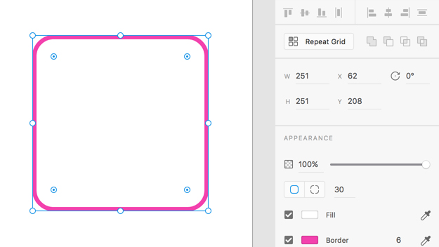
  • The width and height of objects can be specified.
  • The ‘x’ and ‘y’ position of an object can be specified, to determine where the object is positioned within the artboard.
  • The rotation for an object can be specified. Shapes can be rotated anywhere from 0-360 degrees.

Appearance Options

  • The Opacity/Transparency of objects can be adjusted from 0-100% using the slider.
  • The Corner Radius of a shape can be adjusted here; either the radius for all corners can be adjusted equally, or the radius can be specified for individual corners.
  • The Fill colour for objects can be specified, or selected from within the document using the Eyedropper Tool.
  • The Border colour for objects can be specified, or selected from within the document using the Eyedropper Tool. The Border width can also be specified.
  • The Shadow colour and opacity for objects can be specified. The ‘x’ and ‘y’ position of the shadow can also be adjusted, as well as the amount of blur that can be used to soften the shadow.

Read More at Learn the Basics of Adobe XD

Categories: Designing, Others Tags:

UX Design Tips to Boost Conversion Rates Up to 2x

May 13th, 2016 No comments
shutterstock_226806919
Every website owner often asks a question to himself/herself, “How can I improve my intended conversion rates?” Well, it’s a licit question to ask when you are into some business and rely on your website.

Several CMS based web platform allows easy site management and great customization power to its owners. Therefore, it has become the highly preferred platform for companies to rely for having a website.

However, earlier, people consider this platform suitable for blogs only. But, with the passage of time, technological advancement, and constant researches by numerous developers worldwide has explored its power to utilize this platform to its maximum.

No need to worry, some little tweaks and alterations in your website theme can do what you expect. And, I am here to give an answer to your “How.” But, before jumping on to the answer, first, understand about the conversion rate.

People engaged in different business set various goals for a specific timeline. Goals like get 1000 forms filled in 5 days, sell the first lot of product in the first week, and so on. Website designs or landing pages are created with the vision to meet that intended goal in the desired timeline.

A nicely-designed website is worthless until it achieve the desired conversion rate. So, to make it worthwhile for your business, let’s get started.

Humanize Your Site

bigstock-A-red-nametag-sticker-with-wor-46050472

Irrespective of the fact what kind of business you possess; every website is primarily designed with some common objectives:

• Boost website visits
• Grab and hold visitors
• Provide them something valuable to earn trust
• Convert visitors into permanent customers

Here, a question arises to the mind that how you can make your site notable so that first-time visitors would love to visit your site again. Well, it’s by providing a real-life touch to your site. Humanizing any website is a process of adding emotionally intelligent interactions that help you to build a great fan following for your site.

Being engaged in business, you need to be smart, and an intelligent entrepreneur first identifies how their buyers purchase and what they are looking for?

If you recognize the taste of your audience, then you have won half of the battle. You apply those insights into your website design to get it as per your buyers’ intent as it will make your site more appealing and authentic in their eyes. Your buyers will psychologically feel connect to your site with the hope their search ends at your website.

To know more about sites that offer emotionally intelligent interactions, you can go through this must-read link of Little Big Details.

Be Content Focused

Content is the only medium by which you can deliver the real value to your visitors and buyers. Therefore, take your time to analyze how better you can deliver your content. Customize your theme, if required and publish your content in forms to sustain the zest of your visitors. Convince them through your content, why your buyers should choose you over your competitors. By highlighting their pain areas, makes them realize that you want to help and have a genuine idea of the situation they are facing.

According to the News Cred, “FISHER TANK”, a company with almost seven decades of experience did business for more than 60 years through traditional calling and referrals from existing clients. But, when they planned to do it through content marketing campaign, their web traffic soared to 119 percent, traffic from social media by a massive 4800 percent, and leads conversions by 3900 percent. Further, they got several benefits by focusing on content marketing.

Use CTA But, in Style

call-to-actions

Call-To-Actions (CTAs) are pretty crucial when you aimed to attain high conversion for your website. It is a place where your visitors actually take actions to get converted. Improper placement can make it difficult for your buyers to find which may cause you to lose potential prospects. Additionally, the bad color combination becomes responsible for site abandonment.

Therefore, experts’ advice for businesses is to use a proper color combination to increase its visibility, and apt placement is necessary to make it easy to find. Place your CTAs where you provide information so that customers can take actions when they feel prepared.

According to the website Blastam.com, with the aid of Google Website Optimizer, “Nature Air” saw a tremendous increase of 591 percent in its conversions. On their 17 landing pages, they did a single A/B testing to make CTA prominent, but the efforts didn’t work out for them. Then, they decided to put the CTA in the content area and witnessed a massive improvement.

Provide Social Share

design-social-sharing-184

Unarguably, the real success mantra for business is promoting brand on/through social media channels. Thus, it is advised to provide social share button to allow your existing customers and first-time visitors to share your page or information to different social media channels. It will dramatically increase traffic to your website and boost your brand engagement which will increase the chances for conversion.

For instance, Advanced Micro Devices (AMD) did A/B testing and used ShareThis to achieve <a target="_blank" href=”https://vwo.com/blog/amd-3600-social-sharing-increase/”3600 percent increase in social sharing.

Make Your Design to Support Mobile Devices

dompet-wallet-app

Overlooking mobile devices can take your business to the state of deep trouble. If you ignore mobile devices, you must be missing out its outstanding business benefits. Having known the fact that smartphones already surmounted traditional desktops regarding searches which portray that mobile is the future. Additionally, Google also recommends to make your website mobile friendly in order to improve the overall user experience and enable businesses to make their way to the top of Search Engine Result Pages (SERPs). So, get your website design to run smoothly on different mobile devices so that you could reach out to your mobile audience also.

Eliminate Site Errors

Not-Found-404-Orange

Broken links and unwanted 404 errors can ruin the user experience (UX) of your site. These errors can prove the biggest stumbling block that can curb your website conversion rate because modern users take seconds to abandon your site and switch to your competitors.

Therefore, analyze your site in a proper manner to fix all the broken links. However, you can provide a search tool for 404 pages so that users can navigate to some other useful page of your website.

To get an idea how to create a great 404 page for your site, you can follow a must read by Creative Bloq.

Create a Seamless Flow

Eventually, check your site to ensure seamless flow. You can’t entirely rely on your site design. When it comes to attaining high conversions, you have to give priority to Content, CTAs, Mobile platform, and several other factors that can affect your conversion rate.

A well-designed website with the seamless flow can yield fruitful results for your business.

Case Studies

Having highlighted all the essential points above, you can easily conclude that the web is powerful than ever but, all we need to do is to utilize it to its maximum for our benefits.

Here, I am mentioning a must read the link from STUDIO by UXPin that portrays few famous UX case studies to improve conversions.

EndNote

This write-up reveals how you can skyrocket your conversion rate. I hope these tips may prove helpful for your website. After all, it’s all about competition and to stay ahead of your competitors you shouldn’t miss a single shot.

Author Bio:
Abhyudaya Tripathi is a digital marketing expert with over 8 years of precious experience and presently he is an Associate Director at ResultFirst – Digital Marketing Company. He is extremely passionate about making information seekers and quest lovers aware about digital marketing.

Read More at UX Design Tips to Boost Conversion Rates Up to 2x

Categories: Designing, Others Tags:

An Intro to Google Tag Manager

May 13th, 2016 No comments

The following is a guest post by David Attard. I only recently became aware that Google Tag Manager was a thing, but didn’t know exactly what it was, what it did, or why I might care to use it. Thankfully David stepped up here to explain it, so now we all can understand it. Take it David!

Have you ever been on the receiving end of an “urgent” marketing request to change a Google Analytics or other script on your company’s website? And how many of those times have you had to change, and redo the scripts, time and time again during the campaign.

We’ve got a solution for you. You’re urgent change requests are soon to over.

Hands-up all you who’ve ever experienced one of the following:

We’ve got this marketing campaign coming up, and we really need to get this new, different Google Analytics script on our website. It is different from the one used by corporate, so that we can track specific parts of the websites ourselves.

Or something like:

We’ve just developed a new set of landing pages, which need a custom script, together with a KissMetrics script, and on certain pages we also want to add CrazyEgg.

Or even:

I know we’ve asked you to add this script, but we’re mid-campaign and we URGENTLY need to optimize this script, before we run out of marketing budget.

If you’re like most web developers working with a digital marketing team, the above or similar situations probably sound familiar. Google Tag Manager is the solution to create a system which works for both web developers and marketing teams. In developer speak, Google Tag Manager is a script which handles the injecting of other scripts into your website, through a friendly interface.

We’ll show how Google Tag Manager can improve the efficiency of both website developers and online marketing teams.

Why do you need Google Tag Manager?

Any company which has an independent marketing team knows how critical digital marketing is to their success. There are no shortage of tools for adjusting, monitoring, improving, analysing marketing campaigns. As the marketing teams react to the new tools which come along in their industry to stay ahead of the curve, you’ll get more and more changes in the website. Various scripts need to be added to the site to incorporate the new tools.

Most development changes will need to go through an approval process. You might have various approvals to move from development, to staging, to pre-production testing. This is before we can go to production. As the size of a company grows, all these moving parts tend to become heavier and take longer to complete. But in a fast and agile world, things shouldn’t take days to complete.

Besides, developers have more important things to do than update marketing scripts.

Google Tag Manager allows users to define and decide what scripts (“tags”) are shown, and under what circumstances, through a UI. This alleviates a lot of pressure mentioned above because:

  1. The marketing team is under full control of what tags are included under the different conditions.
  2. The development team won’t need to create custom code, conditions, different versions of tags to handle all different circumstances required by the marketing teams.

That sounds like a bad idea

Allowing the marketing team to tinker with your beautifully coded website may sound like a horribly bad idea. You’re bound to believe that this will wreak all kinds of havoc on your site.

Broken scripts are bound to break functionality. I wouldn’t want to let anybody who is not a member of our development team anywhere near our code.

Or I can hear you say:

What if they change something “by mistake” and need to revert to old code? I’ll have to do this over and over again, until they get it right.

And what about the performance of the site? Adding too many tags will slow down the site’s performance and it will all come back to development team to fix.

This are all valid objections. Yet, Google Tag Manager already handles these concerns. We’ll address them below.

How Google Tag Manager Works

What you’ll need to do as a minimum, is sign up for Google Tag Manager and add the GTM script to the website pages where you want to allow the adding of scripts. My suggestion is to use GTM as your single point of reference.

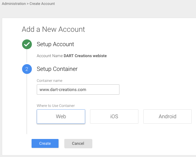
First you create a container. This is where all the tags will be included. Containers can be for websites, iOS apps, or Android apps. For simplicity’s sake, we’ll keep our examples restricted to websites.

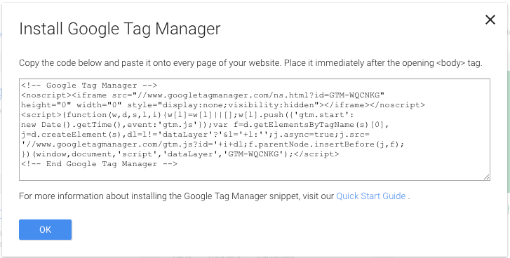
Once you’ve created the container, you’ll get a script which you need to add to your site. This is the only script you’ll need to add. The rest of the “tags” will get added to the site via this tag.

Once you’ve added this tag, you can know start adding your tags to the site.

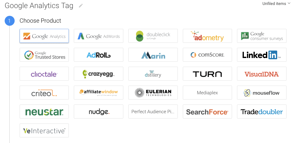
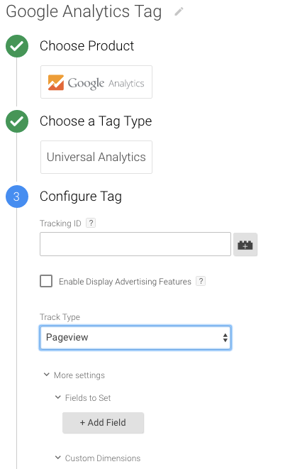
There are about 20 built-in tags which you can add via the GTM interface. If the product or service you want to add isn’t included, you can add any custom tag. Let’s try Google Analytics as our first tag.

Built-in tags for different services allow for customizations as necessary for that specific service.

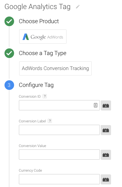
If we were adding a different tag, you would see a different set of customizations. Anything which can be customized in the native script can be done via the Google Tag Manager. The following is an example of adding a Google Adwords tag.

Once you’ve configured the tag as you like, you will be able to specify under which circumstances the tag will fire (“fire”, as in, be included/used). You can have different tags fire based on different conditions or different sections of your website. For example, you can have a specific tag for your website’s corporate page, different tags for sales landing pages, and yet again different tags for documentation and support pages. These may even be handled by different teams within the company.

Have you started to appreciate the benefits of using the Google Tag Manager?

Even if you, as a developer, are handling the adding of the scripts, you can appreciate that you don’t have to perform the server-side coding required to fire the tag under different scenarios. It can all be done via the GTM interface.

The amount of conditions available under which the tag can fire is enough to handle all kinds of complex scenarios your teams may demand. Let’s keep it simple for now and fire the Google Analytics tag under in “All Pages”.

We can push the tag to the site now right? You can, but you may choose to may want to put some safeguards in place.

Besides publishing straight away, Google Tag Manager allows you to:

  1. Preview and debug – this checks the tag and scripts to verify that the scripts are error-free.
  2. Create version – as the scripts are prone to multiple iterations, some of may which may need to be reverted, you can create a version of the current tag. In this way, if anything goes haywire, you can revert to a previous working version. This can prevent lots of headaches, broken sites, panicked administrators, and many frustrated people.

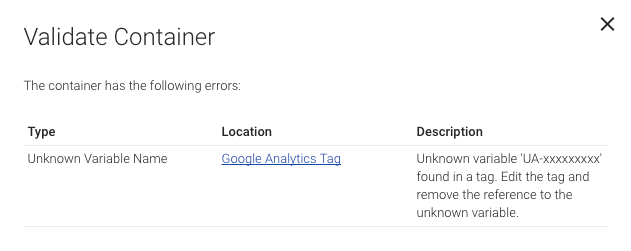
Here we’ve used a broken tag to show you how GTM stops you when it detects an error in the script.

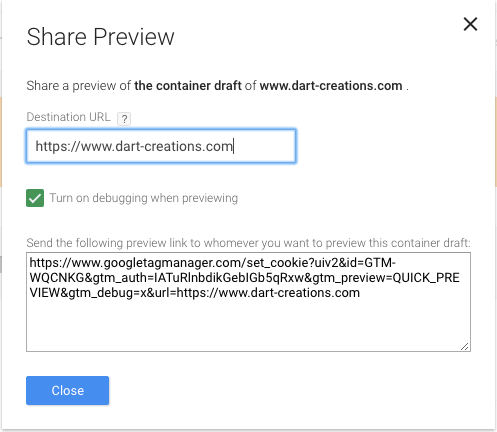
There is also a preview feature that allows you to preview what the current set of tags will look like on your current site. By visiting the site where the tag will be deployed from the same browser where you are performing the Google Tag Manager changes, you’ll see a preview of what the deployed script will look like.

Share Preview also allows you to send a URL which will actually contain the same preview, so that you can share with your peers for approval.

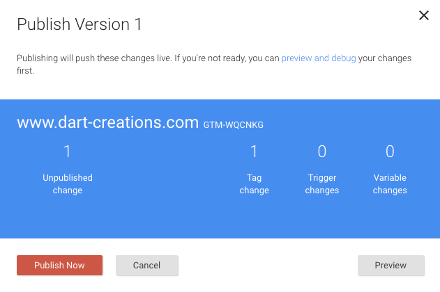
Once you’re happy with the changes, you can Publish your new tag to the live site.

That’s it! Your first Tag will now be pushed to your container (website, in our case).

Advanced Usage of Google Tag Manager

The benefits of using this approach rather than messing directly with the code every time should be evident from the example above.

But let’s dig a little bit deeper.

Whilst creating the example above, we showed for a moment that you can use triggers to decide when the script should fire or not. Some of our scripts probably need to be shown on every page, but probably not all of them. Dumping all of them on every page might cause a performance issue.

Quick Aside: We’ve seen example of scripts which are up to 500KB in size, which is overwhelming. We won’t name and shame you – even though you’re a big company who should know better. If you are in the industry of creating scripts, you’ll be doing everybody a favour if you keep them lean and mean. Hint: Don’t include all of your functionality in the script whether I’ve enabled it or not.

Using Triggers to fire scripts

Let’s say you want to trigger a specific event, include a tracking pixel, or show a customer survey to visitors who have converted. Let’s assume that at the end of your sales process, you send your customers to a Thank You page. While setting the trigger, we can choose what fires the trigger (and hence the loading of the script).

Let’s create a Google Customer Survey, enter our site ID, and then choose “Some Pages” instead of the “All pages” trigger. Once we do this, we are presented with a “Choose Pages” UI, which allows us to define the trigger conditions.

We’re going to use a Regex to match the URL of our Thank You page, but there are plenty of other conditions you can use. Note that besides a Regex you can also choose to use CSS Selectors. Check out the full documentation of the Google Tag Manager triggers.

As you can see, our tag will now only get populated when a Thank You page is being displayed. You can go much more specific than pages. The below are the possibilities you can use in terms of triggers

  • Clicks – this allows you to fire a tag when the user clicks a link or an element of the page
  • Form Submission – this will fire the tag when your visitor has chosen to submit a form
  • History Change – when the URL changes, or when you need to track a virtual pageview such as when firing tags in Ajax applications
  • JavaScript Error – this is triggered if an uncaught JavaScript error is thrown
  • Timer – allow you to send events based on specific time interval to achieve a desired frequency
  • Custom Events – you can use the GTM data layer to raise an event programmatically

Using Google Tag Manager Variables

As with any service which touts itself on being flexible and customizable, GTM supports the use of variables. As per normal code variables, this is simply a value which is populated or defined at runtime.

In tags, you can use variables to define things like transactional codes. Anything from the ID of the product being bought, to the username, email or other user data. We’ll give a quick example of how to use transactional data as a variable in a real-world scenario.

Variables can also be used in triggers, say to define the page URL under which to fire a page view trigger event. Say, we’re trying to grow sales by having a promotional offer for those who spend more than $100. For customers who’ve already spent $100, shipping on their next order will be free.

Our plan is to trigger an Adwords Remarketing campaign specifically to the customers who we know have already spent $1000. We’ll trigger the remarketing code only if the transactional value of the shopping cart is more than $100. We can define a GTM variable which reads off the transaction amount from a JavSscript variable containing the value which exists on the page.

When the page loads, the GTM variable will evaluate and execute. It will match the trigger only if the transaction amount is greater than $100, and at that point inject your Remarketing tag.

This is only one scenario where variables and triggers can be used creatively. We’ll leave it up to you to apply this thinking to your company’s needs.

Final thoughts

In this post, we’ve tried to highlight a number of uses of Google Tag Manager. There are, in my opinion, significant advantages to using GTM.

We’ve seen that it is difficult for a user to “break” the functionality of the site when introducing new tags. The preview and debug functions will highlight any potential problems before they go live. Even if problem scripts go live, it’s easy to revert to previous versions.

Although performance might be a potential concern, we do believe that if the digital team is assisted by a developer, triggers can be used to ensure the performance hit is only taken where necessary. After all, some scripts are necessary!


An Intro to Google Tag Manager is a post from CSS-Tricks

Categories: Designing, Others Tags:

Poll: Should designers code?

May 13th, 2016 No comments

In the brief history of web design, few issues have been as contentious as the question of whether designers should code.

It’s beyond question that to design for the web you need an appreciation of how sites work, but does that understanding need to be in-depth enough that you can write code—after all you expect developers to adhere to a brand guide, you wouldn’t necessarily expect them to create one.

WYSIWYGs are increasingly competent, and most produce code adequate for prototypes, or to pass on to a developer (if not actually production quality). At the same time, frontend code is more complex than it was even five years ago; it’s not at all uncommon to find frontend developers who specialize in a single technology, like CSS. So there’s both less need for designers to code, and an increasingly difficult challenge for those that choose to.

On the other hand, most designers who gravitate to the web do so through a natural curiosity. It’s a strange designer who hasn’t at least played around with developer tools in the browser. What’s more, writing HTML or CSS can’t accurately be described as coding; one is a markup, the other is a set of style definitions—both part of a designer’s job long before web design.

Get Menubar File Control with File Cabinet Pro for Mac – only $14!

Source

Categories: Designing, Others Tags:

Web Development Reading List #137: Butteraugli, Client-Side PKI, And The Importance Of Listening

May 13th, 2016 No comments

This week reminded me again of how refreshing attending a conference can be. As mentioned, I was at the beyond tellerrand conference and, apart from meeting new people, I mostly enjoyed the inspiration I got from listening to the great talks.

With Origin CA you no longer need to go to a third-party certificate authority to protect the connection between CloudFlare and your origin server.

I realized how I might be able to solve a few things that had led to me being unhappy with my work in the past. My trying-to-change-everything-at-once strategy always failed, and seeing that some people just change small things and succeed, I recognized that this is what I want to try over the next months. And I’m happy that I don’t need to do this alone but have some friends who spent nearly the entire Monday night talking with me about how to do more meaningful work.

The post Web Development Reading List #137: Butteraugli, Client-Side PKI, And The Importance Of Listening appeared first on Smashing Magazine.

Categories: Others Tags:

Flexbox Patterns: Ready-To-Use Building Blocks for Your Design

May 13th, 2016 No comments
Flexbox Patterns: Ready-To-Use Building Blocks for Your Design

If you ever delved into Flexbox as an alternative to the classic CSS box model, you probably don’t want to go back. The hitch is, that you need to deal with it in-depth, and who has enough time for that these days. Thus, we’re often stuck with old methods of getting things done, just because we know how to reach the goal using them. Let’s change that. Today, I’ll show you the project Flexbox Patterns as a quick introduction to Flexbox.

Flexbox: Diving Deeper

If you have the time, make sure to watch the free video tutorial on which I reported for the colleagues at t3n here. You’ll receive 160 minutes of essential knowledge.

Flexbox Patterns: Ready-To-Use Building Blocks for Your Design
Flexbox Patterns: Landing Page

We’ve already talked about Flexbox at Noupe here. In the article, we covered the topic of creating a responsive comment section with Flexbox.

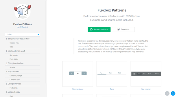
Flexbox Patterns

Thankfully, the interface designer CJ Cenizal has also looked into Flexbox and started a collection of ready-to-use best practices on the website Flexbox Patterns. At the moment, there are only about a dozen of finished modules available. However, the project has just started out, and the available modules already cover the most important application cases.

Flexbox Patterns: Ready-To-Use Building Blocks for Your Design
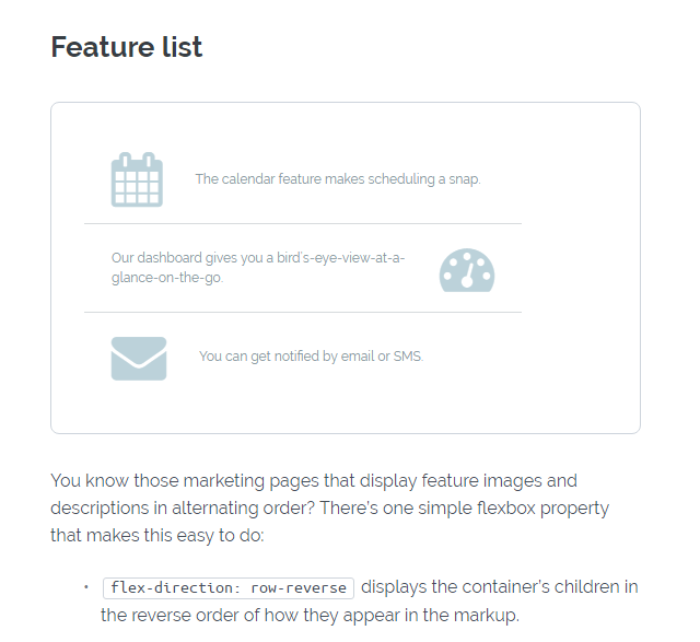
Example: Alternating Rows Via Flexbox

Cenizal gives a detailed and understandable explanation of what he did, the way he did it, and why he did it for each module. The respective code snippets are also included, as well as the working examples of the elements. Generally, all UI elements are usable via copy and paste, but Cenizal recommends using them in the context of a semantically correct concept, such as HTML5 elements, for example.

Flexbox Patterns has gotten a lot of hype ever since it made its way onto the landing page of Product Hunt. At least that shows that there is a significant demand for a service like that.

(dpe)
Categories: Others Tags:

Roberto Blake’s 5 Things you won’t Learn in Design School

May 12th, 2016 No comments
00-featured-roberto-blake-design-tips

One of NYC’s finest designers is Roberto Blake who just so happens to also run a small YouTube channel with advice on the design industry.

Recently I stumbled onto this great 13min clip that covers crucial info about marketing yourself and being the kind of person that creative directors want to hire. I know the title seems really generic, but the content itself is phenomenal – especially for people fresh out of design school. You can stream the video for free right off YouTube.

Some of the key concepts & ideas he mentions are:

  • How to Get Hired as a Graphic Designer
  • How to Get Graphic Design Clients
  • How to Market Yourself Effectively as a Designer in the Current Era
  • How to Find Inspiration as a Graphic Designer
  • How to Be Successful as a Graphic Designer

I’m not intimately familiar with Roberto Blake or his work, but I have to say this is one seriously helpful video. Whether you’ve gone to college or not these tips ring true for all fields of design including print, illustration, animation, and in some cases even development.

The most important concept to remember is likability. Sell your work but also really try to sell yourself as someone that people want to work with. That’s the secret to getting a 2nd interview callback or building a network of trusted freelance clients.

In truth, all of his tips are essential to the business of design. This is something you won’t always learn in college but will always be a big part of any creative career path.

Read More at Roberto Blake’s 5 Things you won’t Learn in Design School

Categories: Designing, Others Tags:

Instagram’s new logo (is all right)

May 12th, 2016 No comments

There’s a process that we go through at least once a month in the design community. It goes something like this:

  1. A company decides that it’s the right time to update their branding.
  2. A bunch of people write comments and articles about how it’s great, or it sucks.
  3. A bunch more people write about how that first bunch of people are all wrong.
  4. Another company decides that it’s time to update their branding.

Rinse and repeat. People seem to get quite worked up about it too. It doesn’t help that big companies love this sort of harmless controversy. If I put my tin-foil hat to my ear, I can hear the ocean, and Facebook executives sighing with relief, glad that we’re not bothering them about the way they messed up Instagram’s timeline.

Okay, but seriously, let’s talk about that new logo. It’s pretty. It has soft round corners, as you might expect. It’s colorful. Yay?

I personally find myself somewhat indifferent to the logo redesign, and pretty much all others. I have yet to encounter a redesigned logo that has actually changed my life, or indeed, my perception of a brand. That is usually defined by any direct experience I’ve had with the company. I’m much more interested to know whether they accomplished their primary goal for the redesign.

That is to say, what exactly did they want this redesign to achieve, and did it?

Was it to create the abstract form of a Polaroid-ish camera? If so, they did it, I guess. Though with cameras increasingly becoming split between phones and professional gear, that association will become less recognizable to all. (And this could be an issue in the future, perhaps prompting another redesign.)

Was it to adapt to the latest trends? I doubt it. As others have pointed out, Instagram stuck to the previous, skeuomorphic, iteration for years after everyone else went flat.

Was it to steal a gradient from Microsoft Office? Probably not. Convergence happens all the time in design, usually by accident.

My theory, based on the way they’ve had Instagram users remixing their logo, and the way they tested it everywhere they could before launch, is that they just wanted a logo with greater flexibility. It’s a matter of practicality. Simple, abstract logos lend themselves more easily to animation, remixing, scaling, and usage in third-party UIs.

It’s probably as simple as that. If I’m right, then I think that they did a fantastic job redesigning the icon. The people complaining will get used to it, and the people who like it will keep being happy, I guess.

Take satisfaction in a job well done, Instagram people. Then fix the timeline.

LAST DAY: 32 Mighty Fonts and 50+ illustrations – only $12!

Source

Categories: Designing, Others Tags: