Archive

Archive for May, 2016

Flexbox and Truncated Text

May 11th, 2016 No comments

Situation: you have a single line of text in a flex child element. You don’t want that text to wrap, you want it truncated with ellipsis (or fall back to just hiding the overflow). But the worst happens. The unthinkable! The layout breaks and forces the entire flex parent element too wide. Flexbox is supposed to be helping make layout easier!

Fortunately, there is a (standardized) solution. You just need to use a non-flexbox property/value to do it.

What we want

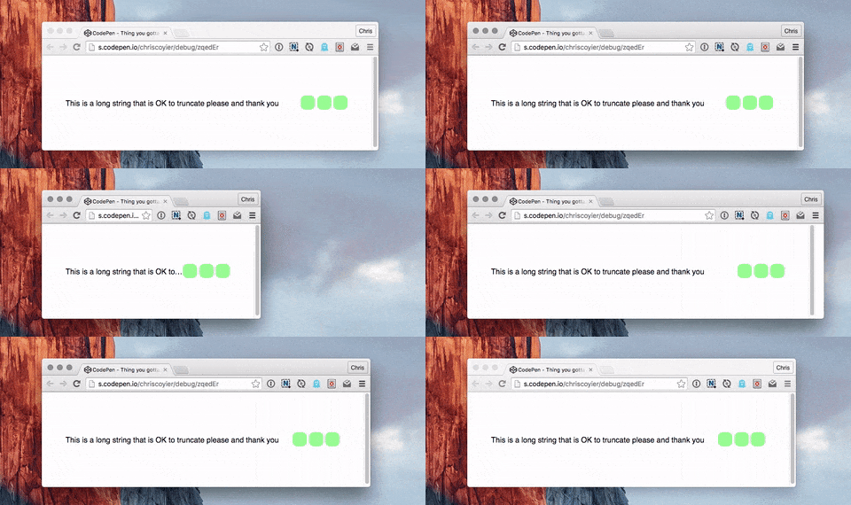
Animated GIF showing the text truncating as the flex child gets narrower.

The potential problem


Animated GIF showing the non-wrapping text preventing the flex parent from getting narrower.

Not only might this prevent the narrowing of a container, it might blow a container out super wide.

Child elements (of the flex child) are the issue.

Confusing things a bit… if the text at hand is directly within the flex child, things work fine:

<div class="flex-parent">
  <div class="flex-child">
    Text to truncate here.
  </div>
  <div class="flex-child">
    Other stuff.
  </div>
</div>
/* Text is directly within flex child,
   so doing the wrapping here */
.flex-child
  white-space: nowrap;
  overflow: hidden;
  text-overflow: ellipsis;
}

The problem comes up when there are child elements, like:

<div class="flex-parent">
  <div class="flex-child">
    <h2>Text to truncate here.</h2>
  </div>
  <div class="flex-child">
    Other stuff.
  </div>
</div>
/* Text is a header now,
  so need to truncate there for it to work */
.flex-child > h2 {
  white-space: nowrap;
  overflow: hidden;
  text-overflow: ellipsis;
}

The solution is min-width: 0; on the flex child

Or min-width some actual value. Without this, the flex child containing the other text elements won’t narrow past the “implied width” of those text elements.

When I first ran into this problem, I found the solution via a Pen by AJ Foster. He writes:

According to a draft spec, the above text should not fully collapse when the flex container is resized down. Because .subtitle has a width of 100%, the min-width: auto calculation that flexbox makes says that its container should be larger than we want.

I found this behavior consistent across Chrome, Opera, and Firefox. Safari was shrinking/truncating even without the min-width (against spec, I think).

Demo

See the Pen Thing you gotta know about flexbox by Chris Coyier (@chriscoyier) on CodePen.

  1. Works: Text is directly inside flex child
  2. Broken: Text is in an

    inside flex child

  3. Works: Text is in

    , but min-width set on flex child


Flexbox and Truncated Text is a post from CSS-Tricks

Categories: Designing, Others Tags:

Easy Steps To Better Logo Design

May 11th, 2016 No comments

Icon and vector marketplaces like Iconfinder (where I work) are making well-designed vector icons an inexpensive and readily available resource for web and print designers. Thousands of high-quality premium icon sets and hundreds of great free sets are available.

Easy Steps To Better Logo Design

Every icon set submitted to Iconfinder is reviewed and evaluated for potential appeal to our website users and for potential commercial value as premium icons. When reviewing icon sets submitted to the website, we have a responsibility to our designers and to our customers to make sure all premium icons on the website are of the highest possible quality.

The post Easy Steps To Better Logo Design appeared first on Smashing Magazine.

Categories: Others Tags:

Ionic vs. Pure Cordova: Three Reasons Ionic Wins

May 11th, 2016 No comments
Ionic vs. Cordova: 3 Reasons Ionic Wins

Saying that one particular type of mobile development (native, cross-platform or hybrid) is the only right way to create mobile apps is similar to saying that only one programming language is the most suitable for coding. As project requirements are always unique, while tools and technologies have different qualities and, what’s more, constantly evolving, nothing can be just black and white.

That’s why, even knowing that hybrid development has a large scope for improvement, we at ScienceSoft keep an eye on its progress and are delighted to see what the Ionic framework can offer developers today.

What’s Ionic?

Used for hybrid development in HTML, CSS, and JavaScript, Ionic allows to quickly create powerful and beautifully designed mobile apps that can be deployed through Cordova. Ionic is built on top of AngularJS and, apart from helping you build a solid app structure with it, uses Angular directives for all its components. As a result, component implementation gets simplified to several lines in HTML.

How Does Ionic improve Cordova Development?

Ionic wraps all Cordova commands and lets you work with any Cordova plugin or additional package. Along with it, you have the following three advantages over Cordova-only development.

#1: Slick UI and UX

Ionic is a perfect fit for the easy and fast development of a simple but trendy design with everything you may need already included in the framework kit. At your disposal, there are dozens of templates, over 80 mixins, 700+ standard icons and lots of built-in UI elements such as headers, footer bars, buttons, grid elements and more. This is definitely a better start than the empty app screen you see in Cordova.

You also get all the UI components: lists, navigation, action sheet, pop over, “pull to refresh” as well as other features that you can implement in your app by writing two or three lines of code. What’s more, the code commands are relatively simple and can be easily recognized by developers. You definitely would know what “ion-infinite-scroll” or “ion-refresher” is.

But in case you stumble upon something unclear, Ionic is ready to help you out with its official documentation and active support community.

A More Convenient Development Process

The ‘serve’ feature is present in both Ionic and Cordova and allows developers to access an HTTP-server to test the application code in a desktop browser. However, working with ‘cordova-serve’ is rather inconvenient as it doesn’t let you launch the test from your initial www-folder and forces you to create an app build first.

Things are different with ‘ion-serve’. You can edit your code in the app folder and immediately see it altered since the app prototype tab is refreshed automatically after every single change. A similar effect can be achieved with Grunt in Cordova, but unlike the out-of-the-box Ionic feature, it’s far from being perfect.

Higher Performance of the Final Product

Compared to Cordova-built apps, the Ionic code creates more powerful and higher performing applications. With jqLite, a fraction of jQuery, it takes a minimal DOM manipulation, and native hardware acceleration is enough. Ionic optimizes animation effects and tunes up the GPU work to achieve the best processing time. Hence, those milliseconds of tap delay that are present in all hybrid apps (due to the bridged gap between the app and the native SDK) are cut in half, and the application gets to perform more vigorously.

Conclusion

Ionic may be referred to as a mere Cordova wrapper, but it actually brings hybrid development to the next level. Besides being a useful tool for creating a beautiful design, it also eases the development process and powers up the application’s performance. If you want to know more about app development on Ionic, feel free to contact ScienceSoft’s mobile application developers.

About the Author

Vadzim Belski is Head of Web Development Department at ScienceSoft, a software development and consulting company headquartered in McKinney, Texas. With over 13 years of experience, he has been taking part in web projects with a primary focus on large-scale IT engagements, such as Viber (an instant messaging and VoIP app with 700 mln active users), Globus VPN Browser and others.

(dpe)

Categories: Others Tags:

A Guided Tour To Analyze The Effectivity Of Calypso

May 11th, 2016 No comments
Screen Shot 2016-05-10 at 9.52.40 AM

Amidst much speculation about the new WordPress interface, the vibrant community recently got its very own WordPress Calypso. Calypso is completely based on JavaScript, HTML, and CSS. thus, the advantage comes in the form that it can easily run on any device having lightweight Node.js server set up.

The new WordPress interface does not follow the traditional WP admin interface; thus, uses JavaScript and the WordPress REST API. This speeds up the development procedure and establishes a better communication with WordPress core from external software as well as applications.

Screen Shot 2016-05-10 at 9.52.40 AM

What is WordPress Calypso?
We have already discussed much on the release of the WordPress Calypso. Now, let’s talk a bit about what WordPress Calypso is all about? Being the latest WordPress interface, Calypso makes it much easier to manage the WordPress content, reading blogs, bringing in changes to the themes, viewing stats, and much more to it. It has been made available to download as a Mac app and is presently in use on WordPress.com.

Calypso has presented a great example of possibilities with the WordPress REST API. More to this, the introduction of Calypso is just exceptional for those who use a Mac as it offers an easy way to interact and manage WordPress websites.

The release of this interface also denotes the positive intention of Automattic (the web development corporation) with the decision of keeping Calypso open and accessible to everyone at WordPress community to add new elements to the same. This again adds more to Automattic’s commitment of open sourcing its code to share the same even with competitors that genuinely adds to the knowledge bank for better WordPress improvements.

What Importance Calypso Holds For The Future Of WordPress?
Calypso offers a very innovative way of communicating with the WordPress core. As it includes JavaScripting, developers as well as users need to learn the programming language and the REST API to initiate the development of a new interface.

Calypso can be seen as the start of a shift in the vibrant WordPress web development processes. Calypso is a huge step for WordPress that is going to contribute more to the evergreen WordPress community. The all JavaScript inclusion is a promising step that would be definitely going to make the future of WordPress much brighter.

The Benefits for The Developers/Users
The recent Calypso release seems to be a promising interface in the WordPress arena. While developing the same, developers have remained focused on a few ideas that guided them throughout the journey. Here is a short explanation of these ideas that are more of the benefits for the developers.

Helps Building Responsive Sites
With the new Calypso release, WordPress has remained focused on including the responsive technique. With the help of the same, it is now much easier to manage existing sites on any device.

Screen Shot 2016-05-10 at 9.53.02 AM

Changes can be Made in Real Time
Any change done to the WordPress website will be reflected in real time. There is no requirement of refreshing the page and wait for the new change to be visible.

Greater Speed/ Improved User Interface
The utilization of JavaScript along with WordPress.com REST API can be done to the fullest. The new interface has been made by keeping the speed in the mind so that users can have an excellent time while working on the same.

Multisite Support
The new WordPress.com has been made in order to be such an interface to manage all the WordPress.com as well as Jetpack-enabled sites. This helps in focusing the content and not worrying for managing the administration.

How to Access Calypso
We have talked much about Calypso and the related benefits. Now it’s time to familiarize our readers with “how to access Calypso”? Here is the stepwise explanation:

Installing Jetpack
The very first step is to install the JetPack plugin. Keep in mind to ensure that the manage module is activated.

WordPress.com login
After installing the plugin, now it’s time to log into the WordPress. After this, ensure that there is correct site display.

Creating and Editing Content
Let’s get familiar with creating content via Calypso. For creating the content, following steps should be followed.

Creation Post
For creating the post, users will have to go to the admin menu where there will be a post item section on the left. For adding the post, click on the add button. Type the post title and the content areas, similarly, as you were using WordPress admin screens.

Image Addition
In order to upload the image, users need to click on the “add new” button. The new calypso is slightly different from the former WordPress admin screen as it uses the term “add new” as it is more intuitive for users whereas WordPress asks users to “upload” the same. Now as per your requirement, images can be added and categorized. You can easily find the option for the same.

Preview Post
This is the second final post prior to actually making a post live. For previewing the post, you can make use of preview button placed at the top of the admin tabs. There is also an option of scheduling the post. The job can be done by clicking on the calendar icon placed on the right of the publishing button.

View Post
There is “view post” link that you can see placed to the right of the notification. This helps in watching your post on your site.

Creating Pages
After you are done with creating and editing the content, it is now time for you to create the pages. In order to add a new page, tap the add button in the pages menu item. Here you can add the page title and the content as we have explained earlier. Here you will find some admin tabs on the left-hand side for “featured images”, “page options” tab and many other such options.

Managing Site
Calypso also helps in managing the site. For the same, the new interface presents two options.

Personalize: It has themes and Menus tabs for customizing the required elements.

Configure: It includes a sharing tab that links to social media via JetPack, plugins for installing, plugins to be activated, as well as WP Admin that links to the admin screen in the main site.

Personalizing Website
There are customization options available for the users and thus, depending upon the requirement, the choices can be made. After personalizing the setting, the next step is to configure the website settings. You will be displayed the menu items depending upon the type of module you have updated.

Conclusion
Having a bunch of benefits both for the users as well as the developers, Calypso is sure to take the WordPress legacy further respectfully. It has got all the elements that are essential to make the website creation an engaging one for the developers. This new interface offers an easy way to develop a completely new version of WordPress admin without bringing changes to the core. All these elements thus make it very much promising.

Author Bio: Being a developer at Sparx IT Solutions, the author has remained related to WordPress website development and keeps on writing new updates that happen within the WordPress community. He also likes to share his researched knowledge with the audiences through engaging blogs.

Read More at A Guided Tour To Analyze The Effectivity Of Calypso

Categories: Designing, Others Tags:

Has the sidebar passed its use by date?

May 11th, 2016 No comments

In this day and age of new design trends, faster and faster website speeds, and mobile dominance, one classic page element is still sticking around, though many may overlook it. Around since the early days of the web and a mainstay on different sites, the sidebar has had longevity.

With many people simply scanning or skimming through content, though, not everyone pays attention to it, especially with the F-shaped reading pattern establishing that people usually start on the left side of a webpage and scan across and down the page. Add to that the increasing demand for faster page-load times, and the sidebar can easily be ignored.

That begs the question, is the sidebar still necessary today? It’s not the primary means of navigation, and other design elements like social media buttons have become more important.

The purpose of the sidebar

The sidebar was never intended to be a site’s primary means of navigation. The navigation bar or menu typically goes horizontally across the top of the page, traditionally always leaving the sidebar as more of an afterthought of secondary navigation.

Nonetheless, a sidebar is supposed to help users with navigation, mainly depending on the type of site. For example, a blog is going to feature a much better use for a sidebar in this regard than, say, a dating site.

Sidebars are generally used to feature content that needs to be highlighted, as when you want users to take a specific action that lets them further interact with your site. For instance, a blog can round up its most popular or recent posts and then feature links to these in the sidebar. This not only helps users navigate the site more efficiently, but it also prompts users to perhaps read content that they otherwise would have missed if it wasn’t featured prominently in the sidebar.

Copyblogger‘s sidebar features its most popular articles, but also a free-training call to action, links to resources, a search bar, and its social media buttons.

Sidebars can be laid out in one of three ways on a page.

The placement of your sidebar

Sidebars can be put on the left- or right-hand side of the page, as well as, in some unique cases, on both sides of the page.

Where you put the sidebar should be dictated by the user experience, as with all page elements.

Left-hand sidebar

When you put your sidebar on the left of your page, know that it’ll basically have to function as your site’s main navigation bar. That’s because the classic usability study that established the F-shaped reading pattern on the Internet confirms that users spend most of the time looking down the left side of a page. Since this is where their eyeballs are, it should also be where the main navigation is if you’re going to position the sidebar here, just to help their user experience.

Consider also that a horizontal menu bar across the top of your page may be too cramped to fit in all of your navigation titles or categories if you’re designing for a big store, organization or news site. A vertical sidebar/navigation menu down the left side of the page can be the solution.

Wikipedia illustrates this design choice to a tee: It doesn’t have horizontal, top-of-the-page navigation, but instead has its navigation bar down the left side of its pages as a very long sidebar.

Right-hand sidebar

The right-hand sidebar is definitely more common; when it’s on the right side of the page, it doesn’t function as main navigation, but as secondary navigation. Again, this goes back to the F-shaped reading pattern and how your site visitors just don’t look at the right side of a page first or prominently. It’s like reading a book in English; we read from left to right.

This means that there’s a good chance that the content in your right-hand sidebar will either be missed or won’t be seen by as many users as the content in your left-hand sidebar. Since this content is secondary, you shouldn’t place too much important info here.

The right-hand sidebar’s secondary status explains why some sites’ pages, such as Match.com’s, actually place ads here, whether it’s ads for related Match.com services or from other brands altogether. Ads here also don’t have as much monetary value as ads in other places on a page.

Of course, other sites use the right-hand sidebar differently, for example to highlight popular and related content for a reader of the site. Nascar.com’s right-hand sidebar features the top headlines of the day and any content related to the article on the page.

Dual sidebars

Some sites will actually use two sidebars, one on the left and right of the page. A concern of this approach is presenting the user with too much info on the page, thereby raising the risk of essential info getting lost in the shuffle, especially if that info is presented on the right-hand sidebar. Another concern is interchanging the important info between the left and right sides of the page without giving enough thought to what should be a priority.

There’s a way to make this still work, though. You have to put the most important content on the left-hand sidebar because that’s where your visitors will look first and most. This means the navigation, the main web apps, etc. Then, on the right, that’s where you can place the secondary navigation items, elements like most popular articles, social media buttons, a search bar, and so on.

Showcase of sidebars

Here’s a look at various types of sidebars from around the web.

LinkedIn

LinkedIn’s sidebar is on the right side of the page, and it offers recommendations of people on the network whom you may know.

Twitter

Twitter has the dual sidebar happening: The one on the left shows your profile and picture while the one on the right shows the number of impressions, recommendations of whom to follow, and worldwide trends.

Fox News

Fox News displays its additional and related content and its hottest, trending stories in the right-hand sidebar.

Still meaningful in 2016

There you have it. Sidebars are still relevant in today’s design world that’s seemingly dominated by news of one new design trend after another. It just goes to show you that, when something is as UX-centric as the sidebar, it can enjoy good longevity and remain a core staple of web design for a long time.

The fact that it’s an unsung page element of sorts is perhaps the best testament to its high usefulness, though. Users have taken it for granted because they simply expect it to be there, as it is a classic element that’s been present for decades on the web.

Without a sidebar, any site would simply be harder to navigate and use, which would cripple the UX. That’s never a good thing from any designer’s standpoint!

Watercolor Flowers Bundle of 400+ Elements – only $24!

Source

Categories: Designing, Others Tags:

Deal: Save 99% on this mighty vector bundle

May 11th, 2016 No comments

Our sister-site, MightyDeals.com, has some incredible deals for designers, but once in a while a really mighty deal comes along. One of the most popular deals ever was the ultimate vector graphics bundle, and we’ve got some amazing news: it’s back, and bigger than ever!

The Vectorlicious Bundle from MightyDeals gives you $2,500 worth of premium-quality vectors, for just $24. That’s an incredible saving of more than 99%!

The deal includes 500 premium vector files to pack your toolbox with. There’s infographic elements, design sets, vintage labels, flat design icons, characters, illustrations, geometric designs, banners, and more…

Every file is 100% vector, delivered in EPS format, and fully scaleable. Head over to MightyDeals to grab this deal today.

Watercolor Flowers Bundle of 400+ Elements – only $24!

Source

Categories: Designing, Others Tags:

High Speed: Really Accelerate WordPress Websites [#4]

May 11th, 2016 No comments
Really Accelerate WordPress Websites

In this small series, we talk about the things that really accelerate WordPress websites. Google Page Speed Insight is not relevant for us, as this is purely about speed. We want our website to enter the millisecond area. We’ve laid the base for this in the first, second and third part. Today’s episode is about the delivery of CSS and JavaScript files.

CSS and JavaScript Play a Major Role When it Comes to Speed

Aside from images and graphics, CSS and JavaScript files and their correct delivery are a determining factor of how fast a website can be. The amount of files that have to be loaded also influences loading time. I can only recommend turning off all plugins that you don’t really need. Most plugins come with their own data overhead, and soon, the theme has to deliver 15 to 25 CSS and JavaScript files.

Especially multi-purpose themes suffer from this disease. A good example would be the popular premium theme Enfold by Kriesi, as it needs 17 JavaScript files on its own. These themes can become rather fast as well, but they can’t enter the millisecond area. A theme with few files and only the necessary plugins is the best precondition for true speed.

WordPress Websites Really Fast: the Idea Behind Today’s Article

Today’s article is about the “correct” delivery of static data. JavaScript can be treated automatically, while manual work is required for the CSS files. We will remove all CSS data from the automatic loading, and let them load manually, in a way that is important for website speed. The style.css file will be loaded in the header after it was freed from unnecessary trash. All other CSS files will be loaded in the footer.

This causes the website to load rapidly. With this type of data treatment, the landing page will load extremely fast, and the subpages will become as fast as the integrated media and ad blocks allow them to. However, the visible area of the subpages will load in the blink of an eye, giving the visitor the impression of an extremely fast website, even though it might take a second or two for the subpage, meaning the individual article, to load.

Which Files are Loaded Where?

It is very important for you to find out which CSS files are needed where. By default, CSS is loaded on all pages. As that is complete nonsense, you need to find out where the stylesheets are truly needed, in order to accelerate your website. For example, the CSS of a contact form is only needed on the contact page. CSS, which is required to display image galleries is either needed on a special gallery page, or on each single article with a gallery in it.

Thus, note carefully where each file is necessary. Because we’ll only integrate them where they are needed.

External CSS vs Directly Implementing CSS in the HTML

For my website Democratic Post I’ve found out that the direct implementation of the CSS into the source code slows down my website more than when I integrate an optimized and correctly versioned file. However, this can be different for your website, so you should simply test both variants.

CSS and JavaScript – Part 1: Removing Query Strings

WordPress ties in static resources at the end of the file (?ver=4.5) via so-called query strings. Generally, this is a good idea that is supposed to make sure that these static resources like CSS and JavaScript can be cached, and don’t have to be newly loaded every time the website is accessed.

http://server.example/wp-content/themes/hemingway/style.css?ver=4.1

However, the parameter is always critisized as a problem for effective caching by speed test tools like Pingdom, because the static content of URLs with parameters is not always stored in the cache, but has to be obtained from the server every time. We’ll avoid this problem later on, with a correct versioning. But first, we’ll remove the query strings from the files. Enter the following code in your theme’s functions.php:

One click opens the Gist at Github

CSS and JavaScript – Part 2: Bring JavaScript Into the Footer Safely

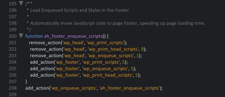
JavaScript being loaded in the footer doesn’t always work perfectly for every cache plugin. Nonetheless, it is absolutely necessary, which is why we’ll help with a small snippet. This code snippet also belongs into the functions.php of the theme, or into a custom site plugin.

One click opens the Gist at Github
Really Accelerate WordPress Websites

CSS and JavaScript – Part 3: Dequeing and Removing All CSS Files

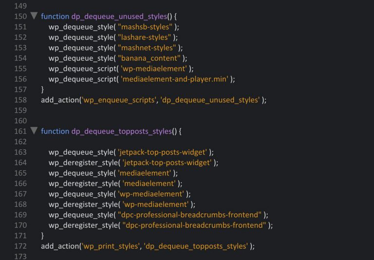
As we want to manually move the CSS to the right spots, so that the loading time can benefit from that, we first need to free all CSS files from the automatic loading via WordPress. After we’ve done that, your theme shouldn’t load any CSS files anymore. For that, we need to trick a bit, as we need to find out its ID in order to remove a stylesheet. Under certain circumstances, you even need to search the IDs in the plugin files.

Really Accelerate WordPress Websites

Afterwards, we need a code snippet that removes all CSS files. However, the first snippet doesn’t work on all files, which is why I added snippet version B. One of the two will definitely remove the CSS. First, try version A and then, if it doesn’t work, try version B.

These snippets also belong into the theme’s functions.php or into the custom site plugin.

One click opens the Gist at Github
Really Accelerate WordPress Websites

CSS and JavaScript – Part 4: Versioning CSS Files Correctly

For this, there may be different solutions, some of which might be more comfortable. However, I chose this solution, because I can determine exactly when I want the files to load due to the manual integration of the CSS files.

What You Need File Versions for

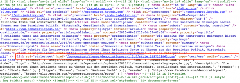
Correct versioning of static files is necessary for optimal caching of resources. This way, we can make sure that the file is, for one, only loaded on the first page visit, and also, that when a file is changed, the new version is instantly loaded as it has a new file name now. Once we’re done, the files in the HTML source code will look as follows:

/wp-content/themes/democraticpost-1.3.0/style.1457278063.css

One click opens a higher resolution.
Really Accelerate WordPress Websites

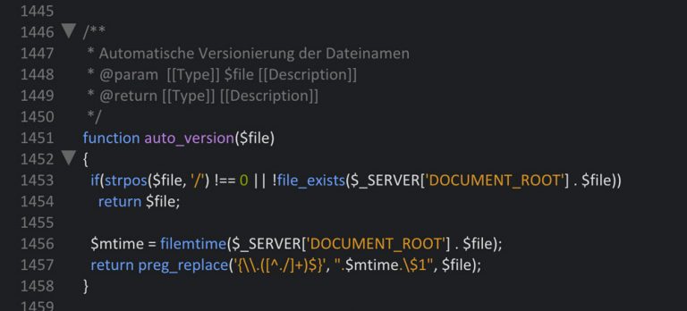
Part 1: The Code for the functions.php

One click opens the Gist at Github
Really Accelerate WordPress Websites

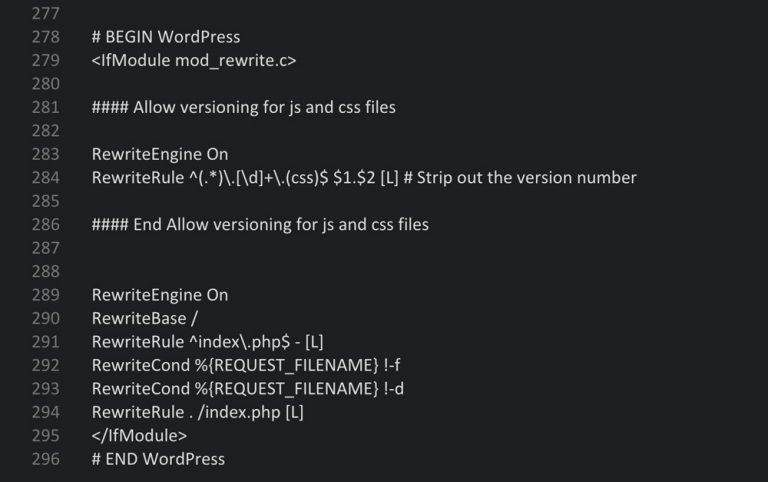
Part 2: The Code for the .htaccess File

The .htaccess file that is located in the WordPress root index, has to be adjusted. Please make a backup of the file before adjusting! Afterward, the WordPress area is replaced by the following.

One click opens the Gist at Github
Really Accelerate WordPress Websites

Part 3: Manually Compressing All CSS Files

As this task can not be done using a caching plugin, we need to do it ourselves. Please make backups of each file before you start this process. Having done that, open the CSS files using an HTML editor, copy the entire content, and add it into the provided field of the CSS compressor. The right setting for this is “highest”. After the tool has compressed the CSS code, we enter it into the style.css file and save it.

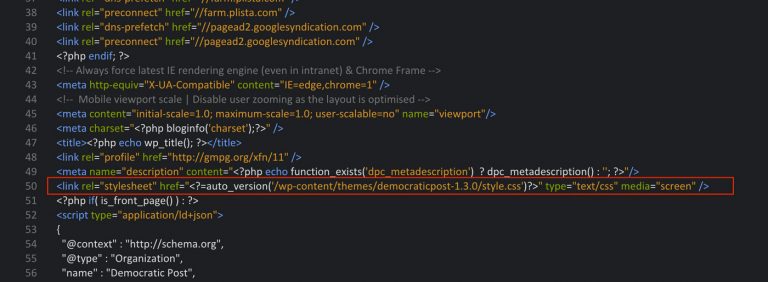
In order for the automatic versioning to work, we have to adjust the small code snippet for the output of the CSS files. The following adjustment belongs into the link area (href=””):

<link rel="stylesheet" href="" />

For instance, the right path could look like this:

/wp-content/themes/democraticpost-1.3.0/style.css

Part 4: Integrating the Files in the Right Spots

First, the Style.css is implemented in the header. The easiest way to do that is by opening the header.php file of your theme and then entering the link in the head area. Please pay attention to the correct spelling of the data path. If it’s not 100 percent correct, the browser will not find the file, which will cause a 404 error.

Style.css

One click opens a higher resolution.
Really Accelerate WordPress Websites

All Other CSS Files

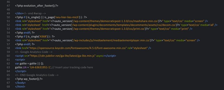
All other CSS files move from the header to the footer, so that the visible area of the website loads instantly. On top of that, the files will only load where it’s absolutely necessary. We place the files above .

One click opens a higher resolution.
Really Accelerate WordPress Websites

Controlling where exactly a file is loaded is done via the tags is_single and is_page. Under certain circumstances, you can also combine both tags, as I did in the upper area. The upper three files are loaded on single posts on one page. The general structure looks like this:

One click opens a higher resolution.
Really Accelerate WordPress Websites

The screenshot shows that the respective CSS file is only implemented in the post with the ID 4368, and that it’s not loaded anywhere else.

WordPress Codex: Using Conditional Tags Correctly

The Treatment of JavaScript

This is the easier part. If we want to be exact, like we were with CSS, and only let the files load where it’s necessary, we require a small premium plugin. It’s called Gonzales and currently costs 19 USD. The plugin places itself in the toolbar that you see when you log in and access your page. The plugin allows you to log each resource on every page, or only on certain ones. With a little effort, you can exactly determine which JavaScript file is loaded where.

A Screenshot:

One click opens a higher resolution.
Really Accelerate WordPress Websites

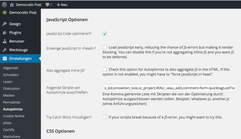
Bundling and Compressing JavaScript Using Autoptimize

After that’s done, the JavaScript files are assembled and compressed. The free plugin “Autoptimize” is a perfect fit for this task. The screenshot displays the required settings:
Really Accelerate WordPress Websites

Conclusion

Those that kept their eyes on the ball up to this point, have already significantly accelerated their WordPress websites. However, we had to learn that a website that loads very fast takes a lot of manual effort. Maybe there are some more intelligent and comfortable solutions to certain tasks, but there’s always room for improvement. In any case, the CSS is now optimally cached by the browsers, and thus, it’s only loaded when the page is accessed for the first time. Every other page visit will be significantly faster.

The next and final part in our series of how to really accelerate WordPress websites will deal with a few smaller tasks that still need to be done. Among other things, we’ll make the popular Jetpack plugin get a move on. Depending on how and which features of Jetpack are used, it can definitely be extremely fast, and not slow down the website. Nonetheless, this requires a couple of adjustments.

Really Accelerate WordPress Websites: the Series

Related Links:

(dpe)

Categories: Others Tags:

Content-First Prototyping

May 11th, 2016 No comments

Content is the core commodity of the digital economy. It is the gold we fashion into luxury experience, the diamond we encase in loyalty programs and upsells. Yet, as designers, we often plug it in after the fact. We prototype our interaction and visual design to exhaustion, but accept that the “real words” can just be dropped in later. There is a better way.

Content-First Prototyping

More and more, the digital goods we create operate within a dynamic system of content, functionality, code and intent. Our products and services drift and spill into partner websites, social media feeds and myriad electronic aggregators, all seeking to shape visitor behavior and understanding. Systems build on systems, and, in short order, we’ve cobbled together a colossus the breadth of which sends minds a-boggling.

The post Content-First Prototyping appeared first on Smashing Magazine.

Categories: Others Tags:

Answers from AMA on Hashnode

May 10th, 2016 No comments

I recently did an AMA on Hashnode and it was lots of fun! I enjoyed the questions and the simple format. I figured I’d plop some of my answers here in the spirit of blogging.

Michele Bourdon: Are you a fan of CSS frameworks? What do you think of them?

Maybe a telling fact: I’ve never used one for a real project.

When I’m the CSS lead on a project (kinda my thing), I feel most comfortable when I’m intimately familiar with everything happening in the stylesheets. I get that intimacy by writing it (and reviewing what other people write). Not to mention I enjoy writing CSS.

I get squirmy when using any outside CSS at all.

But as usual, I’m of two minds. I’m also extremely impressed by some CSS frameworks. Bootstrap is kind of amazing and I feel like the “ugh, bootstrap is everywhere blah blah” sentiment is overblown and unnecessary. I’m super impressed by Foundation. I think it’s approach is probably my favorite (I get good results applying it to raw semantic markup.) It’s starting to get a little weird though recently with all the different varieties native apps and stuff.

For the teams out there that don’t really have a CSS lead, or don’t have one that is excited about that being their job, you can likely get a lot of productivity out of a framework.

There are also about 20 billion of them because of this weird thing that happens where people that have some success writing CSS from scratch want to turn their thinking into a framework for the rest of the world.

Ida Hansen: How do you maintain and manage both CodePen and CSS-Tricks?

A photo was recently taken of me proving that I actually have three hands.

Also a tiny monster forces me to code quickly.

But really, this is my favorite quote about productivity.

I just work on stuff and that’s it. I don’t even work particularly hard. I just checked my RescueTime and it’s kind of embarrassing actually. It’s not even 8 hours a day. I need to up my game there.

Also, if it’s not clear, I’m a founder at both CSS-Tricks and CodePen, but many people work on both projects. Here’s the CSS-Tricks Team and the CodePen Team. I also do ShopTalk Show with my friend and co-host Dave Rupert.

Pankaj Parashar: What are your thoughts about Atomic CSS?

It weirds me out.

I’m not super compelled by it.

But, I know some very smart people that ARE compelled by it. I would use this kind of thinking:

  1. Can we be comfortable and productive with this thing?
  2. Does it seem like this thing will serve us well into the future?

If both of those questions get confident YES’s, use the thing and ignore the nay-sayers.

Fred Copeland: What made CodePen a huge success, given that the front-end world already had jsFiddle, Plunker etc?

Thanks for considering CodePen a huge success. Time will tell, on that one, but I’m very confident!

It’s true that tools like jsFiddle and JSBin predate CodePen, and CodePen was born in their shadow. We had this consideration: “What are the coolest demos people have made on jsFiddle, TODAY?” How do you find them? Who decides that?

Based on that, we decided to make the homepage of CodePen a showcase rather than the editor itself. We decided to have user accounts and make CodePen a social network in addition to a code editor. We decided we’ll pick some of the best work on CodePen and show it to you. We decided we’ll use algorithms to determine popular work, so you have a voice in what is popular as well. The community that came out of that is what makes CodePen different. Well, one of many things 😉

Sirwan Afifi: What tech/language/framework you’re going to utilize in the next 6 months?

The biggest project going right now is Rails, but React/Redux inside of it, and SCSS/PostCSS.

(From another related question:) I’d prefer nobody in the world picks a JavaScript framework based on what I use. I’m a follower in that regard, and definitely not qualified to be a trendsetter.

Why did object-oriented CSS (ala @stubbornella) never take off?

I think it did! Just in a more insidious and effective way. Nicole’s lessons were things like…

  • Be very careful about specificity
  • Think in patterns
  • Use classes a lot
  • Use tools and analytics and heuristics to inform CSS choices

If any of these things seem obvious now, know that they weren’t always. Even if we don’t call it OOCSS much anymore, Nicole was way ahead of the curve on this stuff and influenced how the community thinks about CSS immensely.


A bunch more on the AMA page.


Answers from AMA on Hashnode is a post from CSS-Tricks

Categories: Designing, Others Tags:

Adobe Muse – Building Websites Without Code

May 10th, 2016 No comments
adobe_cs6

Adobe_Muse_logo muse-for-you-shop-adobe-muse-cc-logo

It started with an idea – helping web designers create websites without code.

Adobe Systems has a rich library of programs that help you edit photos, create vectors, edit movies, edit audio, and more. But what about web design? We’ve seen programs like Dreamweaver, Edge Animate, and Flash that all fall within the web design realm. Let’s dive a little deeper into these programs. Dreamweaver requires code knowledge and at first glance might be intimidating to someone who has never heard of HTML5 or CSS3. Flash is great, but it could be a bit flashy for someone who has never created a website and doesn’t need animations. And Edge Animate although discontinued is also somewhat similar to Flash. But what if I wanted to create a simple website? Do I need to know code or work with complex keyframes in Flash or Edge Animate?

adobe_cs6

That is where Adobe Muse comes in. It was released in 2010 and is catching fire within the Web Design community. I myself came across Adobe Muse a few years ago and it was an epiphany moment. Lightbulbs were going off everywhere and all I could think was…this is going to be amazing. I had already been into web development, and when I started using Adobe Muse I knew it was going to be a game changer. The user interface was very intuitive and similar to all of Adobe’s products. There were no templates like WordPress and you could essentially draw your own website as if you were using Adobe Illustrator. Best of all you did not need to know any code. Not only could you easily create website elements you could also add parallax motion to the elements and use third party widgets (plug-ins) to achieve some of the most complicated functions and effects for your website. The learning curve was very easy for anyone with a Photoshop or Illustrator background. You could have a website up and running within minutes.

This gave me an idea. I had already been building websites for clients and that can be a long and tedious process. Not only do you have to meet the clients demands you also have to update the website when the client asks. This lead me to wanting to teach people how to create their own websites. Thus “Muse For You” was born. The slogan is:

“Awesome Websites + No Code = Muse For You.”

I started teaching people how to use Adobe Muse through Youtube and Skillshare. I start off my videos by saying:

Hey, what’s up Musers!

A term I thought was fitting as my videos went along. A Muser is an Adobe Muse user.

Some of my earlier videos where a bit slow and long but I kept going knowing that I would get better with presenting as time went on. I made a video on just about everything in Adobe Muse, and because I had already been into web development I was able to integrate my knowledge of web development with Adobe Muse. I now have over 200 videos and quite a few subscribers.

You can visit my Youtube channel here: https://www.youtube.com/channel/UC5bruG1v9AdLlEFYgW68Yzg

One of the first thoughts I had with Adobe Muse was:

“What if I could merge some of the best scripts and plug-ins on the web with Adobe Muse and allow everyone to use these great features in their website.”

And that has been my mission ever since I came across Adobe Muse. Along with educating everyone about Adobe Muse I now create new widgets every week and offer them in my shop and yearly subscription at http://museforyoushop.com. With these video tutorials and widgets you can make your website look as if a professional web developer had created it.

I would like to give you a glimpse of the power of Adobe Muse merged with one of my favorite effects in the following video tutorial titled: Parallax.js – UX Phone Design (view at top)

The Parallax.js script by Matthew Wagerfield was the first effect that really inspired me when I started getting into web design and development. It allows you to move elements in a parallax motion with your mouse or on tilt with a mobile device. I was very excited when I was able to create a widget with this script and allow anyone to be able to add this to their website in Adobe Muse. All without knowing any code.

I will be sharing my knowledge of Adobe Muse via my weekly blog post on WebDesignerLedger.com. I invite you to check back weekly for news and updates on Adobe Muse :). Happy Musing.

Read More at Adobe Muse – Building Websites Without Code

Categories: Designing, Others Tags: