Archive

Archive for May, 2016

Design Inspiration (May 2016)

May 9th, 2016 No comments

Today we’ll be looking at eye candy that will undoubtedly help you start the new week with your creativity freshly nurtured. Grab your cup of coffee or tea, and let these designs shine on you with their smart details, fantastic textures, and well-chosen color palettes.

Monday Design Inspiration The Image shows a house in a beautiful valley at sunset

I’ve sifted through the web to dig up little nuggets of inspiration to indulge in — just for you. This time I’ve collected a potpourri of styles ranging from delicate and subtle to bold and playful. Nothing but design goodness. So please lean back and soak it all in.

The post Design Inspiration (May 2016) appeared first on Smashing Magazine.

Categories: Others Tags:

3D Within the Browser: Seen.js Creates Complex Graphics and Animations for Canvas and SVG

May 8th, 2016 No comments
Seen.js

HTML5 and JavaScript provide all functions needed to create complex graphics and animations within the browser. For that purpose, the JavaScript library “seen.js” offers a broad array of options to build complex 3D worlds in the browser. “seen.js” is independent of jQuery or other libraries and constructs impressive 3D objects and sceneries on the basis of HTML5 Canvas and SVG. 3D within the browser, without any plugins…

Turn Simple Surfaces Into Complex Sceneries With Seen.js

Getting started with “seen.js” is not exactly easy, that’s due how versatile the library is. In return, the options are much more impressive. Let’s start at the beginning: first, the JavaScript library has to be integrated. Although “seen.js” works without any other dependencies, CoffeeScript should be incorporated as well. That’s because the complete “seen.js” documentation and all examples are based on CoffeeScript. In the following, we’ll create a canvas, meaning a “” or “” element. After that, we’ll bring it to live via CoffeeScript.

<canvas width="640" height"425" id="seenjs"></canvas>
 
<script type="text/coffeescript"></script>

In the script above, we set up a canvas element which is supposed to be used as the drawing area for “seen.js.” The base for 3D objects are the so-called “shapes”. These shapes can be defined regarding size, color, and form. Aside from the development of custom shapes, “seen.js” also offers simple, predefined shapes. This way, spheres, and tetrahedrons can be used, among other shapes.

sphere = seen.Shapes.sphere(1).scale(100)

In the example, a simple sphere that consists of multiple triangular shapes is defined via “Shapes.sphere()”. The number within the method determines how complex you want the sphere to be. The larger the number, the large the number of displayed shapes. The sphere’s size is defined via “scale()”. The value “1” is the smallest possible size.

seenjs_sphere
Two spheres with different amounts of shapes

In the next step, the sphere’s color is defined.

for flaeche in kugel.flaechen
  flaeche.fill.color = seen.Colors.rgb(0, 145, 190, 255)
  flaeche.fill.metallic = true
  flaeche.fill.specularColor = flaeche.fill.color

Here, a for-loop is used to assign a color to every single area of the sphere. The attribute “color” determines the – you guessed it – color. Here, we have multiple ways of defining a color. “Colors.rgb()” assigns a color via RGB including an alpha value. Alternatively, the color can also be entered via “Colors.hrs()”. Adding the parameter “metallic” makes the surface look metallic. In this case, the color determined via “specularColor” is used as the reflexion paint, instead of a simple light reflexion.

seenjs_sphere_metallic
Two Spheres – One With and One Without a Metallic Effect

In the following step, the sphere is added to a model via “Models.default().add()”.

objects = seen.Models.default().add(sphere)

Subsequently, the scene into which the model – the sphere in this case – is placed, is defined.

scene = new seen.Scene
  model : objects
  viewport : seen.Viewports.center(640, 425)

Above, the sphere is added to the scene using the variable “objects.” “Viewports.center()” defines, where the sphere is centered. In our example, we want to center the sphere within the drawing area, which is why we entered the measurements of the “” element.

In the final step, the scene including the sphere has to be rendered and assigned to the canvas element.

seen.Context("seenjs", scene).render()

This is done using the “Context()” method. The ID of the canvas element, as well as the scene, is entered. Finally, everything is drawn onto the HTML5 Canvas via “render()”.

How to Create Multiple 3D Objects With Seen.js

We can place as many 3D objects in one scene as we want to. For that, we first need to create a new “shape” object.

pyramid = seen.Shapes.tetrahedron()
pyramid.scale(50)
seen.Colors.randomSurfaces2(pyramid)

In our case, we use “Shapes.tetrahedon()” to define a three-sided pyramid and bring it to an appropriate size with “scale()”. The color is chosen at random via “Colors.randomSurfaces2()”. In the next step, we assign the pyramid to the variable “objects” using “append()” and “add()”. The sphere is already in there.

objekte.append().translate(-25, 25, 100).add(pyramid)

Then, we place the pyramid in relation to the sphere with the “translate()” method. Without “translate()”, the pyramid would receive the same center as the sphere.

seenjs_append
Two Objects in One Scene

The methods “rotx()”, “roty()”, and “rotz()” allow you to rotate single, or all objects in the space.

pyramid.rotx(30)
objects.roty(90)

In this example, the pyramid is rotated by 30 degrees on the x axis. At the same time, all objects in the scene are rotated by 90 degrees on the y-axis.

seenjs_rot
Rotated Objects

3D Animations With Seen.js

The defined objects can now be animated within the scene with little effort. To do so, we simply add the “animate()” method to the “render()” method. Then, an event is used to define the animation’s course.

seen.Context("seenjs", scene).render().animate()
  .onBefore((time, deltatime) -> objekte.rotx(deltatime * 1e-4).roty(0.5 * deltatime * 1e-4))
  .start()

Above, we defined an event that is called up before each frame change via “onBefore().” The time as well as the deltatime are transferred. In our demonstration, all objects are moved using “rotx()” and “roty()”. They rotate around their own axis, with the rotation around the y-axis being faster.

How to Create Custom Objects With Seen.js

In “seen.js”, there are multiple ways of creating custom objects. One being the “extrude()” method. Here, areas that form an object together are defined in a three-dimensional space.

arrow = seen.Shapes.extrude([
  seen.P(0, 0, 0)
  seen.P(1, 1, 0)
  seen.P(1, 0.5, 0)
  seen.P(2, 0.5, 0)
  seen.P(2, -0.5, 0)
  seen.P(1, -0.5, 0)
  seen.P(1, -1, 0)
 ], seen.P(0, 0, 0))

As seen above, we use “Shapes.extrude()” to create a simple arrow. The coordinates are defined with the method “P()”. It contains three coordinates each, to specify one point each on the x, y, and the z-axis of the space. For more complex shapes, “seen.js” supports the wavefront format. That’s a file format to save geometrical shapes. It is used by many animation programs and is a good choice for that reason.

$.get "something.obj", {}, (content) ->
  something = seen.Shapes.obj(content, false)

In the JavaScript shown above, we use jQuery to load an object file in the wavefront format. The file’s content is transferred to the “Shapes.obj()” method. This method interprets the format and displays a 3D object for “seen.js” based on it.

The Many Other Options of Seen.js

“seen.js” provides plenty other ways of creating objects, changing their appearance, and making them move. For instance, there’s the option to view a scene from different points of view. On top of that, various light sources can be defined. Due to different events, there’s the option to react to events like mouse movement and clicks.

Seen.js: Free and Well-Documented

“seen.js” is available under the Apache license. That means it’s available to anyone for free. On the “seen.js” website, there are plenty of examples that give a good impression of the options that “seen.js” comes with. Even though the documentation is extensive, getting started is not easy. Mainly considering the current low-poly trend, looking into the library is worth it as following this trend allows for the creation of some very impressive graphics and animations.

(dpe)

Categories: Others Tags:

Popular design news of the week: May 2, 2016 – May 8, 2016

May 8th, 2016 No comments

Every week users submit a lot of interesting stuff on our sister site Webdesigner News, highlighting great content from around the web that can be of interest to web designers.

The best way to keep track of all the great stories and news being posted is simply to check out the Webdesigner News site, however, in case you missed some here’s a quick and useful compilation of the most popular designer news that we curated from the past week.

Note that this is only a very small selection of the links that were posted, so don’t miss out and subscribe to our newsletter and follow the site daily for all the news.

Relax: Next Generation CMS

13 Magically Meticulous Design Style Guides

New Spotify iOS Design

Being a Developer After 40

Making… and Breaking the Grid

Logo Design Psychology

Freebie: “Synthetica” One Page Website Template (HTML, Sketch)

The Difference Between CX and UX

Design Trend: Square-Stacked Typography

The Feed is Dying

Design Without a Designer, One Developer’s True Story

How to Stimulate Emotions Using Color

How to Annoy a Graphic Designer

Rediscovering Apple’s Human Interface Guidelines, 1987

Ghost Desktop

The 23-Point UX Design Checklist

How Industry Leaders Create Strong Brands

Why Tooltips are Terrible and Why You Should Use Them for your Product

Future Screen are Mostly Blue

Intel Gives up on the Smartphone and Tablet Markets

Introducing Facebook, Messenger and Instagram Windows Apps

Live Demo of Google AdWords Redesign on May 24

Combining Typefaces: Free Guide to Great Typography

Target=”_blank” — the Most Underestimated Vulnerability Ever

Want more? No problem! Keep track of top design news from around the web with Webdesigner News.

LAST DAY: A Collection of 32 Photoshop Felt Styles & 10 Stitch Effects – only $7!

Source

Categories: Designing, Others Tags:

Comics of the week #338

May 7th, 2016 No comments

Every week we feature a set of comics created exclusively for WDD.

The content revolves around web design, blogging and funny situations that we encounter in our daily lives as designers.

These great cartoons are created by Jerry King, an award-winning cartoonist who’s one of the most published, prolific and versatile cartoonists in the world today.

So for a few moments, take a break from your daily routine, have a laugh and enjoy these funny cartoons.

Feel free to leave your comments and suggestions below as well as any related stories of your own…

And you’re probably a bookworm

It won’t work on your site

Transferrable knowledge

Can you relate to these situations? Please share your funny stories and comments below…

12 Gorgeous Modern Script Typefaces – only $12!

Source

Categories: Designing, Others Tags:

The WordPress Theme Index and the Garbage Invasion

May 7th, 2016 No comments
WordPress Theme Index

One theme to rule them all, one theme to find them, one theme to bring them all and in the darkness bind them. This is a rather exact description of the current situation in the official WordPress theme index. It seems as if there was only one theme left which is uploaded and presented in new versions all the time. In between, the index is loosened up by themes that are so ugly that they could give you eye cancer.

WordPress Theme Index: One Theme, Many Variations

Every month, I have to write an article about the ten best WordPress themes of the month. Generally, I love this article, as I enjoy discovering new and exciting things. However, the article is upsetting, since the content that is uploaded and offered is always the same trash, which is very annoying. It seems like every third person feels like founding a premium WordPress theme provider and selling themes.

In general, this is not a problem, as competition is good for business. However, the “theme providers” try to make money off of reduced versions in the public theme index. This happens using the basic theme, which is constantly only slightly altered and then reoffered. Sometimes, only the colors are changed, at times other photos are used, or the landing page’s structure is changed a little. A close look shows that it is the same theme in different variations.

One Theme Rehashed Repeatedly

Of course, it’s a great thing for a business to be able to repeatedly rehash a template. Simply offer these variations as a reduced version in the official theme index, create a homepage that explains the functional differences between the lite and the full version, and make money. The clueless users want more and more features, even when the loading time is beyond good and evil.

Kriesi or the Beginning of the End

All of this started with developers like Kriesi, who only offers his themes for sale via Themeforest, however. The fact that Kriesi only rehashes his themes is out of the question, but at least his themes always look different. On top of that, his premium themes are designed lovingly, and, for the most part, they look really nice. Nonetheless, he’s a part of the problem. Themes like his “Enfold” are what started the flood of the development of the so-called “multi-purpose themes”.

This is not good for the community for two reasons. For one, the only themes that are developed come with a perceived 500 functions that integrate so many CSS and JavaScript files that you could get sick. But apparently, the users want it to be just like that. The fact that the loading time suffers from that should be evident. Secondly, everyone that feels like being a theme developer wants to create a multi-purpose theme.

One Theme Can’t do Everything

Most of the time, a multi-purpose theme’s basic layout is a business layout. This is not necessarily bad, as many companies want to create a website using WordPress. However, a financially strong company would not use a free theme for that purpose, but would prefer a custom developed template. In addition to that, the developers of the free themes mostly focus on the landing page, leaving out a lot of important elements, like the blog, causing them to look terrible. The goal is fast and easy money, which is why there’s not as much time put into the theme as it would be necessary for a product of quality. A proper multi-purpose theme should cover the following aspects with high quality:

  • A special, highly customizable landing page
  • An “about us” section
  • A portfolio in at least three versions
  • A tenderly designed blog
  • A perfect contact page including Google Maps
  • A perfectly designed shop (based on WooCommerce, for example)
  • All settings should be accessible via the WordPress theme customizer

If you were to develop such a theme from scratch, it would cost months of your time. Most developers don’t have this much time, especially not the vanilla developers that want to make bank off of free, reduced themes in the official index. Find examples of these themes further down.

Vanilla Multi-Purpose With the Same Landing Page

However, as the developers know how well themes like Kriesi’s “Enfold” sell, they also want a piece of the cake. So, the business theme idea is constantly rehashed. More and more of these themes hit the market and the official WordPress theme index. Most of these themes are poorly designed as well, simply ugly and unsightly. You’ll instantly notice that this was not a professional’s work. When the design is ugly already, how bad is the quality of the code under the hood going to be? Okay, I’ll admit, I don’t care. I don’t even want to know.

I’d Like to Have a Theme in the Index…

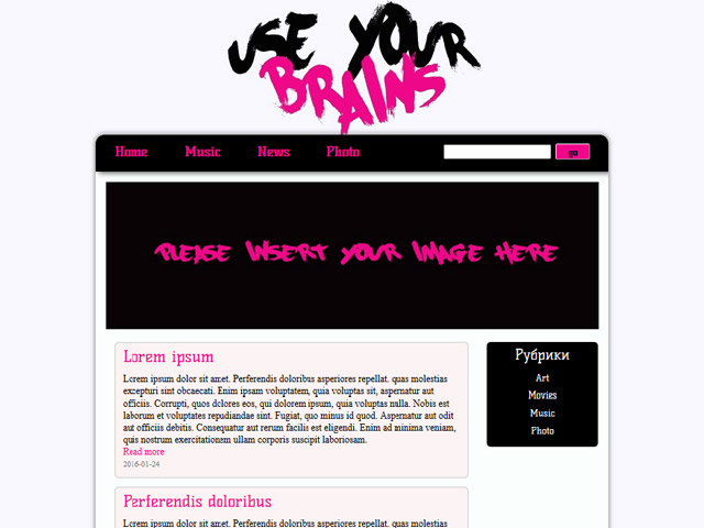
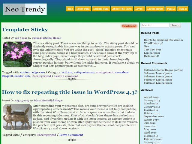
There’s another group of “theme developers”. Those that can barely say PHP without any mistake and don’t have an eye for design at all. They want to have a theme in the index as well, so they “develop” one. These theme’s meet the prerequisites for the code, which is made sure by the theme review team. However, prerequisite doesn’t mean that the quality of the code is acceptable. It only means that it’s not horrible. These themes can be identified easily because their design is so incredibly ugly that it will burn itself into the viewer’s retina forever. Do you want some examples?

Three Examples of Poor Design

Use Your Brains

WordPress Theme-Verzeichnis Beispiel 1

Neo Trendy

WordPress Theme-Verzeichnis Beispiel 2

Cronista

WordPress Theme-Verzeichnis Beispiel 3

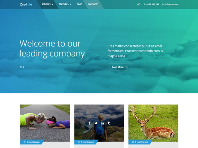
Three Examples for Uniform Design – Multi-Purpose Themes

Akyra

Corporate Plus

WordPress Theme-Verzeichnis corporate

Zap-Lite

WordPress Theme-Verzeichnis Zap

There are many more examples of uniform design that has been revived over and over again. It tries to distinguish itself with changing elements and colors. The less common magazine themes can be used as further examples.

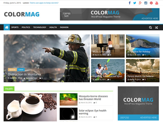
Three Examples of Uniform Design – Magazine Themes

Color-Mag

WordPress Theme-Verzeichnis color-mag

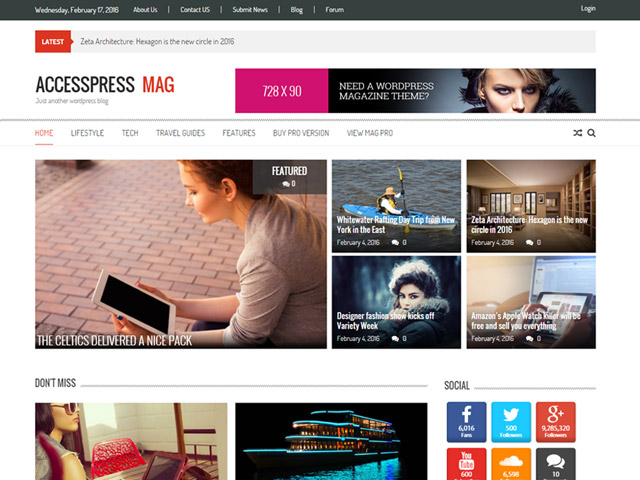
Accesspress Mag

WordPress Theme-Verzeichnis Accesspress

Smart Magazine

WordPress Theme-Verzeichnis smart-magazine

WordPress Theme Index: The Exceptions of the Rule

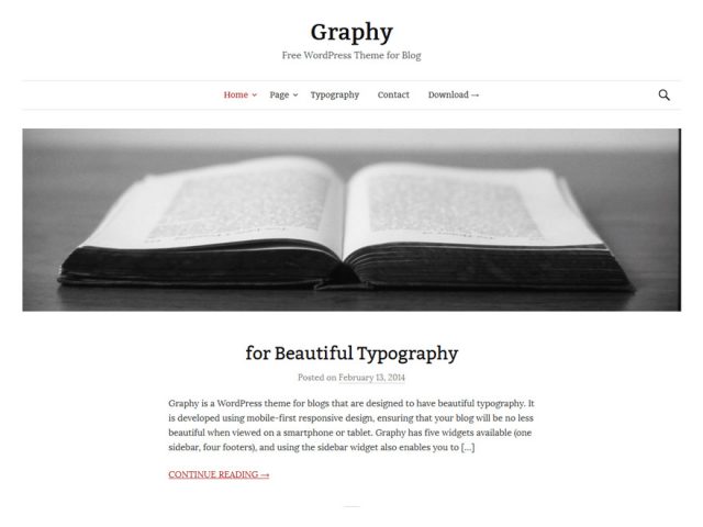
They exist. The infamous and soothing exceptions to the rule. Now and then, you’ll find them after a lot of searching in the WordPress theme index. These are the themes that were created by specialists of their craft. They can mostly be recognized by the fact that they only have one purpose. They are pure blog or portfolio themes. From time to time, pure business themes are added to the index as well. This doesn’t guarantee a good design, but it can promote it. Here is an example of a blog:

Graphy

WordPress Theme-Verzeichnis graphy

My Favorite Designer – Anders Norén

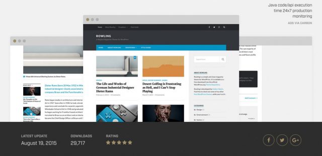
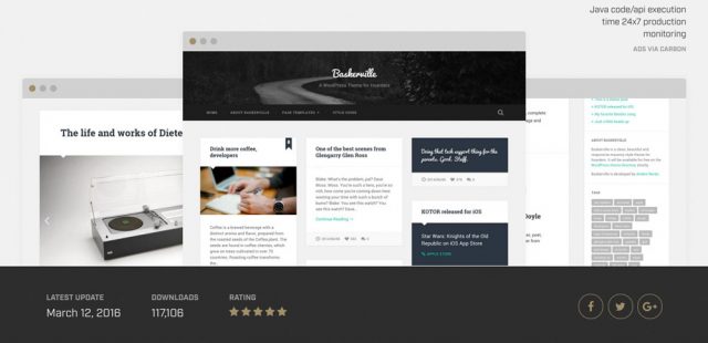
The Swede Anders Norén has lots of courage. His themes are designed independently, and thus, they instantly set themselves apart from the masses of themes. On top of that, they provide a high-quality code and are very durable. They are no multi-purpose themes either. In fact, they are the opposite. They do the one job they were made for. The majority of them looks great, too. Here are two examples:

RowlingDemo

WordPress Theme-Verzeichnis Rowling

BaskervilleDemo

WordPress Theme-VerzeichnisBaskerville

Plea for Courage in Design

Theme designers should finally have the courage to create something new. This mainly addresses those that want to sell their themes. Publishing the same theme in different versions is not the right way. Creating themes for many different purposes with hundreds of features is not the right way either. I plead for more courage, for themes that cover one single job, but that do this one job as good as possible with all necessary functions.

I plead for a more bold theme design, as good themes should look good, set themselves apart, and look fresh. Good multi-purpose themes also have a place in the index, but only if they were thought through and designed very well.
Additionally, developers should remember the fact that less is more. Nobody needs 500 functions, as only a few of them will actually be used in the end.

(dpe)

Categories: Others Tags:

Your Own Personal WiFi Storage

May 7th, 2016 No comments

Our kids have reached the age – at ages 4, 4, and 7 respectively – that taking longer trips with them is now possible without everyone losing what’s left of their sanity in the process. But we still have the same problem on multiple hour trips, whether it’s in a car, or on a plane – how do we bring enough stuff to keep the kids entertained without carting 5 pounds of books and equipment along, per person? And if we agree, like most parents, that the iPad is the general answer to this question, how do I get enough local media downloaded and installed on each of their iPads before the trip starts? And do I need 128GB iPads, because those are kind of expensive?

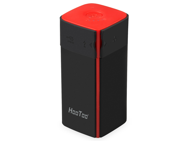
We clearly have a media sharing problem. I asked on Twitter and quite a number of people recommended the HooToo HT-TM05 TripMate Titan at $40. I took their advice, and they were right – this little device is amazing!

  • 10400mAh External Battery
  • WiFi USB 3.0 media sharing device
  • Wired-to-WiFi converter
  • WiFi-to-WiFi bridge to share a single paid connection

The value of the last two points is debatable depending on your situation, but the utility of the first two is huge! Plus the large built in battery means it can act as a self-powered WiFi hotspot for 10+ hours. All this for only forty bucks!

It’s a very simple device. It has exactly one button on the top:

  • Hold the button down for 5+ seconds to power on or off.
  • Tap the button to see the current battery level, represented as 1-4 white LEDs.
  • The blue LED will change to green if connected to another WiFi or wired network.

Once you get yours, just hold down the button to power it on, let it fully boot, and connect to the new TripMateSith WiFi network. As to why it’s called that, I suspect it has to do with the color scheme of the device and this guy.

I am guessing licensing issues forced them to pick the ‘real’ name of TripMate Titan, but wirelessly, it’s known as TripMateSith-XXXX. Connect to that. The default password is 11111111 (that’s eight ones).

Once connected, navigate to 10.10.10.254 in your browser. Username is admin, no password.

This interface is totally smartphone compatible, for the record, but I recommend you do this from a desktop or laptop since we need to upgrade the firmware immediately. As received, the device has firmware 2.000.022 and you’ll definitely want to upgrade to the latest firmware right away:

  • Make sure a small USB storage device is attached – it needs local scratch disk space to upgrade.
  • You’d think putting the firmware on a USB storage device and inserting said USB storage device into the HooToo would work, and I agree that’s logical, but … you’d be wrong.
  • Connect from a laptop or desktop, then visit the Settings, Firmware page and upload the firmware file from there. (I couldn’t figure out any way to upgrade firmware from a phone, at least not on iOS.)

Storage

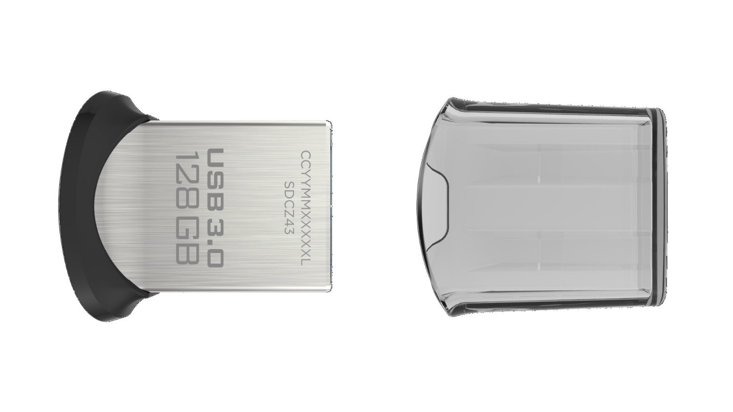
For this particular use, so we can attach the storage, leave it attached forever, and kinda-sorta pretend it is all one device, I recommend a tiny $32 128GB USB 3.0 drive. It’s not a barn-burner, but it’s fast enough for its diminutive size.

In the past, I’ve recommended very fast USB 3.0 drives, but I think that time is coming to an end. If you need something larger than 128GB, you could carry a USB 3.0 enclosure with a traditional inexpensive 2.5″ HD, but the combination of travel and spinning hard drives makes me nervous. Not to mention the extra power consumption. Instead, I recommend one of the new, budget compact M.2 SSDs in a USB 3.0 enclosure:

I discovered this brand of Phison controller based budget M.2 SSDs when I bought the Scooter Computers and they are surprisingly great performers for the price, particularly if you stick with the newest Phison S10 controller. And they run absolute circles around large USB flash drives in performance! The larger the drive, believe me, the more you need to care about this, like say you need to quickly copy a bunch of reasonably new media for the kids to enjoy before you go catch that plane.

Settings and WiFi

Let’s continue setting up our HooToo Tripmate Titan. In the web interface, under Settings, Network Settings, these are the essentials:

  • In Host Name, first set the device name to something short and friendly. You will be typing this later on every device you attach to it. I used mully and sully for mine.

  • In Wi-Fi and LAN

    • pick a strong, long WiFi password, because there’s very little security on the device beyond the WiFi gate.

    • set the WiFi channel to either 1, 6, or 11 so you are not crowding around other channels.

    • set security to WPA2-PSK only. No need to support old, insecure connection types.

There’s more here, if you want to bridge wired or wirelessly, but this will get you started.

Windows

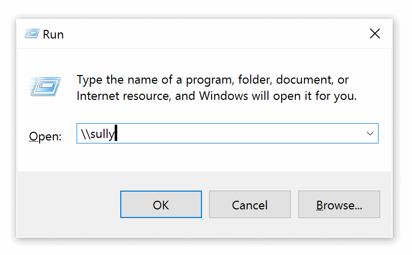
Connect to the HooToo’s WiFi network, then type in the name of the device (mine’s called sully) in Explorer or the File Run dialog, prefixed by .

The default user accounts are admin and guest with no passwords, unless you set one up. Admin lets you write files; guest does not.

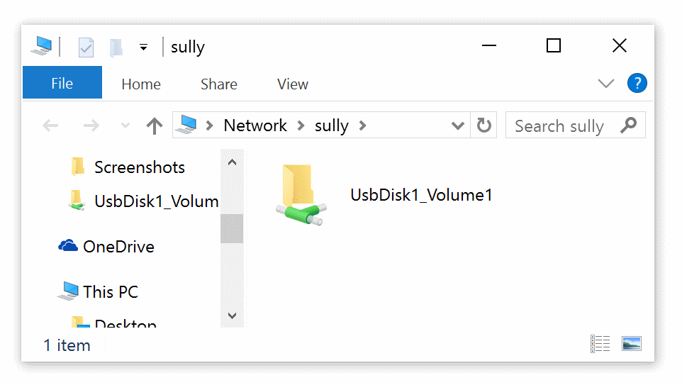
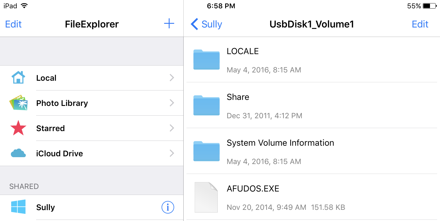
Once you connect you’ll see the default file share for the USB device and can begin browsing the files at UsbDisk1_Volume1.

iOS

I use the File Explorer app for iOS, though I am sure there are plenty of other alternatives. It’s $5, and I have it installed on all my iOS devices.

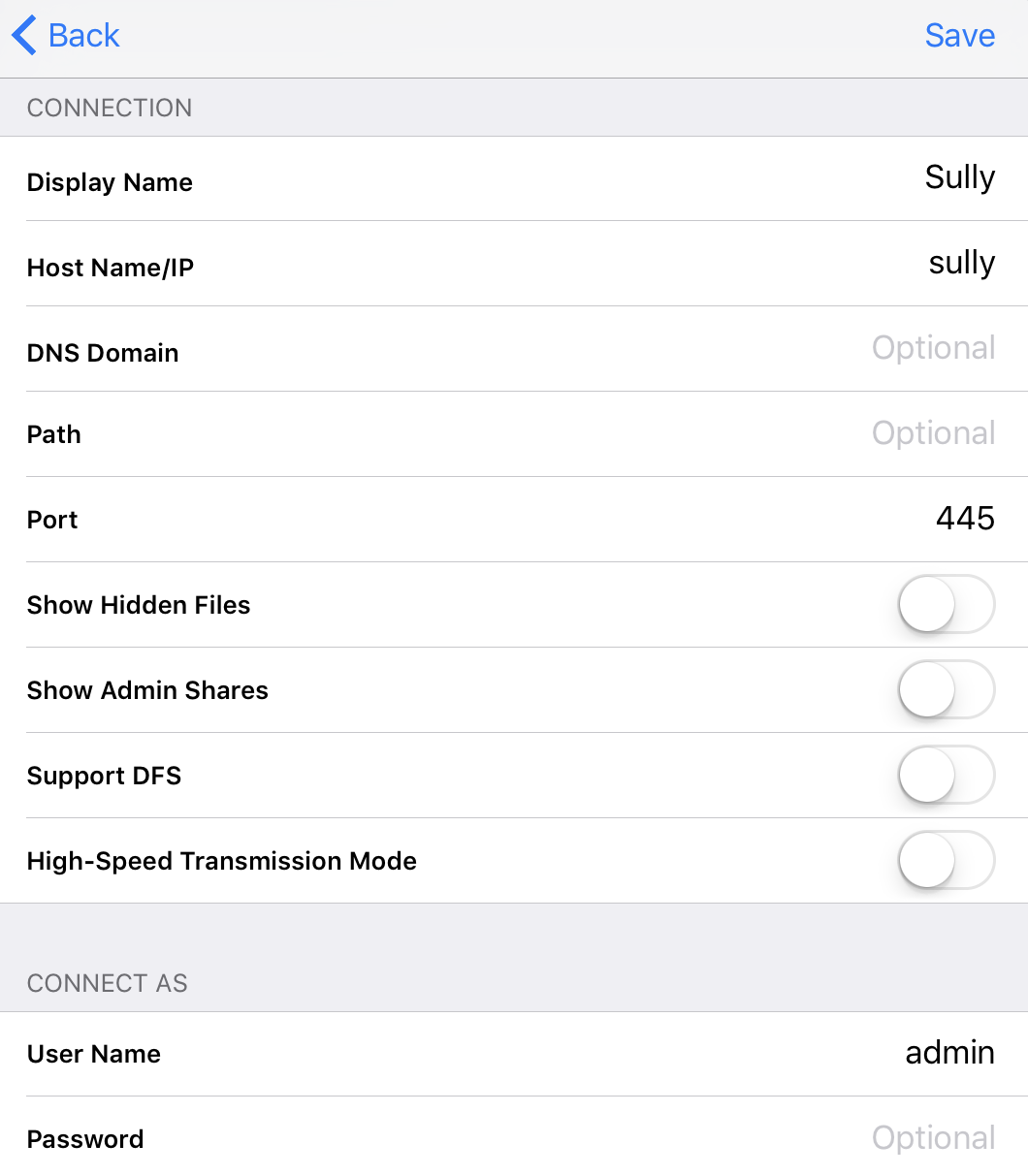
Connect to the HooToo’s WiFi network, then add a new Windows type share via the menu on the left. (I’m not sure if other share types work, they might, but that one definitely does.) Enter the name of the device here and the account admin with no password. If you forget to enter account info, you’ll get prompted on connect.

Once set up, this connection will be automatically saved for future use. And once you connect, you can browse the single available file share at UsbDisk1_Volume1 and play back any files.

Be careful, though, as media files you open here will use the default iOS player – you may need a third party media player if the file has complex audio streams (DTS, for example) or unusual video encoders.

Caveats

For some reason, with a USB 3.0 flash drive attached, the battery slowly drains even when powered off. So you’ll want to remove any flash drive when the HooToo is powered off for extended periods. I have no idea why this happens, but I was definitely able to reproduce the behavior. Kind of annoying since my whole goal was to have “one” device, but oh well.

This isn’t a fancy, glitzy Plex based system, it’s a basic filesystem browser. Devices that have previously connected to this WiFi network will definitely connect to it when no other WiFi networks are available, like say, when you’re in a van driving to Legoland, or on a plane flying to visit your grandparents. You will still have to train people to visit the File Explorer app, and the right device name to look for, or create a desktop link to the proper share.

But in my book, simple is good. The HooToo HT-TM05 TripMate plus a small 128GB flash drive is an easy, flexible way to wirelessly share large media files across a ton of devices for less than 75 bucks total, and it comes with a large, convenient rechargeable battery.

I think one of these will live, with its charger cable and a flash drive chock full of awesome media, permanently inside our van for the kids. Remember, no matter where you go, there your … files … are.

[advertisement] Building out your tech team? Stack Overflow Careers helps you hire from the largest community for programmers on the planet. We built our site with developers like you in mind.
Categories: Others, Programming Tags:

Your Own Personal WiFi Storage

May 7th, 2016 No comments

Our kids have reached the age – at ages 4, 4, and 7 respectively – that taking longer trips with them is now possible without everyone losing what’s left of their sanity in the process. But we still have the same problem on multiple hour trips, whether it’s in a car, or on a plane – how do we bring enough stuff to keep the kids entertained without carting 5 pounds of books and equipment along, per person? And if we agree, like most parents, that the iPad is the general answer to this question, how do I get enough local media installed on each of their iPads before the trip starts? And do I need 128GB iPads, because those are kind of expensive?

We clearly have a media sharing problem. I asked on Twitter and quite a number of people recommended the HooToo HT-TM05 TripMate Titan at $40. I took their advice, and they were right – this little device is amazing!

  • 10400mAh External Battery
  • WiFi media sharing device
  • Wired-to-WiFi converter
  • WiFi-to-WiFi bridge to share a single paid connection

The value of the last two points is rather debatable depending on your situation. But the utility of the first two is huge! The built in battery means it can act as a self-powered WiFi hotspot for 10+ hours. All this, and only forty bucks!

It’s a very simple device. It has exactly one button on the top:

  • Hold the button down for 5+ seconds to power on or off.
  • Tap the button to see the current battery level, represented as 1-4 white LEDs.
  • The blue LED will change to green if it is connecting to another WiFi or wired network.

Once you get yours, just hold down the button to power it on, let it fully boot, and connect to the new TripMateSith WiFi network. As to why it’s called that, I suspect it has to do with the color scheme of the device and this guy.

I am guessing licensing issues forced them to pick the ‘real’ name of TripMate Titan, but wirelessly, it’s known as TripMatSith-{x}. Connect to that. The default password is 11111111 (that’s eight ones).

Once connected, navigate to 10.10.10.254 in your browser. Username is admin, no password. This interface is totally smartphone compatible, for the record, but I recommend you do this from a desktop or laptop since we need to upgrade the firmware immediately.

As received, the device has firmware 2.000.022 and you’ll definitely want to upgrade to the latest firmware right away:

  • Make sure a small USB storage device is attached – it needs local scratch disk space to upgrade.
  • You’d think putting the firmware on a USB storage device and inserting said USB storage device into the HooToo would work, and I agree that’s logical, but … you’d be wrong.
  • Connect from a laptop or desktop, then visit the Settings, Firmware page and upload the firmware file from there. (I couldn’t figure out any way to upgrade firmware from a phone, at least not on iOS.)

Storage

For this particular use, so we can attach the storage, leave it attached forever, and kinda-sorta pretend it is all one device, I recommend a tiny $32 128GB USB 3.0 drive. It’s not a barn-burner, but it’s fast enough for its diminutive size.

In the past, I’ve recommended very fast USB 3.0 drives, but I think that time is coming to an end. If you need something larger than 128GB, you could carry a USB 3.0 enclosure with a 2.5″ SSD, but travel and spinning hard drives makes me nervous. Instead, I recommend one of the new, budget compact M.2 SSDs in a USB 3.0 enclosure:

I discovered this brand of Phison controller based budget M.2 SSDs when I bought the Scooter Computers and they are surprisingly great performers for the price, particularly if you stick with the newest Phison S10 controller. And they run absolute circles around large USB flash drives in performance! The larger the drive, believe me, the more you need to care about performance.

Settings and WiFi

Let’s continue setting up our HooToo Tripmate Titan. In the web interface, under Settings, Network Settings, these are the essentials:

  • In Host Name, first set the device name to something short and friendly. You will be typing this later on every device you attach to it. I used mully and sully for mine.

  • In Wi-Fi and LAN

    • pick a strong, long WiFi password, because there’s very little security on the device beyond the WiFi gate.

    • set the WiFi channel to either 1, 6, or 11 so you are not crowding around other channels.

    • set security to WPA2-PSK only. No need to support old, insecure connection types.

There’s more here, if you want to bridge wired or wirelessly, but these are the basics.

Windows

In Windows, connect to the HooToo’s WiFi network, then type in the name of the device (mine’s called sully) in Explorer or the File Run dialog, prefixed by .

The default user accounts are admin and guest with no passwords, unless you set one up. Admin lets you write files; guest does not.

Once you connect you’ll see the default file share for the USB device and can begin browsing the files at UsbDisk1_Volume1.

iOS

I use the File Explorer app for iOS, though I am sure there are plenty of other alternatives. It’s $5, and I have it installed on all my iOS devices.

Connect to the right WiFi network. Next, add a new Windows type share via the menu on the left. (I’m not sure if other share types work, they might, but that one definitely does.) Enter the name of the device here and the account admin with no password. If you forget to enter account info, you’ll get prompted on connect.

Once you connect, you can browse the single available file share at UsbDisk1_Volume1 and play back any files.

Be careful, though, as media files you open here will use the default iOS player – you may need a third party media player if the file has complex audio streams (DTS, for example) or unusual video encoders.

Caveats

For some reason, with a USB 3.0 flash drive attached, the battery slowly drains even when powered off. So you’ll want to remove any flash drive when the HooToo is powered off for extended periods. I have no idea why this happens, but I was definitely able to reproduce the behavior. Kind of annoying since my whole goal was to have “one” device, but oh well.

This isn’t a fancy, glitzy Plex based system, it’s a basic filesystem browser. Devices that have previously connected to this WiFi network will definitely connect to it when no other WiFi networks are available, like say, when you’re in a van driving to Legoland, or on a plane flying to visit your grandparents. You will still have to train people to visit the File Explorer app, and the right device name to look for, or create a desktop link to the proper share.

But in my book, simple is good. The HooToo HT-TM05 TripMate plus a small 128GB flash drive is an easy, flexible way to wirelessly share large media files across a ton of devices for less than 75 bucks total, and it comes with a large, convenient rechargeable battery.

I think one of these will live, with its charger cable and a flash drive chock full of awesome media, permanently inside our van for the kids. Remember, no matter where you go, there your … files … are.

[advertisement] Building out your tech team? Stack Overflow Careers helps you hire from the largest community for programmers on the planet. We built our site with developers like you in mind.
Categories: Others, Programming Tags:

SEO: Using Headlines Correctly

May 6th, 2016 No comments
11

Captions don’t create a top ranking on their own, but they are an important factor when it comes to rating a page. Thus, using headlines correctly is an essential task at all times. Today, I’ll show you how to use headlines appropriately and display them in the most optimal way.

The heading tag is used to define headlines. Here, the different headings of a content page are defined one by one using HTML. To determine the order, and, in some cases, the formatting, they are defined via . The “n” is replaced with a number. For instance:

  • Primary Heading

  • Secondary Heading

  • Tertiary Heading

  • Quaternary Heading

  • and so on

The longer the text, the more headlines and sub-headlines can and should be used. Of course, that doesn’t only help the search engine – the reader can read a well-structured text much easier, and thus finds the information he’s looking for much faster. This way, the reader receives the desired added value from your website.

Using Headlines

Per page, the main heading

should only be used once. The sub-headlines can be utilized multiple times, but they should be in a healthy proportion to the text. There is no fixed number on how often they should be used. The primary factor is that the reader is not disturbed by them. Here, you should trust your intuition.

The same flair should also be proven when it comes to the content of the headings. Simply spamming keywords will be counterproductive for the website. Clear, short, and precise headings of 4 to 6 words, starting with the keyword, are recommendable. This way, the reader, as well as the search engine can quickly evaluate the article. A clear and informative heading also gives the user a comprehensible overview of the following article.

This information is more or less obvious, at least it can be found very easily on the internet, and most webmasters know about it. In theory, it would not be a problem to apply it. Unfortunately, this often sounds a lot easier than it actually is.

Headings in Website Themes and Shop Systems

As only a minority of people still program their website page by page and manually in HTML, CMS systems with ready-to-use website themes are often used. These modular systems are practicable and useful, but they are very rigid in certain situations. Here, the devil lies in the detail. Headings are not always evident at first glance. In themes, headings are often displayed in the form of tags, to highlight a particular text paragraph or to display it larger. This is easier to program, but it is a problem for the search engine, as a lot of irrelevant text passages on the page are unnecessarily highlighted.

2

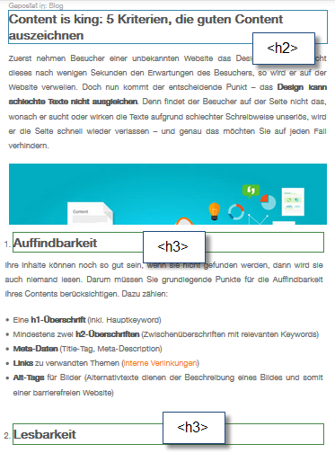
In the example of the famous Avada theme shown above, headlines are used in the footer. This is something you should pay attention to when setting up a new website using this theme.

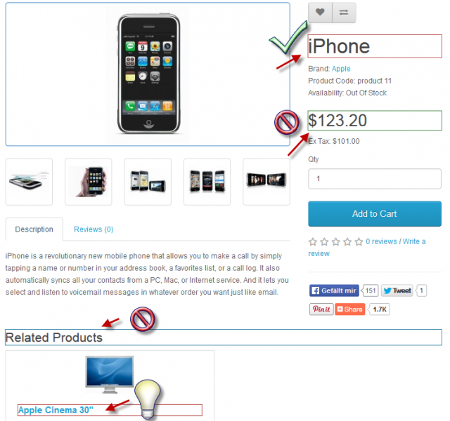
Sometimes, headlines are used for tax rates or shipment options in shop systems. In these cases, it ‘s hard to change that. Often, this pushes the users of CMS and shop systems to the limit of their knowledge and forces them to hire a programmer, which can be rather expensive at times. Still, you should pay attention that the theme treats the shop system and these aspects correctly right from the start.

3

In the case mentioned above, the product name is correct, but the price is not as relevant, and thus, it shouldn’t be displayed as a heading. “Related Products” is not really a relevant information either. As long as the amount of products that are under an existing article is tolerable, it’s no problem to display them as a heading.

Useful Browser Extensions

There are several tools to help you recognize this in advance, instead of having to read out the entire source code. For a lot of browsers, there are apps and extensions that can read out these things rather quickly, like the Web Developer in Firefox, for example. There, you can simply add a frame to all headings via “Contour” > “Add Contours to the Headings.” The framed caption can then be found in the source code much easier. This gives you the option to make changes by yourself. Usually, shop systems come with a demo version, which is a perfect fit to test the changes on.

Using Headings Correctly: Alternatives to the Tag

As an alternative to the tag, the font should just be formatted the way you want it to be. for example, to highlight all bold printed words.

With the h1 Tag:

This is a real Headline

This is a real Headline

With the Strong and Style Tag:

This only looks like a Headline

This only looks like a Headline

While the two pieces of text are almost identically when it comes to the appearance, the source code is disparate. Here, you can also notice the advantage that text parts without hn can be adjusted to the design and the personal imagination much better. Thus, using headings correctly can also mean forgoing headlines.

(dpe)

Categories: Others Tags:

CSS from the Future

May 6th, 2016 No comments

Zeke Sikelianos:

So. We have variables in CSS now. That’s pretty neat, but it doesn’t get us all the way to CSS heaven. What we really need is a way to write little bits of reusable CSS. These features have long existed in Sass, Less, and Stylus, but there’s no way to do it in regular CSS.

There’s plans for adding a new spec for what’s currently being called the @apply rule. It looks like a Sass mixin, but it’s really more like extending a placeholder selector, but because it’s native, without the selector insanity that extend can cause.

Blink is already shipping it behind a runtime flag.

Direct Link to ArticlePermalink


CSS from the Future is a post from CSS-Tricks

Categories: Designing, Others Tags:

Updating Our Prefixing Policy

May 6th, 2016 No comments

WebKit will no longer release experimental features with prefixes (i.e. -webkit-font-smoothing) as many have found that this can actually quite harmful:
Over time this strategy has turned out not to work so well. Many websites came to depend on prefixed properties. They often used every prefixed variant of a feature, which makes CSS less maintainable and JavaScript programs trickier to write. Sites frequently used just the prefixed version of a feature, which made it hard for browsers to drop support for the prefixed variant when adding support for the unprefixed, standard version. Ultimately, browsers felt pressured by compatibility concerns to implement each other’s prefixes.

Instead, experimental features will be shipped behind a runtime flag. Meaning the new features will be available, unprefixed, in development versions of the browser (i.e. “Technology Preview versions” or “Nightlies”).

WebKit is the last to jump on this wagon. Perhaps a few years from now, we’ll hardly use or think about prefixes at all.

Direct Link to ArticlePermalink


Updating Our Prefixing Policy is a post from CSS-Tricks

Categories: Designing, Others Tags: