Archive

Archive for May, 2016

So you want to make a PostCSS plugin

May 3rd, 2016 No comments

The following is a guest post by Marcus Tisäter. I think there are a lot of us out there that find PostCSS kind of fascinating. Especially from the perspective of potentially being able to write our own plugins, in JavaScript, that transform CSS in any way we want. But where to begin? How do you do a good job? Marcus explains.

You may have heard people say that making a PostCSS plugin is easy. But how do you get started? Don’t worry, that’s exactly what we’re going to go through in this article. Then beyond that, we’ll show you what to do once you’re done with your plugin and what it looks like to be a responsible PostCSS plugin developer.

Best practices, here we come.

How do I start?

All it takes is a few lines of JavaScript to get something magical happening in PostCSS. The best way to start is with the official PostCSS-plugin-boilerplate. This starter kit includes a initial setup script, a couple npm dependencies, and boilerplate code for your PostCSS plugin; it also provides you with a file to write tests in AVA (a test runner) and some documentation to get you going.

The snippet down below is the most essential part to understand from the plugin. It’s a wrapping function in a method that you are hooking up into the plugin API.

// You have to require the shell itself, PostCSS.
var postcss = require(‘postcss’);

module.exports = postcss.plugin(‘pluginname’, function (opts) {

opts = opts || {};

// Work with options here

return function (css, result) {
// Transform the CSS AST
};

});

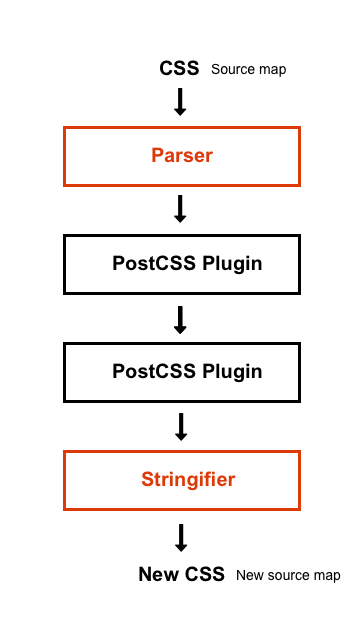
First, we need to understand what PostCSS gives us out of the box. PostCSS by itself does nothing; it’s just a surrounding wrapper for your plugin. The PostCSS core contains a parser that generates a CSS AST (Abstract Syntax Tree), which is a representation of a node tree that parses strings of CSS. When we change something inside the CSS Abstract Syntax Tree, PostCSS will still represent it as a root node but stringify the syntax tree back into a CSS string.

Let’s write a really simple PostCSS plugin. We can call it PostCSS-backwards. PostCSS-backwards will let you reverse CSS declaration values backwards. color: dlog would reverse to color: gold and vice versa.

var postcss = require(‘postcss’);

module.exports = postcss.plugin(‘postcss-backwards’, function (opts) {
opts = opts || {};
return function (css, result) {

// Runs through all of the nodes (declorations) in the file
css.walkDecls(declaration => {
declaration.value = declaration.value.split(”).reverse().join(”);
});

};
});

Of course, this is just a silly example. It’s not useful and nobody would ever use this. More importantly, this would be bad for the PostCSS plugin ecosystem. We’ll talk more about that later.

Before we jump into the actual PostCSS API, I would like you to take look at one of my absolute favorite PostCSS plugins, PostCSS Focus. PostCSS Focus adds a :focus selector to every :hover in your stylesheet. This is great for improving accessibility, as :focus styles are often forgotten and should almost always be paired with :hover styles.

Have a look at the code marked with a few comments of how this plugin is made.

var postcss = require(‘postcss’);

module.exports = postcss.plugin(‘postcss-focus’, function () {
return function (css) {

// Callback for each rule node.
css.walkRules(function (rule) {

// Match the individual rule selector
if ( rule.selector.indexOf(‘:hover’) !== -1 ) {

// Array to contain the rule’s individual selector.
var focuses = [];
rule.selectors.forEach(function (selector) {

// Passes all declaration values within the match of hover replacing those values with the returned result of focus.
if ( selector.indexOf(‘:hover’) !== -1 ) {

focuses.push(selector.replace(/:hover/g, ‘:focus’));
}

});

// Checks if array contain values
if ( focuses.length ) {
// Concat the original rules with the new duplicated :focus rules
// Groups of selectors are automatically split with commas.
rule.selectors = rule.selectors.concat(focuses);
}
}
});
};
});

Get to know the PostCSS API

The PostCSS API is the fastest and most accurate CSS parser that I have ever used. The documentation behind it is very well written and covers everything you need to know in order for you to master it. The API provides various amounts of functions, classes, common methods, and modules to use. There are methods that you might already be familiar with like, prepend, append, clone, cloneAfter or replaceWith. You can compare it to the DOM(Document Object Model) API, being able to manipulate CSS. It’s the same ideology.

If you can’t get what you want done with the PostCSS API directly, you can extend your plugin with so-called helper tools. Tools like selector, value and dimension parsers or function and property resolvers. The Function resolver is one of the more popular ones. It’s a tool made for exposing JavaScript functions.

Other extendable tools to use:

What would make me a responsible PostCSS plugin developer?

Do one thing, and do it well.

PostCSS plugins should be created to do one particular thing; it can be as simple as adding a :focus selector to every :hover in your stylesheet, or converting a unit size like pixels into ems. The important thing is to avoid writing a multi-tool plugin that does lots of things. PostCSS users like to pick their unique set of plugins to do the things they need to do.

If you want to build a multi-tool plugin, you can bundle a set of individual PostCSS plugins into a pack. You might have heard of plugins that are made like that, like cssnext for future CSS syntax or cssnano for modern CSS minification. That’s often appreciated from PostCSS users. It saves them from having to handpick their own sets.

Keep it Simple, Stupid

The old good U.S. Navy design principle KISS (Keep It Simple, Stupid) is a perfect principle to follow when making a PostCSS plugin. Take PostCSS-focus as an example, it’s a very simple idea but still a very usable PostCSS plugin to correct accesbility. The Unix philosophy suits this perfectly in terms of code as well:

Build code that is short, simple, clear, and modular.

I have a cool idea for an PostCSS plugin

There are more than 200 registered PostCSS plugins, so before hacking away on your idea for a plugin, look it up in the PostCSS plugin register. There is a strong possibility that it has already been created by someone else, and you don’t necessarily need to rebuild it. Instead, helping one another out is what makes a good plugin ecosystem. Every PostCSS plugin author I know appreciates support, ideas, and pull requests.

PostCSS recently opened up a [suggestion box](https://github.com/postcss/postcss-plugin-suggestion-box) for users to submit ideas for PostCSS plugins.

Thinking outside the box

The amazing thing about PostCSS is that you can build something that’s very simple but yet efficient, unique, and futuristic. Amazing and popular tools like Autoprefixer, uncss, CSS Modules, and Stylelint are all powered by PostCSS. They are great examples of thinking outside the box.

What’s a bad idea for a PostCSS plugin?

I advise you to not write a “syntax sugar” plugin.

For example, short hand prefixes for non-standard declaration properties or values, like a plugin that transforms font: 10px 700 into font-size: 10px; font-weight: 700. It looks like standard CSS, but it isn’t. Imagine handing over your CSS codebase that uses this over to another developer. It would create confusion and frustration, be harder to maintain, and have an unnecessarily bad learning curve.

I think that’s why some developers are still very skeptical about PostCSS, it let’s us create these possibilities. Still, these syntax sugar plugins can get quite popular. We have seen these mixin libraries go viral. A more appropriate way to create these is to require declaring the property in another way. _font, perhaps, or something else that doesn’t overwrite native CSS in an incompatible way and is unlikely to ever become part of native CSS.

Create something new with the possibilities of PostCSS and keep the spirit of CSS.

– Andrey Sitnik, creator of PostCSS

JavaScript is scary?!

A lot of developers (like myself) are still not very comfortable working with JavaScript. We don’t think we have enough experience to dig into making a PostCSS plugin. PostCSS has actually turned that around for me. It is unbelievable to see how much you can accomplish with just a few lines of code and how easy it is to build a working PostCSS plugin.

PostCSS plugins that use very little code

Yet, still create something unique and useful. Have a look:

Let’s talk best practices

Your PostCSS plugin should only iterate the CSS AST (Abstract Syntax Tree) only once and keep a cache of rules, rather than multiple iteration steps. Using a string representation of a node is quite expensive, so only do that when you need to, and above all ensure that PostCSS plugins are developed using TDD (Test Driven Development).

There is one method from the PostCSS API that you should be cautious about. The node.raws method. node.raws contains information to generate byte-to-byte node strings, this can be bad because it stores whitespace and code formatting data from the stylesheet. As every parser can save different data, it will become very expensive.

  • Use asynchronous methods whenever possible
  • Set node.source for new nodes (generates an accurate source map)
  • Use node.error on CSS relevant errors (creates source position)
  • Use result.warn for warnings (don’t output console.log()s)

Don’t worry if this doesn’t make any sense to you. When the time comes, check out the official plugin guideline page for further detail.

Sourcemapping

PostCSS has great sourcemaps support and integration. It can auto-detect the format you expect, read, and output both inline and external maps. As a plugin developer you have to be careful not to break the sourcemapping functionality.

Every node property sets node.source (contains a origin position in parsed input) by default. PostCSS stringify will calculate the new position of that node and use node.source to create a mapping between the new and old position. The common mistake is that PostCSS plugin authors forget to simply add source on the node creation, which will result in the plugin not being mapped. The best and only recommendation for plugin authors is to use the PostCSS API clone(), cloneBefore() or cloneAfter(), as it will copy origin node source or set the source manually.

What do I do when I’m done?

Everyone is free to write a PostCSS plugin and publish it on GitHub and npm. In the end, it all comes down to taking responsibility for something that you have released.

With great power comes great responsibility.

But before we rush into things, there are a couple of mandatory rules for a PostCSS plugin author to follow. You can find them all here. Let’s walk you through some of the key rules.

TDD (Test Driven Development)

When writing code, it’s also important to write tests. I think developers should know what the purpose of a test is and also be able to write one. There are so many reasons why you should write test in terms. The quality of your final output is often much better, as you’ll get plenty of “aha-moments” when building and running tests. From personal experience, my code drastically improves as I learn how to refactor from the test failures.

I recommend writing tests in AVA because it has a very simple syntax and is also the most commonly used within PostCSS plugins. This is helpful for getting the most contributors for your plugin. AVA also has promise support, which is great for async plugins and other benefits, such as speed, no implicited globals, ES2015 support, and that it runs all the tests concurrently. If you don’t prefer working with AVA, you can look into Chai or Mocha.

Let’s write a simple test for our PostCSS-backwards plugin in AVA.

// Function helper to make our tests cleaner
// This runs our plugin
function run(t, input, output, opts = {}){
return postcss([ plugin(opts) ]).process(input)
.then( result => {
t.same(result.css, output);
t.same(result.warnings().length, 0);
});
}

// This test passed.
test(‘reverse color value from dlog to gold’, t => {
return run(t, ‘a{ color: dlog }’, ‘a{ color: gold }’);
});

CI Service

Using a CI service like Travis for testing code in different node environments is recommended, as you get to test if your code meets the requirements right from node. I also like Travis as it’s configurable and you can run all tests automatically when you commit to your repo and get pass/fail notifications. Give it a go!

Naming your plugin

Your PostCSS plugin name should prefix with “postcss-“, indicating that it in fact is a PostCSS plugin and also clarifying the purpose of what it does just by reading the name. It’s also preferable to have the name lowercased.

  • Preferred: postcss-my-cool-plugin
  • Not preferred: PostCSS-My-Cool_Plugin

Documentation

You don’t necessarily have to write a lot of documentation, but it is important to describe what your PostCSS plugin does by showing input and output code examples in the README. This makes it more clear for the user to understand what the purpose of the plugin is.

Keep a changelog

It’s important to keep a changelog file that is updated with each and every release you have published for your PostCSS plugin. That is very beneficial both for you (having a history to look back on) and for the users of your plugin (a reference for updates and changes). I would recommend a npm publisher like npmpub and to read more on keepachangelog.com/ for tips and tricks on maintaining a good changelog file.

Last words of wisdom

I think the best way to learn how to make PostCSS plugin is to throw yourself out there, take the time to deep dive into getting to know the PostCSS API and playing around in the AST Explorer.

Remember that you are not alone on this journey; you have the PostCSS community to assist you. The beautiful thing about PostCSS is its community. It sounds cliché, but I want to emphasize the fact that you often get to talk with the experts behind the PostCSS core and receive tons of help.

If you have any questions, feel free to leave them in the comments section or tweet me and I’ll try my best to give you an answer. Be sure to check out the documentation at the official website postcss.org.

I would like to thank Ben Briggs, Andrey Sitnik, Dan Gamble, Chris Coyier and Malin Gernandt for making this article possible through proofreading and ideas.


So you want to make a PostCSS plugin is a post from CSS-Tricks
Categories: Designing, Others Tags:

Improve Your Designs With The Principles Of Similarity And Proximity (Part 1)

May 3rd, 2016 No comments

The perceptual process enables us to perceive the world through our senses of sight, smell, sound, taste and touch. In particular, our visual system processes vast amounts of information in its environment. Rather than perceiving elements separately, our brain organizes patterns, objects and shapes into whole forms that we can understand.

Improve Your Designs With The Principles Of Similarity And Proximity (Part 1)

The gestalt grouping principles of visual perception describe this organization as a set of principles that explain how we perceive and organize this huge amount of visual stimuli. The gestalt principles – similarity, proximity, closure, figure-ground, continuance and common fate – are a popular tool used by designers for visually organizing information.

The post Improve Your Designs With The Principles Of Similarity And Proximity (Part 1) appeared first on Smashing Magazine.

Categories: Others Tags:

How to design HTML5 games

May 3rd, 2016 No comments

HTML5 and the term “cross platform” are buzz words, and for good reason. The technology works for smartphones, tablets, laptops and desktops. Agencies love the concept, because any web designer who knows HTML, will understand HTML5. What does it mean for you, the Web Designer?

  • More projects involving HTML5
  • More projects revolving around interactivity
  • Creating experiences for the end user to interact with

At the heart of this interactive experience, are casual games. In this article, I’ll show you how you can get some coveted game design experience. The goal? Have “HTML5 game design” on your résumé.

I play games, but…

It’s a common fallacy among web designers that designing games is a specialized skill. You don’t need to attend game design school, to design games. Anyone can design games. First, let’s break this into parts. Building a game requires 3 major steps:

  1. designing the game;
  2. producing the visual and audio assets;
  3. programming the game.

As a web designer, the easiest way to gain experience, is through designing the game itself. For points 2 and 3, an agency typically already has designated artists and programmers for the job. If you’re good at artwork, 2 is highly attainable. For the purposes of this article, let’s discuss step 1. Where do we even begin? Here are 10 steps that every game designer needs to go through, to earn their stripes.

1) Play lots of casual games

Have an iPhone or Android phone? Go to the App Store, head to the top free games chart. Download and play every single game in the top 20 list. Do this at least once every 2 weeks.

While you’re playing, be conscious of how each game is designed. Which animation techniques and mechanics is it using? Did the characters stand out to you? Did it have a storyline? What did the game make you feel? After 20–30 games, you’ll start to spot patterns.

You’ll notice that some games, at the core are really about the same thing. Eg: Clash of Clans, Boom Beach and Hay Day are about building, defending and attacking.

You’ll notice that simple games, such as Flappy Bird or Swing Copters focus on really hard challenges, which can be repeated an infinite number of times.

You’ll notice that some games focus on compelling storytelling with carefully designed characters.

You’ll also notice a few odd indie games, that’re just downright random but really fun!

2) Make sketches… lots of ‘em

Make sketches of the things you like from the games you played. Sketch characters, maps, menus and user interfaces. Was there a certain character which you liked? Was there a certain angle of the game that made you excited?

Here’s a character called ‘Matt’. He’s a bored office guy, glued to his chair:

3) Make flow diagrams

Flow diagrams describe the step-by-step process of the game. They describe the point where the user starts the game, all the way to important events, such as a victory or loss. Start with simple diagrams like this:

As you gain more confidence, iterate on your simple flow to make more complex flows.

4) Write a game design document

Using what you learned from Steps 1–3, design and write a simplified game design document (GDD). A GDD basically tells the reader what the game is about.

Quick example: Let’s take our character called “Matt” in Step 2, and let’s say he’s trapped in a boring office job. He wants to escape. The catch is, he can only do it from his rolling chair. We’ve produced a neat sketch of the game screen. It shows a maze of office desks conspiring to block Matt’s escape.

As an example, we made the goal of the game simple. Navigate the office maze to escape it.

That’s it, for a very basic GDD. Here’s the complete flow diagram, for our game, Escape The Office.

5) Train your cross-platform mindset

With HTML5 games, a lot of it boils down to being able to run the game on different screen sizes, efficiently. Here’s a rundown of different devices we have in the market: iPhone, iPad, iPod Touch, Samsung Galaxy Note3, Samsung Galaxy Tablet, Google Nexus, LG, Xiaomi, Windows Phone, Windows Laptop, Mac, the list goes on and on… Ridiculous? Yet, this is what large companies do. As an independent designer, how do you design a game, that fits different screen sizes?

  1. Fix the game orientation. Design your game such that, it works either in portrait mode, or landscape mode only.
  2. Find the most common game resolution that works for most devices. Maintain the aspect ratio. Then, scale up or down, depending on the device resolution. We find aspect ratios of 3:4 (portrait), or 4:3 (landscape) most popular, and efficient.
  3. Design lightweight, casual games. Don’t go for the bulky, 3D MMO game. Instead, go for fun, light casual experiences. The game could be as simple as whacking moles, or jumping around platforms. Anything under the sky is fair game (no pun intended).
  4. Always draw high resolution artwork. At least 2048px wide as a baseline. It’s easier to scale down than it is to scale up.

6) Start pitching

Ask your company (or clients) if they’re interested in any game-related projects. Show them your designs. Pitch your heart out. Walk them through the GDD.

Your first game idea pitch won’t be like Shark Tank, rest assured! Chances are, they’ll allocate a small budget for the game. If there’s no budget, continue making better designs, and reaching out to other companies. If you have the resources, fund your own game projects on the cheap.

7) Find a programmer

Once you have a budget, start looking for programmers that specialize in game development. Show them your designs, share the budget, and tell them the vision. Most game developers are very helpful. What you need is a programmer that’s well versed in HTML5 games. This person has to know how to code something that scales nicely for all kinds of form factors. Discuss the “cross platform mindset” with the programmer.

8) Grind

The development of the game itself will take weeks, if not months, initially. There will be blood sweat and tears, but it’ll all be worth the experience. It’s very important to keep the scope of your game design very, very small, at least for your first project.

9) Finish the project

The key word here is “finish” the project. Oftentimes, as designers, we want a perfect game. Zero bugs. Beautifully designed game art, with ideal rules. Throw that mindset out the window. Go for “good enough”. Release the game into the wild. Nothing says it like a game that’s live, in the hands of users. You can always polish up the game post-launch. Done is better than perfect.

10) Measure feedback

Check user responses to your game. Use free tools such as Google Analytics to track your game’s views, plays and events.

If you’re designing games to gain social media attention, analyze the Facebook likes, the Tweets and the Instagram Likes. Study how the users reacted to your game.

Clients from Hell Ebook: HELL TO PAY (Earning Good Money) – only $15!

Source

Categories: Designing, Others Tags:

22 Fresh Free WordPress Themes (Edition: May 2016)

May 3rd, 2016 No comments
22 Fresh Free WordPress Themes (Edition: May 2016)

To get the month of May going in terms of creating we gathered fresh free WordPress themes for WooCommerce, real estate, portfolio websites, fashion, magazines, businesses, creative agencies, a multipurpose graphic website and more. Responsive design, clean and modern, minimal, and lazy load are just some features to highlight. Some of the following themes integrate tons of elements such as unlimited widgets areas, sidebars, navigation bars, sliders, boxed layouts, thumbnails, top search bars, calendars, excellent socials and a lot more.

This round-up of fresh free WordPress themes is particularly large as we have added two collections by the friendly people of Themeshock and ByPeople to the list. Never has there been more to explore than in the following post. Have fun!

22 Fresh Free WordPress Themes (Edition: May 2016)

All these themes are free though some may have commercial variants available or require registration.

Cool Soccer Blog Theme Collection

Created by: ThemeShock
Features: More than 50 submissions, top-quality free WordPress themes, hand-picked from across the Internet for years, one-click download
License: Free for personal use

Amazing Magazine Themes Collection

Amazing Magazine WordPress Themes Collection

Created by: ByPeople
Features: More than 50 submissions, top-quality free WordPress themes, hand-picked from across the Internet for years, one-click download
License: Free for personal use

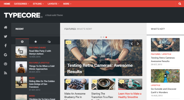
Typecore: Polished Magazine

Typecore: Polished Magazine WordPress Theme

Created by: AlxMedia
Features: Neatly organized in several multisize thumbnail sections, perfect for news or magazine purposes, left sidebar for recent, or popular posts, and comments, right sidebar for what’s hot section, responsive design
License: GNU GPL

Kontrast: Responsive High-Resolution Magazine

Kontrast: Responsive High Resolution Magazine WordPress Theme

Created by: AlxMedia
Features: Toggle fixed-width sidebar, related posts, and post navigation, featured story or slider, boxed layout, footer and header ads, standard post style, ultra-responsive, unlimited widget areas.
License: GNU GPL

Slanted: Colorful Blogging

Slanted: Colorful Blogging WordPress Theme

Created by: AlxMedia
Features: Material Design-like header top navigation bar, fixed layout, regular pagination, bottom recent comments and posts list, nice socials and credits footer.
License: GNU GPL

Blogline: Classic Blog Design

Blogline: Classic Blog Design WordPress Theme

Created by: AxlMedia
Features: Ultra-responsive, extensive styling options, post formats, unlimited widget areas, social links font selection flexible layout options, good SEO, and more
License: GNU GPL

Blogrow: Clean & Modern Personal Blog

Blogrow: Clean & Modern Personal Blog WordPress Theme

Created by: AlxMedia
Features: Standard, grid, or list blog layouts, flexible and full-width carousel, related posts and posts navigation, ultra responsive, extensive styling options, post formats, unlimited widget areas.
License: GNU GPL

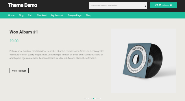
On Sale: Storefront for WooCommerce

On Sale: Storefront WooCommerce WordPress Theme

Created by: ecommercethemes
Features: Clean and crisp child theme, WooCommerce integration, Storefront must be installed before this theme, simple color palette, logo, favicon, and page layout options in customizer, and more.
License: GPLv2

Zoner-lite: Modern Real Estate

Zoner-lite: Modern Eal Estate WordPress Theme

Created by: Fruitfulcode
Features: Bootstrap responsive design, home, blog, documentation, and support pages, several types of posts, standard pagination, and more.
License: GNU GPL

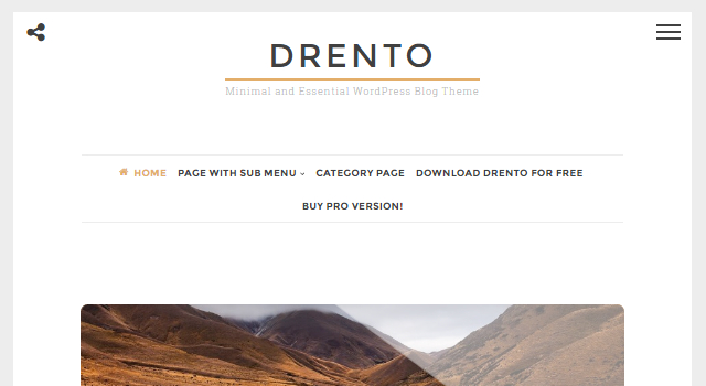
Drento: Minimal and Essential

Drento: WordPress Theme - CrestaProject

Created by: CrestaProject
Features: Clean and minimal style, off-canvas right sidebar menu featuring a calendar, tag cloud, recent posts and comments, big thumbnails, glossy hover effects on featured images.
License: GPL

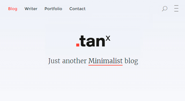
Tanx: Beautiful Minimal Blogging

Tanx: Beautiful Blogging WordPress Theme

Created by: PhiRhythmus
Features: Minimal style, responsive design, single column layout, multiple pages, beautiful typography, lazy load, top search bar, off-canvas right sidebar menu.
License: Free for personal use

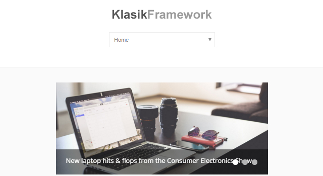
Klasik: Framework-like WordPress Theme

Klasik: Framework-like WordPress Theme

Created by: klasikthemes
Features: Base/ starter theme for quicker WordPress theme development, perfect for business, portfolio gallery, blog or personal, nine widget areas, eight custom widgets, full CMS control.
License: GPLv2

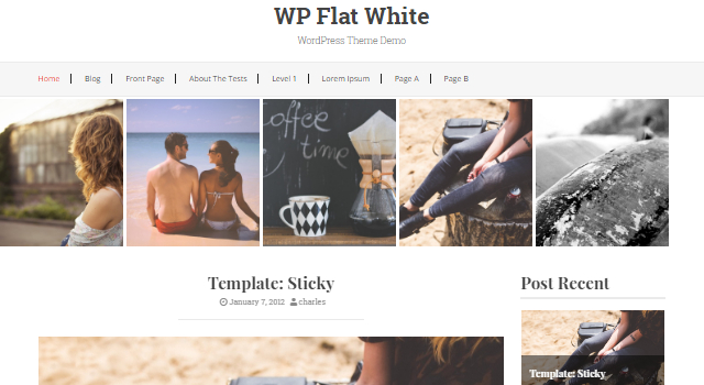
WP Flat White: Clean Blogging

WP Flat White: Clean Blogging WordPress Theme

Created by: Invictus Themes
Features: Modern design, beautiful typography, carousel as a header, multipage layout, fading overlay descriptions on hover events, typical sidebars, several sections.
License: Free for personal use

Kira Lite: Creative Agency

Kira Lite: Creative Agency WordPress Theme

Created by: Macho Themes
Features: Responsive layout, WooCommerce support, translation ready with WPML, flexible, one-page layout, creative design, line icons.
License: Free for personal use

Freesia: Responsive Business

Freesia: Responsive Business WordPress Theme

Created by: Themefreesie
Features: Cross-browser compatibility, multiple layouts available, responsive design, SEO friendly, social media integrated, WooCommerce compatible
License: GPLv3

eStore: WooCommerce Responsive

eStore: Free WooCommerce Responsive WordPress Theme

Created by: ThemeGrill
Features: Clean style, fully customizable, WooCommerce integration, several custom widgets for a professional online store, YITH, and WooCommerce Wishlist Plugin compatibility.
License: GNU GPL

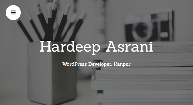
Latte: One-page Portfolio

Latte: One-page Portfolio WordPress Theme

Created by: Hardeep Asrani
Features: One-page parallax, perfect for profile & portfolio showcasing, services section, maps, contact form, testimonials, pricing tables, drag&drop page editor/builder.
License: Free for personal use

Philomina: Fashion Website

Philomina: Fashion Website WordPress Theme

Created by: charlieasemota
Features: Clean minimal style, fashion blogs or websites, responsive layout, multiple language translations support, parallax effects, off-canvas menu.
License: GPLv2

Dyad: Multipurpose Graphic Theme

Dyad: Multipurpose Graphic WordPress Theme

Created by: Automattic
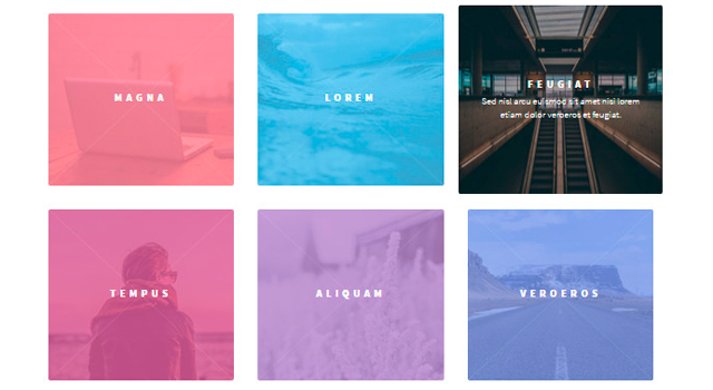
Features: Responsive layout, Pairs image and written content in tight together cards grid layout, full-width top header, perfect for restaurants, food blogs, photographers, and related.
License: GPLv2

Integral: Elegant Agency

Integral: Elegant Agency WordPress Theme

Created by: Themely
Features: Responsive design, media content, smooth parallax effect, drag & drop reordering, toggle sections, translation ready, sticky navigation, contact form 7, and more.
License: GNU GPL

Sauron: Clean Multipurpose Theme

Sauron: Clean Multipurpose WordPress Theme

Created by: webdorado
Features: SEO-friendly, multipurpose, responsive layout, front-page builder, full-screen lightbox, slideshow, layout editor, jetpack, cross-browser compatibility, and more.
License: GPLv2

Codilight Lite: Modern & Clean Magazine

Codilight Lite: Modern & Clean Magazine WordPress Theme

Created by: FameThemes
Features: Theme Customizer, complete localization, SEO optimized, custom page templates, browser, custom theme widgets, top notch support.
License: GPLv2

(dpe)

Categories: Others Tags:

An Ultimate Guide To CSS Pseudo-Classes And Pseudo-Elements

May 3rd, 2016 No comments

Hola a todos! (Hello, everyone!) In my early days of web design, I had to learn things the hard way: trial and error. There was no Smashing Magazine, Can I Use, CodePen or any of the other amazing tools at our disposal today. Having someone show me the ropes of web design, especially on the CSS front, would have been incredibly helpful.

An Ultimate Guide To CSS Pseudo-Classes And Pseudo-Elements

Now that I am far more experienced, I want to share with you in a very friendly, casual, non-dogmatic way a CSS reference guide to pseudo-classes and pseudo-elements.

The post An Ultimate Guide To CSS Pseudo-Classes And Pseudo-Elements appeared first on Smashing Magazine.

Categories: Others Tags:

A Comparison of Animation Technologies

May 2nd, 2016 No comments

The question I am asked most frequently: what animation tool do you recommend?

Having worked with a slew of them, I can tell you there is no right answer. It’s a complicated question and complicated answer. This post serves to clarify what to use, and when, to get you working with the right tool for the job.

If you’re here for React, we’ve got you covered! Jump down to the React section below and we’ll break down what to use and how to use it.

There’s no possible way to go over every single animation library around, so I’m going to stick with the ones that I’ve either used or that interest me. Please keep in mind that these are my recommendations based on my own experiences, and the web has a lot of grey area, so you may have a different experience or opinion. That’s OK.

Native Animation

Before we talk about any libraries, let’s go over some native animation implementations. Most libraries are using native animation technologies under the hood anyway, so the more that you know about these, the more you’ll be able to negotiate what is happening when it becomes abstracted.

CSS

CSS remains one of my favorite ways to animate. I’ve been using it for years and continue to be a fan due to its legibility and excellent performance. CSS animations make it possible to transition between different states using a set of keyframes.

Pros:

  • You don’t need an external library.
  • The performance is great, especially if you do things that are inherently hardware accelerated (offloaded to the GPU). Here’s an article about the properties that will help you do so.
  • Preprocessors (like Sass or Less) allow you to create variables (for things like easing functions or timings) that you’d like to remain consistent, along with :nth-child pseudo classes in functions to produce staggering effects.
  • You can listen for onAnimationEnd and some other animation hooks with native JavaScript.
  • Motion along a path is coming down the pipeline which will be rad.
  • It is easy to use for responsive development because you can modify your animation with media queries.

Cons:

  • The bezier easings can be a bit restrictive. With only two handles to shape the bezier, you can’t produce some complex physics effects that are nice for realistic motion (but not necessary very often).
  • If you go beyond chaining three animations in a row, I suggest moving to JavaScript. Sequencing in CSS becomes complex with delays and you end up having to do a lot of recalculation if you adjust timing. Check out this Pen from Val Head that illustrates what I mean. Staggers are also easier to write in JavaScript. You can hook into the native JavaScript events I mentioned earlier to work around this, but then you’re switching contexts between languages which isn’t ideal, either. Long, complex, sequential animations are easier to write and read in JavaScript.
  • The support for motion along a path isn’t quite there yet. You can vote on support for Firefox here. Voting for support in Safari, as far as I can gather, is a little more individual. I registered to fill out a bug report and requested motion path module in CSS as a feature.
  • CSS + SVG animation has some strange quirkiness in behavior. One example is that in Safari browsers, opacity and transforms combined can fail or have strange effects. Another is that the spec’s definition of transformation origin, when applied sequentially, can appear in a non-intuitive fashion. It’s the way that the spec is written. Hopefully SVG 2 will help out with this but for now, CSS and SVG on mobile sometimes requires strange hacks to get right.

Canvas

Canvas is great to get those pixels moving! So many of the cool things you see on CodePen are made by canvas magicians. Like its name suggests, canvas offers a visual space scripting, in which you can create complex drawings and interaction, all with high performance rendering. We’re working with pixels here, which means they are raster (as opposed to vector).

Pros:

  • Since we aren’t moving things around in the DOM, but rather a blob of pixels, you can make a ton of complex things happen without weighing down performance.
  • Canvas is really nice with interaction. You’re already in JavaScript which offers a lot of control without switching contexts.
  • The performance is very good. Especially considering what you can make.
  • The sky’s the limit on what you want to create.

Cons:

  • It’s difficult to make accessible. You’d have to use something like React to create a DOM for you, which Flipboard managed to do a little while ago, though in their case study it seemed they had more work to do. There’s probably an opportunity there, though, if you’re interested in taking up the charge.
  • I find it pretty unintuitive to make responsive. By this I don’t mean making a small version work on the phone, because that it does well. I mean moving and shifting and reorganizing content based on the viewport. I’m sure there are some really great devs out there who do it easily, but I would say it’s not terribly straightforward.
  • It’s not retina-ready. Unlike SVG animation which is resolution-independent, most of the canvas animations I see are not crisp on retina displays.
  • It can be difficult to debug. When what you are building breaks, it breaks by showing nothing, unlike animating in the DOM, where things are still there but just behaving weirdly.

SMIL

SMIL is the native SVG animation specification. It allows you to move, morph and even interact with SVGs directly within the SVG DOM. There are a ton of pros and cons to working with SMIL, but the biggest con will lead me to omit it entirely: it’s losing support. Here’s a post I wrote on how to transfer over to better-supported techniques.

Web Animations API

The Web Animations API is native JavaScript that allows you to create more complex sequential animations without loading any external scripts. Or will, anyway, when support grows. For now you’ll probably need a polyfill. This native API was created as a backfill from all of the great libraries and work that people were already making with JavaScript on the web. This is part of a movement to align the performance of CSS animations and the flexibility of sequencing in JavaScript under one roof. If you’re interested in hearing more, there is a ShopTalk episode all about it.

Pros:

  • Sequencing is easy and super legible. Just check out this example from Dan Wilson which compares CSS keyframes and the web animation API.
  • Performance seems to be on track to being very good. I haven’t tested this myself well yet but plan to. (You can and should be running your own performance tests as well).

Cons:

  • Support is not great right now. It’s also still changing a bit so while the spec is moving I would be cautious about running it in a production environment.
  • There are still a lot of things about the timeline in GSAP (which we’ll be covering in a moment) that are more powerful. The important ones for me are the cross-browser stability for SVG and the ability to animate large swaths of sequences in a line of code.

WebGL

There are some extraordinary things you can do with WebGL. If anything is blowing your socks off, there’s a good chance it was made with WebGL. What it’s really good at is interactive and 3D effects. Check out some of these demos. Technically it uses canvas, but I like making the distinction because, I don’t know, names are cool when they work to identify slight variance.

Pros:

  • Amazing visual effects
  • Three dimensions means a whole new world for interaction
  • Hardware-accelerated
  • Possibilities for VR

Cons:

  • Tougher to learn than the other native animations we’ve covered thus far. The first two animations I made I thought weren’t working because I had the camera pointed the wrong way (womp womp). There are also less really good articles and books explaining how to work with it than the other technologies I’ve mentioned thus far, but they’re growing.
  • Hard to make responsive. Most websites I’ve seen that use WebGL fall back to a “please view this site on desktop” screen.

External Libraries

GreenSock (GSAP)

GreenSock is far and away my favorite library to work with. Please understand that this bias comes from working, playing around with, and bumping my head badly on a lot of different animation tooling so when I give my strong endorsement, it’s through blood, sweat and tears. I especially like it for SVG. The GreenSock Animation API has almost too many cool benefits to list here without missing something, but they have both docs and forums you can explore.

Pros:

  • It’s extraordinarily performant for something that’s not native. As in, performs just as well, which is major big deal.
  • The sequencing tools (like timeline) are as easy to read as they are to write. It’s very simple to adjust timing, have multiple things fire at once with relative labels, and even speed your animations up or down with one line of code.
  • They have a ton of other plugins if you want to do fancy things like animate text, morph SVGs, or draw paths.
  • Their motion along a path in the bezier-plugin has the longest tail of support available.
  • It solves SVG cross-browser woes. Thank goodness for this one. Especially for mobile. There’s some good info about that in this post they wrote.
  • They offer really nice, very realistic eases.
  • Since you can tween any two integers, you can do cool stuff like animate SVG filters for some awesome effects, and work even work in canvas. Sky’s the limit on what you can animate.
  • GSAP is the only animation library, including the native SMIL, that lets you morph path data with an uneven amount of points. This has opened new opportunities for motion and movement. (If you’d like to it in action, go the logo at the top of this page on desktop and click the orange bit in the dash.)

Cons:

  • You have to pay for licensing if you’re re-selling your product to multiple users (apps and paid-access sites). That’s probably not most cases. I’ll also put in that supporting work on this isn’t the worst thing in the world.
  • As with any external library, you have to watch which versions you are using in production. When new versions come out, upgrading will involve some testing (like any library). You’ll also need to consider the size of the library.

VelocityJS

VelocityJS offers a lot of the sequencing that GreenSock does, but without a lot of the bells and whistles. I no longer really use Velocity due to the cons below. Velocity’s syntax looks a bit like jQuery, so if you’ve already been using jQuery, it will be familiar.

Pros:

  • Chaining a lot of animations is a lot easier than CSS.
  • For refinements in eases there are step-eases where you can pass an array.
  • The documentation is pretty nice so it’s easy to learn and get up and going.

Cons:

  • The performance isn’t great. Despite some claims to the contrary, when I ran my own tests I found that it didn’t really hold up. I suggest you run your own, though, as the web is always moving and this post is frozen in time.
  • GSAP has more to offer, for performance and cross-browser stability without more weight. I would also say that jQuery used to lose performance tests but that might have changed since their RAF adoptions, so Velocity isn’t bad by any means, but it loses out in comparison.
  • From what I can tell, it’s not actively being maintained anymore. I’ve heard that Julian Shapiro has passed the project off to someone else, so it may make a resurgence sometime in the future.

jQuery

jQuery isn’t solely an animation library, but it has animation methods and a ton of people use it, so I thought I would cover it.

Pros:

  • A lot of sites already have it loaded, so it’s usually readily available.
  • The syntax is really easy to read and write.
  • They recently moved over to requestAnimationFrame, so in versions 3.0.0 and greater, the performance will be better than before.

Cons:

  • Versions earlier than 3.0.0 performance is not great and not recommended. I haven’t tested this in a very formal way, but aside from looking at repaints and painting in Chrome DevTools, you can also see it with your eyes.
  • Animations aren’t supported on SVG in any version.
  • jQuery is limited to the DOM, unlike tools like GSAP which work on anything.

Snap.svg

A lot of people think of Snap as being an animation library, but it was never intended to be one. I was going to run performance benchmarks on Snap, but even Dmitri Baranovskiy (the incredibly smart and talented author of Snap.svg, and it’s predecessor, Rafael), says here on the SVG Immersion Podcast that it’s not the correct tool for this, and in a message to me said:

Just a note: Snap is not an animation library and I always suggest to use it with GSAP when you need a serious animation.

That said, jQuery is not great with SVG, though they do now support class operations. If I need to do any DOM manipulation with SVG, Snap is really awesome for this.

A library called SnapFoo was released recently, and it extends Snap’s realm to animation. I haven’t played with it myself yet, but it looks pretty cool and is worth a go. If you try it, report back or comment below!

Mo.js

This is a library by an awesome fellow that goes by LegoMushroom. He’s an extremely talented animator, and has already made some great demos for this library that have me really excited. This library is still in beta and he’s actively working on it (and I mean actively, the repo is updated a ton).

I haven’t worked with it personally yet but will update this post when I do. The thing that excites me the most is how nicely malleable the easings are when you pass in SVG path data. Check out how extensible this is. It looks very promising and like a really good tool. I’ll put in the caveat that since it’s still young, it’s changing still and might not be ready for a production environment quite yet. It’s getting close though, so keep an eye on it.

Three.js

Three.js is a beautiful three dimensional animation tool! Check out some of these examples. I haven’t worked with this a lot so I don’t feel comfortable reporting on it, but I plan to and will update the post when I know more. People usually talk about this and the native WebGL in tandem.

Bodymovin’

Bodymovin’ meant for building animations in Adobe After Effects that you can export easily to SVG and JavaScript. Some of the demos are really impressive. I don’t work with it because I really like building things from scratch with code (so this defeats the purpose for me), but if you’re more of a designer than a developer, this tool would probably be really great for you. The only con I see to that part is that if you need to change it later, you’d have to re-export it. That might be a weird workflow. Also, outputted code is usually kind of gross, but I haven’t seen that effect the performance too much in the case of Bodymovin’, so it’s probably fine.

React-Specific Workflows

Before we talk about React, let’s cover why we have to treat animations in React differently at all. DOM stands for Document Object Model. It’s how we create a structured document with objects, the nodes of which we talk about as a tree. React interacts with a virtual DOM, which is unlike the native browser DOM implementation. It as abstraction.

React uses a virtual DOM number of reasons, the most compelling of which is the ability to figure out what’s changed and update only the pieces it needs to. This abstraction comes at a price, and some of the old tricks that you’re used working with will give you trouble in a React environment. jQuery, for instance, will not play nice with React, being that it’s primary function is to interact and manipulate with the browser’s native DOM. I’ve even seen some strange CSS race conditions. Here are some of my recommendations for nice animations in a React workflow.

React-Motion

React-Motion is a very popular way to animate in React, and the community has adopted it over the old ReactCSSTransitionGroup that used to be most frequently used. I like it a lot, but there are some keys points to working with it that if you don’t get, will have you banging your head.

React-Motion is pretty similar to game-based animation, where you give an element mass and physics and send it on it’s way, and it gets there when it gets there. What this means is that you aren’t specifying an amount of time like you do with CSS or any other traditional web-based sequential motion. This is a pretty different way of thinking about animation. This can mean that the motion has the ability to look really realistic which can be very beautiful. But UIs have different requirements than games, so working with this can get tricky. Let’s say you have two things that have to fire independently and get there at the same time that are different. It can be tough to line them up exactly.

Up until recently, there was no sequencing available. Just last week, Cheng Lou added in onRest, which allows for this kind of callback workflow. It’s still not easy to write a loop without writing an infinite loop (bad). You might not need that but I thought I would call it out. As an FYI to the performance-sensitive, it uses re-rendering.

Pros:

  • The animation can look really beautiful and realistic, and the spring options are nice.
  • The staggering effect is pretty nice. It is also available in most JS libraries, but this one is created based on the last motion, not by duplicating the last one, so there are some nice motion possibilities.
  • The addition of onRest is a big deal. It allows for some sequencing that wasn’t available before, so if you look at the demos, you’re not even seeing all it has to offer yet.
  • I’d consider this currently the animation tool that plays with React the best.

Cons:

  • It’s not super plug-and-play like some other libraries or native are, which means you end up writing quite a bit more code. Some people like this about it, some people don’t. It’s not kind on beginners this way, though.
  • The sequencing, due to the complex nature of the code, are not as straightforward or legible as some of the alternatives.
  • onRest doesn’t yet work for staggering parameters.

GSAP in React

GreenSock has so much to offer that it’s still worth using in a React environment. This is particularly true for more complex sequencing, which is where React-Motion doesn’t offer a slim solution and GreenSock shines. It takes a bit more finessing than usual, and some things that should work and do with the DOM, don’t in React. That said, I’ve gotten React and GSAP to play nice a few different ways now so here’s how I do it.

  1. Hook into the native React component lifecycle methods.
    Here’s how I do that. When I want it to fire right off the bat, I use componentDidMount.
  2. Create a function that has a timeline and then call that function within something you use for interaction. I can have an inline event handler like onClick(), and within the custom function I have for it, I’ll call another function that has a timeline within it. In a jQuery or vanilla JS setup, I would pause the timeline initially and hit replay, but I don’t have to do that here.
  3. Here’s a nice post that Chang Wang wrote about how to hook them into ReactTransitionGroup(), which is a pretty cool way of doing it.
  4. You can use a library like React-Gsap-Enhancer. I haven’t worked with this one myself too much but there are really sweet demos. One of these is a fork of one of my own demos and I will say, though, that when I looked at the code it seemed much more verbose that what I wrote. I’m not sure if that’s due to the library, or React itself, or their style.

CSS in React

CSS animations has had a bit of a resurgence lately likely because it’s the easiest way to go for animations in React. I like working with them for little things like UI/UX interactions. I have seen them behave a little funny if you try to chain things using delays. Other than that, they’re pretty great, especially for small UI adjustments. In terms of real-world animations on the web, sometimes CSS is Occam’s Razor.

Conclusion

This is an opinion post by someone who feverishly works with animation all the time and this is what I’ve gathered from pure brute force of working with these technologies a lot. My opinions might not be shared by everyone, and that’s fine. I don’t have any particular reason to hold allegiance with any technology except, as a developer, considering its versatility, performance, and ease of use. Hopefully this information can save you some time.


A Comparison of Animation Technologies is a post from CSS-Tricks
Categories: Designing, Others Tags:

How To Offer More Personal Customer Support Through Effective Automation

May 2nd, 2016 No comments

Robots are great for cleaning the floor and are perfect for exploring the moon. They’re just not that great at customer support. The last thing your customers want is another “We received your message” email or “Thank you for holding” recording. Robots only succeed in making customers feel like another number, a dubious accomplishment for your team. They’re the opposite of the personal touch that effective support is supposed to be all about.

How To Offer More Personal Customer Support Through Effective Automation

It’s not that robots are useless. They’re great at repetitive tasks, perfect for finding data and remembering anything you’ve ever written down. As sidekicks, robots can help offer more personalized support, doing the tedious parts of support so that you can focus on actually solving problems. You just have to give them the right job. Here’s how to find the perfect job for your robots, so that you can automate support and offer more personalized, hands-on support at the same time.

The post How To Offer More Personal Customer Support Through Effective Automation appeared first on Smashing Magazine.

Categories: Others Tags:

Essential design trends, April 2016

May 2nd, 2016 No comments

Website design sure does look happy these days. Maybe because Spring is in the air or maybe there’s just a good vibe going around. Either way, the trends in website design this month are reflective of that upward feeling, with cool icon-style illustrations, big photography and bright color choices.

Here’s what’s trending in design this month:

1) Icon-style illustrations

It’s hard not to love a great illustration. Some of the best illustrations we are seeing right now have more of an icon-style feel to them. The comes with a few key characteristics:

  • Flat and simple illustrated elements (note how all of the tiny illustrations are combined in the Confederation Studio site)
  • Bright color or simple coloring featuring primary hues
  • Geometric shapes with an interactive purpose
  • Elements with the look and feel of the icon, minus the container, so visually you see it as a drawing and not a button
  • Hand-drawn illustrative effects
  • Elements that looks like icons, but take up considerably more space on the canvas than an icon
  • Simple line-style drawings (such as the style from Draw a Better 2016)

What’s cool about this trend is that it works to incorporate an element of whimsy into a design project without feeling overwhelmingly whimsical. It creates a nice balance of handmade and professional. It also takes on a somewhat more masculine feel than many of the other trends that focus on whimsy, such as watercolor or hand-drawn script lettering.

Even if you aren’t an illustrator, this is a trend you can take advantage of. There are plenty of vendors—paid and free—that create vector-based icon kits. Look for a kit that includes all of the actual shape files so you can pull apart pieces, change colors and mix-and-match parts to create oversized illustrated iconography for your projects.

2. Larger than life photography

A big, bold photograph or image makes a stunning first impression. That’s why so many designers are selecting larger-then life images to draw users into their website designs. This design element can be surprising, interesting and be a great alternative if you have one or two great images, but not a large library to work with.

But you have to willing to get a little uncomfortable to get there.

To make the most of the larger-than-life photography trend you need to be willing to do one of three things with the design:

  1. Crop a photo so tightly that it takes up a significant portion of the screen, so that the image is scaled to a proportion that’s larger than reality
  2. Zoom in to an almost uncomfortable level with images of people and faces to show every detail
  3. Stage a standard photo but add an element that’s different or interesting in a way that’s a little unexpected

All three of these techniques might be quite uncomfortable at first. Intense crops, super-close faces and oddities can all make you a little uneasy at first. Approach the visual for this type of design a little differently. Start with the biggest or oddest option possible. Then back off in small increments and evaluate how you feel about the image. Chances are you might end up going back to one of the earlier options.

By taking this approach you allow yourself to see the design and imagery in a different way. That’s what makes this trend so striking—the images are different. They draw users in because the shapes, crops and overall styles are so unlike most of the websites a user lands on every day.

3. Bright color choices

Bright, bold color is in. The trend has influences rooted in Material Design. Even though Material is an interaction-based design style, some of the visual components are gaining traction on their own. This applies to color in particular.

Why use a Material-style color palette if the rest of the design is not Material? It’s a simple way to add a trendy element to a project without a full-scale redesign. You can almost add a bright color and leave the rest of the design alone with just a few tweaks to the CSS or imagery.

What is Material color? There’s no perfect definition, but here’s how Google describes it: “Color in material design is inspired by bold hues juxtaposed with muted environments, deep shadows, and bright highlights. Material takes cues from contemporary architecture, road signs, pavement marking tape, and athletic courts. Color should be unexpected and vibrant.” – https://www.google.com/design/spec/style/color.html

If you are interested in creating a Material-based color palette and need a starting place, try Material Palette. http://www.materialpalette.com/

The bold color options are beautiful and stand out against many of the more subdued minimal-style projects that have been popular. Bright blues, greens and yellows are especially popular as accents in the color palette. The trend seems to be focused on touches of Material color, not full-scale color palettes.

For a project that really wows, it takes a more than just a bright color. The mood of the project should be equally bright.

  • Note how Lefty pairs bright green with images of happy, smiling people to create an overwhelming positive mood.
  • BNP Paribas uses a bright green to bring users into a game-style interface that is set against a darker backdrop.
  • Big Drop uses a bold yellow (and blue, red and green on the scroll) with light images and a fun typeface to draw users in, making the business site seem less formal.

The trick to adding in hints of Material Design-inspired colors is not to lose your branding. Don’t redo your entire color palette based on a trend; rather find a way to incorporate bright color without overwhelming the design. The example uses are great ways to think about it—use a simple colored shape as a visual element, try a boldly colored headline or use bright color panels to create a more immersive interactive experience for users as they scroll down the page.

Conclusion

It’s great when a few trends can just make you happy. That’s what this group does with color and with type choices and with imagery. Maybe it’s not just the influence of spring and we’ll continue to see these elements in even more designs in the months to come.

What trends are you loving (or hating) right now? I’d love to see some of the websites that you are fascinated with. Drop me a link on Twitter; I’d love to hear from you.

1,000 Pixel-Perfect Hi-Res Web Backgrounds – only $18!

Source

Categories: Designing, Others Tags:

20+ Fresh and Free HTML and PSD Templates plus GUI Packs: May 2016

May 2nd, 2016 No comments
20+ Fresh and Free HTML and PSD Templates plus GUI Packs: May 2016

May has started. The month of transformation shall give you the power to restructure what you need to be restructured. Should your website be among these things rejoice. We have another great collection of free HTML and PSD templates, GUI packs and more freebies for you. Today you will find several web responsive templates, a bootstrap theme, an HTML5 template, a Pinterest-like portfolio, a restaurant website, agencies websites examples, a car dealership website, a multi-purpose template and more. We could not leave behind several UI kits and customizable PSDs featuring an invitation card mockup, an iOS wireframe kit, and a fantastic medical web template. A great collection of UI kits, a minimal OSX kit, a stylish starter kit, an E-commerce design rounds up today’s collection. To top it all off, we have two sets of icons showcasing a flat emoji set, and a transportation pack.

20+ Fresh and Free HTML and PSD Templates plus GUI Packs: May 2016

Flexible: Responsive One-page Bootstrap Theme

Created by: Andrei Dorin
Features: Responsive layout, one-page template, focus on simplicity, corporate business, and presentation websites, Bootstrap and Less.js developed.
License: Free for personal and commercial use

ZFurniture2: Responsive HTML5 Template

ZFurniture2: Responsive HTML5 Template

Created by: Zerotheme
Features: Parallax effects, multipage layout, hover effects, gallery grid, sections got home, gallery, about, and contact.
License: free for personal and commercial use

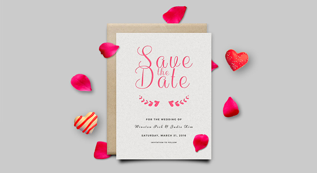
Save The Date: Invitation Card PSD Mockup

Save The Date: Invitation Card PSD Mockup

Created by: GraphicBurger
Features: PSD format, print-ready, smart object layers, 4000×3000 pixels, fancy paper texture.
Licence: Free for personal and commercial use

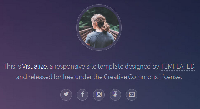
Visualize: Nice Pinterest-like Portfolio Template

Visualize: Nice Pinterest-like Portfolio Template

Created by: Cherry AJ
Features: Responsive features, hovering animations, HTML5 built, masonry grid layout, zooming effects on images and pictures.
License: Free for personal and commercial use

Cooks: Beautiful Responsive Restaurant Web Template

Cooks: Beautiful Responsive Restaurant Web Template

Created by: PSD Depot
Features: Fully responsive, flat style, PSD format, elements style grid, HTML5, and CSS3 built, compatible with all browsers.
License: Free for personal and commercial use

Phantom: Clean Responsive Portfolio Template

Phantom: Clean Responsive Portfolio Template

Created by: HTML5 UP!
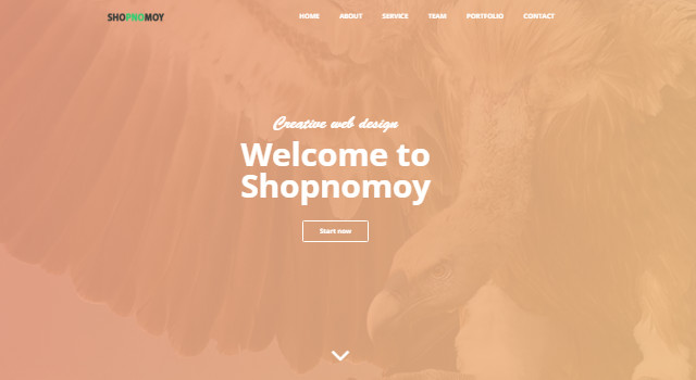
Features: Fully responsive, high customization, hovering animation on cards, zooming effects on images, minimal design.
License: Free for personal and commercial use

Adventure: Clean & Creative Agency Template

Adventure: Clean & Creative Agency Template

Created by: Free CSS / tooplate
Features: For blogs and business, three columns, available in 3 color schemes, highly animated interface, clean style, HTML5 and Bootstrap built, sliding effects by selecting each page section.
License: Creative Commons Attribution 4.0 International License

Garage: Amazing Car Dealership Web Template

Garage: Amazing Car Dealership Web Template

Created by: Tooplate
Features: Big header automatic slider, a modern and useful search bar for keywords, category, year and price counting on drop-down menus and range bars, big thumbnails, responsive layout.
License: Creative Commons Attribution 4.0 International License

Digital Team: Modern Agency Web Template

Digital Team: Modern Agency Web Template

Created by: Tooplate
Features: High customization, clean style, agency purposes, Bootstrap v3.3.5 layout design, slideshow, content tabs, pricing tables, grid and contact form.
License: Creative Commons Attribution 4.0 International License

Froto: One-page Agency Template

Froto: One-page Agency Template

Created by: Ready Theme
Features: Fully responsive, smooth scrolling, easy transitions, Retina-ready, Bootstrap 3.x compatible, clean design, Parallax background section, sticky menu and more, cross browser compatible.
License: Free for personal and commercial use

MoGo: Modern & Clean Web Template

MoGo: Modern & Clean Web Template

Created by: Ready Theme
Features: Bootstrap 3.x compatible, HTML5 built, CSS3 animations, clean design, fully responsive, font awesome included.
License: GNU GPL

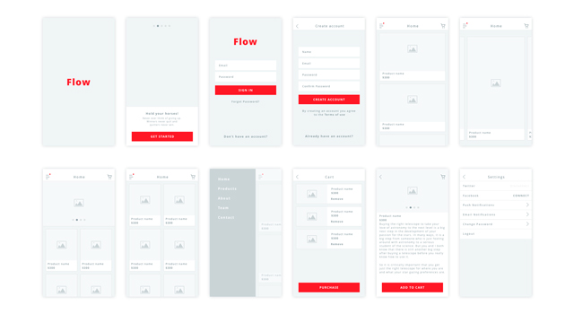
Flow: Clean iOS Wireframe Kit

Flow: Clean iOS Wireframe Kit

Created by: Vineet Kumar
Features: 12 different screens, gray, white, and red scheme, several types of screens,
License: Free for personal and commercial use

Medicare: Medical Web PSD Template

Medicare: Medical Web PSD Template

Created by: Madhu Mia
Features: Fully layered PSD, well-structured, beautiful Bootstrap grid system, regards medical business, map-featured contact form.
Licence: Attribution-NonCommercial-NoDerivatives 4.0 International

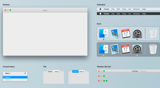
El Capitan: Minimal OSX UI Kit

El Capitan: Minimal OSX UI Kit

Created by: Masao Takahashi
Features: Sketch format, UI for window, status bar, dock, title bar, context menu, buttons, indicator, text field, tab, and more.
License: Free for personal use

Lovely Sketch & PSD iOS Kit

Nice Sketch & PSD iOS Kit

Created by: ThinkMobiles
Features: PSD and Sketch format, 200 MB zipped file, screens for maps, products grid, and more for iOS devices.
License: Free for personal use

Creama: Stylish UI Starter Kit

Creama: Stylish UI Starter Kit

Created by: Hila Yonatan
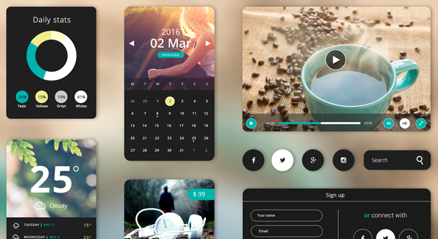
Features: PSD format, widgets for calendar, weather, product, video, account, and more, stylish round corners.
License: Free for personal use

Elton: Stylish ECommerce Design UI Kit

Elton: Stylish ECommerce Design UI Kit

Created by: PixelBuddha
Features: UI Kit, blog, magazine, shop, eCommerce, corporate, slider, forms, headers, footers, PSD format, and stacks more.
License: Free for personal use

Mobile App Flat Emoji Set

Mobile App Flat Emoji Set

Created by: DesignShock
Features: 700 icons, Ai, SVG, and PNG format files in 5 different sizes, nicely designed flat style.
License: Free for personal use

Amazing Transportation Flat Icons Set

Amazing Transportation Flat Icons Set

Created by: IconShock
Features: Professionally crafted in flat style, all categories included (terrestrial, aerial, aquatic, sports, man-powered, etc.), vector files, SVG, Ai, and PNG formats, several sizes.
License: Free for personal use

Photo Management UI Kit

Photo Management UI Kit

Created by: Kamil Janus
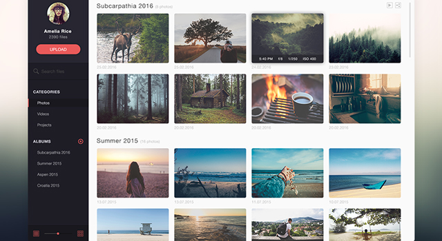
Features: Photo management application, single PSD format file, fully layered UI Kit, left sidebar menu, round corner thumbnails, and more.
License: Free for personal use

Landr: Web & Mobile PSD Template

Landr: Web & Mobile PSD Template

Created by: Andrei Josan
Features: Two Retina-ready designs, web and mobile versions, all icons from Smashicons, images from Unsplash, mobile preview screens from Tethr
License: Free for personal use

(dpe)

Categories: Others Tags:

HTTP Security Headers: How to Secure Your Website

May 1st, 2016 No comments
HTTP Security Headers: How to Secure Your Website

Recently, we’ve introduced you to the online tool Securityheaders.io, which allows you to check a webserver’s safety. You can find your own server’s weaknesses fast and easily. Additionally, you receive plenty of good professional articles on the topic. With all of this support, it is rather easy to neutralize the most significant vulnerabilities and implement another layer of safety. In today’s article, I’ll explain how to set the primary HTTP security headers to allow you to make your server safer.

In Advance: Scanning Servers and Determining the Original State

Use the online tool securityheaders.io to scan your domain. You are likely to see red, as this is the color presented to you when your server is potentially unsafe. That’s not a big deal, as an estimated 80% of all web servers are not secure.

HTTP Security Headers

The scan has created results that are the most common ones. For websites with an HTTPS certificate, there are two additional aspects.

In this article, we want to close the security gaps that the scan informed us about. Furthermore, we want to analyze if all of the results make sense and whether they should be implemented or not.

We’ll Talk About the Following HTTP Security Headers in This Article

  • X-Frame-Options
  • X-XSS-Protection
  • X-Content-Type-Options
  • Strict-Transport-Security (Nur HTTPS-Websites)

What Are HTTP Security Headers?

Every time a browser requests a page from a server, the server replies with the delivery of the page and sends an HTTP response header. These headers can carry metadata like character sets, cache control, and error codes. However, you can also make the response headers send settings that are relevant for the security, and tell the browsers how to react. For example, a strict transport security header would tell the browser only to communicate via HTTPS. In total, there are six different security headers. We’ll tell you which headers you should use, and which ones you should stay away from in this article.

Important: All Mentioned HTTP Security Headers Belong Into the .htaccess File in the Website’s Root Index.

In general, there are three ways to place the headers. For one, using the configuration file of the Apache web server (httpd.conf), then, via PHP directly within the website that you want to protect, and finally, via the server control file .htaccess. I will talk about all three methods. As always, one click on the graphic opens the Gist at GitHub, where the code can be downloaded.

1 – The X-Frame-Options Header

The X-Frame-Options header is supposed to protect your website from being carried out in a frame. Professional content thieves like to create websites that take content from other sites. This content is dragged into the third-party website using a frame most of the time. The thief’s finished site will look as if the material stems from their own website. To prevent this, use an X-Frame-Options header. It is very effective at preventing the execution in a frame.

Browser Support: IE 8+, Chrome 4.1+, Firefox 3.6.9+, Opera 10.5+, Safari 4+

The Disadvantage of This Header: The website can not be executed as a frame anymore. This also includes the “responsive layouts” of the web developer toolbars by Google Chrome and Firefox, as well as the website “Am I Responsive”. Thus, the header should only be placed when the website is not in development stage anymore.

2 – The X-XSS-Protection Header

The X-XSS-Protection header was developed to call up and activate the cross-site scripting (XSS) protection filters in modern browsers. This header should be used in any case.

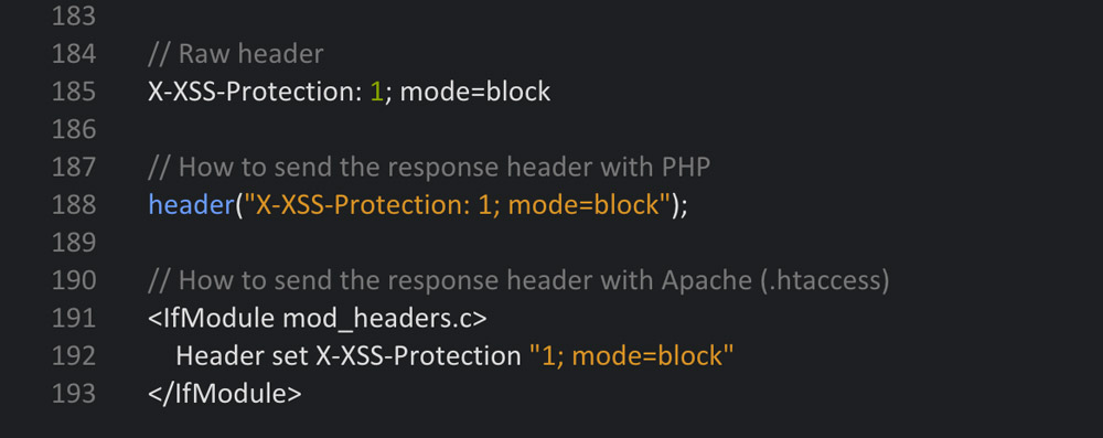
There are three different setting options: 0 to deactivate the filter, 1 to activate (the browser tries to purge and display the defective page) and 1; mode=block activates the filter (the defective page will be blocked).

Browser Support: Internet Explorer 8+, Chrome, and Safari

x-xss-protection

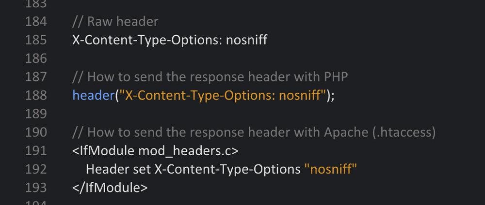
3 – The X-Content-Type-Options Header

This header protects you from attacks with wrong MIME types. When the MIME type is not correct, the browser rejects the loading of styles and scripts. In this header, the setting can only be named NOSNIFF. Once the header is set, only styles and scripts with a correct MIME type will be loaded. The following MIME types will be regarded as correct:

Styles

  • text/css

Scripts

  • application/ecmascript
  • application/javascript
  • application/x-javascript
  • text/ecmascript
  • text/javascript
  • text/jscript
  • text/x-javascript
  • text/vbs
  • text/vbscript

Browser Support: Internet Explorer and Google Chrome

x-content-type-options

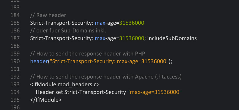
4 – The Strict Transport Security Header (Only for HTTPS Websites)

The Strict-Transport-Security header tells the browser to only access the website via a safe HTTPS connection. This assures that no unsafe connection that could potentially be attacked is created. In addition to that, this HTTP response header prevents users from accessing the page if the server’s TLS certificate is not trustworthy.

Set-Up Options:

  • max-age – The amount of seconds within which the browser forces the secure connection.
  • includeSubDomains – Tells the browser that the safe connection should also be forced for subdomains.

Browser Support: IE 11+, Chrome 4+, Firefox 4+, Opera 12+, Safari 7+.

strict-transport-security

You should use all of the HTTP security headers that we’ve dealt with up to this point. When your website is only distributed via HTTP, you don’t need the last header. However, I strongly recommend setting the upper three.

When all mentioned headers were placed correctly, the next securityheaders scan should result in a solid B. That’s a practical value.

The Content Security Policy Header

The Content-Security-Policy header is to be enjoyed with caution, as it can directly influence or even jam your website if it’s not noted meticulously. WordPress users will also have rather significant problems in the site’s admin area as the header affects that as well. Thus, I can’t give a general recommendation to use it.

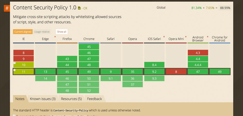
The Content Security Policy (CSP) was developed as protection from Cross-Site Scripting (XSS) and other code injection attacks. The idea behind the header is, that a so-called whitelist, in which all permitted resources are noted is created. Content sources or types that are not explicitly allowed will not be loaded and processed by the browser. If the CSP is not active, the browser loads all files and distributes them, regardless of the source potentially being harmful. With an active CSP, only the permitted files are loaded, all others are not.

All modern browsers support the Content Security Policy.

content-security-header

This response header’s options are very extensive; too extensive for this article. However, if you want to go more in-depth on the Content Security Policy header, I recommend the CSP reference:

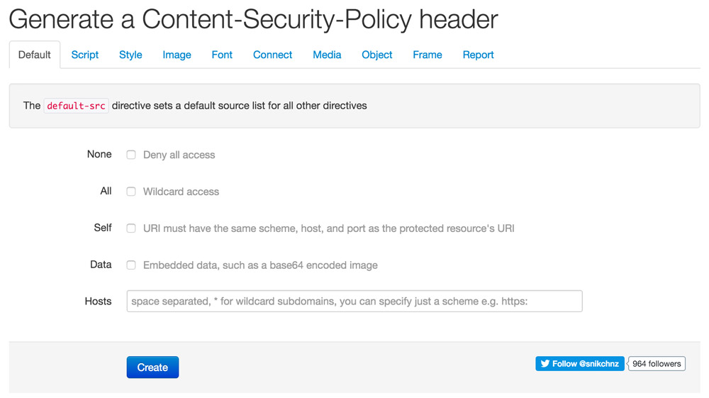
Content Security Policy Generator

For you to be able to create the partially very long code snippets for the correct function of a website comfortably, there’s a good online generator. It leads you through the settings via tabs and lets you adjust the policy over and over until it finally works.

content-security-policy-generator

For the sake of completeness, the Public Key Pins Header should be mentioned. This one can also be used without worries, but it appears to be only doable for server pros.

Conclusion

We’ve talked about the most important HTTP security headers, and we can use them easily by copying the respective code snippets into the server control file .htacess. Even if you are not an expert, you can reach a B in the securityheaders.io scan and do a lot for your website’s security this way. However, only real professionals can achieve an A or A+. When using WordPress, it is very tedious to implement the CSP, as the admin area requires its own CSP to prevent problems. In the latter case, setting the CSP doesn’t make much sense anyway.

(dpe)

Categories: Others Tags: