Archive

Archive for May, 2016

Major redesign unveiled for Google Search

May 27th, 2016 No comments

Perhaps in a nod to the popularity of card-based design, Google has begun to roll out a new look to its mobile Search results. Dubbed “rich cards” in a post on Google’s blog, this new design is a direct successor to the company’s rich snippets feature.

But that’s not all, Google is also experimenting with its desktop Search results, creating a new design layout there.

Rich snippets, searchers will know, are the search results that feature both small pictures and a brief preview of the webpage’s text. Interestingly, the rollout of rich cards isn’t meant to replace rich snippets—merely build on and complement them.

Rich cards will be displayed to searchers in a carousel format, making them easy to navigate via a simple swipe to the left or right. These carousels will show cards from either the same site or from different sites.

Website owners should be pleased with the redesign of Search since it’ll help them stand out in search results more effectively, thereby helping their organic traffic. Google is rolling out this new layout for two content categories in particular: recipes and movies.

Both categories are ideal for this change based on the visual nature of recipes and movie posters. For instance, food site owners can create a richer preview of their content by featuring a standout image for every recipe and dish. Movie sites can do the same with movie posters and graphics.

The key difference between the original rich snippets feature and this upgrade is the number of images featured. Whereas site owners could previously feature just one image in rich snippet results—which debuted six years ago—they can now see a series of images per results, thanks to the carousel.

As of right now, it’s only possible for searchers to see this change if they’re using the English mobile version of Google. Of course, as with all things that Google is still experimenting with, this won’t last long. The company has said that it’s already exploring new options to provide additional content publishers with richer previews of their content, so it won’t be surprising to soon see new content categories being able to use rich cards.

The company also provides integration with Google Search Console, formerly Google Webmaster Tools, so site owners can see relevant data pertaining to their inclusion of rich cards. For example, they can see which images can be further enhanced if they mark up additional fields. They can also see both clicks and impressions for their rich cards, enabling them to monitor search performance.

For a neat preview of how these new rich cards will work in Search, see Google’s Search Gallery to see screen shots of cards and markup type samples.

On the desktop Search front, the company is taking its cues from its mobile Search redesign. Search results are now placed into individual cards. Interestingly enough, the new desktop Search layout only shows up when one is logged out of Google.

Another big change involves Google’s Knowledge Graph. This is the company’s system that retains facts about people, places and general things, to understand how they all connect. In Search, the Knowledge Graph comes into play when, sometimes, boxes are shown in search results to offer direct answers.

It appears as though Knowledge Graph cards will be placed inline, thus prioritizing them in the view over other, competing websites. From a purely visual standpoint, this new look is much cleaner and more simplified. Contrast that to the usual way Google used to display results, which is in the sidebar, making for a more cluttered design that tended to cramp info together in one place on the page.

The new desktop design has practical implications for users, too. Now, they would have to scroll down further to see more actual results; previously, it wouldn’t be uncommon for Knowledge Graph cards for locations to take up the entire length of the page. As a result, pages would now be twice as long.

Here’s a roundup of the other design changes on desktop Search:

  • Wider tabs for the All, Images and News tabs
  • Sub-links showing up under a main result grouped with the same cards
  • Stories from the “In the News” list appearing in just one card
  • The “People also search for” list shows up at the bottom of the page as opposed to in the sidebar

It will be interesting to see if Google’s new visual experiment will indeed help site owners get more easily noticed in mobile search results and receive more organic traffic. The move to richer images suggests search simplification as the carousels replace more written text, but time will tell.

Overall, it appears as though the company wants to keep the design between mobile and desktop more consistent for its Search feature.

Fashion Forward with the Revista Font Family of 26 fonts – only $15!

Source

Categories: Designing, Others Tags:

Web Development Reading List #139: Finding Your Passion, Autofilling Forms And ES6 Tricks

May 27th, 2016 No comments

Finding our passion is a big challenge for all of us as human beings. At some point in life, we try to figure out what our purpose in this world is, what our future will look like. And for some of us, the answers we find to these questions are constantly changing.

Jason Grigsby shares how to build forms that support cross-browser autofill and how to take advantage of new features such as scanning credit cards.

The constant search to find answers lets us stay curious, creative, vital — and if that’s missing, we need to find our passion again by exploring what things we like in our world, what makes us happy. Searching takes time, and we should invest that time — maybe by cutting down watching TV by an hour a week.

The post Web Development Reading List #139: Finding Your Passion, Autofilling Forms And ES6 Tricks appeared first on Smashing Magazine.

Categories: Others Tags:

A Look At The Modern WordPress Server Stack

May 27th, 2016 No comments

Editor’s Note: Today marks a special day for WordPress. Powering many websites (and yes, Smashing Magazine is one of them), it celebrates its 13th birthday today. Happy birthday, dear WordPress! Here’s to many more!

Do you remember when you could run a “fast” WordPress website with just an Apache server and PHP? Yeah, those were the days! Things were a lot less complicated back then.

A Look At The Modern WordPress Server Stack

Now, everything has to load lightning-fast! Visitors don’t have the same expectations about loading times as they used to. A slow website can have serious implications for you or your client.

The post A Look At The Modern WordPress Server Stack appeared first on Smashing Magazine.

Categories: Others Tags:

Power up your website with a WordPress Form Plugin solution. Refer a buddy and get CaptainForm discounts

May 26th, 2016 No comments
CaptainForm

There are many ways you could enhance a WordPress website. One of them is by adding web forms. A WordPress contact form will help you get in touch with your visitors, a WordPress feedback form or a WordPress survey allows you to gather suggestions or requests and with a WordPress quiz you can generate leads and engage your users. These are just a few examples. Certainly, there are many more types of web forms you can use to your advantage, depending on your specific needs.

So, it’s pretty clear that a WordPress form plugin is a must-have for powering up your WordPress website.

A smooth user experience, built-in functionality, great customer care and technical support- these sound like the features that a WordPress website owner would surely search for when choosing a WordPress form plugin.You can find these exact features and other awesome ones in CaptainForm.

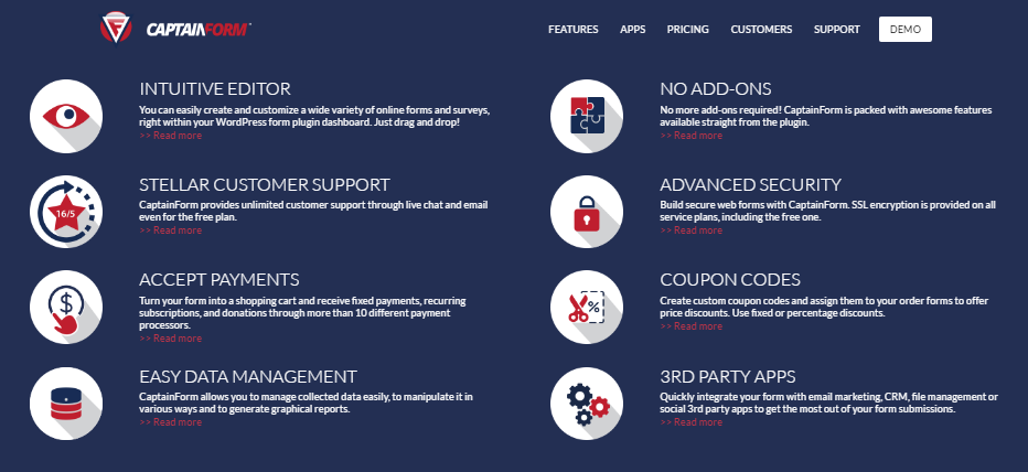
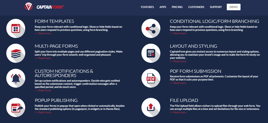
CaptainForm’s advanced features include, but are not limited to a drag and drop editor, multiple form templates, different layout and styling options, easy data management, integration with various payment apps, email marketing apps, project management apps and more.

CaptainForm Features 1

CaptainForm Features 2

In terms of pricing you have 4 plans to choose from: a free one and 3 paid plans. And since we are talking about plans, support is provided for all users, irrespective of the plan they are on (paid or free).

If all this sounds great, you’ll be happy to hear about CaptainForm’s referral program: For each recommended friend that BUYS the product, you get a 10% discount at renewal and your recommended one gets another 10%. You can recommend as many friends as you want. The more, the merrier!

Referral Program

You simply have to submit your details in the provided form and you’ll receive a unique voucher code to distribute to your friends.

Check out CaptainForm and have fun form building!

Read More at Power up your website with a WordPress Form Plugin solution. Refer a buddy and get CaptainForm discounts

Categories: Designing, Others Tags:

5 Great WordPress Plugins for Tracking Analytics

May 26th, 2016 No comments
Screen Shot 2016-05-26 at 9.21.02 AM

Whether your goal is to build an insanely popular blog or create a successful e-commerce site, it’s crucial that you understand your audience. You need answers to questions like:

  • Where are your users coming from (direct visits, search engines, links from other sites)?
  • Which pages or posts on your site are most popular?
  • How long do potential customers spend on your site?
  • When does your site experience traffic peaks?

Collecting data on these questions can help you design a better site and provide more relevant content to your target audience. Fortunately, there are multiple WordPress plugins that can help you collect and analyze this information. Let’s take a look at a few of the most popular and easy to use:

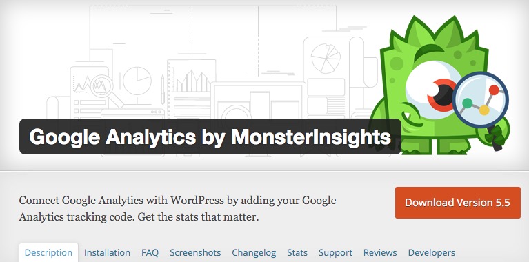
Google Analytics by MonsterInsights

Screen Shot 2016-05-26 at 9.19.33 AM

Formerly Google Analytics for WordPress, this is one of the most downloaded plugins of all time. Eleven million users can’t be wrong. Google Analytics provides comprehensive tracking for blogs, ads, downloads, and video views.

In order to use this plugin you’ll need to set up a free Google Analytics account. Once you have an account and install the plugin, you’ll be able to access your Google data in convenient, customizable dashboards.

Google Analyticator

Another great option for integrating your Google Analytics account, this plugin offers advanced JavaScript customization options for developers. It also supports Google’s site speed tracking so you can keep your site lean and responsive.

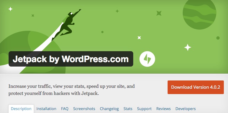
JetPack

Screen Shot 2016-05-26 at 9.20.24 AM

JetPack was designed by WordPress and is exclusive to the platform. This plugin has 25 modules to let you customize the information you want to track.

But its functionality extends beyond data gathering. JetPack will also filter out spam comments from blog posts and prevent unauthorized logins to your site. You can even set it up to share your posts on social media when you create new content.

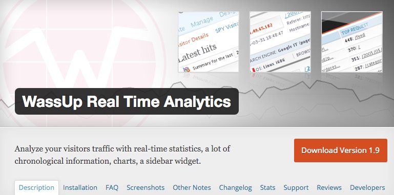
WassUp Real Time Analytics

Screen Shot 2016-05-26 at 9.21.02 AM

As the name implies, this plugin is designed for tracking users in real time instead of waiting for an aggregated traffic report. You can narrow in on the keywords being used, which articles are currently getting the most hits and tons of other up to the minute data. The geolocation map lets you track current visitors. WassUp also helps deter hack attempts and identifies spiders and spam agents to exclude them for data tracking.

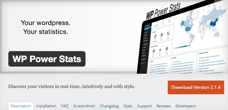
WP Power Stats

Screen Shot 2016-05-26 at 9.22.05 AM

This plugin lets you keep track of page views, geographical traffic data, and dozens of other visitor statistics without using a third party collection agent like Google Analytics. This can be a real plus if you want to emphasize privacy to your visitors and subscribers. You decide what is tracked and only you can access the data.

So how do you choose? You may have to install a few to decide which ones best suit your needs. All offer a free basic tier, but some offer premium plans if you want additional support and features. When you’re aware of your site’s analytics, you’ll automatically have a leg up on the competition, so your best option is to install one of these plugins and start experimenting.

What plugins have you tried for analytics/statistics? We’d love to hear about your experience with these or any other WordPress data tools.

Read More at 5 Great WordPress Plugins for Tracking Analytics

Categories: Designing, Others Tags:

Considerations for styling the `pre` tag

May 26th, 2016 No comments

I wrote about a bunch of design things you should think about if you use the

 tag in your content. Things like:

  1. Do you use the tag inside?
  2. Choosing a font stack
  3. To wrap or not to wrap?
  4. How you can (easily) make code blocks auto-expanding
  5. Dangers if it is headed to email
  6. Syntax highlighting
  7. Language labeling
  8. White-space control
  9. Alternatives

Direct Link to ArticlePermalink


Considerations for styling the `pre` tag is a post from CSS-Tricks

Categories: Designing, Others Tags:

How WebGL is reinventing Flash’s legacy

May 26th, 2016 No comments

Do you remember all those projects with outstanding interactions, mind-blowing animations, and thrilling accompanying sound effects that resulted in an intensely immersive user experience? Yep, chances are those were created with the help of Flash.

However I hate to admit it, the era of this rich multimedia platform has come to an end. Flash is finally dead. But fear not! As often happens when one door closes, another opens, and Flash is slowly being replaced by a fresher, more vigorous successor. Technologies like WebGL, and accompanying JavaScript libraries like Three.js are rapidly growing—enabling developers to build Flash-like projects, without the accompanying security issues.

Today we’re going to focus on WebGL and Three.js. This pairing is powerful option for immersive UX.

WebGL and Three.js

WebGL serves as a foundation that provides instruments for manipulating with interactive 3D and 2D computer graphics. It gives you an opportunity to mix and match its elements with HTML elements and combine them with other constituents of the page or background.

Three.js is a Javascript library with a list of high-end features that let you operate with scenes, cameras, lights, geometry, and more. It is intended to unlock the potential of WebGL by adding extra functionality to the platform. It makes it simple to create GPU-accelerated 3D animations without relying on browser plugins.

Compatibility issues

With the modern technologies, you are always caught in a dilemma: either create a “one size fits all” project that will run on various devices and offer consistent user experience, or put everything on the line and instantly impress the audience that you can reach.

With WebGL and Three.js it is the same story. Safari, Opera and the majority of mobile browsers (and that’s to say nothing about Internet Explorer) are like a fly in your Chardonnay. Unfortunately, a great deal of users are stuck with legacy browsers, so compatibility is quite an obstacle—but support is growing (which is more than can be said for Flash) and provided you don’t use it for anything mission critical, WebGL and Three.js are excellent options.

Examples

Void

Void is an experiment by Hi-ReS!, a creative studio based in London. The developers wanted to abstract from the limitations inherent to modern platforms and browsers and test the limits of current technologies. It seems that they nailed it.

It is a purely desktop application that is powered by WebGL and Web Audio features. Along with Howler.js, GSAP, and Coffee Collider, Three.js took part in producing this outstanding playground that inexorably draws online visitors into a journey that looks much like a digital book.

Reshaping Excellence

This interactive campaign dedicated to Sennheiser’s anniversary is an epic odyssey that combines not only dramatic sci-fi landscapes but also numerous cutting-edge features and details. It is a pure Chrome experiment that allows visitors to participate in forming and shaping a monument of sound. Although the phase of formation has been completed—one million people all over the Globe participated in the event—it sill rocks. You are welcome to make your own contribution, examine this massive sound-sculpture, and enjoy the intro video and top-notch execution.

Bruno Quintela

The personal portfolio of Bruno Quintela is a real-time rendered WebGL experiment that demonstrates the potential of the artist and possibilities of the current web technologies. Use your mouse to examine the scene thoroughly. Drag it in different directions to see what is hidden inside this bulk of accurately placed together 3d polygons with glossy surfaces. The idea serves as an excellent opening for the website that leaves a strong, lasting first impression.

Particle Test

This project exhibits a whirlwind of more less ordered and organized tubes of particles that radiates of high-tech vibe. There is a control center that encourages you to play with such attributes as the radius of a cylindrical-shaped cloud, the density of tubes, height, scale, and more. The concept is mesmerizing.

Water Shader

This artist has managed to imitate a water surface by mimicking the natural behavior of liquid. The convex shape and undulating surface with sun reflections as finishing touches recreate a truly realistic scene that catches the eye from the first second.

WebGL Particle Head

As they were when Flash was successful, particles are all the rage nowadays. Animations of various size and type can be seen in numerous projects, and this work is one such. The subtle version of a head that is vaguely reminiscent of an intelligent human-like robot from Isaac Asimov’s novels is a true masterpiece. Not only does the realization surprise, but also its behavior. It reacts to mouse movements, naturally tilting head to the right, left, up and down.

Dynamic 3D Confetti Text

Text effect is one of the ways to spice up boring interfaces with a note of playfulness and coolness as well as emphasize the required lettering. Rachel Smith’s confetti-inspired solution will certainly help to enrich the design with bright emotions and place the title to the center stage. Type a word in the input field below to see the whole magic. Vibrant and vivid 3D geometric pieces will shape the request and make the result prettily interactive.

3D Panorama Viewer

Three.js comes in handy in common projects as Max Chuhryaev proves. His solution easily transforms panoramic images into an essential detail of the user experience. It has a pleasant perspective and slowly moving camera: together they make you feel a part of the composition. It goes well with the landscapes, cityscapes, and interiors, allowing users to enjoy the beauty of static multimedia.

Triangle Pattern Generator

This experiment gives you a fantastic polygonal background with a lovely 3D feeling. It also acts as a playground where you can make some areas brighter and others dimmer: just use your mouse. The panel of options enables you to tune up a bulk of details of the canvas including light, mesh, render and even export settings.

LAST DAY: Instantly Optimize Your Site’s Images with the ShortPixel WP Plugin – only $4.99!

Source

Categories: Designing, Others Tags:

20 Fresh, Free HTML and PSD Templates plus UI Packs: Spring 2016

May 26th, 2016 No comments
administration-dashboard-html-template

Welcome to the Spring round of our free HTML and PSD templates showcase. As always we have put together a plethora of various design elements that only have one thing in common – they are all free to use. Other than that you will find a diverse variety of different elements for different use cases. We hope we have what you are looking for. Enjoy!

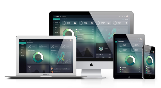
Blur-admin: Free Angular Bootstrap Admin Dashboard Template

Created by: Akveo Team
Features: Angular Bootstrap administration dashboard template, translucid elements, ultra modern style, uncountable components in its left sidebar menu.
License: MIT

Fitness: Healthy Blog One-page HTML Template


Created by: Bucky Maler
Features: Built with HTML5, Sass, JavaScript, Bootstrap 4, Gulp, Design by Blaz Robar, off-canvas right sidebar menu, responsive layout, engaging footer, and more.
License: Free for personal use

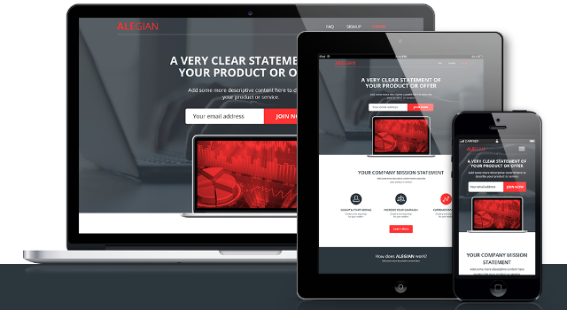
Alegian: Multi-purpose Landing Page HTML Template

ALEGIAN-Multi-purpose-Landing-page-Free-PSD-HTML

Created by: Shahin Srowar
Features: parallax background, drag-and-drop page builder, very easy to customize, responsive layout, Mailchimp-ready, PSD included, and more.
License: Attribution-NonCommercial-NoDerivatives 4.0 International

TravelReady: Responsive Landing Page HTML Template

FREE-TravelReady-Landing-Page

Created by: Shahin Srowar
Features: Flat section backgrounds and elements, minimal icons, free fonts featured, responsive layout, medium and big thumbnails, background video, PSD included, and more.
License: Attribution-NonCommercial-NoDerivatives 4.0 International

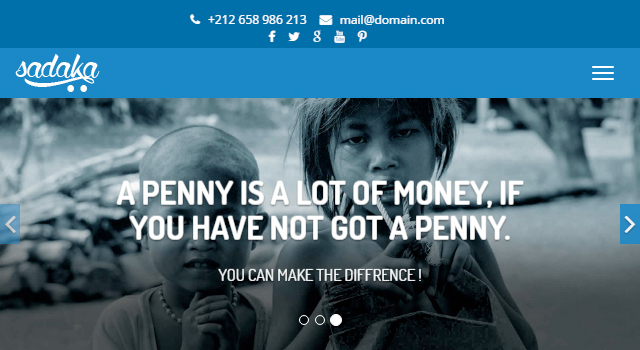
Sadaka: Flat NGO Website Template

sadaka-1

Created by: Ouarmedia
Features: Flat design, big thumbnails, minimal style, hover effects, responsive layout, full-width automatic header slider, constant color scheme.
License: Free for personal use

Fitness: Modern One-page HTML Template

tm-487-fitness

Created by: Templatemo
Features: Viewport-size automatic header slider, sticky and auto-faded top navigation bar, big postcards, big team member vCards, ghost buttons that appear on hover, parallax effects, full-width quote slider.
License: Creative Commons Attribution 4.0 International License

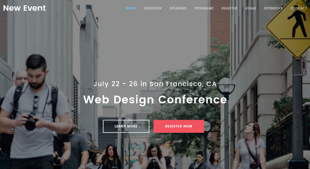
New Event: Modern & Clean HTML Template

tm-486-new-event

Created by: Templatemo
Features: Eased fading and sliding entrance effects for all of its elements, clean style, full-width containers, parallax effects, screen-size header image, sticky top navigation bar.
License: Creative Commons Attribution 4.0 International License

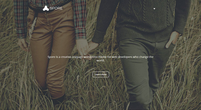
Spore: Free HTML5 Masonry Blog Template

spore-html5-masonry-blog-template

Created by: Allie
Features: Full-screen sliding off-canvas menu, screen-size header image with seamless pattern overlay, masonry grid layout for its home page posts, responsive designs.
License: Free for personal use

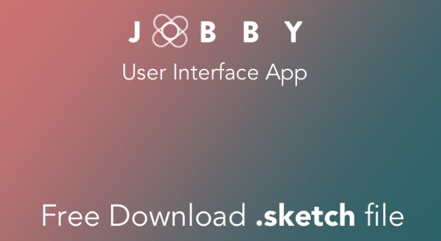
Jobby: Gradient Mobile Sketch UI Kit

2657489-Jobby-Full-project-FREE-DOWNLOAD-sketch-file

Created by: Stefano De Rosa
Features: Concept iOS Social App, gradient overlay, several screens, Sketch format, screens for login, register, menu, homepage, search, profile, and more.
License: Free for personal use

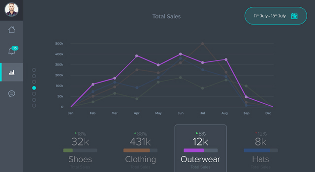
Sales Dashboard iPad PSD Template

2660309-Sales-Dashboard-iPad-PSD-Download

Created by: Bradley Bussolini
Features: Soft dark scheme, glowy elements, left sidebar, dashboard administrator interface purposes, line charts, and more to discover.
License: Free for personal use

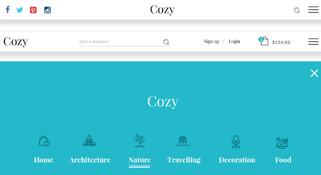
Cozy: Clean & Minimal Website PSD UI Kit

Cozy: Clean & Minimal Website PSD UI Kit

Created by: Dorin Andrei
Features: Clean style, several cards, menus, buttons, sliders, toggles, constant color scheme, beautiful complete typography, web template composition, PSD format.
License: Free for personal or commercial use

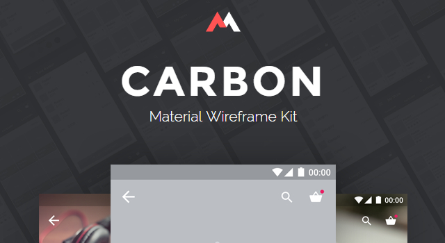
Carbon: Material ECommerce Mobile App UI Kit

Carbon Material ECommerce Mobile App UI Kit

Created by: Panagiotis
Features: 15 artboards, all elements in a separate file, well structured & named layers, vector-only shapes, Roboto fonts, Photoshop, and Sketch format file versions.
License: Free for personal or commercial use

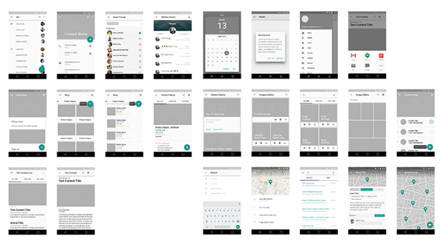
Material Design Wireframe Sketch UI Kit

2660501-Material-Design-Wireframe-Kit-v-02

Created by: Dan Shipley
Features: 41 composed screens, Material Design style, screens for contact, eCommerce, text context, settings, maps, calendar, profile, chat, and more.
License: Free for personal use

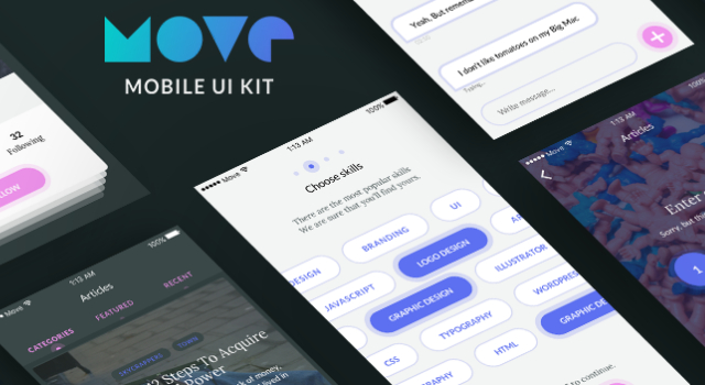
Move: Dark & Purple Mobile Sketch UI Kit

purple-mobile-ui-kit-for-sketch

Created by: Volodymyr Kurbatov
Features: Small mobile kit, high-quality screens for iOS, ease design flow, fully customizable templates, Sketch format, dark and glowy purple scheme.
License: Free for personal use

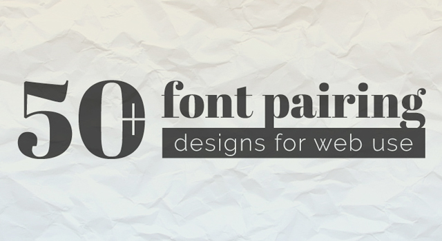
Stunning Collection: 50 Google Font Pairings

font-combinations

Created by: DesignShock
Features: More than 50 font pairing combinations, free-to-use Google Fonts featured on web and print design assets like blog entries, business cards, quote blocks, and more.
License: Free for personal use

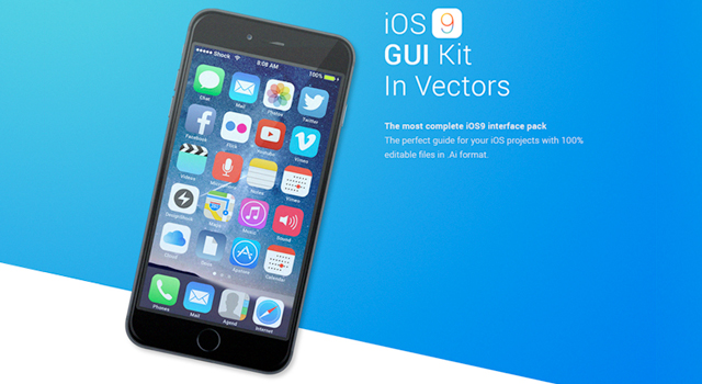
Free Vector Illustrator IOS9 UI Kit

ios-9-gui

Created by: DesignShock
Features: 300 elements, fully vector-crafted elements, AI format, status bars, keyboards, navigation bars, native applications, and more.
License: Free for personal use

Nice Vector Color Line Icon Set

line-icon

Created by: IconShock
Features: Vector based, playful and colorful style geometric shapes, vibrant color palette, soft outline, rounded line shines and shadows.
License: Free for personal use

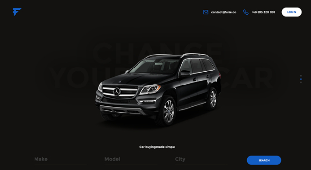
Furie: Modern Car Brand Website PSD Template

2664092-Furie-Free-PSD-Template

Created by: Patryk W?sik
Features: Flat color backgrounds, big transparent background images, overlapping info cards, clean style, friendly typography, search bar, and more.
License: Free for personal use

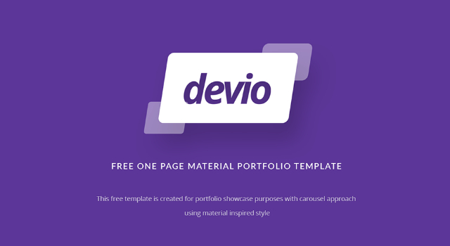
Devio: One Page Portfolio Template PSD

FREEBIES-Devio-Free-One-Page-Portfolio-Template-PSD

Created by: Stefano De Rosa
Features: One-page portfolio website template, Material Design-inspired style, neatly crafted elements such as navigation bar dropdown, carousel, hover state card, and more.
License: Attribution-NonCommercial-ShareAlike 4.0 International

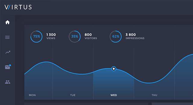
Virtus: Modern Dashboard PSD Template

2666001-Virtus-Dashboard-Free-PSD-Template

Created by: Jakub Kowalczyk
Features: 5 well-layered screens, easily customizable, UI elements, typography, monochromatic color palette, all screens, and more.
License: Attribution-NonCommercial-NoDerivatives 4.0 International
(dpe)

Categories: Others Tags:

Working Remotely Around The World: Workspaces To Explore

May 26th, 2016 No comments

If you’re a footloose creative soul searching for a more affordable and friendly space than a typical rented or home office, coworking could work for you.

Alt-Text

Coworking spaces are popping up in cities all around the world. They allow freelancers, small business owners and independent workers to rent a working area that is shared with others. The setup is usually more casual than the fixed rental agreement you would get in a dedicated office space.

The post Working Remotely Around The World: Workspaces To Explore appeared first on Smashing Magazine.

Categories: Others Tags:

If Fonts Were Cats

May 25th, 2016 No comments
Screen Shot 2016-05-25 at 12.12.07 PM

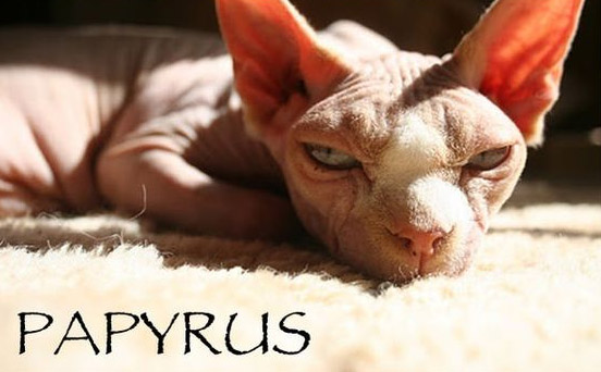
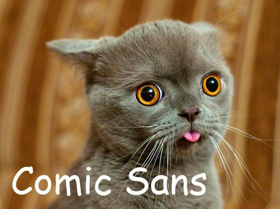
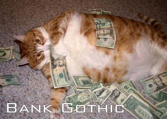
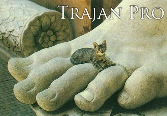
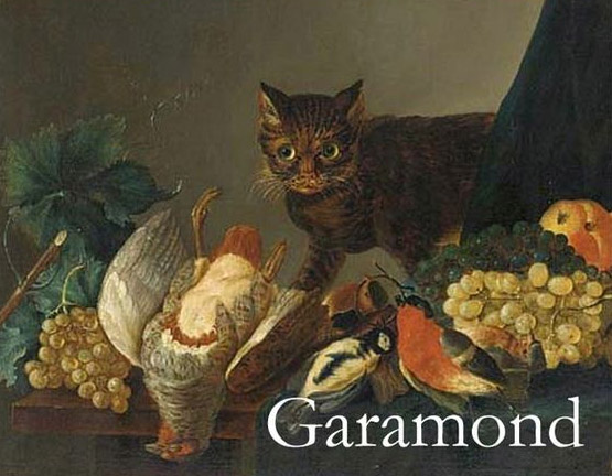
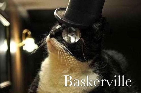
When I think of fonts I think of cats, apparently someone else does as well because I found a bunch of cute and ironic cat-font memes online. First, I thought to myself, “You’ve got to be kitten me right meow!” but then I had to share. Take a look at this adorable collection I’ve put together for you.

Helvetica

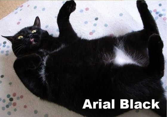
Arial Black

Papyrus

Comic Sans

Impact

one too many

Apple C

Futura

Ballpark

Curlz MT

Bank Gothic

Times New Roman

Porcelain

Trajan Pro

Garamond

Courier

Mesquite Std

Gotham

Cooper Std

Baskerville

You know all these cat puns left you feline good! If you were a cat font, which font would you be?

Read More at If Fonts Were Cats

Categories: Designing, Others Tags: