Archive

Archive for May, 2016

50 fresh resources designers, May 2016

May 24th, 2016 No comments
Flat Office Vector Icons Set

Hey there! Here we are again with a huge selection of freebies for you to enjoy. Scroll down and you’ll find tons of amazing icons, texture effects, fonts, templates, and themes. Go ahead and download it all. Enjoy!

Flat office vector icons

An amazing set of 150 flat, responsive icons that are delivered in EPS, PDF; SVG, and 4 sizes of PNG (16, 30, 40, and 80 pixels) featuring a different design for each of the sizes.

50 company line icons

An amazing set of 50 icons featuring thick and thin lines, with angular and rounded corners, they are pixel perfect designed and delivered both positive and negative versions in Ai format.

50 Company Bold Line Icons Set

Colorful icons set

A great set of over 500 nice colorful icons that feature soft black outlines and round edged lines and shadows delivered in Ai, SVG, and several sized PNG formats perfect for applications and web interfaces.

Colorful General Icons Set

Humongous 80k iPhone icons set

An amazing set of more than 80 thousand icons crafted by following the iPhone guidelines in a filled style delivered in Ai and SVG format files, it counts on more than 20 different industries with thousands of icons each.

Humongous 80k  iPhone Icons Set

Old weathered wood textures

A set of 18 beautifully crafted textures that represent old and worn down wooden surfaces which underwent the effects of exposure to extreme weather.

Old Weathered Wood Textures

Chalkboard Photoshop text effect

An amazing text effect for Adobe Photoshop featuring Smart Object layers that allowing you to create text on a black chalkboard in two different colors, one for the body and one for the shadow of the text.

Chalkboard Photoshop Text Effect

Cardboard box mockup

An unusual branding mockup that features a cardboard box in both transparent and gray texture background that comes available in PSD format and 5 different facets customizable through Smart Objects.

Cool Cardboard Box Branding Mockup

Sketch Apple Watch templates

A set of fully scalable and editable vector based Apple Watch templates that come available in Sketch format featuring every Aluminium, Stainless Steel, and Edition color available as sports bands.

Sketch App Apple Watch Templates

Dark tri-fold template

A professional looking tri-fold template that comes in vector PSD and Ai file formats. Featuring square, rather wide sections, perfect for company branding, infographics, analytics, and similar sort of content showcasing.

Teal: Dark Schemed Tri-Fold Template

Oh My!

An amazing designer’s toolkit that counts on a scene creator, mockup templates, a logo creator, text effects, and inspiration booster, delivered ready to be used in Photoshop.

Oh My! Huge Designer's Toolkit

Wyre

Wyre is a set of more than 120 web layout tiles for website maps delivered in vector Ai, EPS, and SVG format files being fully scalable and editable.

Wyre: Web Layout Tiles Flowchart Templates

Translucid dashboard

A beautiful dashboard composed of translucent and solid elements that feature a soft color scheme giving it a very nice look, it comes available in PSD format perfect for modern administration dashboards.

Translucid Soft Schemed Dashboard

Neptun

Neptun is a kit of 6 nicely crafted screen templates for mobile (iOS phones) that feature a minimal yet modern style delivered in PSD format files, it is perfect for dashboard management applications.

Neptun: Modern & Minimal Mobile Screens PSD Kit

WatchOS2 UI design kit

A Human Interface Design kit for Apple Watch devices that comprises 1000 different elements that compose 186 screens sorted out in 18 different categories.

WatchOS2 User Interface Design Kit

Avital

A stylish UI kit for mobile phones with iOS 8 including more than 21 fully customizable screens sorted out in 7 different categories and delivered in both Sketch and PSD format.

Avital: Elite Mobile iOS UI Kit

Retina-ready iOS9 UI Kit

Quite a complete UI kit that comprises close to 300 vector-based Retina-ready elements such as status bars, keyboards, alerts and notifications and many more. Available in Ai format, free for personal projects.

Free Retina-ready IOS9 Ai UI Kit

Exodus

Exodus is an amazing display uppercase font that features 6 different styles like regular, stencil, and sharpen, perfectly suitable for elegant logos or signs.

Exodus: Luxury 6-style Display Typeface

Sweet Sorrow

Sweet Sorrow is a nicely crafted font that features an old-fashioned look for its script-like characters. It is inspired by 1950s signs and is delivered in OTF and TTF format featuring nice dynamic curves and some ligatures.

Sweet Sorrow: Old Fashioned Script Font

Quantum

Quantum is a beautiful sans serif typeface that features smooth curves and 3 weights for its uppercase and lowercase characters, as well as nice features like little gaps for perpendicular joints of lines.

Quantum: Sans Serif Thin Typeface

Jitzu

Jitzu is quite a fancy didone typeface that is available in basic and swash styles, featuring 5 weights each for its uppercase and lowercase characters, and it supports multiple languages by counting on several accentuated characters.

Jitzu: Fancy 10-weight Didone Typeface

Fantastic collection of 50 font pairings

Perfect combinations are essential in web and print design, so don’t hesitate to take this amazing over-50-font-pairing collection which displays combinations of Google Fonts in several scenarios like business cards, blog entries, quote blocks, and more.

Fantastic Collection of 50  Font Pairings

Restaurant website PSD template

Voila is a restaurant template delivered in PSD format featuring a creative yet professional looking layout that counts on overlaying thumbnails and beautiful typography.

Voila: Restaurant Website PSD Template

Patagonia

Patagonia is a nicely crafted eCommerce website UI kit that features round corner cards composed out of colorful elements cleanly organized, big transparent background images, and shadowed elements.

Patagonia: Modern ECommerce Website UI Kit

Clemo

Clemo is an amazingly well-designed blogging website template that is delivered in PSD format featuring a clean and modern style counting on big thumbnails organized as borderless tiles, a Pinterest-like grey-scale gallery, and more.

Clemo: Clean & Modern Blogging PSD Template

Gratia

Gratia is a restaurant website template beautifully designed in PSD format featuring a dark texturized background as well as huge transparent background images as well as big cards for showcasing dishes and menus.

Gratia: Beautifully Crafted Restaurant PSD Template

Llorix One Lite

A neatly crafted WordPress theme for agency business that features a clean and professional look featuring a one-page introducing home page as well as secondary pages for contact, shop, and download purposes.

Llorix One Lite: Neat Business WordPress Theme

BlurAdmin

A beautifully crafted dashboard administrator template made in web technologies featuring smooth and eased animations for its interactive charts. It counts on a left sidebar menu and a complete set of diverse elements.

Blur-admin: Angular Bootstrap Admin Dashboard Template

Garage

An amazing Bootstrap theme for car retail business websites that features a filtered search at the bottom of its home page’s header image, you can search cars by keyword, category, and ranges of year and price.

Garage: Car Retail Business Bootstrap Theme

Spore

Spore is a beautifully crafted HTML5 template that features a masonry grid layout for its main posts content counting on full and neat responsiveness and nice and smooth fading and ease-sliding transitions.

Spore: HTML5 Masonry Blog Template

Animated Animals

A cool animation purely made in CSS and SVG that represents animals in different multi-layer environment giving it certain sense of depth since they come walking up from behind some hills.

Animated Animals in CSS & SVG

WebGL image slider transition

An amazing snippet in JavaScript using WebGL technologies allowing you to generate a beautiful particle transitions between images of a slider.

WebGL Image Slider Transition

Responsify

A great snippet generated with no more than 250 lines of Jade, SCSS, and Babel code that allows you to test the responsiveness of your website in four types of device; mobile, tablet, laptop, and desktop.

Responsify: SCSS & Babel Breakpoint Tester

Responsive column layout

Cool viewport-sized collapsable columns, each featuring a label for the section they represent, it features nice flat style effects that expand as you click on them to show the whole section.

Responsive Expanding Column Layout

CSS animated puzzle

An animated grid layout for photo gallery purposes that initially showcases the photos in disorganized jigsaw pieces that flip themselves to get organized and compose the image as you hover over them.

CSS Animated Puzzle Hover Grid Gallery

CSSX

CSSX is a set of tools that allow you to write in JavaScript vanilla CSS code, currently working well with Webpack and Gulp. No new syntax was generated and it is still the regular CSS that comes alive in JavaScript.

CSSX: Working CSS in JavaScript

DeckHub

DeckHub is an amazing desktop client for Github repositories management that allows you to get feed and push notifications, customize, rename, and reorder feeds as you like them, mix different repositories, users, and organizations, and more.

DeckHub: Desktop Client for GitHub

Cocycles

Cocycles beta is a web tool that allows you to search open source code by functionality, currently supporting JavaScript, and soon supporting Ruby, Java, PHP, and Python.

Cocycles: Functionality Code Search

Caddy

Caddy is a web server for HTML/2 that features fully managed SSL, supporting IPv6, markdown, WebSockets, FastCGI, templates and more. It comes available for designers, bloggers, and developers.

Caddy: Fully Managed SSL HTTP/2 Web Server

Collection of coders’ games

An amazing collection of games and contests online for all levels of developer around the world, learn from a beginner’s level or join extremely complex contests for the biggest companies and revamp your skills as you go.

Collection of Coders Games to Improve Your Skills

Kite

An amazing tool that will revolutionize the productivity of your code as it saves you from surfing the internet for researching languages, Kite showcases on a floating wing popularity-sorted autocomplete options as you code as well as documentation and examples that you can explore on the go.

Kite: On-the-Go Programming Copilot

Bootstrap 4 cheat sheet

A complete reference for the 4.0.0-alpha.2 version of Bootstrap organized in a layout that will allow you to search functions and preview their snippet example with a visual preview in the bottom half of the screen

Bootstrap 4 Cheat Sheet

Awesome tools and resources

An awesome collection of more than 100 tools and resources for web development counting on resources such as JavaScript libraries front-end frameworks, web app frameworks, package managers, and more.

Awesome Web Development Tools and Resources

CodeTasty

CodeTasty is a powerful Integrated Development Environment hosted directly in the Cloud that allows you to have all of the features a desktop IDE would offer, but with additional ones that only a cloud application can provide.

CodeTasty: Powerful In-the-Cloud IDE

Jam API

Jam API is an amazing service that allows you to turn any website into a JSON accessible API using CSS selectors, it auto pulls the img src on corresponding elements, pulls the href from links, and much more.

Jam API: JSON Accessible Websites Using CSS Selectors

Turntable.js

A responsive jQuery slider that allows you to rotate a list of images with your mouse creating a 3D-like product showcase effect. You can also scroll through them with the touch of your finger sweeping across a container.

Turntable.js: Responsive jQuery Slider

360 degrees product viewer

An amazing library developed in both CSS and jQuery that allows you to showcase products in 3D allowing you to rotate it as you want with a slider knob.

CSS & jQuery 360 Degrees Product Viewer

Sierra

Sierra is a light SCSS library (8.9kB gzipped) that allows you to customize your minimal style website or application with beautiful text modifiers, buttons, typography sizes, forms, tables, and more.

Sierra: Lightweight SCSS Library

Expounder

Expounder is an awesome library coded in both JavaScript and CSS that allows you to hide text behind a link which can be retrieved by the reader as they click on the linked texts, it makes the hidden text expand seamlessly inside the text.

Expounder: JS/CSS Expandable Texts

Timedropper

Timedropper is a beautifully crafted jQuery time-picker that features an easy installation in just a few lines of code, as well as several options such as auto-switch, meridians, format, mouse-wheel, init_animation, and more.

Timedropper: Beautiful jQuery Time Plugin

Vanilla-marginotes

An amazing JavaScript library for showcasing margin-positioned notes as you hover on regular links, the small note smoothly fades in at the side of the paragraph your triggering text is being hovered over.

Vanilla-marginotes: Quick & Cool Margin Notes

Unstuck Webpack

An amazing GUI tool that allows you to create highly customizable web packs completely ready to use; it allows you to decide how you want your dashboard, presets, HTML, transpiler, and CSS settings.

Unstuck Webpack: Custom Webpack Creation GUI Tool

Get Creative with the Hard Work Notebook – only $8.20!

Source

Categories: Designing, Others Tags:

Injecting a Line Break

May 24th, 2016 No comments

I had a little situation where I head a header with a span in it, and I wanted to make sure to put a line break before the span. For the record, there really isn’t anything wrong with just chucking a
tag before it (and in fact the ability to show/hide that is very useful). But… it always feels a little weird to have to use HTML to achieve a layout thing.

So let’s take a journey. A journey in which we say “But…” a lot.

<h1 class="one">

  Break right after this

  <!-- <br> could go here, but can we do it with CSS? -->

  <span>
    and before this
  </span>

</h1>

A block level element would do it

Rather than a , we could use a

, and we’ll get that break just by virtue of the div being a block-level element.

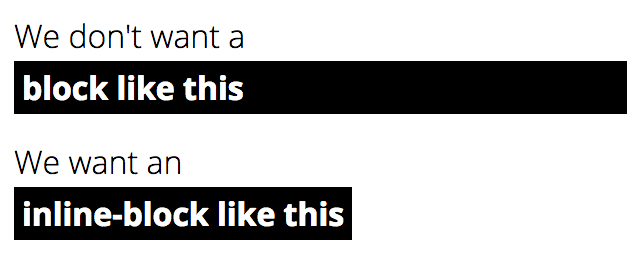
But we’re using a span on purpose, because of the design. The text after the break should be inline/inline-block, because it’s going to have a background and padding and such.

You can insert line breaks via pseudo element

It’s easy:

h1 span::before {
  content: "A";
}

But… the is an inline element. The line break won’t do anything! Just like a real line break won’t do anything.

We can force that line break to work by making white space meaningful…

h1.two span::before {
  content: "A";
  white-space: pre;
}

That actually works. But… because of the padding and background, it leaves a little chunk of that behind when the line breaks:

We could fix the awkward-left-edge-hugging on by using box-decoration-break: clone;, but… that just leaves a bigger chunk up top:


box-decoration-break is great for some issues, but not this one.

If we made the span inline-block, the break would happen within that block, which isn’t what we want either:

Making the pseudo element block-level and leaving the span alone doesn’t do the trick either:

You could get a little weird and inject the actual text with a pseudo element

This was Aaron Bushnell’s idea. The trick here is to make the span block level, but then inject the text with a pseudo element and style it as an inline element.

h1 span {
  display: block;
}
h1 span::before {
  content: attr(data-text);
  background: black;
  padding: 1px 8px;
}

It works! But…

I’ve long been a fan of pseudo element trickery, but this feels slightly dangerous in that you may be hurting accessibility. I think some screen readers read pseudo elements, but I don’t think all, nor are they supposed to. Not to mention you can’t copy and paste all the text this way. At least the text is still maintained entirely in the HTML!

Exploiting table layout

My favorite idea came from Thierry Koblentz. Just make the span display: table; and you’re done. It’s not tabular data of course, but that doesn’t matter. The face you can force table layout from CSS is all about exploiting the unique layout properties of table layout — not semantics.

h1 span {
  display: table;
}

Live Demos

Including one where we just use a
, which is fine.

See the Pen Attempting a line break before and inline-block within a header by Chris Coyier (@chriscoyier) on CodePen.


Injecting a Line Break is a post from CSS-Tricks

Categories: Designing, Others Tags:

Best of May 2016: Ten Free WordPress Plugins

May 24th, 2016 No comments
Die besten zehn kostenlosen Plugins aus dem Mai 2016

In May, just like every month, I searched through the official WordPress plugin index to find the most functional and appealing new plugins for you. I don’t do this entirely selflessly, however, as I myself find it very exciting to test new free WordPress plugins for my diverse projects. This month was very generous and brought a couple of interesting plugins to light.

1 – Posts For All Pages

Posts for all Pages allows you to have your posts displayed on other pages than just the index.php. You can let it help you show all posts of a particular category on any page you want to. This allows for the creation of multiple blogs based on certain categories in not time.

  • Developer: wpyb
  • Work in Progress: yes
  • Last Updated: 05.20.2016
  • Cost: Free from WordPress.org
  • License: GNU GENERAL PUBLIC LICENSE
  • Known Compatibility Issues: unknown
  • Developer Homepage: Unknown
  • Download on WordPress.org

2 – Engaging Convo

Engaging Convo is an innovative comment plugin which provides unusual features. For instance, your visitors can mark an area in your text and start a debate on it directly there. Thus, there’s no reason to scroll to the end of an article, just to be able to leave a comment. Additionally, it is possible to create multiple comment sections for various post areas, and the different sections can be accessed guided by the color in which the text segment is highlighted. Find a demo of the plugin on this page.

  • Developer: lazharichir
  • Work in Progress: yes
  • Last Updated: 05.21.2016
  • Cost: Free from WordPress.org
  • License: GNU GENERAL PUBLIC LICENSE
  • Known Compatibility Issues: unknown
  • Developer Homepage: Unknown
  • Download on WordPress.org

3 – Social Icon Widget

social-icon-widget

This widget brings you appealing icons to link to your social networks in the sidebar.

  • Developer:mostafiz
  • Work in Progress: yes
  • Last Updated: 05.19.2016
  • Cost: Free from WordPress.org
  • License: GNU GENERAL PUBLIC LICENSE
  • Known Compatibility Issues: unknown
  • Developer Homepage: Unknown
  • Download on WordPress.org

4 – UTM Switcher

utm-switcher

The UTM Switcher is a useful plugin for online shops and all digital sellers. You can determine precisely from where your visitors came to certain pages, and then optimize them with customized content, like individual phone numbers e.g.. In digital marketing, it can be tough to find out which advertisement channel brings the best results. It could be Adwords, paid ads on Facebook, advertorials on blogs, and so on. This plugin helps you to find out which channel’s results are the best.

  • Developer: punchrockgroin
  • Work in Progress: yes
  • Last Updated: 05.18.2016
  • Cost: Free from WordPress.org
  • License: GNU GENERAL PUBLIC LICENSE
  • Known Compatibility Issues: unknown
  • Developer Homepage: Unknown
  • Download on WordPress.org

5 – TS Collections

TS Collections lets you activate or deactivate plenty of features with just one click. The following things can be influenced:

  • Move all JavaScript into the footer, including jQuery.
  • Force ASYNC for all JavaScript files, except for jQuery.
  • Automatic linking of Twitter usernames.
  • Mark comments with long URLs as spam.
  • Set the minimum comment length to 20 words.
  • Allow PHP in the text widgets.
  • Remove the automatic URL linking in the WordPress comments.
  • Remove the URL field from the WordPress comment form.

Plugin Details:

  • Developer: rktaiwala
  • Work in Progress: yes
  • Last Updated: 05.18.2016e
  • Cost: Free from WordPress.org
  • License: GNU GENERAL PUBLIC LICENSE
  • Known Compatibility Issues: unknown
  • Developer Homepage: Unknown
  • Download on WordPress.org

6 – Universal Icons

universal-icons

This convenient plugin allows you to display icons before or after a widget’s title. Supposedly, this works with any widget.

  • Developer: rktaiwala
  • Work in Progress: yes
  • Last Updated: 05.18.2016
  • Cost: Free from WordPress.org
  • License: GNU GENERAL PUBLIC LICENSE
  • Known Compatibility Issues: unknown
  • Developer Homepage: Unknown
  • Download on WordPress.org

7 – WallpaperChanger

The WallpaperChanger enables you to make wallpapers switch automatically, depending on the time of day. This means that your website can have one background in the morning and a different one in the evening, without you actually doing anything. This helps to set your site apart from others.

  • Developer: taniafi786
  • Work in Progress: yes
  • Last Updated: 05.18.2016
  • Cost: Free from WordPress.org
  • License: GNU GENERAL PUBLIC LICENSE
  • Known Compatibility Issues: unknown
  • Developer Homepage: Unknown
  • Download on WordPress.org

8 – Disable Blogging

Disable-Blogging

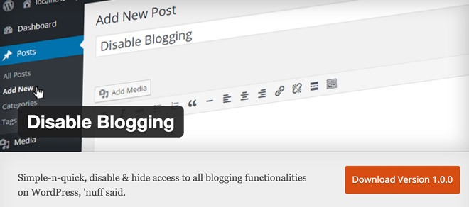
Disable Blogging should be especially interesting for developers that often develop and sell pure business websites without a blog. The plugin deactivates the entire WordPress blog functionality. On top of that, all blog-relevant entries in the WordPress dashboard can be removed.

  • Developer: Fact Maven Corp.
  • Work in Progress: yes
  • Last Updated: 05.18.2016
  • Cost: fee via WordPress.org
  • License: GNU GENERAL PUBLIC LICENSE
  • Known Compatibility Issues: unknown
  • Developer Homepage: Unknown
  • Download on WordPress.org

9 – Pay-to-view

Pay-to-view’s goal is a fair web. This also includes the display of ads, as the owners of most websites need to earn money. However, advertisements are often annoying from the visitor perspective. Thus, the plugin displays a message for every visitor with an active ad blocker, asking them to pay one (1) cent per viewed page, to be able to enjoy the website without ads. If a visitor that uses an ad blocker is not willing to pay the cent, the plugin deactivates the ad blocker. The costs are charged at the end of each month. Every website owner has to decide whether he want to use this solution or not, as he might lose a couple of visitors. But one cent per viewed page really isn’t much.

  • Developer: AFairWeb
  • Work in Progress: yes
  • Last Updated: 05.18.2016
  • Cost: Free from WordPress.org
  • License: GNU GENERAL PUBLIC LICENSE
  • Known Compatibility Issues: unknown
  • Developer Homepage: Unknown
  • Download on WordPress.org

10 – Addonist WhatsApp Share

Addonist-WhatsApp-Share

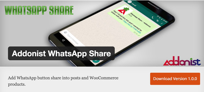
WhatsApp is becoming more and more relevant on mobile and thus also in online marketing strategies. That’s why it sounds like a good idea to make your articles shareable via WhatsApp as well. This could result in a wider spread broadcast of your content. Thus, the plugin adds a share button for WhatsApp to the posts. In the pro version, you can also add the button to WooCommerce products.

Conclusion

This month was very generous regarding new and exciting plugins. I like the comment plugin “Engaging Convo”. I was also impressed by the “UTM Switcher”, which I might use myself after I’ve integrated a shop into my website. Which plugin is your favorite of this month?

Find other recent plugins here:

(dpe)

Categories: Others Tags:

The Making Of Melody Jams

May 24th, 2016 No comments

After months of hard work, I’ve finally gotten my side project, Melody Jams, into the App Store. It’s been quite the adventure, and I’m thrilled to see it in the store. Seeing it live makes me reflect on the process that got us there: our failures and successes, some of the crazy stuff we figured out and what our hopes and dreams are.

The Making Of Melody Jams

To give you some context, I worked with five other people completely remotely. Most of us still haven’t met in real life. In spite of that, we designed, programmed, animated and submitted the app in four months. It works on iPhone 4s through iPhone 6s+ and iPad 2 through iPad Pro. We also tested it with over 30 kids, ranging from nine months to nine years old, in that timeframe.

The post The Making Of Melody Jams appeared first on Smashing Magazine.

Categories: Others Tags:

How to Create Responsive Guides in Adobe XD

May 23rd, 2016 No comments
Learn How to Create Responsive Guides in Adobe XD

In this tutorial, we’re going to learn how to create guides for responsive design, in Adobe Experience Design CC (Adobe XD).

The Steps (1-12)

1. Create a new document 1920 x 1080 from the Start Screen.

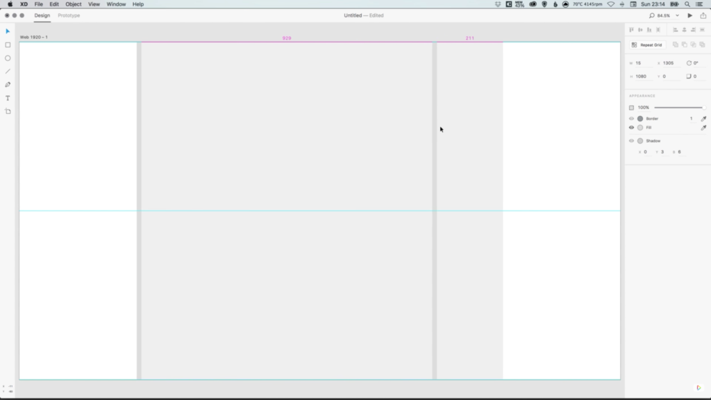
2. Create a shape that is 100% height, and 1170 pixels in width. This shape is going to represent the maximum site width that we will be designing for, and should be centrally aligned to the artboard. Give this rectangle a grey colour for now. Go to Object > Lock to lock this layer in position, so that we don’t select it by mistake when working through the steps to follow.

3. Create a thin vertical rectangle, that is 100% height and 15 pixels in width. This is going to form our site margin, and should be positioned on the inside left edge of the main rectangle. Duplicate this shape, and also position a copy on the inside right edge of the main rectangle. Give these shapes a slightly different shade of grey, so that we can easily distinguish the different shapes/elements, whilst working on the layout.

create-responsive-guides-adobe-xd-1

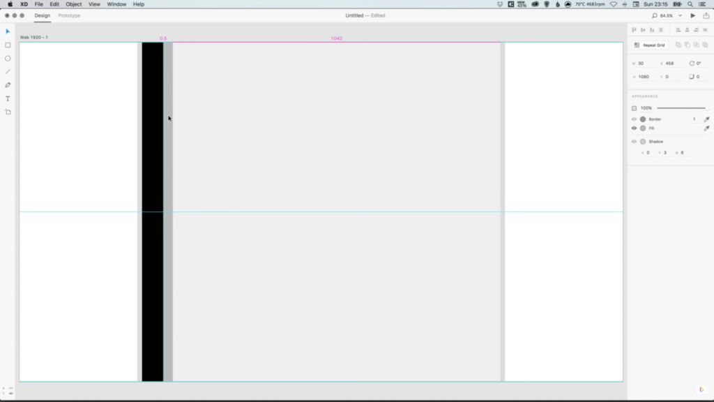
4. Create another vertical rectangle that is 100% height, and 67.5 pixels in width (70 pixels if you design your grid without the left and right margins). Colour this new shape black, and position this alongside the shape created in Step 3.

5. Create another vertical rectangle that is a different shade of grey to the two shades already being used by the other shapes, and position this alongside the shape created in Step 4. The three rectangle shapes should all be lined up alongside each other, with no gaps in between.

6. Using Shift to select these three shapes (excluding the main rectangle). Next, click on the Repeat Grid button in the Property Inspector on the right-hand side.

create-responsive-guides-adobe-xd-2

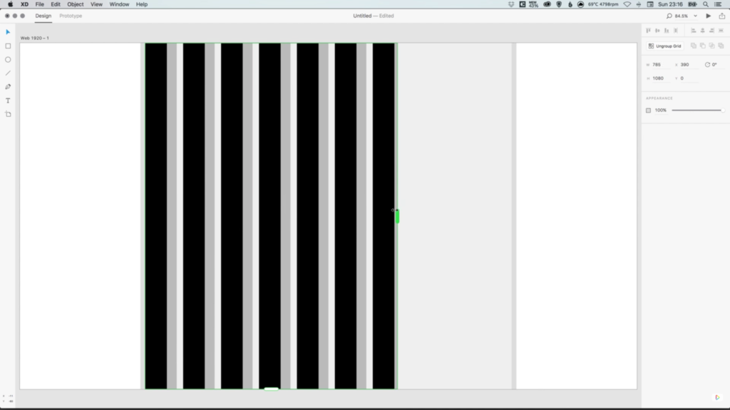
7. Your shapes should now have a set of green guides around them, allowing you to drag the slider on the right, until it touches the edge of the right margin that we created in Step 3.

8. When using the Repeat Grid Tool, Adobe XD automatically creates a gutter (spacing) in between the different objects that are being repeated. By selecting and clicking inside this space (the gap in between objects) you will see some pink guides appear, that allow you to adjust the gutter spacing. For this tutorial, reduce the spacing here to zero, so that there are no gaps between our shapes.

9. Once the gaps have been reduced, select the green right slider again, and drag this out to the right, until it lines up with our right-hand margin as before.

create-responsive-guides-adobe-xd-3

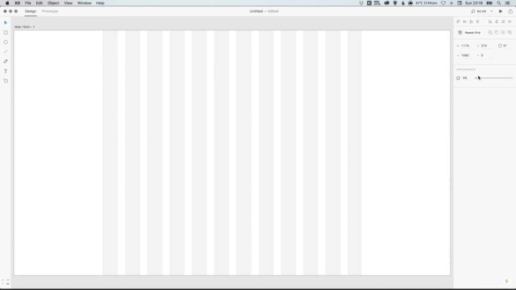
10. Double-click the Repeat Grid group, select the first 30 pixel shape that we created, and adjust the colour to white. You will see that all of the other clones of this shape also change in colour.

11. Use your mouse to drag over all of the shapes that we’ve created (the main rectangle should still be locked), and in the Appearance menu on the right-hand side, adjust the opacity to between 2-5%. Lock these layers, as we did with the main rectangle in Step 2. Keeping the opacity of the responsive grid less than 5%, allows it to still be visible enough to work on, but doesn’t interfere too much with any design elements that are being created, and you can even set the guides to 0% opacity to hide them completely.

12. Start designing an awesome and responsive site!

create-responsive-guides-adobe-xd-4


Download Adobe Experience Design CC (Adobe XD).

Read More at How to Create Responsive Guides in Adobe XD

Categories: Designing, Others Tags:

Forgetting Your Design Work Tasks? Increase Your Productivity with These Tips

May 23rd, 2016 No comments
image003

Losing track of where you are? Miss a deadline, because you thought it was one days from now instead of today? The good news is you probably aren’t a victim of senility. The bad news is your sedentary work routines may be killing you. Not quickly; in tiny increments, similar to slow-creep weight gain.

Fortunately, this slow-death process is not only reversible, but by taking the right steps, you’ll soon be feeling better than ever. Your productivity will noticeably improve, and 5 or 10 years down the road you’ll still be in top form.

A web designer’s work may not appear to be physically demanding, but sitting all day and staring at a screen, and fighting to meet deadlines, can eventually take a toll. Here are three areas you can work on to not only prevent bad things from happening, but will help you to keep your energy levels high, and your mind crystal clear.

Take Care of Your Diet

image001

Better than chips, and salmon will keep your mind sharper too.

Sitting most of the day is bad enough. When combined with poor dietary habits, it can turn you into a professional couch potato in no time at all. Think about what you eat while at work – and then think about how you spend your time at home. If you spend your evenings on the couch, munching on chips, it’s high time to make some changes.

Here are three good ways to improve your eating habits:

  • Watch what you eat (think nutrition).
  • Schedule your meal times (and stick to the schedule).
  • Organize your refrigerator – keep it well stocked with fruits and vegetables (and salmon!)

Not only does junk food contain ingredients that are not always good for your body, these foods can lead to nutritional deficiencies if they make up an appreciable part of your diet. Any deficiency in vitamins or minerals can literally cause you memory loss –and make you more susceptible to illness.

Settle for 8 Hours of Work a Day

image003

If your boss insists that you to be at your desk 10-12 hours a day, you might consider looking for work elsewhere. Working long hours may be the norm if you’re working for a startup, but even then, you can accomplish just as much in 8 hours as you can in 10 or 12 if you go about it right. You’ll save wear and tear on your heart as well.

Check the statistics. Those extra 2 or 3 hours a day increases your risk of incurring cardiovascular problems by 60%. It’s just not worth it. The best way to limit your work days to 8-hour sessions, and perhaps the only way, is through self-discipline. You may also have to learn how to say no on occasion.

Working 9 to 5, or the equivalent, has these advantages:

  • You will do higher quality work than you can by working extra hours.
  • Your productivity will go up.
  • You can take pride in your self-discipline and your ability to say no.
  • You’ll feel better.
  • You’ll have more free time.

There’s probably a number of non-productive things you can cut out to get down to an 8-hour workday, and a workday that includes the breaks you need to relax and clear your mind.

Sleep

image005

If you’re regularly in bed by 10 and up at 6, you’re likely getting enough sleep. If, for whatever reason, that isn’t the case, you need to think about making some changes.

Not enough sleep, combined with a sedentary lifestyle and poor dietary habits, can turn you into an old-timer long before you’re ready for it, plus the effects on your body this combination can cause, can be difficult to reverse.

You may not have to make major changes in your lifestyle, unless getting more exercise, working fewer hours, and eating better, are areas where you need to improve in addition to getting enough sleep.

Here are three not-to-difficult-to-follow rules you should try:

  • Turn off your PC and set your laptop and digital devices aside at least an hour before bedtime.
  • Learn a short relaxation routine or two that you can regularly practice just before going to sleep.
  • Avoid caffeine and any sugar snacks late in the day.

If you’re on the road a lot, you may have to work a little harder at doing what needs to be done to get enough sleep. The reason is simple. You sleep better in your own bed. When you’re in unfamiliar surroundings, your brain sometimes freaks out a bit. It is more vigilant, and a hyper-vigilant brain is not conducive to falling asleep easily, or sleeping soundly.

Do What You Need to Do to Keep Your Body in Tune

image007

Make it a goal to regularly follow practices that are necessary to keep your energy level high, keep cobwebs from forming in your brain, and keep you healthy and fit. When you’re feeling sharp and alert, you’ll find yourself going about your web design work more efficiently and productively.

Consider making these ideas habit-forming:

  • Pay attention to your diet. Getting enough of the proper nutrients such as magnesium and omega 3 fatty acids keeps your mind sharp. Other vitamins and minerals will keep you healthy, and your energy level high.
  • Don’t let working overtime or long hours become a habit. Organize your tasks so you can make an 8-hour day a reality. Your performance will actually improve.
  • Look forward to a relaxing end of the day, followed by a good night’s sleep. Cut out late snacks, especially those containing sugar, and avoid late-day caffeine intake.

Read More at Forgetting Your Design Work Tasks? Increase Your Productivity with These Tips

Categories: Designing, Others Tags:

CSS Modules and React

May 23rd, 2016 No comments

In this final post of our series on CSS Modules, I’ll be taking a look at how to make a static React site with the thanks of Webpack. This static site will have two templates: a homepage and an about page with a couple of React components to explain how it works in practice.

Article Series

Part 1: What are CSS Modules and why do we need them?
Part 2: How to get started with CSS Modules
Part 3: React + CSS Modules = ? (You are here!)

In the previous post we set up a quick project with Webpack that showed how dependencies can be imported into a file and how a build process can be used to make a unique class name that is generated in both CSS and HTML. The following example relies heavily on that tutorial so it’s definitely worth working through those previous examples first. Also this post assumes that you’re familiar with the basics of React.

In the previous demo, there were problems with the codebase when we concluded. We depended on JavaScript to render our markup and it wasn’t entirely clear how we should structure a project. In this post we’ll be looking at a more realistic example whereby we try to make a few components with our new Webpack knowledge.

To catch up, you can check out the css-modules-react repo I’ve made which is just a demo project that gets us up to where the last demo left off. From there you can continue with the tutorial below.

Webpack’s Static Site Generator

To generate static markup we’ll need to install a plugin for Webpack that helps us generate static markup:

npm i -D static-site-generator-webpack-plugin

Now we need to add our plugin into `webpack.config.js` and add our routes. Routes would be like / for the homepage or /about for the about page. Routes tell the plugin which static files to create.

var StaticSiteGeneratorPlugin = require('static-site-generator-webpack-plugin');
var locals = {
  routes: [
    '/',
  ]
};

Since we want to deliver static markup, and we’d prefer to avoid server side code at this point, we can use our StaticSiteGeneratorPlugin. As the docs for this plugin mentions, it provides:

a series of paths to be rendered, and a matching set of index.html files will be rendered in your output directory by executing your own custom, webpack-compiled render function.

If that sounds spooky hard, not to worry! Still in our `webpack.config.js`, we can now update our module.exports object:

module.exports = {
  entry:  {
    'main': './src/',
  },
  output: {
    path: 'build',
    filename: 'bundle.js',
    libraryTarget: 'umd' // this is super important
  },
  ...
}

We set the libraryTarget because that’s a requirement for nodejs and the static site plugin to work properly. We also add a path so that everything will be generated into our `/build` directory.

Still inside our `webpack.config.js` file we need to add the StaticSiteGeneratorPlugin at the bottom, like so, passing in the routes we want to generate:

plugins: [
  new ExtractTextPlugin('styles.css'),
  new StaticSiteGeneratorPlugin('main', locals.routes),
]

Our complete `webpack.config.js` should now look like this:

var ExtractTextPlugin = require('extract-text-webpack-plugin');
var StaticSiteGeneratorPlugin = require('static-site-generator-webpack-plugin')
var locals = {
  routes: [
    '/',
  ]
}

module.exports = {
  entry: './src',
  output: {
    path: 'build',
    filename: 'bundle.js',
    libraryTarget: 'umd' // this is super important
  },
  module: {
    loaders: [
      {
        test: /.js$/,
        loader: 'babel',
        include: __dirname + '/src',
      },
      {
        test: /.css$/,
        loader: ExtractTextPlugin.extract('css?modules&importLoaders=1&localIdentName=[name]__[local]___[hash:base64:5]'),
        include: __dirname + '/src'
      }
    ],
  },
  plugins: [
    new StaticSiteGeneratorPlugin('main', locals.routes),
    new ExtractTextPlugin("styles.css"),
  ]
};

In our empty `src/index.js` file we can add the following:

// Exported static site renderer:
module.exports = function render(locals, callback) {
  callback(null, '<html>Hello!</html>');
};

For now we just want to print Hello! onto the homepage of our site. Eventually we’ll grow that up into a more realistic site.

In our `package.json`, which we discussed in the previous tutorial, we already have the basic command, webpack, which we can run with:

npm start

And if we check out our build directory then we should find an index.html file with our content. Sweet! We can confirm that the Static Site plugin is working. Now to test that this all works we can head back into our webpack.config.js and update our routes:

var locals = {
  routes: [
    '/',
    '/about'
  ]
};

By rerunning our npm start command, we’ve made a new file: `build/about/index.html`. However, this will have “Hello!” just like `build/index.html` because we’re sending the same content to both files. To fix that we’ll need to use a router, but first we’ll need to get React set up.

Before we do that we should move our routes into a separate file just to keep things nice and tidy. So in `./data.js` we can write:

module.exports = {
  routes: [
    '/',
    '/about'
  ]
}

Then we’ll require that data in `webpack.config.js` and remove our locals variable:

var data = require('./data.js');

Further down that file we’ll update our StaticSiteGeneratorPlugin:

plugins: [
  new ExtractTextPlugin('styles.css'),
  new StaticSiteGeneratorPlugin('main', data.routes, data),
]

Installing React

We want to make lots of little bundles of HTML and CSS that we can then bundle into a template (like an About or Homepage). This can be done with react, and react-dom, which we’ll need to install:

npm i -D react react-dom babel-preset-react

Then we’ll need to update our `.babelrc` file:

{
  "presets": ["es2016", "react"]
}

Now in a new folder, `/src/templates`, we’ll need to make a `Main.js` file. This will be where all our markup resides and it’ll be where all the shared assets for our templates will live (like everything in the and our site’s

:

import React from 'react'
import Head from './Head'

export default class Main extends React.Component {
  render() {
    return (
      <html>
        <Head title='React and CSS Modules' />
        <body>
          {/* This is where our content for various pages will go */}
        </body>
      </html>
    )
  }
}

There are two things to note here: First, if you’re unfamiliar with the JSX syntax that React uses, then it’s helpful to know that the text inside the body element is a comment. You also might have noticed that odd element—that’s not a standard HTML element—it’s a React component and what we’re doing here is passing it data via its title attribute. Although, it’s not an attribute it’s what’s known in the React world as props.

Now we need to make a `src/components/Head.js` file, too:

import React from 'react'

export default class Head extends React.Component {
  render() {
    return (
      <head>
        <title>{this.props.title}</title>
      </head>
    )
  }
}

We could put all that code from `Head.js` into `Main.js`, but it’s helpful to break our code up into smaller pieces: if we want a footer then we would make a new component with `src/components/Footer.js` and then import that into our `Main.js` file.

Now, in `src/index.js`, we can replace everything with our new React code:

import React from 'react'
import ReactDOMServer from 'react-dom/server'
import Main from './templates/Main.js'

module.exports = function render(locals, callback) {
  var html = ReactDOMServer.renderToStaticMarkup(React.createElement(Main, locals))
  callback(null, '<!DOCTYPE html>' + html)
}

What this does is import all our markup from `Main.js` (which will subsequently import the Head React component) and then it’ll render all of this with React DOM. If we run npm start once more and check out `build/index.html` at this stage then we’ll find that React has added our `Main.js` React component, along with the Head component, and then it renders it all into static markup.

But that content is still being generated for both our About page and our Homepage. Let’s bring in our router to fix this.

Setting up our Router

We need to deliver certain bits of code to certain routes: on the About page we need content for the About page, and likewise on a Homepage, Blog or any other page we might want to have. In other words we need a bit of software to boss the content around: a router. And for this we can let react-router do all the heavy lifting for us.

Before we begin it’s worth noting that in this tutorial we’ll be using version 2.0 of React Router and there are a bevy of changes since the previous version.

First we need to install it, because React Router doesn’t come bundled with React by default so we’ll have to hop into the command line:

npm i -D react-router

In the `/src` directory we can then make a `routes.js` file and add the following:

import React from 'react'
import {Route, Redirect} from 'react-router'
import Main from './templates/Main.js'
import Home from './templates/Home.js'
import About from './templates/About.js'

module.exports = (
  // Router code will go here
)

We want multiple pages: one for the homepage and another for the About page so we can quickly go ahead and make a `src/templates/About.js` file:

import React from 'react'
import Head from '../components/Head'

export default class About extends React.Component {
  render() {
    return (
      <div>
        <h1>About page</h1>
        <p>This is an about page</p>
      </div>
    )
  }
}

And a `src/templates/Home.js` file:

import React from 'react'
import Head from '../components/Head'

export default class Home extends React.Component {
  render() {
    return (
      <div>
        <h1>Home page</h1>
        <p>This is a home page</p>
      </div>
    )
  }
}

Now we can return to `routes.js` and inside module.exports:

<Route component={Main}>
  <Route path='/' component={Home}/>
  <Route path='/about' component={About}/>
</Route>

Our `src/templates/Main.js` file contains all of the surrounding markup (like the ). The `Home.js` and `About.js` React components can then be placed inside the element of `Main.js`.

Next we need a `src/router.js` file. This will effectively replace `src/index.js` so you can go ahead and delete that file and write the following in router.js:

import React from 'react'
import ReactDOM from 'react-dom'
import ReactDOMServer from 'react-dom/server'
import {Router, RouterContext, match, createMemoryHistory} from 'react-router'
import routes from './routes'
import Main from './templates/Main'

module.exports = function(locals, callback){
  const history = createMemoryHistory();
  const location = history.createLocation(locals.path);

  return match({
    routes: Routes,
    location: location
  }, function(error, redirectLocation, renderProps) {
    var html = ReactDOMServer.renderToStaticMarkup(
      <RouterContext {...renderProps} />
    );
    return callback(null, html);
  })
}

If you’re unfamiliar with what’s going on here then it’s best to take a look at Brad Westfall’s intro to React Router.

Because we’ve removed our `index.js` file and replaced it with our router we need to return to our webpack.config.js and fix the value for the entry key:

module.exports = {
  entry: './src/router',
  // other stuff...
}

And finally we just need to head over to `src/templates/Main.js`:

export default class Main extends React.Component {
  render() {
    return (
      <html>
        <Head title='React and CSS Modules' />
        <body>
          {this.props.children}
        </body>
      </html>
    )
  }
}

{this.props.children} is where all our code from the other templates will be placed. So now we can npm start once more and we should see two files being generated: `build/index.html` and `build/about/index.html`, each with their own respective content.

Reimplementing CSS Modules

Since the

Categories: Designing, Others Tags:

Survey: Typographic Trends 2016

May 23rd, 2016 No comments
Survey: Typographic Trends 2016

What’s popular regarding typography right now? Extensis, a provider of app solutions for font management, has conducted a survey in the creative scene and has come to impressive results. All the survey results, for which about 2,000 creative people from different branches were asked, can be downloaded for free in the PDF file Typographic Trends.

Fonts are Still Used for Printing

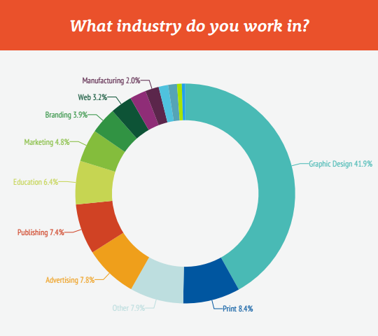
Jim Kidwell, who created the survey Typographic Trends for Extensis, has invited participants from the company’s customer database. That’s a smart approach as these are exactly the people that deal with fonts and typography every single day. Furthermore, that’s why it’s not surprising that 40 percent of the participants come from the graphic design sector, followed by print, advertising, and publishing.

An interesting aspect is that over 90 percent of participants use fonts for print, about 80 percent use it to design logos and two-thirds for the embedding in PDF files. The usage of fonts on websites is only about 55 percent, even though web fonts have been supported by all browsers for a couple of years now, and the supply of free and paid web fonts is rather large.

Survey: Typographic Trends 2016

The survey doesn’t tell you whether the reason is the popular subscription model, which is commonly seen with commercial fonts, or not.

Typographic Trends: Serif Heavy Fonts are Very Popular, Fonts Without Serifs are Welcome in the Future

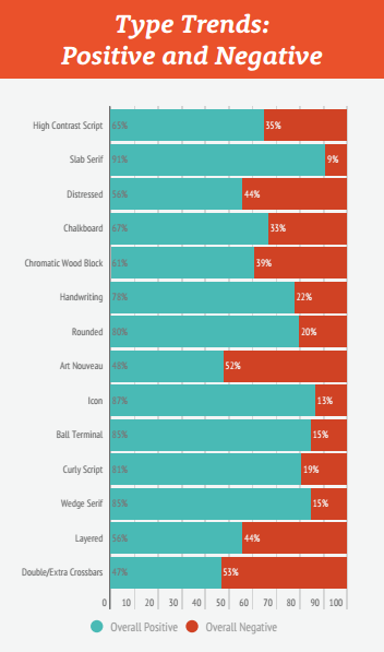
But which fonts are especially popular amongst graphic designers and advertisers? Here, serif heavy fonts are very popular amongst over 90 percent of the participants. This goes well alongside the trend that we noticed in graphic and web design. Whenever a design is supposed to be trendy, serif fonts are used.

Survey: Typographic Trends 2016

Art nouveau fonts, as well as fonts with double or more additional lines, were rated especially bad. The negative rating is probably due to the limited readability of these fonts.

extensis_trend-typografie_kreide

As every trend dies out at one point, Kidwell also asked which fonts are currently overused. Fonts in chalkboard style are some of the top answers here.

When it comes to which fonts the people want to see in the future, fonts without serifs, being the complete opposite of the still very popular serif fonts, are in the top position.

Typography: a Very Emotional Matter

The survey Typographic Trends didn’t only allow the participants to answer via multiple choice. They were also able to communicate their thoughts on the presented font styles. Kidwell has published a collection of these thoughts and comments as well.

Kidwell has published ten participant’s opinions for every single one of the 14 fonts that represented one style each. The opinions include interesting views, as to why someone especially likes or dislikes a font. Here, it becomes evident that typography is a highly emotional issue for designers.

One participant can’t contain himself when it comes to chalkboard fonts, and comments the following: “… please destroy all of these fonts.” Many creative people will be this passionate about fonts, especially when it comes to very unpopular ones.

Mainly Purchasing Fonts From the Big Suppliers

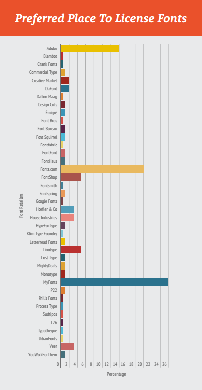
Another fascinating segment of the survey deals with the question where and how the participants purchase fonts. Here, it becomes apparent that there are three large main suppliers that have the edge over the competition. MyFonts, Fonts.com, and Adobe are by far the most popular providers. If you keep in mind that MyFonts, and Fonts.com both belong to the Monotype group, the font market is basically shared between two large companies.

Survey: Typographic Trends 2016

Smaller providers only have minuscule shares which, for the most part, lie below five percent.

Most of the participants license entire families, just when they are needed. It is very rare that entire libraries are licensed, or that only open source fonts are used. The fact that about 6 percent of the asked people don’t license fonts at all is left open for you to judge.

Conclusion

On a total of 31 pages, there are plenty more interesting results on fonts, and how they are used at the moment. The survey Typographic Trends also answers the question which font designer is currently at the top in the eyes of the participants. You can get the results of the study Typographic Trends on the Extensis website. All you need to do to download the file is enter your email address.

(dpe)

Categories: Others Tags:

28 CSS Puns to Brighten Your Day

May 23rd, 2016 No comments
Screen Shot 2016-05-20 at 3.03.40 PM

Some are funny, some are bland, and some you may not even understand. We’ve put together a list of 28 CSS puns that we think you’d love, we did. Comment below and let us know which one you like best! Heck, Let us know if you have some that are even funnier than the ones we’ve collected, we’d love to hear em!

2

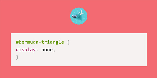
Get it? Because you disappear in the bermuda-triangle…

3

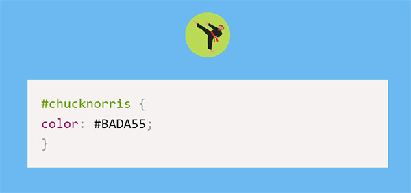
#BADA55 is a real color!

Screen Shot 2016-05-19 at 2.18.38 PM

It’s okay no one is mad about this one…

5951d7d6be882ac2ae3b2e68d482bb57

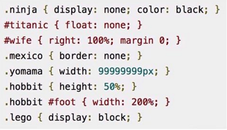
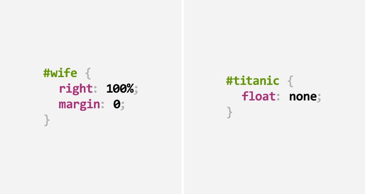
Wife is always right or els the titanic does not float!

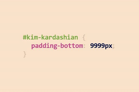
Screen Shot 2016-05-19 at 2.21.15 PM

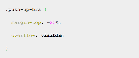
So much padding it broke the internet!

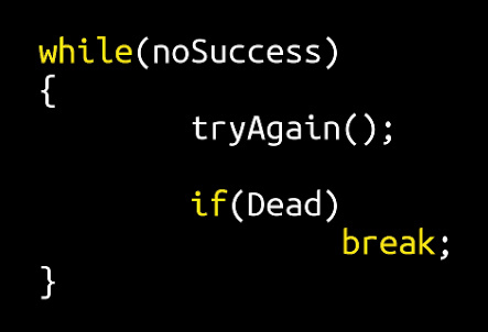
8487446074_74b53af084

Just keep swimming…

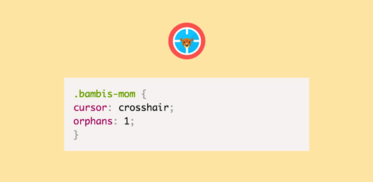
bambiCSSjoke

I had to look deep into my morals before adding this one.

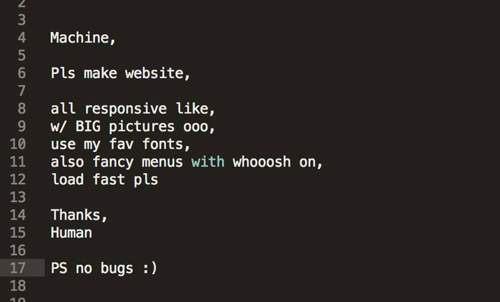
best-programming-language

Ugh, machines make us do all the work!

css_puns_08

What web designing does to us…

css_puns_09

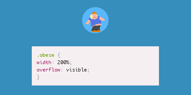
Yo mama so fat… This one had us laughing for a while.

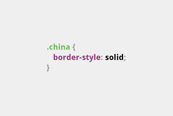
css-pun-2-china-wall2

Get it? The Wall of China!

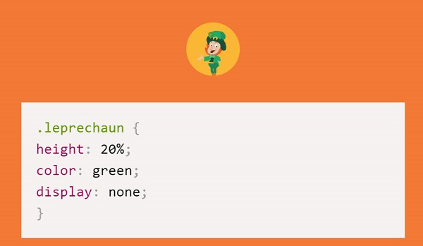
css-pun-leprechaun

Warning: little people are not leprechauns, do not attempt to capture them!

css-puns-funny-jokes-15

Never to be found..

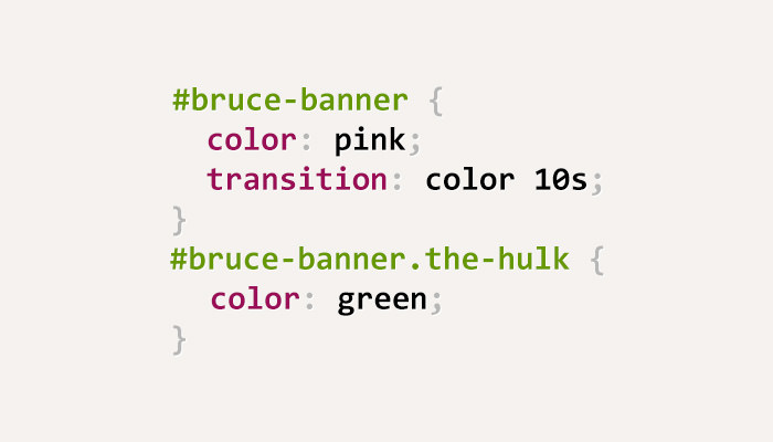
css-puns-hulk

You won’t like him when he’s angry…

Css-Puns-image-humour_2

It doesn’t take much…

css-puns-jokes-07

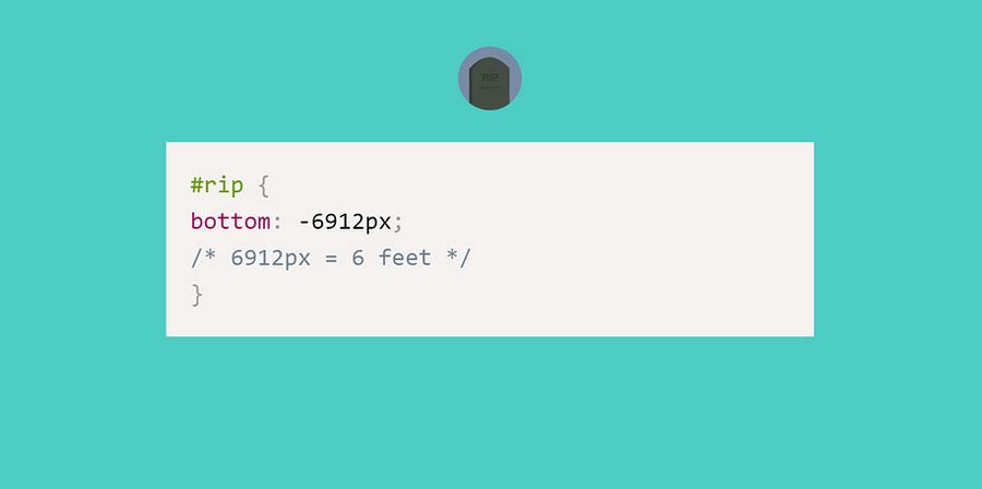
Ha! 6ft under.

css-puns-web-design-funny-jokes-4

One of my favorites!

css-puns-web-design-funny-jokes-10

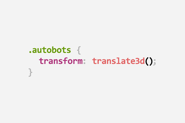
Who doesn’t love good transformer movie?

css-puns-web-design-funny-jokes-11

If you can build it that is!

css-puns-web-design-funny-jokes-14

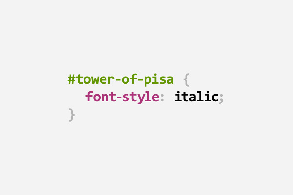
You know, because it’s leaning..

css-puns-web-design-funny-jokes-18

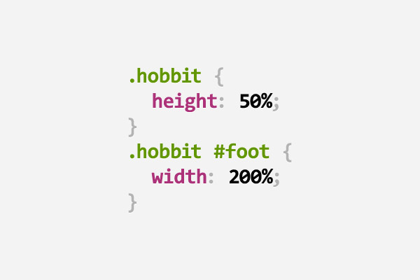
I think I might be a hobbit… it’s time for an adventure!

css-puns-web-design-funny-jokes-27

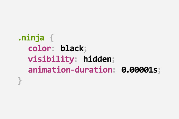
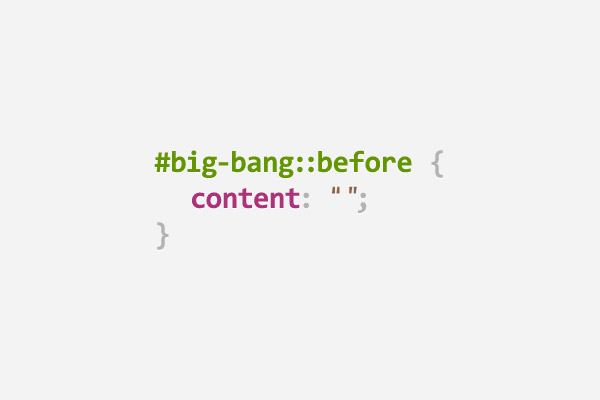
And then there was nothing…

css-puns

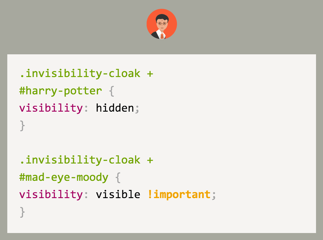
Oh the things I would do with an invisibility cloak…

download

You know its going to be fun debugging when you see that!

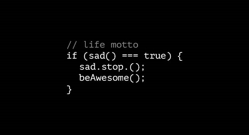
joke-life-motto

Always strive for awesomeness!

there_are_a_two_kind_of_people

This one may take you a minuet… it did for me.

tumblr_mui8g9kgZY1skkj9io1_1280

If this one doesn’t get you signing then you might be a robot…

Don’t forget to comment below and let us know which one you like best! Share your jokes with us as well, we want to see them!

Read More at 28 CSS Puns to Brighten Your Day

Categories: Designing, Others Tags:

HEAD

May 23rd, 2016 No comments

Josh Buchea has collected “A list of everything that goes in the of your document”. Over 100 tags alone!

Direct Link to ArticlePermalink


HEAD is a post from CSS-Tricks

Categories: Designing, Others Tags: