Archive

Archive for May, 2016

Understanding The CSS Property Value Syntax

May 20th, 2016 No comments

The World Wide Web Consortium uses a particular syntax to define the possible values that can be used for all CSS properties. You may have seen this syntax in action if you have ever looked at a CSS specification — as in the syntax for border-image-slice.

Understanding The CSS Property Value Syntax

Let’s take a look: = [ | ]{1,4} && fill? This syntax can be hard to understand if you don’t know the various symbols and how they work. However, it is worth taking the time to learn. If you understand how the W3C defines property values, you will be able to understand any of the W3C’s CSS specifications.

The post Understanding The CSS Property Value Syntax appeared first on Smashing Magazine.

Categories: Others Tags:

Modern Day Development Philosophies

May 20th, 2016 No comments

Hopefully This Actually Reduces Support Emails Driven Development

Ughck I’m Pretty Sure You’re Going To Do Whatever You Want Anyway Driven Development

It’s a Miracle Anything Ships At All Driven Development

Don’t Overthink It Driven Development

console.log(‘Does this code even get run?’); Driven Development

Following the Reese’s Pieces Driven Development

I Think I’ve Heard That Word Before Driven Development

Pragmatic Copy and Pasting

It’s Only Wrong If You’re a Dick About It Driven Development

Whatever, Cripes Stewart Driven Development

Functional Guessing

I Hope Nobody Notices These Commits Are Mostly Whitespace Changes Driven Development

Gut Instinct Driven Development

Struggle Through It Once Then Write a Thinkpiece Driven Development

Toss Another Dependency On The Pile Driven Development

It All Comes Down To HTML Driven Development


Modern Day Development Philosophies is a post from CSS-Tricks

Categories: Designing, Others Tags:

(To use or not-to-use) Classes

May 20th, 2016 No comments
Categories: Designing, Others Tags:

6 plugins to keep your WordPress site on-trend

May 20th, 2016 No comments

There’s no need to talk up WordPress since everyone is aware of its vast potential. Instead, we’re going to talk about some of the plugins.

Some of them are vital, like a plugin for improving SEO or caching the site; others are optional, like a plugin for reCaptcha integration. Among the latter category, you often stumble upon plugins designed to help site owners keep up with recent design trends.

For example, they can spice up interfaces with features like hamburger menu buttons or duotone graphics. Today, we are going to examine six current trends and present you with six simple — and, most importantly, free — solutions that are available in the repository.

1. Cards

As seen on Pinterest, Dribbble, Behance, Twitter, Facebook, Google Plus, and more.

We are going to start with Cards. 2015 was marked by a big fuss around this trend, and it’s not going anywhere. Considered to be one of the most popular design patterns, it breaks the content into digestible chunks, and dishes them up to readers. It is a nearly-universal solution that plays nicely both with desktop and mobile interfaces.

WordPress solution: Masonry Layout

Masonry layouts are one of the best ways of using card-based layouts, so this plugin is a great start. It lets you use a Pinterest-style structure, and apply it to your blog, online magazine, or even e-commerce site.

2. Duotone graphics

As seen in Spotify campaigns, Adidas campaigns, Lois Jeans campaigns, and others.

Duotone is as old as the hills. It has been used a million of times by photographers, who need to bring out middle tones and highlights of a picture. Even though it’s not exactly new, Duotone has taken the Web by storm in the last year. The biggest example of this is Spotify, whose designers have infused the technique with intense hues

WordPress solution: TwotoneFX

TwotoneFX is a small plugin that allows you to convert all the images in your media library into duotone. It has a simple, pretty intuitive interface with several options for editing pictures. Thus, you can set colors and apply filters to thumbnails, images in posts or all the multimedia at once.

3. The parallax effect

As seen on a gazillion websites of various scales, sizes, and themes.

The technique can hardly be called a trend; it has been with us for ages, and technically nothing has changed. You can safely say it’s time-proven tool that, by the way, is hot nowadays. Paired with multiple backgrounds, it assists in building outstanding layouts with a dynamic feel, smooth user experience, and 3D effects.

WordPress solution: Parallax Scroll

Parallax Scroll is an elegant way to add this effect with shortcodes. It enables headers, pages, and custom posts with a parallax background. The official repository demonstrates numerous ways to accomplish this; you can experiment with whatever fits your needs best.

4. Material Design

As seen on MaterialUp, Polymer, Android, Google, and all of its services.

This living document—that is intended as an international visual language—has already carved a niche for itself. It encourages the adoption of best practices in UX design, serving as a sort of “guiding star”. It also provides easily-implemented aesthetic user interface styles .

WordPress solution: Materializer

Materializer is a comprehensive library of Material Design components that was skillfully converted into a WordPress plugin. It offers more than twenty shortcodes for integrating elements such as cards, loading icons, various sorts of buttons, and others into a page or post. Examine the documentation to find out how to use them to your benefit.

5. Animations

As seen in almost every modern portfolio, projects with visual storytelling experiences and other websites, including Goliaths of industry such as Apple.

Among the all current trends, this one is the most eye-pleasing, engaging and powerful. Lazy animations, loading animations, smooth transitions, subtle page motion, traditional easing, sliding, fading and zooming animations, and offbeat typography animations: there are a ton of them in the wild. They are used to enhance interfaces, enrich experiences, and simply bring to life interesting ideas. If you need more information about this fast-growing tendency, then take a glance at The ultimate guide to web animation, it clarifies the issue.

WordPress solution: Animate It

As the name implies, the plugin can set any element of a post, widget or page into motion, giving it subtle, yet noticeable dynamic behavior. It comes with more than fifty different effects, including bouncing, fading, rotating, flipping, and pulsating.

6. Hamburger menu buttons

As seen on The New York Times, Star-Wars.com, Citroen Ad campaigns, and thousands of other websites.

Some say that this button with three lines that hides a navigation menu is a blessing for modern interfaces; others call for it to be killed off outright, providing some sound reasons. The trend is pretty controversial. However, one can argue that no matter what this notorious design pattern is still highly in demand. Apparently, the crowd loves bad guys.

WordPress solution: Responsive Menu

Being trusted by more than eighty thousand WordPress users, this plugin is a must-have for your blog, magazine, corporate portal or whatever you have. It equips the interface with a fully responsive navigation panel that can be customized to your tastes. With seventy different options to choose from, you will be able to create a perfect match for your project.

Ratatouille Sketched: 130+ Hand-Drawn Vector Elements – only $7!

Source

Categories: Designing, Others Tags:

Web Development Reading List #138: Accessible Web Components And CSS And Sass Precision

May 20th, 2016 No comments

From time to time you need to recalibrate your brain by experimenting with new technologies, by tracing down the performance of a certain feature or by reconsidering the environment of your project. While I’m generally not a proponent of inlined CSS, we now will use it for a third-party script we are providing to avoid style leakages. The point here is that this decision won’t harm performance as it’s an asynchronously loaded script.

Accessibility is vital, also when it comes to web components

The other thing I always assumed but never got confirmed was that CSS filters slow down the rendering of a page massively. But as it turns out, when you research this properly, there’s only a barely noticeable difference to unfiltered images. Don’t hesitate to try out new things, only make sure that it’s the best solution when you put it to production.

The post Web Development Reading List #138: Accessible Web Components And CSS And Sass Precision appeared first on Smashing Magazine.

Categories: Others Tags:

Tips For Using Fonts In Typography

May 19th, 2016 No comments
Typography

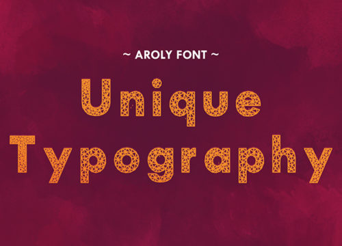
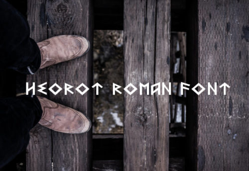
Picking the right font and using it in the typography is a mystifying process for many people. There are endless choices of fonts, whether you are looking for a normal conventional looking font, or an innovative bunny or candy cane font. A few decades ago, designers were limited to very few web safe fonts, most of which looked pretty much the same, but now, there is an astonishing range of typefaces that you can use on your site, blog or print design. Here are a few tips for using fonts in typography.

Be informed about the diverse fonts

diverse fonts

First of all, to choose the right font, you need to be aware of the primary groups of fonts so that you can select the right one. Basically, there are five groups: geometric sans, old style, humanist sans, slab serifs and transitional & modern.

  • Geometric sans are the combination of realistic, geometric and grotesk, and are made up of strict geometric strokes. The strokes are of same width, and the impression is clear, modern and objective. Examples include Gotham, Avant Garde and Helvetica.

  • Old Style fonts are old typefaces that are identified by curved strokes tilted to the left. Examples include Garamond, Palatino and Bembo.

  • Humanist sans are more casual in nature and resemble more of a hand-written piece. Examples include Frutiger, Verdana and Myriad.

  • Leaving the Old Style fonts behind, transitional and modern fonts are more virtuosic, sharp and geometric. They are known for their dynamic, strong and stylish appearance. Examples include Didot, Times New Roman and Baskerville.

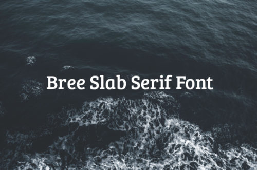
  • Slab serif fonts are characterized by a slight contrast between thick and thin, having rectangular solid box in the end. These look authoritarian and add a distinct twist to your presentation. Examples include Archer, Clarendon and Rockwell.

Add appeal by using contrasting fonts in varying sizes

contrasting

A presentation with the same font all over will not create much impact. Instead, choose different fonts with contrast to each other. For instance, if you are creating a website from a web design template, use contrasting fonts for writing your web content and those sales pages. You need to use different font sizes as well to create a strong appeal. Headings have to be bigger, sub-headings should be smaller, and content message has to be even smaller.

Know the purpose of using the font

timesnewroman

Tips to Help You Choose the Right Fonts

Different kinds of presentations require different genre of fonts. For instance, if you are creating a resume, you need to choose a font that looks strong and formal. Times New Roman does the job very well. But if you are making a template for a poster or pamphlet, then Wild West Style or Victorian will be a better choice.

Make sure that the font is clear and legible

clearfont

If you are creating a long text body, then make sure that the font you use is clearly legible. No one is going to try hard to read what you have written. The font that you use should be aligned properly and should not give visual strain to the reader.

Positioning the text and aligning it

clearn and alligment

Once you have selected your fonts and their size, you need to use them properly on the layout as well. Depending on the background images of the presentation, position and align your text properly. It should be in sync with the rest of the body and also create the desired impact on the reader’s mind.

Fonts are powerful elements to carry your message across to your readers. Whether you are designing a greeting card, a resume, a website page or a magazine layout, use the right fonts to define your work and emphasize the main message. Use these tips to use the available fonts the right way.

Read More at Tips For Using Fonts In Typography

Categories: Designing, Others Tags:

Looking Back: One Year Of Microsoft Edge (Videos)

May 19th, 2016 No comments

Change is difficult in large corporations. But sometimes it is possible. We kindly thank our dear friends at Microsoft for keeping Smashing Magazine alive and supporting its community with solid technical articles on practical JavaScript techniques, open source projects and interoperability best practices. Our editors are working with Microsoft evangelists to deliver most useful and valuable insights to you. — Ed.

microsoft-edge-browser-usage-share-preview

In 2015, Microsoft launched its first new browser in 20 years: Microsoft Edge. After eight months, it’s on a great trajectory for web standards support, but there are many exciting features to come. This article is part of the web development series from our tech evangelists and engineers on JavaScript skills, community projects and best practices including Microsoft Edge browser and the new EdgeHTML rendering engine.

The post Looking Back: One Year Of Microsoft Edge (Videos) appeared first on Smashing Magazine.

Categories: Others Tags:

Netflix releases their own Internet speed testing tool

May 19th, 2016 No comments

Internet speed is a subject that is near and dear to our hearts. It matters because we build websites, and we want every user to have the best experience possible. It also matters because we work hard, and we deserve to marathon those episodes Dawn of the Croods, darnit! So why is this thing still buffering?

Netflix, as one of the primary sources of video content on the Internet, has been engaged in protracted battles with telecom providers, who sometimes have different ideas about the definitions of words like “Internet”, “speed”, and “quality service”. Well, it takes all sorts, right?

The problem is that many telecom customers aren’t getting the sorts of speeds they were promised, and they often don’t have that many options. Netflix wants to deliver their content as fast as possible, as we all do, so they’ve created their very own Internet speed testing tool, so users can see what their actual Internet speed is.

It’s located at the very appropriately-named fast.com.

Now, it’s not super feature-packed. It only measures download speed, which is obviously the most important factor for Netflix, and indeed for most of us. The most important feature, however, is that it’s not in any way ad-supported or affiliated with any telecom provider. Netflix believes that any connection or dependence on advertising could affect the quality of the results.

This is, perhaps, a bit cynical, but I can hardly blame them. It’s no secret that companies like Comcast and Time-Warner have been trying to limit the access that competitors have to their own customers. It’s also no secret that speed testers provided by the telecoms themselves are known to be inaccurate.

Put in that context, it looks like this tool isn’t just a handy little gadget for ISP customers. It’s a calculated move designed to put pressure on telecom companies. On a personal level, I applaud their intent. In the bigger picture, however, the actual impact of this move remains to be seen.

Mind you, this move only works if users aren’t getting the speeds they’re paying for. I found out that I’m getting 11-12 Mbps more than I’m paying for, so I’m feeling pretty happy about this whole thing.

Go test your own Internet speed on fast.com.

Photo courtesy of Flickr user vavva_92.

LAST DAY: Ultimatum 2.8 – The Ultimate WordPress Theme Builder – from $35!

Source

Categories: Designing, Others Tags:

5 Thoughts When Building Security into Your Website

May 19th, 2016 No comments
security

In an age where hacking is proliferating at unprecedented rates, website security matters more than ever. But often when building a website, security is at the bottom of a developer’s priority list. And it can be difficult to understand how to build a strong website which stands a higher likelihood of resisting hacking attempts, malware, and viruses. And unfortunately, regularly running antivirus protection is rarely enough to keep your website safe!

We put together an easy, comprehensive guide for building a more secure website from the ground up, offering practical tips and suggestions which can make your website a harder target. According to published statistics, as many as one in three websites on the entire internet is vulnerable. Don’t let yours be one of them!

Pick Your CMS With Security In Mind

security

Most websites are built on a CMS framework like Jooma or WordPress, these days. But the CMS you choose can have a dramatic impact on your website’s security. For example, most hackers will opt to hack more popular CMS-based websites, simply because they represent a larger pool of popular targets. But the offset to that is that more popular CMS frameworks are generally patched and updated more frequently to correct vulnerabilities than less popular frameworks.

With this in mind, select a framework based on your expected website management schedule. If you think you’ll be able to regularly check for updates to your framework and install them, than a more popular option like WordPress might be technically more secure. If you intend to have a more hands-off approach, and might check in on your website every few weeks or months, you might be better off using a less popular framework, which will make your website a statistically less likely target.

Secure Your Hosting Plan

safe-secure-order

Most website developers are aware that they can purchase additional security mechanisms for their hosting from their hosting provider. But the type of hosting you have can also influence your security. For example, shared hosting is generally less secure than dedicated hosting. And keeping your databases and cpanel regularly updated (just as with your framework) can also help implement security patches and updates to improve your hosting security.

Install Plugins Judiciously

If you’re utilizing a CMS for your website, chances are there are dozens, if not hundreds, of potential plugins for you to install on your website. These plugins can help your website do anything from capture leads to display parallax images to integrate with social media. But we caution developers against installing too many plugins, simply because every new plugin is another element of coding which might have an easy loophole for hackers to gain entry into your website.

A good rule of thumb is to find one or two plugins which do many of the tasks you need, rather than finding plugins which each individually specialize. You should also have an aggressive update regimen, to ensure that all plugins are updated to their newest versions as often and as easily as possible.

Protect Your Login Credentials

290x195PasswordCrack

Always ensure that the names of user accounts never display on a website; and for that matter, ensure that no administrator account to get into your website is named ‘admin’. The ‘admin’ account name is among the most popular on the internet, and unfortunately, this fact makes it all the easier for hackers to crack into websites. Using novel, long user names and passwords, with complex characters, can add a substantial layer of protection to your website.

Other Security Tips

It can sometimes happen that your own machine might help to spread viruses and other problems to your website. Always have a rigorous security suite installed and active on your computer, and use your antivirus protection to conduct regular scans. Try to avoid using public networks where possible, and clear your browser cache regularly.

Read More at 5 Thoughts When Building Security into Your Website

Categories: Designing, Others Tags:

Web Image Effects Performance Showdown

May 19th, 2016 No comments

As browsers constantly improve their graphical rendering abilities, the ability to truly design within them is becoming more of a reality. A few lines of code can now have quick and dramatic visual impact, and allow for consistency without a lot of effort. And as with most things in web development, there are often many ways to achieve the same effect.

Web Image Effects Performance Showdown

In this post, we’ll take a look at one of the most popular image effects, grayscale, and assess both the ease of implementation and performance implications of HTML canvas, SVG, CSS filters, and CSS blend modes. Which one will win?

The post Web Image Effects Performance Showdown appeared first on Smashing Magazine.

Categories: Others Tags: