Archive

Archive for May, 2016

Sponsor: Enterprise WordPress on Media Temple

May 19th, 2016 No comments

Media Temple is the host we both use and recommend here on CSS-Tricks.

Hot off the presses: Media Temple has launched Enterprise WordPress Hosting. This is for large-scale WordPress sites that need the scaling and high-availability of AWS, all managed by the crack engineers at Media Temple.

A little behind the scenes: everything is built on Docker containers. When a high traffic event happens that requires scaling up, that happens in seconds. Media is uploaded and stored on S3, then delivered through CloudFront CDN.

This is some hardcore WordPress hosting, with all the support you need. Remember to use code CSSTRICKS to save 20% for the first year.

Direct Link to ArticlePermalink


Sponsor: Enterprise WordPress on Media Temple is a post from CSS-Tricks

Categories: Designing, Others Tags:

All or Nothing

May 19th, 2016 No comments

Jonathan Snook takes a look at the all property which can be used like this:

.element {
  all: initial;
}

The idea is that it should set all properties of an element to initial, removing all custom styling thus far applied. Essentially resetting the styles of any element so you can build up from scratch.

Unfortunately the inconsistencies between each browser make it difficult to recommend. If you could count on it being consistent, this is a powerful one-liner, alleviating some of motivation behind things like iframes, web components, or css modules.

Direct Link to ArticlePermalink


All or Nothing is a post from CSS-Tricks

Categories: Designing, Others Tags:

Small Victories: Free Instant Website Out of Your Dropbox

May 19th, 2016 No comments
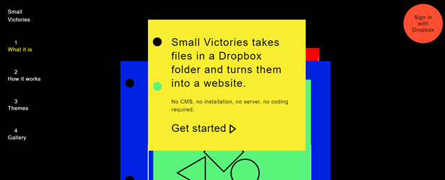
smallvictories-teaser_DE

Using cloud storage for the display of your website is a quite obvious thing to consider. Thus, it is rather surprising that there are not too many services providing offers that pick up this idea. The new service “Small Victories” does just that. Throw a bunch of files into the Dropbox and look what happens.

Small Victories: Simple Flatfile CMS in Your Dropbox

Small Victories is a very slim, free to use CMSaaS (Content Management System as a Service), created by the creative people at the New York-based design agency XXIX.co. The concept is simple. You grant the service access to your Dropbox account. After that, Small Victories creates the main folder, under which the individual websites appear as sub-folders. Move the files that you want to cumulate to a website into these sub-folders. In its absolute basic iteration, that’s all there is to do.

smallvictories-landing

The websites are then available to the public as a subdomain of smvi.co. You can also activate a password protection via a manual entry in a file named settings.txt if you find that necessary. Quickly initiate updates by updating, altering, or extending the respective files in your Dropbox. Every change in the respective Dropbox folder will be mirrored live on the respective website shortly after.

Instead of subdomains, you can also use a custom domain. For that, you need access to your domain’s DNS records, which pretty much every host I know of provides without any issues. Ten years ago, that would have been a different story.

Small Victories: Bringing Structure Into the Design

Of course, it’s going to be very rare that you don’t care how and in which order the content that you dumped into the Dropbox will be displayed. Regarding that, the creatives of XXIX.co have put in plenty of thought.

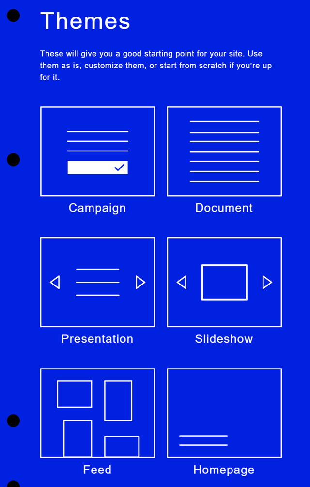
For one, you can choose one of six different templates to create a rough structure of your content. For the presentation of images, for example, the template Slideshow would make sense, one pagers are predefined with the templates Homepage or Campaign.

Small Victories: Themes

Further structure your designs by sticking to logical naming conventions. For the one pagers’ backgrounds, use a file named background.jpg, which will automatically be recognized, and placed as the background. Determine the order of the files that you want to be integrated by numbering them in the form of 01-image.jpg, 02-text.txt, for instance.

Small Victories then displays the data in this exact order. General filters, like sorting alphabetically, or by file date can be done via entries in the settings.txt of the respective site. You can either edit it manually, and move it into the Dropbox, or by using the admin page that is set up for each site.

It’s even possible to distribute image captions. To do so, name a text file identically to the respective image, like image-1.jpg, and image-1-jpg.txt. Small Victories is even prepared for using custom fonts or fonts from Google Fonts and Typekit.

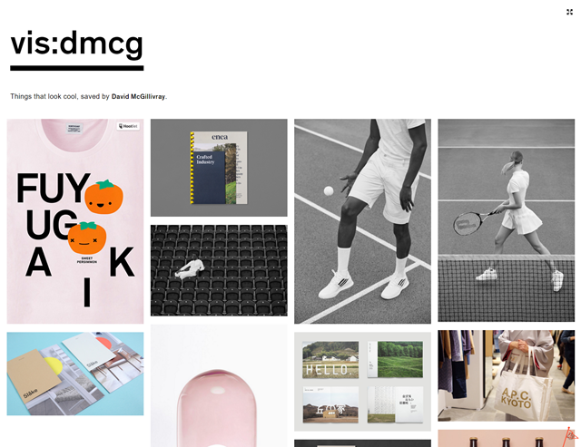
Small Victories: Example
Picture: Example of a Photo Gallery Created Using Small Victories

Those that know CSS and JavaScript well are not limited at all, as Small Victories allows them to realize anything that they are capable of programming. jQuery is provided by the service by default and doesn’t require explicit referencing.

Small Victories: Well-Documented

Small Victories comes with a sufficiently detailed documentation, which introduces you to the process in a very detailed way, and can answer all questions that may come up. Thus, there’s not much to criticize about Small Victories when looking for a simple flat-file CMS.

The catch: Small Victories pursues a collaborative plan, and wants to allow multiple participants to work on one site together. That’s why it can’t work from the folder Dropbox/Apps. The folders in there can not be shared with others. So, to allow others to edit your website, the main folder has to sit outside of the app folder. This makes it necessary to grant Small Victories full access to your entire Dropbox. Depending on how you use your Dropbox outside of that, it is possible that you don’t want that to happen at all. However, keep in mind that it is always feasible to create a new Dropbox for the sole purpose of using it as a container for Small Victories, and it’s free at that 😉

(dpe)

Categories: Others Tags:

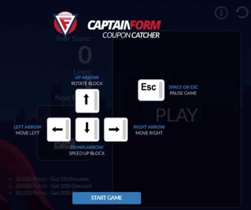
Play the CouponCatcher game, earn points and get CaptainForm discount coupons as prizes

May 19th, 2016 No comments
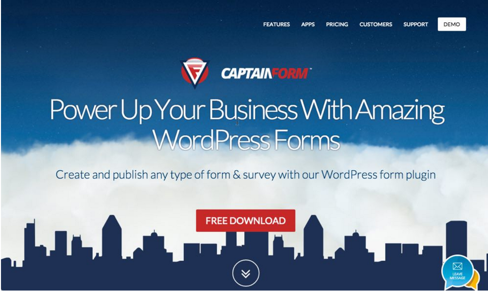
CaptainForm Coupon catcher

CaptainForm

Whether you are a small business owner, a digital agency or a freelancer, most definitely you know by now that web forms are a valuable component for any website. Through web forms, website visitors can send feedback, sign up for events and much more.

Looking for a fast and easy way to add web forms to a WordPress website ? There are many form plugin options you could choose from, depending on your needs. CaptainForm is one of them.

Why should CaptainForm be your go-to WordPress form plugin?

Cool features: intuitive and user-friendly editor, advanced security, a variety of form templates, multiple publishing options, more than 10 different payment processors, multilanguage forms.

CaptainForm doesn’t require add-ons. All the features you may need, you will conveniently find inside the plugin. It integrates with 3rd party apps for email marketing, file and project management, CRM , event management, help desk, social and developer tools. You can integrate your form with MailChimp, SalesForce, VerticalResponse, Zendesk, Zoho CRM, ActiveCampaign, and more.

These advanced features will help you create any WordPress form you may need. From WordPress contact forms to WordPress booking forms or WordPress polls and surveys, the possibilities are endless.

And if you ever need help or assistance, customer support is provided through email and live chat for all users.

Regarding the pricing, you have one free plan and three paid plans to choose from. PICK YOUR PLAN!

PLAY AND WIN DISCOUNTS: You can now win CaptainForm discounts easier than ever thanks to the fun Coupon Catcher game. All you have to do is play the tile-matching puzzle game, earn points and you’ll get discount coupons as prizes.

CaptainForm Coupon catcher

20.000 Points – Get 5% Discount

50.000 Points – Get 10% Discount

80.000 Points – Get 20% Discount

It’s addictive!

Read More at Play the CouponCatcher game, earn points and get CaptainForm discount coupons as prizes

Categories: Designing, Others Tags:

4 cutting-edge technologies to speed up your sites

May 19th, 2016 No comments

The internet is constantly making headway with speed being the major metric of progress and a key question for most web developers. A previous WebdesignerDepot article How slow is too slow in 2016? highlighted the need to focus on speed, so we decided to present a few features that will help your site make the grade in 2016.

HTTP/2

Published in May 2015 and supported since the second half of 2015, HTTP/2 is a new version of the world wide web protocol.

The main improvement is the ability to cover multiple requests in a single connection. This ability is called multiplexing and it’s revolutionary for web designers. Techniques like sprites or Data URIs won’t be effective anymore.

HTTP/1 was more efficient when loading one large image instead of several small because it wasn’t able to cover multiple requests at the same time. This was taken care of in the new version.

HTTP/2 also compresses headers before the requested data are sent, which simplifies the transport. Lastly, the new version is binary and not textual, as the previous version was.

The result is a performance boost of up to 50%. You can test the difference here.

The most difficult thing about moving to HTTP/2 may not be HTTP/2 at all. Even though HTTP/2 doesn’t require a secured website directly, browsers only support it over SSL.

Your first step towards HTTP/2 should hence be an SSL certificate.

Once you have a certificate, implementing HTTP/2 on your own is only possible if you administer your server. Otherwise, it all depends on your web hosting or server hosting company.

According to W3Techs, currently only about 7% leverage HTTP/2.

SSL certificate

Put simply, SSL certificates encrypt the connection between a server and a client. Obtaining a certificate is easier than you may think and you can get one for free with Let’s Encrypt.

Let’s Encrypt is a new certification authority that left public beta in the middle of April of 2016. The goal of Let’s Encrypt is to eliminate all the manual processes required for obtaining a certificate. with Let’s Encrypt, the whole process is automated and takes just a few minutes.

You can get a certificate through your web hosting provider. For those who administer their own server, this article provides a step-by-step installation tutorial.

Brotli

Brotli is a new compression algorithm introduced last fall by Google. In general, compression algorithms reduce the size of transported data.

Google reported that compared to the current solutions, Brotli offers 20-26% better compression ratio. As a consequence, you can save about 40% of your traffic on HTML files and about 25% on CSS and Javascript.

As of now, Brotli is only supported by Chrome and Firefox, other browsers to follow soon.

Regarding servers, major servers like Nginx, Apache and Node.js require a packet installation. No server offers Brotli by default at the moment.

CDN

A Content Delivery Network is a set of servers around the world. These servers contain copies of your site’s content (images, videos, software etc.). When accessed, your data loads from a server closer to the visitor and so the overall loading is much faster everywhere on the planet.

Another great advantage is the improved reliability of your site. As the content is spread around tens of servers, your web hosting server is spared a significant portion of traffic and therefore is better protected from crashing.

The result is a website loading faster by (on average) 50%. Usually even more.

LAST DAY: Ultimatum 2.8 – The Ultimate WordPress Theme Builder – from $35!

Source

Categories: Designing, Others Tags:

The Problem With Using SVG Sprites

May 19th, 2016 No comments

Using external SVG sprite maps to deliver lossless scalable vector images is widely used in responsive web design today and well-supported by tools like svg4everybody.

The Problem With Using SVG-Sprites

At German newspaper Zeit Online, we embraced this technique quite a lot. However, we recently changed this workflow back to completely inlining the SVG into the HTML owing to a bug in Apple’s Safari browsers (mobile since iOS 9.3, in Mac OS X since Safari 9.1) – the same way GitHub is doing with its octicons.

The post The Problem With Using SVG Sprites appeared first on Smashing Magazine.

Categories: Others Tags:

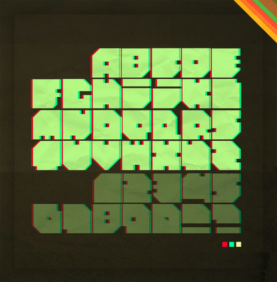
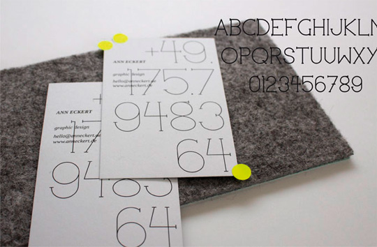
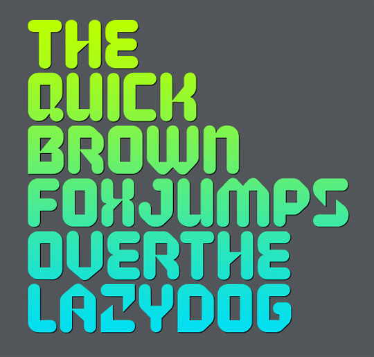
26 Free Progressive and Experimental Fonts

May 19th, 2016 No comments
modern_fonts_7

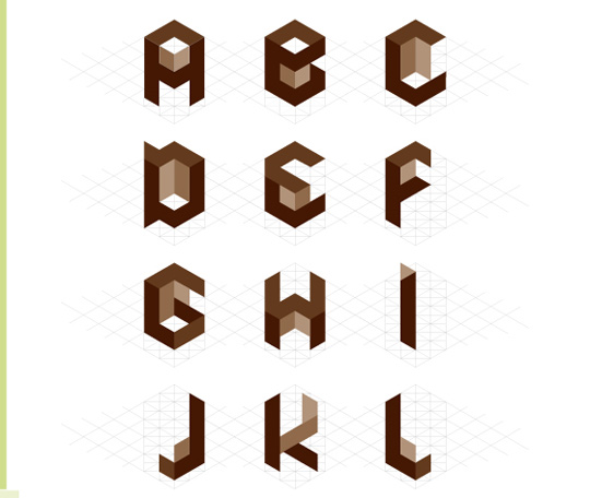
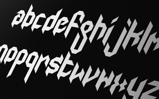
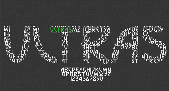
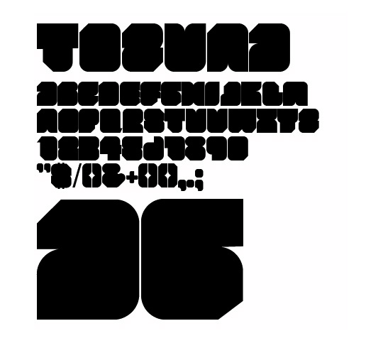
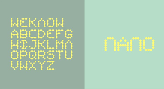
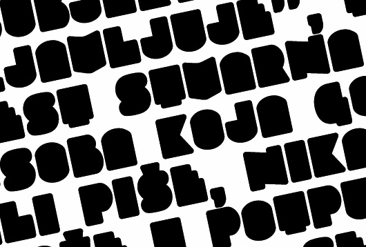
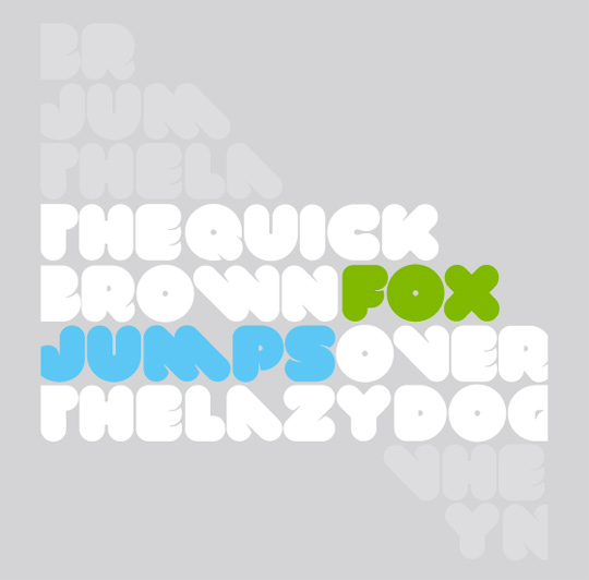
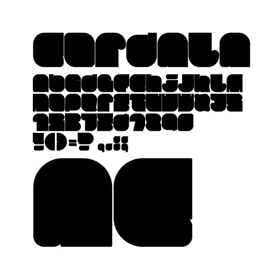
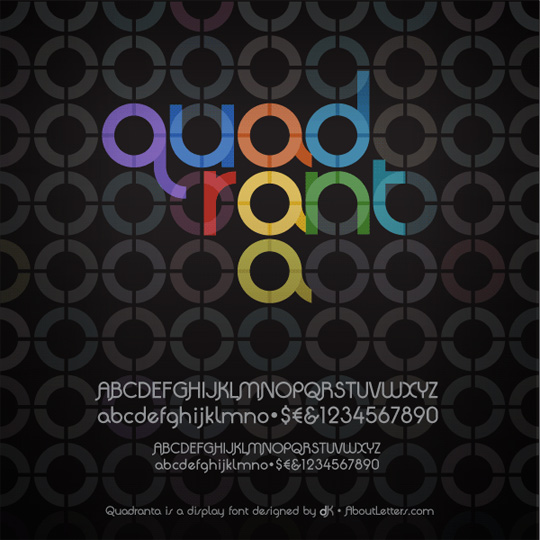
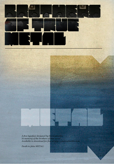
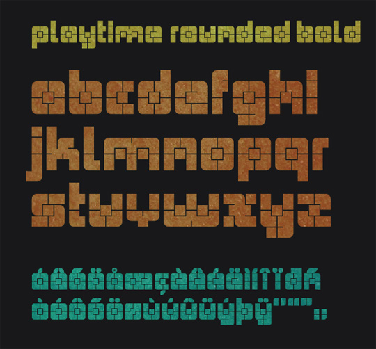
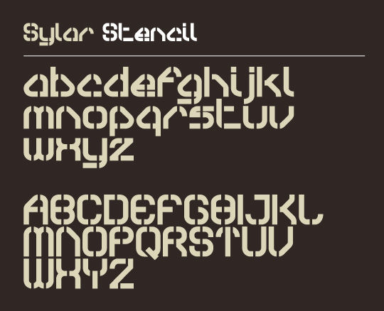
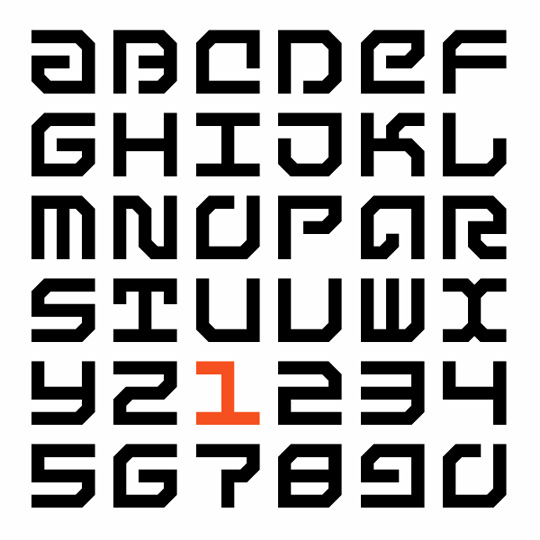
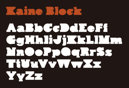
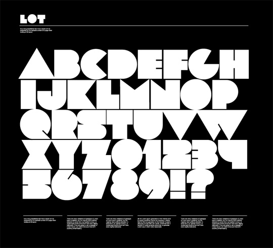
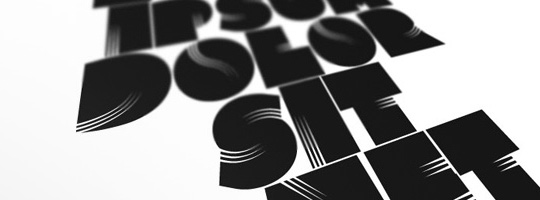
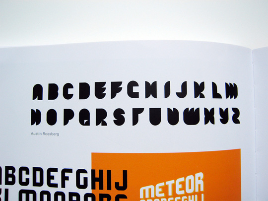
Design is constantly changing and moving forward. However, typography is one aspect of design that seems to resist progression. When it comes to typography, there are standards and traditions that have been around for many years. These rules are there for a reason – to make sure that letters and words are legible. But to move forward, sometimes rules have to be broken. So for this post we’ve rounded up 26 free progressive and experimental fonts. These fonts might be pushing the limits of traditional type design, but the results are stunning.

Rounded

Cube 02

fonts

Paranoid

fonts

Mod Gothic

modern_fonts

Ultras

modern_fonts

Tozuna

fonts

Nano

modern_fonts

Slukoni

modern_fonts

VAL

fonts

Gordala

modern_fonts

Quadranta

modern_fonts

Metal

fonts

Playtime

fonts

Sylar Stencil

fonts

Sans Serious

fonts

Kain Block

fonts

LOT

fonts

Clutchee

fonts

Tribbon

fonts

KnucklePuck

fonts

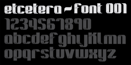
Etcetera

fonts

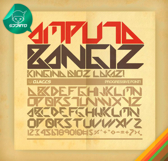
Amputa Bangiz

fonts

Betlog Square

fonts

Slimbo

fonts

Days

fonts

FILE

fonts

Read More at 26 Free Progressive and Experimental Fonts

Categories: Designing, Others Tags:

How to Quickly Add Images in Adobe XD

May 18th, 2016 No comments
Learn How to Quickly Add Images in Adobe XD

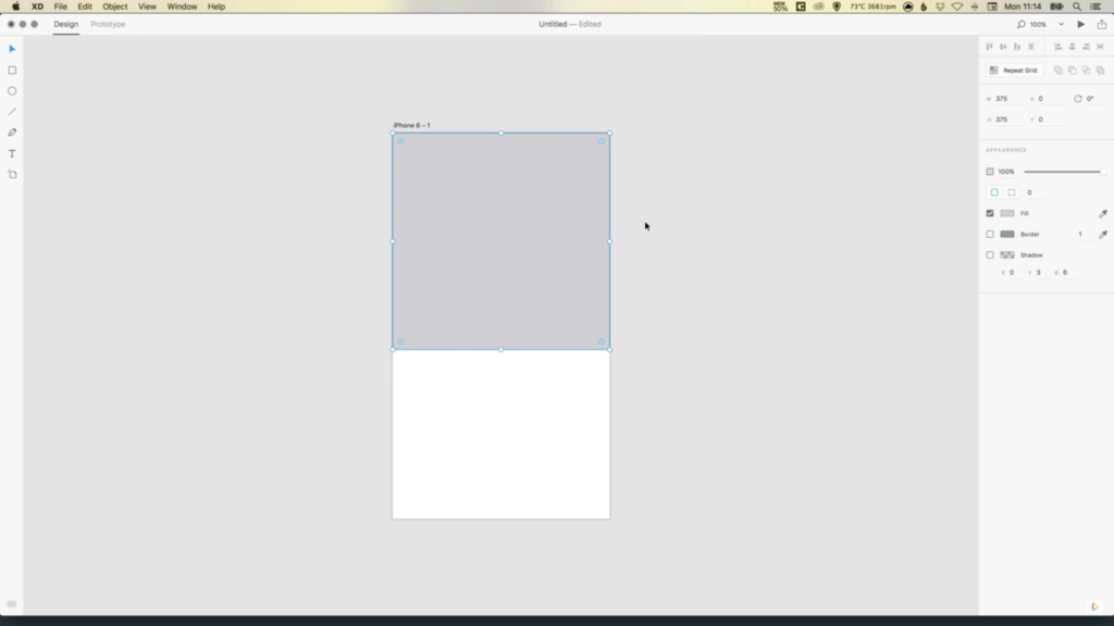
In this tutorial, we’re going to learn how to quickly add multiple images in Adobe Experience Design CC (Adobe XD).

The Steps (1-11)

1. Create a new document by selecting iPhone 6 from the Start Screen.

2. Select the Rectangle Tool and hold Shift to draw a square that fills the entire width of your artboard. Alternatively, you can enter the width and height of 375 pixels in the Property Inspector on the right-hand side with the shape selected.

quickly-add-images-adobe-xd-1

3. Give the square a fill colour of your choice.

4. The artboard width is 375 pixels, and in order to display additional images below across 3 columns, we must divide the artboard width by 3 (375/3 = 125).

quickly-add-images-adobe-xd-2

5. Select the Rectangle Tool and holding Shift create a new square, and give this shape a width and height of 125 pixels. Position this shape directly under the larger square, and align to the left edge of the artboard.

6. Select the smaller square and then click the Repeat Grid button in the Property Inspector on the right-hand side.

quickly-add-images-adobe-xd-3

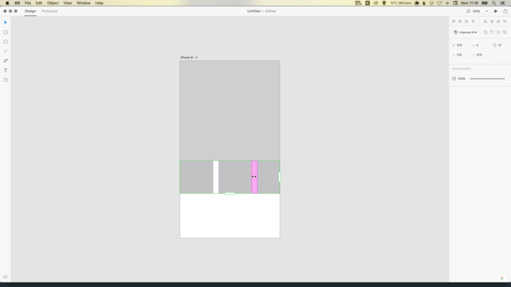
7. Notice the green border that appears around your content? Select the right slider and drag this to the right to repeat the square, and create the three image placeholders.

8. When using the Repeat Grid Tool, Adobe XD automatically creates a gutter (spacing) in between the different objects that are being repeated. By selecting and clicking inside this space (the gap in between objects) you will see that some pink guides appear, that allow you to adjust the gutter spacing. For this tutorial, reduce the spacing here to zero, then drag the green slider to the right so that it touches the edge of the artboard once again.

quickly-add-images-adobe-xd-4

9. Next, drag the bottom green slider down, and repeat Step 8 to reduce the gutter spacing to zero.

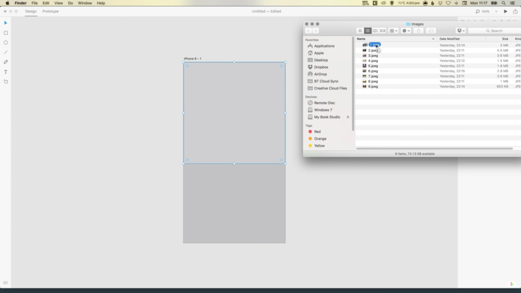
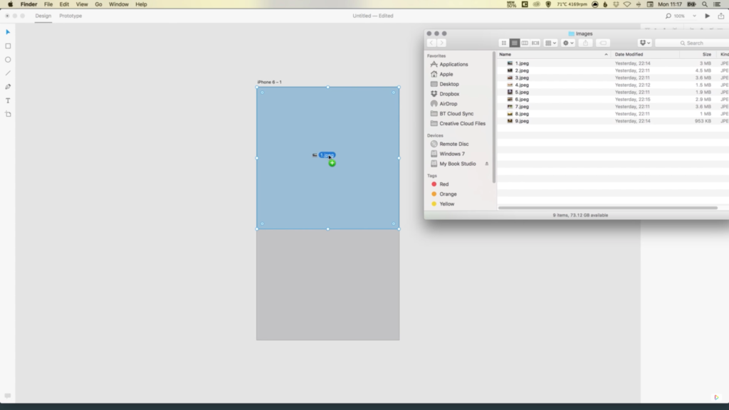
10. Select the larger square, and from your window/desktop drag your featured image on to the square, and it will automatically import this image into the document to occupy this space.

quickly-add-images-adobe-xd-5

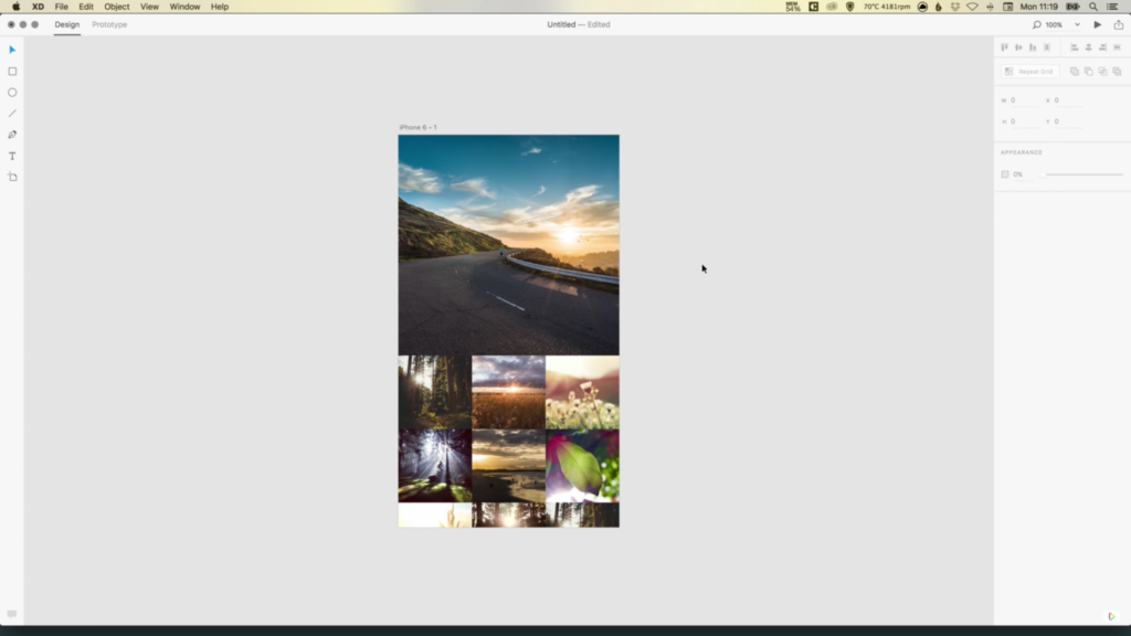
11. Next, hold Shift and select all of the other images that you wish to import (remember, the order in which you select these images, is the order that they will appear when imported into Adobe XD), and drag these on to that first smaller square that we created. Adobe XD will then automatically populate all of the other small squares with your selected imagery.


Download Adobe Experience Design CC (Adobe XD).

Read More at How to Quickly Add Images in Adobe XD

Categories: Designing, Others Tags:

Top 20 Multipurpose Website Templates for 2016

May 18th, 2016 No comments
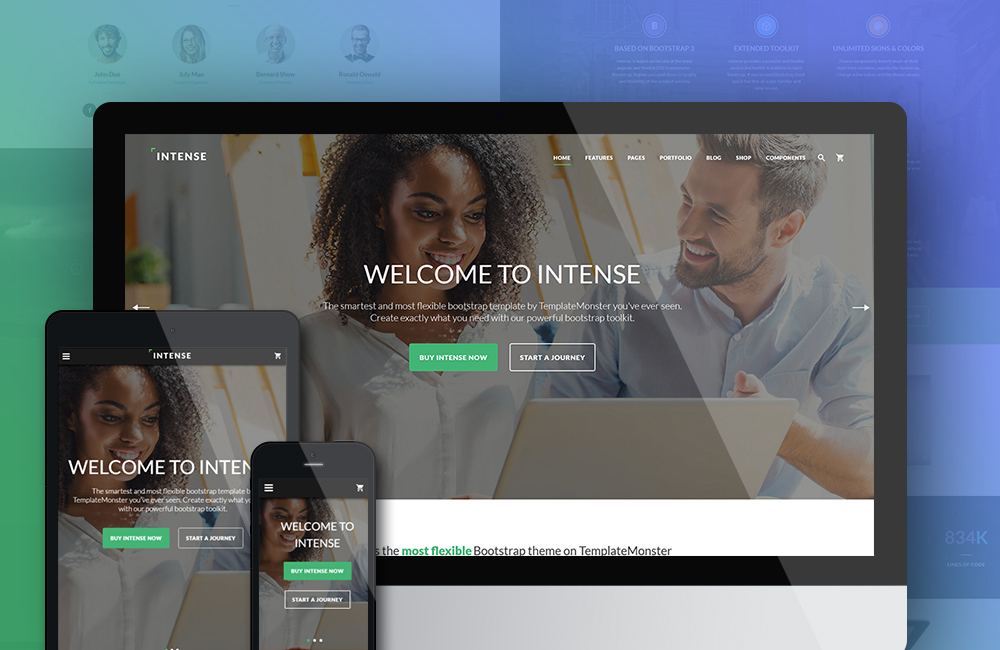
intense pic 02

More and more often, web developers opt for multipurpose website templates that are crafted to suit any brand, company, business, organization, etc. Such templates are commonly pre-loaded with all the features, pages and extensions that one might need to have at one’s disposal when working on a website. Thus, multipurpose website templates can save loads of your time, effort and money when launching a personal blog, portfolio, business or eCommerce site. Thanks to their high level of flexibility, you have the freedom to personalize each template in a way that perfectly fits your new project.

If you are in search of universal and trendy web page designs that fit different types of websites, then our new compilation should be of interest to you. Below, we have listed 20 of the most impressive multipurpose website templates, including 11 multipurpose HTML5 templates, 7 multipurpose WordPress themes, and 2 multipurpose Joomla templates. Check them out in detail.

Multipurpose HTML5 Website Templates
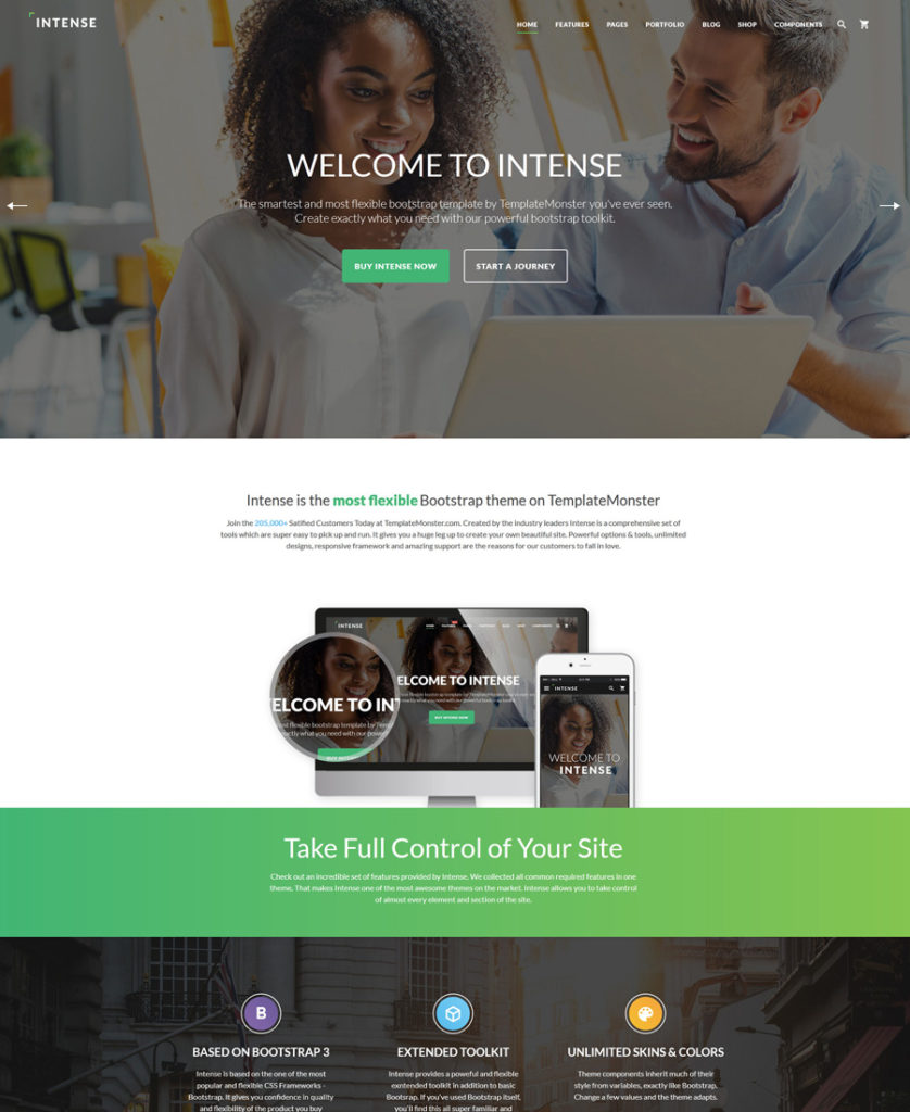
1. Intense

intense - one of the best multipurpose website templates
Demo | More info

“Intense” is a multipurpose HTML5 template by TemplateMonster. Powered by Bootstrap, the template ensures flawless performance of your website across a variety of devices. “Intense” is pre-loaded with 160+ HTML5 pages, which will help you get started with blogs, portfolios, personal and business sites as well as eCommerce projects. 15+ portfolio templates, 30+ blog templates, 10+ eCommerce page templates and a whole lot of other elements are ready to go out of the box. “Intense” comes with free 24/7 support and lifetime updates, which means that the collection of ready-made components will only grow with time. On top of that, the template includes an ever-growing collection of child themes: Portfolio, Restaurant, Real Estate , etc. It goes without saying that “Intense” includes a variety of smart customization options, all of which can be accessed from the user-friendly dashboard.
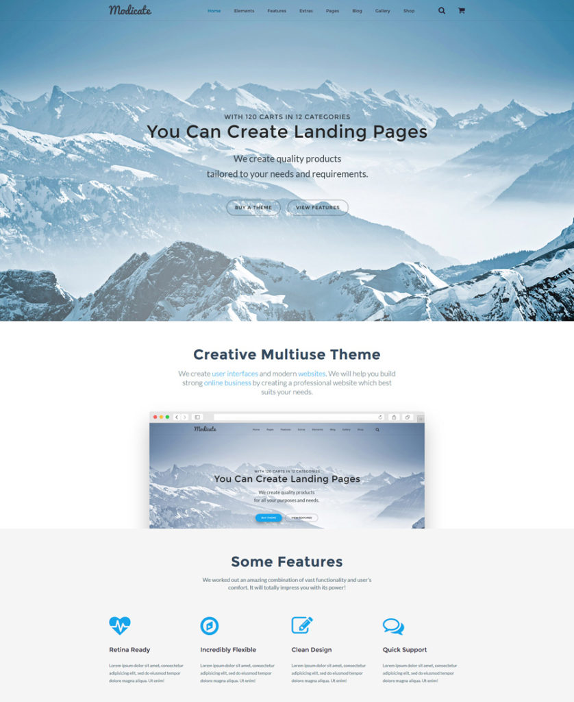
2. Modicate

modicate - one of the best multipurpose website templates
Demo | More info

Modicate is an all-in-one HTML5 template that includes every tiny detail that you will need to build a blog, portfolio, eCommerce or any other type of web project that you have in mind. Thanks to a package of over 50 pre-designed HTML5 pages, you will be able to get started with your website in no time at all. All pages and features that Modicate includes are ready to go out of the box, so just pick any one, add your content and bring it to life. The template also boasts a rich kit of UI elements, which all web designers will appreciate. Ready-made layouts, cool animation effects, multiple header and footer options, and a whole lot of other components will be available to you on download.
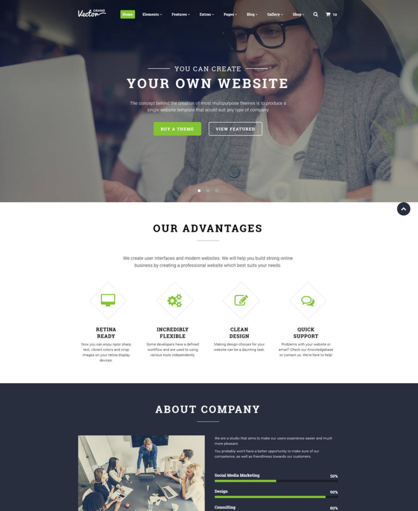
3. Grand Vector

grand-vector - one of the best multipurpose website templates

Demo | More info

The sleek and professional design of this multipurpose HTML5 template will help you grow the users’ interest in your business and boost conversions effortlessly. Pre-loaded with a variety of working forms, 6 blog layouts, multiple gallery types, eCommerce page templates, and more advanced functionality, the template is intended to fit small-to-large-sized web projects. In addition to its rich variety of UI elements and pro customization options, Grand Vector looks extremely impressive. Its layout was designed with attention to detail. Cool animations, parallax scrolling images, sliders and galleries will make your website easy on the eyes.
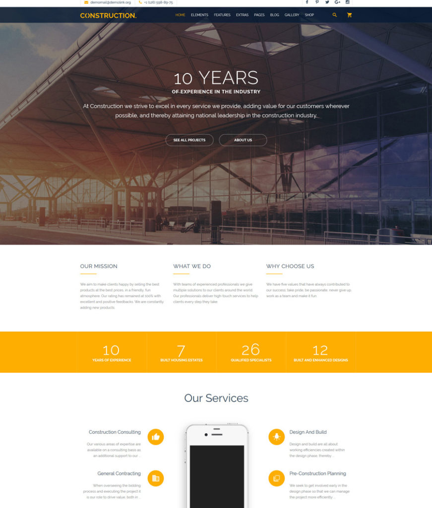
4. Construction

Construction - one of the best multipurpose website templates

Demo | More info

The template was developed to suit multiple purposes. Construction, industrial, maintenance, agriculture, transportation or any other business will look professional and trustworthy when built with its help. Created with valid, semantic code, the template also features stunning animation options, which are intended to encourage the users to become immersed in browsing your web pages. Advanced Bootstrap features will make your site fully adjustable to all screen sizes. Thanks to a number of built-in working web forms, you will feel the ease of expanding your site’s functionality without wasting time on the installation of third-party components.
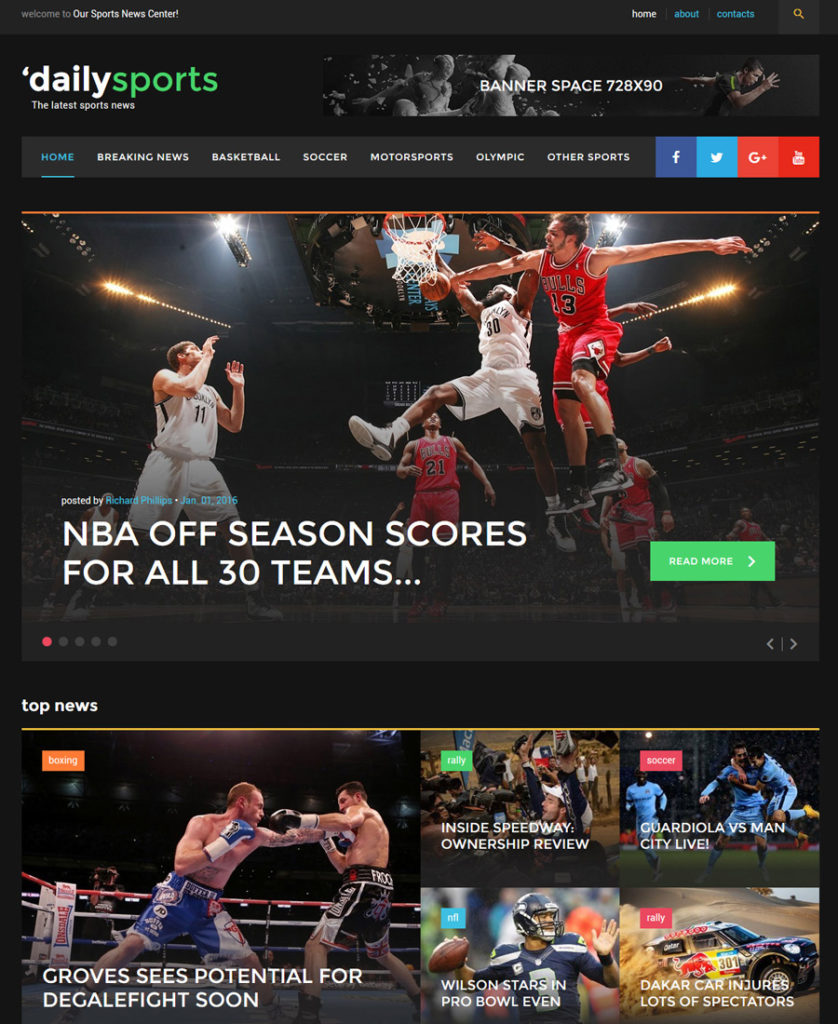
5. DailySports

dailysports - one of the best multipurpose website templates

Demo | More info

The following design on this list of multipurpose website templates is best suited for content-heavy websites, like news portals and online magazines. Thanks to its clean, flat layout style, the content is brought to the forefront. Navigation has been enhanced with a sticky drop-down menu and advanced search. Social sharing options also remain fixed to the top of the page. A 2-column layout structure of the theme gives you the freedom to share your recent content updates and additional navigation elements in an easy-to-scan manner. The layout can be tweaked in any way you wish thanks to header and footer variations and a rich UI kit. Numerous post formats are also available.
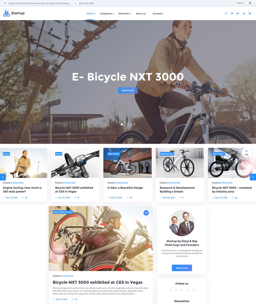
6. Startup

startup - one of the best multipurpose website templates

Demo | More info

As the name implies, the template is intended to make any startup project shine on the web. Built in a clean, minimalist style, the template features lots of white space, which makes your site’s layout easier to scan. A well-balanced content structure allows the visitors to look through the latest content updates and have constant access to additional navigation elements. The main website menu features drop-down functionality and remains sticky to the top of the page as a user browses your site. The theme’s layout can be tweaked in multiple ways thanks to the availability of various header and footer options, a host of widgets, a rich UI kit and 30+ pre-designed page templates.
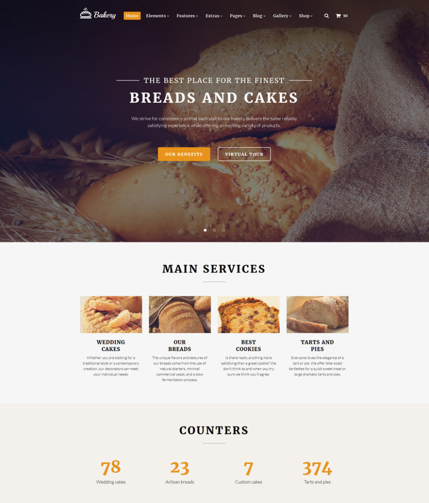
7. Bakery

bakery - one of the best multipurpose website templates

Demo | More info

This HTML5 template will work great for a variety of food and drink related websites. Its soft color scheme creates a cozy atmosphere on the page, making the users feel like home. Stunning animation and parallax scrolling images provide for a more interactive browsing of your content. A host of pre-designed page layouts will help you build a powerful web resource that can both inform the audience about the latest industry news, and sell goods online. A rich UI kit for developers has been pre-loaded with fonts, working forms, grids, buttons, tabs, progress bars, and a whole lot of other elements that will make your web resource more diverse and informative.
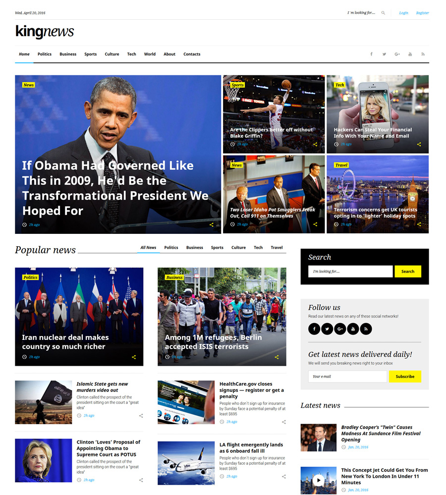
8. King News

kingnews - one of the best multipurpose website templates

Demo | More info

News portals and online magazines will stand out with their readability and user-friendliness when built with the help of this HTML5 template. It is highly informative yet easy to browse. A grid-based content structure lets you share various types of data in an easy-to-comprehend way. Pre-loaded with multiple cool widgets, the template allows your visitors to keep track of your social media feeds, view recent comments and posts, as well as access the calendar, while enjoying your most recent publications.
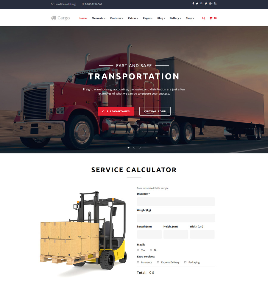
9. Cargo

cargo - one of the best multipurpose website templates

Demo | More info

The next item on this list of multipurpose website templates is an HTML5 template for transportation services companies. Thanks to a variety of pre-designed pages, layout variations, multiple gallery types, abundance of UI element and widgets, the template is intended to make your web page both functional, informative and user-friendly. With its help you can build not only blogs and business web projects but also fully featured eCommerce sites.
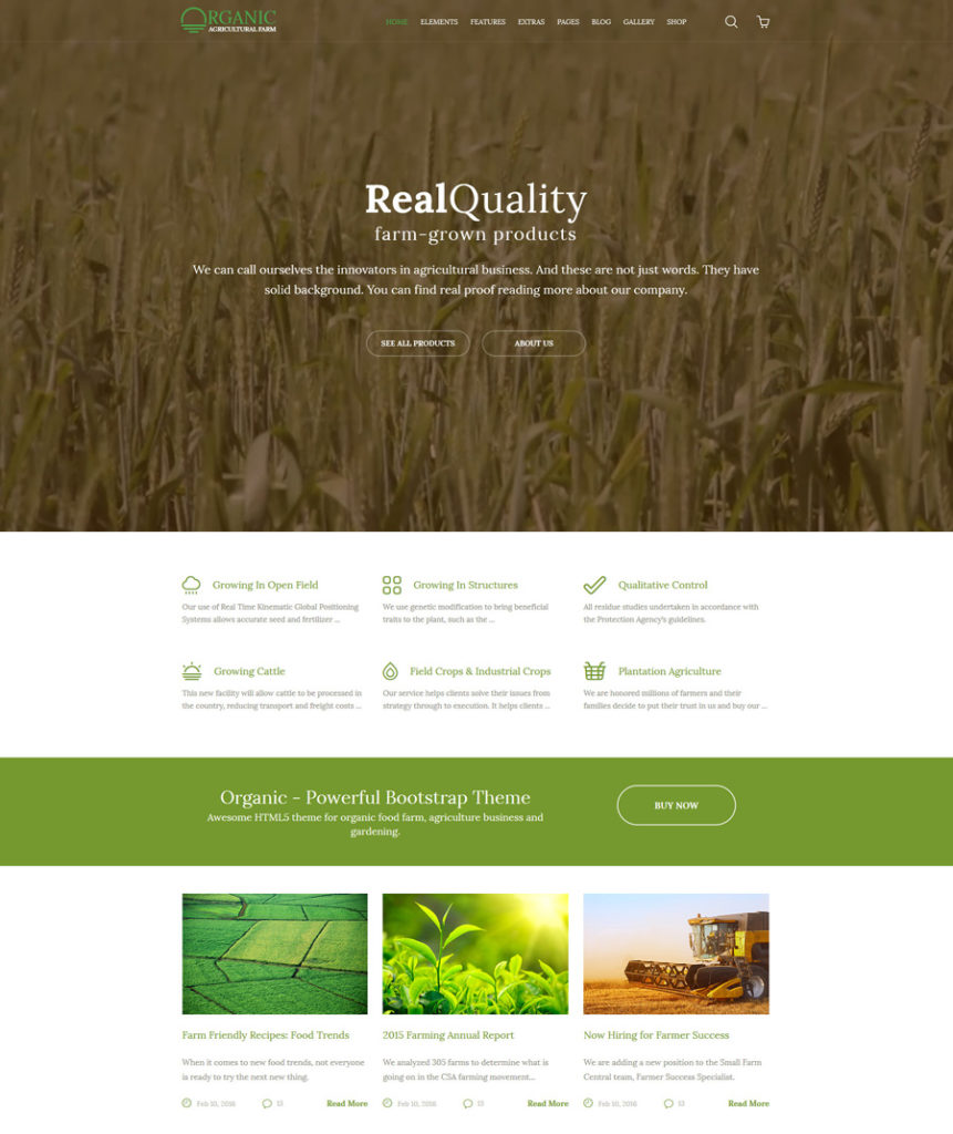
10. Organic

organic - one of the best multipurpose website templates

Demo | More info

The template was crafted using valid, semantic code and advanced Bootstrap features. It would be a perfect option for people or companies dealing with agriculture. Running on a fully responsive framework, the template will make all of your site’s content adjust seamlessly to any device. A clean layout of the template features high-resolution visuals in the background, sliders and galleries, which serve as great attention-triggers. This HTML5 template was bundled with a number of pre-designed page layouts, which enable you to get started with your web resources without the need to design Blog, About, Pricing, eCommerce, 404, and other pages on your own.
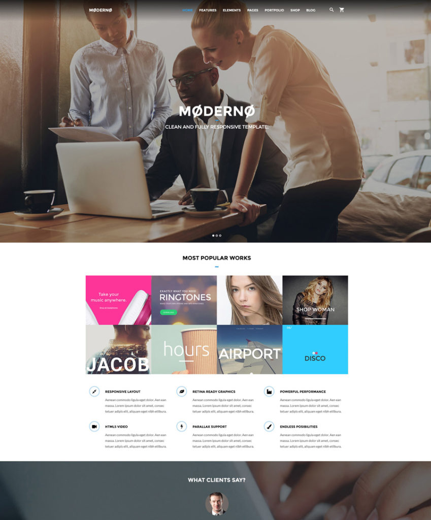
11. Marketing agency

marketing-agency - one of the best multipurpose website templates

Demo | More info

This professionally designed multipurpose HTML5 template is intended to save loads of your time and money on the development of a competitive web resource that meets the most current trends in web design. With this theme you have the option of choosing from a variety of gallery types, working forms, ready-made blog layouts and eCommerce page templates. With a header enhanced with a sticky MegaMenu and live search, an informative footer and back-to-top button, first-time visitors can easily browse the theme.

Multipurpose WordPress Themes
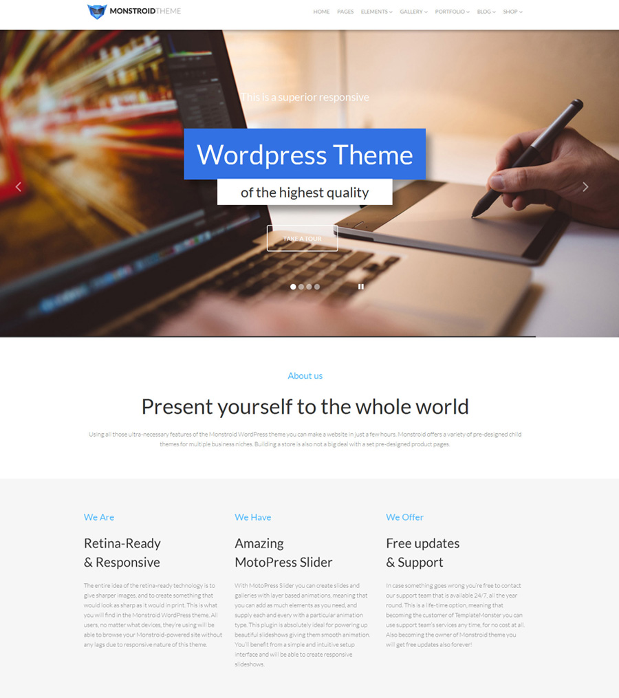
1. Monstroid

monstroid - one of the best multipurpose WordPress themes

Demo | More info

Monstroid is one of the most popular WordPress themes from TemplateMonster. Feature-rich and enhanced with loads of cool visual elements, the theme is designed to be tweaked easily by users of all skill levels. Thanks to free lifetime updates, by downloading the template once you receive a product that remains up-to-date forever. All Monstroid owners get unlimited free access to the gallery of child themes, the number of which is constantly growing. On top of that, the template includes multiple layout variations, an integrated skin color switcher, premium extensions (which all Monstroid owners can use for free), 500+ Google web fonts, and so much more. With Cherry Framework 4 on board, the template is easy to install and handle.
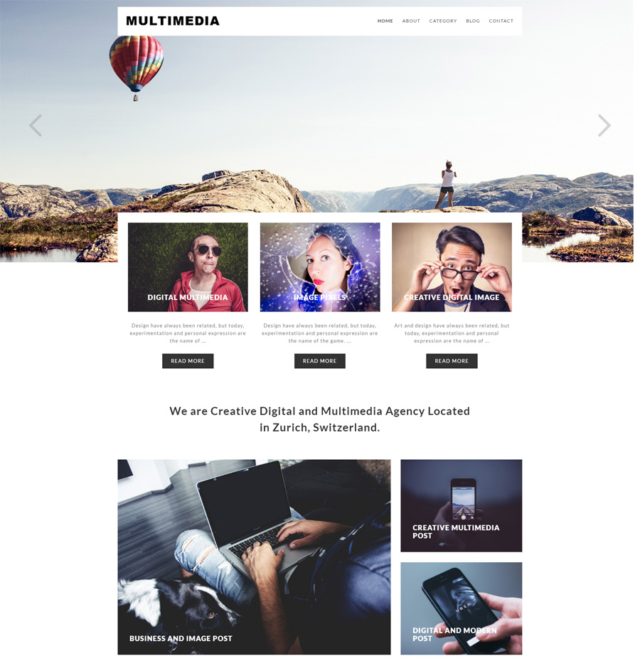
2. Multimedia

multimedia - one of the best multipurpose WordPress themes

Demo | More info

Minimalist style and clean design of this multipurpose WordPress theme make it a perfect option for design and other creative agencies that aim to bring the users’ focus of attention on content. A large hero slider on the front page of the template serves as a great attention trigger. A card-based content structure is both trendy and functional. Running on a fully responsive framework, the theme will seamlessly adjust all your content to any screen size. SEO-friendly and crossbrowser compatible, Multimedia includes support and system updates.
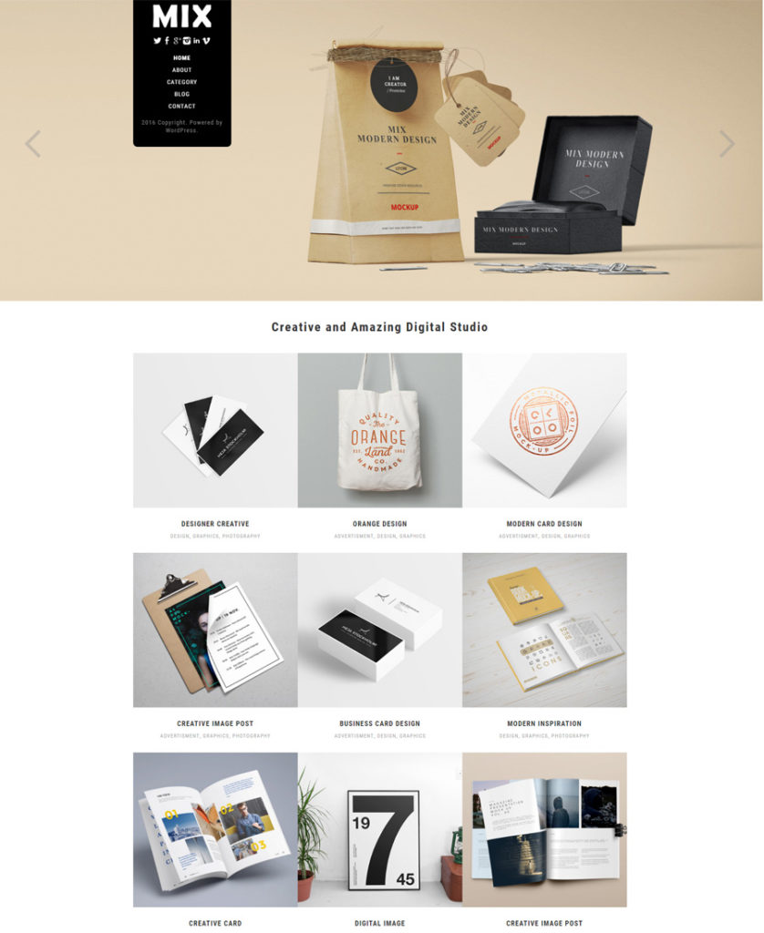
3. Mix

mix

Demo | More info

A mobile-friendly design of this multipurpose WordPress theme would be a perfect fit for any business or creative project of yours. The theme is SEO optimized and intended to run smoothly across a variety of web browsers. Its clean layout features grid-based content positioning, which allows you to share loads of data without compromising its readability. Unlimited domain usage is available on the download, as well as updates and support.
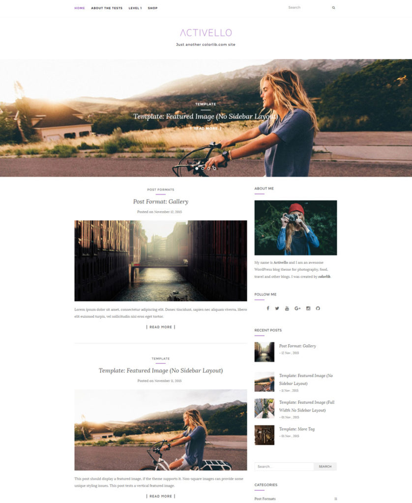
4. Activello

activello - one of the best multipurpose WordPress themes

Demo | More info

Activello will work great for both blogs and eCommerce sites. Its pixel perfect design was enhanced with a full-screen slider, which is intended to showcase your content with style. Compatible with a number of free and premium WordPress plugins, the theme is also packaged with Google web fonts, unlimited color options, featured slider, infinite scroll, and more. Translation ready, Activello also includes pro support.
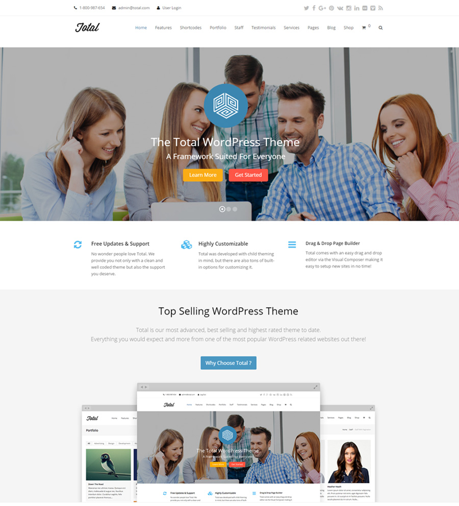
5. Total

total

Demo | More info

This multipurpose WordPress theme has been pre-loaded with a host of smart options, letting you get started with any web project that you wish. WooCommerce support lets you build an online store and with bbPress you can run an online forum, etc. Due to its drag-and-drop page builder, both experienced web developers and beginners will be able to tweak the layout by adding/removing/replacing various page elements with the help of a mouse. The theme includes dozens of theme demos, which you can import to get a quick start creating your web page.
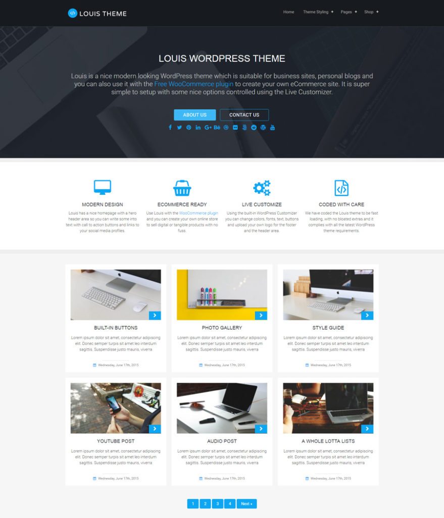
6. Louis

louis

Demo | More info

This is a free multipurpose WordPress theme, whose clean and concise layout will perfectly fit blog, business and eCommerce sites. Pre-loaded with Live Customizer, the theme can be tweaked in any way you wish, absolutely effortlessly. A grid-based layout is easy to navigate. Thanks to the smart use of white space, the content looks more prominent. The template runs on a fully responsive framework, so you may be certain that data that you share on your site will scale gracefully to any screen size. The theme features customizable widgetized areas, audio and video support, photo galleries, built-in buttons, and more cool options.
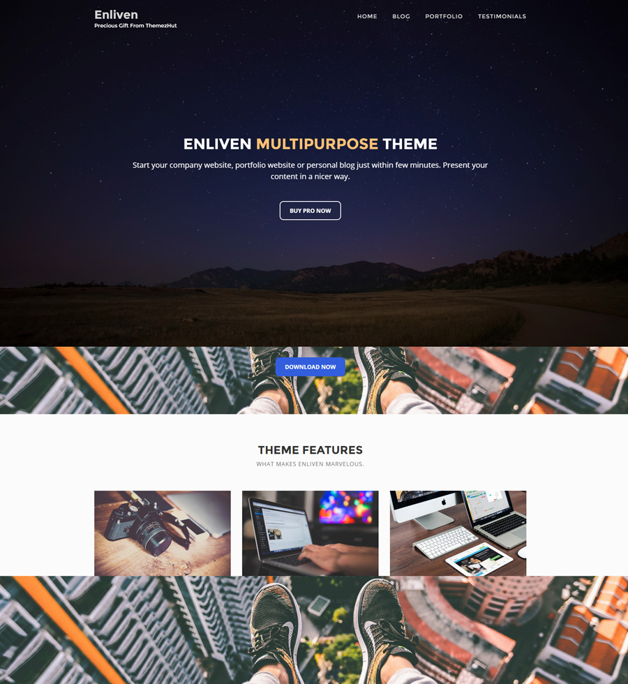
7. Enliven

Enliven

Demo | More info

Here is one more free multipurpose WordPress theme that is intended to bring a stylish look to your business website. Its clean portfolio layout can be tweaked effortlessly. The theme is licensed under GPL, which means that you are free to change the code, look and feel of Enliven any way you wish. Running on a fully responsive framework, it is pre-loaded with custom content types to categorize and display your portfolio beautifully.

Multipurpose Joomla Templates
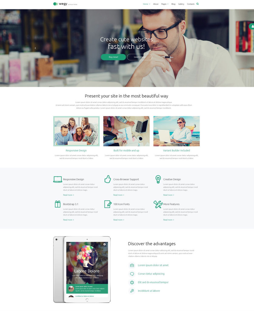
1. Wegy

wegy - one of the best multipurpose Joomla templates

Demo | More info

This sleek and modern Joomla template can be adjusted to match multiple purposes. Coming with frequent system updates, Wegy is a universal Joomla template that remains up-to-date for a lifetime. A variety of pre-designed page templates, with which the package was loaded, will help you get started with your Joomla website in no time. Bootstrap, RTL support, Google web fonts, Google map API, a number of working forms, 10+ Joomla modules, several color schemes to choose from, and a whole lot of other smart features, have been pre-loaded into this template, so that you can get your site live in no time, while simply tweaking the settings here and there. Actually, this is one of the most advanced Joomla templates by TemplateMonster.
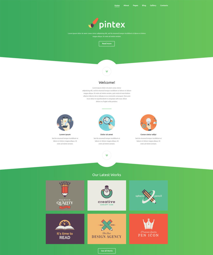
2. Pintex

pintex - one of the best multipurpose Joomla templates

Demo | More info

Pintex is more than just an ordinary multi-purpose Joomla template that can be used for various online businesses. This is an all-in-one solution that is pre-loaded with all features, pages and extensions that you will need for an effective presentation of your project online. To be more specific, Pintex includes 10+ Joomla modules, 10+ pre-designed complementary and additional pages, multiple color schemes, Google map API, Google web fonts, etc.

These were 20 of the most impressive multipurpose website templates that we think are worthy of your special attention. Do you think that we missed any cool design? Please let us know in comments below.

Read More at Top 20 Multipurpose Website Templates for 2016
Categories: Designing, Others Tags:

ease-out, in; ease-in, out

May 18th, 2016 No comments
We got to talking about easing in a recent episode of ShopTalk with Val Head and Sarah Drasner. Easing is important stuff when it comes to animations and transitions. Combined with the duration, it has a huge effect on the feel of change. If you’re taking animation seriously as part of the brand on a project, you should define and consistently use easings.

That said, it’s a balance between:

  • Crafting/using easings that match your brand
  • Adhering to soft “rules” about what type of easings are appropriate when

Let’s look at one particular best practice, as I understand it. But first, another observation.

The default transition-timing-function in CSS (the easing) is ease.

.thing {

  /* The default, as in, you get this without defining anything */
  transition-timing-function: ease;

  /* Also the same as */
  transition-timing-function: cubic-bezier(0.25, 0.1, 0.25, 1);
  
}

It’s a pretty nice one! I’m guilty of hardly ever changing it. I set and tweak the durations and generally leave it to ease. Too nice, perhaps? I wonder if we would be more proactive about choosing well-fitting easings if CSS defaulted to the more boring/lifeless linear easing. Although linear can be quite useful, I’ve found, when the change is very small, like only moving a few pixels or a color changing shade.

The ease timing function is so nice, perhaps, because it’s a variant of ease-in-out. That is, the change happens slowly both at the beginning and end, and speeds up only in the middle somewhere. This gives soft edges (metaphorically) to the change and generally feels good.

ease vs. ease-in-out. They look quite different but are in the same vein. From cubic-bezier.com

There are two other built-in CSS timing functions:

  • ease-in: slow at the beginning, fast/abrupt at the end
  • ease-out: fast/abrupt at the beginning, slow at the end

While they make a certain intuitive sense looked at that way, the general “rule” (in quotes) is to use them opposite of how they are named:

  • ease-in: when things are moving out.
  • ease-out: when things are moving in.

Think of a knight’s squire. When the knight calls them, they better arrive at a run, and slow down into place. When the knight sends them away, they’d better very quickly get moving out of there.

That feels like a best practice. Like the animation is being courteous and obedient on both sides. Get here in a hurry, but compose yourself. Get out of here even faster and without delay.

Here’s the CSS that goes along with that kind of thinking. This changes the easing function depending on if the element in question is being shown or being hid, as well as the timing.

.container .alert {

  /* This timing applies on the way OUT */
  transition-timing-function: ease-in;

  /* Quick on the way out */
  transition: 0.2s;

  /* Hide thing by pushing it outside by default */
  transform: translateY(130%);

}

.container.alert-is-shown .alert {

  /* This timing applies on the way IN */
  transition-timing-function: ease-out;

  /* A litttttle slower on the way in */
  transition: 0.25s;
  
  /* Move into place */
  transform: translateY(0);

}

See the Pen Different eases for “in” and “out” by Chris Coyier (@chriscoyier) on CodePen.

I put this CSS-based demo together based on the smart things Val and Sarah were talking about as well as recently seeing Google’s design spec for this exact movement.


Google is saying don’t ease-out on the way out, presumably as it looks like it’s lagging getting the heck out of your way. Also, entering over 0.225 seconds and exiting over 0.195 seconds.

The animation timings we’re using here are also in “rule” territory, as Val generally described: 0.1-0.2s for simple interface movements, and up to 0.5s for more complex or larger movements.

In summary:

  • ease is pretty nice, but you might want to customize some easings that feel right for your brand
  • ease and ease-in-out have soft edges on both sides, but sometimes it’s more appropriate to use ease-in or ease-out
  • You don’t have to use a single easing for both directions of an animation, you can switch it up
  • You can change duration also

Also, here’s a handy-dandy reference to the defaults and their matching cubic-bezier in case you want to start with one of them and customize from there:

.examples {

  transition-timing-function: linear;
  transition-timing-function: cubic-bezier(0, 0, 1, 1);

  transition-timing-function: ease;
  transition-timing-function: cubic-bezier(0.25, 0.1, 0.25, 1);

  transition-timing-function: ease-in-out;
  transition-timing-function: cubic-bezier(0.42, 0, 0.58, 1);

  transition-timing-function: ease-in;
  transition-timing-function: cubic-bezier(0.42, 0, 1, 1);

  transition-timing-function: ease-out;
  transition-timing-function: cubic-bezier(0, 0, 0.58, 1);

}

ease-out, in; ease-in, out is a post from CSS-Tricks

Categories: Designing, Others Tags: