Archive

Archive for May, 2016

Screamy Bird

May 18th, 2016 No comments

During San Francisco’s Stupid Shit No One Needs and Terrible Ideas “Hackathon”, Glen Chiaccheri made a game where you have to literally scream your way through it.

Make sure to check it out in Firefox, as Chrome and Safari don’t support the getUserMedia API fully. This is the API that allows web developers to request access to the user’s microphone, which you can find more info about on HTML5Rocks.

Direct Link to ArticlePermalink


Screamy Bird is a post from CSS-Tricks

Categories: Designing, Others Tags:

Blisk: the new browser built just for developers

May 18th, 2016 No comments

Developers have had a hard time trying to home in on a browser that’s completely user-friendly to their needs. Sure, Mozilla has taken strides to gain favor with the developer community. If you’ll remember, it last year released what it billed as its most developer-friendly browser update to date, Firefox Developer Edition 38.

While Mozilla’s offering wasn’t bad, it can’t compete with Blisk, the Chromium-based browser that was designed specifically to allow developers to create and then test websites that look amazing and work seamlessly on any and all devices. While this may seem like a tall order and too ambitious for Blisk, the browser is easy enough to use, so that first-timers on the platform can get the hang of it pretty easily.

What sets apart Blisk from other browsers and makes it so developer-friendly is a pre-installed collection of popular devices in the emulator mode. This helps developers easily test the way their code appears across various devices as well as browsers. A huge benefit of this is how developers can compare how their designs behave on various pixel ratios and screen resolutions.

Then, there’s the so-called “scroll sync” feature. This lets developers deal with the same part of code across various devices without losing concentration. Say, you scroll down a page on your desktop device; Blisk now allows you to see the exact same part of the page on a mobile device.

Another feature worth talking about is its auto-refresh feature. This feature regularly updates your page content so that programmers won’t have to reload multiple tabs every time changes are made to their code. But that’s not all.

The new browser also comes with a one-click, screenshot feature that enables developers to document technical problems with greater ease than ever. If you want to share bugs with your development team more effectively than ever, don’t worry. Blisk has you covered by automatically saving all of your screen shots to its cloud storage, allowing members of your team to access them whenever they want.

There’s also a new feature for the analytics-minded developer. A new, built-in, analytics dashboard is part of the browser, too. It monitors your code for any cross-browser compatibility issues, speed problems, and quality concerns. It additionally tracks and then alerts developers of any bugs within their code in real-time.

What makes this browser a joy to work with is how compatible it is with other services such as:

  • Asana
  • Google Drive
  • Trello
  • TFS

While Blisk has been available since the beginning of the year, this latest update has made it truly friendly to developers and therefore worth highlighting. First-timers to this browser can use Blisk’s tutorial to become familiar with its interface, development tools, and coding learning curve.

At the time of this writing, Blisk is available for Windows only. However, the company assures us that Blisk will also be available for Linux soon. In the meantime, Mac users can anticipate Blisk being released for Mac in June, according to a tweet from the company’s official Twitter stream.

9 Beautiful Handwritten Modern Script Fonts – only $17!

Source

Categories: Designing, Others Tags:

The secret to happy clients

May 18th, 2016 No comments

Sometimes, being a web designer is more than just creating a beautiful, functional website. You may have to play different roles depending upon the situation and the client you’re working with.

One of the more common roles you’ll have to play is that of a teacher. It could be as simple as explaining how to make a website does what your clients want or need. Often, though, there’s a part of teaching that is a bit more nuanced.

There will be times when you work with a client who is not particularly tech-savvy. And, as is often the case when someone is trying to accomplish something that is a little outside of their expertise, they can be quite uneasy with the process. I experience the exact same feeling when something needs fixed around the house.

How do you go about making a client feel comfortable in this type of situation? It involves being part teacher and a little bit therapist.

Listen and identify pain points

Your first task in creating a comfortable environment for your client is to simply listen to what they have to say and ask good questions in response. If they currently have a website that they aren’t fully satisfied with, find out why.

Go beyond just the basics of the design itself. You may find that there were problems with updating the content or content management system. Perhaps the site itself just wasn’t as flexible as needed. It could even have been a lack of trust or poor relationship with the previous designer. Find out what happened and what caused any problems that occurred.

This information will give you a good idea of what the client’s hopes and pain points are. You can then formulate a plan that takes this into consideration.

Explain the process

It can be very difficult to explain what we do. If you’ve ever tried to brag about a fancy feature you’ve added to a website to someone who’s not in the industry, you know what I’m talking about. They can often get this bewildered look over their face, smile and say “Great!” (even if they have no idea what you just tried to tell them).

So the key here is to politely explain the process of how you’ll help your client accomplish their goals in layman’s terms. This, however, can be a double-edged sword. The last thing you want to do is insult their intelligence by speaking to them as if they were a 5-year-old.

Try to think about how you’d feel if the roles were reversed. If the client were explaining their business to you, how would you want them to do it?

A simple outline of the steps involved should suffice in most cases. Let them know that that they can feel free to ask questions at any time. Having an open line of communication is a crucial part of building trust.

Be confident and honest

As someone who doesn’t necessarily have the social skills of a game show host, I know that speaking confidently can be difficult. Just remember that you’re an expert in your field and you know what you’re talking about. If you speak with knowledge and confidence, that can go a long way toward putting your client at ease.

Now, we know that some people (not you) will speak with confidence regardless of whether they know anything about a particular subject. It’s perfectly fine if you don’t have all the answers. There was a point early in my career where I felt like I’d be seen as a fool if I didn’t know something on the spot. If you don’t know something, just advise your client that you’ll be happy to research the answer for them and follow up later on.

It’s also advisable to be honest about the pros and cons of the project’s various facets. For example, rather than saying a specific piece of software will “solve all of your problems”, explain what it does well and point out any limitations it has. Over hyping something will only set up unrealistic expectations.

Overall, being honest and open will get you a lot more respect. As a bonus, you won’t have to worry about covering yourself because of false promises. It’s just easier!

Beyond business

The relationship between you and your clients can often be a long-term one. With that in mind, getting to know each other on a slightly more personal level can bring some extra comfort to you both.

Take some time to chat about a common interest. It might be that you both are parents or like the same sport. Maybe you see a picture or other knick-knack in their office that represents a favorite hobby.

Obviously, you don’t want to get too personal. There are also some folks out there who aren’t really into bonding. Just use your best judgment.

A comfortable client is a happy client

There is no magical formula for making your clients comfortable with you or the project you’re working on. More than anything, it’s just a matter of treating people well and having a bit of empathy. Find a way to genuinely relate to someone else on a human level.

Over the course of many years, I have worked with clients who have come from different backgrounds, age groups and so on. Some have been very much into technology, others not so much. I’ve found that those factors don’t mean a whole lot when it comes to the final outcome of the project. Some of the sites that I feel came out the best were ones where I had a good rapport with the client. When there is good communication and mutual trust, the outcome tends to be much more successful for everyone involved.

Perhaps our job really does go beyond design and code. Even though web design is a highly-technical line of work, there is more of a human element involved than we might think. And, no matter how great our technical skills are, our ability to work with people may be just as important.

9 Beautiful Handwritten Modern Script Fonts – only $17!

Source

Categories: Designing, Others Tags:

Five Simple Steps To Test Your Varnish Cache Deployment Using Varnishtest

May 18th, 2016 No comments

Varnish Cache is an open source HTTP accelerator that is used for speeding up the content delivery of the world’s top content-heavy dynamic websites. However, the performance or speed a newcomer to Varnish Cache can expect from its deployment can be quite nebulous.

Five Simple Steps To Test Your Varnish Cache Deployment Using Varnishtest

This is true for users at both extremes of the spectrum: from those who play with its source code to create more complex features to those who set up Varnish Cache using the default settings.

The post Five Simple Steps To Test Your Varnish Cache Deployment Using Varnishtest appeared first on Smashing Magazine.

Categories: Others Tags:

Why Great Products Need Great Collaboration

May 18th, 2016 No comments

Development and design working together makes better products for our users. Design and usability decisions have a big impact on the developers who implement them, and, ultimately, on the experience of users. For these decisions to be successful and provide users with the best experience, communication between designers and developers is vital.

Collaboration Between Development And Design Makes Better Products

When developers are expected to work in a corner until needed, that isolation from the design process prevents them from crafting the end product just as much as the designers themselves. The person who ultimately pays is the user.

The post Why Great Products Need Great Collaboration appeared first on Smashing Magazine.

Categories: Others Tags:

SEO: Optimal Images for Google Image Search

May 18th, 2016 No comments
Optimal Images

There are plenty of articles on the optimization of text content for the best possible keyword ranking. However, the importance of image content is often underestimated or not mentioned at all. The best article wouldn’t be anything without pictures. At least, it would be incomplete. Additionally, visual elements help us understand the content of articles much better, and this is the point at which every webmaster should realize that image content is extremely valuable for search engines as well. On top of that, there’s not only the Google web search but also the Google image search, which also has a lot of potential to permanently increase your website’s visibility.

Advantages of Google Image Search

In the following, to clarify the value of Google image search, we want to show you four arguments for optimal images:

  1. Increases the website’s visibility
  2. Secures market shares against competitors
  3. Adds value for customers and search engines
  4. Boosts Conversions

1. Increase the Website’s Visibility

For many webmasters, “visibility” is written with a capital V, and the value is often used to measure the success of onpage optimizations.

Specific optimization of image content in articles, infographics, diagrams, and so forth doesn’t only increase the value for readers/customers, but also for the search engine. These small and slight optimizations help the search engine recognize what the image elements show the reader. If the engine understands what the images display, it boosts the value of a well-written article so much, that it receives a better placement within the Google SERPs. Additionally, the optimized content is also better placed in the Google search engine. The better the content is optimized, the better the rankings in the image search, and thus, the better the website’s visibility.

The development of image visibility, as well as other areas, can be measured by the SISTRIX tool, for example.

The following graphic shows how the development of image content (yellow graph) looked like on Google.de.
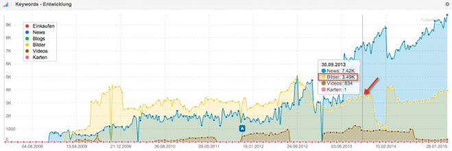
Optimal Images for Google Image Search
Source: Sistrix Blog

2. Market Shares and Competitors

The goal of a profit-oriented website has to be to increase the market shares within its branch and to receive all the reachable competition advantages with that. This is especially interesting when competitors are not even active in certain areas yet, and this is where the Google images search comes into play. Often, your competition is not set in this area at all, or only very slightly, which is your chance to lead traffic to your page via optimal images.

On top of that, every webmaster knows that there are overpowered behemoths in plenty of branches, which claim a majority of traffic from the organic Google search. This is another point where Google image search comes into play, as these giants often ignore this source of traffic. This is your chance to gain additional market shares.

Let’s take a look at the whole thing in an example of one of the most popular diving areas:

When searching for “Tauchreisen Raja Ampat“, the website of the tour operator scuba-native.de comes up as the 15th result. Thus, a majority of customers is lost to competition.
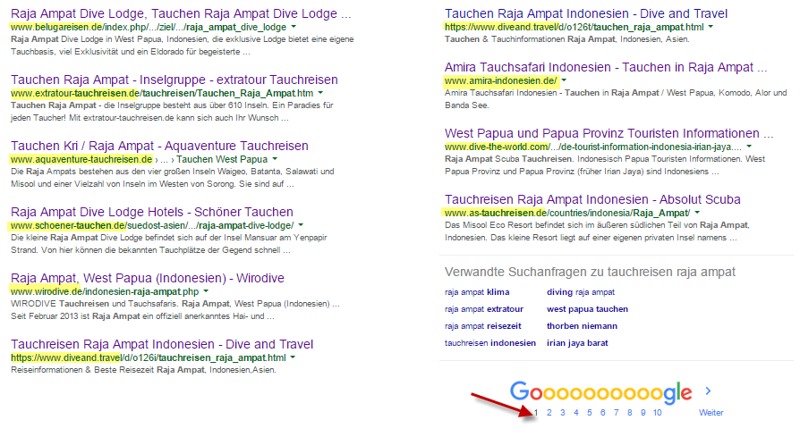
Optimal Images for Google Image Search
Source: Google.de

Now let’s look at the top third of the Google image search, where scuba-native.de has a much better ranking than most of its competition.

Suchergebnisse-Google-Bildersuche-659x186

As we can see, scuba-native.de has by far the most images in prominent positions. Most competitors that were still on page 1 of the organic search are barely present. As especially scuba travels to Raja Ampat are expensive trips, they are directed to a high society target audience that will inform themselves about the travel in detail, the tour operator will have further chances on valuable traffic through the many optimal images.

3. Added Value for Customers and Search Engine

The added value for customers and search engines is significant. Everyone knows it: an article or a product description without images delivers less information than articles and products with images. On top of that, content without images can become annoying rather quickly, leading to a higher bounce rate, which results in a negative signal for the search engine, and a negative influence on the ranking. Thus, you definitely have to turn the negative signal into a positive one.

When the bounce rate drops, and the visit duration on your website increases, the search engine will know that the search result was the right one for the customer. In addition to that, it also receives information on the content of the website, which makes it easier to rate. This can also have a positive influence on the rankings and the visibility of your website.

4. Increasing the CTR

The added value of articles/products with related image content is evident. Here, every webmaster should ask themselves: would I blindly buy a product that was not shown to me before, or that I couldn’t see clearly? Or would you rather decide for the product that you saw an image of, or that displays its purpose in a positive way?

The answer should be clear as there are only very few customers that are willing to buy a pig in a poke.

Thus, every webmaster should be aware of the value of increasing the CTR with optimal images.

But be careful: as for every optimization, a healthy balance is essential. Using as many images as possible is not always recommendable. For example, when images overload a product and thus distract from the purchase, you have to think about the placement. To avoid an overload, you can set up a passive gallery, like the one that Amazon runs for its products.

How Image Optimization Works

Image Descriptions

The keyword density is raised via the distribution of relevant keywords for image content. This procedure helps the search engine to categorize the content of a page. With a proper amount of relevant keywords that were tailored for an article, a better ranking of the article in the SERPs can be achieved.

Bilderoptimierung-für-die-Google-Bildersuche-659x222
Source: Sunliner.de

Bildbeschreibung

Image Size

When images are too small, the image search ranks them poorly, or not at all. I recommend a minimum length of 300px for one of the sides. The other side’s length depends on the format. The optimal image search format is the 4:3 horizontal format.
Optimal Images for Google Image Search

Optimal Images for Google Image Search

Image Name / Path Name

Pictures should have a sensible name, to enable search engines to categorize them easier. A talking path is also recommended (Hyphen as a divider).

Image Captions

Pictures should have meaningful captions so that Google can assign them better. In the optimal case, the image caption is in the same CSS class as the picture.

Alt Tag

You should always assign useful alt tags to pictures, which is already being practiced:

Optimal Images for Google Image Search

Picture Sitemap

An XML sitemap for images eases the work for Google, and should exist where all relevant images are stored.

(dpe)

Categories: Others Tags:

Earn More From Your Freelance Web Design Business

May 17th, 2016 No comments
1

More than a few web designers take up freelancing to fill in income gaps when business is slow, to add a little spice and variety to their work, or with the thought of working more for themselves and less for others. Even if you are fairly solidly situated in the business you are working for, you might find yourself in one or more of the above situations.

If you do freelancing on occasion, whether for enjoyment, or out of necessity, you’ve possibly given some thought to turning it into a full-time occupation. That’s a goal worth pursuing, but you first need to know a few things about how to establish and go about growing your new freelance business.

Following this piece of advice is all-important if you want to succeed. Simply working hard at your freelancing business won’t cut it. What you to do, is to work on your business.

This is how you go about it.

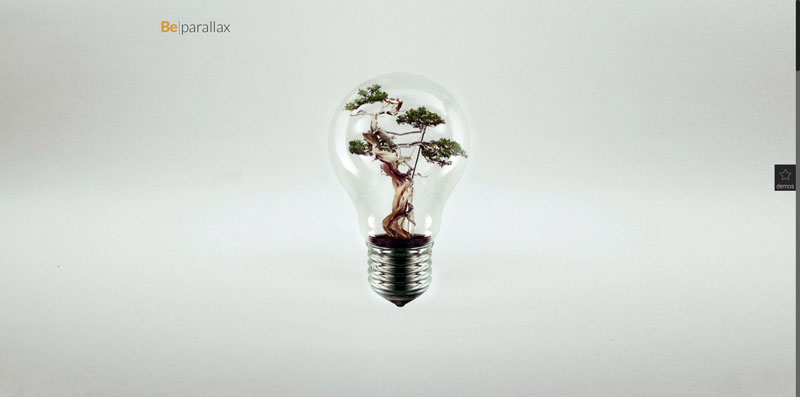
Be Parallax – Pre-built WordPress website

Full Time Freelancing Is a Business – Treat It that Way

You tend to develop a certain mindset about your freelance work if you are only doing it on a part-time or sporadic basis. Since you are a professional designer, you take the work you are doing seriously, whether it is for your employer or from your freelancing activities. That mindset, may be one of treating what you do for your client or employer as a business, but one of treating your freelancing activities as a diversion or a hobby. That needs to change, and doing so won’t always be easy.

You have to change your mindset about your freelancing and begin to treat it as a business. To do that, you have to learn how to run a business. It may take some time to do so, but the payoff can be great.

Where to start?

You’ll Need to Build a Great Portfolio

2

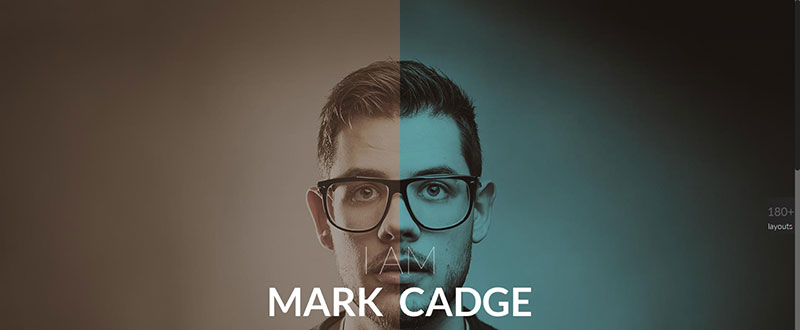
Be Portfolio – A Highly Popular Be Pre-Built Portfolio

Go over your past web design efforts and pick the ones you believe are your best. It takes a good portfolio to attract a potential client’s attention in this highly competitive industry. Comments, reviews, and testimonials about your work should be included. Showing both what you can do, and how you go about doing it, is important to these potential clients.

You want to include one or two examples that highlight your capabilities, and for a very good reason. You have to assume that most of those looking through your portfolio may only spend a minute or two in doing so. You have about that much time to convince someone searching for a professional web designer to decide you might be the answer.

You’re naturally super-critical of your own work. You need to take that attitude and apply it toward building your portfolio. Creating a near-perfect portfolio can be a challenge, but it’s doable; especially if you have the right tool for the job.

The right tool in this case is a pre-built website from Be Theme, a best-selling premium WordPress theme that has everything you need to put together an online portfolio that will make viewers sit up and take notice.

Brush Up on Your Marketing Tactics

As a professional web designer, you may feel that those in the marketing profession speak a foreign language. Now that you’ve decided to set up your own freelancing business, it’s time to start learning something about that language, and words like “client acquisition channels”, “A/B testing”, and “CRO funneling”. Understanding and researching these three terms will take you a long way.

  1. Client acquisition channels take many forms, ranging from social media to SEO marketing techniques, and even to how you name your website domain. One of the most effective acquisition channels is a blog. Blogging is a good way to tie into networks where you can showcase your work.
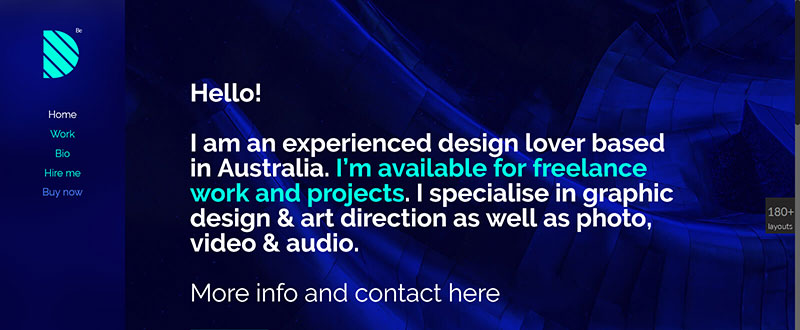
  1. Pay close attention to the homepage of your portfolio or portfolio website. You want it to clearly state your position or tell your story – like in this example.

Check out Be Freelancer

3

  1. Have a plan in front of you that addresses the subjects or themes you want to write about. Pick one or more areas that you love working in, researching, or writing about. You only have to be a little more knowledgeable than the next guy to be considered an expert on a given subject, and people tend to gravitate toward experts.
  1. Measure the results of your acquisition channel activities. Keep a list of what you’ve done and what you’ve written and the response you’ve collected.
  1. Brush up on CRO funneling, how to approach it, and what it can do for you. Study the types of traffic you’re getting, good ways to collect leads, and how to interpret website testing results – like A/B testing.

You might even give some thought to publishing a weekly or monthly newsletter once your business is underway. As a final thought, it never hurts to ask someone who has been successful at the game for a few marketing tips or a little advice.

Growing Your Freelancing Business – A Summary

4

Freelancing can and should be fun, and if you treat it as a business, and not as a hobby, it can be highly profitable as well.

  • You may not acquire the right mindset to run a business overnight, but you need to start working on it. The idea of working for yourself brings with it a certain amount of freedom, but it also requires taking on new responsibilities. As the CEO of your new venture, you get to call the shots, but you’ll also learn that decisions have consequences.
  • Publish the best portfolio you are capable of doing. With the right tools at your disposal, putting together a truly awesome portfolio can be easier than you think. Be Theme, with its huge library of pre-designed websites, including several excellent portfolio-oriented selections, is just the right tool. Be Theme is easy to use, and it gives outstanding results.
  • Don’t let being a techie get in the way of learning some of the ins and outs of marketing. Employing good marketing techniques is essential to your success. There’s a ton of free advice on the subject, but learning more about the marketing topics outlined above will take you a long way.
  • Attend events, get on social media, and make networking a standard business practice. It not a matter of sell, sell, sell. It’s a matter of making yourself known and of building trust.

Read More at Earn More From Your Freelance Web Design Business

Categories: Designing, Others Tags:

50 Retro and Vintage Web Designs to Inspire You

May 17th, 2016 No comments
retrosites01

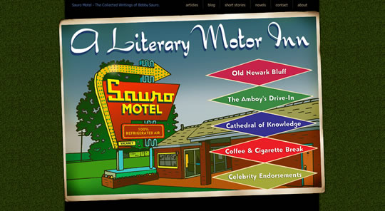
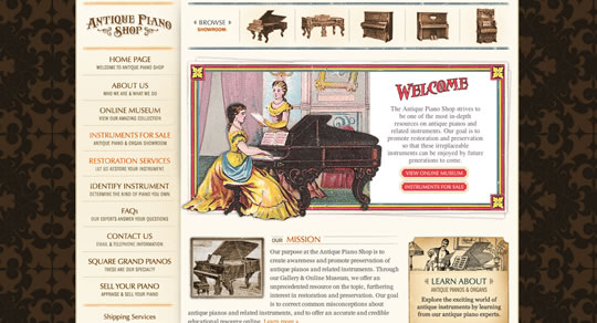
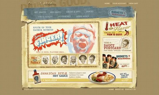
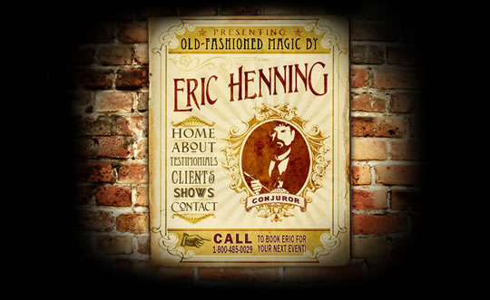
Last week, Henry posted an article with 30 Fonts Perfect for Vintage and Retro Style Design and I simply loved the first font of the list, the matchbook typefaces. By the time I saw it I could think of several good ways to use it in web design, print design on even other ways. I was so inspired that I decided to do a selection of retro and vintage websites for our weekly web design inspirational post.

I really like retro and vintage stuff… websites, posters, print, adds, everything. I think it’s amazing how an ‘old style’ still get our attention and appreciation. For this selection of retro and vintage web designs, you will see retro and vintage elements, fonts, images, colors, textures, etc. I hope you enjoy the selection. And of course, if you have a cool retro/vintage font site to share with us, the comments are open.

Eighty Two Design

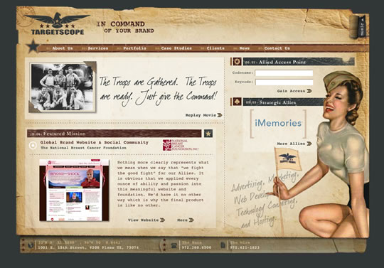
targetscope

retrosites01

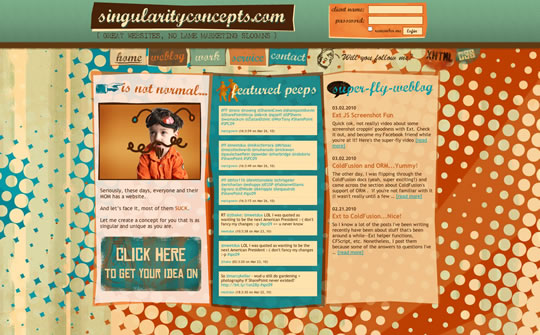
singularityconcepts.com

retrosites02

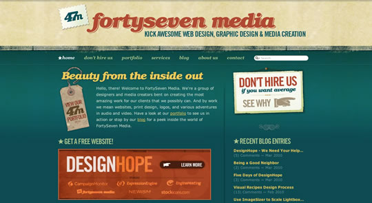
fortyseven media

retrosites03

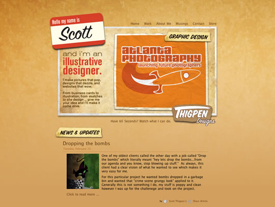
thigpendesigns.com

retrosites04

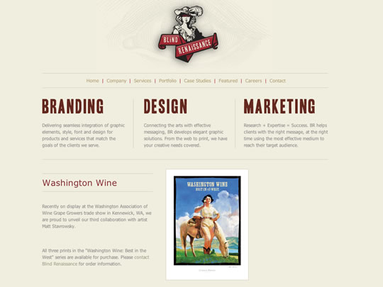
icblind.com

retrosites05

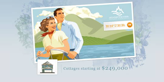
edgewater

retrosites06

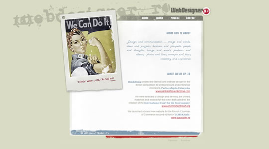
WebDesigner.ro

retrosites07

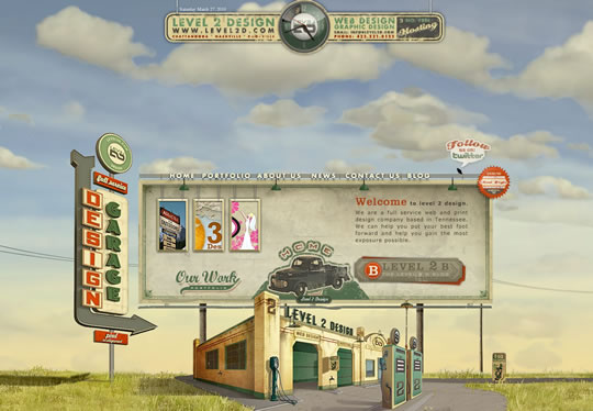
Level 2 Design

retrosites08

Custom Design

retrosites09

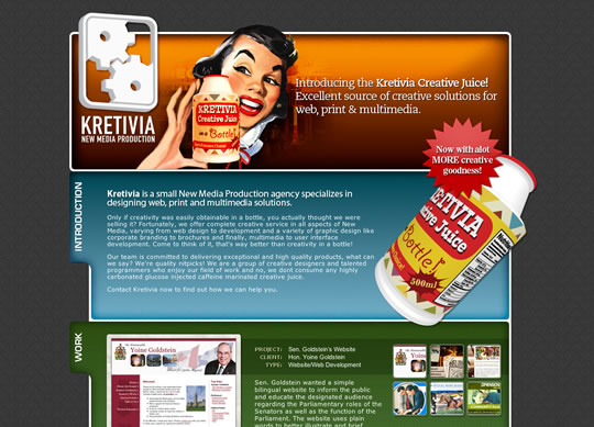
Kretivia, New Media Production

retrosites10

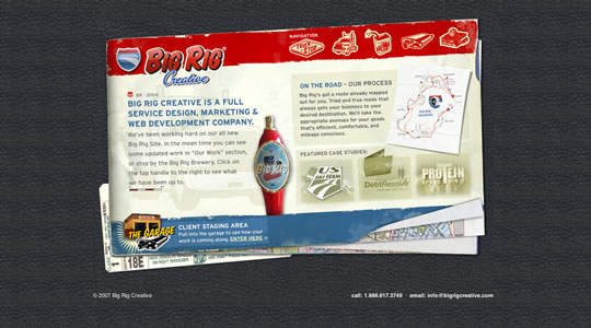
Big Rig Design

retrosites11

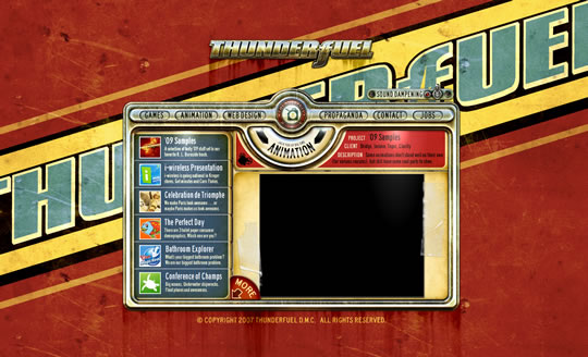
THUNDERfuel

retrosites12

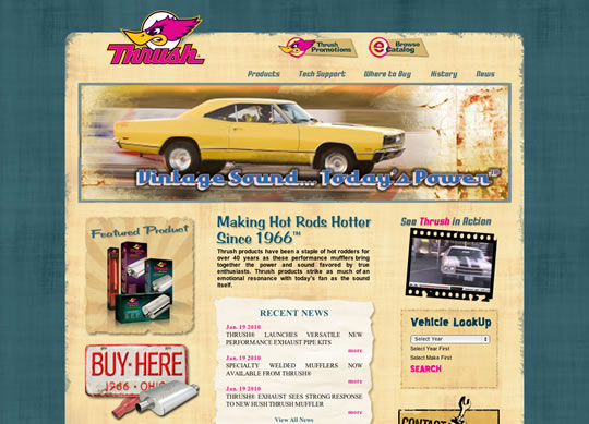
Thrush

retrosites13

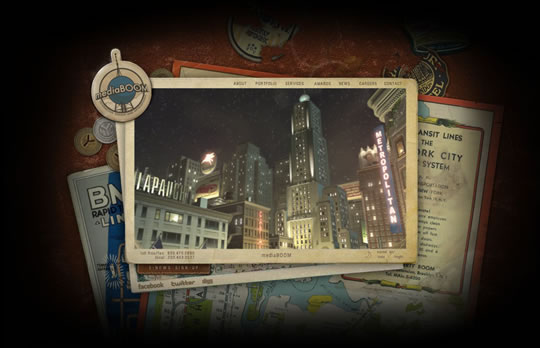
mediaBOOM

retrosites14

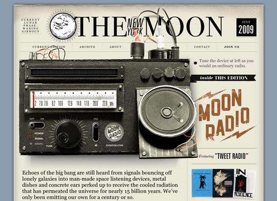
Radio – The New York Moon

retrosites15

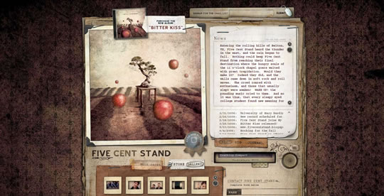
fivecentstand.com

retrosites16

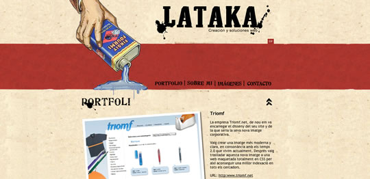
LATAKA

retrosites17

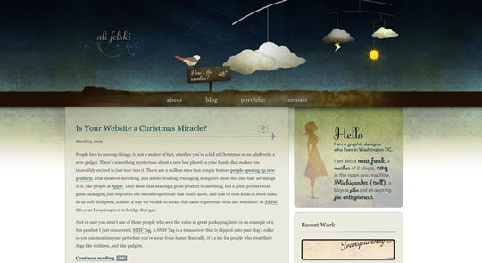
Ali Felski

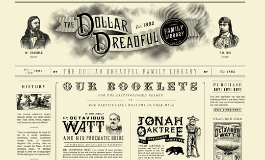
retrosites18

The Dollar Dreadful

retrosites19

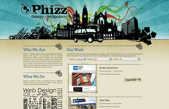
phizz.biz

retrosites20

Style 4 you

retrosites21

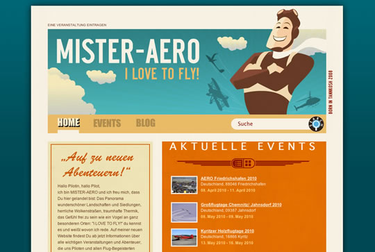
Mister-Aero

retrosites22

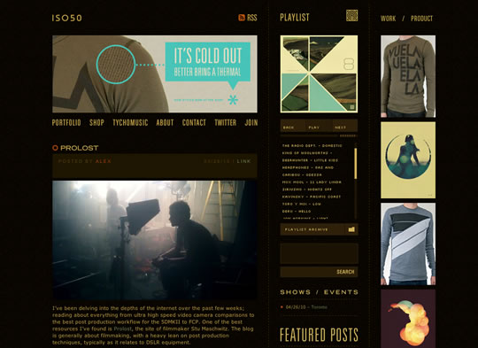
iso50

retrosites23

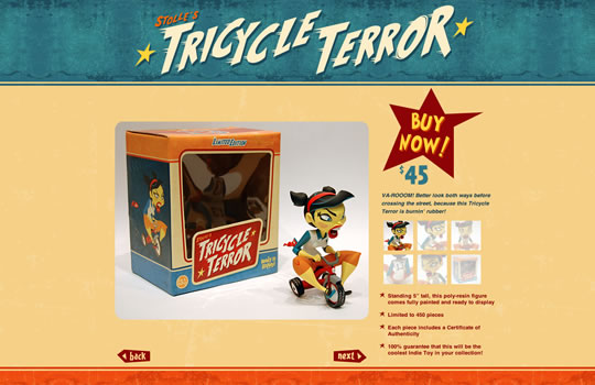
Tricycle Terror

retrosites24

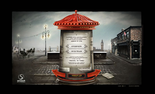
sensisoft.com

retrosites25

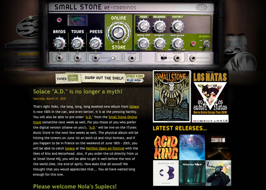
Small Stone re-cordings

retrosites26

prahba.com

retrosites27

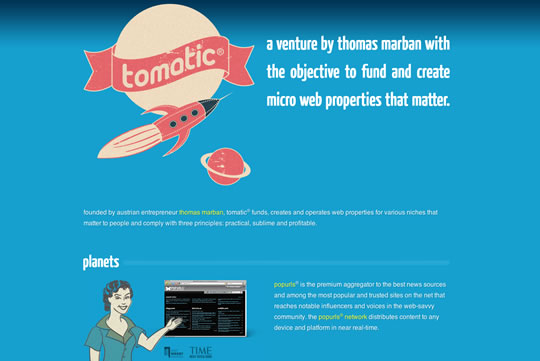
tomatic

retrosites28

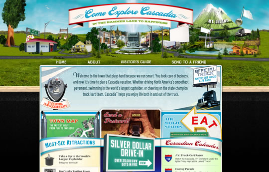
Visit Cascadia

retrosites29

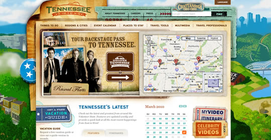
Tennessee

retrosites30

jacksonfish.com

retrosites32

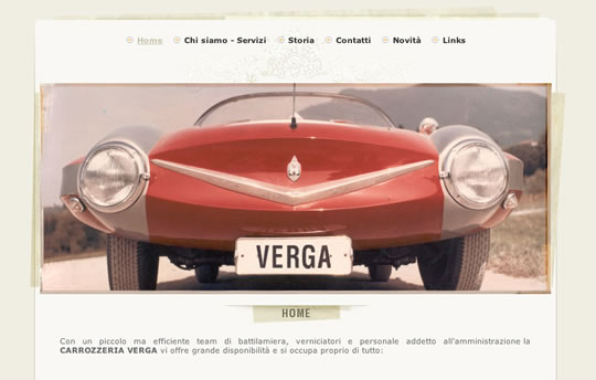
Carrozzeria Verga

retrosites33

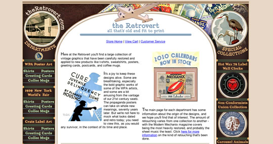
the Retrovert

retrosites34

Sauro Motel

retrosites35

Antique Piano Shop

retrosites36

painisgood.com

retrosites37

Eric Henning Magic

retrosites38

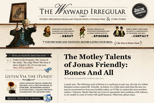
The Wayward Irregular

retrosites39

flatwoodsfolkart.com

retrosites40

Brocante Boutique

retrosites41

Buy Vintage Clothing

retrosites42

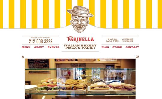
Farinella

retrosites43

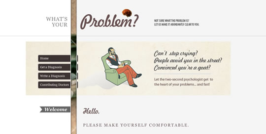
What’s your Problem?

retrosites44

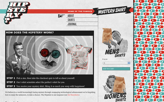
Hipstery

retrosites45

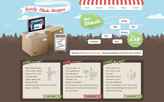
readymadedesigns.co.uk

retrosites46

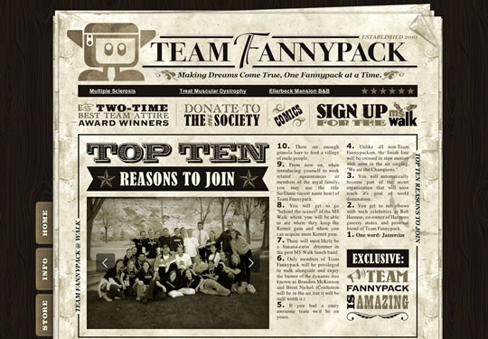
Team Fannypack

retrosites47

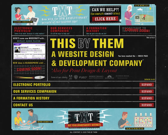
thisbythem.com

retrosites48

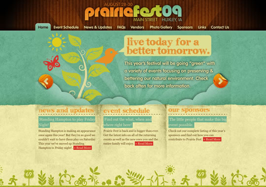
huxleyprairiefest.com

retrosites49

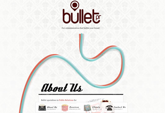
bullet

retrosites50

Read More at 50 Retro and Vintage Web Designs to Inspire You

Categories: Designing, Others Tags:

70+ Beautiful Damask Patterns and Textures

May 17th, 2016 No comments
ornate_10

Damask is a weaving style or technique that originated in the early Middle Ages near Damascus, Syria. This particular style typically produced very ornate and decorative patterns in the fabric. These types of patterns are wonderful to use in a design that needs to have a vintage or ornate look. In this post there are over 70 beautiful damask patterns and textures that you can use in your designs.

All of these are free, but make sure to read the terms on the download pages before using.

Floral Vector Pattern

Free damask seamless pattern

Free damask seamless pattern

Birthday Special

Birthday Special

Teal Brown Grunge Damask

Teal Brown Grunge Damask

Dark Teal Damask Wallpaper

Dark Teal Damask Wallpaper

Patterns.2 (2 patterns)

Patterns.2

Green Grunge Damask

Green Grunge Damask

Ornate Textures Lite Pk (9 textures)

Ornate Textures Lite Pk

Nouveau Pattern 2

Nouveau Pattern 2

Damask Wallpaper patterns (25 patterns)

Damask Wallpaper patterns

Teal Gold Damask

Teal Gold Damask

Wallpaper

Wallpaper

Orange Damask Wallpaper

Orange Damask Wallpaper

Orange Gold Damask

Orange Gold Damask

Big Damask Textures (6 textures)

Big Damask Textures

Ornate Textures Dark Pk (9 textures)

Ornate Textures Dark Pk

Gothic Mono

Gothic Mono

damask wallpaper

damask wallpaper

damask wallpaper 2

damask wallpaper 2

Charcoal Damask

Charcoal Damask

Wintry Damask Wallpaper

Wintry Damask Wallpaper

Patterns 2 (6 patterns)

Patterns 2

Read More at 70+ Beautiful Damask Patterns and Textures

Categories: Designing, Others Tags:

BigCommerce Design: The Future is Now

May 17th, 2016 No comments
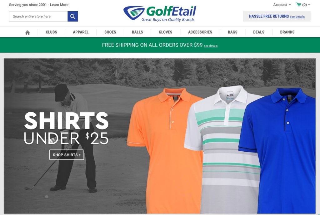
Golfetail

BigCommerce hasn’t become the preferred ecommerce platform for growing and mid-market businesses by accident: our powerful SaaS platform has the features and flexibility to support the complex needs of sophisticated merchants, within a simple interface that makes it usable for seasoned pros and technological newbies alike.

But none of that matters to the most important group — customers. They want a simple shopping experience that bring the products to life and make checkout a breeze. Offering this experience increases customer retention and helps reduce the 6-7x cost of acquiring new customers.. BigCommerce was always a leader in that department, but there was certainly room for improvement.

Enter Stencil.

The brand-new theming engine from BigCommerce is already in the process of transforming how merchants build, customize, and optimize their websites to convert more customers and grow their brands. Stencil encompasses several groundbreaking components, including:

  • Stencil Framework and Developer Toolkit: The toolkit enables developers to design and iterate themes locally, with full access to all assets –– but with no impact on the merchant’s live storefront. Instead of limiting developers to proprietary languages, they can use the ones they love such as Handlebars, YAML, Sass/SCSS, and more.
  • Theme Marketplaces: Third-party marketplaces enable developers to distribute themes to multiple merchants. The BigCommerce Marketplace will begin distributing partners’ Stencil themes in 2017 –- allowing ample time for agencies and designers to build out a profitable business model around Stencil theme creation and conversion.
  • Theme Editor: This graphical, browser-based tool enables merchants to rapidly customize their themes’ look and feel – and their storefront’s function – with no coding. Theme developers’ configuration choices determine which theme aspects merchants can customize, with what range of choices.
  • Storefront Customization: Merchants acquire themes, apply them to their storefronts, and customize them – creating an elegant user experience that resonates with their brand, and makes it easy for customers to find and purchase the products they want.

Each one of these parts is packed with enough features and benefits — both to web developers and customers — to justify their own deep-dives. But one in particular, Theme Marketplace is especially noteworthy.

New Themes from BigCommerce
We wanted to give developers the ability to tweak and hone a storefront like no other platform, but we also wanted to offer themes that were visually astounding from the get-go. Our new Theme Marketplace offers 68 total styles of beautiful, modern templates that allow merchants to express the power of their brand without necessary customizations. For merchants who want to go beyond the template, the Theme Editor and Stencil Framework allow them to get the most out of their theme — with or without a developer.

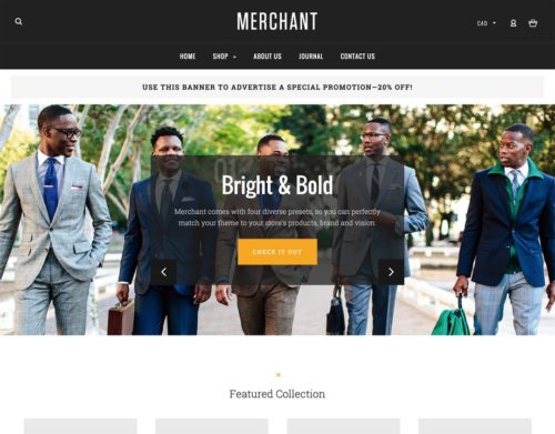
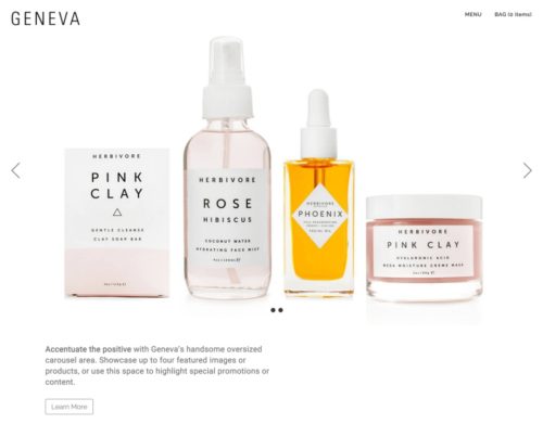
Example Templates

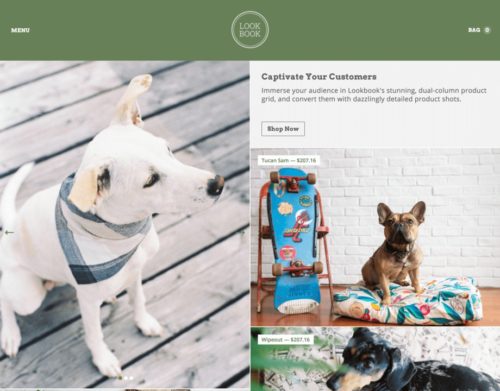
bright large_preview_screenshot copyGeneva large_preview_screenshot copyPet large_preview_screenshot copy


Optimized for Conversion
Looking great is obviously a critical part of closing sales, but it’s not the only one. We made sure our new themes were designed with a conversion-first mindset. But before someone can convert, they need to find a store in the first place. That’s why themes are optimized for conversion and search engine optimization by:

  • Mobile-Optimized for a streamlined shopper experience and high mobile rankings (see Google’s mobile algorithm update to learn more)
  • Optimized check-out capability which has been shown to increase conversion by 12%
  • Faceted search which has been shown to increase conversion by 10%. Customers can find what they’re looking for — fast.
  • SEO optimization out of the box, including strong URL structure and built in metadata. Centralized in-app SEO make advanced optimizations easy to deploy throughout a store.

More on Stencil
Stencil is loaded with perks that make it easy for developers and merchants alike to customize and test a theme. A few more include:

  • A local development environment w/ rapid theme upload & preview
  • All the versatility of an on-premise platform, minus the cost and headaches
  • Out-of-the-box Browsersync to preview changes across mobile, tablet, and desktop.
  • Quickly make or test changes without having to perform manual uploads or affect the live store, maximizing speed to market and minimizing site disruption.

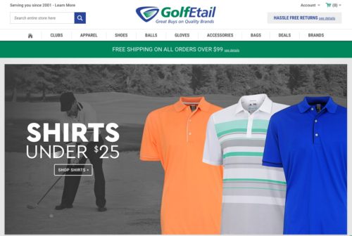
How GolfEtail dramatically improved their site with a Stencil theme from BigCommerce

Golfetail


What was your main goal in moving to BigCommerce and with the site re-design?

Our ultimate goal for choosing a new ecommerce platform was simple: increase revenue. As part of this, we felt three fundamentals areas were an absolute necessity: first, a seamless integration into ChannelAdvisor; secondly, enterprise-level functionality; and thirdly, a high level of security and stability. Each of these were critical factors in making the choice to move to BigCommerce.

Is there any part of the site in particular that stand outs to you?

The stability of the site has dramatically improved. We no longer need to worry about third party applications impacting our site performance. BigCommerce manages this for us.

Speaking of performance, how is the new site doing in terms of average order value (AOV), conversions and time on site?

Since we have only been live for a week, it would be premature to draw any long-term conclusions, and we are still making refinements. With that that said, here’s some anecdotal data that compares the week prior to launch versus the week post launch:
? Pages per session: up 13.5%
? Session Duration: up 21.4%
? Bounce Rate: down 5%
? Number of items in basket: up 13.6%
? Transactions: up 12.4%
? Revenue: up 8.9%

Those are some impressive first numbers. How was it working with Diztinct?

We have worked with Diztinct for the past decade or so. Jeff Dyken, who owns Diztinct, has a keen eye, understands our business and focuses on results. He is a seasoned website developer.

Great to hear. Any advice you’d give to other brands looking to either move platforms or re-design their site within the Stencil framework?

We looked at other other ecommerce platforms that offered similar enterprise-level flexibility and features that BigCommerce brings to market, but BigCommerce far exceeded the others by offering a high level of stability in their integrations with their various apps and partners. Simply said, we don’t need to dedicate an IT team to making BigCommerce work; BigCommerce does that for us. In all, BigCommerce brings us the enterprise level functionality and support we need, which allows us to focus on what we do best: namely, sell golf equipment

Free Trial button

Read More at BigCommerce Design: The Future is Now

Categories: Designing, Others Tags: