Creating a CSS Curtain Opening Effect
If you’re as old as me, you might remember watching Let’s Make a Deal on the old television airwaves. The show is apparently still on these days in a new format, but the original always stuck out to me because of one simple thing: the reveal.
There’s something exciting about not knowing what is behind a set of curtains and that’s what Let’s Make a Deal was all about. Contestants had a choice of three doors, any of which opened to reveal a prize.
It was exciting!
That technique of curtains sliding open to reveal a treasure (even if it is a Bob’s Big Boy gift certificate) is a neat little tactic and one that we can use ourselves with a little bit of CSS. Here’s the final demo:
See the Pen OXJMmY by Geoff Graham (@geoffgraham) on CodePen.
The HTML
This basically boils down to three elements:
- The curtain wrapper
- Left curtain panel
- Right curtain panel
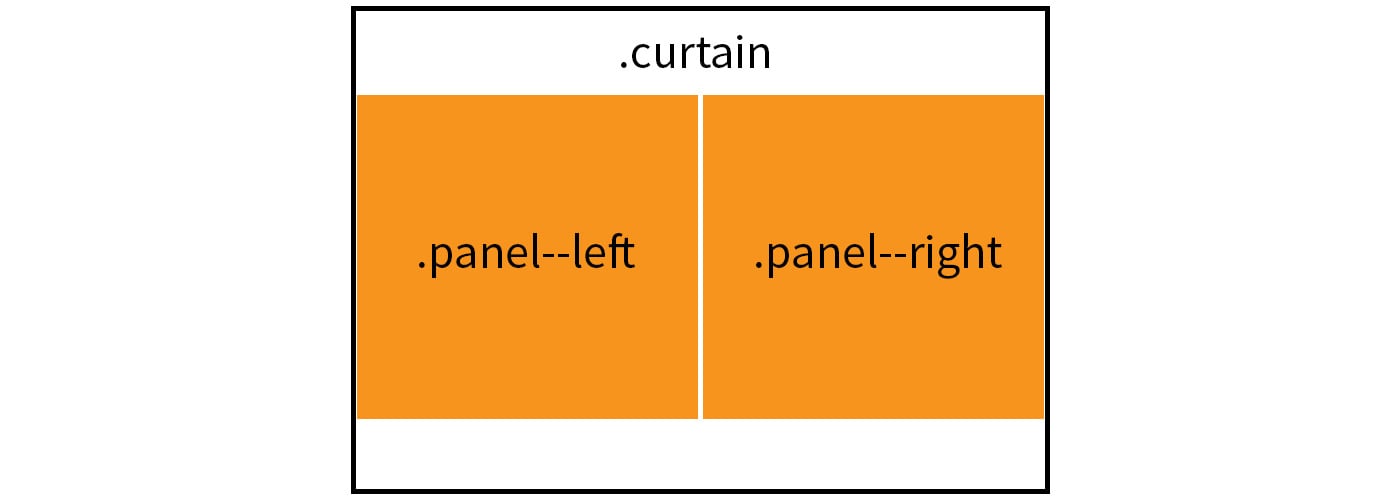
We can visualize what we’re doing in a diagram:
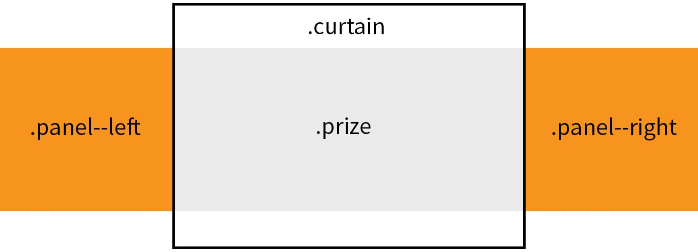
…and when the curtain panels slide open, they will reveal a prize as the fourth element:

Let’s use that as the blueprint for our HTML.
<!-- The parent component -->
<div class="curtain">

  <!-- The component wrapper -->
  <div class="curtain__wrapper">

    <!-- The left curtain panel -->
    <div class="curtain__panel curtain__panel--left">

    </div> <!-- curtain__panel -->

    <!-- The prize behind the curtain panels -->
    <div class="curtain__prize">

    </div> <!-- curtain__prize -->

    <!-- The right curtain panel -->
    <div class="curtain__panel curtain__panel--right">

    </div> <!-- curtain__panel -->

  </div> <!-- curtain__wrapper -->

</div> <!-- curtain -->
The CSS Layout
Now that we have our elements defined in the HTML, we can start positioning them with CSS.
Our first goal is to position the curtain panels so that they are not only side-by-side, but also in front of the prize itself.
.curtain {
  width: 100%; /* Ensures the component is the full screen width */
  height: 100vh; /* We're using this for demo purposes */
  overflow: hidden; /* Allows us to slide the panels outside the container without them showing */
}

.curtain__wrapper {
  width: 100%;
  height: 100%;
}

.curtain__panel {
  background: orange;
  width: 50%; /* Each panel takes up half the container */
  height: 100vh; /* Used for demo purposes */
  float: left; /* Makes sure panels are side-by-side */
  position: relative; /* Needed to define the z-index */
  z-index: 2; /* Places the panels in front of the prize */
}

.curtain__panel--left {
  /* Styles for sliding the left panel */
}

.curtain__panel--right {
  /* Styles for sliding the right panel */
}

.curtain__prize {
  background: #333;
  position: absolute; /* Forces the prize position into the container start */
  z-index: 1; /* Places the prize behind the panels, which are z-index 2 */
  width: 100%;
  height: 100%;
}
It might look like we’ve done next to nothing if we were to stop here and check our work. In fact, we’re just looking at an orange block.
See the Pen wWvJaO by Geoff Graham (@geoffgraham) on CodePen.
This is a good thing! We’re actually looking at two curtain panels taking up the entire curtain container with a panel for a prize lurking behind the scenes.
The Checkbox Hack
I’d be remiss to neglect the fact that we are going to be putting the checkbox hack into practice here. The checkbox hack, in case you’re unfamiliar, is a method where we can change the presentation of elements based on the known state of a simple form checkbox. We have an article on the method in case you want to dig deeper into how it works.
The first rule to using the checkbox hack is that we need a checkbox in our markup. Let’s add that into the HTML:
<!-- The parent component -->
<div class="curtain">

  <!-- The component wrapper -->
  <div class="curtain__wrapper">

    <!-- The checkbox hack! -->
    <input type="checkbox" checked>

    <!-- The left curtain panel -->
    <div class="curtain__panel curtain__panel--left">

    </div> <!-- curtain__panel -->

    <!-- The prize behind the curtain panels -->
    <div class="curtain__prize">

    </div> <!-- curtain__prize -->

    <!-- The right curtain panel -->
    <div class="curtain__panel curtain__panel--right">

    </div> <!-- curtain__panel -->

  </div> <!-- curtain__wrapper -->

</div> <!-- curtain -->
First, let’s make sure our checkbox is both invisible and takes up the entire space of our curtain component. We want the entire curtain to be clickable and this will allow us to do just that.
input[type=checkbox] {
  position: absolute; /* Force the checkbox at the start of the container */
  cursor: pointer; /* Indicate the curtain is clickable */
  width: 100%; /* The checkbox is as wide as the component */
  height: 100%; /* The checkbox is as tall as the component */
  z-index: 100; /* Make sure the checkbox is on top of everything else */
  opacity: 0; /* Hide the checkbox */
}
Notice that the default state of the checkbox is checked in our HTML. This allows us to style our elements based on the :checked state.
/* When the checkbox is checked... */

/* Slide the first panel in */
input[type=checkbox]:checked ~ div.curtain__panel--left {
  transform: translateX(0);
}

/* Slide the second panel in */
input[type=checkbox]:checked ~ div.curtain__panel--right {
  transform: translateX(0);
}
This also means we can update our curtain panels so that they slide out of the container when the checkbox is unchecked.
/* Slide the panel to the left out of the container */
.curtain__panel--left {
  transform: translateX(-100%);
}

/* Slide the panel to the right out of the container */
.curtain__panel--right {
  transform: translateX(100%);
}
Now we’re onto something! Clicking the curtain component moves the panels off the screen and reveals the prize panel.
See the Pen xOxqOL by Geoff Graham (@geoffgraham) on CodePen.
Animating the change
Next up, we need to animate the transition of the panels once the state of the checkbox has been changed on click. Otherwise, as you may have noticed, the change looks less like a sliding door and more like the blink of an eye.
Let’s add a transition to the .curtain__panel class:
.curtain__panel {
  background: orange;
  width: 50%; /* Each panel takes up half the container */
  height: 100vh; /* Used for demo purposes */
  float: left; /* Makes sure panels are side-by-side */
  position: relative; /* Needed to define the z-index */
  z-index: 2; /* Places the panels in front of the prize */
  transition: all 1s ease-out; /* Animates the sliding transition */
}
How cool are we?
See the Pen aZbJBw by Geoff Graham (@geoffgraham) on CodePen.
Bringing it all together
Now that we have all the working elements in place, we can start tweaking things up be adding content to the curtain and prize panels.
See the Pen OXJMmY by Geoff Graham (@geoffgraham) on CodePen.
Creating a CSS Curtain Opening Effect is a post from CSS-Tricks
