Archive

Archive for June, 2016

Google Fonts unveils huge redesign

June 15th, 2016 No comments

Google Fonts is the latest Google service that’s gotten a design makeover. The directory of free web fonts makes it a cinch for designers to customize fonts, share fonts with their colleagues, and even collaborate on fonts with the original designer.

In a tweet on its official Twitter stream, Google Fonts announced that it had debuted a new look that would streamline browsing for new fonts. People who need fonts for their sites or applications now have a much more accessible service to use.

When you compare the old version of Fonts to the new version, the contrast is notable.The new design is defined by less clutter, more colors, and a cleaner user experience.

The new design is defined by less clutter, more colors, and a cleaner user experience

Whereas the old version showcased typefaces in rectangular boxes from left to right, the new version makes sensible use of card-based design to both organize and show off Google’s family of open-source fonts. The overall result is a presentation that has to contend with less clutter, which makes it easier for designers, developers and users to navigate through the site to find fonts they like.

The shift of the main content to the center of the page allows the use of white space to be really effective. In the old design, white space was unfocused as different page elements competed for attention.

Minimalism

The new design features less navigation than the old design. Whereas there was a navigation bar that let designers see various typefaces in action based on words, sentences, paragraphs and poster tabs, all of this has been removed in the new rollout. Instead, designers now only get to see the display choices when they hover their cursors on the actual font cards; there, they’ll be greeted with different drop-down boxes for the preview text and styles.

The size-selection dropdown box has been removed and is now a single slider in every card. Further, the filters dealing with different categories and how to sort all the fonts have been moved from the left sidebar to the right sidebar.

Color

Perhaps in keeping with its Material Design sensibilities, Google has also introduced more color into its Fonts service. The old design only featured blue and white, which made the use of white space ineffective since most of the page was white anyway.

The new design allows users to pick their color scheme: Clicking on the “change background color” icon will let users choose between pink, black, blue and yellow for the background. All display good contrast, but some background colors work better than others.

A welcome sight for designers who want a hassle-free experience

UX

The UX is really what matters most at the end of the day. Google Fonts’ redesign has improved the UX to maximum efficiency. When designers are interested in a font, they can click on “see specimen” to arrive on a new page that tells them all the font particulars as well as info on the typeface designer. The old version actually used popup windows to present the same info.

Users also have the option to hide the search bar, which the old design didn’t allow.

All in all, the Fonts update should be a welcome sight for designers who want a hassle-free experience in choosing a new font for their web projects. The clean design helps deliver an improved UX that makes navigation easier.

Learn to Master Framer JS and Add Interaction to Your Static Designs – only $27!

Source

Categories: Designing, Others Tags:

Google Fonts Redesign

June 15th, 2016 No comments

It’s a big redesign of a site I’m sure all of use have visited many, many times. It even resides on a new subdomain: fonts.google.com.

Live typing samples in the search index for the win! There are also much nicer font specimen pages with clearer examples, cool/nerdy data visualizations, and pairing recommendations. Reminder that you may want to use a bit more sophisticated font loading than the snippets they provide, though.

Direct Link to ArticlePermalink


Google Fonts Redesign is a post from CSS-Tricks

Categories: Designing, Others Tags:

JavaScript: Ramjet Transforms HTML Elements

June 15th, 2016 No comments
javascript-ramjet-teaser_EN

Transformations and Animations are used on more and more websites due to CSS3 and HTML5. The JavaScript library Ramjet uses CSS3 options and allows you to transform any HTML element into a different one.

Simple Effect With Large Impact

Basically, the transformation effect used by ramjet is a simple one. Take any two HTML elements. Images, texts, and SVG graphics can be combined, and the position and size of elements don’t matter either. A simple JavaScript invocation is what makes the first element transform into the second one via animation.

ramjet_beispiel
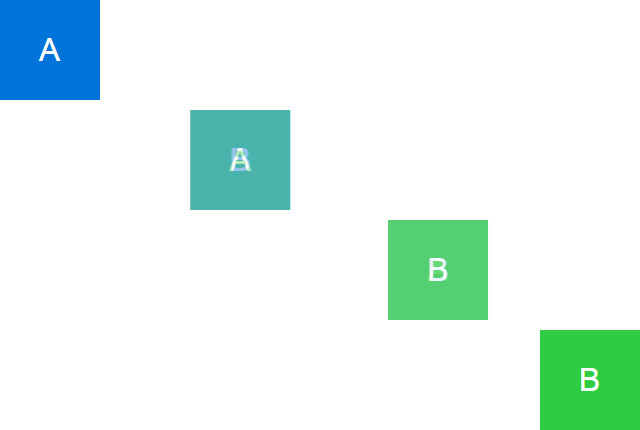
Example for a Transformation Animation as Known From iOS

Here, the size and position of the first element are matched with the second one. At the same time, the first element is faded out, and the second one is faded in. With a quick animation, you create an impressive transformation effect. The longer the animation’s duration, the more obvious the way of transformation, which waters the “wow effect” a little.

Ramjet: Addressing and Transforming Elements Via ID

Ramjet is very easy to use. Once the JavaScript library is implemented the usual way, both of the HTML elements you want to transform can be addressed via their ID.

ramjet.transform(elementA, elementB);

In the example, an element with the ID “elementA” transforms into the element with the ID “elementB”. In this simple variant, both output elements remain visible as such.

If you want to make the second element appear during the transformation, causing the first element to fade out, you need to invest a bit more JavaScript into the effect.

elementA.style.opacity = 0;

ramjet.transform(elementA, elementB, {
  done: function () {
    elementB.style.opacity = 1;
  }
});

For this example, the second element (“elementB”) needs to be hidden. To do so, you could set its visibility to zero (using the CSS attribute “opacity”). After that, the first element (“elementA”) is hidden once the transformation starts. Next, we trigger the transformation via “ramjet.transform()”, by transferring the two IDs (“elementA” and “elementB”). During the animation, the output elements are not visible anymore.

ramjet_animation
Course of the Animation From Element A to Element B

The parameter “done” causes a function to be executed as soon as the transformation is completed. This makes sure that the second element becomes visible at the end of the animation.

Additional Parameters

Aside from the parameter “done”, there are other ways to define the transition. For example, “duration” allows you to determine the duration of the animation. On top of that, there’s also “easing”, giving you the option to choose an easing method to accelerate or slow down the animation.

ramjet.transform(elementA, elementB, {
  duration: 5000,
  easing: ramjet.easeIn
});

While “ramjet.linear” is the standard easing method, there are “ramjet.easeIn”, “ramjet.easeOut”, and “ramjet.easeInOut” as well, all of which give you different animation effects.

Instead of making elements invisible via “style.opacity”, there are also alternative methods with “ramjet.hide()”, and “ramjet.show()”. These also set the “opacity” attribute to 0 or 1, respectively.

Ramjet: Browser Support

Ramjet runs on all modern browsers like Chrome and Firefox. The library also works in Internet Explorer starting from version 9. Ramjet is available under the MIT license and is thus free to use for commercial and private projects alike.

(dpe)

Categories: Others Tags:

Typography Handbook(s)

June 15th, 2016 No comments

I ran across this Typography Handbook the other day and thought it was very well done. It gets you right away by looking at two resumes and having your rather instinctively prefer the one with nice type, even though the information on them is exactly the same.

Reminds me of how many other typographic “handbooks” there are:

Direct Link to ArticlePermalink


Typography Handbook(s) is a post from CSS-Tricks

Categories: Designing, Others Tags:

Designing Modular UI Systems Via Style Guide-Driven Development

June 15th, 2016 No comments

Using a style guide to drive development is a practice that is gaining a lot of traction in front-end development — and for good reason. Developers will start in the style guide by adding new code or updating existing code, thereby contributing to a modular UI system that is later integrated in the application. But in order to implement a modular UI system, we must approach design in a modular way.

Designing Modular UI Systems Via Style Guide-Driven Development

Modular design encourages us to think and design a UI and UX in patterns. For example, instead of designing a series of pages or views to enable a user to accomplish a task, we would start the design process by understanding how the UI system is structured and how its components can be used to create the user flow.

The post Designing Modular UI Systems Via Style Guide-Driven Development appeared first on Smashing Magazine.

Categories: Others Tags:

On Scroll Audio Effects in Adobe Muse

June 15th, 2016 No comments
Muse For You - On Scroll Audio Effects in Adobe Muse Muse For You - On Scroll Audio Effects in Adobe Muse - Image

Add On Scroll Audio Effects in Adobe Muse. No Coding Skills Required.

Adobe Muse CC Logo

I have to admit – I am an audiophile (An audiophile is a person enthusiastic about high-fidelity sound reproduction).

I also love websites, and combining these two is like drinking a café mocha with a delicious scone on the side :P. I just recently downloaded an app called “Drop Flip.” It’s a fun little game where you have to drop a ball into a cup while going through various obstacles. Now the game was fun, BUT the part I loved the most were the sounds that were made when the ball would hit the different shapes before going into the cup. Nothing better then beautiful sounds perfectly timed to allow the user to experience information in a fun and refreshing way.

This is the same case with the “On Scroll Audio Effects” widget. This widget allows you to trigger sounds while the user is scrolling through the website. You assign the audio to an element and when the element reaches a certain point within the browser you will hear the sound. With accented audio effects you could give your website a whole new feel. We respond to information visually and sonically, and when both of these are combined you can really elevate the user experience when someone visits your website.

Muse For You - On Scroll Audio Effects in Adobe Muse Muse For You - On Scroll Audio Effects in Adobe Muse - Image

The widget is super simple to use. Simply drop the widget onto your Adobe Muse website, assign a graphic style name to the element you want to trigger the audio, add the audio, and then select at what point from the top of the browser you would like the audio to play. That’s it! You can have multiple audio effects play as the user scrolls through the website. You can also have the audio play every time the user scrolls past the element or just play the audio once.

I just recently applied an update to the widget that stops the previous audio from playing when another audio is triggered. This makes for very clear audio, and two audios will never overlap. You can watch an example of how to use the widget and where to access it in the video above. I go over few other widget updates as well. To access the widget visit http://museforyoushop.com. Happy Musing!

Read More at On Scroll Audio Effects in Adobe Muse

Categories: Designing, Others Tags:

The Story Behind The Ekaterinburg Metro Map

June 14th, 2016 No comments

A large metropolitan underground train network might as well be a teleportation device: People don’t care how it gets them from A to B, just that it does. In London, Paris and Moscow, the map of the metro does not show surface geography, because there is not much empty space on the sheet.

The Story Behind The Ekaterinburg Metro Map

Designing a city’s metro map is quite a challenging task, even when there is just one line. Last year, my colleague Pasha Omelyohin and I were thrilled to work on the redesign of the metro map for Ekaterinburg, Russia. We had fun (he designed, I directed). In this article, we’ll cover our design process. It’s going to be detailed, so, depending on your interests, this might be very boring or very exciting. Still, we’ve left out so much. We hope this helps in case you have to work on a similar project.

The post The Story Behind The Ekaterinburg Metro Map appeared first on Smashing Magazine.

Categories: Others Tags:

Component-Led Design Patterns with Nunjucks & Grunt

June 14th, 2016 No comments

The following is a guest post by Morgan Feeney. Morgan and his colleagues went through a journey of trying to find the right code prototyping tools, and found that a Nunjucks based system worked well. I think it’s a compelling choice! I’ll let Morgan make that clear.

Recently I was involved with the creation of an in-house system for building HTML prototypes intended to act as a reference point for an eCommerce CMS called Hybris. It started out simple, with PHP. As the team grew, so did the codebase, this eventually made things untidy, giving me sleepless nights.

We used PHP at first because:

  1. Includes. PHP include()s allow reusable chunks of code to be created. For example: headers, footers, and components.
  2. Familiarity. candidates were being recruited with prior knowledge of PHP & content management systems such as WordPress.
  3. Logic. Like if () {} else {}. People could take advantage of logical features, or, choose to write plain HTML, accommodating people of different skills.
  4. Simplicity. Simple enough to enable our journey.

Since the beginning, we strove for an effective componentized system. We looked for influence from systems such as Atomic Design and how templating is achieved by CMSs like WordPress and Magento.

Design Patterns with PHP

We devised a way to split up bits and pieces of code. We called them:

  • Templates
  • Components
  • Fragments

Templates were web pages based on a boilerplate PHP file. They looked like this:

<?php 
  require_once('../../_assets/classes/Prototype.class.php');
  $pageTitle = 'Boilerplate template | HTML';
  Prototype::getComponent('shared/head');
?>

<body>
  <?php Prototype::getComponent('shared/simple-header'); ?>
  <div id="main-content" class="container-outer">
    <div class="container-set-width">
      <div class="container-main">
          <!-- ADD YOUR STUFF HERE -->
      </div>
    </div>
  </div>
  <?php Prototype::getComponent('shared/footer'); ?>
  <?php Prototype::getComponent('shared/scripts'); ?>
</body>
</html>

Components were things like forms, carousels, and bigger chunks of reusable code. Ideally components were self contained and able to be placed anywhere without worry of CSS inheritance affecting the appearance unintentionally.

Fragments were anything smaller than a component, such as a product image or a single product including the price and product title.

What PHP Lacked

The main thing lacking from our PHP prototyping system was template inheritance. This led to the codebase growing undesirably. There were things lurking around which were no longer of any use and many duplicate files. It was also a nasty experience to search and find things.

PHP served its purpose at first, but eventually we superseded it with Nunjucks. Nunjucks enabled a different kind of system.

Reasons We Changed from PHP to Nunjucks

  1. Template inheritance. Reduces code duplication and allows us to maintain less code.
  2. Functionality. Nunjucks beat out other template languages that were tried (such as Handlebars) due to built-in features like includes, filters, and macros.
  3. Documentation. The documentation is very useful. It helps make Nunjucks easy to get your head around and provides working examples.
  4. Deliverables. Could be compiled as HTML using Grunt. We found doing this with PHP problematic.
  5. Logic. We could still accommodate people of different skillsets, as you can still write logical code or plain HTML.
  6. Simplicity.

Design Patterns with Nunjucks

  1. Layouts
  2. Templates
  3. Components
  4. Partials
  5. Macros

Comparing to the previous list using PHP, you’ll notice that layouts and macros are new here. Partials is another word for fragments.

Layouts are boilerplate HTML files, like templates, but this time there is a single file used as a base as opposed to a duplicate each time. How? Template inheritance. To quote the Nunjucks docs:

Template inheritance is a way to make it easy to reuse templates. When writing a template, you can define “blocks” that child templates can override. The inheritance chain can be as long as you like.

Here’s an example Nunjucks layout file:

<!DOCTYPE html>
<html lang="en">
  <head>
    <meta charset="utf-8">
    <title>{{ page_title }}</title>
    <meta name="description" content="{{ page_description }}">
    <link rel="stylesheet" href="{{ base_path }}css/style.css">
    <meta name="viewport" content="width=device-width, initial scale=1">
  </head>
  <body class="{{ body_classes }}">
  <article>
    <nav id="main-nav" class="container-fluid navbar navbar-dark bg-inverse {{ main_nav_classes }}">
      <div class="container">
        {% block nav %}
          {% include "components/nav.njk" %}
        {% endblock %}
      </div>
    </nav>
    <header id="main-header" class="container-fluid {{ main_header_classes }}">
      <div class="container">
        {% block header %}
          {% include "components/header.njk" %}
        {% endblock %}
      </div>
    </header>
    <section id="main-section" class="container-fluid {{ main_section_classes }}">
      <div class="container">
        {% block main %}
        <!-- This block (and any other block) can be replaced using template inheritance, or leave the default content in -->
          <h2>This `<h2>` tag appears by default, yet can be replaced</h2>
          <p class="lead">
            This `<p>` tag is also a default but can be replaced.
          </p>
        {% endblock %}
      </div>
    </section>
    <footer id="main-footer" class="container-fluid m-t-3 {{ main_footer_classes }}">
      <div class="container">
        {% block footer %}
          {% include "components/footer.njk" %}
        {% endblock %}
      </div>
    </footer>
  </article>
  {% block footer_scripts %}
    {% include "partials/footer-scripts.njk" %}
  {% endblock %}
  </body>
</html>

Nunjucks and Grunt Suit the Project

Our project requirements are specific. They demand certain things. For example, one of the business requirements is that we hand-over HTML files to off-shore developers for implementation to some Java template files.

While we were still using PHP, we used a couple of Grunt plugins: grunt-php-2-html & grunt-prettify to automate this process. However, the structure of the project could often lead to issues with variable scope. This lead to things like individual component HTML being compiled with PHP errors embedded. Not ideal! You’d then open the file and manually remove the error, and then it’s no longer automated, or you’d end up working out why your variable scope is all screwed up instead of getting on with your work. It’s a process which shouldn’t require much thought once implemented.

Fortunately, using grunt-nunjucks-2-html means all files are compiled to HTML from the start. In order to see the front end at all, you need to view a `.html` file. We essentially use Nunjucks as a static site generator. The `.njk` files get ignored and are only used for compiling HTML files such as components for handing over or complete web pages for viewing. The language and output suit the needs of the project much better than the old PHP system.

Using Nunjucks to Ensure Code Consistency

There’s another aspect to our project that doesn’t have anything to do with Nunjucks, but it has everything to do with design patterns.

We use the Bootstrap framework (v3.3.4 to be exact). When using a framework like Bootstrap in a team there can be issues with code quality. There shouldn’t be, but sometimes conventions aren’t always followed, right? Bootstrap is a great resource for particular use cases, but not every use case is the same. The docs are excellent, there are plenty of examples, but sometimes you can run into trouble when you work with others and the framework is used differently by different people.

If you want to avoid this, you can use another great feature of Nunjucks: the Macro. To quote Nunjucks:

Macros allows you to define reusable chunks of content. It is similar to a function in a programming language.

Here’s a Nunjucks macro example:

{% macro field(name, value='', type='text') %}
  <div class="field">
    <input type="{{ type }}" name="{{ name }}" value="{{ value | escape }}" />
  </div>
{% endmacro %}

Now field is available to be called like a normal function:

{{ field('user') }}
{{ field('pass', type='password') }}

We can take some of the reusable parts of Bootstrap and package them up into reusable, configurable chunks of code called, for the sake of this article, Macros.

Here’s an example of a Bootstrap card Macro:

{% macro cardMacro (image, title, text, btnText="Button") %}
  <div class="card">
    <img class="card-img-top img-fluid" src="{{ image }}" alt="{{ title }}">
    <div class="card-block">
      <h4 class="card-title">{{ title }}</h4>
      <p class="card-text">{{ text }}</p>
      <a href="#" class="btn btn-primary">{{ btnText }}</a>
    </div>
  </div>
{% endmacro %}

The code is exactly the same each time it’s used. It’s the equivalent of a Sass/Less mixin.

One benefit of using Macros like this is that the code will always be consistent no matter who uses it. It’s a quick win for standards adherence. Another is that you’ll only have to update the macro in a single place if the code needs updating later.

Componentization of HTML for use with CSS frameworks.

Want to learn more? If you’ve made it this far, then perhaps you have a similar requirement and would like to find out more about how you can make use of Nunjucks and Grunt.

I’ve setup a repo called: Bootstrap Patterns with all the code used in this article, plus a heap more to get you started. I’ve added what you will need to pull down the required packages. As we’re using Grunt, you’ll need to have Node running on your machine. You should have basic knowledge of using a task runner and NPM.

What’s in the repo?

Working examples of how Nunjucks, Grunt & a CSS framework (Bootstrap in this case), can be combined. It demonstrates how the same reusable design patterns can be combined to achieve multiple variations.

Let’s look at each of the design pattern levels

1) Layouts

The file `layouts/layout.njk` is comprised of a reusable page structure. I’ve anticipated all the usual things I need to create web pages using Bootstrap. There are variables for things like meta information, e.g.

<title>{{ page_title }}</title>

Variable classes such as:

<body class="{{ body_classes }}">

Generic Bootstrap classes required for layout such as .container and .container-fluid added to elements such as nav, header, section, footer, along with Nunjucks variables, blocks, and includes; to enable total flexibility:

<header id="main-header" class="container-fluid {{ main_header_classes }}">
  <div class="container">
    {% block header %}
      {% include "components/header.njk" %}
    {% endblock %}
  </div>
</header>

2) Components

In the file: `components/nav.njk` the following Nunjucks features are used in order to create a reusable pattern:

  • Import
  • For
  • Filter
  • Block
  • Macro
{% import "macros/macro-search.njk" as macroSearch %}

<div class="nav navbar-nav">
  {% for item in navItems %}
    <a class="nav-item nav-link" href="{{ item.menu_item | lower | replace(" ", "") }}.html">{{ item.menu_item }}</a>
  {% endfor %}
  {% block navRight %}
    {{ macroSearch.search() }}
  {% endblock %}
</div>

This file demonstrates how several features of Nunjucks can be combined. I created a macro: `macros/macro-search.njk` which we import into `components/nav.njk`, as we want to add a search form in the nav.

{% import "macros/macro-search.njk" as macroSearch %}

We loop through some JSON data objects called navItems which are used to build the navigation, then use a filter to make the URL lowercase, and strip unwanted whitespace so the link is valid.

{% for item in navItems %}
  <a class="nav-item nav-link" href="{{ item.menu_item | lower | replace(" ", "") }}.html">{{ item.menu_item }}</a>
{% endfor %}

3) Macros

We call the search form macro in block tags just in case we don’t want the search form to appear in this component at some point later.

{% block navRight %}
  {{ macroSearch.search() }}
{% endblock %}

4) Templates

In templates we extend layouts like so:

{% extends "layouts/layout.njk" %}

This allows us to inherit the same layout many times without re-writing the code in more files.

…The nav component is then called into a block tag in the layout file:

<nav id="main-nav" class="container-fluid navbar navbar-dark bg-inverse {{ main_nav_classes }}">
  <div class="container">
    {% block nav %}
      {% include "components/nav.njk" %}
    {% endblock %}
  </div>
</nav>

I wrap nav in a block tag by default. This default can either be left, or changed via a template.

5) Partials

The only use I made of partials in this example was for some script tags in the footer. But as the name suggests, it’ a partial piece of code… it could be anything small.

{% block footer_scripts %}
  {% include "partials/footer-scripts.njk" %}
{% endblock %}

Finally

The examples I provide in this article are just scratching the surface of what can be achieved. There are more examples in the repo, so please do take a look, and feel free to let me know your thoughts.

I want to give a large shout out to the guys on the UI team at N.Brown Group PLC where these ideas came about, it’s been a blast!


Component-Led Design Patterns with Nunjucks & Grunt is a post from CSS-Tricks

Categories: Designing, Others Tags:

How to attract a never-ending supply of clients

June 14th, 2016 No comments

Your business is starving. You’re struggling to get the clients and projects you need to keep your business going. Sometimes, it feels like you’ll never be able to get enough clients.

You’re not like everyone else. You enjoy the freedom that comes with working for yourself. You love that you’re in control of your future. But if something doesn’t change, you’ll be forced to accept horrible work from a penny pinching client, or an oppressive job doing more of the work you hate.

What if there was a way to change that? To attract new eager-to-buy clients on demand?

Sounds like a fairy tale, right?

Not only is it possible, I’m going to show you how to do it. Do the work and you’ll start to attract a steady stream of new clients. Do an amazing job and eventually people will give you leads they’ve paid for, with some sending job offers your way.

Here’s the obvious question…

Why on earth would anyone else give you their leads, for free? The same leads they’ve worked so hard for? If we’re competing for the same customer how does that make any sense? Who does that?

I call these people complementary sources.

Complementary sources are people who serve the same customers you do, in a different, but complementary way:

  • copywriters create content that tells a story and creates action;
  • developers create the behind-the-scenes movement that makes everything work;
  • designers create designs that communicate without speaking and guide without words;
  • analysts use data to measure and improve performance incrementally.

These professionals complement each other. They need to depend on each other if they plan on serving and protecting their clients.

Each of these freelancers have their own set of leads and their own set of clients.

And it’s the same for every business

Have you ever heard the saying “No man is an island”? That saying applies here. If you’re in business, you’re surrounded by these complementary sources. And the best part? All of them need help.

These complementary sources are great at what they do. But there’s something all of them struggle with consistently: Marketing.

Maybe they’re okay at marketing and they’re generating leads but they struggle to turn that interest into money. Maybe they’re cherry picking the leads they want and tossing the rest.

Whatever the reason, they’re leaving a lot of money on the table. They’re losing leads, customers and sales, and they don’t even know it.

That’s your in. Fix that problem for them, earn their trust and they’ll gladly give you their leads.

“I hate marketing, how am I supposed to fix their problem?”

Simple. You stop marketing and you start teaching.

If you’re a designer, you teach your source’s clients about the buyer evaluation process, how buyers evaluate your clients in 1/20th of a second.

You educate them, explaining the who, what, why and how.

At this point, we’re overwhelmed. Where should we start? Who do we approach? What should we say?

First you take a few big, deep breaths, then you…

Step 1: Create a list of your complementary sources

Remember our definition for a complementary source? These professionals serve the same customers you do in a different, but complementary way.

Here’s a few more examples:

  • game designer, game writers and game developers;
  • realtors, mortgage brokers, and appraisers;
  • ad agencies, web development shops and hosting companies.

See what I mean? They all serve the same people. Okay.

Your turn.

List 5 – 10 industries that complement yours. Got ’em down? Okay good. It’s time to…

Step 2: Choose one company from each industry to interview

You’re not looking to sell them on your product or service. You’re not trying to manipulate them into covertly buying anything.

You’re after information. You’re looking for holes. Places where you can fix a problem, add something valuable or help them achieve more.

Here’s how you ask:

Hi Jan,
My name is Andrew McDermott. I’m the co-founder of Zrro.net. Are you available for a research interview on January 28th, 2015?
Let me know,
Andrew McDermott
Co-founder, Zrro.net

This is just one approach out of many. But whatever you do, keep your request, short and sweet.

You’ll want to record this interview, so let them know/ask for permission upfront. You want to focus your attention on listening and asking questions. You don’t want to be focused on taking notes.

You’ll want your questions to cover four very specific areas:

  1. Desires: why do they want the things they want? What are they hoping to achieve?
  2. Goals: what specifically do they want to achieve? Goals are useful when they’re specific, measurable, etc.
  3. Fears: what are these complementary sources afraid of? You’re looking for personal and detailed examples like I’m afraid abc corp. will steal all my clients, afraid all my customers are gonna leave me, can’t get customers to stay, afraid I won’t find the answer, etc.
  4. Frustrations: what grinds their gears? Clients not signing up? Not paying on time? Offering to pay you with “equity” or “partnership” instead of real money? What?

You’ll need to customize your questions for interviewees in different industries but they should be the same for the most part. Remember, you’re not looking for two people from one industry. You’re looking for one person from each industry.

If you’re feeling aggressive and want a massive amount of leads quickly, do this for each of the industries you have in your list. If you prefer a more conservative approach, start with one or two industries and work from there. If you’ve done a good job you’re ready for…

Step 3: Outreach and pitch

Create a list of real businesses in each of the industries you’ve targeted. These companies should be at the same level you’re at or better.

If you’re a one person shop, it’s ideal to go after businesses with 1 to 25 employees.

Targeting a business that’s much larger than yours, say a fortune 500 company, isn’t a good idea. Any deal you’d create would be one-sided in your favor. That’s bad because you don’t have a whole lot to offer your partner, at this point.

Okay, you’re ready to pitch. What do you say?

Remember the interviews you did in step two? Now’s the time to use them. Simply feed the desires, goals, fears and frustrations back to prospects, in your pitch, like this:

Hi Rick,
I’ve been talking with Jan over at ABC corp. She mentioned she was having a tough time turning her leads into paying clients. I gave her a free plan that got her 6 new clients in the first month. I’d like to share that plan with you, no catch.
Interested?
Andrew McDermott
Co-founder, Zrro.net

Here’s the beautiful part. We end our pitch with a closed-ended question. We make it super easy for complementary sources to simply respond with a Yes or No!

Okay, we’re ready to…

Step 4: Layout the plan

You’ve done your homework. Your interviews tell you complementary sources are struggling to convert the leads they have. These professionals pounce on the clients who are ready to buy, ignoring the rest.

But you know that’s a mistake.

You layout your plan:

  • if they have dead leads, you create an irresistible offer to resurrect them;
  • they want their customers to buy more? Show them how you can do that by teaching their customers;
  • they want more customers to sign up for their monthly service? You’ll throw in a bonus (e.g. education, free service) to sweeten the deal.

You have a solid plan to give your sources what they want. And with the right material, they’ll get it without either of you breaking the bank. You reduce the risk they’re taking and they get what they want.

And how do their customers get what they want?

They come to you. They give you their name, email, phone number—anything you need to start a relationship. And viola, just like that you have a database of interested customers.

Put these customers in to your follow-up system of choice. Then send them ultra valuable and really helpful education. Alternate between helpful content, tools and resources and a sales pitch with an irresistible offer (e.g. free graphic design worth $500).

Get them used to working with you. Then, when the time is right, encourage these customers to make the switch—from a free to paid client.

Do this for yourself and your complementary source. Do this regularly and you’ll watch your sales grow from a trickle to a flood of new clients.

Do it well and you’ll find that your complementary source prefers that you handle more and more of their leads. Congrats, you’re now their secret weapon, their own personal money tree.

This won’t work for me because…

My business is different, or new or unique or something. This objection rears its ugly head whenever we share this strategy with others. But it’s a lie.

How do we know?

Aquatic Taekwondo. It’s a business we’ve just made up. And that business has complementary sources:

  • traditional Taekwondo dojos;
  • self defense websites, journals and blogs;
  • martial arts apparel manufacturers.

And there’s actually more. I could go on but I think you see the point. We’re all surrounded by people who can help us.

And they will, if we know how to ask.

Your business doesn’t have to starve

If you’re struggling to get the clients and projects you need you’re not alone. But you have a way out.

What would it be like to have a waiting list of eager and excited clients? Money in hand and begging for a chance to work with you? It feels like a dream but it can be a reality for you. If you do the work.

Follow the steps I’ve outlined and you’ll have an unlimited, never ending supply of clients and sales. Money, opportunity, freedom—whenever you need it.

Start now and it’s yours for the taking. You can do it.

COLOSSAL Font Bundle (30 Fonts with Extended Licenses) – only $29!

Source

Categories: Designing, Others Tags:

A Framework For Brainstorming Products

June 14th, 2016 No comments

Brainstorming is notorious for being unstructured and often unactionable. People get in a room with some Post-its and whiteboards and expect the great ideas to happen. The problem is, even if there are great ideas in the room, there is often no clear-cut way to decide on what ideas to take action on.

A Framework For Brainstorming Products

About a year ago, I and my colleague Michael (founding partner at AJ&Smart) were sitting in a masterclass run by the fantastic Adrian Howard on the subject of feature prioritization in agile development. More specifically, we were asking how we could decide which feature comes next and when it should be released.

The post A Framework For Brainstorming Products appeared first on Smashing Magazine.

Categories: Others Tags: