Archive

Archive for June, 2016

FontYou: Your Fonts in the Cloud

June 14th, 2016 No comments
fontyou

The way fonts have been advertised and used changed a lot over the past couple of years. Due to the establishment of web fonts, the commercial font providers now offer different subscription models alongside the standard purchase option. On top of that, there’s an increasing number of free, high-quality fonts, developed specifically for web use. Now, there’s the cloud service FontYou, which wants to cover the distribution of fonts, as well as the management and even development of fonts all at once.

Font Management Via Desktop and Web Application

Font management is the central aspect of FontYou, and it works in a combination of desktop and web app. The desktop application, which is currently only available for Mac OS, is used to upload fonts that are then available in the cloud. Once done, all fonts uploaded to the so-called “library” are accessible from the web app. They can also be assigned to different lists there. This way, you could categorize them depending on classification, foundries, or projects, for example.

The nice thing about cloud-based font management is that all uploaded fonts are available wherever you need them. This is certainly interesting for people that don’t always work on a stationary computer, but also work on the go using a notebook or other device. FontYou also doesn’t restrict you to one font provider, unlike other services such as Typekit.

fontyou_verwaltung
The Font Management of FontYou

As it should be, fonts can be activated via the web application. That means that they are available to the operating system, and can be used in applications like Photoshop, Illustrator, or InDesign.

Unfortunately, the desktop application for the upload of fonts is only available to Mac users at the moment. Uploading via web app is not possible, but wouldn’t make much sense anyway. That’s because the desktop app is also required for fonts that are activated via web app accessible in the system.

Store With 60+ Fonts

Apart from the, currently, free font management, there’s a store with 60+ fonts with different amounts of cuts. According to FontYou, there will be monthly updates. Thus, you can expect the number of fonts to grow on a regular basis.

fontyou_store
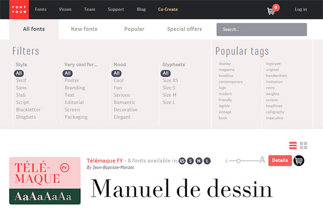
The FontYou Font Store

The fonts all originate from FontYou, which makes it the foundry. However, you can also get the fonts somewhere else. For instance, the FontYou fonts are also available via MyFonts and Linotype. FontYou offers fonts in different sizes and for different prices.

Thus, there are fonts in size XS with a restricted character set of 300 characters for 20 Euro. This contains Latin lower and upper case letters, as well as punctuation marks, but no language-specific support. Depending on the font, other sizes (S, M and L) with large character sets can be chosen as well. The S version supports 34 languages. The M version comes with additional number formats, like proportional numbers, and numbers for tables, while the L version comes with small caps, and over 740 characters.

fontyou_kaufoptionen
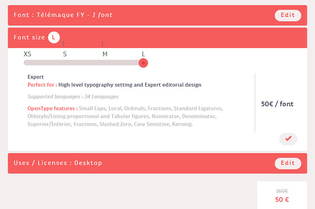
Flexible Purchase Options in the Store

The price for the size L is 50 Euro. Depending on where the font will be used, you won’t always need all the characters. If you only need the font to design a logo, the S version should be sufficient. For traditional office applications, the M version will be okay while size L is only required by experts that want to use OpenType features, for example.

The named prices are for the use of either desktop or web fonts. The costs for a combination of both is 30 Euro for the M, and 75 Euro for the L version. When purchasing the complete family of one font, there will be a discount. This is rather common amongst other providers as well, however, and nothing unique to FontYou.

All fonts purchased in the store will automatically be available from the FontYou font management, and can be activated there.

The font variety is rather broad. There are solid serifs, and sans serif fonts, as well as hand-written fonts, and a few unique display fonts. There’s a font for every purpose.

Help Developing Fonts

Aside from the font management and the store, FontYou also allows you to help develop fonts. You don’t have to be a professional font developer to do so. You can simply hand in a font idea by uploading it as a draft. Alternatively, you can also use the web application developed by FontYou to visualize your thoughts directly within the browser. If your idea is turned into a font, FontYou will give you a share of the revenue.

fontyou_entwickeln_entdecken
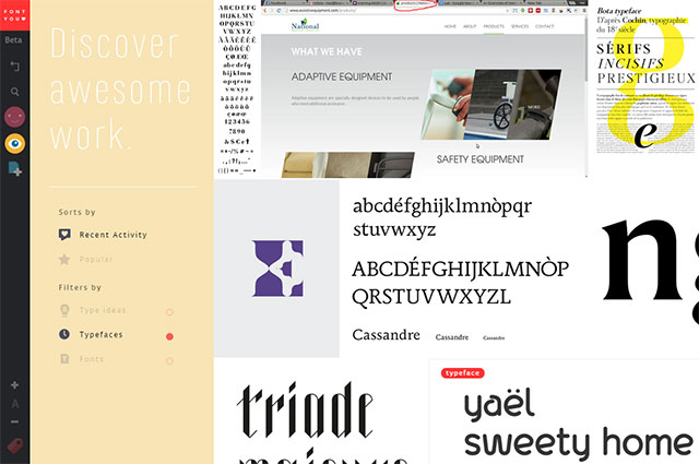
Discovering Font Drafts and Handing in Your Own

You can also look through other uploaded drafts to get some inspiration for your own font ideas. The more detailed your draft, the higher your share of the revenue if your font actually gets published. An overview tells you how much you’ll make of it.

Professional font designers can create fonts at FontYou, or help to realize the sent-in drafts. Depending on your support, you’ll also receive a share of the revenue for this. The task of the type designers, as FontYou calls them, is to check the creation of characters, as well as the metric, and the kerning of a font. FontYou then takes care of the font’s “mastering”.

Preview on Further Features

FontYou is a rather new project. It plans to expand the font management by adding an automatic activation. Many font management applications already provide this functionality. It makes sure that fonts don’t have to be activated manually anymore.

A trial service is also in the works. It will allow you to test fonts for free before buying them. They also plan to implement an overview of the entire character set of each font.

On top of that, Fontyou runs a blog which does not only report on recent news on the service, but also on interesting things regarding typography, fonts, and their design.

Conclusion

Fontyou leaves a good impression, and could definitely become a useful service for graphic and web designers. Only time will tell how the service will develop. A few features known from other font management and shop services are still missing. However, this might change shortly.

(dpe)

Categories: Others Tags:

Microsoft buys LinkedIn: What it means for designers

June 13th, 2016 No comments

On Monday, Microsoft and LinkedIn announced that Microsoft would buy LinkedIn in an all-cash deal for $196 a share, at $26.2 billion. In a news release on the Microsoft website, both companies vowed that LinkedIn would however, retain its unique culture and brand, essentially remaining independent of new parent Microsoft.

This deal has a slew of interesting implications for designers and networking in general. One of the biggest possibilities for designers is the new advantage of sitting down with either leads or clients in meetings and being able to talk about relevant information with confidence.

Here’s how it will work: Microsoft’s personal digital assistant, Cortana, is good today for doing simple things for users, such as seeing what’s on their calendars and then recommending to them the best times for them to leave their location to be on time for a meeting. That’s still quite limited, which is what Microsoft is hoping will change thanks to its LinkedIn acquisition.

Because of LinkedIn’s voluminous data on professionals, it may be possible in the near future for designers to walk into a meeting with their leads or clients and know everything about their professional backgrounds, résumés, and goals. All it would take is for designers to use Microsoft’s Office products, which would be linked up with Cortana…which would itself be able to see their leads’ or clients’ information on LinkedIn.

Say goodbye to the days of designers walking into meetings blind. Designers looking to effectively network would get a boost, too.

Thanks to this acquisition, it’s now possible to integrate LinkedIn data on professionals within Office 365. This can lead to new and better experiences for designers who are, say, looking to complete a certain project, yet don’t quite know to whom to turn for guidance, inspiration, resources or help.

Although this purchase means good things for designers, there are also other reasons that LinkedIn agreed to Microsoft’s offer. Its stock price hasn’t been doing well, its ad business was seeing challenges, and its growth was less than stellar according to Recode.

The LinkedIn newsfeed, which today is somewhat spotty in terms of value, could be transformed into a very useful feed that presents designers with articles that are relevant to projects they’re working on. At the same time, Office 365 could recommend, based on the LinkedIn data, specific professionals designers can work with to complete their projects with more efficiency and mastery than ever. This is a scenario envisioned by Microsoft CEO Satya Nadella in an email to employees.

This deal has big implications for designers who want to take their networking to the next level. With LinkedIn integration, designers using Microsoft products like Office 365 now have the tools at their disposal to tackle meetings and interviews with more intelligence and, therefore, more confidence in closing the deal than ever before.

LIFETIME ACCESS: 500,000+ Stock Vectors, Illustrations and Icons – only $39!

Source

Categories: Designing, Others Tags:

45 Advertisements You Will Never Forget

June 13th, 2016 No comments
baby-ronald-mcdonald-ad

Advertisements are everywhere. Consumers have a need and advertisements direct the consumer to the company that has a solution for their need. For years, we have tried in vain to escape advertisements, but aggressive advertisement companies have stepped up their creativity. These days, instead of relying on the simple goodness of lemonade and children’s laughter, ads have taken a decidedly more provocative turn. Gone are the nostalgic days of skipping through wheat fields. These days, ads venture on the irreverent. They cater to your physical senses and bend your mind to what is possible. Here are some of the most insanely good advertisements of recent memory, broken down into ambient, billboards, commercials and print.

Ambient

1. Skin Cancer Towel

2. WINZIP Compressed House

3. WPPED Cream Elevator Award

4. Neglected/ Invisible Children

5. McDonald’s Pole

6. Piano Stairs

7. Human Meat

8. Life Is Too Short for the Wrong Job

9. Kleenex Soap Dispenser

10. Elm Grove Police Department: Slower is Better

11. Unicef Land Mine

12. 2012. We Were Warned

13. Nikon D700: Papparazzi

14. Pantene Anti-Breakage Shampoo: Rapunzel

15. Swiss Skydive Elevator

Billboards

1. Panasonic nose trimmer: Fatty

2. Nestle Billboard

3. Sign from God

4. Formula Toothcare Bite

5. Imodium AD Toliet Tissue

6. Allstate Auto Insurance

7. Zimbabwean Money Billboard

8. iPod and iTunes

9. Powerhouse Gym

10. Get Organized with Peter Walsh

Print

1. Findus FraichíFrites: Granny Fries without the Granny

2. International Vegetarian Union: Vegetables Are All Your Body Needs

3. Bose Noise Reduction Headphones

4. Clorets: Fishy Breath

5. Gun Central Alliance, South Africa

6. The Joy of Pepsi

7. Utopolis: Reality Sucks

8. Fortis Bank: Plastic Surgery Loans

9. Target Dri Bots Nappies: No One Likes a Bed Wetter

10. McDonald’s Baby Ronald

Commercials

1. Honda Cogs

2. Adidas/ FIFA Women’s World Cup 2003

3. Yellow Pages

4. Jack in the Box/ Meaty Cheesy Boys

5. BMW/ Theo Jensen

6. Apple Macintosh/ 1984

7. Dove/ Evolution

8. Heineken

9. Traveler’s Insurance/ Prized Posession

10. Vizzavi/ Pixar

Read More at 45 Advertisements You Will Never Forget

Categories: Designing, Others Tags:

10 Amazing WordPress Themes for Travel Agencies

June 13th, 2016 No comments

Have you set up your own hospitality / tourism business website on WordPress yet? If you have then well done; you won’t find a better platform to help you manage all aspects of your business on the digital realm. But setting up a WordPress website is only the beginning. To set yourself apart from your

Categories: Designing, Others Tags:

Draw the 2016 Instagram Logo in Illustrator

June 13th, 2016 No comments
draw-instagram-logo-4

In this tutorial, we’re going to learn how to draw the 2016 Instagram logo in Adobe Illustrator.

The Steps (1-19)

1. Create a new document.

2. Select the Rectangle Tool and hold Shift to draw a square. Give this shape a black fill and remove any strokes.

3. Using the handles inside the shapes’ corners, drag these towards the centre of the shape to round of the corners.

draw-instagram-logo-1

4. Next, source an image of the 2016 Instagram logo online (eg. Google), Copy and Paste this into Illustrator, and using the Eyedropper Tool, sample the 5 different colours used in the logo, and create swatches of these colours – blue, purple, red, orange, yellow.

5. With the square selected, go to Edit > Copy, and then go to Edit > Paste in Place.

6. Left-click holding Alt and Shift to scale this new square down in size towards the centre, and give the shape a thick stroke and remove the fill.

draw-instagram-logo-2

7. Select the Ellipse Tool, Left-click and hold Shift to create a circle.

8. Drag over all of the shapes created so far to select, and in the Align Palette, align all shapes horizontally and vertically. Give this circle the same stroke width as we did for the square in Step 6.

9. Create a new circle using the Ellipse Tool. Make this circle smaller, give this fill a white fill, and remove the stroke.

draw-instagram-logo-3

10. Select all shapes created so far, and go to Object > Expand, select Fill and Stroke, and click OK.

11. Select the black shape created in Step 2, and click on the Gradient Slider in the Gradient Palette.

12. Drag the blue swatch on to left side of the Gradient Slider. Drag the pink swatch on to the right side Gradient Slider, and drag the red swatch into the centre.

draw-instagram-logo-4

13. Select the Ellipse Tool and hold Shift to create a circle. Give this circle a fill colour using the orange swatch.

14. With the orange circle selected, go to Effect > Blur > Gaussian Blur, and blur the shape as far as you can, up until you see any hard edges appear. The goal is to softly blend this circle into the existing gradient.

15. Select the orange circle, and go to Edit > Copy, and then Edit > Paste in Place. Hold Alt and Shift to scale this new circle down in size towards the centre. Give this shape a fill colour using the yellow swatch, and apply to same Gaussian Blur effect as in Step 14. Select both circles and go to Object > Group, to group these two shapes together.

draw-instagram-logo-5

16. Select the gradient shape and go to Edit > Copy, and then Edit > Paste in Place, and position the orange and yellow circles in the bottom left corner of the gradient shape.

17. With the copy of the gradient shape selected, go to Object > Arrange > Bring to Front. Next, hold Shift to also select the orange and yellow circle group, and go to Object > Clipping Mask > Make. This will mask the circles inside the gradient shape/rounded rectangle.

18. Move the masked orange and yellow circle up so the edges line up with the gradient shape in the bottom-left corner.

19. Lastly, group all shapes with colour together by holding Shift to select, and then going to Object > Group, and then go to Object > Arrange > Send to Back, to make sure that the white Instagram logo is displayed on top of the colours.

draw-instagram-logo-6

Download Adobe Illustrator.

Read More at Draw the 2016 Instagram Logo in Illustrator

Categories: Designing, Others Tags:

How To Roll Out New Features Without Hurting Loyal Users

June 13th, 2016 No comments

“Be agile; release early; release often.” We know the drill. But is it strategically wise to keep rolling out features often? Especially once a product you’re building reaches a certain size, you probably don’t want to risk the integrity of your application with every new minor release.

The UI Stack

The worst thing that can happen is that loyal users, customers who have been using that one little feature consistently over the years, suddenly aren’t able to use it in the same convenient way; the change might empower users more, but the experience becomes less straightforward.

The post How To Roll Out New Features Without Hurting Loyal Users appeared first on Smashing Magazine.

Categories: Others Tags:

Form Validation UX in HTML and CSS

June 13th, 2016 No comments

You can do and impressive amount of form validation with just HTML attributes and make the user experience pretty clean and clear with CSS selectors. But it does require some CSS trickery to get things just right!

(You can) make the label look like a placeholder

First: always use real elements. Just that alone is a UX consideration all too many forms fail on. Placeholders are suggestions for valid input, like putting “Tulsa” in an input labeled “City”.

I’d say if the form is short and an obvious pattern (like sign up or log in), you could use the placeholder visual pattern, but us real labels instead.

Taking a form like…

<form action="#0" method="post">

  <div>
    <input type="text" id="first_name" name="first_name">
    <label for="first_name">First Name</label>
  </div>

  <!-- ... --->

</form>

You use the

as a positioning context and place the label directly over the form.

form {
  max-width: 450px;
  
  // positioning context
  > div {
    position: relative;

    // Looks like placeholder
    > label {
      opacity: 0.3;
      position: absolute;
      top: 22px;
      left: 20px;
    }
  }
}

You don’t need to do any tricky cursor stuff, because it’s all semantically wired up already. If they click the area taken up by the label, it will activate the input. If they click the input, it will activate the input. Both correct.

The trick is putting the input first (semantically fine) so you can hide the label on focus:

form {
  
  /* ... */

  > div {
    > input[type="text"],
    > input[type="email"],
    > input[type="password"] {

      &:focus {
        & + label {
          opacity: 0;
        }
      }

    }
  }
}

Make certain inputs required

Perhaps the easiest possible validation on a form you can do is use the required attribute to require a field. No faster way to catch an error than letting the browser do it if it can!

<input required type="text" id="first_name" name="first_name">

Positively indicate valid input values

Let users know a field has been entered correctly. The browser can give us this information through the :valid CSS selector:

form {

    > input[type="text"],
    > input[type="email"],
    > input[type="password"] {
      
      // show success!
      &:valid {
        background: url(images/check.svg);
        background-size: 20px;
        background-repeat: no-repeat;
        background-position: 20px 20px;

        // continue to hide the label
        & + label {
          opacity: 0;
        }
      }
    }
  }
}

:valid, in this case, is ensuring the required condition is met, but that selector is also useful for validating the type of input.

Show reminders about validation of type

You can also require an input’s value to be of a certain type, like email or number. Here’s examples of all of them.

<input type="email" id="email" name="email" required>

That input is both required and required to be a valid email address format. Let’s do this for the UX:

  1. Tell the user about the requirements when the field is focused
  2. Remind them the field doesn’t have a valid value otherwise

But also… don’t show any reminders when the input is empty. As in, don’t assume an invalid state. It’s just kind of annoying and unnecessarily negative. In order to do that, we’ll need to know if the input is empty or not.

Sub trick! Testing if an input has a value or not

We want to do stuff with :valid and :invalid, but we don’t want to jump the gun with :invalid and use it before the input has a value.

Is there a CSS selector to test if an input is empty? Not really! You’d think :empty would be it, but it’s not. That’s for matching things like

… container elements with nothing inside them. Inputs are no-content elements already.

The trick is to make sure the input has a placeholder value, then:

input:not(:placeholder-shown) {

}

We’re not really using placeholder in our demo, but a value of a single space works:

<input placeholder=" ">

:placeholder-shown is super useful for us here! It’s basically the secret selector for testing if an input currently has a value or not.

There is no IE or Firefox support though, which is particularly difficult to navigate around. With new features like this, @supports is normally a savior, but…

/* This doesn't work */
@supports (input:placeholder-shown) {
  input:not(:placeholder-shown) {
  }
}

You can’t use @supports for selectors, or property/values.

Testing for placeholder support in JavaScript is easy enough:

var i = document.createElement('input');
if ('placeholder' in i) {

}

But there doesn’t appear to be a simple way to test for :placeholder-shown. So…. this might just need to wait for deeper browser support to use on big production stuff.


Assuming wonderful support, this is how the logic would play out…

form {

  > div {
    
    > input[type="text"],
    > input[type="email"],
    > input[type="password"] {
     
      // When input is...
      //   1. NOT empty
      //   2. NOT in focus
      //   3. NOT valid
      &:invalid:not(:focus):not(:placeholder-shown) {
        // Show a light reminder
        background: pink;
        & + label {
          opacity: 0;
        }
      }
      
      // When that invalid input becomes in focus (and also still isn't empty)
      &:invalid:focus:not(:placeholder-shown) {
        // Show the more robust requirement instructions below.
        & ~ .requirements {
          max-height: 200px;
          padding: 0 30px 20px 50px;
        }
      }
      
    }
    
    // <input> ~
    // <label> ~ 
    // <div class="requirements">
    .requirements {
      padding: 0 30px 0 50px;
      color: #999;
      max-height: 0;
      transition: 0.28s;
      overflow: hidden;
      color: red;
      font-style: italic;
    }

  }
}

You can create robust validations

It’s not just required or type="email" (and the like), you can also client-side validate things like length (e.g. minimum password length or maximum characters in bio textarea) and even go full-on regex.

Here’s an article on that. Say you wanted password requirements like

  • At least 6 characters
  • At least 1 uppercase character
  • At least 1 lowercase character
  • At least 1 number

You can do that like:

<input pattern="(?=.*d)(?=.*[a-z])(?=.*[A-Z]).{6,}" type="password" id="password" name="password" required placeholder=" ">

Demo

I’m leaving in the :placeholder-shown stuff here, which makes this not work great in Firefox and IE. It’s just a demo! Feel free to pick and choose stuff from here that works for you.

See the Pen Form with a bunch of HTML5 Validation and CSS3 Help by Chris Coyier (@chriscoyier) on CodePen.

More


Form Validation UX in HTML and CSS is a post from CSS-Tricks

Categories: Designing, Others Tags:

101 best free fonts of 2016, so far

June 13th, 2016 No comments

2016 has been one of the best years for type design in decades. The lettering craze has pushed a lot of illustrators towards digitizing their work. There’s a ton of great font software available these days. And with typography now recognized as one of the most important aspects of a website, everyone wants in on the act.

In past years we’ve seen a few narrow trends dominating, but so far this year it’s very diverse. There’s fewer crazy experimental typefaces around, but also fewer staid sans-serifs; everyone’s meeting somewhere in the middle. Today I’ve compiled a list of the best free fonts that have been released, or received a major update, since the start of the year. There’s plenty to get stuck into, lots of really useful workhorses, and one or two playful inclusions.

Browse through, try them out, and as always if you use them in a project, let us know!

Fibon Sans

Cloud Sans

Qanelas Soft

Maquinada

Nocturno BG

Moderan

Antre

Patrona

Cataleya

Reckless

Cenotaph

Maxwell

Slabbo

Peach Tea

Balans

Kust

Tapas ES

Suelta

Tattoo

Water Plant

Kiwi

Pangram (Personal Use)

Elder

No Fancy Name

Bluegrass Outline

Mosk

Gamer

Mi Teiyng Script

Meteora

Rombomb

Hadron Sans

Savone

Yozakura

Neptune Harbour

Dirty Lines Script

Fela

Turum

Leoscar

Chocoleta

Fvriosa

Fifty Five

PhotoCab

Lemour Serif

Tavolga

Orkney

Heyro

Original

Iceland

Outsiders

New York

Brooks

Elixia

Allison

Hasta Grotesk

Trocchi Sans

Blanka

Sukar

Yunus

Gutenberg

Gotu

Geoglyph

Stereo (Personal Only)

Bajern

Blern

Apricity

Bitter HT

Adi Sans

Hovel

Ordnung

LeParisien

Norwester

Mister Rooster

Bebop Slab

Polt

36 Days of Type

Ambarella

Duwhoers

Cajito

La Tour

Coves

Okomito

Jeboy (Personal Only)

Arc

Surco (Trial Only)

Monogram Rounded

Queulat

Syabab Brush

Números

Sedici

Jellee

Alien Child

Muller Narrow

Three

Ginebra

Andis

Erial

Mercurial

Kayak

Tommy Lee

LIFETIME ACCESS: 500,000+ Stock Vectors, Illustrations and Icons – only $39!

Source

Categories: Designing, Others Tags:

SVG in Responsive Webdesign: Pros and Cons

June 13th, 2016 No comments
SVG in Responsive Webdesign: Pros and Cons

The SVG format has plenty of advantages over other image formats for the web. It’s vector-based, compact, and even editable via plain text editors thanks to the XML syntax. There’s a reason why it’s becoming increasingly more popular, especially with the steadily growing mobile web. Responsive webdesign is where it has a lot of strengths. However, it does have some problems here as well. So let’s take a look at the pros and cons of SVG in responsive webdesign.

Scalable at Will

As a vector format, SVG is scalable at will. Especially in responsive and fluid layouts, graphics are often scaled to the maximum width available depending on the browser and display size. With standard JPEG and PNG, you often risk images becoming pixelated. SVG graphics, on the other hand, are always displayed razor-sharp.

While photos can deal with a scaling of over 100 percent, logos and other, less filigree drawings, however, will look blurry at such a scaling.

To allow SVG graphics to be scaled at will, you need to enter the “viewBox” attribute into the “” element, and to forgo absolute width and height values. Applications like Illustrator automatically place this attribute when exporting to SVG format. When SVG graphics have set width and height values, they are always displayed in these dimensions. Then, scaling isn’t possible. When using the “viewBox” attribute, an SVG graphic is always displayed in the maximum width of the element that ties in the graphic.

&lt;img src="demo.svg" width="640" height="320" /&gt;

When an SVG file is implemented via an “” element, like in this example, you should enter a width and height there. Otherwise, the graphic is scaled as if the “width” value was set to 100 percent.

Another positive aspect of the scalability is the use on high-resolution displays. Without using the “srcset” attribute, which allows for the integration of high-resolution image files, pixel-based graphics are always scaled up. However, when using SVG graphics, you save the work of having to provide multiple versions of a graphic for different pixel densities. An SVG graphic is always displayed at its best resolution.

Adjustable Via Media Queries

Another significant advantage of the SVG format is the application of Media Queries and CSS. Similar to an HTML document, the appearance can be adjusted to the respective width. In contrast to HTML documents, the width of the browser window or display, respectively, is not the decisive factor, but the width of the element that integrates an SVG graphic into a document.

Especially detailed graphics often fail to shine on small displays. For that, there’s the option to simply hide expendable details using a “display” attribute. As a graphic’s line width is always scaled with the rest, the lines can sometimes become too slim to be clearly visible.

svg-responsiv_ohne-media-queries
SVG Without Media Queries: Thin Lines Because of Small Scaling

Here, a stronger line can be chosen using CSS.

line {
  stroke-width: 6px;
}
 
@media all and (max-width: 320px) {
  line {
    stroke-width: 12px;
  }
}

In our example, the line width is set to six pixels. It is buffed to twelve pixels on depictions of less than 320 pixels in width.

svg-responsiv_mit-media-queries
SVG With Media Queries: Line Width is Enhanced For Small Scaling

Overall, plenty of optimizations can be made this way. By now, Media Queries and CSS within an SVG graphic are supported by all modern browsers. Internet Explorer starting from version 10 also supports it.

It doesn’t matter whether you implement the SVG file via “”, “” or “” elements. In any case, the Media Queries are executed.

Integrating SVG Via CSS

Integration via CSS works the same way as the integration with an “” element. However, there are a few things to keep in mind here. For example, if you want to use an SVG graphic as a background image, it will always be scaled to the element’s full width when using the “viewBox” method described above.

svg-responsiv_background
Background Graphic with „viewBox“ Property but without „background-size.“

This can be helped by defining a fixed size for the “” element instead of using the “viewBox” attribute. Alternatively, it is possible to define the background size via CSS, using the “background-size” attribute.

div {
  background-image: url("demo.svg");
  background-size: 50px 25px;
}

svg-responsiv_background_size
Background Graphic With “viewBox” property and “background-size”

From time to time, you might want to equip HTML elements with a background graphic that has the exact same measurements. For fixed sizes, that’s not a problem, as all you need to do is enter absolute values. However, when trying to equip the element with a relative size instead, which is often the case when it comes to responsive webdesign, a few tricks are necessary.

Here is where the so-called “padding-bottom” hack comes into play. Let’s assume an element is supposed to always take up 50 percent of the window width. With CSS, an SVG background graphic can always be defined to assume the HTML element’s width. The problem starts when it comes to the height. When assigning a relative height to the HTML element, it will always be displayed in relation to the window, but not in relation to the element’s width.

However, it is possible to enter a value that is interpreted in relation to the element width, using “padding-bottom”, and the “calc()” rule. For instance, when my SVG graphic has an aspect ratio of 2:1, I can enter this aspect ratio with “padding-bottom”. For that, the width of the element is divided by the aspect ratio.

div {
  background-image: url("demo.svg");
  width: 50%;
  padding-bottom: calc(50% / (2 / 1));
}

As seen above, the width of 50 percent is divided by the aspect ratio of 2:1. Instead of “calc()”, you could also directly enter the calculated value, 25 percent in this case. Thus, the HTML element always has a width of 50 percent as well as a height that matches the SVG graphic’s aspect ratio.

Conclusion

The SVG format can make use of many of its strengths when it comes to responsive webdesign. Above all else, it eases work, as graphics don’t need to be provided for multiple solutions anymore. There’s no longer a lack of sufficient browser support either.

(dpe)

Categories: Others Tags:

Popular design news of the week: June 6, 2016 – June 12, 2016

June 12th, 2016 No comments

Every week users submit a lot of interesting stuff on our sister site Webdesigner News, highlighting great content from around the web that can be of interest to web designers.

The best way to keep track of all the great stories and news being posted is simply to check out the Webdesigner News site, however, in case you missed some here’s a quick and useful compilation of the most popular designer news that we curated from the past week.

Note that this is only a very small selection of the links that were posted, so don’t miss out and subscribe to our newsletter and follow the site daily for all the news.

A Visual Guide to What’s New in Bootstrap 4

Google Creative Lab: AnyPixel.js

Is HTML5 the New Windows?

Landing Page Design Basics

Design for Programmers

Today on the Internet

Discover Typography: It’s a Date

Design-Ready Objects for Adobe Photoshop

10 Reasons You Should Be Using Atomic Design

Picnic CSS: A Beautiful CSS Library to Kickstart your Projects

9 Landing Page Design Tips that Improve UX and Conversions

Making your JavaScript Pure

The 7 Most Controversial Rebrands of 2016

Test your Design and Copy, for Free

Google Built a Giant Display Out of Arcade Buttons, and it’s Amazing

Amazing Optical Illusion Makes the Louvre’s Pyramid Disappear

The Ideal Design Workflow

The App Boom is Over

Brutalist Web Design

Design the Perfect, Custom Notebook at 100-year-old Japanese Stationery Store

The Future of Branding is Debranding

Google is Testing a New Material Design Layout for Desktop Searches

Why I Turned Down $500K, Pissed Off my Investors, and Shut Down my Startup

Design has Never Mattered More

Brainstorming Questions, not Ideas, Sparks Creativity

Want more? No problem! Keep track of top design news from around the web with Webdesigner News.

LAST DAY: 1,000 Pixel-Perfect Hi-Res Web Backgrounds – only $18!

Source

Categories: Designing, Others Tags: