Archive

Archive for June, 2016

Design to Make Technology Human

June 11th, 2016 No comments
Still from "Minority Report"

The design of a man-made object is only complete when people use it.

What happened?

Charles Babbage designed the first computer between 1833 and 1871. Then came 1984. The Apple Macintosh computer was invented: the birth of a mass-market PC with a graphical user interface and mouse. A completely new operating system was created to navigate information within this graphical interface.

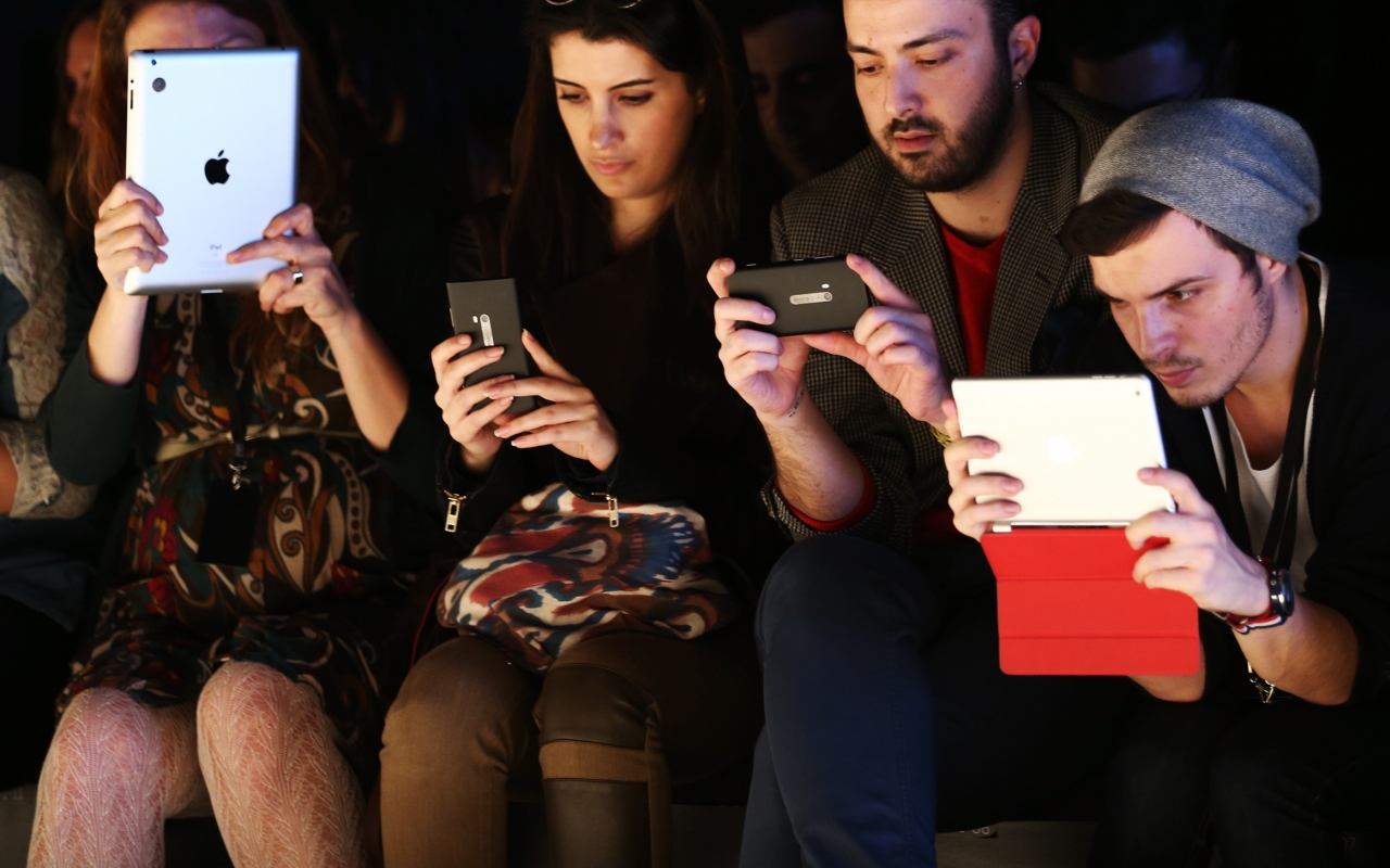
Since then, screens have continued to shrink. We’ve moved from desktop, to laptop, to smartphone, to iWatch, to GoogleGlass, to?—?well —anything: the internet of things. The amount of smartphone users reaches 1.75 Billion by 2014.

We’re addicted to our screens.

But while creating and consuming information in 2D, we forgot about space.We forgot that information exists across systems, not just within them. And because we are so addicted to what happens inside screens, we forgot how to be human.

gettyimages-163563951

The evolving device

We’re discovering that information exist across systems and not just within them. New interfaces are increasingly designed with human habits in mind. Visually, we’re looking to natural surfaces and elements, which further communicate and respond to our human nature.

Material Design by Google Developers is trying to give people access to meaningful content using human behavior and “develop a single underlying system that allows for a unified experience across platforms and device sizes.” It sounds like a step in the right direction and is fun, neat, and colorful.

When we can design across systems, devices will evolve or disappear. We will not stop consuming content, rather consume it in a way that suits human behaviour, not the other way around.

Delivering content that sounds human

Future interfaces deliver content in more meaningful, relevant ways.Content can stimulate all of our senses and be delivered at contextually relevant times.

Fluid Interfaces is part of MIT Media Lab and is designing interfaces, which allow content to flow across systems. FingerReader is a wearable device that assists in reading printed text by receiving audio feedback of the words and haptic feedback of the text layout. Blind people can now read with their finger, an example of the human body as an interface, assisted by technology.

Audio is expanding not only the internet, but also our relationship with the content itself. Audio is an exciting medium to deliver content because unlike visual information, it doesn’t take up space.

As depicted in Her, we can experience an emotional connection with audio content, because sounds human; and characters and personalities mean that the content is?—?in a sense human. The Early Edition by Capsule.fm gives content personality using artificial hosts, Miranda and Carl, who read news headlines, weather, entertainment and jokes in between your music. The most sharable and engaging content is actually not necessarily informative content such as news, rather the engaging and personalised audio confessions, artificial jokes and flattery.

Guy Hoffman proves the power of connecting audio with body language. His projects in human-robot interaction combine audio output with posture, which connect with humans on a natural level. In his TED Talk “Robots with Soul”, Hoffman explains how his inspiration from animation and acting resulted in the implementation of body language in robots, which were programmed to improvise music performances.

Still from "Her" by Spike Jonze

Still from “Her” by Spike Jonze

Systems are connected

Minority Report offered a vision of the collaborative workspace. John Underkoffler of Oblong Industries worked together with Spielberg on Minority Report and has since delivered a similar technology for the real-world collaborative workspace: Mezzanine. Take a look at the demo Underkoffler presented to Robert Scoble, which shows a truly collaborative workflow.

Elon Musk shows futuristic interfaces and workflows at SpaceX, where the complete design experience has been reimagined, allowing engineers to design more directly in 3D. Implementing a number of technologies, including Leap Motion, Siemens and Oculus VR, as well as NVIDIA and Projection Design. Musk demos the Hand Gesture Holographic Interface to show how SpaceX is improving the engineering and design processes through interaction.

Still from "Minority Report"

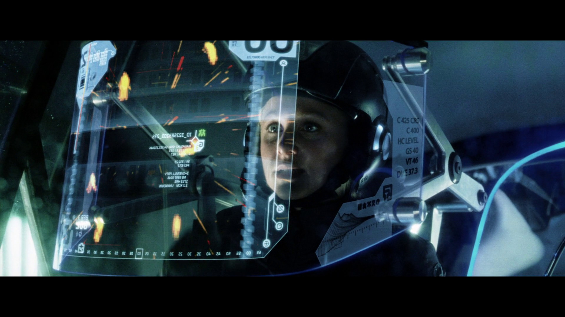
Still from “Minority Report”

The world is our interface

As we increasingly discover that we are no longer constrained to a screen or device, there are new possibilities for interaction with content and our environment. The car offers a unique case for interface design. Here, we should again seek inspiration from human senses, using them compliment the driving experience?—?or rather?—?free us to concentrate on driving. Using voice recognition technology and eye tracking technology, as well as new touch interfaces such as Matthaeus Krenn’s proposal for an in-car UI, we can build an intuitive environment, which works together with our own behavior.

Touch is increasingly exciting in interaction design and the future interface, where haptic technology provides a more sensitive and responsive experience with our environments. In his Keynote at Solid 2014, Ivan Poupyrev demonstrates his work with Disney, using haptics to build inspiring, interactive playgrounds with “Beyond Gadgets: Interactive Everything”.

Still from Ivan Poupyrev: "Beyond Gadgets: Interactive Everything" - Solid 2014 Keynote

Still from Ivan Poupyrev: “Beyond Gadgets: Interactive Everything” – Solid 2014 Keynote

Contextual content

Not only should the interface be part of our existing environment, the content should react or be generated by our environment. Welcome to contextual content.

Delivering content which is relevant to your context is what we’re building at Capsule.fm and means that information that you hear is relevant to your context: everything from your location, mood, behavior and intentions. Not only do you get the content that you want at a time that suits you, using natural language processing, the content in delivered in an interactive flow.

So say you’ve just heard a news story relevant to your location and in the morning, when you’re on the way to work. We will then bridge that to your music, streamed from iTunes, Soundcloud or WiMP, because you’re on the move. In cases where you are more likely to be relaxing or news is of a different mood, the amount of music and other content is adjusted to suit your context. This is how a morning might sound.

Alive and growing

Systems are living and grow with our input. Our feedback makes them grow and become more intelligent.

As they expand, we can seek inspiration from the natural work in the form of natural surfaces and materials. The iPhone6 Sapphire shows the potential of new materials with light, durable and portable possibilities.

Nature already has design figured out. Constructal law is a universal phenomenon derived from physics to account for design generation and evolution in nature. Adrian Bejan states “For a finite-size system to persist in time (to live), it must evolve in such a way that it provides easier access to the imposed currents that flow through it.” The distribution of imperfection over time generates geometry. If the flows stops, the system is dead.

User experience in this time of information flow are considered in the documentary “Connecting”, where Robert Murdock describes the process of guiding the user to desired outcomes and the interface as a stage in which props (or features) are used to gently direct the user.

Let’s think of content and information as a fluid, living system, which is moving with us during our everyday lives. Let’s deliver and provide access to that stream, in an intelligent, relevant way, which is in tune with human behavior. Let’s rethink interfaces as our world, rather than devices or trapped within an exiting element.

Read More at Design to Make Technology Human

Categories: Designing, Others Tags:

Comics of the week #343

June 11th, 2016 No comments

Every week we feature a set of comics created exclusively for WDD.

The content revolves around web design, blogging and funny situations that we encounter in our daily lives as designers.

These great cartoons are created by Jerry King, an award-winning cartoonist who’s one of the most published, prolific and versatile cartoonists in the world today.

So for a few moments, take a break from your daily routine, have a laugh and enjoy these funny cartoons.

Feel free to leave your comments and suggestions below as well as any related stories of your own…

A compounding factor

At least they go together

A natural misunderstanding

Can you relate to these situations? Please share your funny stories and comments below…

3D Lettering Mega Bundle with Extended License – only $12!

Source

Categories: Designing, Others Tags:

Affinity Designer unveils cool new features

June 11th, 2016 No comments

Big news from the Affinity Designer team! No, it’s not out on Windows yet (they’re still working on that). They’ve introduced two new features that will make working with Affinity Designer a bit easier.

The first is one we’re all somewhat familiar with: symbols. In this case, symbols are objects of which there can be more than one instance. Edit one, and you edit them all. It’s great for designing repeating content like image galleries.

Most of the big graphics and design applications have some version of this feature, and it’s good to see Affinity Designer follow suit. it can take a lot of the pain out of editing lots of objects.

The really big news, however is going to bring joy anyone who has ever had to mock up a responsive design. Basically, the you can now apply constraints to any object based on a “parent” object. You know, like browsers do automatically.

Basically, once you set up a parent object (such as a background) and some smaller objects (buttons, text boxes, etc.), you can define how those smaller objects will react when the parent object is resized. You can set them to stretch and contract, or just move relative to one edge of the object, or redistribute themselves to stay centered.

And sure, setting all of this up is a bit of work, but then you can duplicate these objects onto a new art board, and they will automatically, responsively change to match the new “screen size”.

Okay, have a look for yourself:

Yeah. It’s cool. There hasn’t been anything like this in any point ‘n’ click graphics or design application that I have seen to date. Not since the invention of vector graphics themselves have I seen anything quite so useful to UI designers. Well, to the ones that don’t design in the browser, anyway.

This feature makes Affinity Designer a worthy contender in the responsive design space, which makes me all the more excited to see the application go cross-platform.

65 Gorgeous Marble Paper Textures with Extended License – only $9!

Source

Categories: Designing, Others Tags:

The Ideal Design Workflow

June 10th, 2016 No comments

lols. I told you design tooling was crazy right now.

Direct Link to ArticlePermalink


The Ideal Design Workflow is a post from CSS-Tricks

Categories: Designing, Others Tags:

Draw an iPhone 6 Wireframe in Illustrator

June 10th, 2016 No comments
Dansky_Learn How to Draw an iPhone 6 Wireframe in Adobe Illustrator

In this tutorial, we’re going to learn how to draw an iPhone 6 wireframe in Adobe Illustrator.

The Steps (1-15)

1. Create a new document.

2. Select the Rectangle Tool, and draw a four-sided shape.

3. In the Transform Palette, give your rectangle a Width of 750 pixels, and a Height of 1334 pixels. This shape will represent the iPhone screen.

draw-iphone-wireframe-1

4. Make sure that you remove any fill from your shape, and give the shape a stroke. Set the stroke colour to black, and give the stroke a width of your choice.

5. Draw another rectangle that is similar dimensions. However, make this rectangle slightly wider, and much taller, than the rectangle that we created in Step 2-3.

6. With the outer rectangle selected, go to Effect > Stylize > Round Corners, and adjust the radius for your corners. This shape will represent the main body of the iPhone. The radius can be edited in the Appearance Palette if required.

draw-iphone-wireframe-2

7. Select the outer shape (with rounded corners) and go to Object > Path > Offset Path. Select the Preview box, and adjust the path offset until it’s slightly larger than the current rounded rectangle. This new ‘offset’ shape, will also represent part of the body of the iPhone.

8. Select the Ellipse Tool and hold Shift to draw a circle. Position this circle between the screen and the bottom of the iPhone. This circle will represent the ‘Home’ button on the iPhone.

9. Create two smaller circles, and position these in the area at the top, to represent the iPhone’s camera. All shapes created so far should have no fill, and a consistent stroke width and colour.

draw-iphone-wireframe-3

10. Using the Rounded Rectangle Tool, also draw a horizontal rectangle in the area at the top to represent the microphone.

11. Again, using the Rounded Rectangle Tool, create a small vertical rectangle for the button on the left side. Use the Direction Selection Tool to drag over half of the rectangle, and once half of the anchor points are selected, press Delete or Backspace to remove this half of the shape.

12. Copy > Paste another two versions of this shape, making one slightly smaller in height, and positioning this at the top. In total, their should be one smaller button, and two larger (equal-sized) buttons.

draw-iphone-wireframe-4

13. Select the inner most rectangle that represents the iPhone screen, and adjust the inner handles to round-off the corners slightly.

14. Using the Rectangle Tool, create a rectangle with the same dimensions as the artboard, and fill this rectangle with a colour of your choice.

15. Select all of the lines that we’ve created, and adjust the width/colour as necessary, depending on the aesthetics that you would like your iPhone wireframe to be.

draw-iphone-wireframe-5

Download Adobe Illustrator.

Read More at Draw an iPhone 6 Wireframe in Illustrator

Categories: Designing, Others Tags:

Crafting UI Design to be Content Agnostic

June 10th, 2016 No comments
Content agnostic UI Design

A website’s primary goal is to deliver the content that you’re looking for – or content you’ll be interested in. Many sites out there miss the mark though and leave out a crucial step in their design process – Content Strategy.

Content Strategy is about crafting our website’s content to best match the goals and desires of the audience, among other things. The more relevant the content to the user’s intentions, the more interested the users will be. That said, it’s also important to stay content agnostic as well – Meaning, we shouldn’t design our site’s UI to only work with the content in it’s current iteration.

Content often outlives our UI design iterations. Trends come and go, tastes change, and different styles become commonplace. So while it’s easier just to reshape content with each revision, the benefits of keeping content consistent far outweigh the costs of revising with each redesign.

Clarity vs Creativity

Our goal as designers is to make the UX as simple and easy as possible. in doing that, content is our greatest ally. Crafting the messaging and flow of the user’s experience when reading content can point them where we need them to go and deliver key points in the process.

Redesigning a website is a constant balancing act of updating the content to be accurate, but not changing so much that you’re altering the overall message just to make things fit into the new aesthetic.

content-first strategy

Start with Content First

Using a content-first approach in UI Design is nothing new or revolutionary. Starting by assessing and laying out content before even considering UI design can help keep the focus where it’s important – on the content itself.

Personally, I flesh out wireframes to lay down the general site outline in low-fidelity, then move to sorting out content. Doing this process, it’s easy to bounce back and forth as content and the site layout changes. While it’s alright to modify a layout to accommodate the content, it’s not as acceptable to snip and cut content to fit the layout. In doing that, we would be losing valuable information for the sake of UI decoration. There are a few exceptions to this, but they’re few and far between – and most often fringe use cases at best.

No existing content?

This is the *best* position to start in. If an old site’s content is simply too far gone to be useful to the audience, or if we’re starting fresh, a blank slate opens a lot of possibility. Crafting an overarching message is important – Are you trying to sell a product? Or maybe push information to the user? In any case, being able to smoothly guide the user through your pitch or knowledge can make or break a website… Good UI or not.

Many designers (myself included) are tempted to just run with filler text like lorem ipsum. But doing that, finalizing the UI Design, and only finding out after that it complicates the Content Strategy portion of the process can be a giant pain in the butt. It’s best to do content strategy while the rest of the project is flexible, as that allows for the most freedom.

Remaining Content Agnostic

Part of the content-first design movement is remaining content agnostic. It’s a very helpful point that many designers ignore since it complicates the overall process. Ideally, when we’re upgrading a WordPress theme or launching a custom site overhaul – The content itself should stay the same or at least only be tweaked with updated information. Why? Well, our audience hasn’t changed. Completely changing the content could alienate the existing audience.

Communicating to our users is a huge part of our job as designers. With a content-first approach and keeping our audience in mind, we can make redesigns and new site launches much more user friendly. Take a stab at it in your next project, and give us a preview of your process in the comments below!

Read More at Crafting UI Design to be Content Agnostic

Categories: Designing, Others Tags:

Poll: Do redesigns do more harm than good?

June 10th, 2016 No comments

More than any other medium, the web offers the opportunity to redesign, republish, reedit, revamp, and redo our work over and over again.

Print designers hit the deadline at 5pm on a Friday, send the artwork to a printer, and forget it (at least, that’s the plan). Web designers hit the deadline at 5pm on a Friday, push the update to the server, and then start working through the client’s revisions (at least, that’s the fear).

We know that trends in design, and wider culture, affect how sites are received. We also know that developing technology present new opportunities. And more often than not, we don’t know what’s going to work best for a client until we can gather analytics, and we can’t gather analytics until the site’s live; so the nature of web design is to always be iterating.

On the other hand, design patterns only become design patterns because they are user patterns first. When a site offers users a way of performing a task to which they grow accustomed, changing the process can be like pulling the rug out from under them.

Every time we redesign a site in a saturated market, we present ourselves to our customers as something new, to be reevaluated, rather than the business they’ve previously trusted. A fishing trawler is likely to be upgraded over the course of its life. How often would it be upgraded if in order to do so, all the fish it had ever caught had to be thrown back and (hopefully) recaught? A flawed experience that the user understands is, for most businesses, preferable to a perfect experience that the user has to reengage with.

65 Gorgeous Marble Paper Textures with Extended License – only $9!

Source

Categories: Designing, Others Tags:

Web Development Reading List #141: jQuery 3, Chillout.js, And How Technology Shapes Society

June 10th, 2016 No comments

There are weeks where I don’t find articles for the “Going Beyond” section of the Web Development Reading List at all. And then there are weeks like this one, where two brilliant pieces show up that reveal so much about how we live together with new technology and how this shapes our society.

The Self-Fulfilling Prophesy

Along with a bunch of good tech articles, a great way to leave you for the next two weeks. Please note that I’ll be away on vacation next week, so there won’t be a summary next Friday.

The post Web Development Reading List #141: jQuery 3, Chillout.js, And How Technology Shapes Society appeared first on Smashing Magazine.

Categories: Others Tags:

Fast and Easy: How to Optimize Your WordPress Site’s Speed

June 10th, 2016 No comments
Fast and Easy: How to Optimize Your WordPress Site's Speed

Have you ever visited a website where you really wanted to view and engage with their content, only to be turned off by the web page’s loading time? Even worse, have you seen cases where you or others that you know have lost sales only because their web page took a few seconds more to load? Major e-commerce websites stress that long page loading speeds lose them thousands of dollars in revenue for their business, and several other web entrepreneurs fall into the same trap. People are more engaged with the internet now than ever before. However, many web entrepreneurs that use WordPress haven’t taken any actions toward improving the website’s speed. In the following guest article, we have provided proven basic methods for improving the loading speed of your web pages and increase the performance of your website. Optimize your WordPress now.

Test the Page Loading Performance of Your Web Pages

You need to know how quickly your site’s content is loading for web users. Two of the best online tools to use are Pingdom Tools and Google PageSpeed Insights. Pingdom Tools will give you the website loading time as well as the sequence in which the web files are loaded on your web page and how long they take to load. From looking at the visuals that they provide, you can clearly see which files need to be optimized to improve the web page’s loading time.

Lightning Quick: How to Optimize Your WordPress Site's Speed

You can even see how the loading time is broken down by the DNS and server response.

Google’s PageSpeed Insights provides a performance score which is also attributed to speed. However they don’t specify any timings with the files that are being loaded. Instead, they offer suggestions for optimizing the web page to improve the performance score on both the mobile and desktop version of your website.

Lightning Quick: How to Optimize Your WordPress Site's Speed

You can continue to optimize the recommended elements on your web pages until you receive scores that will give you a green tick (which is usually a score above 80).

What Improvements Can You Make With Your WordPress Website?

Aim to keep your web page size to 1MB.

This is a bold goal. The lower the size of the web page, the quicker the web page should load. Large files such as embedded audio files, video files, and images can significantly impact a web page’s loading time. Furthermore, themes and plugins can also slow down the performance of the website. We recommend doing the following.

Minimize the size of your images.

One of the biggest culprits for slowing down websites comes from large image files being hosted on the web server. When images are used on your site, they should be configured and uploaded with minimum display dimensions. Additionally, the files should be compressed in size. Compression tools such as TinyPNG, and Compressor.io can reduce file sizes by up to 60%. You can also use the WP Smush plugin to compress the image files even further once they have been uploaded to your WordPress site.

Serve your content from a content delivery network (CDN).

The location of your hosted content also has a tremendous impact on the page loading time of your website. For example, if your site is hosted in New Zealand and someone wants to access your website’s content in Scotland, there will be a time lag between them requesting the content from your server to display on their device. When your site is configured with a CDN, the site’s content can be delivered much quicker since the content can be stored on servers around the world.

Lightning Quick: How to Optimize Your WordPress Site's Speed

Check CDN options with your web hosting company or look into inexpensive options such as a CDN from Amazon S3.

Once you have your CDN in place, you will need to configure the CDN to your WordPress site. You can install plugins such as W3 Cache (which is free and can be accessed via the WordPress repository), or you can opt for a premium option such as WP Rocket. Once installed, you can configure the CDN settings so that your website’s content will be loaded from the content delivery network instead of the server of your web host.

Implement Google AMP and Yoast’s Glue to boost your site’s content delivery.

Google’s accelerated mobile project (AMP) is an Open Source project committed to improving content delivery solutions for websites, which will enhance web user’s experience. AMP can be installed on WordPress from the Plugin repository and then be configured with Yoast’s add-on ‘Glue’, which can also be downloaded from the Plugin repository.

Other Considerations to Keep in Mind

Choose a Reliable Web Hosting Provider

Your optimization efforts will be in vain if you pick a slow web hosting provider. Consider investing in a dedicated server or VPS solution.

Invest in a Light Theme

There are several themes that might look pretty, however if they take a long time to load or if they are too heavy in size, they will severely impact your site’s speed performance. Look for reputable themes that are known to be light and quick, such as themes based on the Genesis Framework.

Only Use Essential Plugins

Unused plugins can run in the background and slow down your website’s performance. If you have any unused plugins, turn them off and delete them from WordPress if they are no longer required.

With these improvements, your site should be able to load in less than two seconds. However, there are always more improvements that can be made to improve your website’s loading time. Do you have any other methods that you feel should be added? Leave your thoughts in the comments below.

About the Authors: With over 15 years industry experience, Pixelstorm has developed a reputation as a leading digital marketing agency in Melbourne, specializing in WordPress website development.

More Information on Performance Optimization

If you want to get more in-depth you should check out our series on WordPress Performance here:

(dpe)

Categories: Others Tags:

10 Proven Ways to Build a Websites that Customers Will Love

June 10th, 2016 No comments
build websites

Most webmasters think that their website is only about them. Wrong! Your website is mostly about your target audience, the people who would flock to it and click on the CTA button.


So it makes sense to design one that would appeal to them first. And not just appeal but also be a quick and easy experience for them. From working on the aesthetics to working on the functionality, here are some freebies that would help you turn any boring old website into a snazzy new one that both communicates the objectives and promises great user experience.

Build Websites & Make Them More Usable

build websites

There are basic elements to every website but they need not be boring. Of course, you will have a login page but need that be boring and ancient? This freebie is an eclectic mix of 7 PSD design resources comprising login pages, display badges, ribbons, and so much more.

You can use this in a myriad of ways. The rating system automatically adds to the credibility of any product or site in general. The tags can be used to show special products and prices while badges are a great way to keep the users engaged by linking it to engagement or membership levels.

Besides scoring in the design department, a website should also be usable and easy to navigate, this set would help you with both.

A Modern Free Font to Build Websites

build websites

It’s not just about what you write on your website but also how you write. The font plays an important role to help build websites more visually appealing and definitely helps with branding too. Certain font types carry a lot of weight and a sort of perception associated with it, like for instance Break has a high-end luxurious vibe to it and is, therefore, perfect for a bespoke brand.

Although primarily used by fashion-centric websites, Break would also find a place for itself in a website dealing with luxury artefacts or even for a website of a creative agency. Available in five weights – bold, semibold, regular, light, and extra light, the font contains both upper and lower case, numerics and symbols.

Editable Call To Action Buttons

build websites

Getting the reader to click on the call to action is the penultimate goal of any website, the ultimate being conversions. When you have a visitor on your site, you work hard and design a website that would entice them into staying a little longer, you craft content in a way that it communicates and sells to them. But not a lot of attention is given to the call to action button, you may come up with a solid text or visual content around it but the button in itself is usually ignored.

From a design perspective, your CTA button could be an add-on to the overall design of your website making it an additional element that adds to the quirk. Or even if you don’t want to go down that fancy route, just pick one that’s at least not centuries old! This freebie has a list of 105 editable CTA buttons that you can use for a number of different types of websites. These are easy to modify and allows for changing the text, color, and size too.

Stock up on this for repeated usage in different projects.

Create your custom login in minutes without any coding skills

build websites

A login page is the entry point of your website. That’s where you meet your customers and where you meet your customers is usually a sad boring place. With websites inching more towards the creative zone now, you have to make use of everything to stay ahead of the game. Use your creative juices to come up with a different take on the mundane login page. Spruce it up with special customizable backgrounds that make your readers chuckle or look at it in awe.

Select different styling options and text colors to add mojo to it. And overall, just make it look visually appealing than the sad sorry state most of the login pages are in. And if you are thinking “Well, just how big of a hole would sprucing up my login page burn in my pocket” then you’d be pleasantly surprised. Not only do you get this deal at absolutely no cost but you also don’t need to outsource this to a designer. Even website owners with no coding knowledge can create a login page in minutes! It’s that easy and quick.

Beautiful Macro Photography Techniques E-Books

build websites

Images are such an integral part of any website. Whether it’s a portfolio-centric website or one that is primarily educational, there’s no thinking of a website without images. But images are also expensive, a generic stock photo would set you back at least $50 if not more.

If you are looking to cut corners, then it’s best to click images yourself. Anyone with a DSLR and basic photography knowledge would be able to cut down the cost incurred on procuring images for a website by going down the DIY lane. Of course, as the requirements to build websites gets more pronounced you would have to click images more in tune with those like a fashion based website calls for fashion-centric images, an e-commerce would require a good understanding of clicking product photos. But in general, you need to know the basics. One such aspect of photography that you should know and that would come handy is macro photography. The ability to zoom in on and show something from a macro perspective will help your images to stand out better and your website would get a visual boost.

Not sure where to start looking for macro photography tutorials? Consider this freebie that teaches you everything from the basics to the advanced.

Photoshop Actions for Sports Effect

build websites

Photographers are always pressed for time. They are out scouting for locations, getting the gear in top shape, shooting, shooting, and then shooting some more. And then comes the post-processing part. Editing from scratch would take hours and especially if you have to do something repetitive and basic, you should consider Photoshop Actions, these are a series of recorded steps that help to enhance a photo as per your requirement.

Need to simultaneously work with RGB, Sharpness, Contrast, and Brightness? One Action will change everything in a click. More so, these enhance your images as per the steps laid down by the experts. If you choose a Photoshop Action that was originally crafted by a pro, you can use it to edit your picture as per their direction, albeit indirectly. So your images get a boost from the pros themselves.

This freebie is perfect for those who click sports images as they are sports-centric but can also be worked in other ways.

Social Media Mistakes That Are Killing Your Brand

build websites

Social media isn’t just the shiny new toy now it’s like that marriage you should work at and work really hard at because your competitors are doing just that. Reach out to your prospects and convert them with killer content. And the best way to do so is by using a social share plugin that would automate the process.

The plugin helps to target prospects and the correct social media platform and share content, eventually increasing the number of visitors on your site. Harness the power of social media with a good social share plugin like this one.

UI Kit to Tantalize Your Shopping or Social Website

build websites

What’s with those super bad shopping websites? Do they really want us to even stay on the website for more than 5 seconds? Fashion or any e-commerce website has to be visually appealing, one that makes the visitor want to buy everything.

If you are working on a fashion-centric website and don’t want to blow it, consider this UI kit that’s handcrafted and comes with a plethora of features that will make the procedure quick and the interface amazing.

Create A Photography Website That Works For You

build websites

Designers and photographers need websites for themselves too, it’s like a stage for your work. Invest a lot of time and effort in this, learn the basics to build websites and how to be different from the herd or simply check out this e-book that covers everything you need to know about making your own website.

Give your competitors something to envy, make your website a kickass amazing platform that’s perfect to show your kickass amazing work.

Beautiful free icons to build websites

build websites

A set of assorted icons that will come in use in almost all of your projects, this freebie is a saving grace for every designer. Stock up on this and you are bound to find repeated usage for each one. From making your page look visually appealing to communicating what needs to be conveyed, these icons are champions in themselves.

Which of the freebies did you like best to build websites that customers will love?

Read More at 10 Proven Ways to Build a Websites that Customers Will Love

Categories: Designing, Others Tags: