Archive

Archive for June, 2016

Design Beyond The Screen

June 9th, 2016 No comments
Apple watch

Design no longer needs to happen within a single screen or device. We have reached a new era in history where our bodies, cars, bedrooms, heaters, streets and ?just about everything can be an interface.

This article will present exciting technologies and various interfaces with new interactions, as well as take a historical perspective on the evolution of human behaviour with machines. For simplicity’s sake, I like to group human interaction with the environment and technology into 4 ages.

Google's Project Soli

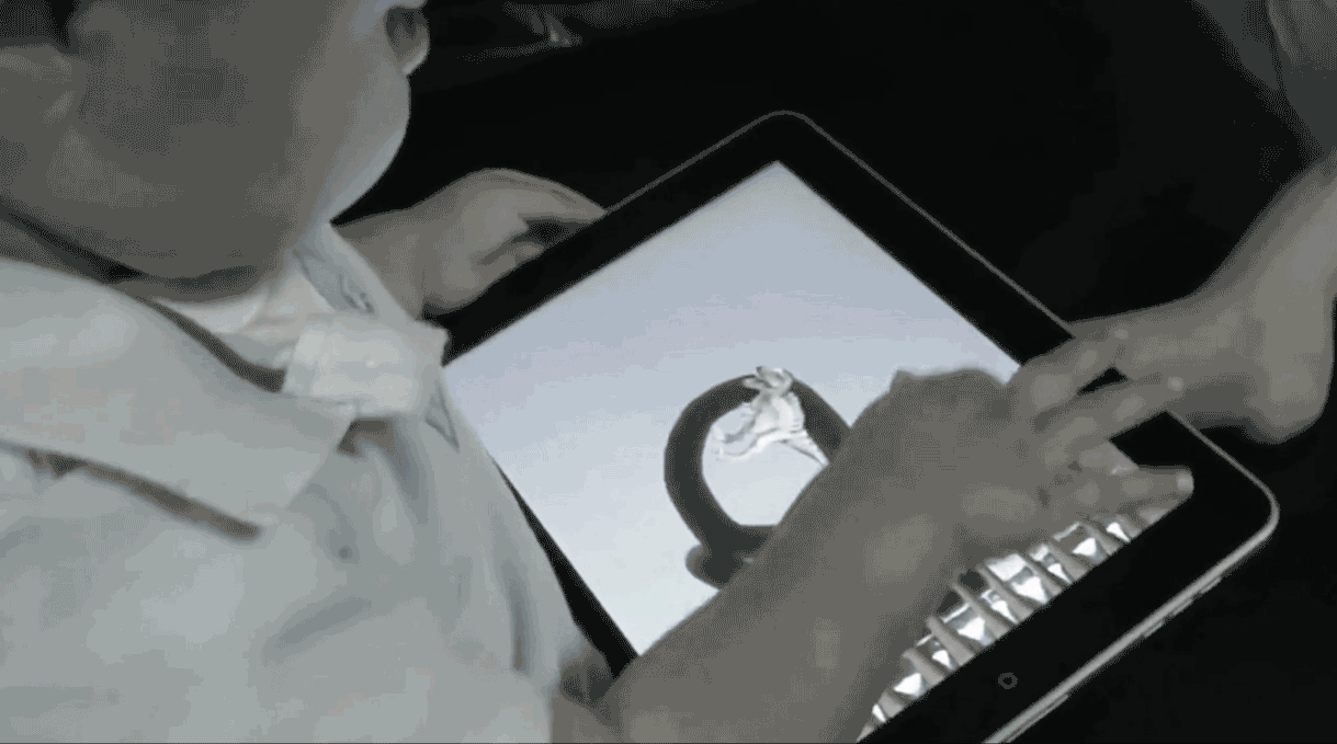
Google’s Project Soli

The Age Of Tools

We used primitive objects and symbols to communicate.

Humans began communicating with symbolic representations carved into any surface. Hieroglyphics were one of the initial ways that humans started communicating, and it was highly symbolic. This symbolism would later develop into art, writing, documentation and story-telling. We can even argue that we have come full circle and are using the symbols on our keyboards to communicate subtleties in communication beyond words, even if they are silly.

The tools that we used to communicate became more and more sophisticated, resulting in things still widely used such as pens.

Emoji

The evolution of communication

The Age Of Machines

When hardware was the interface.

The industrial revolution placed emphasis on productivity. Welcome to the age of the machine, where we built objects at scale to make our lives simpler.

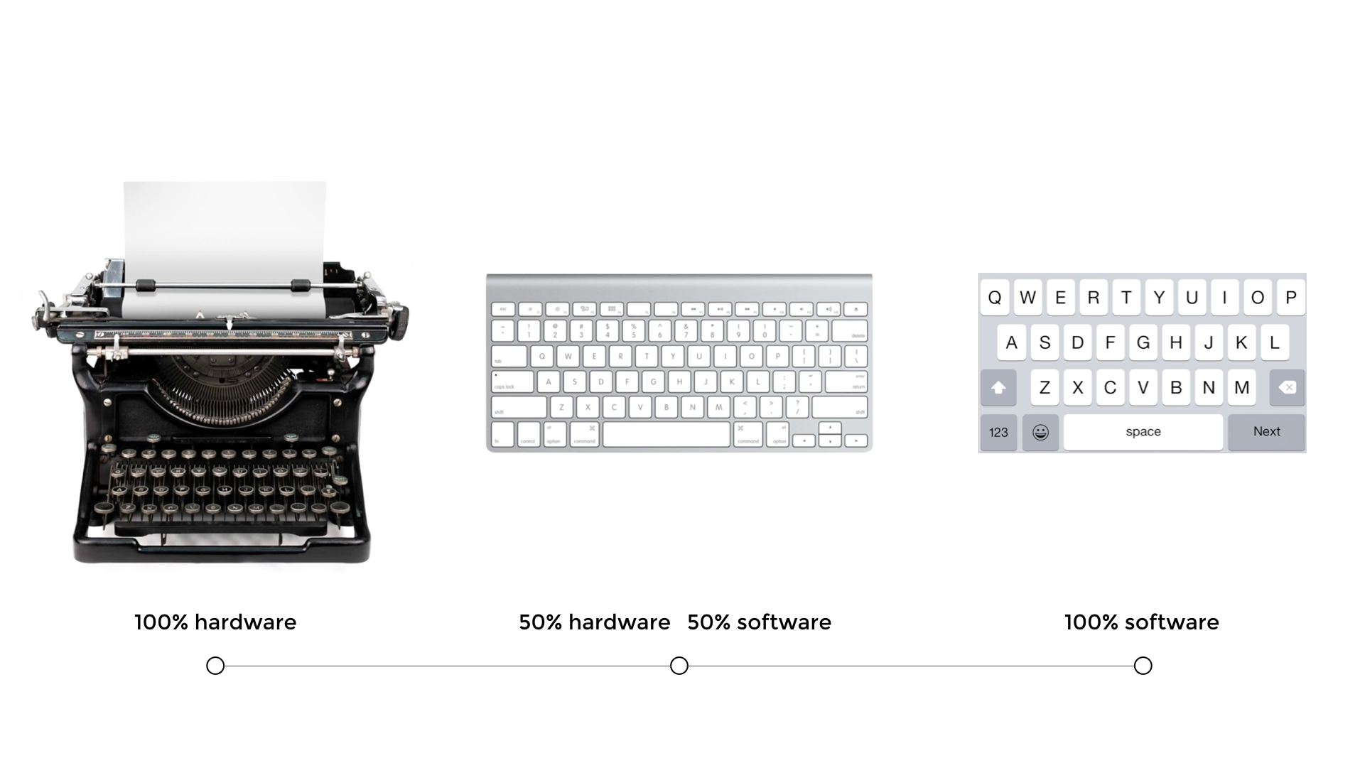
The typewriter was invented in 1868 by Christopher Latham Sholes. We begun tapping physical keys to make words, still using our fingers, instead of a pen. It helped create a consistent and effective format that could be easily adopted as well as save us time.

The drawback, however, was that we needed to learn how to type. We were mass producing machines and the power shifted to the rise of the machine. Despite designing hardware as the interface, we still had to learn how to use them.

The Age of Software

Learned skills from using hardware become metaphors to teach us how to use software.

When software needed an interface, designers looked to existing hardware and behaviour to make it easy for us to learn how to use it. For example, we looked back to the typewriter to learn how to type on a screen. The typewriter was used to inspire the keyboard to make it easier for us to know what to do. We had already learned to type, so the natural progression was to begin interacting with screens.

We see this same transition with our smartphone keypads looking like mini versions of the very same keyboards and typewriters. Adorable and useful. As we began to touch, we began to define a completely new way of interacting with our environment.

Hardware to software

Skeuomorphism is another example of making the two dimensional screen look like a three dimensional world to help users understand how they should interact with the interface. Designers created interfaces that were already familiar by depicting things like controls of a radio or mixer in audio interfaces. Apple famously led this trend under the direction of Steve Jobs. It wasn’t until Jonathan Ive became more powerful at Apple that skeuomorphic design slowly evolved into flat design, punctuated by the release of iOS7 in 2013. We were ready to make the leap to less literal cues and could now appreciate the simplicity of a reduced interface. The current iOS Human Interface Guidelines actively encourage the shift from “Bezels, gradients, and drop shadows sometimes lead to heavier UI elements” with a “focus on the content to let the UI play a supporting role.”

Material design also shifts towards different representation of the third dimension by giving the entire canvas depth, as opposed the the individual UI elements as represented in skeuomorphism. Material design depicts the “surfaces and edges of the material provide visual cues that are grounded in reality. The use of familiar tactile attributes helps users quickly understand affordances. The fundamentals of light, surface, and movement are key to conveying how objects move, interact, and exist in space and in relation to each other.”

Touch is human-centric

On why touch worked

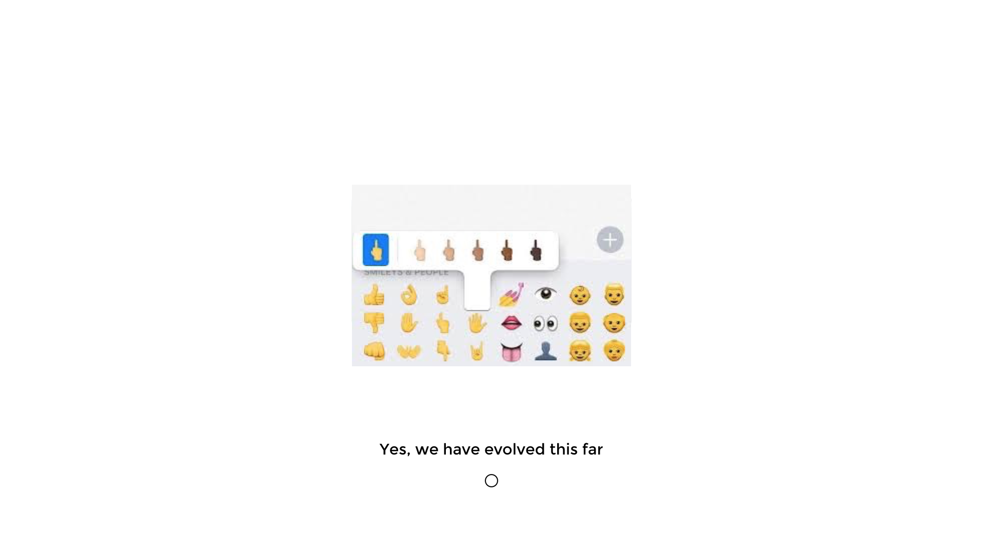
With the rise of the smartphone, we taught ourselves all kinds of funny gestures for the novelty and to be able to use it?—?and?—?of course because it was really cool to be able to all kinds of fun and even secret stuff with our hands. We learned the difference between a pinch and a tap and a long tap and invented more gestures than we can keep up with.

We started expanding and contracting as a way of zooming in and out. This behaviour became so natural that I have witnessed grown men try and zoom in on physical maps.

Touch works because it is intuitive. You see babies working tablet devices faster than their grandparents these days, simply because we are born to explore things with our fingers. It’s innate and reminds us of back where we started during the beginning of communication.

touch

Touch is innate

Touch came with a price

And the user experience often suffered

We wanted to touch everything in sight and along the way, we made up some pretty obscure gestures and made it nearly impossible to find things.

That’s because we hid stuff.

We hid a lot of the main user interface features. A major part of the problem was competition between Android and iOS, where initially iOS lead the way and significantly reduced their Human Interaction Guidelines. The simplicity looked beautiful, but we were just hiding the ugly or complicated stuff for later and often made interfaces more difficult to use. Android emulated a lot of the worst things Apple implemented and it really wasn’t really until Material Design was introduced that there were even consistencies in Android design at all. The myriad of device sizes didn’t exactly help either.

We also forgot about consistency.

A swipe on iOS can mean to read an email, delete an email, archive an email, or playfully connecting with my next Tinder match, depending on the app and the context. As designers, we cling to extensive onboarding sequences just to show users what to do.

Touch only works on big screens

Now we have new devices and they have such small screens that touch becomes difficult. Designers of these devices re-introduce hardware centric features humans struggle with.
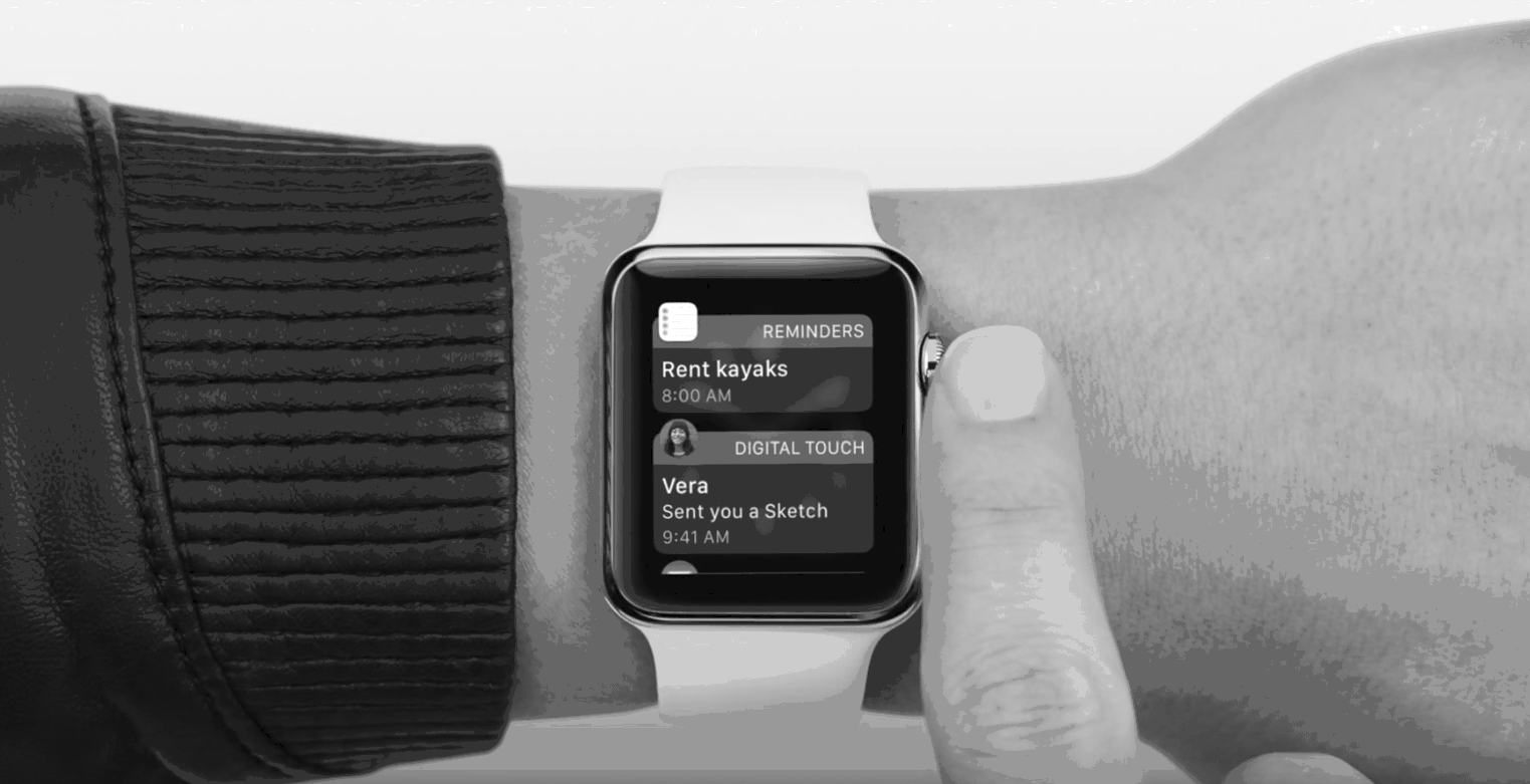
Apple watch

Apple watch

Even if your fingers are finer and more dextrous than mine, I still smile at the thought of poking around on our wrists.

You cannot navigate such a complex things as the internet from a hardware centric feature such as the Digital Crown. It is a real-world spin-off from known watch adjusting behaviour, but it is time consuming as well as fiddly.

The age of the self

The world is our interface

Now that the time has come, how do we design experiences and products in a world where any environment is interactive?

The next iteration partly illustrates us coming full-circle, with the Apple Pencil being a piece of technology, both hard- and software which is helping us write again, similar to where we once started: a simple tool and a surface.

It just so happens that this simple tool is a not so simple Apple Pencil and the surface happens to be a pretty advanced iPad Pro. Specifications aside, what is exciting here is that we are now getting to a point that technology is so advanced that we can “unlearn” how to use it.

The Apple Pencil is human centric because it takes 2 things that we are already familiar with: an actual pencil and an iPad, meaning that we don’t need to learn anything in order to be able to use it (unless we need a reminder of how to write with a pencil again).

How can we design products to facilitate innate behaviours, rather than design products that force us to learn new skills? How can we become more human centric in our design philosophy?

Moving beyond touch

Not only did small screens instigate designers and technologists to explore others ways of interacting with technology, new use cases and contexts inspired us to start thinking of different ways that we could use technology.

Voice commands, for example, work great while driving or cooking, but may cause a couple of stares while asking Siri where the nearest erotic massage parlour is on the train commute home.

Voice is a way that we can interact with technology around us. It can be both passive and interactive. The great thing about voice is obviously that we don’t need any hands for that?—?however there are limitations such as context which mean that it is not always going to be the most intuitive.Voice recognition has also not really been good enough to be trusted until very recently, but now we are at a time that voice recognition is eerily good.
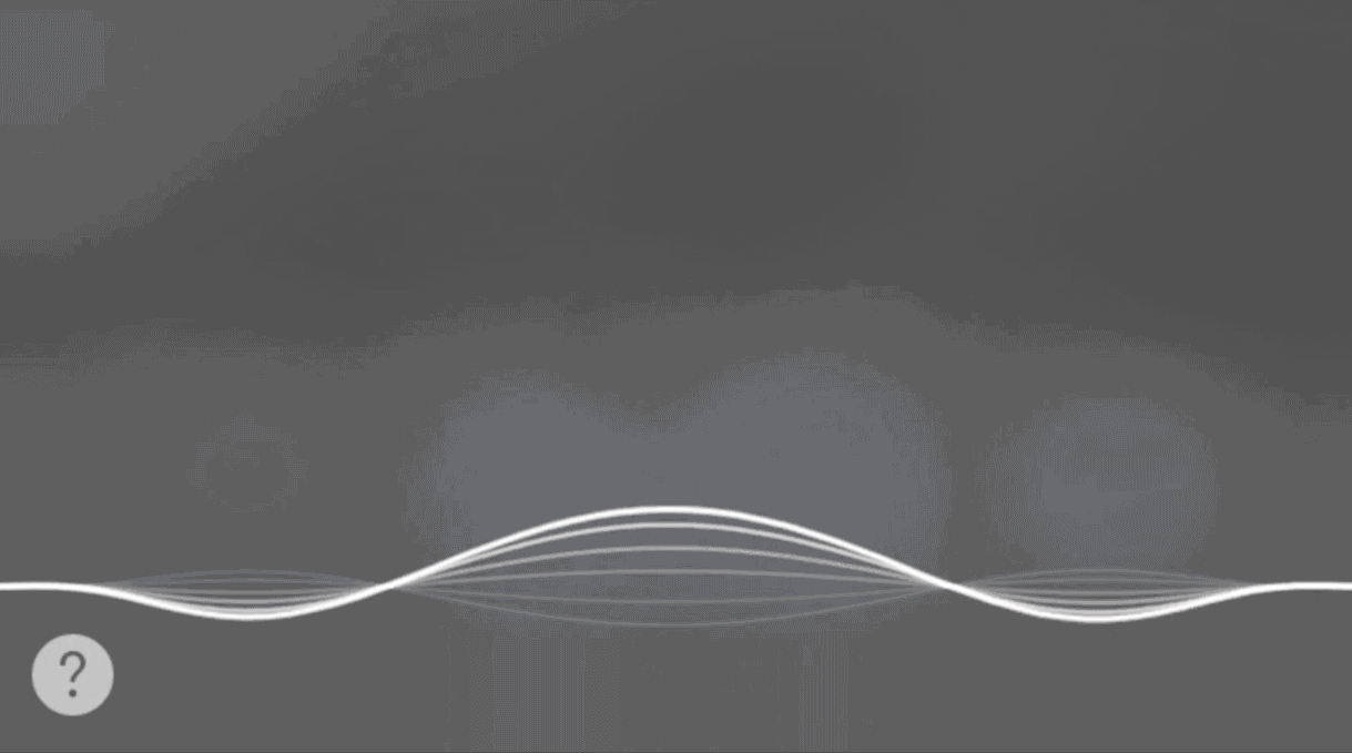
Siri

Siri

Virtual reality (VR) was thrust into the mainstream with a lot of hype, supported by the purchase of Oculus Rift by Facebook in 2014. Shortly after, Google presented Google Cardboard at I/O in 2014, a low cost VR solution, a little lighter on the wallet than the $2 billion tag of Oculus, and there are more low-cost alternatives coming. Virtual reality places the user in a computer simulated three dimensional world, allowing us feel immersed in the experience and move way beyond our fingers, hands and voice. Despite allowing us to use our entire body, virtual reality is constrained by the elaborate head gear.

Influential tech figures, such as Kevin Rose, boldly announced that “Virtual Reality will turn out to be a dud,” elaborating that “consumers will always take the path of least resistance,” a similar argument can be made in terms of usability. I must agree that the novelty factor is great, but anything so interactive needs to feel intuitive. Wearing a huge mask, sometimes tethered to your desktop computer, may well not be that intuitive. We are already one step closer to removing the computer tethering on some platforms, thanks to Gameface Labs, yet still hiding behind the VR mask.

Like touching. But without touching

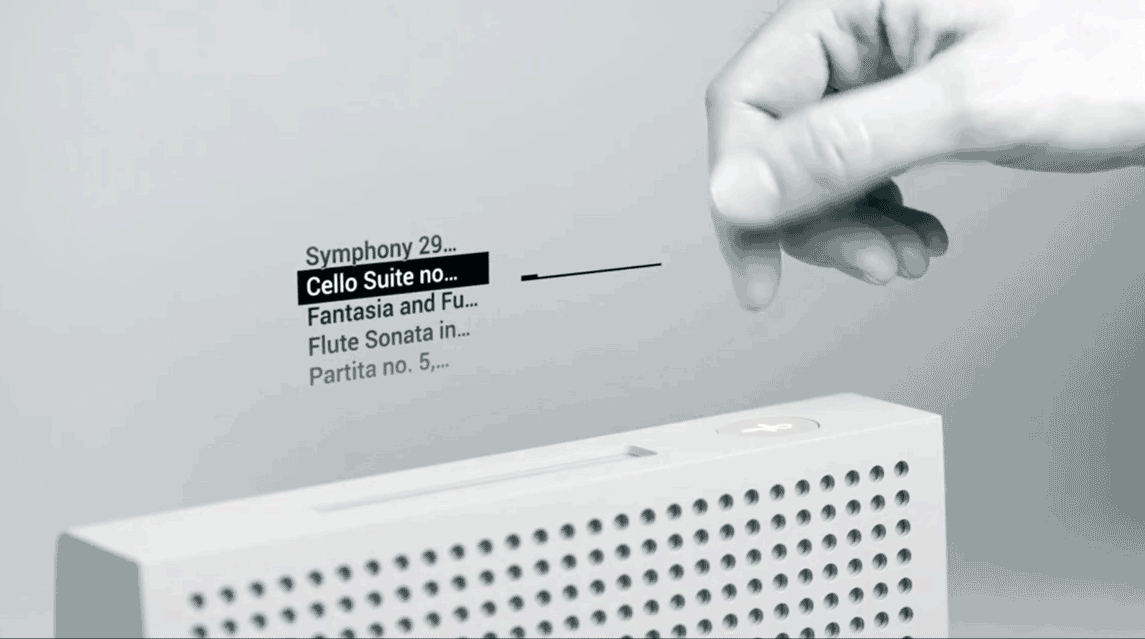
Project Soli is a tiny radar that can turn basically any piece of hardware into an interactive device, controlled by delicate gestures. It’s from the Advanced Technologies and Projects (ATAP Lab) at Google and has helps make the world our interface.

Now that Project Soli is open for a select group of developers to work on, the future of interaction design is limited only by our range of gestures. Project Tango is creating devices that we already use to help navigate the physical world. It combines motion tracking, depth perception and area learning to help spatially process information. Because Project Tango is completely open source, the opportunity to innovate is pretty real. There are already some unique consumer products built, including Left Field Labs’ Soundfield and Space Sketchr. Lenovo will be releasing a Lenovo Tango device, the new beginning of using our smartphones to map our worlds in three dimensional space. With a whole lot of new technology and use cases, our job as designers is to make the experiences feel truly human. My ask is that we leverage existing human behaviours and use technology as a facilitator.

Read More at Design Beyond The Screen

Categories: Designing, Others Tags:

Adaptive Web Design Explained

June 9th, 2016 No comments
Screen Shot 2016-06-01 at 4.21.45 PM
Responsive and Adaptive Web Design are two different approaches to Website Design that try to accomplish similar goals: Mobile websites with a Great User Experience.

Adaptive Web Design is another term for progressive enhancement of a web site.

Adaptive Web Design also encompasses a range of other strategies which can be combined with responsive web design.
The term was first coined by Aaron Gustafson in his book “Adaptive Web Design: Crafting Rich Experiences with Progressive Enhancement” in May 2011.

Checkout More Graphic Design Videos: http://goo.gl/1yqkNK

Read More at Adaptive Web Design Explained

Categories: Designing, Others Tags:

How To Use Airtable as a Front End Developer

June 9th, 2016 No comments

I came across Airtable at a recent hackathon-esque event, when a fellow developer suggested we use it as a way to store and use our data. I was super into it. For the first time, I felt like: “This is a database for me. This is what I want out of a data storage system.”

In a nutshell…

Airtable lets you build spreadsheets. Each spreadsheet is a database.

Imagine building “Project Progress Tracker”. You’d want to store things like the name of the project, whether it’s complete or not, the category of project, and some photos.

Those would be four columns in the spreadsheet: name (string), complete (checkbox/boolean), category (multi-select), photos (files).

Then each row in the spreadsheet is an entry in the database.

You can now not only view this data in Airtable’s nice UI, but programmatically access it. You get great JSON API’s for all the CRUD actions: Create, Read, Update, Delete.

Let’s Build Something: A Poll!

We’re front end developers, so let’s build something functional. A poll is a basic example of something we can design and build, and needs a database to be useful. Airtable can help!

How about a form where you vote for a favorite emoji:

<form action="#0" id="voting-form" class="voting-form">
  <h1>Which of these emojis is your favorite?</h1>
  <div>
    <select name="emoji_choice" id="emoji_choice">
      <option value="👯">👯</option>
      <option value="🍑">🍑</option>
      <option value="💥">💥</option>
      <option value="🍕">🍕</option>
      <option value="☠️">☠️</option>
    </select>
  </div>
  <div>
    <input type="submit" value="Vote">
  </div>
</form>

Send the Votes to Airtable for Storage

When the user submits our form, let’s create a new entry in our database (Airtable spreadsheet). Let’s POST the data, directly through JavaScript, via Ajax. We’ll use Axios here, since it’s a nice dependancy-free Ajax library.

var form = document.querySelector("#voting-form");
var select = document.querySelector("#emoji_choice");

// When the form is submitted...
form.addEventListener("submit", function(event) {
  event.preventDefault();

  // POST the data
  axios.post(airtable_write_endpoint, {
    "fields": {
      "Emoji Choice": select.options[select.selectedIndex].value
    }
  });

});

Get the Results from Airtable

Now we want to display the results of the poll as a chart. SVG is great for that. Let’s use the D3.js library to help us programatically create the chart. We could even just have it build some

s for this, since the chart is some straightforward rectangles, but using D3 opens up the door for future fanciness.

Let’s create a function we can call to get the data and build the chart:

function getData() {
  // zero out data
  pollData = {
    "👯": 0,
    "🍑": 0,
    "💥": 0, 
    "🍕": 0, 
    "☠️": 0
  };
  
  // GET the data
  axios
    .get(airtable_read_endpoint)
    .then(function(result) {
      result.data.records.forEach(function(element, index) {
        pollData[element.fields["Emoji Choice"]]++;
      }); 
}

Build the Chart with the Data

We can pass D3.js an array of data and it can build out a chart:

function buildChart(data) {  
  var x = d3.scale.linear()
    .domain([0, d3.max(data)])
    .range([0, 400]);
  
  d3
    .select(".chart")
    .selectAll("div")
    .data(data)
    .enter()
    .append("div")
    .style("width", function(d) { 
      return x(d) + "px"; 
    })
    .text(function(d, i) {
      return emojis[i] + " " + d; 
    });
}

With a little CSS colorization:

.chart {
  padding: 20px;
}
.chart div {
  font-size: 20px;
  text-align: right;
  padding: 5px;
  margin: 0 0 3px 0;
  color: white;
}
.chart div:nth-of-type(1) {
  background-color: #FDBE1A;
}
.chart div:nth-of-type(2) {
  background-color: #F2B6A0;
}
.chart div:nth-of-type(3) {
  background-color: #FFD85A;
}
.chart div:nth-of-type(4) {
  background-color: #830C07;
}
.chart div:nth-of-type(5) {
  background-color: #999999;
}

We get results!

Live Demo

In this live demo, we string the functions we wrote above together into working together:

See the Pen Airtable Emoji Poll by Chris Coyier (@chriscoyier) on CodePen.

Things To Know About the API

Key Secrecy

The demo above is entirely front end! I love that, but you should know, that exposes the API key for this database. You wouldn’t want that for anything public of consequence, but for an internal thing it might be fine.

To keep your key secret, you’d make the API calls from the backend. This kind of thing is usually referred to as an “API proxy” or “API wrapper”. You’d write some simple code where you Ajax to that and it makes the requests to the API.

As luck would have it, Airtable has an example API proxy (in Ruby) available for you to check out. Here’s another example in PHP you could look at.

The Docs are Awesome

They show the API docs as they relate to your databases! So the example URL’s and parameters are the real ones that you use.

We maybe could have made demo more efficient by trying out the filterByFormula API parameter and telling it to return us all records that match a certain emoji and checking the count, rather than counting ourselves.

5 Requests per Second

Airtable isn’t really for mega production high power data storage. I’m sure that’s no surprise. Airtable is for you and your team moreso than a data store for your startup.

Airtable Also Gives You Forms

In our demo we created our own form. That’s useful when you need to do totally custom things, but we didn’t have to. Airtable allows you to create different “views” of your data spreadsheets, including a “form” view.

You can customize the form to your liking and send people links to it, or, embed the form right on your own site. Yeah! A form builder ideal for collecting structured data!

If what you’re building is fairly date-specific, you can also build calendar views to view and interact with data that way.

Build Away

What comes to mind for you when you think about the potential of easy and friendly data storage and a tool like Airtable?


How To Use Airtable as a Front End Developer is a post from CSS-Tricks

Categories: Designing, Others Tags:

Find A Friend, Boost Your Creativity, And Make Your Digital Dream Come True

June 9th, 2016 No comments

Are you passionate about something? Do you have a secret project? Not something that will change the world (though who knows?), but will definitely change you? Do you have a friend who complements your skills? Has anyone recently asked you for help with their project? Do you just have a digital dream, or is there also a plan to make it come true?

Find A Friend, Boost Your Creativity, And Make Your Digital Dream Come True

Every professional has something in common. It’s called the comfort zone. The first sign you’re in it is when you see no challenge on the horizon. You know pretty much everything you need to perform well, and if anything unfamiliar comes your way it can be solved fairly quickly. It can take a while to realize you’ve stopped moving, and working on freelance projects seems like the only way to keep your brain busy.

The post Find A Friend, Boost Your Creativity, And Make Your Digital Dream Come True appeared first on Smashing Magazine.

Categories: Others Tags:

Review: LG UltraWide monitors

June 9th, 2016 No comments

It doesn’t really matter how big your monitor is, it’s not big enough; you could always use a few extra pixels for those occasional-use panels, or perhaps to run a couple of browsers side-by-side.

Traditionally designers who needed a bit more space would hook up a pair of monitors, but not only did that result in an ugly ‘seam’ down the middle of your viewport, and endless color calibration issues, it also left you with terrible posture as you twisted between screens.

A superior option is the LG 34UM88 monitor, or its sibling, the LG 34UC98 curved monitor. The gorgeous 34UM88 is a huge 34? screen, with a 21:9 aspect ratio. Both screens have a resolution of 3440 x 1440.

Where the 34UM88 really does excel is its color; if you do a lot of artworking, this monitor will make your life a lot easier. The 34UM88 has a 1000:1 static contrast ratio delivering a 99% sRGB color gamut; we can see print designers raving about it.

There are onscreen controls if you want to tweak anything, but it’s really only required for the kind of calibration you perform once, and then forget. Besides which, we found the defaults to be fairly usable.

The image quality on the screen is excellent; it uses WLED backlight technology to ensure a stable image. The refresh rate is 60hz, which is adequate for video, and for most gaming—at least as good as the MacBook Pro we hooked the screen up to. There’s also support for AMD FreeSync, which will give you a 55Hz–75Hz variable refresh rate; if you do most of your work with static images, this won’t impact you at all.

One of the best features, often overlooked by other screens, is the 178 degree viewing angle which means the whole team can gather around your monitor without having to crane their necks to see. There’s also the added benefit of the anti-glare coating, so you won’t have to draw the blinds every time you want to discuss work.

Where the 34UM88 really excels is in delivering the screen real estate you need to run multiple applications. It’s great for comparing CSS rendering in browsers, for example. Running multiple CS applications side-by-side is also great.

The 34UM88 comes with tons of ports and connections—HDMI x 2 (v2.0), Display Port x 1 (1.2a with Adaptive-Sync), Thunderbolt 2.0 x 2, USB 3 x 1, USB Up 3.0 x 1, and USB 3.0 Quick Charge x 1—but despite this, it’s really simple to setup. We just connected it to a MacBook Pro using a Thunderbolt cable and it started working. There is an option to connect multiple devices simultaneously, for which we have yet to discern a use. There’s also a couple of 7W Maxx audio speaks and a headphone jack.

For those that like to save desk space, the 34UM88 can be wall mounted but the height, and tilt, adjustable stand that ships with the monitor is fairly minimal.

The 34UM88’s marginally more expensive sibling is the 34UC98, which boasts a distinctive curve. Curved screens aren’t everyone’s idea of a good experience, but if you haven’t tried one, the 34UC98 may be the one to experiment with. While both monitors are lacking in some areas, the 34UC98’s curved screen delivers an experience immersive enough to make up for its deficiencies.

The LG 34UC98 doesn’t feel distorted at all. In fact, the curved screen corrects perspective distortion, meaning that the edges of the viewport are truer to life than a flat screen.

If you’re a designer working with a lot of windows and panels, then both the LG 34UM88 and the LG 34UC98 offer a great working experience. The rich color on display is stunning. And, if you can afford to part with a little more money, the 34UC98 offers an immersive experience that really needs to be experienced to be appreciated.

[– This is an advertisement on behalf of LG –]

LAST DAY: Polish-Inspired Kapra Font Family with 8 Variants – only $7!

Source

Categories: Designing, Others Tags:

Top 10 Free WordPress Themes for WooCommerce

June 9th, 2016 No comments

How much were you prepared to splurge on your online storefront’s look and aesthetic appeal? 60, 80, maybe 100 USD? What if you could get a great look for your WordPress and WooCommerce powered store for the low, low cost of nothing? That’s true, and that’s possible thanks to the brilliant and amazing theme developers

Categories: Designing, Others Tags:

Mastering Skills: 30 Best Illustrator Tutorials of 2016

June 9th, 2016 No comments
how-to floral pattern

Recently, we have compiled a list of 30 of the best tutorials for Photoshop that were aimed to help practice your skills and extend your knowledge. Today is the turn of Illustrator, the most popular software for crafting vector artworks and designs. Traditionally, this advanced graphics program has a vector-related environment that most digital artists find comfortable. It is applicable for projects that need to be scaled to any degree without losing quality and sharpness. Prints, posters, illustrations, cartoons are preferably done here. It is also pretty flexible on different issues due to providing tools that give full control over objects.

Our list comprises how-tos both for newbies and creative folks with intermediate level. Some tutorials can be challenging and hard at first sight; however it does not mean that you can’t reap benefits from them. You can easily repeat all the steps paying meticulous attention to details, and as a result, end up with a rather satisfactory outcome, to say nothing about obtaining insights of some interesting techniques.

30 Best Illustrator Tutorials of 2016

Create a Low-poly Portrait

Creator: Breno Bitencourt

How to Design a Colorful Hungarian Folk Art Pattern in Adobe Illustrator

how-to floral pattern
Creator: Janie Kliever

Amazing Texture Techniques for Vector Artwork

forest scene
Creator: Jeffrey Bowman

Create 3D Effects in Illustrator

vector 3d effects
Creator: Karan Singh

Create Stylish Vector Portraits From a Photo

pop art portrait
Creator: Eelco van den Berg

Design Retro Isometric Artwork

retro isometric scene
Creator: Mark Oliver

How to Design a Vintage Travel Poster in Adobe Illustrator and Photoshop

ireland-inspired scene
Creator: Janie Kliever

Create a Lighthouse in Adobe Illustrator

lighthouse illustration
Creator: Veerle Pieters

Create a Cityscape in Adobe Illustrator

cityscape illustration
Creator: Veerle Pieters

7 Steps to Create a Geometric Poster Vector Design

geometric poster
Creator: Mary Winkler

Create A Mouthwatering Chocolate Covered Strawberry – Adobe Illustrator Tutorial

strawberry vector
Creator: vectips

Create a Bright and Fun Plastic Text Effect with Graphic Styles

plastic text effect
Creator: Mary Winkler

How To Create a Decorative Drop Cap in Adobe Illustrator

decorative drop cap
Creator: Chris Spooner

3D Text Effect

3d text effect
Creator: Andrei Marius

Round Flat Pub Icon

building-icon
Creator: Andrei Marius

How to Use Vector Graphics to Create a Repeating Pattern in Illustrator

a repeating pattern
Creator: Go Media Inc.

Print Poster Tutorial – Bringing Doodles and Sketches into Your Illustrator Workflow

doodles into illustrator
Creator: Ben Fellowes

How to Create Watercolor Brushes in AI

watercolor brushes
Creator: Heather Sakai

How to Create a Greyscale Monochrome Vector Portrait in Adobe Illustrator

greyscale portrait
Creator: Sharon Milne

How to Create Animals Icons in Adobe Illustrator

line style icons
Creator: Marta Berzina

How to Create a Sea Sunset Painting in Pointillism Style with Stipplism in Illustrator

paint scene
Creator: Iaroslav

Create a Dynamic Futuristic User HUD Interface with VectorScribe in Adobe Illustrator

hud interface
Creator: Iaroslav Lazunov

How to Create a Destroyed Text Effect with Stipplism

rock graphics
Creator: Iaroslav

Create a Graffiti Logo on a Brick Wall with Texture in Illustrator

graffiti logo
Creator: Iaroslav Lazunov

How to Create a Vintage Love Envelope in Illustrator

vintage envelope
Creator: Kim Chen

How to Draw a Pack of Six Sports Icons in Illustrator

six icons
Creator: Bao Nguyen

How to Create a Vector Map Infographic in Adobe Illustrator

vector map
Creator: Andrei Marius

How To Create a Colorful Vector Landscape Illustration

wild west illustration
Creator: Chris Spooner

How to Create a Simple Shape Fruit Vector Design

fruity pattern
Creator: Mary Winkler

How to Create Delicious Cupcake Icons in Adobe Illustrator

yummy icons
Creator: Diana Toma

(dpe)

Categories: Others Tags:

Freebie: Soccer Icon Set (13 Icons AI, EPS, SVG, PNG)

June 9th, 2016 No comments

Some folks love it, some hate it. Today’s icon set, designed by Manuela Langella, is dedicated to both lovers and haters of… football! That’s right, the 2016 UEFA European Championship starts tomorrow. Clink! Clink! Let the games begin!

Freebie: Foosball Icon Set (13 Icons AI, EPS, SVG, PNG)

You may modify the size, color or shape of the icons. No attribution is required, though reselling bundles or individual pictograms isn’t cool. Please note that this icon set is available under a Creative Commons Attribution 3.0 Unported license. We’d kindly like to ask you to provide credits to the creator and link to this article if you would like to spread the word about the freebie.

The post Freebie: Soccer Icon Set (13 Icons AI, EPS, SVG, PNG) appeared first on Smashing Magazine.

Categories: Others Tags:

Freebie: Foosball Icon Set (13 Icons AI, EPS, SVG, PNG)

June 9th, 2016 No comments

Some folks love it, some hate it. Today’s icon set, designed by Manuela Langella, is dedicated to both lovers and haters of… football! That’s right, The 2016 UEFA European Championship starts tomorrow. Here’s the schedule so you don’t miss a match, or know when not to disturb those who’re planning to watch. Clink! Clink! Let the games begin!

Freebie: Foosball Icon Set (13 Icons AI, EPS, SVG, PNG)

You may modify the size, color or shape of the icons. No attribution is required, though reselling bundles or individual pictograms isn’t cool. Please note that this icon set is available under a Creative Commons Attribution 3.0 Unported license. We’d kindly like to ask you to provide credits to the creator and link to this article if you would like to spread the word about the freebie.

The post Freebie: Foosball Icon Set (13 Icons AI, EPS, SVG, PNG) appeared first on Smashing Magazine.

Categories: Others Tags:

Draw a Vector Pencil Icon in Illustrator

June 8th, 2016 No comments
Dansky_Learn How to Draw a Vector Pencil in Adobe Illustrator

In this tutorial, we’re going to learn how to draw a vector pencil icon in Adobe Illustrator.

The Steps (1-16)

1. Create a new document.

2. Select the Pen Tool, and choose no fill, and select black as your stroke colour.

3. Left-click anywhere on your artboard and hold Shift to draw a straight vertical line. Give this line a stroke width in the Stroke Palette.

draw-pencil-icon-1

4. With the line selected, hold Alt and Shift and drag to the right to create a copy.

5. Repeat Step 4 to create a third copy of this line, and ensure all three lines are spaced an equal distance apart.

6. Using the Pen Tool, draw horizontal lines across the top of your three vertical lines.

draw-pencil-icon-2

7. Again, using the Pen Tool, Left-click on the bottom anchor point on your first vertical line, and position your second click directly underneath the middle line, and drag out to create a curve.

8. Using the Direct Selection Tool, drag the middle line downwards, so that it meets the end anchor point on your curved line.

9. Repeat Step 7 on the right hand side, with a symmetrical curve that matches the first curve that we created.

draw-pencil-icon-3

10. Select all lines created so far, and in the Stroke Palette, select Round as the corner type.

11. Using the Pen Tool, again Left-click on the bottom anchor point of the first line that we created, and position your second anchor point further downwards, but again beneath the middle line. This will form the tip of our pencil.

12. Repeat Step 11 on the opposite side to complete the tip of the pencil.

draw-pencil-icon-4

13. Following the above steps, you should now have something similar to a triangle shape for the tip of your pencil at the bottom. Using the Pen Tool, Left-click and hold Shift to draw a horizontal line through the middle of this shape. This will create the separation between the wood of the pencil, and the pencil lead.

14. Drag over all your lines to select, and go to Object > Expand, and leave Fill and Stroke selected, and click OK.

15. In the Pathfinder Palette on the right, select Unite to combine all of these lines/shapes into one complete shape.

16. With your pencil icon selected, click the Live Paint Tool in the Toolbar on the left, and select colours to add to your pencil. Using the Live Paint Tool allows you to click in the white spaces between your lines and effectively quickly colour-in your pencil.

draw-pencil-icon-5

Download Adobe Illustrator.

Read More at Draw a Vector Pencil Icon in Illustrator

Categories: Designing, Others Tags: