Archive

Archive for June, 2016

Finding Colors: 5 Tools for Great Color Concepts

June 2nd, 2016 No comments
Finding Colors: 5 Tools for Great Color Concepts

Colors play a significant role when it comes to design. However, not everyone can create coherent, suitable color concepts. Thus, there’s a bunch of web applications that help you find appropriate color combinations. Monochromatic colors can be compiled just as well as complementary colors. Partially, the tools are different from the outset.

Adobe Color CC

Adobe Color CC certainly is the most popular color tool. Everyone can use it for free, without login via Adobe ID. Once started, you need to choose a color rule. Here, you decide whether to use monochromatic or complementary colors. In total, there are seven rules to combine the colors according to different principles.

Depending on the color rule, different movable dots appear on a color circle. These dots can only be moved in dependency of each other. For a triad, for example, the dots are aligned in a way that the angle between the dots always stays the same. For complementary colors, the dots are always opposite to each other.

Each color can also be defined using a slider, or by entering RGB or hexadecimal values. Then, the other colors are adjusted in accordance with the color rule. As a signed-up user, you can save color themes, giving you permanent access to any combination once defined.

Paletton

Finding Colors: 5 Tools for Great Color Concepts

The web application Paletton works in a very similar fashion. Here you choose a rule first as well. Aside from monochromatic colors, you get to make a choice between adjacent colors and a triad – determine three basic colors each in both cases -, as well as a tetrade, where you define four basic colors.

When using Paletton, the color circle is divided into two parts. The outer ring is used to define the basic colors, and the center is used to set the color’s brightness as well as the contrast between the secondary and the primary colors. The result is a color concept with the basic colors, as well as the respectively fitting, additional secondary colors.

A custom URL is created for each color theme, to make your compiled colors accessible, and editable at all times.

Colorcode

Finding Colors: 5 Tools for Great Color Concepts

If you prefer working without a color circle, you should take a look at Colorcode. This service allows you to combine as many colors as you want, by moving the mouse within a field. Depending on the movement, the color value varies. Once you find a color you like, save it with a click. This way, you can compile all colors for your concept.

Here, you are also able to compile monochromatic colors or complementary colors. To do so, one basic color is defined each. All other colors, with the amount being unlimited, are determined depending on the chosen color rule.

You can comfortably download the color concept for Sass or Less as a PNG file.

Coolors

Finding Colors: 5 Tools for Great Color Concepts

Coolors works without a color circle as well. Instead, colors are set via sliders. Five colors that you can adjust individually are displayed. Subsequently, you can alter the hue, saturation, brightness, and the temperature of all five colors.

On top of that, there’s also the option to protect individual colors from being changed. Then, these will remain the same while changing the saturation of the other colors, for example.

While the other tools suggest entire color themes, you have to define your own colors when using Coolors. However, it is very easy to change them and have the theme be displayed brighter or darker overall.

Export your color theme as an SVG, PNG, PDF, or SCSS file. It is also possible to save it as a URL.

Multicolr Search Lab

Finding Colors: 5 Tools for Great Color Concepts

Multicolr Search Lab pursues an entirely different approach. Here, you define up to five colors, and the tool searches images that fit the specified colors from over 20 million creative commons images.

The tool is an addition to the other applications. This way, you will always find images fitting your color theme, which you can use for a page background, for instance.

(dpe)

Categories: Others Tags:

Web Hosting 101: What You Need To Know

June 1st, 2016 No comments

The Internet has been a revolutionary instrument for businesses, whether big or small. Sure, traditional ways of advertising your products and services like printing leaflets and banners can be beneficial. However, in today’s highly industrialized and competitive world, having your own website has been a crucial part of customer engagement and brand promotion. For a

Categories: Designing, Others Tags:

Create a Gold Effect in Adobe Illustrator

June 1st, 2016 No comments
Screen Shot 2016-05-31 at 9.52.49 AM

In this tutorial, we’re going to learn how to create a gold effect in Adobe Illustrator.

The Steps (1-10)

1. Create a New Document.

2. Either Paste or Place an existing vector shape into Illustrator, or create a new shape using the shape tools.

3. Create four colour swatches using the RGB values in the image below.

create-gold-effect-1

4. Select your shape, and in the Gradient Palette on the right-hand side, Left-click anywhere on the Gradient Slider to create the default gradient – black to white.

5. Left-click and drag swatch #4 on to the far left side of the Gradient Slider, and then repeat this step, also dragging the swatch to the far right side.

6. Drag swatch #3 into the middle of the Gradient Slider and release the Left Mouse Button. This will create a highlight on the shape.

create-gold-effect-2

7. To remove a colour from the Gradient Slider, Left-click on the swatch and drag downwards until it disappears.

8. Select swatch #2 and drag this on to the Gradient Slider, and position slightly to the left of swatch #3. Repeat this step, dragging the same swatch slightly to the right of swatch #3.

create-gold-effect-3

9. Next, drag swatch #1 in between swatch #4 and swatch #2 on the left side of the Gradient Slider. Repeat this step on the right side too.

10. The Angle of the gradient can then also be adjusted in the Gradient Palette.

create-gold-effect-4

Download Adobe Illustrator.

Read More at Create a Gold Effect in Adobe Illustrator

Categories: Designing, Others Tags:

Battling BEM (Extended Edition): 10 Common Problems And How To Avoid Them

June 1st, 2016 No comments

Whether you’ve just discovered BEM or are an old hand (in web terms anyway!), you probably appreciate what a useful methodology it is. If you don’t know what BEM is, I suggest you read about it on the BEM website before continuing with this post, because I’ll be using terms that assume a basic understanding of this CSS methodology.

Battling BEM (Extended Edition): 10 Common Problems And How To Avoid Them

This article aims to be useful for people who are already BEM enthusiasts and wish to use it more effectively or people who are curious to learn more about it. Now, I’m under no illusion that this is a beautiful way to name things. It’s absolutely not. One of things that put me off of adopting it for such a long time was how eye-gougingly ugly the syntax is. The designer in me didn’t want my sexy markup cluttered with dirty double-underscores and foul double-hyphens.

The post Battling BEM (Extended Edition): 10 Common Problems And How To Avoid Them appeared first on Smashing Magazine.

Categories: Others Tags:

Creating a CSS Curtain Opening Effect

June 1st, 2016 No comments

If you’re as old as me, you might remember watching Let’s Make a Deal on the old television airwaves. The show is apparently still on these days in a new format, but the original always stuck out to me because of one simple thing: the reveal.

There’s something exciting about not knowing what is behind a set of curtains and that’s what Let’s Make a Deal was all about. Contestants had a choice of three doors, any of which opened to reveal a prize.

It was exciting!

That technique of curtains sliding open to reveal a treasure (even if it is a Bob’s Big Boy gift certificate) is a neat little tactic and one that we can use ourselves with a little bit of CSS. Here’s the final demo:

See the Pen OXJMmY by Geoff Graham (@geoffgraham) on CodePen.

The HTML

This basically boils down to three elements:

  • The curtain wrapper
  • Left curtain panel
  • Right curtain panel

We can visualize what we’re doing in a diagram:

…and when the curtain panels slide open, they will reveal a prize as the fourth element:

Let’s use that as the blueprint for our HTML.

<!-- The parent component -->
<div class="curtain">
	
  <!-- The component wrapper -->
  <div class="curtain__wrapper">
    
    <!-- The left curtain panel -->
    <div class="curtain__panel curtain__panel--left">

    </div> <!-- curtain__panel -->
    
    <!-- The prize behind the curtain panels -->
    <div class="curtain__prize">

    </div> <!-- curtain__prize -->
    
    <!-- The right curtain panel -->
    <div class="curtain__panel curtain__panel--right">
	    
    </div> <!-- curtain__panel -->
    
  </div> <!-- curtain__wrapper -->

</div> <!-- curtain -->

The CSS Layout

Now that we have our elements defined in the HTML, we can start positioning them with CSS.

Our first goal is to position the curtain panels so that they are not only side-by-side, but also in front of the prize itself.

.curtain {
  width: 100%; /* Ensures the component is the full screen width */
  height: 100vh; /* We're using this for demo purposes */
  overflow: hidden; /* Allows us to slide the panels outside the container without them showing */
}
  
.curtain__wrapper {
  width: 100%;
  height: 100%;
}
      
.curtain__panel {
  background: orange;
  width: 50%; /* Each panel takes up half the container */
  height: 100vh; /* Used for demo purposes */
  float: left; /* Makes sure panels are side-by-side */
  position: relative; /* Needed to define the z-index */
  z-index: 2; /* Places the panels in front of the prize */
}

.curtain__panel--left {
  /* Styles for sliding the left panel */
}

.curtain__panel--right {
  /* Styles for sliding the right panel */
}
  
.curtain__prize {
  background: #333;
  position: absolute; /* Forces the prize position into the container start */
  z-index: 1; /* Places the prize behind the panels, which are z-index 2 */
  width: 100%;
  height: 100%;
}

It might look like we’ve done next to nothing if we were to stop here and check our work. In fact, we’re just looking at an orange block.

See the Pen wWvJaO by Geoff Graham (@geoffgraham) on CodePen.

This is a good thing! We’re actually looking at two curtain panels taking up the entire curtain container with a panel for a prize lurking behind the scenes.

The Checkbox Hack

I’d be remiss to neglect the fact that we are going to be putting the checkbox hack into practice here. The checkbox hack, in case you’re unfamiliar, is a method where we can change the presentation of elements based on the known state of a simple form checkbox. We have an article on the method in case you want to dig deeper into how it works.

The first rule to using the checkbox hack is that we need a checkbox in our markup. Let’s add that into the HTML:

<!-- The parent component -->
<div class="curtain">
	
  <!-- The component wrapper -->
  <div class="curtain__wrapper">
    
    <!-- The checkbox hack! -->
    <input type="checkbox" checked>
    
    <!-- The left curtain panel -->
    <div class="curtain__panel curtain__panel--left">

    </div> <!-- curtain__panel -->
    
    <!-- The prize behind the curtain panels -->
    <div class="curtain__prize">

    </div> <!-- curtain__prize -->
    
    <!-- The right curtain panel -->
    <div class="curtain__panel curtain__panel--right">
	    
    </div> <!-- curtain__panel -->
    
  </div> <!-- curtain__wrapper -->

</div> <!-- curtain -->

First, let’s make sure our checkbox is both invisible and takes up the entire space of our curtain component. We want the entire curtain to be clickable and this will allow us to do just that.

input[type=checkbox] {
  position: absolute; /* Force the checkbox at the start of the container */
  cursor: pointer; /* Indicate the curtain is clickable */
  width: 100%; /* The checkbox is as wide as the component */
  height: 100%; /* The checkbox is as tall as the component */
  z-index: 100; /* Make sure the checkbox is on top of everything else */
  opacity: 0; /* Hide the checkbox */
}

Notice that the default state of the checkbox is checked in our HTML. This allows us to style our elements based on the :checked state.

/* When the checkbox is checked... */
        
/* Slide the first panel in */
input[type=checkbox]:checked ~ div.curtain__panel--left {
  transform: translateX(0);
}
        
/* Slide the second panel in */
input[type=checkbox]:checked ~ div.curtain__panel--right {
  transform: translateX(0);
}

This also means we can update our curtain panels so that they slide out of the container when the checkbox is unchecked.

/* Slide the panel to the left out of the container */
.curtain__panel--left {
  transform: translateX(-100%);
}

/* Slide the panel to the right out of the container */
.curtain__panel--right {
  transform: translateX(100%);
}

Now we’re onto something! Clicking the curtain component moves the panels off the screen and reveals the prize panel.

See the Pen xOxqOL by Geoff Graham (@geoffgraham) on CodePen.

Animating the change

Next up, we need to animate the transition of the panels once the state of the checkbox has been changed on click. Otherwise, as you may have noticed, the change looks less like a sliding door and more like the blink of an eye.

Let’s add a transition to the .curtain__panel class:

.curtain__panel {
  background: orange;
  width: 50%; /* Each panel takes up half the container */
  height: 100vh; /* Used for demo purposes */
  float: left; /* Makes sure panels are side-by-side */
  position: relative; /* Needed to define the z-index */
  z-index: 2; /* Places the panels in front of the prize */
  transition: all 1s ease-out; /* Animates the sliding transition */
}

How cool are we?

See the Pen aZbJBw by Geoff Graham (@geoffgraham) on CodePen.

Bringing it all together

Now that we have all the working elements in place, we can start tweaking things up be adding content to the curtain and prize panels.

See the Pen OXJMmY by Geoff Graham (@geoffgraham) on CodePen.


Creating a CSS Curtain Opening Effect is a post from CSS-Tricks

Categories: Designing, Others Tags:

Blog Checklist: 10 Important Things to Keep in Mind Before Publishing a Post

June 1st, 2016 No comments
Blog Checklist #1

Professional bloggers can’t afford to forget an important aspect before publishing a post. They earn money off the articles they post. Nonetheless, hobby bloggers can also benefit from a professional way of working. The visibility in the Google index search results will rise accordingly. Thus, in this article, I’ll show you a list of the truly essential things that you should check before publishing an article. This blog checklist will help you minimize mistakes, and remember critical aspects.

1 – Find a Catchy Headline

An article’s heading decides whether your article will be read or not. If you chose a bad title, the chances of your post being opened drop dramatically. It doesn’t matter how good your content is, it won’t be read. It’s like with a book. If it has a weak title, barely anyone will want to buy and read it.

People ignore posts with unattractive headings, which is why you should make sure to find a very catchy caption for your post.

The most famous American content marketing blog “Copyblogger” offers extensive information on good headlines, and ebooks available for free download. However, a free registration is required.

2 – SEO Heading and Placing a Description

Usually, the SEO heading and the post’s title aren’t different from each other. But sometimes, an error that can cost you visitors will occur. Google automatically cuts the title down to a maximum of 60 characters. Longer headings are simply cut off.

suchergebnis-768x114

A poor example. Heading and Description are both cut off.

A search result like that is not really inviting, as it lacks crucial information. Thus, the SEO title should never exceed 60 characters. An SEO plugin can certainly help when it comes to choosing a unique article title for the search engine. The required function is offered by wpSEO as well as Yoast SEO.

The Meta Description

The meta description is very important as well. As you can see in the screenshot above, the description is also cut off when it’s too long or generated automatically. For that reason, the meta description should be optimized. For both of these things, Yoast SEO offers an editor with a preview.

metadata

3 – Can the Focus Keyword be Found Everywhere?

Every article that you write should be optimized for a focus keyword. It’s the main topic under which you want your article to be found on Google. That’s why you should make sure that the keyword is placed in the heading (SEO and blog), the meta description, the images’ alt tags, and in the article’s content. For example, when your focus keyword is “blog checklist”, you can manually check how often the keyword is used via Ctrl + F (Cmd + F for Mac users), or you could use the Yoast SEO plugin.

Yoast SEO comes with a detailed automatic content analysis which shows you how well your article is optimized for the respective keyword.

yoastseo-content-analysis

The SEO Optimization With the Yoast SEO Content Analysis.

The better your post is optimized, the better it will be ranked within the Google search results. Thus, you should put a lot of effort into these tasks.

Overview: Where You Should be Able to Find the Keyword

  • In the heading
  • In at least one subheading
  • Multiple times in the article’s content
  • In the SEO heading
  • In the meta description
  • In an image’s alt tag – article image and / or image in the article

The keywords you should use can be analyzed using the Google Keyword Planner. Here, you can find an excellent guide on how to supply the alt tags with keywords.

Further Information:

To correctly optimize an article for search engines, there’s a new plugin that takes an entirely new direction to optimally prepare posts for the search results. It’s called bananacontent, and it starts at 9 Euro a month. You can use it in addition to other SEO plugins as it only takes care of the optimization of the articles for search engines.

bananacontent-beitrags-optimierung-768x396

The Bananacontent Article Optimization Feature.

4 – Adding Related Keywords and Keyword Variations

Back in the day, articles were only optimized for a single keyword under which you wanted the article to be found. However, the modern search engine optimization uses related keywords to further increase the findability. Finding related keywords is rather simple, as all you need to do is enter your keyword in Google search and scroll to the bottom of the page. There, you’ll find the related search requests. Also, use these word combinations in your articles.

related-searchterms

5 – Paying Attention to Internal Links

Placing internal links is important for search engine optimization. On top of that, it helps to reduce the bounce rate and increases the number of page impressions. Google also benefits from it, as it helps the search engine to better index the website. Thus, try to link at least one or two of your older articles in every new post you write. If you just started your blog, that’s a little tricky, but it becomes easier the more articles you write.

6 – Add Picture Credits and Sources

This is one of the most important aspects, as it helps you save money. When you don’t add sources and credits for the images you use, you can quickly receive an expensive warning and DMCA requests. Additionally, it is important only to use pictures and graphics that can be utilized for free.

Here, you can distinguish between images with a license and license-free images. Some images on Flickr can be used freely if you name the creator, and link the license. When it comes to these pictures, make sure the link to the author and the license are clearly visible. However, it is even better to use completely cost-, and license-free images. Then, you’re always on the safe side.

Further Information:

Noupe: Free Photos: 43 Handpicked Services for Entirely Free to Use Images

7 – Subheadings and Formatting

Formatting of the Subheadings

Subheadings are imperative. For one, they divide the text into sections, and for another, they are the carriers of keywords. Here, it is important to place the correct subheadings. This is done depending on the relevance of the individual sections. The headings form a hierarchy, with the most important title being the heading of the post, which should always be a

(Heading 1).

Heading 2 (

) is used for the most important area of the article as a subheading. After that, heading 3 (

) is next in the hierarchy.

Remaining Optimal Article Formatting

Optimize your article for good readability. Keep the following things in mind:

  • Avoid long sentences, divide your texts into short paragraphs
  • Use lists for enumerations
  • Format important words or sentences to be bold or italic
  • Use quotes where it seems appropriate
  • Add suitable media to the article (videos or images)

8 – Add Categories and Tags

Especially this aspect is often forgotten. You simply don’t think about it, and suddenly, the category is displayed as “General.” Of course, this doesn’t really help your article’s findability in the search results, or a user’s manual search via categories. Thus, always make sure that your articles are categorized properly. Now and then, an article can also be placed in two categories, like “WordPress” and “Plugins”, for example.

Also, add a couple of relevant tags, as some users like to use tags to receive the desired information. Here, the rule of thumb is as follow: as many tags as necessary, and as little tags as possible.

Further Information:

WPBeginner: Categories vs. Tags – SEO Best Practices for Sorting your Content

9 – Check for Article Image and the Right Sizes for Social Media

Have you assigned an article image? Check this, and also implement the keywords in the image’s alt tag while doing so. Does your image have the proper measurements for Facebook, Twitter, and Google+? This aspect is important, as many people use article pictures that are simply too small for an optimal presentation of your posts in the social networks. When your posts have measurements of at least 500 x 300 pixels, you don’t need to change a thing. Your articles will be presented in an optimal way.

If your theme happens to use smaller post images, it would be advantageous to create and use separate post images for social networks. Yoast SEO helps you do this in a simple, and understandable way. The screenshot shows where you can upload the picture for Facebook and Twitter.

yoastseo-separatefacebook

Here, you have the option to upload a separate post image for Facebook and Twitter.

10 – Using the Preview Feature and Testing the Article

I always use the WordPress preview feature before publishing an article or planning to post it. I recommend you do that as well. It’s an easy way of testing whether your article is optimally formatted, or if it still requires some optimization.

previewarticle

Always use the preview before publishing an article.

When your article looks good and appears to be perfectly readable, you should check if your links in the article work.

Extra: Working with This Blog Checklist is Simple

Every checklist is bad as long as there is no easy way that guarantees that you can apply it to every blog post. The free WordPress plugin “Pre-Publish Post Checklist” helps you with that. The plugin allows you to create custom checklists. You can not publish an article until every single item on the list is ticked. This way, you can make sure that you don’t post any article prematurely, and that you don’t forget any essential aspects.

Download Pre-Publish Post Checklist on WordPress.org

Conclusion

This checklist contains all the important things that you should check before posting an article. When you stick to these simple factors, you’ll only publish articles that were optimized for man and machine. On top of that, you can’t forget any of these aspects due to the WordPress plugins mentioned.

(dpe)

Categories: Others Tags:

Finding the right design solution for your client

June 1st, 2016 No comments

Have you ever been caught in a revision loop? Where you’re stuck in an endless cycle of revisions, edits and corrections? If you’ve gone through this, you know it’s a disaster.

A client, your boss—someone wants you to make a few revisions. You make them, then they come back with more revisions. You fix those, but they’re back again with more.

This cycle repeats itself over and over and over again. Best case scenario, it’s plain frustrating. Worst case scenario, it’s a never ending nightmare, where the client ends up frustrated and angry.

Some designers feel it’s inevitable. They want to keep their clients happy and they know clients typically want revisions, so they feel pressured to offer “unlimited revisions.” If you’re able to create a design your client is happy with, the first time, it can work.

But what if you can’t? Is there a way to keep clients happy while dramatically reducing revision requests?

As it turns out, there is…

The process I’m about to share is one we’ve used to reduce revision requests by 96 percent, year after year in our own business. We used this process to turn over projects quickly and more importantly, make our clients very, very happy.

But before we talk the perfect design or making clients happy, we need to talk about revisions.

Why clients ask for revisions

When it comes to decision making, personality definitely plays a big role. But there are two important factors that play an even bigger role. Optimizing your process around these two factors can create a dramatic increase in client happiness and a reduction in the amount of revisions you receive.

So what are they?

  1. Temperament—your client’s nature, disposition or behavioral habits;
  2. values—this is more about their worldview and (much) less about morality or ethics.

Let’s look at temperament first. When it comes to temperament there are lots of different rating systems. I’ll keep things simple and focus on four temperaments, as it relates to what you do.

There are 4 basic temperaments

Controling temperament:

  • are natural born leaders;
  • preoccupied with being in charge;
  • a love for challenges and problems, they gain energy from conflict;
  • often feels threatened by questions;
  • want it now, get to the point, give me the bottom line.

When you’re working with these clients, it often feels like they’re bulldozing their way over you. They don’t ask, they demand. These clients are more likely to assume they’re smarter or more capable than you.

Fun temperament:

  • they just want to enjoy themselves;
  • will ignore details and fine print;
  • love the spotlight but avoid confrontation;
  • struggle with respecting boundaries;
  • they want choices and options, but loathe limits.

Fun clients struggle to think things through. They start a project full of energy but struggle to finish. They’re easily distracted, struggle to anticipate events and rarely weigh the consequences of their actions.

Perfectionist temperament:

  • keep their emotions close to their chest;
  • singularly focused on making it perfect or getting it right;
  • they’re careful, methodical and deep thinkers;
  • they’re logical, often using facts, statistics, data to convince others;
  • they have very high standards, love rules and crave consistency.

Did I mention perfect clients have very high standards? They’re only satisfied when things are perfect to them. They’re obsessed about how their project should be done. They’ll lose sleep over that single item that’s out of place. Try to rush things along and they move even slower.

Peaceful temperament:

  • are loyal—once you’re in, you’re in;
  • are relationship experts, they’re loving, kind and compassionate;
  • they don’t like change;
  • they will avoid confrontation at all costs, regardless of the medium;
  • struggle with indecisiveness and procrastination.

While peaceful clients are great at relationships, they struggle with decision making and changes. It can be difficult to get a response from them; they’re more likely to agree with you to avoid conflict, even if your decisions is not what they want. Often times they’ll hold things in until they explode.

Then there’s our value systems

Eduard Spranger, a German philosopher and psychologist identified the six value systems that determine how we view the world.

Theoreticals are people who have an intense desire to search for, absorb and share knowledge:

  • driven to learn;
  • love to teach and share knowledge;
  • lifelong learners, viewing the world as one big classroom.

Utilitarians are focused only on the bottom line. They want a return on any investment made, whether it’s their time, money, resources or relationships:

  • singularly focused on the return, “what’s in it for me?”;
  • every decision is analyzed through the lens of “what’s the payoff?”;
  • obsessed with measuring success.

Aesthetics are focused on beauty, form and harmony. They view the world through the lens of beauty and presentation:

  • interested in and focused on beauty, regardless of the medium;
  • their definition of beauty tends to be highly subjective;
  • how it looks, how it’s presented, is their first priority.

Socials love people and thrive on relationships. They choose to invest their time, money and resources in helping and serving others. They focus their attention on relationships, helping others achieve their potential:

  • focused on how every choice or decision affects others;
  • they’re “other” focused, with little to no focus on themselves;
  • driven to “do good” for others.

Individualists crave and pursue power. They have a strong need for significance, choosing to use their position to influence and guide others:

  • spend their time on activities that feed their ego and desire for significance;
  • want the credit for anything noteworthy; crave awards, recognition and status;
  • they’re driven to achieve and are often perceived as arrogant.

Traditionalists crave unity and utopia. Their hope for the ideal pushes them to pursue tradition, spirituality and systems for living:

  • believe objective rules and standards must be followed without question;
  • focused on “the right way” and “the wrong way” of doing things;
  • want what they perceive to be the best for others but may come off as harsh and judgmental.

Clients aren’t happy until things fit with their temperament and value systems. You could give your clients exactly what they’ve asked for, but if it clashes with their beliefs, temperament or value system they’re more likely to reject your work.

Get it right and clients feel you “get them.” All of a sudden you’ve gone from just another designer or developer to a trustworthy adviser they’ll fight to keep. When this happens their trust in you skyrockets as revision requests fade away.

We’ve seen how temperament and values affect client happiness. How do we use that to create designs they’re happy with each and every time?

Step 1: Ask the right questions

High quality clients love thoughtful questions. As it turns out, these clients are also the ones who spend lots of money on repeat projects. So what kind of questions do you ask?

  • Desires: most of the time, clients have a deeper reason or desire for the things they want; they want to expand their business, more time with family, freedom, launch a new product line, etc.
  • Goals: what do they have to do to achieve their desires? Double sales by 23 percent, hire 10 new employees? Increase web traffic by 117 percent in 6 months? Whatever it is, it’s specific.
  • Fears and Frustrations: are they afraid customers will hate the design they’ve paid you for? That their offer will fall flat? That the site won’t perform well?
  • Vision: what does the end product look like? How do they see it working? What do customers think and feel about it? What do they see?
  • Outcome: how does their new design perform? Do they overcome the fears and failures of the past? How is this change received?

If they’re okay with it, it’s a great idea to record or write down their answers. A recording gives you the word choices, verbal cues, emotion, temperament and value systems behind their answers. It’s something you can refer back to and it’s something you can use to hold them accountable.

Step 2: Compartmentalize decision points

“Control” clients want you to get to the point. “Perfectionist” clients freeze under pressure. “Peaceful” clients struggle with indecisiveness. How do you deal with these challenges?

You compartmentalize. Ask clients to approve/work on the tiny decisions.

First the standard stuff:

  1. create a top 10 list of features (e.g. must haves for launch);
  2. credentials and access info;
  3. sitemaps, wireframes, etc.

Next, the moderately challenging stuff:

We ask clients to choose between two or three mood boards; each one is designed around their answers to our questions as well as the temperament and values criteria we’ve just discussed. It’s the key point most designers miss.

Compartmentalization gets the micro-commitments you need to move the project forward.

Step 3: Combine decision points to create the “perfect” design

The right design blends everything from steps one and two together in one cohesive look. And that’s the catch, the perfect design should be filtered through their temperament and values.

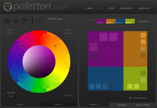
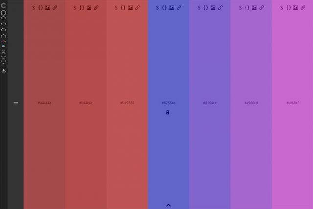
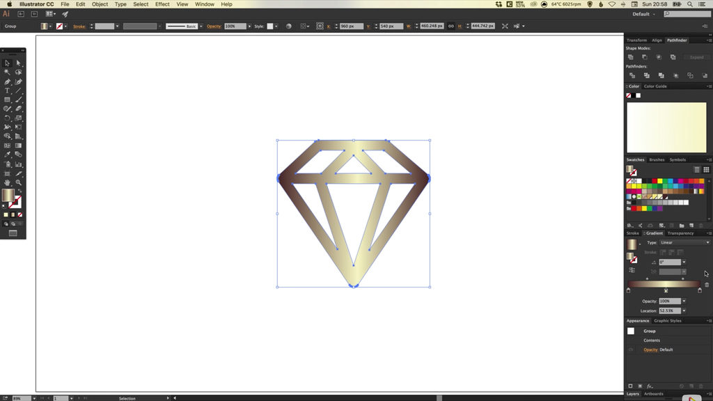
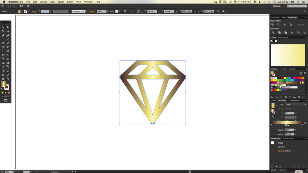
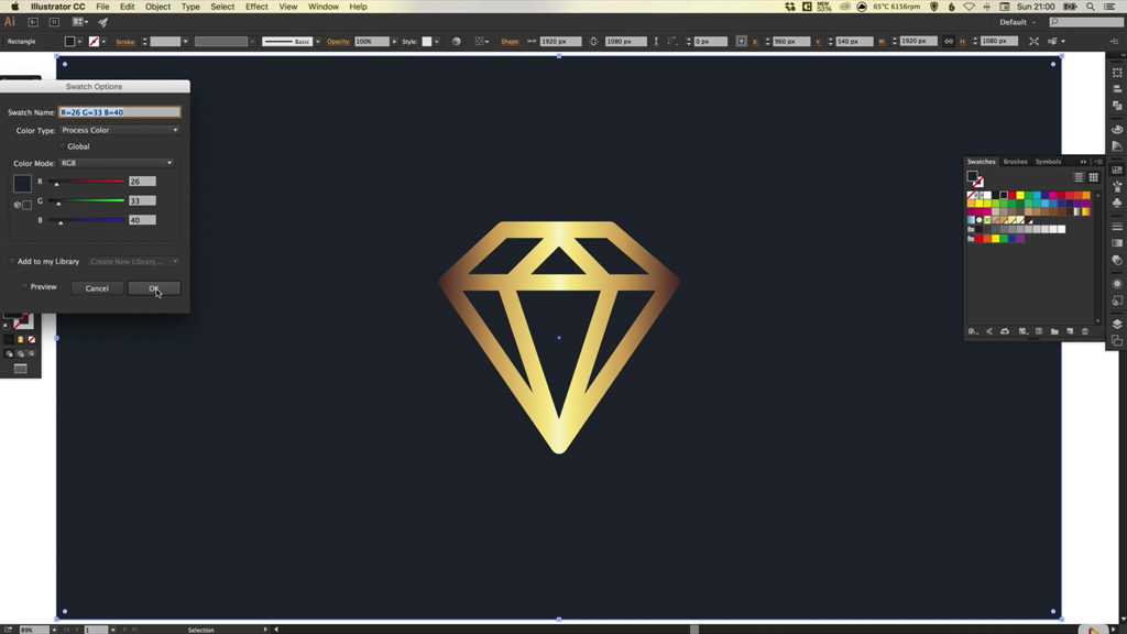
Can you spot the temperaments and values in the design?

Utilitarian + Perfect

Utilitarian + Control

Aesthetic + Perfect

Theoretical + Perfect

Individualistic + Control

These designs convey professionalism, but there’s more being communicated. Can you see how the temperaments and values, intangible details, shine through? These are the skills top tier clients want.

Skill is the starting point, knowledge is mandatory, but wisdom makes you invaluable.

Step 4: Use the right temperaments and values to share the design

This is the part where things get off track. You’ve created the perfect design. You’re excited, the client is excited. They’re ready for the big reveal.

You share it with them, and they’re unhappy: “I mean, it’s ‘nice’ it’s just that something’s missing.”

What. Just. Happened?

When we share anything with clients we speak their language. We use their dominant temperaments and values as the filter for anything we share.

Have a Utilitarian client with control tendencies? We run everything through the “return on investment” filter. We stick to the facts, and avoid gushing about the new design we’re proud of.

Aesthetic client with perfect tendencies? We frame everything using the language of beauty, form and harmony. We introduce designs using lofty and high level concepts.

Theoretical clients with social tendencies? We teach them about the design, explaining how it’ll bring them closer to their clients and improve morale.

Doing this gives your clients closure. Presenting your work this way ties up loose ends. If there are any unanswered questions they’re flushed out. This is the part where clients feel gratitude. They feel understood and at peace. They’re ready for the next step and they’re ready for you to lead.

What if they ask for revisions anyway?

It doesn’t mean you’ve failed, it just means you’ve missed something. It could be a loophole, a missed question or a tiny detail. You’ll need to find and fix the problem.

What if my client just wants control? Give it to them, with controlled decisions. Do you want A or B, this or that? When they push for something you don’t offer, maintain a strong front: “I’m so sorry I’m not able to do that.”

If they’re still hammering you for control, tax them. Make it painful (financially) for them to get what they want. This financial motivation is great for the “let’s just see what these 15 additional versions would look like” clients.

What if you don’t speak “client”? If you’ve asked the right questions you have your translator. Go back over their answers to find what you’re looking for (e.g. values, temperament, goals, etc.).

Unhappy clients create revision loops

You won’t be sucked into an endless cycle of revisions, edits and corrections if you speak their language.

Ask the right questions and your client will tell you who they are. Take the time to listen and they’ll give you everything you need to create amazing work on demand.

Do that and your portfolio will be filled with happy clients who see that you understand them. Continue to serve them and repeat clients become the norm. You’ll avoid revision loops and the never ending nightmare of unhappy clients.

Client happiness guaranteed.

Imaginer Plugin: 11 Professional Photoshop Effects – only $14!

Source

Categories: Designing, Others Tags:

Battling BEM (Extended Edition): 10 Common Problems And How To Avoid Them

June 1st, 2016 No comments

Whether you’ve just discovered BEM or are an old hand (in web terms anyway!), you probably appreciate what a useful methodology it is. If you don’t know what BEM is, I suggest you read about it on the BEM website before continuing with this post, because I’ll be using terms that assume a basic understanding of this CSS methodology.

Battling BEM (Extended Edition): 10 Common Problems And How To Avoid Them

This article aims to be useful for people who are already BEM enthusiasts and wish to use it more effectively or people who are curious to learn more about it. Now, I’m under no illusion that this is a beautiful way to name things. It’s absolutely not. One of things that put me off of adopting it for such a long time was how eye-gougingly ugly the syntax is. The designer in me didn’t want my sexy markup cluttered with dirty double-underscores and foul double-hyphens.

The post Battling BEM (Extended Edition): 10 Common Problems And How To Avoid Them appeared first on Smashing Magazine.

Categories: Others Tags:

Six Link Bait Ideas That Will Improve Your Website’s SEO

June 1st, 2016 No comments
Six Link Bait Ideas That Will Improve Your Website's SEO

When it comes to earning links naturally, Google advises webmasters to develop valuable content that will encourage websites to link to them. However, when it comes to creating ideas for link-worthy content, many webmasters become stuck. Great white-hat SEO stems from implementing a smart content marketing strategy. Below are a few inspirational link bait ideas that have earned websites an influx of organic links from authoritative sites.

Six Link Bait Ideas for Your SEO Strategy

Idea 1: Create a Site Function That Will Help Web Users

To create the best opportunity for your site to become link-worthy, it needs to be valuable to the web user. What better way is there to provide value than by making their lives more convenient? SkyBet created a smart campaign where they created a pop-up page for employees, dubbed the ‘Boss Coming, Look Busy’ button. Pressing the button launched a fake page full of spreadsheets that most office users work on when they are actually busy. The campaign earned several natural links from several blogs and forums.

Idea 2: Do a Video Demonstration With a Twist

Demonstrate the products or services that your business offers and add a twist to it. The guys from Blendtec executed this perfectly with their video series ‘Will it blend?’

The campaign was a viral hit, accumulating millions of video views on YouTube and ‘crème de la crème’ links from premium sites like The Daily Mail, Adweek, Mashable, Gizmodo, and Crunchbase. The site has accumulated thousands of authority links, which significantly improved their SEO competitiveness and helped turn their brand into a household name.

Idea 3: Create an Interesting Web Game That Appeals to People in Your Industry

Your business can have a simple game created that resonates with the sentiment and interests in your industry. One website created the game ‘Whack a Cutts’, which featured Google’s Head of Webspam Matt Cutts. The game is based on the Whack a mole game and allows users to vent their frustration by earning as many points as possible by whacking Matt Cutts head as it popped up out of the ground.

Whack-a-Cutts Browser Game

Whack-a-Cutts Browser Game

The web page has generated high authority industry links from sites like Search Engine Roundtable, Search Engine Land and even Matt Cutts’ own blog!

Idea 4: Take an Interesting Spin on Popular Content

Improve your site’s link baiting success by using popular content and presenting it in another format. In the SEO industry, one webmaster created the site ‘The Short Cutts’, which succinctly explains SEO points that have been made from every video Google’s Matt Cutts presented. The idea is a simple one, but it has generated over 300 shares on Linkedin, 2000 shares on Google Plus and links from prominent websites like Search Engine Land, Search Engine Journal, and several other SEO industry sites.

Idea 5: Develop an Online Application

Sometimes, a simple web application can have an enormous impact to your site’s link-worthiness. Functional applications like calculators or comparison engines can quickly earn bookmarks and shares across different web platforms.

A great example is the Elf Yourself site that was developed by OfficeMax. The site allows people to create an elf version of themselves, family or friends to share during Christmas. The links that the site has acquired from this campaign has enabled their Domain Authority to skyrocket to 72. It has also generated several links from sites like Tech Insider, Forbes, and Mashable.

Elf Yourself by OfficeMax

Elf Yourself by OfficeMax

Idea 6: Develop a WordPress Plugin

People are always on the lookout for WordPress plugins that can improve the value that their site offers. Widgets such as a customizable contact form could earn your site hundreds of links from high authority development websites. One of the major success stories is the Yoast SEO plugin, which features on thousands of websites and is linked to thousands (if not, millions) of times from web development blogs and platforms.

Cracking the code for generating natural links may take time, but if you publish link worthy content regularly and promote the content to relevant audiences, your site will start to earn links naturally every week and will build in authority very quickly. Take a look at the link bait opportunities available in your industry and start implementing a content marketing strategy that will earn you the authoritative links that will make your SEO ranking skyrocket to long-term page 1 rankings.

Conclusion

Hopefully, you didn’t read this article expecting that we bring you ideas that could just be realized without effort. Instead, all you can do comes at a price. But this price is well worth it.

Should you need further help with SEO, there are a plethora of agencies out there eager to assist you.

Categories: Others Tags: