Archive

Archive for June, 2016

Freebie: Months And Seasons Set (12 Vector Illustrations, PNG, SVG, EPS, AI)

June 23rd, 2016 No comments

Time goes by fast, so today we’d like to share a colorful freebie to remind ourselves to appreciate each and every month of the year. Have you stopped to smell the pink blooming trees in March, or pluck plenty of fruits in the generous month of August, or enjoy the falling colorful leaves in rainy November?

Partial Preview

Every month of the year comes loaded with unique energy, so that it can give us inspiration and ideas, and then leave so many special memories behind. This background collection, dedicated to the charm and uniqueness of the twelve months of the year and its seasons, is available in PNG, SVG, AI and EPS and is all set to energize any project it becomes a part of.

The post Freebie: Months And Seasons Set (12 Vector Illustrations, PNG, SVG, EPS, AI) appeared first on Smashing Magazine.

Categories: Others Tags:

Creating a Home Office that Invigorates Creativity

June 23rd, 2016 No comments

When you have been toiling away at work for hours on end, it’s easy to lose your creative drive and become bogged down in the minutia of your day-to-day operational demands. For anyone working in graphic design, this creativity block can be a serious detriment to your business’s prosperity. That’s why we at Modernize have

Categories: Designing, Others Tags:

Design with data using Invision’s brand new plugin

June 23rd, 2016 No comments

Craft is InVision’s suite of screen-design tools that lets designers easily add content with a click. Two things designers value in their workflows—speed and data—are efficiently brought into their projects thanks to Craft.

Now, Invision is debuting Data within Craft; Data is a free plugin that lets designers pull things like text, images and JSON values out of public API sites live, and add them directly into Sketch.

Previously, designers could only pull in text and images from places like Dropbox, their local files, websites, Unsplash and from built-in data. Thanks to the JSON tab, creatives can now enter URLs or drop in JSON files to assign values to design elements. After this, they can utilize the duplicate plugin to create unique design components with only a click—each one featuring new data from their API.

If you have already been using Craft you’ll find significant changes in the interface, thanks to Data. For one thing, the “type” and “photos” plugins have now been consolidated within Data, thereby simplifying the menu so that you’ll find all of the images and text that you pull in one, well-organized location.

Grabbing images and text from live sites has never been more streamlined, as it happens in the same menu. Simply click on a photo to fill anything with an image; you can also do the same with text. As with the other data tools, when you duplicate this content, Data will let you pull more content from the same webpage.

Draft centers around three “modes” that speed up workflows:

  • Custom: This tab lets you fill your design with customized photos and text with only a few clicks. To drop in random user names, for instance, simply choose a few bits of text and then click “Names”. This process is the same with the rest of the categories (Cities, Headlines, Currency, etc.).
  • Web: This tab lets you pull in photos and text from any site that’s desirable. Just as with the Custom tab, simply pick a block of text or the image and then click the text or image on the site itself.
  • JSON: This tab allows you to plug in APIs to access and then design with any kind of data you choose. This feature is ideal if you want to design with either public data from an external source or your own API data.

Learn more about the Craft Data plugin here.

LAST DAY: Create Your Own Fonts in Minutes Right Inside lllustrator – only $24!

Source

Categories: Designing, Others Tags:

Hueman WordPress Theme: Free and Feature-packed

June 23rd, 2016 No comments
Das Hueman Theme für WordPress

Hueman has over 70,000 active installations, making it one of the most successful free WordPress themes. This is more than enough reason for us to give you a close look at this theme. Let’s find out together, what it is that makes this theme so successful, and what it has to offer. The pretty design can’t be the only reason for the tremendous success.

At first sight, the theme already sets itself apart from the rest. It has an appealing look, a very lovingly designed demo page, and no premium version, that you would have to buy for lots of money to receive essential functions. It’s a very honest theme with many features that you’d typically only find in expensive premium themes. Additionally, there are Hueman add-ons, which integrate further functions into the theme.

1 – Hueman – the Important Links

2 – What Application Areas is the Theme Useful For?

Hueman is very flexible, but not a so called “multi-purpose theme.” Thus, it’s not suitable for all purposes. This is not a disadvantage, but much rather an advantage. Themes that offer themselves for all application areas are mostly only really suitable for one or two areas, without additional work.

Hueman is best used for magazines, news pages, and personal blogs. It’s also said to be a great business theme, but for that, it lacks essential functions and areas. The theme doesn’t allow you to create proper portfolios either.

But that’s not necessary. It’s main strengths, being blogs and magazine, look very appealing when using Hueman, and that’s where it shines.

3 – The Theme’s Feature Variety

Hueman offers a lot of options for being a free theme. On top of that, it is prepared for the most important plugins, so that you don’t need to be afraid of an evil surprise when activating one of the plugins.

Hueman is Prepared for the Following Plugins:

As I said earlier, the theme offers extremely much for being a free version.

  • Post Formats (All)
  • Related posts under the articles (category or tag principle)
  • Social links for your social networks
  • A slider
  • Highlighted posts
  • Google Fonts
  • Ad areas in the header, the sidebar, and the footer
  • Layout options – two sidebars (left, right, or left and right), one sidebar (left or right)
  • Boxed layout or full website width
  • An own logo
  • A background image is also possible
  • All colors can be fully customized
  • The website’s width is adjustable
  • Custom, unlimited widget areas
  • Multiple menu positions
  • SEO: Structured Data Markup
  • Integrated compression of stylesheets
  • Website icon – Favicon and app icons
  • Feedburner link
  • Image border radius – roundings can be assigned to all images within the content
  • The sidebar layout is either assigned globally or via post/page for all articles
  • Footer: define a number of widget areas, an additional logo, own footer texts, and a lot more
  • Unique options for mobile views, like an own menu, for example
  • Three additional widgets – Hueman Dynamic Tabs, Hueman Posts, and Hueman Videos
  • Own page templates
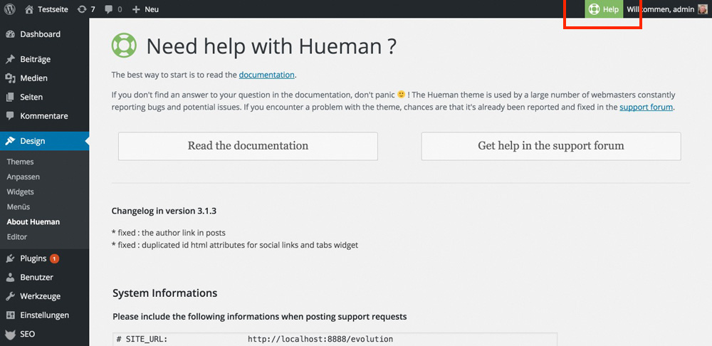
  • A “help” button in the admin menu, used for the display of the documentation, and the support forum
  • With installed Hueman add-ons: a share bar for the articles, and theme shortcodes

4 – Impressions of the Hueman WordPress Theme

As you saw, the theme has a lot to offer. I find the integration of the help button to be very commendable. Beginners and users with less technological knowledge can get help instantly.

Der Help-Button und die Seite, auf die er leitet. Hier findet der User dann den Link zur Doku und dem Forum.

The theme’s help page. Here, the user will find the links to the documentation and the forum.

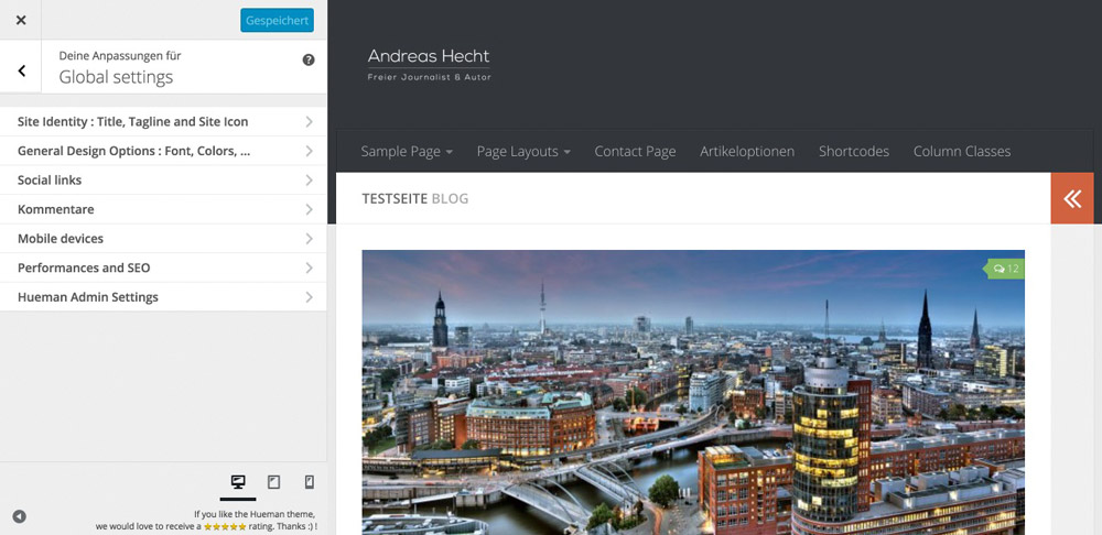
Ein kleiner Teil der umfassenden Theme-Optionen im Customizer.

A small part of the extensive options in the customizer.

Eine benutzerdefinierte Startseite mit dem Dynamic Tabs Widget in der Sidebar.

A user defined landing page with the Dynamic Tabs widget in the sidebar.

Die Seite für die Suchergebnisse: noch verbesserungswürdig.

The page for the search results: still room for improvement.

Layout – the sidebar options

Der Standard. Eine Sidebar rechts und eine links.

The standard. One sidebar on the right, and one on the left.

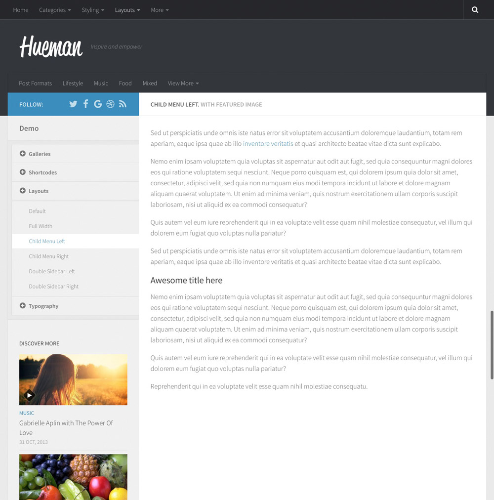
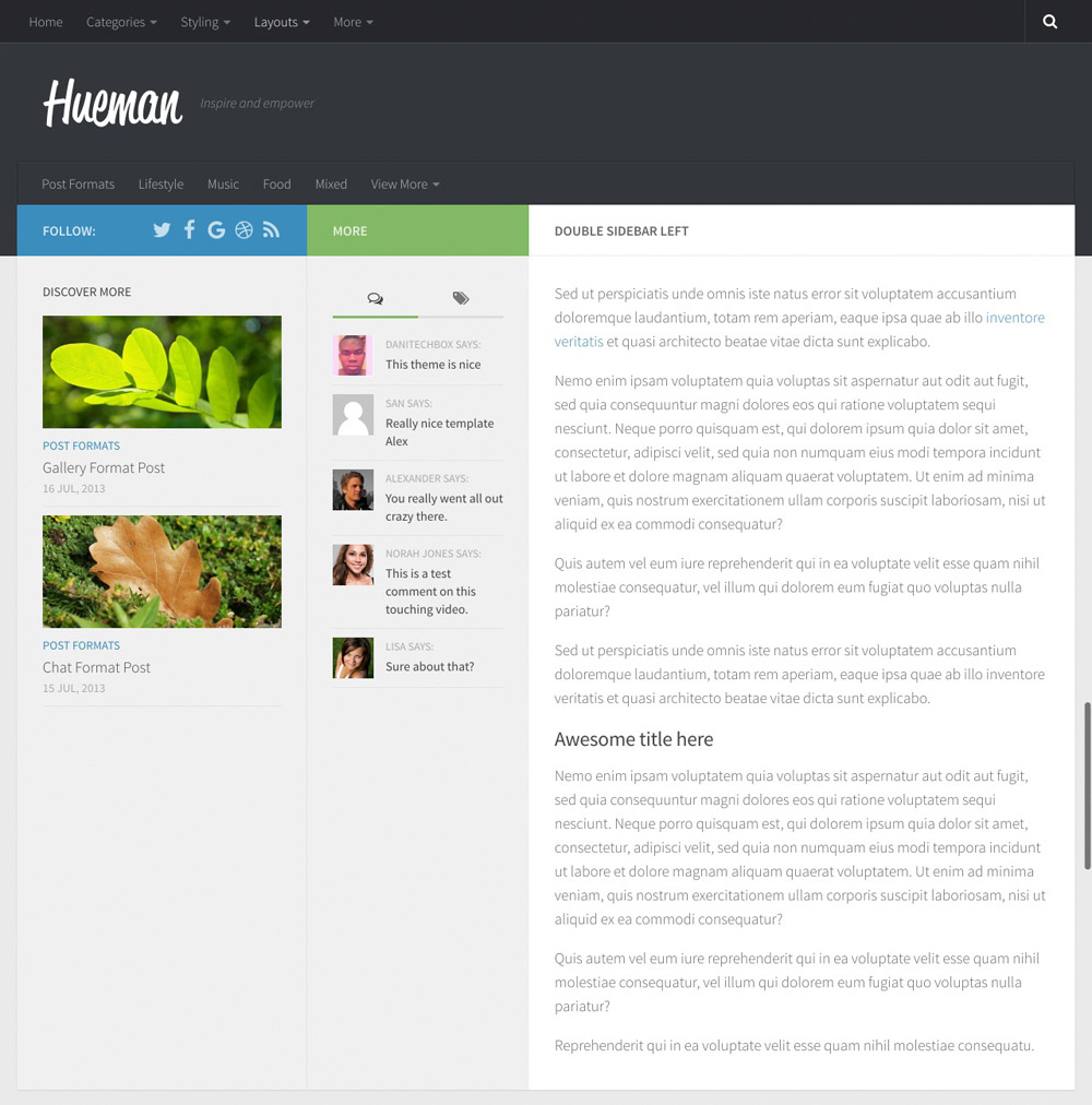
Das Theme mit einer Sidebar links. Hier kann auch ein zusätzliches Menü Platz finden.

The theme with a sidebar on the left. Here, there’s also room for an additional menu.

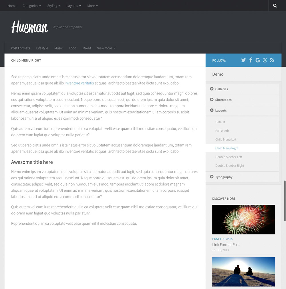
Das Hueman Theme mit einer Sidebar rechts.

The Hueman theme with a sidebar on the right.

Hier sind beide Sidebars für die Anzeige links konfiguriert.

Here, both sidebars a configurated to be displayed on the left.

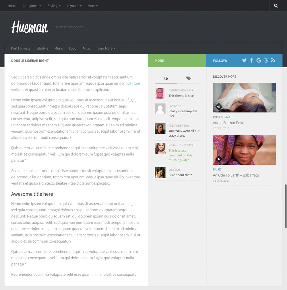
Natürlich kann das Sidebar-Doppelpack auch rechts angezeigt werden.

Of course, the double sidebars can also be displayed on the right.

This is Where There’s Room for Improvement

Where there is light, there is also shadow. The developers simply haven’t considered two things that would’ve been critical. For one, a feature to integrate Google Analytics codes, and for another, an option to adjust text colors in the content area. Both adjustments could be made by developers in about ten minutes, making the theme feel a lot more “complete.”

Of course, it is also possible to manually integrate your Analytics code via a function. The text color is also changed easily. However, it would simply be better if these features were included.

For Completion: the Code for Both Functions

https://gist.github.com/anonymous/7831016ef571833ea5a41079f51a6d0e

Conclusion

Free themes from the WordPress theme index rarely get me excited. Hueman however, managed to fascinate me. It is almost entirely customizable to fit your needs, offers plenty of theme options, as well as a reliable code quality. On top of that, there’s free support. All I can do is strongly recommend this theme.

(dpe)

Categories: Others Tags:

The DAU Of Hip-Hop: Designing For Authenticity (A Case Study)

June 23rd, 2016 No comments

In the tech industry, many of us came of age during hip-hop’s rise as a dominant art form. Its spirit of individualism, bravado, and constant reinvention makes it impossible for us not to admire. Our thought leaders craft mixtapes and pour millions of dollars into apps that decode rap lyrics.

The DAU Of Hip-Hop: Designing For Authenticity

The founders of my former company rapped to celebrate every corporate milestone. We’re compelled to quantify what we love about it, and to somehow technologize it the same way Instagram did photography. Many have tried, myself included, but capturing hip-hop’s alluring qualities in an app is no simple task.

The post The DAU Of Hip-Hop: Designing For Authenticity (A Case Study) appeared first on Smashing Magazine.

Categories: Others Tags:

Unit Testing Private Methods in Javascript

June 22nd, 2016 No comments
Screen Shot 2016-06-10 at 3.28.18 PM

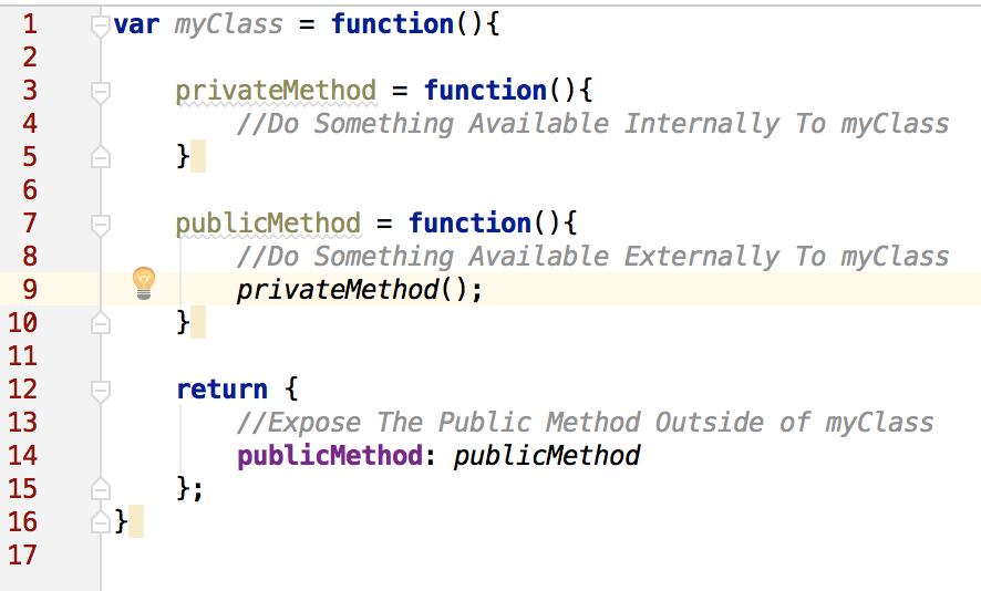
JavaScript is growing up. As it matures, we see more and more improvement associated with JavaScript testing and deployments. One area I get a lot of questions about is unit testing, more specifically, unit testing private methods.

Screen Shot 2016-06-10 at 3.26.18 PM

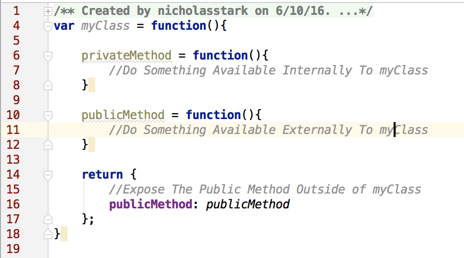
Traditional revealing module pattern.

When dealing with this issue, there are two main approaches commonly used. The first is to test the method through another public method that calls it. The other would be to expose it publicly even if the only thing that needs access to it are the unit tests. Neither strategy is perfect or ideal but here are a couple of things to consider when choosing which is best for you.

Screen Shot 2016-06-10 at 3.27.03 PM

Testing your private method by calling a public method that calls it.

Start off by considering your objective. My objective is to be able to make changes to the code-base with confidence. Additionally, if an issue presents itself, I want to be able to find and address the issue quickly.

When you have several private methods chained together, it becomes no different to test than one big super method. If there’s a problem with the logic, it can be cumbersome to track down the issue. On the flip side of that, if every method were public, you could test each method and ensure that it’s doing its little bit of work correctly. All of the methods doing their one job adds up to a complete workflow. If one of the methods fails to do its job, it’s quick and easy to identify where the issue lies. The drawback is that we totally destroyed the notion of a public vs. private methods and all the good things that come along with it.

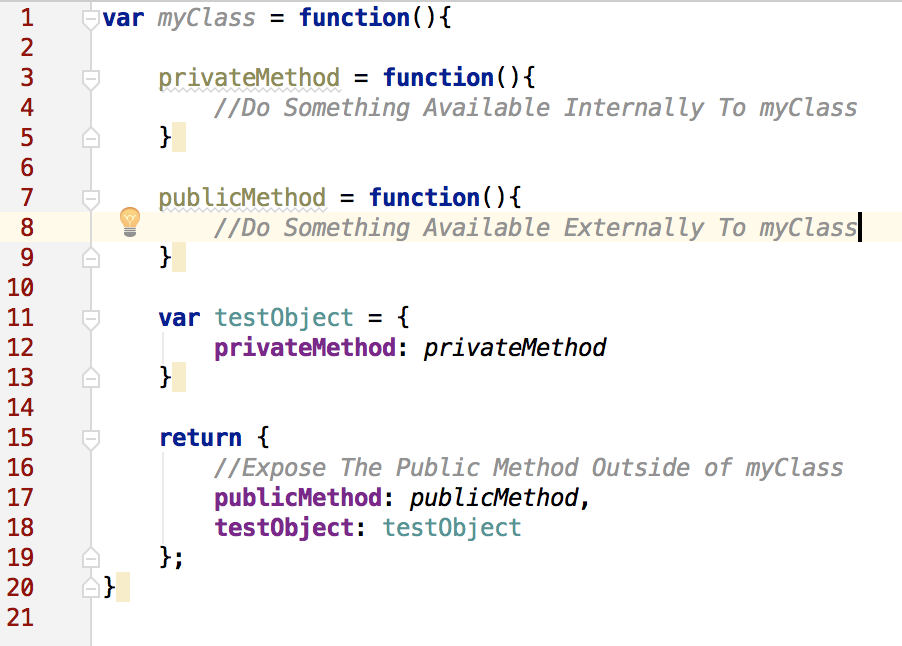
One approach that I’ve taken with several companies is a hybrid. I will follow a classic module pattern and expose publicly only those methods that are called externally from outside the class. Then I create a ‘testObject’ and expose it publicly. The properties of my testObject are all the private methods that I otherwise would not be able to test. Now all my private methods are exposed publicly. While it’s not nearly as safe as keeping them private, at least I know that I should only ever see ‘class.testOject.somePrivateMethod’ being called from within my unit tests. If I ever do a code review and see someone calling ‘class.testObject.*’ in the core code, I know someone is calling the private method in a way it’s not intended.

Screen Shot 2016-06-10 at 3.28.18 PM

Hybrid testing pattern. Exposing your private methods through a single test object.

It’s a great pattern and has worked very well for several enterprise implementations. It’s not perfect but is a good compromise in most cases. You’ll want to consider your application and the pros and cons of the various strategies before deciding which is best for you.

Read More at Unit Testing Private Methods in Javascript

Categories: Designing, Others Tags:

Web Design Trends 2016 [Infographic]

June 22nd, 2016 No comments
Die_Design_Trends_2016

Web designers always have to keep in touch with the latest design trends. Nobody can afford to deliver outdated layouts. To make sure that you know which web design trends are relevant this year, we’ll provide you with an infographic. The graphic takes a step into the near future and explains which trends will be the most impactful this year.

1 – The Rise of Flat and Material Design

Flat design is minimalistic and restricted to the basics. Its purpose is pure functionality, which doesn’t mean it can’t look nice. The opposite is the case, as a well-done flat design is visually appealing.

However, the attributes that would create a 3D illusion are missing. Flat design is purely one-dimensional but works excellent nonetheless.

Material design, on the other hand, takes it a step further by integrating realistic light, shadow, and motion effects. On top of that, it creates a slight 3D effect in some parts, especially in the navigation menu areas. Both design trends don’t originate from the desktop section, but from the mobile device sector, like smartphones and tablets.

The minimalistic flat design, and the material design, known for its shadows, will be something that we will get to admire a lot this year.

2 – Background and Fullscreen Videos

Due to the people’s steadily accelerating DSL connections, a justified trend can be realized for the first time. Using background or fullscreen videos is useful to transfer a message to a website visitor faster than you could using texts and graphics.

Videos are a valuable tool, as long as you don’t exaggerate using them. Just because you can integrate videos now, doesn’t mean you should. These tools should only be used to send a clear message to the website visitor. Maybe to highlight, or boost a brand, or to visually support an individual message.

Especially when using videos in the background area, you should make sure to optimize its speed, to prevent it from increasing the loading time unnecessarily.

3 – Mobile Apps and Social Networks Will Dominate

The usage of smartphones and mobile devices is growing worldwide. Especially designers have to prepare for this trend, as the essential apps for all application areas don’t only have to be functional, but look good on top of that. Visual impressions also count.

The trend towards mobile apps will not slow down; it is more likely that it will continue to pick up pace. This affects website owners as well. quickerspecialWhile well executed responsive website views were a great thing until now, the users will demand faster and specialized apps for smartphones.

Obvious: The trend will go towards apps, instead of responsive websites.

4 – Design Optimized for Speed

Responsive design allows for the optimal usage of a website on all thinkable devices with multiple screen resolutions. By now, it is completely normal that users don’t only use a website in the desktop view, but also on mobile via smartphone or tablet.

Designers and developers will have to keep this in mind. While in the past, it was enough to just provide a fitting responsitivity, today’s developers already have to think a step ahead.

The more content is used on mobile; the more impactful an important aspect becomes. I am talking about the website speed on a mobile device. Not enough developers optimize the speed for the view on small screens. But that’s what counts.

The secret is called “mobile first”. Here, the mobile view of a website is developed first, and then optimized for loading speed. Only when the mobile area is completed, the desktop view will be developed.

5 – Finding and Integrating the Correct Typography

Typography was important in 2015 already, and this year, typographically appealing websites will become even more important. Typography is the foundation of every website, and also a type of art when placed in completion.

Good typography can convey a message and buff a brand. Many logos of large brands only consist of lettering, and still took over the world. Just think of the famous Coca-Cola logo.

In the web design sector, dealing with good typography will become increasingly more important as typography can either turn a website into a magnificent one or completely destroy a design.

6 – Extended Minimalism. Back to the Roots

Minimalism will be rediscovered again. In combination with flat design, or a material style design, it can direct the visitor’s attention towards the functionality and the content. Then, nothing should be a distraction from the content’s actual message.

Design has to assure that the website’s (or app’s) actual functionality is supported. The trend is moving towards comprehensive user guidance. A minimalistic design can be very supportive, leading the visitor on the designated way.

7 – Storytelling: Drafts With a Personal Character

The visitors of websites are getting overwhelmed by the amount of content. A permanently growing source list comes on top of that when searching the web for something. The raging flood of information makes it incredibly important to design websites with a character and personality.

On the first visit, the visitor has to know what your website is about, and what the brand wants to convey. To secure that, the user’s fantasy has to be incorporated. In the ideal case, the website tells a personal story.

In the future, barely any designer will be able to survive without creating a website with a personal character. This trend benefits the client’s desired branding.

8 – Card Based Interface Design

Desktop design as we know it probably won’t exist for too long anymore. You can already observe a shift from the well-known page design towards the card section. A card-based interface design is intuitive, and in the end, more practical, as the content is divided into individual components.

The single components are already well known from using mobile devices, and almost everyone can use a smartphone intuitively. These controls will also manifest themselves on desktop websites as they allow you to offer your visitors more information, in a much clearer way than before.

Web Design Trends 2016: The Infographic

Die_Design_Trends_2016

Source of the Infographic:

CoastalCreative.com

Categories: Others Tags:

Creatives Unite! Join the Legion of the Bold!

June 22nd, 2016 No comments
legionofthebold

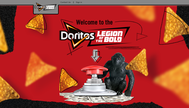
Did you know that there is a community for people like you? One that comes up with bold designs and other big creative ideas? Where you can participate in contests and win cash to fuel your creative interests? You didn’t? Feel invited into the Legion of the Bold…

Disclaimer: We’ve partnered with Frito-Lay in this sponsored campaign.

What is the Legion of the Bold?

After the immense success of Doritos’ “Crash The Super Bowl” video contest, the brand decided to take their consumer engagement to the next level. Thus, the Legion of the Bold was born. The Legion of the Bold is a creative community that empowers fans to create unique and inspiring content for the chance to earn brand recognition, have their work highlighted by a major brand and earn cash prizes to fuel their own personal creative interests. Doritos Legion of the Bold encourages open innovation and creativity among its list of highly creative members.

More than a dozen “contests of skill” (briefs) have hit the community ranging from creating a “Love Ballad” to developing a script for an on-air spot to designing a fresh t-shirt design. The contests are uniquely designed to both challenge the creative community and push them to step out of their comfort zone. Anyone within the community can compete in each challenge regardless of their self-identified expertise. For example, a graphic designer could give a shot at writing copy for a social post.

Top winners are compensated for their work, which allows them to support their creative interests. Win one of these contests for the opportunity to buy that brand-new set of acrylics or the latest stylus you have your eye on. What’s more, you could possibly see your amazing creation posted across Doritos’ thriving platforms. Seems like a fun challenge, right?

legionofthebold-2

Examples of Closed Contests: This Would Have Been Fun!

Had you only heard about it earlier, you would have joined already. Following are some of the challenges they conducted:

Bold Doritos T-Shirt Design Challenge

In honor of Doritos 50th Anniversary, the Legion of the Bold was asked to create clever, creative and most of all, bold t-shirts. The winning design won $1000 and the honor of creating the boldest shirt ever.

Vine for Doritos Challenge

Doritos wanted to give Legion of the Bold members their 6 seconds of fame on Doritos® Vine feed and asked people to create a 6-second video that shows the world how Doritos® are bold, unexpected, exciting, or cool in your life. The winning Vine won $5000 and internet fame in Doritos Vine feed.

Next Big Idea Challenge

This was a conception-focused idea challenge. “Legion members, we are looking to you to help develop big program ideas for 2017 plans. Create an idea for a potential Doritos® 2017 program, focused on a movie partnership, gaming opportunity, or any other partnership or promotion that will get people excited and drive them in-store to buy Doritos chips.”

Now It’s Your Turn

The Legion of the Bold is looking for creatives like you. People who love the challenge of a blank sheet to come up with something enormous. Want to prove that you are the right one?

Go sign up for Doritos Legion of the Bold where you can create content for Frito-Lay brands, showcase your work and earn cash to fuel your own creative interests.

Please note, content is not only for Doritos, it spans across the Frito-Lay portfolio.

(dpe)

Categories: Others Tags:

Don’t Overthink It (Flexbox) Grids

June 22nd, 2016 No comments

Four years ago I posted “Don’t Overthink it Grids” and it resonated with quite a few people. Even back then, I thought we might have been at Peak Grid. Someone was promoting a new grid framework practically every week.

That article was my way of saying: “Fear not! You can make a grid yourself! You don’t need a complicated framework.” It might not have been quite as fancy, but that’s how I rolled. You float a couple of elements with some percentage widths and call it a day.

These days, if you are ready to jump to flexbox for layout, DIY grids are even easier.

This is how I normally do it:

<div class="flex-grid">
  <div class="col"></div>
  <div class="col"></div>
  <div class="col"></div>
</div>
.flex-grid {
  display: flex;
}
.col {
  flex: 1;
}

That supports any number of columns and they are automatically equal width and flexible!

Wanna have them break into a column for small screens? Easy:

@media (max-width: 400px) {
  .flex-grid {
    display: block;
  }
}

Need gutters? You could add margins to the columns. You could add padding to the columns. I like the idea of using justification to create the columns, like:

.flex-grid-thirds {
  display: flex;
  justify-content: space-between;
}
.flex-grid-thirds .col {
  width: 32%;
}

If you go the flexbox route, you also now have the ability to change the order of columns as needed, which can be great for keeping more important content higher in the source as well as responsive design reshuffling.

See the Pen Easy Flexbox Grid by Chris Coyier (@chriscoyier) on CodePen.

My point, again: it’s not required that you reach for a grid framework to build a grid. You can do it! This is also not to say that flexbox is trivially easy and you’ll never have any problems. There are plenty of edge cases and weird browser support things that you may run into if you start using more niche flexbox features. The stuff we looked at here is pretty vanilla though and I’d be surprised if you had problems.

More

Philip Walton has written more on the glory of flexbox grid systems.

To be fair, grid frameworks tend to be fairly robust, and plenty of teams find success in having predefined classes and recipes for building any type of grid they need. If you’re interested in leaning on a grid framework that is flexbox specific, here’s a few I know about: Frow, Flexbox Grid, and Gridlex.


Don’t Overthink It (Flexbox) Grids is a post from CSS-Tricks

Categories: Designing, Others Tags:

Are you solving the wrong problems?

June 22nd, 2016 No comments

If you’re a web professional, there’s a good chance you’ve found yourself spending at least some time on the wrong problems. Maybe you were asked to implement a useless feature. Maybe you’ve ended up spending too much time on something because it was difficult, rather than important.

For the purposes of this article, we’ll define the wrong problems as ones whose solutions will help neither the business nor the customer, while wasting time and money in the process. We’ll examine why this happens, and find specific ways to avoid it.

Issue 1: Impressing the wrong people

A common problem occurs when web professionals are encouraged to impress their clients, their managers, their organization, or an awards committee, instead of the actual users of their sites. The result is often a site that excites the company, but confuses the customers. A common symptom of this problem is when a site has complex visual effects, but the users have to struggle to find the basic information they’re looking for.

This problem can happen for a number of reasons including pressure, misaligned incentives, attachment to an idea, or a lack of communication.

Leaders can help avoid misaligned incentives by setting a tone of: Don’t try to dazzle me; just make our customers’ lives easier.

The solution is to keep the focus on the user. Whether you’re creating a site or you’re paying for one, that means always asking how decisions will affect the user. Is everything on the site clear? Can people find what they’re looking for? Do any of your choices get in your customers’ way?

If you’re still having trouble getting your clients or your organization to listen, make sure you’re showing the business value of your comments. For example, “If we take out that bulky file, the page will load faster, which means more people will stay on it, and profits will go up by $X.” If that doesn’t work, there might be a bigger organizational problem that won’t be solved with user experience questions. Leaders can help avoid misaligned incentives by making sure to set a tone of: Don’t try to dazzle me; just make our customers’ lives easier.

Issue 2: Chasing a doomed solution instead of fixing the real problem

Sometimes, web developers will find themselves laboring over a solution that is time-consuming, expensive, or fundamentally flawed when something simple would have worked much better.

For example, let’s say the client asks for site search functionality. It’s easy to dive into specifics. Where do they want the search bar? What’s the deadline? How do they want the results page to look? What should the URL structure be?

The question no one asked was “Why?”

In this totally hypothetical story, the client didn’t need search at all. They weren’t a major retailer or a reference site, and the real issue was that customers couldn’t find what they were looking for. A few simple tweaks to the home page navigation would have solved the problem, but instead, the company ended up building a site search that ultimately didn’t solve the customers’ confusion.

How do you avoid this?

The best approach is to keep asking about the underlying problems instead of getting too deep into the idea of one solution. For example, instead of diving into building a site search, ask why it is needed. If you keep asking why, you’ll eventually uncover the real problem, which will be something like “Customers can’t find what they’re looking for.”

If everyone understands the true problems and goals, you’ll end up with solutions that are less costly, less time-consuming, and more effective.

Issue 3: Spending time according to difficulty instead of importance

If you’ve been involved in a web project, you might have experienced a situation where too much time was spent on something that wasn’t really important. Difficult things can take longer, but difficulty is often not correlated with importance.

For example, I once saw a situation where a ton of time was almost spent on a complex, barely visible background animation that was useless at best, and distracting at worst. This animation was also going to be buried way at the bottom of the page.

The distracting animation was there was because someone in the company…wanted to feel dazzled

It would have been easy to spend lots time on this footer background effect while neglecting the important parts of the page. Fortunately, a meeting revealed that the real reason the distracting animation was there was because someone in the company, at the last minute, wanted to feel dazzled. When it became clear that this was a vanity project and not something that would help the users, the animation became de-prioritized.

How do you avoid spending too much time on difficult, but unimportant things?

  1. Before you start a website, make sure you understand its most important goals. That understanding can help prevent you from going too deep into a section or feature that doesn’t provide a significant benefit. If you need to ask someone, do that too!
  2. If you find yourself spending too much time on something that isn’t important, step back and reevaluate the priorities. Does the company really need this feature? Will it help the users? Is there an acceptable shortcut that will have the same effect? Questions like these can free up more of your time so you can work on the stuff that matters. That’s best for the business, the users, and you.

Issue 4: Not having enough information to make the right decisions

As a developer or designer, sometimes you might not hear all of the business reasons for a particular decision. As a client or manager, you might not hear all of the technical or user experience information you need to make a judgment call. A lack of information can lead to decisions that waste time, money, and customer attention.

One way to fix a lack of information is to be vocal (in a friendly way) when you see an issue.

For example, if a certain course of action will destroy the user experience in a way that will stop people from buying, you might want to mention that. Oftentimes, you’ll find that everyone was too focused on something else to see the issue. If you’re a client or a manager, it’s good to let everyone know the business reasons for various decisions, so that everyone involved can produce the best solutions.

Issue 5: Letting ideas mutate from person to person

There’s a children’s game called Telephone, or Chinese Whispers, where everyone stands in a line. Starting at one end, each person whispers a message to the next, with the goal of preserving the original message. By the end, the message is often drastically different.

This scenario is funny as a game, but it’s not so funny when this happens in professional communication. It’s all too common for a good idea to go through several layers of misunderstanding, until the version that gets communicated to the key stakeholder sounds ridiculous.

It’s all too common for a good idea to go through several layers of misunderstanding, until the version that gets communicated…sounds ridiculous

Sometimes, this scenario results in an entire web project based on a misunderstood version of the original idea. To be clear, I’m not saying it’s bad when ideas change. I’m saying it’s a problem when ideas change due to misunderstandings rather than intentional feedback and growth.

Here are some suggestions for how to avoid mutating ideas:

  1. Distill the message into its simplest form. Focus on the main intent, and remove as many extraneous details as possible; people have enough to think about already.
  2. When necessary, communicate an idea directly to the people who need to hear it. To be clear, this does not mean you should CC the whole office, or alarm the CEO with every stray thought. It simply means that if you have something important to say, don’t just casually mention it to the person next to you and hope it gets around.
  3. Put your message in writing whenever possible. That way, you have more time to think about it, and there’s a clear record that anyone can refer to if needed.

Conclusion

Web professionals can end up solving the wrong problems for a variety of reasons, many of which are not entirely in their control. While the suggestions in this article won’t solve everything, I hope they will give you a framework for approaching the things you work on. As long as you focus on the user, avoid being misled by surface solutions, and communicate openly, you have a much better shot of solving the right problems.

SuperSpray – One of A Kind Image Spray Add-On for Photoshop – only $9!

Source

Categories: Designing, Others Tags: