Archive

Archive for June, 2016

How To Harness The Machines: Being Productive With Task Runners

June 22nd, 2016 No comments

Task runners are the heroes (or villains, depending on your point of view) that quietly toil behind most web and mobile applications. Task runners provide value through the automation of numerous development tasks such as concatenating files, spinning up development servers and compiling code.

How To Harness The Machines: Being Productive With Task Runners

In this article, we’ll cover Grunt, Gulp, Webpack and npm scripts. We’ll also provide some examples of each one to get you started. Near the end, I’ll throw out some easy wins and tips for integrating ideas from this post into your application.

The post How To Harness The Machines: Being Productive With Task Runners appeared first on Smashing Magazine.

Categories: Others Tags:

Adobe reveal major Creative Cloud update

June 21st, 2016 No comments

Adobe has just released a major update to its Creative Cloud apps. Updates have been made to Adobe Stock, and Creative Sync, meaning that almost every application in the ecosystem is affected.

The updates include additions to Adobe’s flagship Photoshop application, as well as further enhancements to Adobe Stock. However this is not the anticipated “CC 2016” update, but is (rather strangely, given that we’re half way through 2016) being referred to as “CC 2015.5” in the case of Photoshop, and “CC 2015.3” in the case of Illustrator.

Performance enhancements

There is thankfully a substantial performance enhancement in the latest iteration of the Creative Cloud apps. Recent MacOS updates seemed to have adversely affected Photoshop in particular, so the speed boost is a welcome, and much needed improvement.

Photoshop still doesn’t run at the speed of Affinity Photo, but it does feature far more tools, and it is closing the performance gap incrementally. Illustrator also appears to be faster, although Illustrator’s speed hadn’t been as much of an issue as Photoshop’s.

Adobe XD still in preview

Adobe XD is still in preview, which means you can still download it for free, even without a Creative Cloud membership.

Happily, it is now available in German, French, and Japanese. (Spanish is expected to follow shortly.)

Photoshop CC 2015.5

Several new features have made it into Photoshop. However they’re largely of the “cool trick” variety, rather than the “must have” kind.

The content-aware crop feature has been introduced to enable resizing of canvases without the dreaded checkerboard appearing. It’s particularly useful when rotating images; simple geometry means that rotating a rectangle and then cropping to a square will reduce the overall size of the image. The content-aware crop tool fills in the empty space similarly to the clone stamp tool, so that the image doesn’t have to be cropped smaller. It works extremely well for images with a lot of sky, or less detail; less well if there’s a strong combination of pixels in the adjacent area, as it tends to create a noticeable pattern. As with any tool, use when appropriate.

Content-aware crop in Photoshop 2015.5

There is a new face-aware liquify tool in Photoshop, which is ideal for dropping a few pounds in your latest selfie. It functions just like the liquify tool except that it recognizes facial features, and preserves them, so that a thinner face doesn’t look squished. This was made for whoever runs the Kardashian social media accounts.

Possibly the most useful addition is the match font feature which scans images for typefaces, then suggests possible matches on your local machine or via Adobe Typekit. It’s a great way of faking an extensive knowledge of typefaces, and it’s a surprisingly accurate matchmaker.

Face-aware liquify in Photoshop 2015.5

Illustrator CC 2015.3

Illustrator now features a fast export of assets, so you can output for numerous devices simultaneously. It’s an excellent addition, given that almost any asset you need that isn’t SVG will have to be served in a variety of sizes and densities.

Even more usefully, you can now export an entire set of artboards to multiple formats in a single pass, allowing you to maintain entire icon sets with a single icon per artboard.

Live Shapes have also been improved, so that their corner controls are hidden at smaller sizes; less zooming in and out to adjust sizes in future.

Creative Cloud Libraries permissions

A major boon for anyone managing large sets of assets across organizations, Creative Cloud Libraries now feature control permissions, so you can grant “read only” access to your developers for branding files, while giving your design team full access. And because it’s powered by CreativeSync, any changes the design team makes will sync to the developers’ files.

And for those managing really really large sets of assets, the Creative Cloud Libraries panel now features search filters, to help you track down that illusive icon you designed last March.

Improved CC Libraries panel in InDesign CC

Deeper integration with Adobe Stock

The major additions to this version of Adobe Stock center around closer integration and a one-click licensing system to allow you to license stock images directly on your artboard.

Adobe’s mission is to streamline workflow, allowing designers to search for, and license images from their growing library, more easily. Not a revolutionary concept given that Adobe make money from their stock offering, naturally they want to make purchasing simpler. Is this a benefit to designers? Well, if you’re using Adobe Stock anyway (and Adobe Stock carries one of the better ranges of stock images) then it will make finding and licensing easier. If you’re not already using Adobe Stock, then…meh.

For those hoping to contribute to Adobe Stock, you will shortly be able to submit shots from various applications, including Photoshop and Lightroom.

Adobe Stock Premium

In a further addition to their stock offering Adobe have announced Adobe Stock Premium, which is Adobe Stock, only more expensive. Adobe claim that this new range of 100,000 specially selected images “meet the standards of top advertising agencies and digital and print publications”. Suggesting perhaps that their standard stock images do not.

Premium Collection images, genuinely do look very good. But they don’t have the same streamlined workflow. More importantly they are not covered by your existing Adobe Stock subscription and they aren’t cheap: Images are priced individually, many exceeding $500.

Adobe Stock Premium images

Should you download it?

These are welcome additions to Creative Cloud for designers who are already making use of Adobe’s software. The streamlined workflow, the bug fixes, and a few little tweaks here and there make for a much improved work experience. What is gratifying is that Adobe do appear to be spending as much time fixes existing problems, as they are working on new features. Creative Cloud customers will want to update ASAP—and you can, right now, via the Creative Cloud app.

If you prefer to work with software from one of Adobe’s competitors then this is another update that’s unlikely to win you over; if you don’t already subscribe to Adobe Stock, closer integration with Photoshop is entirely moot.

If you’re sat on the fence, then now may be time to trial Creative Cloud. It is still the industry standard, and the improved performance across the board goes a long way to maintaining that coveted status.

Canvas Acrylic Megafamily of 9 Font Families, 39 Unique Typefaces – only $19!

Source

Categories: Designing, Others Tags:

Netflix updates its branding

June 21st, 2016 No comments

Netflix has just updated its branding with a new logomark. Or is it just a really short logotype? In any case, the saga of 2016 logo updates continues with a brand new “N” made in a ribbon-style.

First things first, this is not replacing the Netflix logotype as we know it. There’s no need. Netflix’s logotype will still be used anywhere it happens to fit. This new piece of branding is intended to go places where the full logotype is just taking up too much space.

Basically, it’ll be used on mobile apps, any time a designer wants to use a bunch of small logos in their website footer, and in the brand-new “Share on Netflix” button. Okay, that last one was a joke. The point is, they wanted something that looked like Netflix branding that would fit in small, square, or vertically oriented spaces, and they nailed it.

Now, on to the subjective opinions! The ribbon-type technique is kind of everywhere these days, and may not be to everyone’s taste, but still… it’s pretty. It’s the right shade of red. The little curvature at the bottom gives it that “Netflix feel”. It works. It’s a good example of carefully-considered branding in action.

Some commentators are speculating about whether this branding update might lead to a redesign of other aspects of the platform. My guess—and it is just a guess—is that any such changes will be incremental additions to match new use cases, just like the introduction of this logomark.

This being only the second Netflix branding update that I can remember, and considering their generally careful approach to making design changes, that makes the most sense to me. Netflix is a service used by a lot of non-techies as well as the nerd-inclined, and people in both categories are often slow to adapt to new interfaces. Any major changes are likely to happen over years, and I’ll bet most of them will be under the hood.

(We could all learn a thing or two from them.)

Canvas Acrylic Megafamily of 9 Font Families, 39 Unique Typefaces – only $19!

Source

Categories: Designing, Others Tags:

Sequence Animations with Audio in Adobe Muse

June 21st, 2016 No comments
Muse For You - Muse Motion 2 Update - Greensock - Adobe Muse CC

Sequence Animations with Audio in Adobe Muse. No Coding Skills Required.

Adobe Muse CC Logo Greensock Logo

Imagine being able to add a beautiful and fluid animation sequence to your website with just a few easy steps. Now imagine being able to add audio to the sequence. Then imagine not having to learn hours and hours of code to do this.

Now stop imagining.

With the new update to the Muse Motion 2 Widget from http://museforyoushop.com, you can now easily sequence animations with audio with just a few simple clicks. The widget is powered by the Greensock Animation Platform (GSAP) which is one of the most advanced animation platforms on the web.

Ever since I started web design and development I have always dreamed of a simple and easy way to create a story with animation and audio on my website. I searched every where on the web, spent hours studying code, and yet I still wasn’t able to effectively and quickly create a sequence with audio on my website.

Muse For You - Muse Motion 2 Update - Greensock - Adobe Muse CC

With the Muse Motion 2 Widget it is as simple as dragging and dropping the widget onto your Adobe Muse website and assigning the widget to elements on your Adobe Muse website. You can then choose from various animation options and now you can add audio. I’ve recently made the widget easier to access, and it now loads faster in Adobe Muse. You can also add an unlimited amount of animations to the sequence. Best part of all – each time an element plays in the sequence you can have audio trigger. Watch the video above for a quick demonstration on how to use the new updated version of “Muse Motion 2” and where to access it. Happy Musing :).

To access the widget visit http://museforyoushop.com.

Read More at Sequence Animations with Audio in Adobe Muse

Categories: Designing, Others Tags:

Content Jumping (and How To Avoid It)

June 21st, 2016 No comments

The following is a guest post by Brandon Smith. Brandon takes a look at one of the more eye-twinging behaviors of web sites and some possibilities for avoiding it.

Few things are as annoying on the web as having the page layout unexpectedly change or shift while you’re trying to view or interact with it. Whether you’re attempting to read an article as it wriggles around in front of you, or you try to click a link only to have another one push it out of the way and take you off to somewhere unexpected, it’s always frustrating.

This layout shifting is especially frustrating on mobile devices, where a big enough change can push all familiar content off screen and cause a visitor to completely lose her bearings. I would argue that shifting the page layout after the initial render (without relevant user interaction) may be the single most unpleasant user experience a site can create. I’m surprised to see it happen even on really big sites that are otherwise very well made. The good news is that it’s fixable.

Luckily, modern browsers don’t perform initial render until the style sheets have finished loading, which means that with some clever CSS we can do a lot toward fixing this problem.

What causes layout shifting?

Most commonly, it’s the result of loading Ajax partials. Ajax is asynchronous, meaning nothing is waiting for it to finish. But when it does finish, and the results are plopped into the document, it can cause relayout and push other elements around.

It’s especially common with ads, but can also be images or even fonts.

I’ve done it to myself

The first time I encountered this problem actually wasn’t for ads or images, but for rendered templates from our own server. I was working at Broadleaf Commerce, on a preexisting Admin interface that we were adding features to. We didn’t want to rebuild the whole thing using something like Angular, but we did want some of the content to be able to update without a page refresh. We created Ajax containers bound to server routes that would re-render and send back just a section of the page. It worked quite well, but in some cases we had multiple of these sections going down the page with static headers in-between. A few seconds after initial visit the headings (and sometimes other static content) would all jump down – exactly the jarring layout shifting experience we’re trying to avoid.

Fixing with min-height

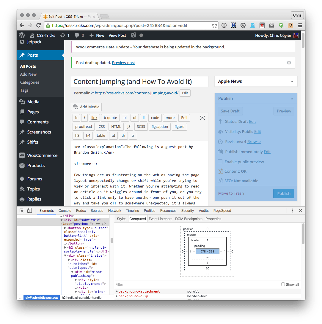
To fix it, I used the browser’s DevTools to measure the height of the resulting content and hard coded it as a min-height for the container in the CSS.

Imagine this widget was Ajax’d in. We could measure the size of it here and set min-height: 363px on a placeholder element.

This meant that the surrounding layout began in more or less the state that it would end up, with the only change being the interior of the content boxes. I also set a background color for the containers to suggest that something would go there. These simple additions made the interface much more concrete and predictable. One could debate whether hardcoding the minimum height is wise, given that it decouples the layout from the actual content. This is why we used min-height instead of height. If the content size grows later on, the behavior will just fall back to what it was before until someone updates the CSS. In the worst case, there’s no negative effect.

Here’s an example of what this would look like (rerun to see delayed ad loading):

See the Pen Avoiding Content Jumps by CSS-Tricks (@css-tricks) on CodePen.

Another Example: A Third-Party Widget

Another time, I was working on a client site who wanted to use the Braintree drop-in UI (https://www.braintreepayments.com/products-and-features/drop-in-ui) for their checkout page.

It’s a great little widget, but you’ll notice that even on Braintree’s own site the content gets pushed around when the widget expands. To Braintree’s credit it does so with a smooth transition which helps maintain some continuity, but the page I worked on still benefitted from a wrapper element with a min-height, keeping something as fundamental as the checkout button from moving around unexpectedly.

Fixing with Transitions

Using smooth transitions can make an unexpected content change a lot less jarring.

.ad-wrapper {
  height: 0;
  overflow: hidden;
  transition: height 0.66s ease-out;
}
.ad-wrapper.loaded {
  height: 100px;
}

See the Pen Avoiding Content Jumps by CSS-Tricks (@css-tricks) on CodePen.

The downside is that they only work when you set dimensions explicitly; min- properties and content-derived layout changes won’t transition. Still, transitions can be used in cases where you have unpredictably sized content and you don’t mind using JavaScript to query its size and smoothly resize the container accordingly.

Another Example: Font Loading Shifts

In a more unusual case, I was once working on a client site that prominently used a horizontally condensed font. The problem was that it had to be loaded in, so after a few seconds nearly all of the site content would suddenly change size. It wasn’t as drastic of a shift as the above examples, but since it affected nearly everything on the page it was much more of an eyesore. In the end I found this really great article that supplies a verbose but effective font-family statement that covers web safe condensed fonts for all major platforms. But before finding that, min-height was once again my friend.

Examples From Around The Web

The Verge (mobile)

I notice on The Verge that

  1. Their ad at the top is sometimes a small banner and sometimes a larger ad
  2. They seem to already be using a min-height technique for the banner-sized ad

It’s possible that their ad API doesn’t tell them what size the ad will be. If it does, they should adapt the min-height accordingly. If this isn’t possible, they might already be doing all they can with pure CSS. Although even then, I would argue that from a UX perspective, a really large ad should go further down among the content instead of at the very top, and the banner would be more appropriate at the top. Then again, showing the user a nearly full-screen ad as soon as they visit the main page is probably a lucrative source of revenue.

Kotaku (mobile)

Worth noting on Kotaku is that there’s no ad at the very top of the main page, so when you first visit it there isn’t a jump. However, if the page ever loads while already scrolled down a ways (such as after pressing the back button when you’ve finished reading an article), there is some massive, disorienting jumping caused by large ads peppered throughout the post stream. They all seem to be the same size, so this would be a simple fix.

Summary

One of the most important things to keep in mind when designing any user experience is expected behavior. We expect that clicking a blue, underlined segment of text will take us to another page. If it instead opens a modal, or does nothing at all, we have a confusing and frustrating user experience. The same is true of navigating the page we’re already on. When we see an article appear in front of us, we expect it to sit still unless we scroll it. When we see a link or a button, we expect it to still be there when we reach to tap on that spot. Violations of these basic assumptions are at best unpleasant, at worst frustrating or even disorienting.


Content Jumping (and How To Avoid It) is a post from CSS-Tricks

Categories: Designing, Others Tags:

The Ten Freshest WordPress Plugins of June 2016

June 21st, 2016 No comments
LH Jetpack Related Posts

Once again, it’s time for me to write the article that’s the most exciting of each month. As always, my job is to find the best, and freshest WordPress plugins. Many friends of WordPress like to test new features, me being one of them. How many new, and cool features are waiting for you this time? Wait and see.

1 – LH Jetpack Related Posts

This plugin allows all users of the popular Jetpack plugin to customize Jetpack’s related posts feature. Via the user interface, you can decide what should be used to display the related posts. You also choose where the posts should appear, as well as whether tags, or custom post types should be used for the selection of related posts.

  • Developer: shawfactor
  • Work in Progress: yes
  • Latest Version From: 06.09.2016
  • Costs: free via WordPress.org
  • License: GNU GENERAL PUBLIC LICENSE
  • Known Compatibility Issues: unknown
  • Developer Homepage: unknown
  • Download on WordPress.org

2 – Archive Akkordion

Archive Akkordion creates a sidebar widget that can display your archive, sorted by year and month, in an animated accordion style. You choose the title, the animation, and whether the amount of posts will be displayed or not.

  • Developer: istvan_r9
  • Work in Progress: yes
  • Latest Version From: 06.07.2016
  • Costs: free via WordPress.org
  • License: GNU GENERAL PUBLIC LICENSE
  • Known Compatibility Issues: unknown
  • Developer Homepage: unknown
  • Download on WordPress.org

3 – Multiple Map Marker Filter

multiple-map-marker-filter

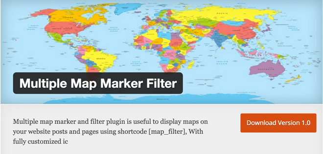
Multiple Map Marker Filter allows you to create maps, and to have them be displayed wherever you want, using a shortcode. Creating custom markers with specific icons is not a problem either. It’s also possible to use multiple maps on one page. The maps can be adjusted to meet your requirements.

  • Developer: Kiran Patil
  • Work in Progress: yes
  • Latest Version From: 06.09.2016
  • Costs: free via WordPress.org
  • License: GNU GENERAL PUBLIC LICENSE
  • Known Compatibility Issues: unknown
  • Developer Homepage: unknown
  • Download on WordPress.org

4 – Sketchus Pricing Tables

Sketchus-Pricing-Tables

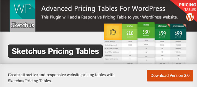
This plugin can be used to create responsive, and appealing price tables, which you then use in your theme. There are two different designs to choose from, but the layout is adjustable to your desires with a bit of know-how. HTML and CSS is used to create the tables, JavaScript is not used at all.

  • Developer: Sketchus
  • Work in Progress: yes
  • Latest Version From: 06.08.2016
  • Costs: free via WordPress.org
  • License: GNU GENERAL PUBLIC LICENSE
  • Known Compatibility Issues: unknown
  • Developer Homepage: unknown
  • Download on WordPress.org

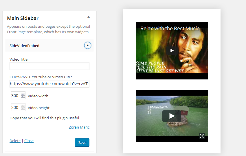
5 – SideVideoEmbed

SideVideoEmbed

If you’d like to present your YouTube or Vimeo videos via a sidebar widget, your search might be over. This plugin is able to present your videos in a very appealing way, making it a great asset for everyone who likes moving pictures.

side-video-embed-screen

  • Developer: Zoran Maric
  • Work in Progress: yes
  • Latest Version From: 06.06.2016
  • Costs: free via WordPress.org
  • License: GNU GENERAL PUBLIC LICENSE
  • Known Compatibility Issues: unknown
  • Developer Homepage: unknown
  • Download on WordPress.org

6 – Wishlist WooCommerce

wishlist-woocommerce

Wishlist WooCommerce extends the popular shop plugin WooCommerce by a wishlist feature for its users. They are now able to easily save their favorite products in a wishlist, giving them instant access at any time. The button as well as the wishlist can be adjusted to fit the existing design. All popular features known from Amazon have been integrated.

  • Developer:XootiX
  • Work in Progress: yes
  • Latest Version From: 06.08.2016
  • Costs: free via WordPress.org
  • License: GNU GENERAL PUBLIC LICENSE
  • Known Compatibility Issues: unknown
  • Developer Homepage: unkown
  • Download on WordPress.org

7 – WP Emoticon Rating

WP Emoticon Rating gives your readers the option to rate your articles via emoticons. The plugin adds emoticons beneath each article on your page. From there, readers can easily rate your posts.

  • Developer: WebsEfficient.com
  • Work in Progress: yes
  • Latest Version From: 06.07.2016
  • Costs: free via WordPress.org
  • License: GNU GENERAL PUBLIC LICENSE
  • Known Compatibility Issues: unknown
  • Developer Homepage: unknown
  • Download on WordPress.org

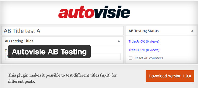
8 – Autovisie AB Testing

Autovisie-AB-Testing

An article’s title is an extremely important element. Only very good titles will make users read the article’s content. It doesn’t matter how good your posts are, as long the title doesn’t spark users’ curiosity, they won’t read it. Thus, you should prepare multiple titles for your article, and then use this plugin to test them against each other. Autovisie AB Testing gives you fast results on which title is the best.

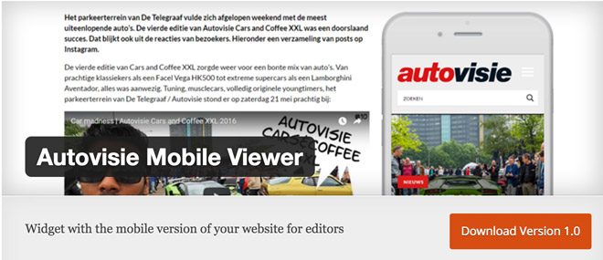
9 – Autovisie Mobile Viewer

Autovisie-Mobile-Viewer

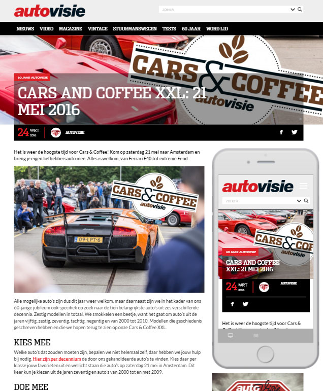
This really interesting plugin lets you, and your editors check an article or page’s mobile view on your website’s desktop view. This way, you can instantly tell whether the responsive view looks harmonious or not. With this plugin, you won’t need another external tool to check mobile layouts. Your visitors still see your website’s normal view.

ScreenshotScreenshot

  • Developer: autovisie
  • Work in Progress: yes
  • Latest Version From: 06.08.2016
  • Costs: free via WordPress.org
  • License: GNU GENERAL PUBLIC LICENSE
  • Known Compatibility Issues: unknown
  • Developer Homepage: WordPress Mobile Viewer
  • Download on WordPress.org

10 – Lead Form Builder

lead-form-builder

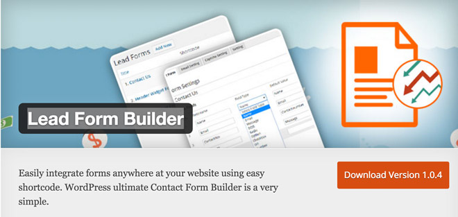
The Lead Form Builder allows for the fast and easy creation of all possible forms for your website. Using the simple drag & drop concept, you can create the forms you need in no time. The finished forms can the be integrated anywhere via WordPress shortcode.

Screenshot Lead Form Builder

  • Developer: themehunk
  • Work in Progress: yes
  • Latest Version From: 06.08.2016
  • Costs: free via WordPress.org
  • License: GNU GENERAL PUBLIC LICENSE
  • Known Compatibility Issues: unknown
  • Developer Homepage: not available
  • Download on WordPress.org

(dpe)

Categories: Others Tags:

Improving UX For Color-Blind Users

June 21st, 2016 No comments

According to Colour Blind Awareness 4.5% of the population are color-blind. If your audience is mostly male this increases to 8%. Designing for color-blind people can be easily forgotten because most designers aren’t color-blind. In this article I provide 13 tips to improve the experience for color-blind people – something which can often benefit people with normal vision too.

Improving UX For Color-Blind Users

There are many types of color blindness but it comes down to not seeing color clearly, getting colors mixed up, or not being able to differentiate between certain colors.

The post Improving UX For Color-Blind Users appeared first on Smashing Magazine.

Categories: Others Tags:

Creative Freelancer Bootcamp

June 21st, 2016 No comments
Banner-01

FREEDOM! That is the first thing that freelancers talk about when asked why they became a freelancer. Why work in an office when you can work from anywhere in the world with just a laptop and an Internet connection? While the benefits are many, the challenge is managing clients, money, time, copyrights and yourself.

Join us, for a one-day bootcamp to learn from seasoned professionals – Patrick Gan, Michael Ng and Rukshan Perera, on how to survive freelancing in the creative industries.
Topics include:
· Freelancing basics such as contracts and invoices
· Managing yourself
· Managing clients and projects
· Understanding what it’s like managing freelancers from the client’s POV.
We will also have the first of it’s kind – portfolio sharing sessions and 1-to-1 portfolio clinics with mentors, to help develop your portfolio to best represent your skills set to potential clients.
Lastly, of course, we have networking – it’s not what you know, it’s who you know! ?
Date: 29th June 2016
Time: 8.45am – 5.30pm (Breakfast provided!)
Venue: *SCAPE Level 5
Seats are limited, so sign up at: http://creativefreelancersbootcamp.eventbrite.sg/

The post Creative Freelancer Bootcamp appeared first on Design Sojourn. Please click above if you cannot see this post.

Categories: Designing, Others Tags:

Come to our Creative Freelancer Bootcamp! It’s Free!

June 21st, 2016 No comments
Banner-01

FREEDOM! That is the first thing that freelancers talk about when asked why they became a freelancer. Why work in an office when you can work from anywhere in the world with just a laptop and an Internet connection? While the benefits are many, the challenge is managing clients, money, time, copyrights and yourself.

Join us, for a one-day bootcamp to learn from seasoned professionals – Patrick Gan, Michael Ng and Rukshan Perera, on how to survive freelancing in the creative industries.

Topics include:
· Freelancing basics such as contracts and invoices
· Managing yourself
· Managing clients and projects
· Understanding what it’s like managing freelancers from the client’s POV.

We will also have the first of it’s kind – portfolio sharing sessions and 1-to-1 portfolio clinics with mentors, to help develop your portfolio to best represent your skills set to potential clients.

Lastly, of course, we have networking – it’s not what you know, it’s who you know! ?

Date: 29th June 2016
Time: 8.45am – 5.30pm (Breakfast provided!)
Venue: *SCAPE Level 5
Seats are limited, so sign up at: http://creativefreelancersbootcamp.eventbrite.sg/

The post Come to our Creative Freelancer Bootcamp! It’s Free! appeared first on Design Sojourn.

Categories: Designing, Others Tags:

Grab the new MacOS wallpaper

June 21st, 2016 No comments

MacOS 10.12 is out in beta. Early beta tests can be buggy though. If you want that fresh Mac feel on your current version without the risk—or on your PC for that matter—you can download the new wallpaper.

As Mac OS 10.12 is code-named “Sierra”, it’s only fitting that the background would feature the lovely Sierra Madre Mountains, in all their sunset-drenched glory. It comes in high-resolution at 5120×3684 pixels, which should be large enough for pretty much any monitor out there.

You even have two versions to choose from. If you want to see more of the sky as you gaze at your desktop, presumably pondering the deep questions of life, grab the version from Apple.com. If the stone and shadow of the mountain is more to your fancy, grab the version from 9to5mac.com.

Canvas Acrylic Megafamily of 9 Font Families, 39 Unique Typefaces – only $19!

Source

Categories: Designing, Others Tags: