Ten Design Trends That Boost Your Conversion Rate [Infographic]

Trends come and go, especially when it comes to web design. That’s why web designers and developers should not blindly follow every trend. However, the ten following design trends give you a solid chance of improving your website’s conversion rate. Especially when running an online shop, you should consider one or two of these trends.
Full-Width Images
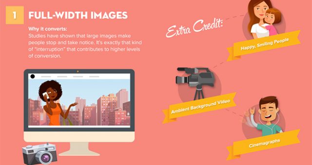
Images are always a good choice to get the attention of your website visitors. Large format pictures that take up the entire browser or display width have an exceptionally large effect.
If the images happen to display faces, the attention is raised even more. Alternatively, page-filling videos are also a promising factor of web design success.
Split-Screen Layouts
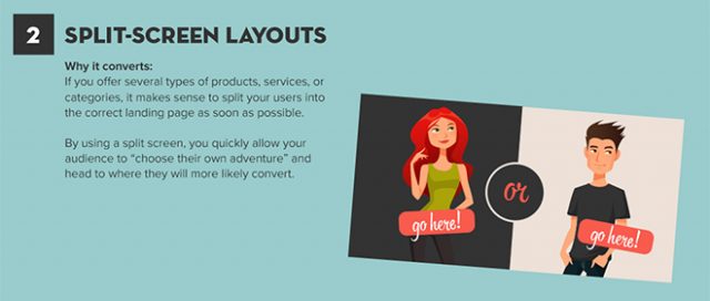
A successful website takes its visitors to what they are looking for as fast as possible. Split-screen layouts help to suggest different goods, services, or information, allowing your guests to choose what they desire.
This makes it easier for your visitors and potential customers to decide between different pages, leading them to their goal a lot faster.
Monochromatic Colors
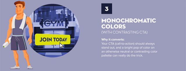
Colorful is always flashy, but can also cause your visitors to lose the orientation on your website very quickly. Thus, restrict your layout to monochromatic colors, which means using different shades of one color. Make your call-to-action button stand out by using a flashy contrast to the monochromatic page.
This way, you highlight the most prominent button or link, giving your visitors a distinct orientation help. Reducing your colors, and choosing a harmonious high-contrast design gives your website a classy look.
Prioritized Navigation
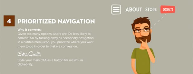
Extensive websites usually come with an extensive navigation. Here, it makes sense to prioritize certain navigation items, like a call-to-action, while making the remaining items less striking.
You could also collect all the less relevant links in a hamburger menu, or move them to the end of the page. This makes your visitors focus on the “important” things while navigating.
When displaying your call-to-action as a button, this also increases the chances of it actually being chosen.
Minimal Lead Capture

Focus on the essentials and avoid using too many words. Especially landing pages are the wrong place for extensive anthems about your product or business.
Ask a simple question which they will ideally answer with “yes”, and make sure to briefly present a few of your product’s or service’s advantages.
Video Content
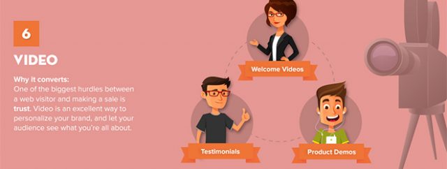
Especially when trying to sell something on your website, one thing is of essential importance: trust. The easiest way to build trust is by using a video.
Directly address your potential customers in a video, and give your brand a personal touch and, above all, a face.
Sticky Call-to-Action
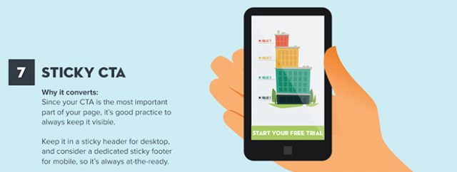
Making your users act is an important goal of your website. Thus, place call-to-actions in a way that they are always visible.
In mobile web design, it makes sense to install them like a sticker so that they are always visible in the upper or lower page border, even when scrolling. This increases the chances of your call-to-actions being noticed and used.
Card Design
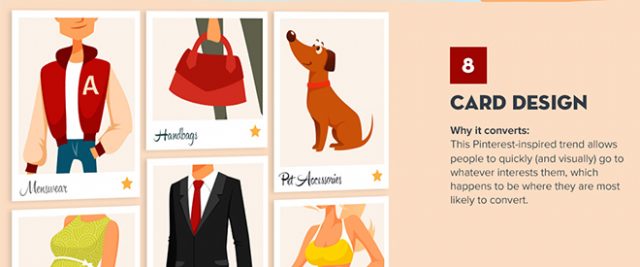
Present your different products like nice cards in the Pinterest style. This brings order into your page while still providing an appealing way of displaying plenty of different content.
Single-Column Call-to-Action
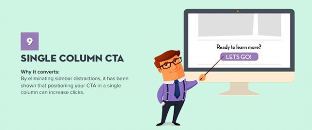
Place your call-to-action to make it stand alone, if possible. Even with a multi-column website, it should always create as much attention as possible.
Breaking a multi-column layout to place a call-to-action is a good idea. It turns your button or link into a real eyecatcher.
Personalized User Experiences

The better you know your target audience, the more detailed you can address them. You should do that. Use information like the location (the more accurate, the better) and previously purchased or viewed products.
This creates a custom page for each user, motivating them to act.
The Complete Infographic
The complete infographic, created by the team of “The Deep End”, collects all ten design trends, which can be combined perfectly, in a clear way.
(dpe)
