Archive

Archive for July, 2016

The Moment CSS Started Making “Sense”

July 12th, 2016 No comments

It was way back in 2008 that Chris shared his “Ah-ha!” moment when working with CSS. You know, that metaphorical lightbulb that ignites when you go from not knowing what the heck CSS is to suddenly having a baseline for understanding how it works.

For Chris, it was the combination of three concepts:

  • Every page element is a box
  • I can control the size and position of those boxes
  • I can give those boxes background images

It’s funny how something seemingly so simple can snowball into a skill that defines a career, whether that’s designing websites for clients or starting a blog like this one.

There’s a timeless quality to recalling the “Ah-ha!” moment for anyone. The CSS-Tricks team has grown in the eight years since Chris wrote that post, so we thought it would be fun to poll ourselves and share the moments where CSS started making sense for each of us.

Geoff Graham

CSS started to make sense for me when I realized that it was a document containing styles used by an HTML file and that classes were placeholders for where styles should be inserted.

This is somewhat similar to Chris’ experience, but more on the document level of things. I wondered how a web browser was able to change the presentation of a page simply based on what was in the HTML document and all I saw was something like this:

<div class="header">
  <h1>A Headline</h1>
  <h2>A clever subtitle</h2>
</div>
<div class="content">
  <p>The content and all that.</p>
</div>
<div class="footer">
  <p>Copyright 2006</p>
</div>

I couldn’t for the life of me understand how that chunk of markup could be transformed to a full-fledged design. That is, until I saw the linked CSS file in the document :

<link rel="stylesheet" href="path/to/style.css" />

Opening that file got the ol’ hamster wheel in my brain turning and led me to start looking at the markup on an element-by-element basis. Where I was looking at the HTML markup as a whole, I was starting to look at it in blocks:

<div class="header">
  <h1>A Headline</h1>
  <h2>A clever subtitle</h2>
</div>

…where that block corresponds to the rules for .header in the stylesheet. I could see how the height for that block was given a height, a background image, and even could change the color and size of the text within it.

Robin Rendle

I was sitting in my backyard fumbling my way through Jeffrey Zeldman’s Designing with Web Standards when it struck me: web design could go far beyond making my dumb band’s website. With a single command it was possible for websites to reveal their guts, their internal logic, as by that time the Web Inspector would permit me to move boxes on the screen with changing one of the values for padding or margin.

However, it wasn’t until I experimented with this line of CSS that I was hooked:

.element {
  float: right;
}

With this tiny string of code I could break the whole page, I could smash columns of text together and hurl images off into oblivion; the treasured words of the author were mine to squeeze and stretch, no matter how ugly the end result might be.

I realize now that it’s in this wanton destruction of other people’s websites where everything began to make a little sense. Even today, as a professional web designer, I still get a kick out of breaking things and treating websites like my own personal playground.

Sarah Drasner

I’m an old timer, I was building web pages back in the days of tables before CSS was around. When it first came out, I was skeptical. For me, the big turnaround was CSS Zen Garden. This site did such an amazing job showing how presentation and content could be decoupled, and the sheer power of CSS in terms of layout and control. The ability to not repeat myself and declare something once and have it propagate everywhere had me giddy.

But my “Ah-ha!” moment in working with CSS was a little different. Mine was pretty similar to Chris’, in that it started with boxes, but with a slight variation:

  • There are elements that work like boxes, which you can control position and spacing for.
  • There are elements that work like text, which you control through line-height, font, etc.
  • If I think about how the browser sees the elements and styling, I can debug it.

Past that point, I got into the sheer creative wonder of working with CSS. It started with where code meets design, but has since moved further. Imaginative programming, like animation, generative code, and all the extra magic like for loops. Organizational power for architecting design systems, with mixins, extends, and variables that SASS allows for.

What was your moment?

Many people shared their experiences in the last post Chris wrote, but it would be interesting to know what that moment is for others who may have started working with CSS since it was published.

We also posed the question on Twitter:

A long time ago we talked about your “CSS Ah-ha! Moment”https://t.co/UGKciONYUl

Let’s do it again!

When did you start to “get” CSS?

— CSS-Tricks (@Real_CSS_Tricks) July 6, 2016

We got some interesting replies! Here’s a few:

@Real_CSS_Tricks head { display: block;} was a big one for me

— James Nowland (@jnowland) July 6, 2016

@Real_CSS_Tricks that position: absolute is positioned relative to the nearest positioned ancestor

— Patrick Marx (@ptrckmrx) July 7, 2016

@Real_CSS_Tricks Probably when I made a deal with the Devil.

— Billy Purvis (@mrmonkeytech) July 6, 2016


What was your moment? Were you viewing a website’s source to dig for answers? Or perhaps a friend was showing you the ropes? Maybe it was even a blog post you read and still have bookmarked to share. Whatever it is, please share in the comments!


The Moment CSS Started Making “Sense” is a post from CSS-Tricks

Categories: Designing, Others Tags:

How I Ended Up With Element Queries, And How You Can Use Them Today

July 12th, 2016 No comments

We often want a component to respond to the dimensions of its parent element rather than the dimensions of the browser window. Currently that’s not possible but ultimately that’s the idea behind Element Queries, and over on Smashing Magazine Tommy Hodgins has written about the development of EQCSS.js, a JavaScript library which allows developers to write element queries.

This implementation of element queries is interesting as it suggests that we can style an element dependent on the features of another element, even if it’s not the parent. Tommy makes an example like this:

@element '.widget' and (min‐width: 500px) {
  body {
    background: red;
  }
}

If the .widget element is larger than 500px then the body would change its background color, and so this opens up a whole new field of experimentation with CSS. It’s pretty exciting stuff, if you ask me.

Direct Link to ArticlePermalink


How I Ended Up With Element Queries, And How You Can Use Them Today is a post from CSS-Tricks

Categories: Designing, Others Tags:

Top 15 Updates – Adobe Muse 2015.2

July 12th, 2016 No comments
Adobe Muse CC - 2015.2 Update

Top 15 Updates – Adobe Muse 2015.2

Adobe Muse CC Logo

Adobe Muse has recently been updated to Adobe Muse 2015.2. The update was released on June 21, 2016. In the video above I go over what I think are the top 15 updates. They are as follows (in no particular order):

  1. New Start Screen
  2. Vertical Site Map Display
  3. Ellipse Tool
  4. Vertical Move Handle
  5. Rectangle and Ellipse Frame Tool
  6. Responsive Width and Height
  7. Responsive YouTube and Vimeo Videos
  8. Minimum Page Width
  9. Fixed-Width Scroll Effects
  10. CC Libraries and Swatches Panel
  11. Adobe Illustrator Workflow
  12. Collecting All Assets
  13. Fallback Fonts
  14. Preview Network Address
  15. Improved Google Pagespeed Rank

Adobe Muse CC - 2015.2 Update

One of the big updates is the fixed-width scroll effects. In the 2015.1 release we were introduced to “Fluid-Width” breakpoints which allowed websites to be similar to responsive websites. The only issue with this was that the scroll effects were disabled. Those of us who started to use Adobe Muse early on really loved to use scroll effects – me included. Now with the 2015.2 update the scroll effects have been re-introduced on fixed-width breakpoints. You just have to make sure the breakpoint is set to fixed-width and the scroll effects are enabled again.

Along with this update and widgets from museforyoushop.com you can create an awesome website. No coding skills required.

Happy Musing :).

Read More at Top 15 Updates – Adobe Muse 2015.2

Categories: Designing, Others Tags:

The right way to increase your freelance rates without losing clients

July 12th, 2016 No comments

You aren’t being paid…

Scratch that. You aren’t being paid what you’re worth. You bend over backwards for your clients. But they have no idea how hard you work. How much effort it takes to do what you do. So they nickel and dime you to death.

They use special phrases to send you hints. “This is an easy project, should only take you a few minutes… right?” When you both know it’ll take at least two to three hours to complete.

But they don’t stop there

They haggle and complain. They use your fears against you. They know you’re afraid of losing them, that you’ll do whatever it takes to keep their business. So they squeeze you financially. After a while that manipulation starts to take its toll.

It leaves many designers drained and crippled with fear.

  • “All my customers will leave if I increase my prices.”
  • “I’m working more but earning less, how will I survive?”
  • “Just have to work harder, that’s about all I can do.”

Left unchecked, a client’s bad behavior can induce learned helplessness. Designers give in and accept the abuse.

This doesn’t have to be you.

You can be the designer that commands higher prices. You can attract clients who pay your fees without a second thought. The kind that values your time and your expertise, seeing you as the expert you are.

But you’ll need to understand why they reject price increases before you can get them to pay whatever you ask.

Why clients reject price increases

Clients say “no” for many reasons, but most of their reasons boil down to eight specific things.

  1. Loss of control: Forcing changes on clients, telling them “this is the way it is” creates feelings of helplessness. How do they regain control? By resisting.
  2. It’s surprising: If your clients are used to spending $2,500 for a small site and you suddenly ask them for $25,000 your client’s answer will most likely be “no”.
  3. It’s too different: Your clients are comfortable with PHP and WordPress, or you recommend asp.net and Sitefinity, and they want to know why. If they don’t buy in to your plan, a “no” is probably on its way.
  4. Bitterness and resentment: You’re brilliant. Your client thinks you’re a magician. But you embarrassed them that one time in a meeting in front of their friends. Now they’re carrying a grudge. You’re definitely getting a “no”.
  5. Too much uncertainty: Your client hosts their website, media, thousands of files — with Amazon web services. You want to switch to a new provider they’ve never heard of and you don’t have a plan. They’re going to say “no”.
  6. Distrust: You’re more likely to hear a “no” if you’re asking for a change but your client doesn’t believe you can pull it off.
  7. Too hard, too much work: Your client relies on Windows Server 2012. You”d like them to use an Apache Server instead. You’ve presented an airtight case for switching but it’s just too disruptive to their business. They turn you down.
  8. Ripple effects: Something’s disrupted their business. Instead of spending their time and money with you, they feel they have to put out other fires first. They turn your offer down.

It’s always possible there’s a different reason, but these are the most common.

Here’s how you handle these problems

You create the perfect solution. We’ve just gone over the reasons why clients say No. These reasons are unpleasant but they give us a clear idea of the ingredients we’ll need if we want our clients to say Yes.

The perfect solution…

  1. Gives clients controlled choices: Your clients don’t know what they don’t know. Controlled choices (do you want A or B) gives them control.
  2. Tells the whole story: Let’s say you’re creating a new service. Which detail will get each and every customer to buy? Don’t know? Neither do I. So you tell them everything.
  3. Makes small, incremental changes: If your clients are used to spending $2,500, change the price slowly. From $2,500 to $3,000. $3,000 to $3,500 and so on.
  4. Prepares clients for change: Don’t spring a new idea or change on your clients without warning. Give them regular updates on a schedule.
  5. Is trustworthy: Show clients, via social proof, certifications, etc. that you can do what you say you can.
  6. Is simple and/or easy: The easier it is for clients to do what you’re asking, the more likely they are to do it.
  7. Includes everyone who’s affected. Will other departments need to use your work? Are other people influencing the buyer’s decision? Make them part of the process if you can.
  8. Is respectful and kind: Most of us know this already. But it’s an incredibly common mistake. Disrespect becomes a problem when othering and purpose conflicts come into play.

If you follow these steps, your client is primed for a yes. It’s not guaranteed, just far more likely.

But, we’re not all the way there yet. We don’t know when we should increase prices, or how.

Clients tell you when to increase your prices

… If you know what to look for.

You’ll need to know who you’re dealing with first, before you know when. Knowing who you’re dealing with sets the tone for everything else. You’ll know which customers you can approach and how to structure your offers.

  • Opportunists: I call them “Groupon Clients”. These are the clients who demand spec work, wanting you to give them everything for next to nothing.
  • Noobs: are inexperienced clients who need lots of hand-holding and support. Often times they’re in over their heads, overwhelmed and full of questions.
  • Victims: are wounded. They’ve been burned by someone in their past: a designer, partner, etc. They’re extraordinarily sensitive and very suspicious.
  • Forgetful: These clients tend to have a lot on their plate. Typically they’re juggling multiple projects at once. They’re forgetful so they need hand-holding that’s free from condescension and contempt.
  • Ideal: clients have their act together. This isn’t their first rodeo. They have healthy expectations and they’re free from heavy trust issues. These clients expect a lot but they’re a pleasure to work with.

See the differences between these clients? It’s enormous. It’s also the reason why a one-size-fits-all approach to pricing fails when you’re selling services.

  • Opportunists won’t tolerate any price increase. Keep them around if it’s worth your time. When you’re ready, let them go.
  • Noobs want lots and lots of help; eventually that becomes difficult. They genuinely need help, but your time is limited. So you bundle the things they need help with together and you offer them a (bigger) set price.
  • Victims want help, but they need to know they can trust you. Continually remind them that you’re trustworthy by validating that trust with your work. Then, and only then, can you offer them a higher price. Increase your price only when you’ve dramatically increased your value (e.g. free hosting with design services over X amount).
  • Forgetful clients want reminders. If they see the value of your work, that you take care of things for them, they’ll be more willing to pay for that right. Increase your prices only after they’ve developed a habit of depending on you for the things they need.
  • Ideal clients want you to exceed their expectations. They want to be satisfied. Have you ever heard the saying “under-promise and over-deliver?” This applies to ideal clients. They’re more likely to go for a price increase immediately after they’re satisfied.

Did you catch the window of availability? These clients are more likely to say “yes” to your price increase, if you time it right. This just leaves us with the question of “How?”

Here’s how you increase your prices

You use positioning. But that’s the problem isn’t it? The vast majority of designers “tell” their clients they’re raising their prices. They don’t ask. This is because the traditional mantra says you shouldn’t have to ask permission — that’s apologizing for raising your prices.

That take it or leave it approach tends to backfire, because clients are given the wrong kind of choice. They’re asked to make a “Yes or No” choice.

What if you gave them a “Yes or Yes” choice?

Suddenly you’ve removed “no” from the equation. Clients aren’t forced into something they don’t like, they’re enticed into something they can’t wait to buy.

Let’s compare “Yes or No” to “Yes or Yes”.

Yes or no

Designer: Effective March 31st, I’ll be increasing my rates from $50 per hour to $150 per hour.

Client: Wait, what? Why? More money for the same service? How do you justify that? I dunno if I…

Designer: My expenses have gone up, so I’ve gotta increase my rates…

Yes or yes

Designer: Hey, I’ve got some great news! From now on, web design clients get free maintenance and hosting.

Clients: Seriously? How can you afford that? What’s the catch?

Designer: We’re offering this to clients that upgrade to our concierge service. It’s something we’re offering to our best clients (you’re one of them). You’re paying a little bit more up front, but you’ll save three times as much as you’re spending for both right now.

Client: Okay… that sounds amazing. A little too good to be true but, amazing if this is legit. Tell me more.

Designer: We can keep things as-is. We’re also offering a free trial. Try it! If you hate it you can always go back to the way things are right now.

See the difference?

We’re not asking clients to choose between “Yes or No”. We’re asking them to choose between “Yes or Yes”.

Some clients will leave anyway

It’s true. Do everything right and some clients will still choose to walk away. Relationships end for a wide variety of reasons. Handle it well and it won’t be due to price.

But I don’t want to lose any clients

Losing a wonderful client is painful, especially if you’ve built a wonderful relationship with them. The relationship may end professionally but it doesn’t have to end personally.

Make the right moves and you’ll have a list of new clients who are eager and ready to buy.

This sounds like too much work

You might think, “Learning about each client, planning my moves carefully, moving slowly… it’s too hard. I’m not sure if I’ll be able to do it.” It can feel overwhelming if you’re doing this for the first time, but it’s not as hard as it seems.

Simply set a goal (e.g. I want to make $175 per hour or increase my prices every year by 15 percent); then, once you have a clear goal in mind, use the strategies I’ve shared to reach that goal.

You should be paid what you’re worth

You take good care of your clients; it’s important that they take care of you. If you want to increase your prices, it’s important to ask the right way. Give your clients the things they need to buy in to your request.

Great clients are reasonable. Give them a compelling reason to pay more and they will. Give them the ability to choose, and they’re far more likely to see things your way.

But it only works if you ask. Do it right, take it slow, and you’ll soon be paid what you’re worth.

30+ Creative Auto-Calculating Invoice Templates- only $9!

Source

Categories: Designing, Others Tags:

How We Started Releasing Features Twice As Fast (Case Study)

July 12th, 2016 No comments

When businesses rely on your app for their day-to-day work, you have to be agile enough to quickly address their needs. If you don’t, others definitely will. In the unforgiving world of SaaS, delaying a critical feature (or rushing a bug-ridden piece of code) will mean losing clients. A solid agile workflow can make all the difference.

How We Started Releasing Features Twice As Fast: A Case Study

We’re the team behind Active Collab, a project-management app with an ever-growing set of features and a sizeable user base. This means that even the smallest change in functionality will affect a large number of people. Therefore, the development process needs to run smoothly and up to a standard, with delays reduced to a bare minimum.

The post How We Started Releasing Features Twice As Fast (Case Study) appeared first on Smashing Magazine.

Categories: Others Tags:

Simbla 2016: New Data-Driven Website Application Builder

July 12th, 2016 No comments
simbla

Many homepage builders promise you to be able to create websites without requiring any knowledge of HTML, CSS, and JavaScript. Then you find out that this comes at the cost of having to succumb to more or less flexible premade design templates. The website builder Simbla is one of the exceptions that don’t just provide pretty templates. The site layout is responsive and based on HTML5. That said, Simbla offers everything that contemporary websites need. Now, thanks to the brand-new database builder, you also get to visualize, manage, and edit extensive and complex data.

Creating a Database and Filling it With Content

Noupe readers already know Simbla as we’ve already published a detailed review here and here. The creators of Simbla don’t only want to work well with current standards. Current design trends are also always considered. For instance, there are new templates with parallax effects. Instead of static scrolling, the website’s different elements in the background and foreground are moved at different speeds while scrolling. This creates the illusion of motion, the so-called parallax effect.

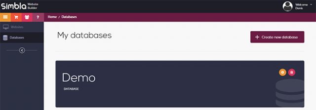
Setting up a Database in Simbla

Setting up a Database in Simbla

However, the biggest new addition to its feature set is Simbla’s online database builder. It allows you to create your own database and fill it with content. Due to the extensive assignment of permissions, you are in full control over who’s allowed to create, read, alter, and delete data sets.

The databases represent an own area that is independent of the websites. After setting up a database, define users, roles, as well as tables. For that, there’s the default user “public”, which takes care of the public access to the website. However, you also get to set up other users that will only have access after logging in, for example.

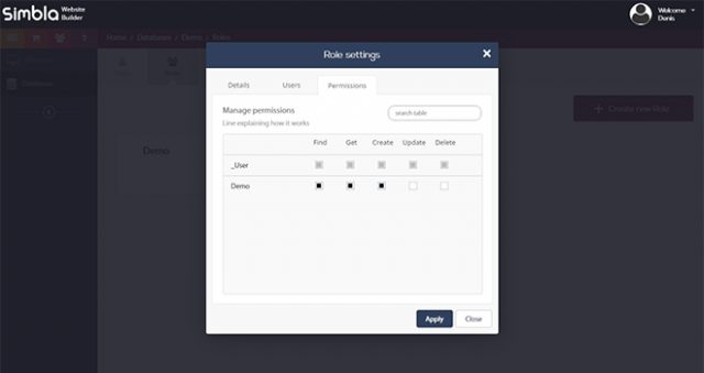
simbla_datenbank_rollen

Defining Roles and Rights

You get to distribute different rights for each user. To give an example, it is possible to only assign reading rights to the user “public”, and writing rights to other users. Here, the rights “find” to search, “get” to display, “create” to create, “update” to update, and “delete” to delete a dataset, are available to you.

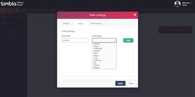
After assigning users, roles, and rights, create one or more tables. Comfortably add columns and define their type. Among others, the types include character strings, numbers, arrays, boolean values, and files. In contrast to databases like MySQL, files such as images and documents can easily be integrated, and then be accessed later on. Additionally, you also receive a preview of image files.

Creating a Table, Defining Columns and Types

Creating a Table, Defining Columns and Types

The columns “Id”, “createdAt”, and “updateAt” are created and taken care of automatically. Thanks to the graphic user interface, creating and managing databases becomes as easy as child’s play. Setting up new rows and filling them with content is a snap.

If you need to use a data table somewhere else, export it into a CSV with one click. Only embedded files are ignored during the export.

Building Simple Web Applications Using Databases

Once your database is done, you can integrate it into your Simbla website extremely quickly and comfortably. To do so, you first need to choose the database from the website settings. Afterward, all of its contents are made available.

„App Widgets“

“App Widgets”

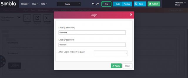
There are unique content elements called “app widgets,” which allow you to create a database connection. For that, you need to switch to the Pro mode, however. Then, you get to establish a login form for registered users, or a form that writes data into the table. Of course, you are also able to display your database’s content as a table on your website. All you need to do is choose from different table layouts.

Due to the extensive options, you easily construct simple as well as complex website applications, without much effort or programming knowledge.

For instance, when you want to offer content to registered users only, all you need to do is add a form that lets the users register. Email verification is done automatically. Your registered users will be displayed in the database area.

Login Form

Login Form

A login form is what allows registered users to check in and out. Additionally, you can also decide that certain pages are only available to logged-in users.

Complex Web Applications Via JavaScript

The database builder allows for far more complex web applications as well. Instead of using a simple “app widget”, you also have the option to conduct extensive database requests and operations. For that, there’s a custom JavaScript API.

Thanks to the API, Simbla can work as a website application builder, which enables you to create custom requests, complex CRM systems, or even realize order handling, and booking requests.

Getting into the API is rather easy. Use “Simbla.Object.extend()” to access a database table, and make a request that you can work with via “Simbla.Query()”.

var db = Simbla.Object.extend("DatabankChart");
var abfrage = new Simbla.Query(db);

There are plenty of options to categorize and limit your request. Here, “descending()”, and “ascending()” make sure that the table is displayed in a descending or ascending order, respectively.

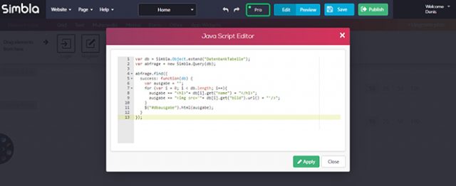
JavaScript Database Request

JavaScript Database Request

On top of that, there are plenty of comparison options like “lessThan()”, “greaterThan()”, as well as the option to limit a request to a specified number of results via “limit()”, as well as skip data sets with “skip()”.

arequest.greaterThan("ColumnYear", 2010);

The previously sorted, or limited data sets are searched via “find()”, and can then be distributed.

request.find({
  success: function(db) {
    var output = "";
    for (var i = 0; i &lt; db.length; i++){
      output += "&lt;h1&gt;"+ db[i].get("name") + "&lt;/h1&gt;";
      output += "&lt;img src='"+ db[i].get("image").url() + "'/&gt;";
    }
    $("#dboutput").html(output);
  }
});

In our example, the data sets are written into a variable via “get()”, and then into the element with the ID “output” using “html()”.

The website builder also provides a custom editor for JavaScript. For the HTML output, you need to place an HTML content element on a page and assign an element to it that has the ID defined via JavaScript.

&lt;div id="dboutput"&gt;&lt;/div&gt;

New Features to be Expected

At the moment, the JavaScript API is still under construction. Simbla has announced that they would further extend the scope of functions. One can also assume that additional methods and attributes will be added, allowing for even more extensive database queries in the future.

However, the API’s current situation already enables plenty of queries. Getting to results is rather simple. Those that have experience when it comes to JavaScript will get the hang of it fast, and be able to create custom requests.

The builder is fascinating for those that lack experience with database queries and MySQl, as it comes with its own, way easier database solution, and the JavaScript API.

Contemporary Website Builder for Complex Web Applications

The Simbla website builder sets itself further apart from the plethora of competitors due to its database builder. Here, the connection to databases is far more extensive than it is for all other approaches, where you mostly won’t get more than a simple form named “the database connection”.

Handling Simbla is very simple as well, and even the custom JavaScript API is not much of a challenge.

If you would like to give Simbla a try, which I strongly advise you to do as soon as you are looking for a website builder anyway, create a free account and test the entire website and database builder in detail. I’m sure you won’t be disappointed.

(dpe)

Categories: Others Tags:

Mobile Navigation Via Taps and Gestures Instead of the Mouse

July 12th, 2016 No comments
hover-navigation

Mobile web has strongly influenced our habits of when, how, and where we use the world wide web. The way of how we navigate through websites has changed the most. A few years ago, the mouse had the main responsibility for the navigation, and now, tablets and smartphones are controlled via simple taps and gestures. Thus, contemporary websites should definitely consider taps and gestures when it comes to user interfaces and mobile navigation.

The Hover Problem

Navigation on a smartphone or tablet works fine without paying close attention to taps and gestures. Links are opened via tap instead of a click, and scrolling is done by swiping. However, when it comes to hover effects, which are quite popular in web design, mobile devices will already give you trouble.

That’s because a hover effect, using the CSS pseudo class “: hover”, for example, just doesn’t exist on mobile devises, and thus, it won’t be triggered when calling up links via tap. So, when equipping links with hover effects, the link target and the hover effect are processed at the same time on mobile devices. At best, the visitor will see the hover effect for a short period of time, until the page referenced in the link is accessed.

Navigation Via Hover Effect on Fotolia

Of course, web developers can generally forgo hover effects to guarantee a homogeneous user interface on desktop and mobile devices. Or you could choose to take a different approach for desktop and mobile devices. If the hover effect is only used as ornamental art, you should just leave it out on mobile devices.

When information, like texts, is displayed using a hover effect, you should find a way to display them without the hover effect for mobile devices.

Media Query and “pointer”

CSS might not give you an explicit way to choose between controls via mouse, and touch displays. However, the “pointer” designation allows you to distinguish between high and limited pointer accuracy. On touch devices, “pointer” hands out the value “coarse”, which is equivalent to a limited accuracy. For other devices, the value “fine” is used for a high precision.

@media (pointer: fine) {
  a:hover p {
    display: block;
  }
}

In the example, a paragraph within a link is only displayed via hover when using a device with a high pointer accuracy, as that means that it’s controlled with a mouse. This way, you are able to operate your website depending on the control concept – mouse or touch -, without using JavaScript.

Links and Buttons Require Space

Aside from hover effects, there’s another aspect that you should consider when designing mobile user interfaces: the size of and the distances between links and buttons.

touch-navigation
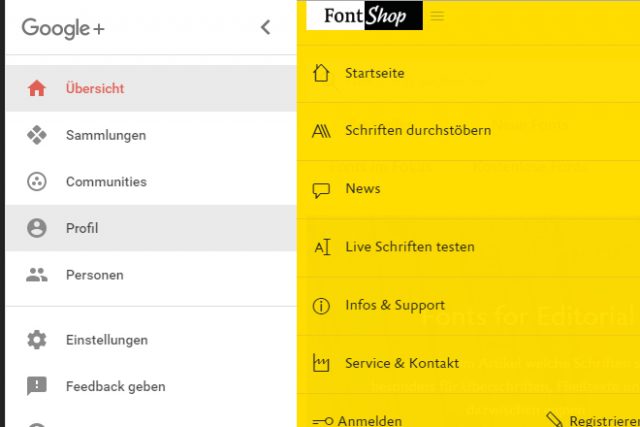
Example for Menus With Sufficient Size: Google+ and FontShop

While the mouse allows you to click small links and buttons very precisely, the finger tap is not as accurate. Thus, you should make sure that your elements are large enough on mobile views. It is also important to leave enough space between the individual elements. All of this prevents the visitor from accidentally choosing a wrong link or button.

If you want to distinguish between desktop and mobile view, you could, once again, use the “pointer” designation to design different menus and forms.

Making the design of these elements dependant on a device’s display width, like it’s common in responsive weblayouts, doesn’t make much sense. After all, tablets are also operated via taps and gestures, and usually, they display the desktop view.

Reacting to Gestures Via JavaScript

By default, links and buttons are triggered with a simple tap on mobile. However, you can also react to gestures by using touch events. These are similar to the well-known mouse events. As such, there are events that are triggered at the start and end of a touch, as well as during the motion on the display.

document.getElementsByTagName("body")[0].addEventListener("touchmove", function(e) {
  console.log(e.touches[0].pageX);
  console.log(e.touches[0].pageY);
}, false);

In the example seen above, the event “touchmove” activates a funtion that writes down the position of the touch inside the browser window (“pageX” and “pageY”) into the console. All taps are captured as arrays using “touches[]”, by the way. Thus, if there are two fingers on the display at the same time, both moves and their positions are available to you via “touches[0]” “touches[1]”.

hammerjs_gesten
Gestures Supported by Hammer-JS/

This way, you react to swipe gestures as well as rotation and zoom gestures. As JavaScript doesn’t know any gestures, you need to create the using touch events, or by using according frameworks like Hammer.JS, which knows common gestures, allowing it to react to them with unique actions or functions.

Long-Tap is the “new” Hover

Hammer.JS can also be used to create so-called long-taps. Here, the finger stays on the display for a short while. Long-taps are often used to access context or pulldown menus.

Long-taps have the advantage of allowing for two different actions of one element, similar to the hover effect. On desktop devices, the mouse is often used to expand a dropdown menu via hover effect, while the click calls up individual menu items. On mobile, the long-tap enables you to expand a dropdown menu without directly activating a menu item.

For that reason, the long-tap can be used as a replacement for the hover effect on mobile devices. In any case, you should consider if your gestures and taps are intuitive, and whether they can be applied properly by the user.

Conclusion

It is not easy to transfer the common control concepts, as we know them from the mouse, to mobile and touch displays. However, many gestures have established themselves over the past years, like swipe and pinch gestures, for instance, which you should use for the navigation of your website.

The long-tap has also become a common alternative to the hover effect. Nonetheless, you always have to remember that both mouse and touch have differences that you need to consider.

(dpe)

Categories: Others Tags:

Key Things To Know About The Role Of Big Data In Validating & Measuring UX

July 11th, 2016 No comments

For companies, the quality user experience is crucial to gain competitive advantage. This is often ensured by monitoring and tracking user interactions. How far the quality of the experience can be delivered to customers remains a challenge for most businesses. The digital signature or traces left by business today tells a lot about their

Categories: Designing, Others Tags:

BBE For WordPress: The Bootstrap Building Engine You Should Use

July 11th, 2016 No comments
bbe main

WordPress, for the most part, provides an intuitive and easy to use manner of website creation and development. It is simple, straightforward, and offers great scope for customization.

However, at the end of the day, you might need specialized tools for the job, and when it comes to website creation, there are several builder plugins and themes out there for WordPress users that you can rely on.

But unfortunately, vast majority of these website builders, be they independent or work in assonance with WordPress, are bulky and bloated. They offer a difficult to use interface, and focus too much on either being beginner friendly or developer friendly. You can either go for a WYSIWYG editor that feels like a toy if used by a seasoned coder, or a code-heavy builder that is rocket science for the less advanced users.

What should one do? Well, we have the perfect solution for you: meet BBE, the Bootstrap Building Engine for WordPress. At its core, BBE is not a power tool or a framework. It is a simple WordPress theme that behaves and works the way you want it to, thereby helping you do more with WordPress.

BBE For WordPress: The Bootstrap Building Engine You Should Use

What is BBE for WordPress?

Before we go any further, let us take a moment to familiarize ourselves with BBE for WP.

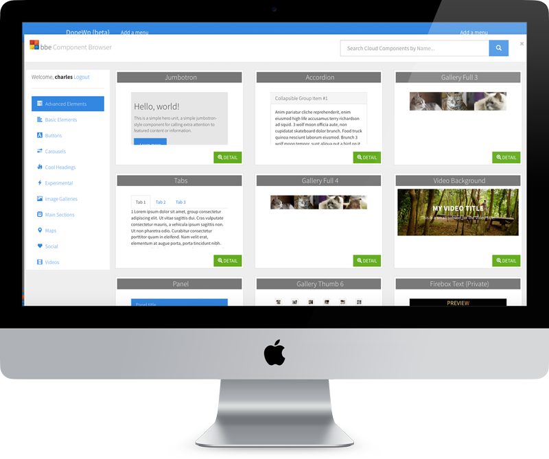
Basically, BBE is a totally free WordPress theme (yes, you read that right — free of cost for you to download and deploy). It comes with a powerful Bootstrap powered page builder, and numerous readymade components to help you get started with. Furthermore, it offers an HTML editing platform to help you incorporate and preview your changes for your website.

All of that — for free. Sounds awesome, doesn’t it?

But how is BBE different from the various other page builders out there? Isn’t it yet another Bootstrap based framework or monster theme?

bbe for wordpress

BBE is more than just a standard framework, and it is different from the millions of bloated frameworks that you might have come across. BBE is a simple and standard WordPress theme. It works well with the Theme Customizer, and gives you total control over the template elements. You can tweak and modify every single page element, and essentially learn how web development should work, or extend it by means of custom code.

Furthermore, since BBE is based on Bootstrap, it can be skinned by means of Bootswatch as well. BBE lets you include shortcodes and widgets, and edit content, labels and images right from the frontend itself. BBE offers SEO optimized code, and it lets you reuse HTML and CSS code samples as well. Plus, it saves your HTML editing history, so you can go back and undo the changes if something gets messed up.

bbe main

Well, that’s what we had with the features of BBE theme. What about its actual implementation?

BBE WordPress Theme in Action

So I decided to give BBE theme a spin on a test site. You can download the free WordPress theme yourself and try it out, though the premium components will require a subscription.

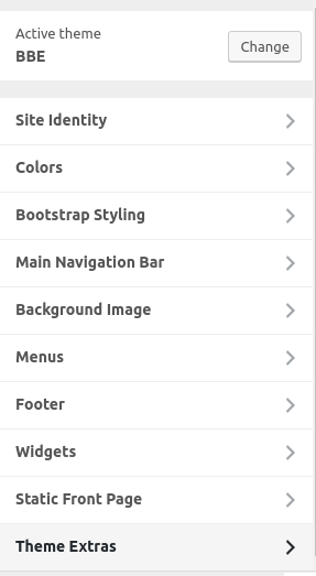
You can upload and activate the theme much like you would, with any other WordPress theme. After activation, BBE does not add any separate settings section in the WP admin panel. All of the action happens from right within the Customizer.

In the Theme Customizer, you can choose the Bootswatch skin that you wish to use, as well as enable or disable the Lightbox, and so on.

bbe customizer

Of course, that is not all. The real beauty of BBE lies in the fact that you can create pages using different types of containers, columns and blocks. If you have had any level of experience with Bootstrap, you will feel at ease with BBE right away. Here is a video to help you get a better idea:

And here is a handy getting started guide for you.

Pricing

As already mentioned, BBE the theme in itself is totally free of cost. However, if you opt for a premium membership, you can gain access to a remote repository of HTML components that can help you accomplish a lot more with BBE in WP.

The premium membership costs $79 per annum, and also entitles you to premium level support.

Conclusion

In a world filled with page makers, page builders, website creators, frameworks and skeleton themes, where exactly does BBE for WP stand?

To be frank, BBE does not reinvent the wheel. It is not something that you will look at and be amazed simply by seeing a demo or a GIF. However, once you actually give BBE a try on your website or your web project, you will realize what BBE attempts to accomplish. This is where you might come to admire BBE in the long run.

BBE solves one major, often-talked about but rarely addressed problem that exists with modern page builder plugins and themes or frameworks — bloatware. BBE is not bloated and it does not promise to do everything under the sun for you. BBE is simple, and works in a clean manner, much like a good WordPress theme should.

Furthermore, BBE knows what comes under its territory and what does not. The code is SEO friendly, the theme is eCommerce ready, but if you wish to setup a theme shop or handle SEO features, get the plugins that you need. Your WordPress theme should not encroach upon plugin territory, and BBE for WP is aware of this rule.

Lastly, the BBE theme is free to download and extend, so there is nothing for you to lose in this. The premium membership does cost $79, and depending on whether or not you need to use the premium features, you can choose to opt for it.

Download the Bootstrap Building Engine for WordPress from this page.

Read More at BBE For WordPress: The Bootstrap Building Engine You Should Use

Categories: Designing, Others Tags:

Collaborative Engineering and Design Tools

July 11th, 2016 No comments
zeplin tool screenshot

Working at any large company, the greatest hurdle is always the problem of scale. Be it engineering, design, or how they work together, communication is the key to a successful business. Here are some of the tools that I’ve seen help a great deal while collaborating on a large team. With a number of engineers and designers in the mix — not to mention hybrids like me — working together seamlessly and staying focused on a common goal for a long period of time can be challenging. Here are a number of tools I’ve seen firsthand to ensure tight and seamless collaboration and communication.

Zeplin

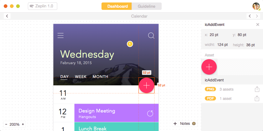
One of the most time-intensive tasks a designer has at a big company isn’t the ideation or the design, it’s producing the specs. Whether you’re designing for the Web, Android, or iOS, Zeplin has been a huge boon for productivity. You can import your Sketch documents and Zeplin will even export code snippets. You can export assets directly from the screen, and at multiple pixel densities if necessary. There’s even a Slack integration if you so choose.

I’ve heard designers say that because this tool exports with a guideline page with a style guide that includes a palette, they are forced to stay on track with their color choices to the component library even more- it becomes very obvious if they stray by a little. In a world where consistency reigns, this is a godsend for cross-team collaboration. It shaves hours off of each project as designers no longer have to spec out every single design with all of the padding, font-weight, and spacing.

CodePen

In terms of quick inspiration, sites like CodePen and Dribbble are well known for their ability to stoke some creative fires. Designers and developers spend a lot of time expressing themselves through code and pixels on these sites. But I find CodePen to be a wonderful place to be collaborative in a professional environment. Here’s a breakdown of how and why I’ve done this with large teams:

1) It’s useful for debugging. Working with a large codebase with a few hundred other developers can be an amazing learning experience, in part due to increased quality of code through code reviews, but also because of the challenges you face. You’re not simply writing code, you’re also writing code that others can read.

It’s exciting to be a developer working on a large codebase that millions of people will see. The flip side of this is that you often have to move quickly on these large teams, and there are a lot of moving pieces. Due to this fact, the ability to see a piece of Front-End code in isolation becomes a powerful debugging tool.

An animation is worth a thousand meetings.
– Rachel Nabors

2) Prototyping is another reason CodePen proves vital. I’ve worked on teams will often show interaction ideation and we have to produce potentially throw-away code very quickly. CodePen has helped us create fast work for communication purposes with their private pens and private collections. I will often screenshot the page I’m working on so as not to build out the entire thing, and absolutely position just the pieces of interaction I need to demo over the top of it. Inevitably, after some iterations, I’ll have a few different versions for my product managers to go through, so I’ll make a private collection.

Private collections allow me to group together many versions of new work that my coworkers can browse through and work with at a glance. It also becomes a resource for other designer/developers looking to fork my pens to work with as a template so that they have the compiled site-wide stylesheet and JS file.

3) CodePen has an active community of people working on solving common problems. A lot of us use CodePen for the same reason we use Stack Overflow: if a problem comes up for us, it has probably come up for others. There are a ton of pens to reverse engineer to understand a technique better, and even well-organized design patterns that attack some common use-cases. These days, if you’re not relying on the community to help educate you, you’re doing unnecessary footwork.

Quip

Quip is a tool that one of my former colleagues and Engineering Lead, Joe Tuson, turned me on to. I use Quip for shared, collaborative documents, and even to organize large projects like designing systems on a high level. It’s a little easier-going than a wiki that seems more formal and tends to be written once, communicated out, and left. Quip encourages collaboration through their easy to work with GUI, and ability to see notifications of what’s been changed, when it’s changed. Most of the stuff I work on is proprietary, so I made a little fakey mcfakerston doc example below so you can see how it works:

I particularly like that even within the notifications in the sidebar, you can see who has viewed the change, which allows you to get a handle on how many people are up to speed on the document.

We would all love a world where a waterfall workflow from product ? design ? engineering ? QA happens in a neat linear fashion. Unfortunately (or perhaps fortunately) this workflow doesn’t allow for quick iteration. The flow of tickets and mocks on a moving project in Jira or Github can become a bit confusing. Quip has become very helpful for quick design and product changes by allowing the mocks to live in the same place as our to do lists. It’s easily to maintain because it’s easy to keep updated, commented on, and no big deal to delete from.

They have a browser version as well as desktop app, so it’s very simple to customize your notification preferences. Living documentation for a quick and shared project is invaluable.

Lingo

Most big companies use storage such as Dropbox to house design documents, but what if you have a need for just an icon? The Noun Project has an app that allows you to seamlessly browse through a lot of visual information and group by project. If you have shared product illustrations like common SVGs that are consistent for visual branding, this tool is really wonderful.

They support a lot of different file formats, and if you have the app open and are taking screenshots, you can get a notification that allows you to import the screenshot in one click. This is awesome for collaborating on a few different versions of designs and communicating all of them at a glance. Personally, I’ll make a few different versions of a product mockup and screenshot each one of them, importing them into lingo as I go. I can then keep each review process separate and even easily present them all for design reviews.

I’ve found this tool to be especially helpful working with icons. Looking for the correct icon and keeping a component library and sprite sheet up to date on a large team can be really cumbersome. Lingo makes searching for, organizing, and keeping your icon system up to date really simple.

Elegantt

Most people know about the benefit of the simplicity of Trello’s swimlanes, but the thing I like most about it is plugin feature, called Elegantt. This is a gantt chart feature that lets you plot what you’ll be working on, when. As someone who constantly balances a lot of different types of projects, I find this useful because you can visually see if you’re taking on too much work at once and maximize your productivity or set proper boundaries.


Whether you’re a designer or an engineer or both, collaboration with other teams or across teams is as important as the actual work. These are some of the tools I’ve tried, tested, and like working on large systems. If you have some that have worked for you as well, feel free to add more in the comments. The more we share, the better we all work together.


Collaborative Engineering and Design Tools is a post from CSS-Tricks
Categories: Designing, Others Tags: