Archive

Archive for July, 2016

How To Create Icons In Adobe XD

July 27th, 2016 No comments

Released in March this year, Adobe Experience Design is a new all-in-one tool that lets you design and prototype websites and mobile apps. for websites and mobile apps. XD is still in beta and available for Mac with a Windows version on track for a release later in 2016. It is bound to provide a fast and efficient way to create new user interfaces, wireframes, and visual designs with various devices in mind.

Creating Icons With Adobe XD

As an icon creator, I tried to use XD to create icons from scratch and to apply them to a new user interface. In this tutorial, I want to guide you through the steps it took so you can follow along. We’ll take a look at how to create a set of office icons for a new app. Plus, I’m going to show you how you can use XD’s features to interact with your newly-created user interfaces during the prototyping phase. So, let’s get started.

The post How To Create Icons In Adobe XD appeared first on Smashing Magazine.

Categories: Others Tags:

MapSVG: Vector-Based Maps for jQuery and WordPress

July 27th, 2016 No comments
mapsvg

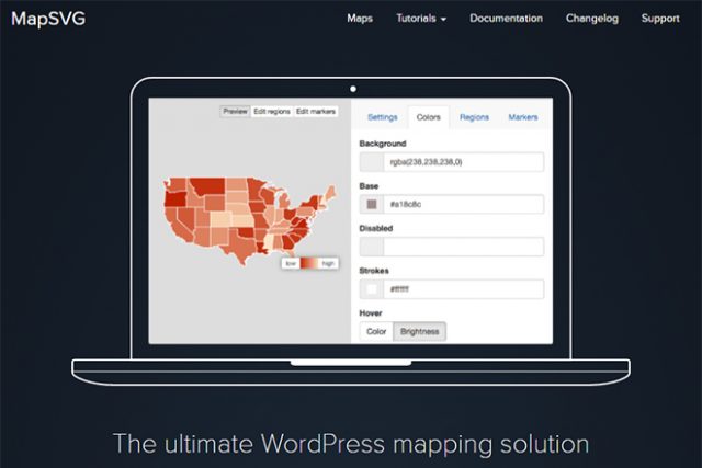
Maps are always needed, either for the visual extension of statistics or for the display of location. MapSVG is a service that allows you to easily integrate vector-based, interactive maps in SVG format into your website. MapSVG is available as a plugin for both jQuery and WordPress.

State Maps Including Divisions

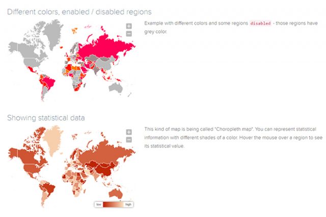
MapSVG gives you access to far more than 100 different maps. Among them are not all, but most countries of the world. Aside from the countries themselves, the maps also display a nation’s subdivisions. On the map of the US, you’ll also find the individual states, and on the French one, you can see the different regions.

mapsvg_karten
Example: How to Use the Maps

Additionally, there are two world maps with all nations included; one with detailed borders, and one with rather roughly drawn borders. An interactive preview with countries or regions that you can click to receive information on the name, and the official ISO-3166-Code, is also provided for each map.

On top of that, there are a couple of examples for each map, showing you how it could be applied.

Using MapSVG in WordPress

As MapSVG is a commercial service, the free version is restricted to a few functions and maps. However, the plugin “MapSVG Lite” gives you a very easy way of integrating and customizing maps. “MapSVG Lite” only contains maps for the USA, meaning that you either need to switch to the premium plugin or upload your maps when you need different ones.

mapsvg_neu
Easily Uploading and Editing Own Maps

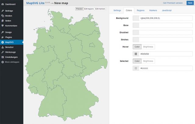
The only important thing is that the map material is provided in SVG format. It doesn’t matter if you create the maps in Illustrator or another program or if you use free map material. In any case, “MapSVG Lite” allows you to use custom maps.

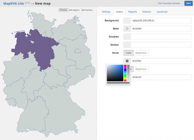
You can then choose the map’s colors via the user interface of the plugin. Apart from the background, line, and base color, you also get to define colors for individual, and deactivated areas, as well as for a hover effect.

mapsvg_farbe
Adjusting Colors

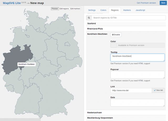
If an ID is assigned to the paths of your SVG map, it is displayed as a region. On a German map, for example, it would make sense to name the paths that represent the federal states after the state they represent. Then, the individual federal states are available to you as regions.

After that, define tooltips and links for each region. Also, you can also add a zoom and scroll function to a map. It would also be possible to enhance a part of the map using buttons or a mouse.

mapsvg_regionen
Editing Regions and Adding Tooltips and Links to Them

Once you’re done editing and saving your map, a shortcode to be placed on a page or in an article is provided.

Adding Locations Via Markers

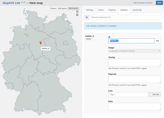
While the premium plugin allows you to determine locations by entering an address, the lite plugin only gives you the option to manually place markers. However, due to the visual user interface, it is rather comfortable to put new markers on the map.

mapsvg_marker
Placing Markers and Equipping Them With Tooltips and Links

Similar to regions, you place markers with tooltips and links. For instance, it is easy to create a map with business locations alongside links to these locations.

jQuery Plugin and Costs

For everyone that works without WordPress, MapSVG is also available as a JQuery plugin. There is no free version for it, though. So, if you’d rather use MapSVG via jQuery, it will cost you 25 USD.

The WordPress premium plugin costs 35 USD. In return, all maps are available, and there are no restrictions regarding functions. In the lite plugin, you can only place five markers. Using the premium plugin, you also get to create custom JavaScript events and create much more customized maps with individual functions.

(dpe)

Categories: Others Tags:

Adobe Muse Quick Tip #1 – Page Expansion

July 26th, 2016 No comments
Muse For You - Quick Tip #1 - Page Expansion - Adobe Muse CC

Adobe Muse Quick Tip #1 – Page Expansion. No Coding Skills Required.

Adobe Muse CC Logo

In the 2015.1 release of Adobe Muse in early February we were introduced to fluid-width breakpoints. This allowed you to create a responsive website in Adobe Muse and change the layout of the website on different breakpoints. Most of us loved it and some of us were struggling with wrapping our heads around the concept of breakpoints. One thing that is great about Adobe Muse is the easy learning curve, and when breakpoints were introduced it kind of made the curve a bit steeper :D.

Muse For You - Quick Tip #1 - Page Expansion - Adobe Muse CC

I tend to go the easy route when designing websites. The easy route for me is having 100% width elements that automatically change size as you re-size the browser. This makes the element responsive, and I don’t have to add breakpoints. In the video tutorial above I go over using the “Page Expansion” option that allows you to make elements across the browser 100% width, so you can have a responsive website without adding a lot of breakpoints and cluttering up the website. It is a great alternative and works really well with the Adobe Muse responsive width and height options.

Happy Musing :).

Read More at Adobe Muse Quick Tip #1 – Page Expansion

Categories: Designing, Others Tags:

7 Ways to Get More Freelance Clients Than You Can Handle

July 26th, 2016 No comments
Best-Freelance-Websites-to-find-Jobs

Best-Freelance-Websites-to-find-JobsResearch shows that over 53 million Americans currently work as freelancers, and an estimated half of the American workforce will be freelancers by 2020. However, all is not necessarily rosy for freelancers; it has been revealed that finding work and achieving income stability are the top barriers for freelancers.

If you work as a freelancer, you’re probably struggling to get clients. With over 53 million Americans freelancing, and more expected to join soon, you simply can’t fold your arms and watch and hope to get freelance clients. With the following seven techniques, you can proactively work to get more freelance clients than you can handle.

  1. Leverage Your Products to Promote Your Services

Many freelance designers and developers create free themes, plugins, graphic packs and other useful products for other people to use, and there isn’t much benefit they derive from this.

If you have a plugin that thousands of people are installing and you are not advertising your services in it, you are missing out. For example, if you have a plugin that helps people optimize their database, you can include a note in the plugin page that you offer consulting aimed at helping people boost their site speed. If you have a plugin aimed at helping people make their site mobile responsive, you can also note that you offer web design help.

Even if your products are paid, it doesn’t hurt to include a note to let people know that you are a freelancer that they can hire for their design needs.

  1. Partner With Other Freelancers to Get Jobs

If you are a freelance web designer, there’s every probability that your clients will want content for their website when it is finally ready. Since you are not a freelance writer, it is impossible for you to do this job. A mistake most freelancers make is that they let this offer go and forget about it. Instead, you can be creative by partnering with other freelancers and establish a relationship in which you send each other work you cannot do; for example, a freelance designer partners with a freelance writer, and the designer sends his clients to the writer if they have writing jobs. The freelance writer does the same and sends his clients to the designer if they have design jobs.

If done strategically, this alone can serve as a source of more jobs than you can handle for you.

  1. Partner With Agencies to Get Jobs

Also in line with partnering with other freelancers is partnering with agencies. The only difference is that agencies are more likely to have more job offers than individual freelancers.

You can identify SEO agencies, writing agencies and other agencies, and convince them to start offering design services to their clients while you do the work; they charge their clients more, they pay you a part of it and both you and the agency win.

  1. Leverage Content Marketing to Get Clients by Blogging

Interestingly, many freelance web designers and developers have set up countless blogs for other people but they do not have one of their own.

According to data from Hubspot, businesses that blog generate significantly more leads than businesses that do not blog. It doesn’t take much effort to realize why this is the case; blogging — in essence, publishing content — means search engines have something to index and rank when people ask questions online. In turn, the people who read this content, if impressed, are potential clients that can use your services. Once you start your blog, use the following techniques to leverage your blog to boost your client portfolio:

  • Create in-depth tutorials about what your potential clients are struggling with
  • Do occasional critiques of some of the major organizations in the industry of your potential clients
  • Try to have articles published on other relevant blogs that link back to you
  • Make it clear on your blog, and in your bio in your articles, that you are a freelancer looking for work
  1. Leverage Freelance Job Boards

Freelance job boards are one of the most popular means freelancers use to get jobs, but a mistake many people make is assuming that you can only get job offers on popular, and often overcrowded, job boards like Upwork.

In reality, there are many popular alternatives to sites like Upwork; not only are these sites less crowded, making it easier for you to get jobs, but they also often result in clients that pay more. They provide opportunities for designers, developers, writers and other freelancers.

Some top sites like this include CloudPeeps and Twago. A simple Google search will reveal many more.

  1. Have a Waiting List for Clients

Pretty much every freelancer goes through the “feast or famine cycle.” The feast or famine cycle is a period where you have a lot of client opportunities at a time and little to none at other times; for most freelance writers, it happens every year. Sometimes, they have more work than they can handle and have to turn work down. At other times, however, they barely have enough work to keep food on the table.

The solution to avoiding this and ensuring that you have work all year round is to create a waiting list; whenever you have more work than you can handle, instead of having to turn clients away, you simply ask clients to sign up to your waiting list and tell them that you will reach out to them once you’re available for more work.

By doing this, you are getting permission from the clients you couldn’t work with to reach out to them when you are finally ready. While not all of them will eventually work with you, a good portion will, and this will ensure you have consistent work at all times.

  1. Strategic Cold Pitching

Finally, mastering the art of strategic cold pitching will help you get more jobs than you know what to do with, season in and season out.

You will notice my emphasis on “strategic.” We all get those cold pitches that we immediately regard as spam, and our reaction is either to send them to the spam or trash folder. You don’t want to be lumped in the same category as these people.

Here are some tips to help you get results through strategic cold pitching:

  • First establish your credibility; if you’ve been featured in a major place, or if you’ve worked for a famous person, start by referencing this fact.
  • Make it clear that you know the person you are pitching; through their site, social media or elsewhere. If you’re a stranger, you’ll probably be ignored.
  • Tell them about the service you want to offer.
  • End by letting them know you’re open to questions/concerns they have.
  • If you don’t hear back after a while, follow up.

Read More at 7 Ways to Get More Freelance Clients Than You Can Handle

Categories: Designing, Others Tags:

A Tale of `width` and `max-width`

July 26th, 2016 No comments

An interesting conversation came up in the comment thread of one of our posts last week, Considerations for Styling a Modal.

You might want to limit the width of a modal, right? Kinda gives it that “modal” look on larger screens. Let’s say 600px sounds right. But, you want to make sure it doesn’t bust outside of its parent element. For example, avoid causing horizontal scrolling on a mobile screen.

How would you do that?

  1. width: 600px; max-width: 100%;
  2. width: 100%; max-width: 600px;

The answer: it doesn’t really matter, they are the same thing.

Some people’s reactions:

  • The second one is “more correct”
  • Very big difference, actually
  • The second one would be friendlier to a narrower parent width
  • The first is garbage
  • The second describes the behavior in a more logical way

I agree it’s kind of mind bending. They seem like they would be different. A reduced test case is always a good plan.

This might be a useful way to think about it: if the element would render wider than what max-width says it can be, max-width wins.

Scenarios:

  • Parent is 1000px wide
    • Width says element should be 600px wide. That doesn’t break the max-width rule, so 600px it is!
    • Width says element should be 1000px wide. That breaks max-width rule, so forces element down to 600px.
  • Parent is 320px wide
    • Width says element should be 600px wide. That breaks the max-width rule which says element can only be at most 320px wide, so 320px it is!
    • Width says element should be 320px wide. That doesn’t break the max-width rule, so 320px it is!

Whether the parent element is wider or narrower, these different rulesets end up agreeing with each other.

Although as Michael Lawton says, there is a difference when they are flex items.


A Tale of `width` and `max-width` is a post from CSS-Tricks

Categories: Designing, Others Tags:

New `video` Policies for iOS

July 26th, 2016 No comments

This is pretty big news: earlier today the WebKit team announced that iOS 10 will now support silent elements with the autoplay attribute, which is a big deal for performance. Jer Noble describes the update in much more detail:

It turns out that people these days really like GIFs. But the GIF format turns out to be a very expensive way to encode animated images when compared to a modern video codec like H.264. We’ve found that GIFs can be up to twelve times as expensive in bandwidth and twice as expensive in energy use. It’s so expensive that many of the largest GIF providers have been moving away from GIFs and toward the element. Since most of these GIFs started out their lives as video clips, were converted into animated GIFs, and were again converted back to video clips, you might say that the circle is complete.

Direct Link to ArticlePermalink


New `video` Policies for iOS is a post from CSS-Tricks

Categories: Designing, Others Tags:

How to select the perfect image format

July 26th, 2016 No comments

[– This is an advertorial post on behalf of Cloudinary –]

JPEGs, PNGs, and GIFs — oh my! Most web developers only learn which format to use through trial, error, and long experience. And almost nobody understands how these formats actually work.

In this article, we’ll take a high-level look at each formats’ compression algorithms, in order to understand how their differing strategies make them more or less appropriate for different kinds of images. Then, we’ll tour a few next-generation image formats (like WebP and JPEG-XR) and see how we can use smart servers to take advantage of these powerful (but not yet universally-supported) formats, today.

Let’s kick things off with a dear old friend…

JPEG

Allow me, for a moment, to spend some time appreciating the venerable, amazing, JPEG. The twenty-five-year-old bag-of-algorithms that is ISO 10918 aka the JPEG standard has stood the test of time.

So, how does it work? And what is it good for?

JPEG compression carves an image up into 8×8-pixel-blocks, and then does something a little bit crazy to them, with a whole lot of math. It converts each block’s pixels—lists of R, G, and B values, mapped to sequential points in space—into a list of coefficients, used in equations which describe the block in terms of waves of energy. In technical terms, the JPEG compression algorithm translates an image’s information from the spatial domain to the frequency domain.

Practically, this means that JPEG is very good at compressing continuous-tone images: images with a tremendous number of colors, and smooth transitions between them. In other words, JPEG assumes that your image is going to look more or less like a photograph.

Conversely, the JPEG format is terrible at compressing images with crisp edges or high-energy, noisy textures—it’ll put rings around sharp edges and blur out fine detail.

In order to compress these images well, we to employ different compression algorithms. Enter our next format:

GIF

In the early days of the web, if an image wasn’t a JPEG, it was a GIF.

The GIF format uses the LZW compression algorithm, which is far simpler than JPEG’s mathemagic. Essentially, the LZW algorithm scans over your image data and generates very short codes for the parts of it that repeat; LZW shortens repetition. Which means that the GIF format is good at compressing images that have large chunks of identical or repetitive data. Images that only have a few colors, in broad swaths, with sharp transitions between them can be stored efficiently and losslessly as GIFs.

And even though it’s a simple format, GIF sports a pair of fancy features: transparency and animation.

But… GIF is terrible at compressing things that have even a moderate number of colors; heck, the format has a baked-in, hard, 256-color limit. Converting an image with more than that number of colors into a GIF results in lossy posterization, which looks awful.

In short, GIF and JPEG have opposite and complementary strengths. They made a killer team in the web’s early days.

But unresolved patent questions surrounding the LZW algorithm inspired a few very smart individuals to take a second crack at designing a lossless image format for the web.

PNG

PNG excels with the same sorts of images that GIF does, and brings a few added benefits:

  • No 256 color limit
  • Alpha channel transparency (so a pixel can be partially-transparent, and not simply all-transparent or fully-opaque)
  • In all but a few edge cases, superior compression

This image from Wikipedia shows off PNG’s ability to compress a full-color image with semi-transparent pixels pretty dang well.

How does PNG beat GIF, when it comes to compression? By adding some layers to its compression stack…

First, the PNG algorithm tries to reduce the amount of data it will need to store by using the pixels that it already knows about to predict the ones that it doesn’t. The format features five different prediction strategies, but basically, the PNG assumes that pixels next to each other will be similar. If this assumption proves true, PNG saves data by only storing the difference between its prediction and the actual value; small numbers take up less space than large ones.

Second, PNG cuts out repetition by allowing the image to refer to previous, identical pixel sequences (instead of storing the same data twice) using an algorithm called LZ77. If you squint, PNG’s LZ77 and GIF’s LZW are achieving the same ends—cutting out repetition—but get there via means which are distinct enough to evade patent lawyers. Everybody wins!

And then, finally, having done all of that, PNG uses a process called “Huffman coding” to boil the remaining values down even further by generating the smallest-possible codes for the most common values (incidentally, the JPEG format uses Huffman coding as a last-step as well).

Combining all three of these (lossless) techniques provides huge benefits over GIF’s single strategy. And sophisticated tools can provide even greater compression ratios by altering the original image data lossily before it’s run through this gauntlet, in order to make it more compression-friendly.

Stepping back, all that you need to know is this: PNG will perform worse than JPEG when it comes to photographs, and better than GIF almost always. So, use it for images with crisp edges and broad swaths of solid color or precisely repeated patterns.

The next generation

As of this writing, those three formats—JPEG, GIF, and PNG—are the only image formats with universal support. Which is to say, they’re the only formats that developers can actually use. But new, cutting edge formats are already here—and they’re spectacular.

WebP

WebP is an offshoot of Google’s WebM video format; the core of it’s compression strategy is predictive, which is to say, it takes the simple predictive strategy used by the PNG format to the next level. WebP uses one of up to sixteen different prediction strategies for every (variable-sized) block in the image, and can optionally either losslessly or lossily compress the residual difference between the predicted and actual values. The format’s relative complexity provides it with a lot of flexibility; it’s good for a wide variety of imagery (both graphic, if you choose its lossless settings, and photographic, if you go lossy), with (generally) better compression than either PNG or JPEG.

But, it’s Google’s format and it is only supported in Chrome at the moment.

JPEG-XR

Microsoft’s next-gen-format-of-choice, JPEG-XR layers a bunch of new techniques on top of the basic mechanics of JPEG compression, enabling:

  • Lossless compression
  • More efficient lossy compression
  • Alpha-channel semi-transparency

Like WebP, JPEG-XR is a lot more complex, performant, and less-well-supported than its predecessors. Right now, the format is only supported in Internet Explorer and Edge.

How to use the formats of tomorrow, today

Is there any way for us to use these next-gen formats, right now? There is!

New markup allows developers to supply the same image in multiple formats, and lets the browser decide which one to load out of the bunch. Unfortunately, this markup can get a little complex:

<picture>
<source type="image/webp"
       srcset="sunset.wepb" />
<source type="image/vnd.ms-photo"
       srcset="sunset.jxr" />
<img src="sunset.jpg"
    alt="A colorful sunset" />
</picture>

Fortunately, there’s another way forward. Front-end engineers can shift this complexity to the back-end, employing smart servers that can send different users different resources from the same URL.

Using a service like Cloudinary, developers can deploy dynamic, adaptively-compressed images by adding a few simple characters to their URLs. Stick f_auto onto a Cloudinary URL, and you get adaptability without adding any complexity. The picture markup above boils back down to:

<img src="http://res.cloudinary.com/eric-cloudinary/image/upload/f_auto/sunset"
    alt="A colorful sunset" />

How does this work? Turns out, clients tell servers which formats they support when they request image resources from servers. A smart server, then, can send different clients different resources, based on the information contained within their requests.

And that’s not all that a smart server can do–when you tack on a q_auto too, Cloudinary will automatically figure out not only which format will work best for each client, but also which specific compression settings will work well for your particular image, saving you from having to remember anything at all about each formats’ complex internal workings. So! Stop reading, and sign up for a free account today.

[– This is an advertorial post on behalf of Cloudinary –]

100 High-Quality Business Flyer Templates – only $17!

Source

Categories: Designing, Others Tags:

The Illusion Of Life: An SVG Animation Case Study

July 26th, 2016 No comments

With flat design becoming the ever visible trend of 2016, it’s clear why there’s been a resurgence in SVG usage. The benefits are many: resolution-independence, cross-browser compatibility and accessible DOM nodes. In this article, we’ll take a look at how we can use SVGs to create seemingly complex animations from simple illustrations.

The Illusion Of Life: An SVG Animation Case Study

This project began as a simple thought experiment: How far can we push SVG animation? At the time, designer Chris Halaska and I were colleagues working on an illustration-heavy campaign website. While aesthetically pleasing, the designs lacked the required “oomph” that all creatives search for.

The post The Illusion Of Life: An SVG Animation Case Study appeared first on Smashing Magazine.

Categories: Others Tags:

How Poorly Hamburger Menus and Hidden Navigation Work

July 26th, 2016 No comments
Hamburger-Menüs sind lecker

Small display, little room – on smartphones, it’s always a challenge to fit in all the content and the navigation of a website. That’s why hiding the navigation and only placing a hamburger menu which displays the navigation after a tap has established itself. For a long time already, there have been discussions whether you should hide something as important as the navigation. In a study, the Nielsen Norman Group, which researches user behavior, found out that said behavior differs between visible and hidden navigations.

179 Participants, Six Websites

The aim of the study was to find out how often the navigation was found and used on a website. For that, 179 participants had to visit six different websites on different devices. About half of all participants called up the six websites on a desktop device only, while the other half accessed them on smartphones.

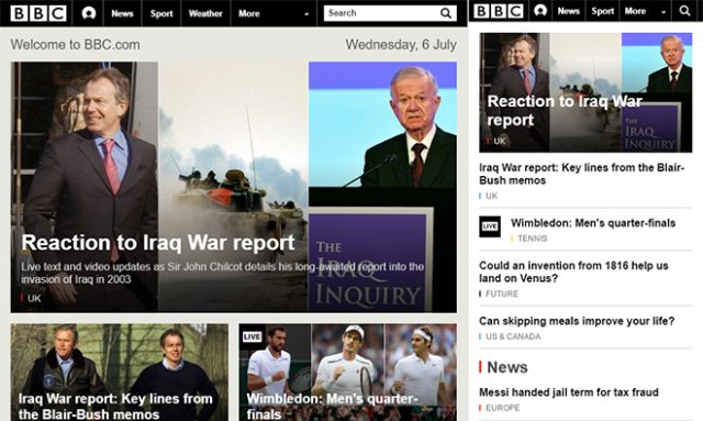
Combined Navigation at BBC

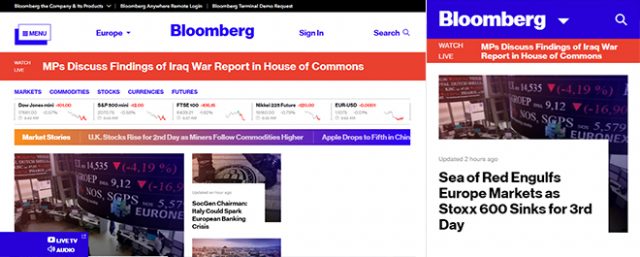
The websites were the ones of 7digital, BBC, Bloomberg Business, Business Insider UK, Supermarkt HQ, and Slate. Each website has a differently designed navigation. The study distinguished between a visible navigation, with all menu items listed up in the header or sidebar of the site, and a hidden navigation, where the menu items could only be reached via a hamburger menu or a button labeled “Menu”. Aside from that, there was a combination of both versions, where some items were visible, while the rest was displayed via “more” button as a drop-down list.

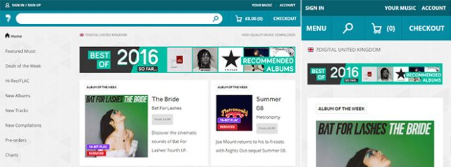
This way, the navigation of 7digital is always visible on desktop devices and is unfolded via “menu” icon on smartphones. The BBC website uses a combined version on the desktop. With only the most important menu items visible, others are displayed via drop-down menu.

Navigation Only Accessible Via Hamburger Menu

Navigation Only Accessible Via Hamburger Menu

In contrast to that, the website of Business Insider uses a hamburger menu to grant access to the navigation on both desktop and mobile view. By the way, there was no website that had a visible navigation on both desktop and mobile devices. The main reason for that is probably because a permanently visible navigation is a rather unusual choice for mobile devices.

Visible or Partially Visible Navigation was More Commonly Used

Only 27 percent of the participants that visited the desktop devices used the hidden navigation, while the visible or combined navigation was used by 48, or 50 percent, respectively. On mobile, only 57 percent utilized the hidden, and 86 percent went for the combined navigation.

Visible and Hidden Navigation at 7digital

Visible and Hidden Navigation at 7digital

Hidden navigation was also down regarding how much time it took to navigate. Participants on desktop devices took 31 seconds to navigate with a hidden navigation, but it only took 26 seconds on websites with visible navigation. Interestingly, the combined navigation did the best with only 23 seconds.

The difference between hidden (26 seconds) and combined navigation (24 seconds) was not as large. The reason for that may be that mobile device users are already used to reaching the navigation via hamburger menu, while they are not as common on desktop devices.

Conclusion

In the result, one can say that the hidden navigation was used much less, took longer, and a much lower amount of content was actually found using it. On the desktop, only 54 percent of the content that the users were supposed to call up was actually found, and on mobile, it was only 64 percent.

Hidden Navigation at Bloomberg

The combined navigation did the best, achieving 80 percent on the desktop, and 85 percent on mobile. Even the fully visible navigation was three percent behind, with only 77 percent of the content being found.

If possible, you should forgo a hidden navigation. Ideally, you always display necessary menu items, and hide minor ones behind a “more” icon, that shows all remaining items as a drop-down list, for instance.

You can find all the study results with plenty of diagrams and detailed explanations on the Nielsen Norman Group’s website.

(dpe)

Categories: Others Tags:

Full Width Containers in Limited Width Parents

July 25th, 2016 No comments

I bookmarked a tweet a few months ago, as it was a bonafide CSS trick and that’s what we love around here.

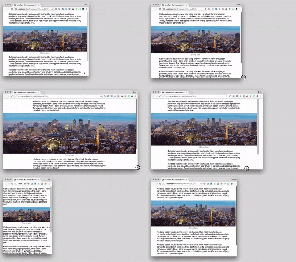
The issue is: how do we make a full-browser-width container when we’re inside a limited-width parent?

Starting Point

This image is 100% wide as it’s limited-width parent.

We want to stretch it exactly as wide as the browser window.

Here’s some minimal assumed markup:

<!-- parent -->
<main>

  <p>Stuff.</p>

  <!-- container we want to be full width -->
  <figure class="full-width">
    <!-- could be whatever content -->
    <img src="dog.jpg" alt="">
  </figure>

</main>

Considerations

If we could use absolute positioning, we could set the container to be at left: 0; and width: 100%; – but we can’t, because we want the container to remain in flow.

Can’t we just apply some negative margin to each side and pull it outwards? In some circumstances, we can!

With Known % Width

Let’s say the parent container was 60% wide and centered. That means there is 20% width on either side of it. But margin is calculated based on the parent element, so to pull it to the left 20% of the browser window, you’d need 1/3 of the width of the parent, so…

main {
  width: 60%;
  margin: 0 auto;
  /* creates 20% margins on either side */
}
.full-width {
  /* 1/3 of 60% = the 20% margin on either side */
  margin-left: -33.33%;
  margin-right: -33.33%;
}

With Known Non-% Parent Width

Under most other circumstances, we just don’t have enough information to know exactly how far to pull out the full width container with negative margins.

Well, unless…

We could use the width of the browser window in our CSS math. The amount we want to “pull” to the left and right is half the width of the browser window plus half the width of the parent. (Assuming the parent is centered.)

So, so our parent is 500px wide:

.full-width {
  margin-left: calc(-100vw / 2 + 500px / 2);
  margin-right: calc(-100vw / 2 + 500px / 2);
}

A fixed width like that feels a little red-flaggy (i.e. what happens on narrower screens?), all this would likely be wrapped in a media query that makes it only apply on larger screens:

@media (min-width: 500px) {
  main {
    width: 500px;
    margin: 0 auto;
  }
  .full-width {
    margin-left: calc(-100vw / 2 + 500px / 2);
    margin-right: calc(-100vw / 2 + 500px / 2);
  }
}

Since our demo was an image, you might also do something like .full-width img { width: 100%; } too, to get that full coverage.

If it’s less brain bending, you might have luck reducing to:

@media (min-width: $max-width) {
  .full-width {
    margin-left: calc(50% - 50vw);
    margin-right: calc(50% - 50vw);
  }
}

Translate

Since animations (probably) aren’t involved here, it’s probably not super necessary, but you could pull the container back to the edge with transforms instead.

@media (min-width: 40em) {
  .full-width {
    width: 100vw;
    transform: translateX(calc((40em - 100vw)/2));
  }
}

@supports()

The above idea was taken from a Pen by Brandon Mathis where he combined that idea with wrapping it all in @supports.

/* See warning below */
@supports (width: 100vw) {
  .full-width {
    width: 100vw;
  }
  @media all and (min-width: 40rem) {
    .full-width {
       transform: translateX(calc((40rem - 100vw)/2));
    }
  }
}

The idea here is that none of this would apply if the browser didn’t support viewport units. That way you could pull fallback behavior above this in the CSS and let this override it if it can.

Seems like a good idea, but in my testing only Firefox got this right. Chrome would sometimes incorrectly apply the media query when it wasn’t supposed to (screenshot). (I say “sometimes” as it seemed like a redraw would “fix” it, only to not apply the media query the other direction.) Edge also didn’t seem to apply the media query rules at all (screenshot). Maybe nested @-rules are a bit buggy yet.

No calc() needed

Sven Wolfermann followed up Jon Neal’s idea with a clever variation that doesn’t need calc():

.full-width {
  width: 100vw;
  position: relative;
  left: 50%;
  right: 50%;
  margin-left: -50vw;
  margin-right: -50vw;
}

The idea here is: push the container to the exact middle of the browser window with left: 50%;, then pull it back to the left edge with negative -50vw margin.


Very clever! This way you don’t need any information about the parent width at all. Do note that both this and the calc() version require the parent to be exactly centered in the browser.

You might even think: why bother with the right and margin-right? It’s true you don’t really need it on a left-to-right site, but if there is any chance of direction: rtl; happening, you’ll need the right properties, so having both is more bulletproof.

I’m gonna put a fork of this method here, as it seems the most useful.

See the Pen full viewport width image (container) inside article by Chris Coyier (@chriscoyier) on CodePen.


Full Width Containers in Limited Width Parents is a post from CSS-Tricks

Categories: Designing, Others Tags: