Archive

Archive for August, 2016

Video Overlay Effect in Premiere Pro

August 31st, 2016 No comments
Dansky_How to Create a Video Overlay Effect in Adobe Premiere Pro

In this tutorial, we’re going to learn how to create a video overlay effect in Adobe Premiere Pro.

The Steps (1-11)

1. Create a New Project in Premiere Pro.

2. Go to File > Import and select the video footage that you wish to import into the project.

video-overlay-effect-premiere-pro-1

3. Drag the imported footage on to the Timeline to create a Sequence. The settings for the Sequence will be determined by the footage that you are importing.

4. To create the colour overlay, go to Title > New Title > Default Still, and specify a name for the new Title.

video-overlay-effect-premiere-pro-2

5. Once the workspace appears for the new title screen, select the Rectangle Tool and create a shape that is 100% the height and width of the workspace. There are a number of different options that can also be specified on the right-hand side in the Title Properties window.

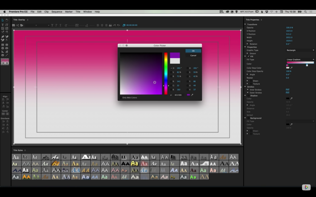
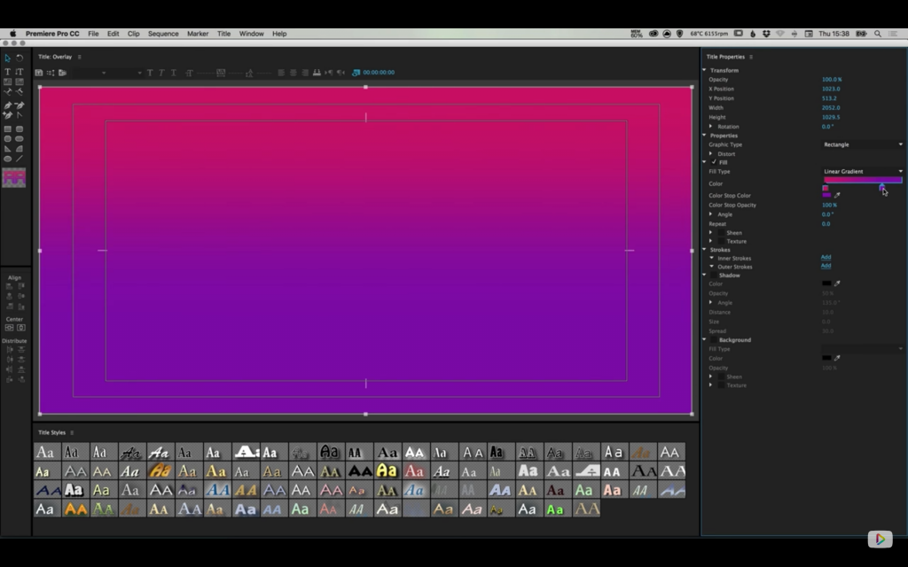
6. Select the Fill Type dropdown, and change Solid to Linear Gradient. On the Gradient Slider displayed below, Double-click each of the swatches individually to select a different colour.

video-overlay-effect-premiere-pro-3

7. Left-click anywhere on the Gradient Slider to add a new colour swatch on to the gradient. Similarly, you can Left-click and Drag an existing swatch off of the Gradient Slider to remove it altogether.

8. For this tutorial, Double-click both of the default swatches on the Gradient Slider, and set one swatch to pink, and the other swatch to purple. Both colours should now blend into one-another seamlessly.

video-overlay-effect-premiere-pro-4

9. At the top of the Title Properties window, you can also adjust the Opacity to allow the video footage to show through the gradient overlay that we’ve created. For this tutorial, the Opacity was set to 70%.

10. Left-click the ‘x‘ in the title bar at the top of the screen to exit out of the title workspace and return to the main project view (doing this will not close the application).

video-overlay-effect-premiere-pro-5

11. The new Title should now be listed in the Project Folder, and can be dragged on to the Timeline. Drag the newly created Title on to the Timeline above the existing footage. By default, the Title will have a preset length, but by Left-clicking and dragging on the right end of the Title, this can be increased/decreased to match the length of the footage underneath.

video-overlay-effect-premiere-pro-6

Download Adobe Premiere Pro.

Read More at Video Overlay Effect in Premiere Pro

Categories: Designing, Others Tags:

WDL Shop: Get a 1-year subscription to Adobe CC Photography Plan

August 31st, 2016 No comments
WDL Adobe CC Bundle

Looking to perfect your photo editing skills? This week on the WebDesignLedger Shop, we’re featuring a 1-year Adobe Creative Cloud Photography Plan + Training Bundle for only $129.99. That’s an 89% discount off the sticker price of $1,200! This bundle gives you full access to the benefits of the Adobe community with access to an extensive library of video tutorials to get you up to speed quickly and help master new skills.

What’s included:

  • Photoshop and Lightroom 12-month subscription. Perfect to help you fine-tune your photo editing skills. ($120 value)
  • Photoshop CC Camera Raw Training ($180 value)
  • Photoshop CC Color Management Training ($180 value)
  • Photoshop CC Fundamentals Training ($180 value)
  • Photoshop CC Selections Training ($180 value)
  • Lightroom CC/6 Fundamentals Training ($180 value)
  • Lightroom CC/6 Slideshow Training ($180 value)

Your subscription will be available for instant digital download after purchase. There are 5 days left to grab this amazing Adobe bundle so hurry to the WebDesignLedger Shop before it’s before it’s gone!

Read More at WDL Shop: Get a 1-year subscription to Adobe CC Photography Plan

Categories: Designing, Others Tags:

Desktop Wallpaper Calendars: September 2016

August 31st, 2016 No comments

We all love a good wallpaper to polish up our desktops. So to provide you with fresh artwork on a regular basis, we embarked on our desktop wallpapers mission eight years ago. Each month we challenge you, the design community, to get your creative juices flowing and produce some inspirational and unique desktop wallpapers.

And, well, also this time designers and artists from across the globe challenged their artistic abilities and contributed their designs for September. The result is a collection of desktop wallpapers that are a little more distinctive than the usual crowd. All of them come in versions with and without a calendar and are free to download. A big thank-you to everyone who shared their artwork! Now, which one will make it to your desktop?

The post Desktop Wallpaper Calendars: September 2016 appeared first on Smashing Magazine.

Categories: Others Tags:

5 freelance tests you’re probably failing

August 31st, 2016 No comments

Marketing is a waste of time. At least that’s how it feels for many designers. They’re not getting enough traffic, clients or sales. In fact, everything about getting customers feels like a slog. It feels like they’re spinning their wheels.

Maybe you can relate.

Marketing is tough when you don’t feel you know what you’re doing. Which is exactly why so many designers are unsure about what to say, who to say it to or when. No wonder we make mistakes. Our mistakes lead to pain and disaster. But marketing mistakes aren’t where things go wrong. They go wrong right from the start. The errors are subtle, easy to miss and very expensive.

It’s horrible because the choices you make, what you do in the beginning, sets the tone for everything after. Clients are like kids. Train them well and your relationship grows. Set limits and expectations and they’ll trust you. Become a worthy leader and they’ll follow.

Clients are like kids. Train them well and your relationship grows. Set limits and expectations and they’ll trust you

I’m going to make an educated guess. You probably want more clients, right? Not only that, you want a consistent stream of new clients every month. When you’re done serving these clients, you want them to buy more. You want to make more money, doing less and less work.

You’d like to avoid predators, tire kickers and knowledge vampires. You prefer to work in a drama free zone that’s enjoyable, profitable and on your terms.

That about right?

If you want some or all of those benefits you’ll need avoid making certain mistakes. Mistakes like…

1. Using the four ears model

Have you ever offended someone accidentally? When you meant to give them a compliment, but it was received as an insult?

That’s the four ears model at work. The four ears model states that anything you communicate, whether it’s written down or read aloud sends four different messages, on four different layers:

  • Matter layer: truth, facts and data.
  • Self revealing layer: something you reveal about yourself.
  • Relationship layer: what you think about your relationship with the receiver.
  • Appeal layer: what you want, your call to action, request or offer.

So why is this a problem? People, professionals, designers, have a habit of sharing damaging information like this.

  • Matter: “Google, please hire me”
  • Self revealing: I’m fine with begging for what I want
  • Relationship: Google, I’m beneath you.
  • Appeal: Please give me a job.

The Google-Please-Hire-Me guy desperately wanted to work at Google. But Google rejected him, choosing to ignore his messages after things became needy. When designers struggle with negative feelings — neediness, insecurity, fear — it seeps into their conversations. Whatever your client sees in your marketing gets filtered through those negative feelings from that point on.

Speak intentionally. Think about the message you send in your marketing. Use the four ears model to create the kind of message you want to send.

  • Want to be seen as in-demand? Create messages that convey genuine scarcity.
  • Looking to create prestige? Share messages that establish hierarchy—awards, validation from other prestigious organizations, wins, etc.
  • Want to show clients you can help them win? Focus on messages that show your track record and your ability to win.
  • Want to be seen as confident? Even if you feel insecure? Create strict requirements showing that you’ll only accept the clients you feel are worthy of your time.

Whatever you do avoid using the four ears model accidentally.

2. Using services to sell services

What do designers, plumbers and attorneys have in common? They all offer free consultations.

The vast majority of service providers offer free quotes, free estimates, free consultations. And the vast majority of them are abused by freeloaders, tire kickers and knowledge vampires.

But this abuse isn’t the worst part. It’s the one-on-one selling. The more “free consultations” you offer, the less time you have to work on your business and the less time you have for yourself. A sharp increase in free consultations can easily double or triple your workload.

As you become more “successful” the free consultation model traps you in your business, taking more and more of your freedom.

Try this instead:

  • Create limits: Set limits on what you’re willing to give with free consultations. Are they only available to subscribers? People who’ve read or purchased an intro product? Make clients jump through (a few) hoops if you want all-stars.
  • Eliminate free: Which clients are serious about hiring you? Which ones are out to waste your time? Ask prospective clients to pay for their consultation and you’ll separate those who are serious from those who aren’t.
  • Create scarcity: If you absolutely have to offer free consultations, create scarcity. Decide how much time you’d like to spend ahead of time. If you can only offer five hours a month. Divide that by the amount of customers you’d like to serve (e.g. five consulting slots per month). Place everyone else on a waiting list, and cut ties with the no shows.

Then, create leverage pieces to market your business. Send people to these leverage pieces and you’ll attract a consistent stream of customers, all without being personally involved.

3. Fixing your solution

Let’s pretend you have a bicycle. You ride it everywhere, to work, to the store, to your friend’s house. You’re in great shape but it’s getting old. When it comes to traveling, a bicycle only goes so far. You want a car, so you buy a car.

It’s a solution to your bicycle problem, but it’s also another problem. Because that car needs oil changes, cleaning, maintenance. If something goes wrong you’ll have to take it into the shop. Your car was supposed to solve your big problem, and it did. But your problems have suddenly multiplied.

It’s no different with you and your clients. Your clients want your solution to their problem. But that solution creates more problems. If they buy a website they’ll need hosting, maintenance, email, advertising and on and on. Here’s what that means for you: Every solution creates more problems that need to be solved. It’s a never ending cycle but it’s your responsibility to take care of that for your client. Which most designers don’t do because they…

4. Asking for the sale

“I hate marketing. I’m scared, what if they yell at me? I’m a designer, not a salesperson.” It’s a common objection that points to something most designers don’t want to do.

I get it. Being vulnerable, putting yourself out there, facing rejection, it sucks. Especially if you’re not sure how you’ll be received. Add imposter syndrome to the list of struggles and asking for the sale becomes a terrifying ordeal.

Stop selling. Start asking questions about the problem. Questions allow you to control the flow and direction of a conversation. But it also helps you avoid overt rejection. Ask your clients about their plan to deal with the new problems they now have to face.

“You mentioned that your site has to be fast. How are you going to maintain that speed now that the redesign is done? You’ll need…”

If clients are clueless about this, they may feel embarrassed they didn’t have an answer. So it’s important to treat them with compassion. Listen to them, be genuine, be kind. Then, you explain the solution. Problems attract attention on their own.

Problems create stress and anxiety.

Solutions relieve stress and anxiety.

It’s a never ending cycle that shouldn’t stop. Not if you’re looking out for your client anyway.

5. Telling the whole story

Let’s say you’ve found your ideal client. You’ve done all the work you need to do to attract their attention. They’ll have questions, objections, concerns. Something’s kept them on the fence, but you’ve dealt with their problems. You know they’re more likely buy.

What’s the one thing that pushes your customers off the fence?

It’s hard to figure out isn’t it? It could be a bonus you’re offering, your blog post, an email you sent out, anything. You can ask, but most clients won’t tell you—even worse that one thing is different for every client. So how do you know which detail matters most? You don’t know.

Try this instead: You tell the whole story, giving clients everything they need to make an informed decision. You’re not sure what specific detail will get them to buy, so you give them everything. What’s worse, clients bounce around. They jump from point to point on your web page, scanning for details, anything that jumps out at them.

When you tell the whole story, you eliminate information asymmetry. You give clients all of the information they need to make their decision… for or against you. Fail to do that and they simply move on. When there isn’t enough information — pictures are missing on your about page, no uniqueness, poor presentation, clients run.

Tell the whole story and they’ll stay long enough to make their decision. But telling the whole story takes too long, right? Actually no. It’s easy to give clients what they want when you know what they’re looking for.

  • If they want to see who they’re working with, you add pictures.
  • Are they interested in credentials? Put them up.
  • Are they looking for experience in a specific industry? Share your portfolio samples.
  • Do they want pricing and budget details? Explain them.

Most clients won’t get these details. Their designers won’t ask them the right questions and they won’t get what they need.

Start your marketing off on the right foot, and you won’t waste your time. You’ll be prepared to attract the traffic, clients, and sales you need to grow your freelance business. Do it right and you won’t spin your wheels. Do it wrong, and you’ll struggle to get the results you need.

Corporative Complete Family (64 different fonts) – only $19!

Source

Categories: Designing, Others Tags:

When is the Right Time to Think about Web Performance?

August 31st, 2016 No comments

Web performance is vital, but lately I’ve felt that the topic has only been brought up by front-end developers, and only becomes a point of discussion at the end of a project. Subsequently, whenever I hear about solutions to trim down large websites, I can’t help but feel that these are merely suggestions or tricks that developers and engineers should employ after the initial design process has kicked off.

So what sort of design topics impact performance? Well, any question that a designer might ask themselves. Like these:

  • How many fonts should we use?
  • What sort of imagery should we apply?
  • What kind of analytics scripts do we need?
  • How does a user scroll through our app?
  • How does this complex component affect our CSS?
  • How should we even write CSS?
  • What kind of frameworks should we choose?

More often than not, these questions will lead to more code, more complexity and more bloat in a design system since…

  • The more fonts we add the longer we ask our users to wait.
  • The type of imagery we choose for a project will impact what image formats we use.
  • If we pick a crazy number of analytics tools then that can slow the whole app down, too.
  • Adding a complex component in CSS, that will only be used once in the app, will lead to code bloat and it’ll further slow down the time to first render (if only marginally).
  • Deciding which framework we use will have an enormous impact on the critical path.

In short, design teams should measure their success against key web performance metrics because every decision they make will eventually lead to drastic changes in what gets sent down the pipe to the end user.

And the way I’ve started to think about it is like this: every conversation about design is also a conversation about web performance. I try to remind myself that the two are inseparable from the other and so as a web designer I ought to be considerate of these problems from the very beginning of a project, not just at the end.


When is the Right Time to Think about Web Performance? is a post from CSS-Tricks

Categories: Designing, Others Tags:

How to Protect Your Website From Content Theft

August 31st, 2016 No comments

Content theft is not an attractive issue. Many bloggers that are in the business for a while have already had to experience this. Sometimes, content was ever so slightly changed, sometimes it was a blunt copy. This brings up the question what can be done to prevent content theft.

First things first: You’re definitely not alone with this problem. I’ve had one of my most successful content stolen, as well as one of my themes. I was able to solve both of these issues with a couple of “friendly” words in an email.

However, you need to be aware of the harsh reality: this is the internet. Thus, there can be no absolute protection from theft of intellectual property. Nonetheless, there are a couple of things that make it more difficult for the thieves.

Preventing Content Theft

Prevention is always better than aftercare. For that reason, I’ll give you some tips that will often let you prevent someone from stealing your content.

1 – Cater for a Clear Copyright

You need to make very clear what you want to allow others to do when it comes to your texts. Every visitor has to be able to find and view your copyright terms quickly. A clear copyright could look like this:

© Copyright [your full name] and [website name], [current year]. Unauthorized use of content or parts of content is prohibited without a written permission by the author. Excerpts may be used, however, only with a clear credit to the source. This needs to be done as follows: mention of the author, website, as well as a link to the original article.

Maybe you could place the terms in the sidebar, as it is easily noticeable and accessible there. However, you could also place a link to the copyright in the footer, which redirects interested viewers to a certain page. Of course, you can also prohibit any usage, all depends on your wishes.

2 – Use a Creative Commons-License

Similar to the previous option, you get to define exactly which type of use you want to permit, and how you want to be linked back to. Creative Commons is one of the most popular providers of free licenses in multiple versions. On the organization’s website, you’ll also find a license generator, which lets you define your personal copyright license.

If you decide for one of the Creative Commons licenses, you should make it very visible as well. A link in the footer is completely sufficient. It could look like this, for example:

© Copyright [your full name] and [website name], [current year] – Link to the license

3 – Make Your RSS Feed Show Excerpts Only

Content theft often happens via RSS feed. All the thieves need to do is configure your website feed once, and they will always have your latest content on their page. Here, it can be very helpful to only show excerpts.

However, this type of prevention could come with heavy disadvantages. Many users still like to read new blog content via RSS feed. These users might be angry when all you get to offer are excerpts.

The Solution: Yoast SEO

One solution could be to use Yoast SEO. This SEO plugin lets you implement custom copyright messages into the feed. This way, your copyright would be placed under each of your thief’s articles, letting you deliver the full feed again.

4 – Use Google to Search For Your Content

Your content could already be located on other websites that you are not aware of. Content theft is rather common, so use Google and other search engines to look for your texts. Copy an excerpt of one of your articles, use it in quotes for more precision, and start a search.

5 – Protect Your Images

Without your images, your content is only worth half as much. Thus, you should protect your images from unauthorized use. A small entry in the .htaccess file makes sure that your images can not be hotlinked from your server into other blogs.

Using the image material would only be possible when the images were downloaded and implemented into the articles before.

View the code on Gist.

6 – Use Google Alerts

For this Google service, a Google account is required. In the settings, you get to pick which types of content are important to you. Once that content pops up somewhere, you’ll receive an email from Google.

7 – Use Copyscape or Plagium

Copyscape is a rather useful online tool which helps you find copies of your content very fast. The free function is generally sufficient, but there is a paid version with significantly more features.

Plagium is another tool that lets you find out if there are plagiarizations of your articles on the web.

Content Theft Detected?

If all measures to prevent theft of your intellectual property failed, you have to react. Here, the following three options remain.

1 – Message the Thief

Find the content thief’s email address and message him. Be friendly, but make it clear that you will make use of legal measures if the content is not removed immediately, and if the thief does not stop stealing.

I always had success that way, thus, further steps were not necessary.

2 – Contact Google

It is also possible to contact Google directly, requesting the removal of the duplicates from the index.

Google reacts to copyright complaints according to the USA’s copyright law (Digital Millennium Copyright Act, DMCA).

If you happen to host your blog on WordPress.com, you can contact Automattic. That’s the company behind WordPress. However, this only works with WordPress.com and not when it comes to the self-hosted version of WordPress.org.

Automattic: Digital Millennium Copyright Act (DMCA) Notice

3 – Inform the Thief’s Web Host

If sending an email to the thief did not result in a solution, all that’s left is contacting the online gangster’s host, and notifying him of his customer’s practices. This type of combat has proven itself to be effective as well. It is easy to find the host with a simple whois query of the respective domain.

Conclusion:

Content theft will always be a topic, and there is no 100 percent safe protection from it. We can not always prevent it, but we can keep an eye on our content. We are also able to make it a little harder for the thieves, hoping that they move on to an easier victim instead.

Source: Prevent Content Theft

Categories: Others Tags:

20 Code Snippets for Clean and Stylish Contact Forms

August 31st, 2016 No comments
Full-screen contact form

Several text inputs with accompanying labels and a huge prominent CTA at the end to submit a form and send it to the recipient – usually, a contact form looks exactly like that. And it seems that there are no difficulties in generating one at home. Not so fast, however, there are some pitfalls. For example, do you need your feedback form to be responsive, bootstrap-powered or entirely customized? If yes, then you need to sweat it out. You have to play with CSS styles, Javascript libraries, and modern HTML features in order to find a perfect symbiosis that will bring the mockup to life. To say nothing about making it work with the help of PHP or some other means.

However, as is always the case, on the web there are numerous viable and reliable pre-defined solutions, code snippets and templates that may do all the heavy lifting for you or at least provide you with an excellent starting point, saving you lots of time. Today we have rounded up 20 pens that feature clean, elegant and hassle-free contact forms that tackle this issue pretty efficiently. Some of them like those that include just static yet refined designs can be quickly customized, while others that have unique layouts or accompanying effects may find its place in your projects without drastic changes.

Fullscreen Form Interface

Creator: Mary Lou

Responsive Contact Form with Map

contact form with map
Creator: Lentie Ward

Responsive Material Design Contact Form

responsive material design form
Creator: Nikhil Krishnan

Clean Contact Form

clean contact form
Creator: nick haskell

Elegant Contact Form

elegant contact form
Creator: Mark Murray

Responsive Contact Form Using Bootstrap 3 and Google Maps API

responsive contact form
Creator: Craig Wheeler

Sass Flip Contact Form

sass flip form
Creator: Danny Beton

Vintage Inspired Contact Form

vintage form
Creator: David Fitas

Simple Flat Contact Form

flat contact form
Creator: Zach Saucier

Contact Form

envelope style form
Creator: Iulian Savin

Drop-Down Contact Form

drop-down form
Creator: Greg Sweet

Contact Form HTML+CSS

diagonal style form
Creator: Trevor L.J.M. McIntire

Form Feedback

light contact form
Creator: CrocoDillon

Minimalistic Form

minimalistic form
Creator: Matheus Marsiglio

Flat Responsive Form

flat responsive form
Creator: And Studio

Personal Website

contact form in personal website
Creator: Tim Robert-Fitzgerald

Blackboard/Chalkboard Contact Form

blackboard form
Creator: Greg Sweet

CSS Only, Responsive Modal Form

responsive modal form
Creator: Daryll Doyle

Contact Form

contact form animation
Creator: Peter Kullmann

Under the Sea Contact Form

under the sea form
Creator: Geert-Jan Hendriks

Categories: Others Tags:

How We Use Prototyping, And How It Made Us More Efficient

August 31st, 2016 No comments

Prototyping is essential to help your team create the best product possible. It’s a chance to experiment with ideas and turn them into something tangible that you can test and build upon. When you fail with your prototype, you land softly — there’s always the chance to iterate and improve.

The team behind Adobe’s new prototyping tool Experience Design (Adobe XD) uses prototyping as a method to test new features before they make it into the program. Being a product manager on the Adobe XD team, I’ll share some insights into how the team uses prototyping to build and improve Adobe XD, and make prototyping more efficient for designers.

The post How We Use Prototyping, And How It Made Us More Efficient appeared first on Smashing Magazine.

Categories: Others Tags:

Multi-Color Gradients in Adobe Muse

August 30th, 2016 No comments
Muse For You - Gradient Background Widget - Adobe Muse CC 2015.2

Add Multi-Color Gradients to your Adobe Muse website. No Coding Skills Required.

Muse For You - Adobe Muse CC Adobe Muse CC Logo

In this tutorial I go over how to add a multi-color gradient to your Adobe Muse website. We will be using the “Gradient Background” widget found at http://museforyoushop.com.

1. Drag and drop the “Gradient Background” widget onto your Adobe Muse website from the library panel. If you do not see the library panel go to Window—>Library.

2. If you would like to add a gradient to the background of your website type in “html” in the graphic style section.

3. Click on “Drag Gradients” in the widget to visit the “Drag Gradients” website. Here you can create a custom gradient background with as many colors as you’d like. There are also a few presets that you can choose from.

4. Copy the “Drag Gradients” code and paste into the “Gradient Background” widget.

5. Preview page in browser and view the gradient background on your website.

6. If you would like to assign a gradient to an individual element on your Adobe Muse website simply assign a graphic style name to the element via the graphic styles panel, and change the graphic style name in the widget to match the element. This will assign the gradient to that element. This works well with rectangles or circles added using the rectangle tool or ellipse tool in Adobe Muse.

7. Done.

Gradients can add a nice touch to your website. One of my favorite designs is the multi-color gradients used at http://stripe.com. Now with the “Gradient Background” widget you can add a similar effect to your Adobe Muse website.

Watch the video above for a demonstration on how to add multi-color gradients to your Adobe Muse website.

For more video tutorials and widgets for Adobe Muse visit: http://museforyoushop.com.

Happy Musing :).

Read More at Multi-Color Gradients in Adobe Muse

Categories: Designing, Others Tags:

Protected: HostGator Giveaway

August 30th, 2016 No comments

This content is password protected. To view it please enter your password below:

Read More at Protected: HostGator Giveaway

Categories: Designing, Others Tags: