Archive

Archive for August, 2016

Fighting the Status Quo

August 11th, 2016 No comments

Many of us, stuck in the trenches of Design Thinking, have to challenge the status quo.
We have to convince, cajole, or fight with people to effect change. Change goes against established Orthodoxies or cultural norms, thus you would have likely heard a lot of: “Son, this is how things have always been done here…”
Kelli Richards, a 12 year Apple veteran, shares some of her tips to help get you going. (Words in brackets are mine.)

  • Create a risk profile for your current strategy the way you would for a new opportunity. Looking at the trends you already know about—and considering you’ll inevitably face some that you so far don’t—how does maintaining the status quo increase your risk? (Map out relevant trends that is going to make your existing business model outdated.)
  • Show how the steps you recommend can lead to an increased return on investment, keeping in mind that you’ll need to define ROI in a way that resonates with upper management. (This may not always be about money. Customer loyalty, increased traffic, brand awareness are good alternatives.)
  • Shine the spotlight on indecision and help teammates get more comfortable taking action with incomplete information. Ask, “How much do we really need to know before making a decision?” (Also remind your team mates that when we made a decision, it was based on the information we knew then.)
  • Diplomatically resolve turf wars that hold the company back. When new products risk cannibalizing old businesses, emotions unavoidably get heated. Still, it’s better for an internal department to innovate than for an external competitor to gain an advantage. (Better us then them.)

Via: Fastcompany

The post Fighting the Status Quo appeared first on Design Sojourn. Please click above if you cannot see this post.

Categories: Designing, Others Tags:

Fighting the Status Quo

August 11th, 2016 No comments

Many of us, stuck in the trenches of Design Thinking, have to challenge the status quo.

We have to convince, cajole, or fight with people to effect change. Change goes against established Orthodoxies or cultural norms, thus you would have likely heard a lot of: “Son, this is how things have always been done here…”

Kelli Richards, a 12 year Apple veteran, shares some of her tips to help get you going. (Words in brackets are mine.)

  • Create a risk profile for your current strategy the way you would for a new opportunity. Looking at the trends you already know about—and considering you’ll inevitably face some that you so far don’t—how does maintaining the status quo increase your risk? (Map out relevant trends that is going to make your existing business model outdated.)
  • Show how the steps you recommend can lead to an increased return on investment, keeping in mind that you’ll need to define ROI in a way that resonates with upper management. (This may not always be about money. Customer loyalty, increased traffic, brand awareness are good alternatives.)
  • Shine the spotlight on indecision and help teammates get more comfortable taking action with incomplete information. Ask, “How much do we really need to know before making a decision?” (Also remind your team mates that when we made a decision, it was based on the information we knew then.)
  • Diplomatically resolve turf wars that hold the company back. When new products risk cannibalizing old businesses, emotions unavoidably get heated. Still, it’s better for an internal department to innovate than for an external competitor to gain an advantage. (Better us then them.)

Via: Fastcompany

The post Fighting the Status Quo appeared first on Design Sojourn.

Categories: Designing, Others Tags:

A Beginner’s Guide To Progressive Web Apps

August 11th, 2016 No comments

Progressive web apps could be the next big thing for the mobile web. Originally proposed by Google in 2015, they have already attracted a lot of attention because of the relative ease of development and the almost instant wins for the application’s user experience.

A progressive web application takes advantage of the latest technologies to combine the best of web and mobile apps. Think of it as a website built using web technologies but that acts and feels like an app. Recent advancements in the browser and in the availability of service workers and in the Cache and Push APIs have enabled web developers to allow users to install web apps to their home screen, receive push notifications and even work offline.

The post A Beginner’s Guide To Progressive Web Apps appeared first on Smashing Magazine.

Categories: Others Tags:

All You Need to Know When Working with Remote Developers

August 10th, 2016 No comments
8

When you seek the services of a developer, you want to connect with an agency that can produce quality work. You would also like to do business with a developer that wants to act as a partner and an extension of your design team. Hence, you will be looking for a developer that brings to the table one of the most important elements that contributes to a project’s success. And that’s top quality collaboration.

In short, you are seeking the services of a developer who cares.

Large scale, or one-on-one, collaboration counts.

By working as partners, design and development teams can cut communications gaps, hiccups, and delays. These can turn a promising project into a web designer’s personal nightmare.

These potentially disruptive influences are avoidable. You just need to turn to a professional agency like this one for your project’s development needs.

The Golden Rule(s) for Working with Remote Developers

With web developers, remote does not mean hard to reach, slow to respond, or a justification for poor communications. There are more benefits from working with a remote developer than you might realize.

By choosing a top-quality remote developer, you get the services of a talented and experienced team that serves a global market. With clients ranging from independent creative agencies, to design teams employed by major corporations.

To be remain competitive, these remote developers have learned how to maintain a high level or productivity. They are up to date with trends and technologies in an ongoing effort to improve their skills.
2

Coders relax in unique, yet effective ways.

When you partner with a remote agency, you can assume communications and collaboration will be top quality. To serve you best, it has to be that way; and the top development teams know that.

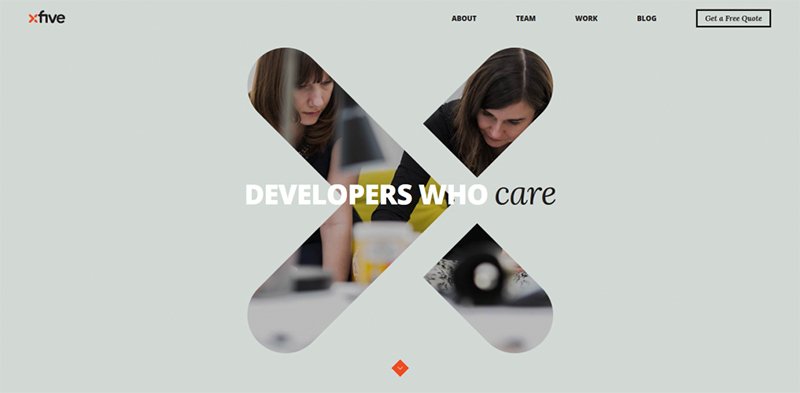
You’ll see this and more, if you team up with Xfive. You’ll witness the payback this developer’s workflow and project management formulas can give you. As an Xfive client, you will have a project manager who will work closely with you, and look after your interests. You will also have the benefit of partnering with a team with 10 years of global experience.
3

An Xfive team at work serving its worldwide clientele.

Four Golden Rules for working with remote developers:

State your requirements clearly. A clearly written, well-organized brief can do wonders to get a project off to a smooth start. You may even find it helpful to kick off collaboration activities before you finish the brief. In that way, you can receive useful feedback from a team of coders that wants to make your project a success.

Be practical. Work with your project manager or coding team to determine the best technologies and coding practices before you move forward. Since it’s your project, you can call the shots; but the advice the coding team gives you is worth following.
4

Technology can do only so much. The maker’s touch does the rest.

Make an extra effort to communicate effectively and efficiently. Collaboration is a two-way street, and it’s important that you live up to your part of the process by being prepared.

Listen – Listen to the coding specialists. When you are working with a developer like Xfive, feedback, suggestions, or constructive criticism is always offered with your best interests in mind.

Preparing Your .psd Files to Hand Over to a Developer

You already know how important it is to present your developer with carefully prepared and well organized design files. If you follow these seven steps, you are unlikely to leave anything out, and you will make the coder’s planned workflow easier to follow. You could look upon the necessity of carefully prepping your design files as a fifth golden rule.

The Seven Steps:

1) Prepping the File

When possible, it’s a good practice to create separate .psd files for the homepage and each of the secondary, tertiary, or specialized pages. Coders prefer working with many small files to working with a single file that includes everything.

Make versions for the developer that cut layers not required for coding, and keep master versions for yourself.

2) Preparing Layout and Color Palette Documents

Try to keep Photoshop guidelines to a minimum if you intend to place any in the documentation for the coder.

You can create a layer group that outlines blocks of page content and submit it either as a .psd file or a Word document. This is done to define common page design components and body copy styles.
5

3) Identify Navigation Functions and States

Don’t neglect to include user navigation and interaction functions and states, so coders will not have to guess at your intent. This should be done for every button type that appears in the design. Group this information in a separate folder.

4) Flattening and Merging

Flattening and merging layers can make a coder’s work much easier. By flattening layers, you save coders the trouble of guessing which layer goes with another. By merging layers that will not need extra editing by the developer, the possibility of design elements being accidentally altered can be significantly reduced.

5) Preparing Font Information
6

Fonts look like this when preparing to print a book. Preparing website fonts is much less complicated.

Fonts used for both headings and copy should be left as editable text. You should size it in pixels rather than point sizes. Use kerning in rasterized of flattened images, but do not use it in editable text.

6) Preparing Images

It’s usually a simple task to reduce image file sizes by optimizing them. This will be a great help to the developer, plus the end result will be fast page load times, coupled with a better UI.

7) Organizing Layers

Devise a scheme for naming both layers and layer groups. Preferably by sticking naming conventions that are easy to follow. A good approach is to use names that provide some sign of the content contained within. Many web designers define a folder structure at the same time the PSD file is being created.

Mockups Can Make Everyone’s Life a Little Easier

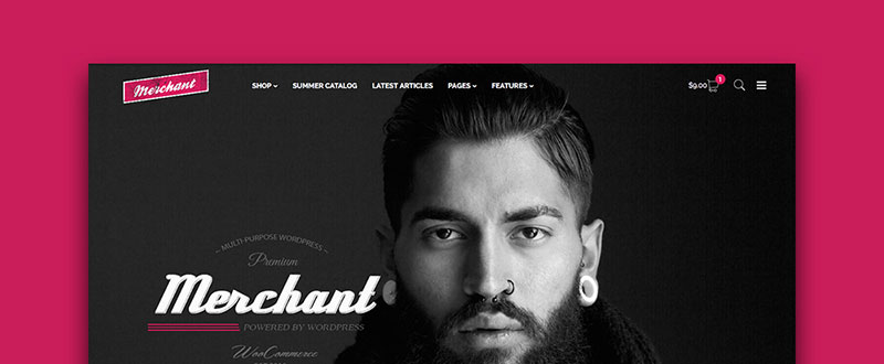
Mockups are often used to present a preliminary design to a client. Use a mockup if you want a reality check before submitting your design files to the developer. Even more, creating a mockup with the intent of providing the developer with helpful information is a huge favor.
7

Presenting a mockup is like sending your developer a love letter.

If you believe that your design, or any web design for that matter, is easily transformed into code, you may be working under a misconception. By preparing a mockup or prototype, you can give the developer the opportunity to determine if your design can be coded as is. Or if changes will be necessary before it can be converted to either HTML5/CSS3 or your language of choice.

  • It’s good practice to create separate mockups for inner pages, or if the only difference lies in the icons, export them separately. When supplying several mockups, you should organize them just as you would organize your design files.
  • Size mockup graphics just as they need to appear in the website. This applies to the inner pages as well as to the homepage or special landing pages.
  • Identify interaction states and label buttons, form fields, and inputs as needed.

8

Prototyping is a great platform for testing interaction feasibility and performance.

  • Make it a point to test all interactions before submitting a mockup to the developer. The ability to test interactions is one of the major benefits of mockups. And you can even use low-fidelity mockups can to show developers content dependencies.

Don’t worry too much about fine-tuning the visual details in your mockups. The developer is primarily interested in reviewing and providing feedback on design infrastructure. Prepare to go through several prototype cycles before the developer tells you that everything is good.

How to Use Mockups to Address Responsiveness

Mockups are extremely useful in linking designer creativity with developer logic. This is particularly true when dealing with more complex issues – and responsiveness is one of them. You can avoid many downstream problems related to responsiveness, by starting first with mobile displays. And creating a mockup for every screen size that a visitor will encounter.

9

Create mockups for all standard screen sizes.

Not all design elements behave in the same way when a display is changed from landscape to portrait, or vice versa. And not every design element will fit neatly on a smaller screen, so there will be some design choices to be made.

  • Which, if any, logos, icons, or graphics elements can be allowed to change in size, location, or both?
  • Will font size and line height variations become a problem as screen sizes change.
  • Will navigation system that is fine for a PC display perform as expected on a smartphone or tablet?
  • Will sidebars and footer content display correctly for all screen sizes? Or will they be partially eclipsed or disappear altogether on smaller screens?

A mobile-first approach when preparing mockups for a developer is a smart approach to take. Especially if you start small and scale up; adding elements as you progress.

How to Be Certain You’ve Selected the Best Coders to Work With

You’ve already seen why selecting a remote development agency makes good sense. And I showed you the steps you should take to ensure you will have a good working relationship with the agency you’ve chosen. How then, do you go about determining which agency will be the right one for you?

Review and analyze their portfolios, and verify that the services offered include those that you need.

Look into each company’s history. Take note of how many years the company has been in business, and the size and makeup of its clientele. You might want to narrow your choices down to those companies that have been serving clients around the globe for many years. Including large companies or well-known corporations.
10

Read the testimonials. Developers that have been in business for some time should be able to supply testimonials from high-powered clients. And testimonials that have some meat on them.

Check the prices. Developers that advertise flat rates often charge fees for what they regard as extras. Your best approach would be to provide an outline of your project and request a quote. Comparison shopping never hurts.

Chemistry counts. When you are looking for a developer who is willing and able to act as a partner and as an extension to your design team. Ask plenty of questions about how an agency does business. If you don’t get satisfactory answers, look elsewhere.

Take a minute to make a mindset change. Tell yourself that, while you may be seeking a service, what you really want is a partner. Xfive, with 10 years of global development activity, has what it takes. And the Xfive team will be delighted to serve as your trusted partner, and a brilliant one at that.

Just ask Microsoft, Fox, Twitter, of eBay what they think about having a cool partner like Xfive to work with.

Better yet, if you want to get a taste as to how the Xfive team will treat your project, and treat you – send them an overview of your project.

Read More at All You Need to Know When Working with Remote Developers

Categories: Designing, Others Tags:

Facebook delivers a better UX for businesses

August 10th, 2016 No comments

Every business today seems to have its own Facebook business page, and with good reason; Facebook is a huge force in marketing as the world’s second-most visited website, and no business wants to miss out on potential leads it can pick up from having a Facebook presence.

In the last few days, the company has been finalizing the rollout of its new business page that are characterized by a cleaner look and feel. One of the most prominent changes that users will notice is that the tabs are gone and have been replaced by a left-hand side navigation. Also, the call to action buttons on the page—CTAs like “shop now,” “learn more” and “sign up”—are all more prominent than they ever were.

Facebook began experimenting with these new designs a couple of months ago, but they’re only now being rolled out on a wider basis. The past couple of months has seen a few, different iterations of business pages. For example, at first, business pages sported a bigger Cover photo and removed any display ads that usually showed up on the right-hand side of desktop pages.

The user experience drastically changes thanks to this redesign. The profile picture will not block a page’s cover photo anymore since the latter has been moved to the right. The cover photo after the redesign still retains the same dimensions: 828 X 315 pixels.

The striking, blue call to action button is now at the top right of the page, just beneath the cover photo. Businesses also enjoy more customization, as this call to action button can be configured to show exactly the kind of action the businesses want their customers to take. For instance, shopping at their retail site, watching a video, learning more about their product or service, or booking an appointment.

The theme of this redesign is a cleaner and more minimalist look. The removal of the right-side display ads greatly help with this appearance, as Facebook is attempting to make desktop business pages more consistent with the recent mobile updates for its Facebook pages from earlier this year.

As far as usability goes, the biggest improvement comes from the removal of the page tabs. Without the tabs, a business page now feels like a traditional site, with navigation down the left-hand side of the page. As a result, users should feel like they can navigate the entire page more efficiently as they browse from one section—such as About, Likes, Events and Events—to the next.

In the last several weeks, more and more users have already begun remarking on these changes. Most users should now be able to see the improvements to the redesigned business pages—Last week, a Facebook spokesperson asserted that this redesign rollout is almost finished. On August 3rd, the rollout was expanded; by this week, you should be able to see exactly what the new business page looks like.

135 Professional Photoshop Actions from Contrastly – only $17!

Source

Categories: Designing, Others Tags:

Zooming Background Images

August 10th, 2016 No comments

The following is a guest post by Dylann Winn-Brown, who shows us a performant way to accomplish this design effect.

Whilst working on a client’s website recently, I was asked to replicate an effect like this.

Containers with background images which zoom within their container on hover, revealing more information.

This type of effect is notably used in portfolio-type situations where the design intends to show both visual and informational details.

There are many different possible methods

As I had never created an effect like this before, I began to take a look at different ways of doing this and came across a number of different methods.

One option was to use a jQuery Plugin. This one wasn’t quite the effect I was after, and certainly not very lightweight.

Another option was to position an within the container and manipulate it with CSS. There could be some potential benefits here, like being able to set the source with srcset so that the image used is performance and device-appropriate.

In my situation, I wanted to manage the effect entirely in CSS, so I went for that.

Basic functionality

In order to achieve optimal performance, I decided to use the CSS transform property to handle the enlargement of the image. (CSS animations benefit from hardware acceleration and as a result appear smoother than other methods of animating.)

Rather than an , I used an additional

inside the parent to act as the image. The structure being:

<div class="parent">
  <div class="child"></div>
</div>

First we specify the dimensions for the parent element. Then the child can fill the parent using width: 100% and height: 100%;, as well as set the background image, ensuring it scales to cover the area.

.parent {
  width: 400px; 
  height: 300px;
}

.child {
  width: 100%;
  height: 100%;
  background-color: black; /* fallback color */
  background-image: url("images/city.jpg");
  background-position: center;
  background-size: cover;
}

We then add hover effects to our parent element which will affect our child element. A focus style is good for accessibility as well:

.parent:hover .child,
.parent:focus .child {
  transform: scale(1.2);
}

You may want to use a tool for adding prefixes for the best possible browser support.

To finish up the basic effect, we can add some transitions to our child element’s normal state:

transition: all .5s;

If you want to add a color overlay, you can make use of pseudo elements like ::before:

.child::before {
  content: "";
  display: none;
  height: 100%;
  width: 100%;
  position: absolute;
  top: 0;
  left: 0;
  background-color: rgba(52, 73, 94, 0.75);
}

.parent:hover .child:before,
.parent:focus .child:before {
  display: block;
}

Now when we hover on the parent element, the child element should show a color overlay!

Finally, we’ll cover how to add some text to show on our overlay. We can add an element to our current child element like so:

<div class="parent">
   <div class="child">
      <span>Hello</span>
   </div>
</div>

We can give our some style:

span {
  color: white; /* Good thing we set a fallback color! */
  font-family: sans-serif;
  padding: 25%;
  position: absolute;
}

and we can make it visible only when we hover on the .parent:

.parent:hover span,
.parent:focus span {
  display: block;
}

Live Demo

See the Pen Image zoom on hover – portfolio websites by Dylan (@dwinnbrown) on CodePen.

Mobile Support

If the containers are links and the hover states don’t reveal any essential information, you might just leave it alone.

If the hover states are important, in order for this to work on touch screens, we can use empty onclick="" handlers on our .parent containers. Unfortunately I couldn’t come across another way of doing this but if any of you do, let me know in the comments!


Zooming Background Images is a post from CSS-Tricks

Categories: Designing, Others Tags:

Experience Design Essentials: Animated Microinteractions In Mobile Apps

August 10th, 2016 No comments

Dariel Fitzkee, the famous magician, once said, “Magic is both in the details and in the performance.” Interaction design is just like that. Designers love to get the big picture right, but if the details aren’t handled properly, the solution will fail. The magic is all in the details. That’s why well-designed microinteractions make experiences feel crafted.

To get a better understanding of how your design benefits from microinteractions, it will help to sketch out your app ideas. Adobe introduced a new design and wireframing app called Experience Design (or Adobe XD) which lets you design wireframes and make them interactive. You can download and test Adobe XD for free.

The post Experience Design Essentials: Animated Microinteractions In Mobile Apps appeared first on Smashing Magazine.

Categories: Others Tags:

Simple & Sweet On Scroll Animations in Adobe Muse

August 9th, 2016 No comments
Muse For You - Simple and Sweet On Scroll Animations Widget - Adobe Muse CC

Simple & Sweet On Scroll Animations in Adobe Muse. No Coding Skills Required.

Adobe Muse CC Logo

Have you ever seen those car commercials where everything looks really smooth and slick? The car is driving down the road and making those turns effortlessly…the driver is switching gears…the tires are turning. Everything feels and looks like a perfect combination of beauty and motion. This same effect of beauty and motion is what I intended with the “Simple and Sweet On Scroll Animations Widget” for Adobe Muse.

Muse For You - Simple and Sweet On Scroll Animations Widget - Adobe Muse CC

Subtle on scroll animations can be a great way to give your website a more fluid and dynamic feel. The user scrolls down the page and elements are either fading in or moving in from different directions. This widget was created specifically for that purpose. You can choose from 26 different animation options and have your elements fade in as well. You can also choose at what point within the browser the animation will trigger.

Muse For You - Simple and Sweet On Scroll Animations Widget - Adobe Muse CC

The features include:

  • Choose from 26 different on scroll animations
  • Select at what point in the browser the element will animate
  • Have another element trigger the animation
  • Set the animation duration
  • Set the easing for the animation
  • Add a delay to the animation before it starts
  • Works across breakpoints
  • Disable at a certain breakpoint
  • Add to any element on your Adobe Muse website
  • Works in Adaptive Design and Fluid-Width Design
  • Lightweight for your website

The widget works great on mobile as well.

The “Simple & Sweet,” widget was designed…well to be simple and sweet :D. There are not any over the top animations, and everything is designed to introduce elements in an elegant and subtle way.

In the video above I go over where to access the widget and how to use it. You can access the widget at http://museforyoushop.com.

Happy Musing :).

Read More at Simple & Sweet On Scroll Animations in Adobe Muse

Categories: Designing, Others Tags:

Developers “Own” The Code, So Shouldn’t Designers “Own” The Experience?

August 9th, 2016 No comments

We’ve all been there. You spent months gathering business requirements, working out complex user journeys, crafting precision interface elements and testing them on a representative sample of users, only to see a final product that bears little resemblance to the desired experience.

Maybe you should have been more forceful and insisted on an agile approach, despite your belief that the organization wasn’t ready? Perhaps you should have done a better job with your pattern portfolios, ensuring that the developers used your modular code library rather than creating five different variations of a carousel. Or, maybe you even should’ve sat next the the development team every day, making sure what you designed actually came to pass.

The post Developers “Own” The Code, So Shouldn’t Designers “Own” The Experience? appeared first on Smashing Magazine.

Categories: Others Tags:

Does startup efficiency kill design originality?

August 9th, 2016 No comments

Once upon a time, the web was full of crazy ideas. And no, I’m talking about the wide array of conspiracy theorists and the like (they’re still everywhere, watching as you read this). The subject I’m actually referring to is design.

Back in the day, the web was a bit more of an experimental playground for both professional and aspiring designers. You saw it in the use of different navigation styles, color schemes and typography. It also led to sometimes outlandish layouts, use of multimedia and graphics.

The results weren’t always pretty (or even professional), but you can’t say that designers weren’t trying to make the most out of the medium.

Do the evolution

These days, the web isn’t so much of a playground. It’s grown up, put on a sensible business suit and tends to lean more towards quiet consistency than bombast. The old Wild West, it seems, has developed into a sprawling suburb. You can practically smell the Starbucks from here.

The old Wild West, it seems, has developed into a sprawling suburb. You can practically smell the Starbucks from here

While it may sound like I’m a little nostalgic, I actually like the way things have evolved, for the most part. As designers, we’ve learned from the mistakes of the past and have done a much better job at following standard practices. We’re doing more to ensure usability and accessibility. They are all wonderful byproducts of a more mature industry. We’ve never had it so good.

What’s changed the most, of course, is the array of tools we have at our disposal. They help us publish content more easily and design modern, functional websites in a fraction of the time. The tools have changed how we work. So, it would seem that they have also changed the way we design a website. The question is: how has that affected our creativity?

Rapid development

A lot of designers these days use frameworks in the design and development of projects. Whether it’s a front-end framework like Bootstrap or Foundation, a theme framework like Divi (or the whole WordPress commercial theme industry, for that matter)—there are great reasons to use these tools.

When used properly, they take some of the pain away from the design and development process. With pre-made layouts and UI elements built-in, you don’t have to reinvent the wheel, so to speak. That can both save designers time and save clients money.

The race for efficiency

Sometimes, though, maybe we lean on tools a little too much. For example, I tend to use FontAwesome on just about every new project. I think it adds a nice aesthetic, along with helping draw a user’s attention to specific items my clients want to promote. And, while I don’t use any front-end frameworks at the moment, I can certainly see why you’d want to. You can use them again and again to create an attractive site.

If you’ve got a busy career…then you’re all about doing quality work as efficiently as possible

There’s the rub. We tend to use these items over and over because that’s what they were designed for. If you’ve got a busy career and are working on multiple projects simultaneously, then you’re all about doing quality work as efficiently as possible.

We’re busy and on a tight schedule to get things done. Therefore, it’s easy to fall into the trap of repeatedly using ready-made elements the same way every time. Maybe we change a color or add a border, but it’s essentially the same element used in the same way.

It’s certainly not a crime or a sin. But, in a way, it sort of takes the fun out of the design process. Some might think it’s a bit of a bummer. Others may look at it as the industry maturing to the point where mass-production simply leads to a little less variation in style.

In some ways, you could compare it to the auto industry. Honda makes a whole lot of Accords, but they are all essentially built on the same chassis. They only come in a certain few colors and have a limited number of options. Well, web design certainly hasn’t become that regimented… but you get the point.

Does originality still matter?

Make no mistake, there are designers out there creating some original (and beautiful) work. And there always will be those who forge their own unique style on the web.

But as we look more at the mainstream, things can feel a little ho-hum on that front. Perhaps that is to be expected, seeing as how the web has become such a necessity in our daily lives. After all, most designers and clients don’t have much incentive to break the mold. There’s too much at stake to take what may be seen as an unnecessary design risk.

The job of a website these days is to simply look good and simply work as expected

In that way, maybe it’s not as cool to make something original as it used to be. As mentioned earlier, we’re now at a point where user experience is such an important part of a designer’s job. Thus, the job of a website these days is to simply look good and simply work as expected.

If all that means a more homogenized web, then maybe it’s not such a bad thing.

You can’t go back

While I miss that feeling of stepping into uncharted territory from the web of the past, I also understand that it just doesn’t mesh with the realities of today. So, maybe we can’t go full-on crazy with our designs anymore. So what? On the bright side that means we may not cringe at our past work five or ten years from now.

Still, I’m going to challenge myself to see how many smaller, less drastic elements of originality I can put (or sneak) into my work. While I’m sure that they won’t all make the cut into the final product, maybe a few go in unnoticed.

The city of Austin, Texas has a famous slogan of “Keep Austin Weird”. Maybe we can do a little bit of the same for the web, just to keep a small piece of the legacy alive.

Get Detailizer 2: Detail Booster for Photoshop – only $14!

Source

Categories: Designing, Others Tags: