Archive

Archive for August, 2016

Take control of your business finances with Invoicely

August 3rd, 2016 No comments

There are hundreds of good financial apps and services online, each promising to change the way you do business, and crucially, to make you more money. So how do you choose which one is right for you? The key is to select one that is designed for your type of business.

If you’re a freelancer, or small business, then one of the best apps available is Invoicely; Invoicely is built for freelancers and small businesses, so it has all the features you need to help your business thrive. We all want to get paid for our work; the best way to get what we want is to ask politely, and the best way to get paid is to invoice professionally. Over 100,000 businesses use Invoicely to do that everyday.

The biggest threat to any small business is cashflow—you’ve earned the money, but you just haven’t been paid yet, and you have your own commitments pending… If you want to get paid quickly, you need to make it easy for your clients to pay. Invoicely does that by optionally accepting payments simply and quickly, right from your invoice. Clients can even pay you from their mobile device. Make it easy for clients, and you’ll cut back on a huge proportion of your settlement delays.

Invoicely’s fully featured suite of customizable business reports shows you exactly where you stand. Any time you want to look at your accounts there’s a wealth of dynamically generated results to compare; you’ll see monthly and yearly statements, income vs. expenditure, and receivable vs. payable.

For those clients who owe you regular payments, in exchange for hosting, or as a retainer, for example, Invoicely automates your invoice process, sending them out automatically. Just set up the bill, and your client will receive polite reminders whenever it’s due.

If you prefer to bill jobs by the hour, then accurate records are essential. Invoicely enables time-tracking and then converts your hard work into an invoice in seconds.

Maintaining brand consistency is essential for any business, and Invoicely is highly customizable, allowing you to make invoices your own.

Unlike some financial apps, Invoicely employs 256-bit https encrypted servers, to ensure that your business remains, your business. Industry leading security means that Invoicely can safely sync your private data to the cloud and give you access on any device, in the office, at home, or on the move.

Invoicely even allows you to run multiple businesses from a single account. A fantastic feature for designers pulling in money from different sources, such as freelancing and passive income. Run all of your finances from brand design to T-shirt printing from the same simple account dashboard.

Invoicely’s core offering is free, so you can start benefitting from the service straight away, with zero commitment. The free plan is perfect for most freelancers: send unlimited invoices, accept payments via PayPal, and brand your invoices. You can upgrade, or downgrade, your free plan to a premium plan at any time, with no long-term commitment.

Premium plans start from $9.99/month, all the benefits of the free plan plus: start from up to 2 team members, issue estimates, integrated time-tracking, expense tracking, recurring payments, and unlimited branding flexibility.

[– This is a sponsored post on behalf of Invoicely –]

3 Amazing TypeType Font Families, 50+ Fonts – only $17!

Source

Categories: Designing, Others Tags:

Optimizing Critical-Path Performance With Express Server And Handlebars

August 3rd, 2016 No comments

Recently, I’ve been working on an isomorphic React website. This website was developed using React, running on an Express server. Everything was going well, but I still wasn’t satisfied with a load-blocking CSS bundle. So, I started to think about options for how to implement the critical-path technique on an Express server.

This article contains my notes about installing and configuring a critical-path performance optimization using Express and Handlebars. Throughout this article, I’ll be using Node.js and Express. Familiarity with them will help you understand the examples.

The post Optimizing Critical-Path Performance With Express Server And Handlebars appeared first on Smashing Magazine.

Categories: Others Tags:

Blogging for Beginners Vol. 3: Tips for Addictive Content

August 3rd, 2016 No comments
"Just Write"?

While the first part of our series dealt with the right domain and a suitable web host, the second part was about essential equipment, plugins and the choice of good themes for your blog. Today, we’ll talk about the thing that makes you a blogger: content. Well, not only content but addictive content!

“Just Write”?

Good content is what makes the internet, and turns blogs into what they should be: an inspiring source of knowledge with a perfect presentation. Bloggers have a significant advantage over traditional journalism. They can express their personality in their articles, allowing them to develop a unique style. Let’s get on with a few tips I can give you from my experience.

Write For Your Readers, Not For Google

You should do that, as there’s way too much content that wasn’t written for the readers, but rather directly for Google. On the one hand, this gives you an advantage in the search index, on the other hand, however, you let lots of potential go to waste. Those that optimize their posts for readers will gain significantly more visitors in the long run.

Readers share posts they like. This is mainly done via Facebook. Facebook can be a massive source of traffic for your blog. Hopefully, your visitors will also comment on the posts they like. They state their opinion and often add important aspects to the information. You won’t get this type of feedback from Google. Google itself also wants to see content optimized for the reader.

Now, let’s take a look at the structure of your blog posts’ content.

1 – Pick a Good Topic

The topic you choose should be one that you have lots of knowledge on. Don’t make any hasty decisions, but take the time you need to find the right topic. Once you found it, you could do some research on Google to find out which part of your topic is not covered enough already. Step by step, your topic will manifest itself in your head, and writing the article will become very easy.

2 – Think of an Excellent Title

An excellent title is essential for your article. A perfect heading should make readers curious and have them click. It also shouldn’t be too long. For the full heading to be shown in the Google search results, it can’t have more than 65 characters.

Of course, you also have the option to use a different title on your blog than in the search results. Yoast SEO or other SEO plugins allow you to determine separate SEO titles to be displayed in the search results.

3 – Write a Catchy Introduction

The introduction is the first part of your article. It should give a brief explanation of what the article will be about. In the majority of cases, two sentences are enough to explain an article and make the visitor want to read. However, to do that, it will have to be written in a way that makes the reader curious. A potential reader will decide whether or not he wants to read the article depending on the title and introduction.

4 – Start the Post and Go Into Detail

The introduction is followed by the opening which prepares the reader for the article. This is where the red line that should be consistent throughout the whole article begins. After a short opening, the time has come to go into detail and start dealing with your topic closer.

Going into detail definitely doesn’t hurt, the opposite is the case. Try and write the article as elaborate as possible. Stay away from filler words and tricks that are used to artificially stretch the article. Still, Google likes elaborateness and will generally rate long articles better than short ones. Thus, an article should have around 1,000 words. But beware. Only use 1k words if necessary.

Studies have shown that the best articles with the best ranking have an average of 2,000 words. SerpIQ found out that the top articles average 2,400 words.

© serpIQ. Very Clear: the Top Rankings Average 400 Words More Than the Lower Rankings.

© serpIQ. The Top Rankings Average 400 Words More Than the Lower Rankings.

5 – The Important Quality Control

Before publishing an article, in-depth quality testing should be conducted. Check your text for spelling errors and unnecessary filler words. Check your style. If you find style errors, correct them. When aspects of the topic were not dealt with sufficiently, extend your article. It’s better to publish fewer articles as long as they are detailed and of high quality. Your readers will be thankful. For English texts always use Grammarly.

6 – Elaborate Information

In the following articles, we have compiled all important aspects of the construction of articles, as well as what should happen after they were published. You’ll learn about the structure of a professional article, and what professionals do before and after publishing.

How to Become a Perfect “Copyblogger”

No, a copyblogger does not copy other blogger’s texts. A good copyblogger can be seen as some sort of advertorial writer. He refines texts in a way that makes them enjoyable to read. This way, he drastically increases the scope of his articles’ distribution.

The interesting thing is, that every text on a website is an advertising text. You want to accomplish something with your content. Maybe you want to convert people to fans and faithful readers, or you want to make them subscribe to your newsletter. Perhaps you run an online shop and want to boost the conversion rate to make more people buy your products.

Fantastic texts are required for all of the above – ad texts, even if you dislike the word.

Here are some useful resources for you to read.

Copyblogger.com – useful free knowledge for you

One of the 15 Free E-Books From Copyblogger.com

One of the 15 Free E-Books From Copyblogger.com

Copyblogger is likely to be the most popular website when it comes to content marketing. The formerly personal blog of Brian Clark has turned into a rather large business with plenty of pillars over time. The amount of things you can learn is massive.

For instance, there’s no other website that offers 15 professional e-books for free, all of which are full of knowledge on all areas of internet and content marketing. By the way, many other websites already use the knowledge of Copyblogger.com.

The E-Books

  • Copywriting 101: How to Craft Compelling Copy
  • How to Write Magnetic Headlines
  • How to Create Compelling Content that Ranks Well in Search Engines
  • Content Marketing: How to Build an Audience that Builds Your Business
  • The Business Case for Agile Content Marketing
  • A Content Marketing Strategy that Works
  • How to Create Content that Converts
  • How to Effectively Promote Your Content
  • Content Marketing Research: The Crucial First Step
  • The 5 P Approach to Copy that Crushes It
  • Email Marketing: How to Push Send and Grow Your Business
  • Keyword Research: A Real-World Guide
  • Landing Pages: How to Turn Traffic into Money
  • 10 Rock Solid Elements of Effective Online Marketing
  • Internet Marketing for Smart People: Classic Edition

Download Requirements:

You need to register a free account at my.copyblogger.com. After that, you gain immediate access to all e-books. You also get to use the forum for free.

Conclusion

Today, I gave you a “blueprint” for an article’s structure, as well as provided extensive information here at Noupe. You also received lots of useful resources that can help your blog boom when using them. In the next, final part, we’ll talk about ads and your blog’s sidebar. What should it contain and what should it never contain? Find out here at Noupe, the curious side of the web.

(dpe)

Categories: Others Tags:

Precedence in CSS (When Order of CSS Matters)

August 2nd, 2016 No comments

On your average CSS-writin’ day, odds are you won’t even think about precedence in CSS. It doesn’t come up a whole heck of a lot. But it does matter! It comes up any time multiple CSS selectors match and element with the exact same specificity.

Assuming specificity is exactly the same, order does matter.

Styles declared later win.

Within a single stylesheet

Say we have some HTML like this:

<!DOCTYPE html>
<html lang="en">
<head>
  <meta charset="UTF-8">
  <title>Document</title>
  <link rel="stylesheet" href="styles.css">
</head>
<body>
  <div class="module module-foo module-bar">
    Module
  </div>
</body>
</html>

The order of the attributes in the HTML don’t matter. It’s the order in the stylesheet. Let’s focus on the background:

/* 
  All of these selectors match
  and they all have the same specificity
*/

.module {
  background: #ccc;
  padding: 20px;
  max-width: 400px;
  margin: 20px auto;
}

.module-foo {
  background: orange;
}

/* LAST declared, so these property/values win */
.module-bar {
  background: lightblue; /* I win! */

  /* I still have all the _other_ styles as well */
}

An intentionally convoluted example

Order is not limited to a single stylesheet. The order of the stylesheet in the document matters even more.

Check out this document with three distinct style… uh… let’s call them chunks. A chunk being either a , a block, or an @imported stylesheet.

<!DOCTYPE html>
<html lang="en">
<head>
  <meta charset="UTF-8">
  <title>Document</title>

  <!-- #1 -->
  <link rel="stylesheet" href="1.css">

  <!-- #2 -->
  <style>
    .module-baz {
      background-color: pink;
    }
  </style>

</head>
<body>
  <div class="module module-foo module-bar module-baz">
    Module
  </div>

  <!-- #3 -->
  <style>
    @import "2.css";
    /*
      Contains
      .module-bar { background: #f06d06; }
    */
  </style>

</body>
</html>

I labeled the chunks #1, #2, and #3. All of them contain CSS selectors with the same exact specificity. #3 is the last declared, so it wins the precedence battle.

Async loaded CSS still respects document order

Perhaps you’re loading CSS with an awesome CSS loader like loadCSS. What happens if we were to load a fourth CSS file with it with the exact same setup as the “convoluted” example above?

loadCSS injects the stylesheet at the bottom of the by default, so it would become #3 and the block at the bottom of the body would become #4 and thus win.

<!DOCTYPE html>
<html lang="en">
<head>
  <meta charset="UTF-8">
  <title>Document</title>
  <link rel="stylesheet" href="1.css">

  <script src="loadCSS.js"></script>
  <script>
    loadCSS("2.css");
  </script>

  <!-- 2.css will be injected right here -->
</head>
<body>
  <div class="module module-foo module-bar module-late">
    Module
  </div>
</body>
</html>

It’s actually invalid (although it works) to have a or block as a child of the , so it would be really rare for a stylesheet loaded by loadCSS to not be the winner by default.

Also, you can specify an ID to target so you can control CSS order:

<script id="loadcss">
  // load a CSS file just before the script element containing this code
  loadCSS("path/to/mystylesheet.css", document.getElementById("loadcss"));
</script>

Does Critical CSS get weird?

One of the reason you might use loadCSS at all is because you’re intentionally trying to defer loading of your stylesheet, because you’re injecting critical CSS into the to try and get styles into the first packet and speed up rendering.

<!DOCTYPE html>
<html lang="en">
<head>
  <meta charset="UTF-8">
  <title>Document</title>
  <style>
    /* #1 
       Critical CSS chunk up here */
  </style>
  <script>
    /* #2
       Load the rest of the CSS 
    */
  </script>
</head>
<body>
  <div class="module module-foo module-bar">
    Module
  </div>
</body>
</html>

The practice of critical CSS involves moving up CSS selectors into a higher chunk. The #1 chunk. The lowest-order and easiest-to-override chunk. So, theoretically, yes, there could be conflicts/changes in what CSS gets applied when comparing the page with just the critical CSS applied and with the CSS fully loaded. But the stylesheet does fully load, and comes after the critical CSS, so it will ultimately be as-intended.

You might might need to fine-tune exactly what makes it into critical CSS and what does not – to avoid weird flash-of-style-changes.

Do extends get weird?

In a preprocessor, they can.

Say you want to style a thing with a variation:

<div class="module module-variation">Module</div>

And the (super simplified for demo purposes) preprocessor code ends up like:

%variation {
  background: orange;
}

.module {
  background: #ccc;
  padding: 20px;
  max-width: 400px;
  margin: 20px auto;
}

.module-variation {
  @extend %variation;
}

You’d think… OK, .module-variation is the LAST declared selector, so it wins, so the background should be orange. But it’s not, because the extend moves the selector to where the thing it’s extending is defined, which in our case is before what we are trying to override. The compiled CSS is:

.module-variation {
  background: orange;
}

.module {
  background: #ccc;
  padding: 20px;
  max-width: 400px;
  margin: 20px auto;
}

So the background is actually #ccc, not what we want. Probably easiest to solve this with specificity rather than source order.

Native extends, should they become a thing, would presumably be less confusing.

It’s a silly thing to manage

Nobody wants to think about this. Winning style with specificity is way easier. But knowing about it is a good idea, because unnecessary specificity bloat is a bummer too.

And on we dance.


Precedence in CSS (When Order of CSS Matters) is a post from CSS-Tricks

Categories: Designing, Others Tags:

XPRS: Responsive, Modular, Feature-Rich Website Builder

August 2nd, 2016 No comments
xprs

The XPRS Editor sets itself apart from the plenty of other website builders mainly due to its elegant and coherent design. The user interface is very appealing, and easy to use. Those that prefer contemporary design, as well as contemporary technology, are likely to fall in love with XPRS. In any case they will be able to create very beautiful websites. Additionally, features like creating a blog or a shop are also supported.

Extensive, Elegant Themes

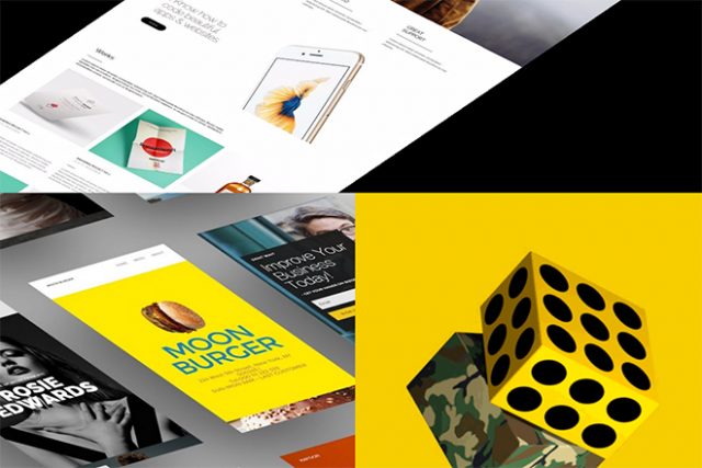
After signing up for a free XPRS Editor account, you start by choosing a theme. The templates are assigned to various categories, which are based on branches, among other things. Here, creative people will find a suitable theme just as quickly as restaurant owners or real estate agents.

xprs_themes
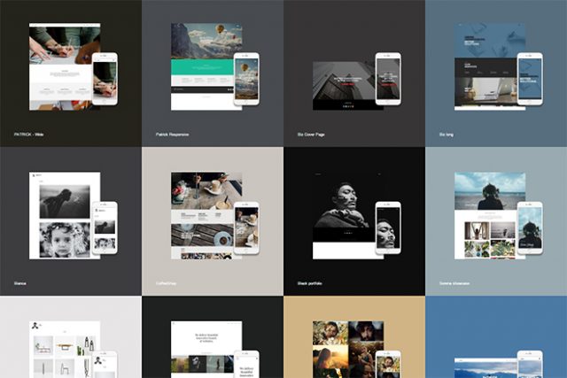
Overview of Some of the Many Themes

All themes are responsive and come with a detailed preview. This gives you a desktop, and a mobile view, as well as a preview of some example pages. Thus, you get a pretty accurate image of how the theme will look with your content on it when choosing it.
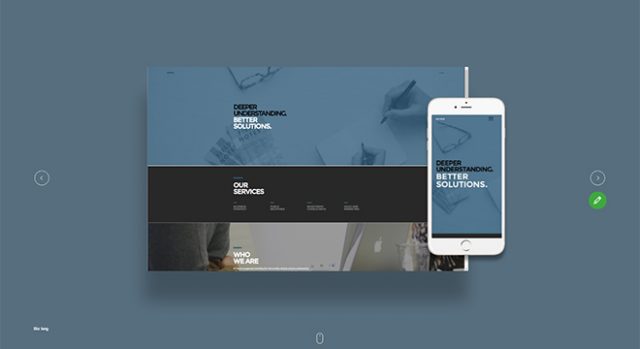
xprs_themes_vorschau
Theme Preview

Once you decided on a theme, you immediately start editing the content of your new website.

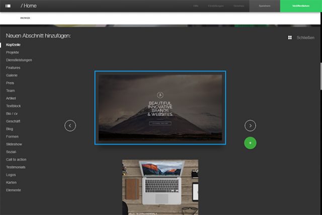
Building a Page Using Stripes

Each theme is equipped with placeholder content. Use it as a base to fill your site’s landing page with content. All elements can be customized individually.

xprs_segmente
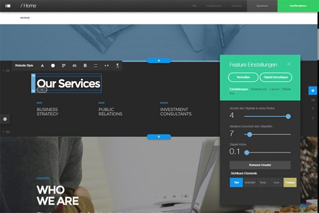
Division of a Page in Sections

Particular about the XPRS Editor is its modular page structure with so-called stripes. Stripes represent different content areas within a page. Texts, images, text-image-compositions, forms, and galleries are some of the many stripes that you can freely place on a page.

There are individual settings available for each stripe. The type of stripe determines which settings are available for it. For example, you define the placement of the images, the amount of images per row, as well as the gap between the pictures for a gallery.

xprs_segmente_auswahl
Choosing One of the Numerous Stripes

Of course, you can also move stripes within a page and delete them. Copying and pasting stripes are possible as well.

You don’t have to worry about the layout of the individual sections. The website builder automatically makes sure that all content will also be displayed correctly on mobile devices.

Adding Effects

Only very few contemporary sites work without animation effects. Modern CSS3 and JavaScript allow for impressive effects which you can also use in the XPRS Editor. There are classic hover effects applied to your gallery, for instance.

xprs_effekte
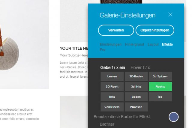
Adding Effects to a Stripe

Choose an effect from a list. These include enhancement and 3D image effects. If you want to, add an effect to the elements that scroll into the viewport. The builder also provides a bunch of options for that.

Your Shop

Adding a shop to your website is just as easy as integrating a gallery. Simply deposit a photo, as well as a product description and enter the price.

xprs_themes_ecommerce
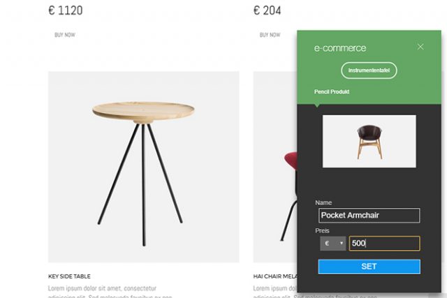
Adding a Shop as a Section

The entire purchase procedure including shopping cart and payment is done by XPRS via its own e-commerce system. This allows you to pursue your orders, determine payment methods, and to complete all the other administrative tasks that come with running an online shop.

At the moment payment via credit card and PayPal is possible. Payment via Bitcoin will be available in the future.

Adding a Blog

Adding a blog to your website is similarly easy. It’s provided as a stripe as well, and can just be placed on any desired spot on your site.

This stripe displays linked teasers to the individual blog posts. Using the settings, you can add new posts to your blog and manage existing ones.

xprs_blog
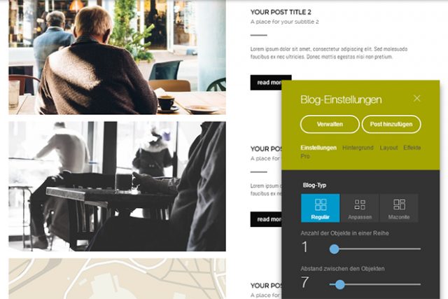
Simple Addition of a Blog

You can create unique blog entries by adding sections. This allows you to combine texts, images, and other elements at will.

Upload images from your computer and manage them using a media center. There, you’ll find a bunch of free-to-use images.

Managing and Adding Pages

Although one-pagers for websites are still popular, the website builder also helps you create complex websites with multiple pages. Set up pages, and add a menu to your site via the page management.

xprs_website
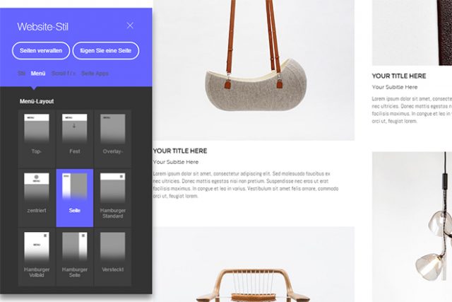
Choosing a Menu for Your Website

There are classic page menus, as well as those that are fixed to the upper border of the page. There’s also the option to choose a variant of the contemporary burger menu, which is very popular at the moment. In total, there are nine different types of menus to choose from.

Preview and Publishing

Once all pages are set up and filled with content, you can make XPRS display previews for various devices. Aside from the desktop view, there’s also a view for smartphones, as well as one for tablets.

xprs_vorschau
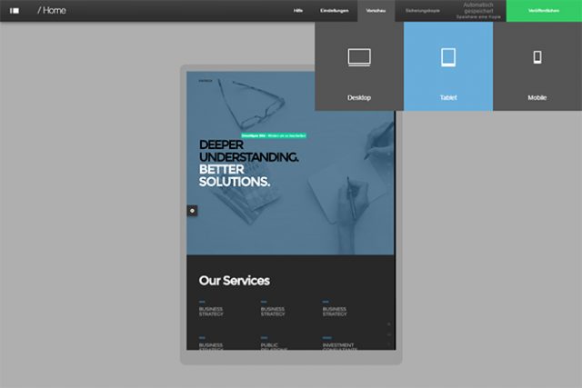
Preview on Different Devices

There are different options for publishing your website. If you don’t have a domain, or don’t want to use your own one, the XPRS Editor creates a new URL.

On top of that, you can also make your website run on your custom domain, or have a domain be registered via XPRS.

SEO and Header

To allow your website to be found, there are a couple of additional SEO options. This lets you decide whether you want search engines to index your website. Additionally, you add a title, description, and keywords.
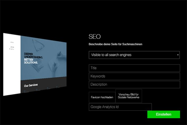
xprs_themes_seo
SEO Settings

If you want to use Google Analytics, just enter your tracking ID. The XPRS Editor takes care of the rest.

To make sharing on social networks look beautiful, upload an image file that will be displayed for shared links on Facebook and others.

Control On the Go Via App

Another unique thing about the XPRS Editor is its app that allows you to take care of your website on the go.

Especially when running a blog, this app is an easy and comfortable way of writing and posting articles on the move.

xprs_app
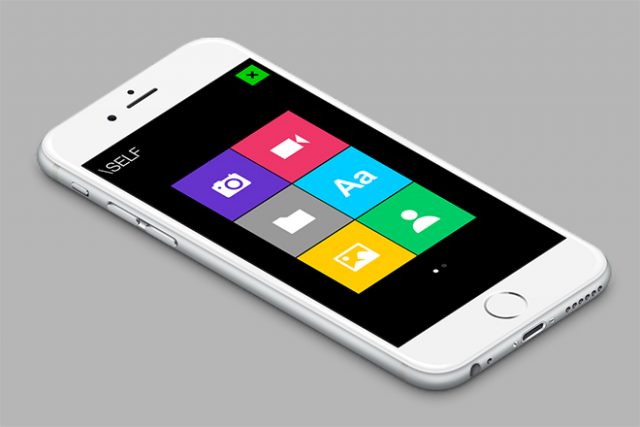
Comfortably Managing a Website On the Go Via App

However, the app is only available for iPhone and iPad at the moment, and can be downloaded from the Apple Store.

XPRS White-Label: The Professional Solution for Designers, Agencies, and Providers

Now that you know what the XPRS system is able to achieve you might be interested to know how you can get it to work for you as a professional in the field. XPRS has come up with an iteration that they call XPRS White-Label, and it might be just what you are looking for. XPRS White-Label has a speaking name. It, in fact, delivers what you might already have expected, a fully unbranded version of the XPRS system. Rebrand XPRS to your own corporate design and run your own website builder for unlimited clients. White-Label does not stop at just letting you add a custom logo. You can use your domain and even your own set of templates.

For a payment of 350 dollars a year, you can take full advantage of XPRS WhiteLabel. Connect as many clients as you like with all these clients still getting unlimited storage. Bill your customers via the billing system of XPRS or your own. Taking advantage of the billing system of XPRS will cost you a fee of 5 percent per transaction while using your own solution is free.

Setting up the White-Label is done in a matter of minutes. So should you just today find out that you’d like to run a website building company, choose XPRS and have it running by the afternoon.

Besides the solution for an annual payment of 350 dollars, there are even more sophisticated offerings. Pay 2,500 dollars a year and get the possibility to download the generated websites so that they can be run on your servers or wherever the clients wants them. Furthermore, the customization of the White-Label is more detailed than with the standard White-Label.

Out of reach for most people, but still available, is the XPRS Servers Control for 25,000 dollars. That plan lets you host the entire application on your own Google Cloud Server.

Conclusion

Using the XPRS Editor is free for students, artists, and non-profit users. Commercial use costs 7.95 US Dollars a month. The more professional offers are presented in detail just a few lines above. In fact, if you ask me, the professional offerings are what fascinates me most. Build your own website building business in minutes and without a risky investment. Just 350 bucks a year are all it takes. I guess there’ll be quite a few that will try to get this running successfully. From time to time you will find promotions that allow you to snatch the account for even fewer than 350 dollars.

From the user’s perspective, working with the XPRS Editor is as easy as it gets. On top of that, it comes with plenty of features that allow you to realize almost any wish, and benefit from virtually all the current options available to contemporary websites.

All the themes are up to the state of today’s design and offer great results for about 90 percent of all possible website use cases.

(dpe)

Categories: Others Tags:

I’m not a UX Designer, and neither are you

August 2nd, 2016 No comments

In the last few years the term User Experience has come to the fore, and with it we’ve seen the rise of the UX Designer.

Every few months someone tweets a pair of images, one will be a biscuit (labeled ‘UI’), and the other will be a smug face eating said biscuit (labeled ‘UX’). A few weeks later a heartfelt post will appear on Medium refuting the tweet by arguing that the correct definition of ‘UI’ is the mug of tea into which the biscuit was dunked.

These metaphors are seized upon, because “UX Design” has become a catch-all term for a process we’re still trying to define.

UX can’t be designed

Well, it can…in some fringe cases…

A roller coaster designer for example, could be said to be designing experiences. A roller coaster is a sensorily overwhelming experience; with the extreme changes in gravity, balance, sound, air pressure, on a thrill ride you barely notice that all you usually see is the back of the seat in front of you. A roller coaster is an experience that can be designed because the variation of experience is limited. But even then, we can’t control the length of the queue, the weather, or the amount of strawberry milkshake the kid sat beside you sucked up before riding.

You might also say that a movie director is a UX designer. Sitting in a movie theater watching a film we’re engrossed in a single linear narrative. Provided the spell isn’t broken by someone’s mobile, the entire audience will experience the same emotional highs and lows for two hours plus.

One of the first analogies for UX vs. UI that I remember hearing was the bicycle metaphor: UI is the bicycle, the frame, handlebars, tires, etc.; UX is the experience of freewheeling down a hill. However unless I’m planning a route for Le Tour, or working as a city planner designing cycle lanes, I have no way to design a cyclist’s experience; I can’t control traffic, I can’t control geography, and I can’t control other road users.

I can design a UI (a bicycle) that will function in as many diverse situations as possible, but I don’t design the UX (the act of cycling), that is left to the user.

UX is never singular

UX is not an illusion, it plays a role in every site and app. The mistake is in believing that there’s a singular user experience that can be designed.

We can design for user experiences. We can create clear, and functional UIs, engaging micro-interaction, empathic content.We can create a framework within which user experiences can occur, but we cannot design them.

We can create a framework within which user experiences can occur, but we cannot design them

At school we learn that there are five senses: sight, hearing, touch, taste, and smell. As we get older we learn that the definition of sense is a little fuzzier; hunger, balance, temperature can all be considered non-traditional senses. Some psychologists argue that there are more than 20 senses.

A print design might involve several traditional senses: sight, touch, perhaps smell. A website typically involves one or two: sight and hearing. And so we are, at best, designing two fifths of a user’s experience. If we take non-traditional senses into account it may be as little as 5% of the user’s actual experience that we affect.

I cannot know what soundtrack will be playing when someone visits my site, I cannot know where they were before, or where they will be after, I have no control over the duration of the experience, or on the users’ degree of focus. UX is a deeply personal thing, not only unique to each user, but unique each time that user’s context changes.

Responsive design often focuses on different viewport sizes, but it’s much more than that: connection speed, screen resolution, environmental influences (such as light levels), are all factors beyond our control. The core principle of responsive design is to embrace that variation, not as a limitation, but as an inherent quality of the medium.

The natural extension of responsive web design, is a responsive user experience in which UX is not designed, but rather a framework is created within which a UX can occur. By designing for UX, rather than designing UX itself, we’re building tools for the user to develop their own experience. By relinquishing that process to the user we enable them to become fully engaged, defining their own relationship with a product or service on their own terms.

By refraining from designing a UX, we create a more open, egalitarian, and engaging web.

UX vs. Ergonomics

Typography is largely concerned with legibility and readability. In other words, the act of absorbing information. The UX of reading a book goes far beyond typography, it extends to the weight of the tome, the feel of the paper, the smell of the binding, it encompasses all aspects of using a book.

We don’t print a book at 2pt, because that’s too small to read. We don’t print a book at 200pt, because there would be too few words on a page. The act of designing for humans, of finding a human-orientated point from which to embark, is called ergonomics. It’s something that has always been part of design.

Designing for humans, does not mean designing the act of being human. UX is the result of a design; an end result, not a process.

Keep off the grass

One of the most famous memes on UX is a pathway with a patch of grass. In some variations there’s a gate, in others the path is simply turns at a right-angle. In all cases, the pathway is labeled ‘Design’ and the muddy track across the grass created by hundreds of feet is labeled ‘UX’.

Like the biscuit metaphor, the path meme perpetuates the myth that UI is about restricting users, whereas UX is about freedom and enjoyment.

Designing for humans, does not mean designing the act of being human

What the meme conveniently ignores, is that whilst walking on grass may leave a trail, walking on concrete does not. For every person who walks across the grass, there may be ten thousand who do not.

The false narrative on UX is that there’s a definitive user experience, and that by crowd-sourcing our design decisions, a single ‘correct’ path will emerge.

We don’t control a user’s context, and we shouldn’t try. Sites, and apps, aren’t films, or events. Truly successful UX isn’t designed, it occurs when users are given a framework to interact with on their own terms.

One of the most successful film franchises of all time is Star Wars, not due to the films themselves, but thanks to the accompanying toys. What Star Wars delivers well isn’t a couple of hours of linear narrative, but rather an expansive world in which fans play out their own stories. Without that expandability, George Lucas might as well have made The Last Starfighter.

I’m not a UX Designer, and neither are you

Good design is about achieving engagement. As a designer you can ask for that engagement, but you can’t enforce it. UX is a personal thing, created by the user’s mind in response to stimulation.

We’re not film directors, or roller coaster designers, or even novelists; We’re facilitators: we clean up popcorn; we press the ‘launch’ button; we set the type. It may not be glamorous, but it’s good honest work.

I’m not a UX Designer, I’m a Designer, and you are too.

250+ High Quality Real Paint Textures and PS Brushes – only $24!

Source

Categories: Designing, Others Tags:

Creating a Dot Navigation Menu in Adobe Muse

August 2nd, 2016 No comments
Muse For You - Creating a Dot Navigation Menu in Adobe Muse 2015.2 - Featured

Adobe Muse Quick Tip #3 – Dot Navigation. No Coding Skills Required.

Adobe Muse CC Logo

Menus are an important part of any website and can sometimes add an element of class and style to the website. You might be familiar with dot navigation menus that stay fixed to the left or right of a website and when a dot is clicked on it goes to a different section of the website. They are very slick and on the right website can fit in perfectly. Adobe Muse allows you to create a dot navigation menu easily with the “Tooltip” composition widget. After the menu is created you can link the dots to different sections of the website via anchor points. You can also have the menu names appear when you rollover the dots.Muse For You - Creating a Dot Navigation Menu in Adobe Muse 2015.2In the video tutorial above I go over how to create a dot navigation menu in Adobe Muse in under 10 minutes. This tutorial is part of the “Quick Tip” series where I give quick tips on Adobe Muse.

Happy Musing :).

Visit http://museforyoushop.com for more Adobe Muse widgets and video tutorials.

Read More at Creating a Dot Navigation Menu in Adobe Muse

Categories: Designing, Others Tags:

How To Create A Responsive 8-Bit Drum Machine Using Web Audio, SVG And Multitouch

August 2nd, 2016 No comments

In this little tutorial, I’m going to share some tips I recently followed to build a fun demo for the Build 2016 conference. The idea was to create a small 8-bit drum machine, with 8-bit sounds and graphics:

This small web app was used in one of our demos to illustrate how you can easily provide a temporary offline experience when your hosted web app loses Internet connectivity. It works in all desktop browsers as well as on all smartphones (iOS, Android and Windows Mobile).

The post How To Create A Responsive 8-Bit Drum Machine Using Web Audio, SVG And Multitouch appeared first on Smashing Magazine.

Categories: Others Tags:

Using A Static Site Generator at Scale: Lessons Learned

August 2nd, 2016 No comments

Static site generators are pretty en vogue nowadays. It is as if developers around the world are suddenly realizing that, for most websites, a simple build process is easy enough to render the last 20 years of content management systems useless. All right, that’s a bit over the top. But for the average website without many moving parts, it’s pretty close!

However, does that hold true for websites bigger than your humble technology blog? How do static site generators behave when the number of pages exceeds the average portfolio website and runs up into the thousands? Or when development is a team effort? Or when people of different technical backgrounds are involved? This is the story of how we managed to bring roughly 2000 pages and 40 authors onto a technology stack made for hackers.

The post Using A Static Site Generator at Scale: Lessons Learned appeared first on Smashing Magazine.

Categories: Others Tags:

CDN: When do You Really Need One?

August 2nd, 2016 No comments
Brauchst du wirklich ein CDN für deine Website?

Content delivery networks – CDN for short – are on everyone’s lips, and are often on the wishlist of bloggers. You’ll often read that a CDN will make your website insanely fast and that you just have to get one. The only question is: do you really need it or are there other, possibly better, ways?

What is a CDN?

A CDN is a distributed compound of servers that are located all over the world. Their only task is to cache a website’s static data, meaning images, CSS, and JavaScript files. The providers copy your static data onto their servers. Then, these files are always delivered from the server that’s the closest to your visitor.

A CDN also works as a load balancer; most CDN providers have server networks per location, which means that they can easily handle a larger amount of requests than your server, which your website is on. That’s the theory.

From that, one can conclude that a CDN should always deliver files faster than your own server. This doesn’t always have to be true, however, as the deciding factor is the response time of the server in question. In certain scenarios, this can actually be better on your own server. Here, an in-depth test will need to show if that’s the case.

In Which Scenarios Can a CDN be Necessary?

Not every blogger needs a CDN. In fact, the opposite is the case, and it is only needed in very few scenarios. For instance, when you only write in German, you’ll only address readers that are from German-speaking areas. Here, a CDN would only make sense if your server or web hosting package is too weak and needs a boost.

Of course, there are many possible use cases for that German example website as well. For example, should you drive significant viewer traffic (at least multiple hundred thousand of page views every month), it is time to consider a CDN. Here, the traffic and simultaneous blog call-ups are the deciding factors.

When writing in English, you address a target audience that is spread over the whole world. In this scenario, a good CDN really is necessary, as a visitor from the USA will experience your website’s speed very different from a visitor from Germany or Australia.

Website visits from foreign countries are often served much slower than visits from the country your site is based in. Then, a CDN helps you make your site deliver much faster for visitors from countries that are far away.

A German visitor will then receive the images, the CSS, as well as the JavaScript from a German server, while a visitor from the US will get the static resources from a US-based server. This will make your website significantly faster, given that your chosen CDN has enough servers in enough locations.

Nonetheless, all of this also depends on your traffic, as the higher the visitor count, the more necessary a CDN becomes, as it allows your website to respond to more requests simultaneously.

First Optimize the Website, Then Add a CDN

Many bloggers assume that a CDN is all it takes to make a website really fast. Of course, that is complete nonsense. A CDN can only support a website and squeeze the last bit of speed out of an already optimized website. For non-English blogs, the central question is whether a CDN is actually necessary or not.

You can already get your website into the millisecond area of loading speed without using a CDN. Apparently, that takes lots of work, but it’s up to you if you want that.

If absolute speed is your goal, you can reach that without CDN. Even in peak times of up to 95,000 monthly visitors, my personal website wasn’t forced to its knees. But maybe this amount of visitors is nothing for some of you.

If that is the case, I recommend a CDN. However, Noupe proves that barely optimized websites can be rather fast as well. Here, the server is the decisive factor.

This is possible without a CDN:

Speedtest of the Democratic Post From the 28th of June. Without a CDN, of Course.

Speedtest of the Democratic Post From the 28th of June. Without a CDN, of Course.

In the screenshot seen above, you see the first test run on my website. The following one would be even faster. This is possible without a CDN. This is not an individual case either, as my personal blog loads even more quickly, although it lacks an SSL certificate and HTTP2.

Speedtest of my Blog Techbrain.de From the 28th of June. Without CDN, HTTPS, and HTTP2.

Speedtest of my Blog Techbrain.de From the 28th of June. Without CDN, HTTPS, and HTTP2.

What Really Makes WordPress Websites Fast

I have already explained how I achieved this result in a previous series of articles on Noupe:

In Conclusion, One Can Say

Before thinking about a CDN, first, optimize your blog’s bottlenecks. This alone will already lure out a lot of speed. The most important things are:

  • A proper server, e.g. the Managed-Root Cloud server by hostNET for 14.40 Euro a month. A reasonable server is crucial.
  • Magnificent image optimization – Optimus HG is the best one and can create webP
  • PHP7 + HTTPS + HTTP2
  • The lowest possible amount of plugins
  • The lowest possible amount of toys
  • An optimal treatment of CSS and JavaScript files. For example, dividing Jetpack CSS, deleting unnecessary Jetpack CSS, only letting files load where they are necessary, and so on…

You Still Want a CDN? Here Are Two Recommendations

You need to pay attention to small details like HTTP/2 and SSL certificates, as both services offer support for Let’s Encrypt. Let’s Encrypt provides free SSL certificates.

1 – KeyCDN – Content Delivery made easy

KeyCDN

The goal of KeyCDN is to be the easiest CDN to use, while still offering a lot of power to its customers. Thanks to their own WordPress Plugin, the integration is very simple, and the functions are convincing. Additionally, you only pay for what you use. A test account is available. All features can be tested for free.

An in-depth test will show you how good this CDN really is. We will report on that.

2 – CDN77.com

cdn77

CDN77.com is a British provider and, aside from HTTP/2 and automatic Let’s Encrypt allocation, also offers Google’s new compression standard Brotli. Google promises an up to 40 percent faster delivery of resources in comparison to the Gzip standard. However, CDN77 only offers integration with three cache plugins in WordPress. WP Fastest Cache, W3 Total Cache, and ZenCache are supported.

Conclusion

Whether you really need a CDN or not strongly depends on your personal situation. If all you need is a little more speed, other measures are a better choice. However, when you own a website that publishes English texts or drives massive traffic, a CDN is recommended. This can be especially helpful during peak times, allowing for a quick delivery of your blog. Smaller standard blogs are better off considering other things that have a much larger influence on speed than a CDN could ever have.

(dpe)

Categories: Others Tags: